
Photo courtesy of Dick Armstrong; click to enlarge
The photo shown above was taken during spring training in March of 1950. The gentleman on the right is Philadelphia A’s owner/manager Connie Mack, who was then 87 years old and was preparing to manage his 50th season — and, as it turned out, his last. The man standing next to him is Dick Armstrong, who at the time was the team’s new public relations director.
Nearly seven decades later, Dick Armstrong is now 94 years old and is believed to be the only remaining A’s employee to have worked with Connie Mack. In other words, he’s the last living link to a key chapter in baseball history. Armstrong also played an important role in Baltimore Orioles history, helping to establish their first logo and creating their (and MLB’s) first costumed mascot.
I recently had the pleasure of doing a phone interview with Armstrong about all of these subjects. Here’s an edited transcript of how our conversation went.
Uni Watch: You played in the minor leagues, is that right?
Dick Armstrong: I did. I signed as a utility infielder and a pitcher in the [Philadelphia] A’s farm system.
UW: How did you make the transition from being a player to working in the A’s front office?
DA: Art Ehlers, who was the Athletics’ farm director, had signed me to my first contract. And because I was a college graduate, I guess he took an interest in me. The A’s were just starting a farm system, and at the end of my first season he called me into his office and said, “Look, you’re getting married soon, and you’ll have a family to support. How long do you want to bang around in the minor leagues wondering if you’ll make it to the majors?” He suggested that I should consider the front office, which I thought was the best news I’d ever heard. I was thrilled!
UW: How old would you have been at this point?
DA: Let’s see … 23. So they sent me to become the business manager of one of their newly acquired minor league teams, in Portsmouth, Ohio.
UW: So you worked in minor league administration and then worked your way up to the majors?
DA: Right. I was at Portsmouth for two years. That was a class “D” team — a good one, but still limited in terms of salary and so forth. I was ambitious, and I went to see Art Ehlers, and I had a speech all ready to give him, explaining how I wanted to move up in the organization. My wife was waiting outside for me, and I was all set to go, but before I could say anything he said, “How’d you like to be the PR man for the Philadelphia Athletics?” So after I picked myself up off the floor, I said, “I’d love to do that.”
UW: Did most teams have PR men in those days, or were the Athletics one of the first teams to do it?
DA: The Yankees and Red Sox had their own PR men, and maybe one or two other teams. But most teams usually had arrangements with local advertising agencies or PR firms — the A’s and the Phillies used the same one, Adelphia Associates — with an account rep who’d handle publicity. The A’s contract with them was expiring, and they were opening up to other possibilities. Other agencies were vying for the account, but Art was a man of vision and a creative kind of person, and he was impressed by what we’d done in Portsmouth, so his philosophy was, why shouldn’t major league clubs be more fan-friendly and fun, like minor league clubs?
So Art wanted to hire me, but the team’s board of directors still had to be convinced. I learned that Connie Mack was approaching his 50th season as the team’s manager, as well as the owner, so I spent three days building a promotional idea around that — a season-long celebration, called the Connie Mack Golden Jubilee. Apparently none of the other agencies had thought about doing something like that, so that convinced the board, and that’s how I got the job.
It was a big success. We had a yearbook, which wasn’t so common in those days, and it celebrated Mr. Mack’s anniversary. That’s what everyone called him — Mr. Mack. I also wrote a song, called “The Connie Mack Swing.” That was introduced on Opening Day, and we sent copies of the disc to every club, and whenever the A’s came to town, they all celebrated Mr. Mack’s 50th season. The Phillies were jealous, because they couldn’t compete with the attention we were getting.

Unfortunately, the A’s had a terrible season, lost over 100 games [they went 52-102 — PL], and at some point that began to diminish and even throw a wet blanket over the whole thing. Mr. Mack would poke his head out of the dugout and fans would boo — it was sad. Meanwhile, the Phillies had the Whiz Kids, won the pennant. Lost four straight to the Yankees, but they won the pennant.
UW: Speaking of Mr. Mack, he was famous for wearing a business suit, instead of a uniform, when he managed the A’s. But there’s one thing I’ve always been unclear about. I’ve seen photos of him wearing the suit in the dugout, but did he also go out onto the field to make pitching changes, or to argue with umpires? I’ve never seen him wearing the suit on the field — only in the dugout.
DA: He would sometimes go out onto the field, but very seldom. He’d often come out to the edge of the dugout. You know, one time in spring training I got him to agree to wear a uniform.
UW: Really?

DA: Yes, very early in the morning, long before anyone else got to the ballpark. He had been a catcher, so I had him in catcher’s gear. I chose one of the photos and sent it out as a publicity release that said, “A’s Sign New Rookie.” It was used everywhere, everywhere. It must have been in every newspaper in the country.
UW: Later on, you ended up working for the Baltimore Orioles, and my understanding is that you arranged a design contest among local artists to help create the Orioles’ first logo. Could you tell me about that?
DA: Yes. A group of Marylanders had been awarded the St. Louis Browns’ franchise, and that franchise was going to be called the Orioles for 1954, and I got the chance to work for them. There had been a minor league Orioles, but since we were now a major league club, we wanted our own logo and also a live mascot, which had never been done before to my knowledge.
UW: Which came first, the logo or the live mascot?
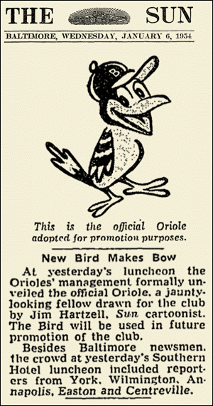
DA: Here’s how that happened: We had a contest for people to submit sketches of a bird. I had something in mind, and we finally got what we wanted from a guy named Jim Hartzell, who was one of the leading cartoonists for The Baltimore Sun. He was a good artist, and he had just the right character in the bird’s face, at least for me. I bounced it off the other executives, and they all approved.
I think what we did was suggest a couple of possible names for the bird and have the fans vote, and the one they chose was Mr. Oriole. So that became his name, and Jim Hartzell depicted him in different poses and emotions. We paid him $350 — that was the award for winning the contest.
So then the next idea was, how about having a stylized, three-dimensional costume of the bird, with someone in the costume. So I got my friend Johnny Myers to do it — a high school teammate and friend of many years. I used to jokingly say that he had the perfect legs for the part, because his legs looked like bird legs. Anyway, Johnny knew this guy named Tinker — I don’t remember his first name, but I think he was a related to the Tinker who was part of Tinker to Evers to Chance, a nephew once removed or something like that. He was a costume designer, and he said he could do what we wanted. He made the most beautiful costume, with feathers and all that. So Johnny Myers agreed to be the first human being in this costume.

When he made his first appearance — and of course we drumrolled him onto the field — he cavorted and so on, led cheers, and people went wild. They loved it! What they didn’t know was that Johnny was a jazz musician — he was a fantastic trumpet player. Played with big bands. Under his wings, completely hidden, he had his trumpet. So he gets up on the dugout, whips out this trumpet and starts playing jazz. We jokingly said we had the only jazz-playing bird in captivity. It was so sensational, you can’t imagine the impact it had.
UW: You mentioned that no major league team had ever had a costumed mascot before. What about in the minor leagues — had it ever been done there?
DA: I don’t know about the minor leagues.
UW: What happened to the costume?
DA: I have no idea. It still exists somewhere, I’m sure. Someone has it in their basement or something. Who would throw it away?
UW: What do you think of today’s costumed mascots, and do you consider yourself sort of the grandfather of all of them? Do you feel some sense of ownership over everything that mascots have become?
DA: I don’t feel I deserve that title or honor. But I do feel that to be historically accurate, people should know that Mr. Oriole was the first costumed mascot — not Mr. Met, as is sometimes claimed. He came 10 years later! There’s a Mascot Hall of Fame in Indiana, and they didn’t even know about our Orioles mascot until I told them.
———
There was more — a lot more. A year later, in 1955, Armstrong, who up until that time had never been particularly religious, felt a spiritual calling. A year after that he left the Orioles and began studying at the Princeton Theological Seminary. He later became an ordained minister.
Although Armstrong never worked in baseball again, he loves talking about his time in the game. You can learn more about his life on his blog, and he’s also written this book. He’s been facing some medical challenges, but he was extremely gracious throughout our conversation, and it was a pleasure to speak with him. Take care, Dick.
(Major thanks to my old college pal Jeff Katz, the former mayor of Cooperstown, for pointing me toward Dick Armstrong, and extra-special thanks to Dick’s son Andy Armstrong for arranging the interview.)
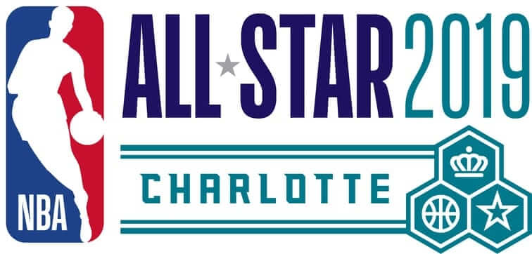
NBA All-Star leak: Over the weekend I corresponded with a source regarding the uniforms for the NBA All-Star Game, which will be taking place on Feb. 17. Here’s what he had to say:
Uniforms are similar to last season’s ASG package. Black vs. white again, current team logo on the chest. The difference this year is they’re making it a bit of a mashup with the 1991 uniforms (as the game was in Charlotte in ’91) — red-white-blue neckline and sleeve trim, stars on the side panels. The shorts are very similar to the ’91 shorts, which I’m actually a big fan of. … KIA sponsor patch again on the left and jumpman logo opposite again.
Everything about the game is supposed to be inspired by ’91, as retro is huge in street fashion right now.
I figured the unveiling would probably come this week or next. But then I woke up this morning to find the following photo waiting for me:
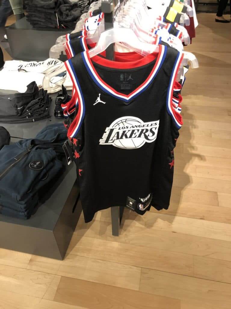
That shot was posted overnight by Twitter-er Josman Suri, who said he took the photo at a Nike shop. It matches the description from my source, so we can treat this leak as legitimate. Can’t say I think much of the design, but I’m intrigued by my source’s description of the shorts and am looking forward to seeing those.
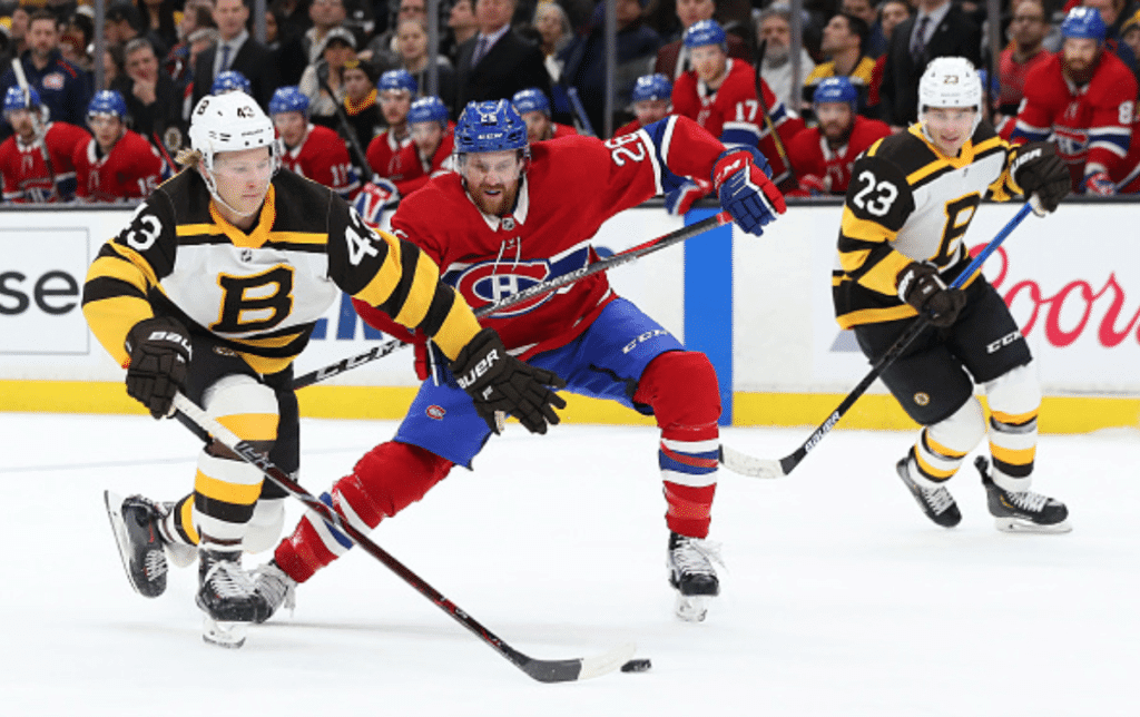
A feast for the eyes: Great-looking game last night in Boston, as the Bruins reprised their Winter Classic throwbacks and their Canadiens, wore their red home uniforms on the road. Even the fights looked good! Why can’t they do this all the time?
Lots of additional photos here.
Click to enlarge
Collector’s Corner
By Brinke Guthrie
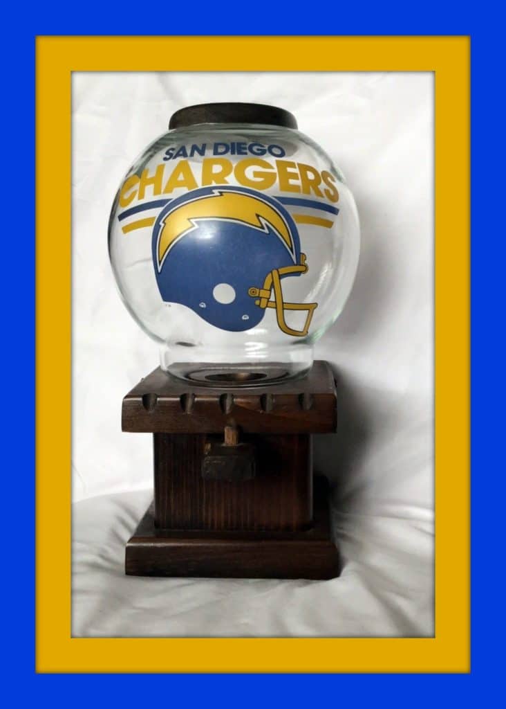
I can flat-out promise that we’ve never had a San Diego Chargers gumball machine on Collector’s Corner before. Chargers fans (be they in San Diego or Los Angeles) can console themselves over Sunday’s lost to the Patriots with this — just fill ’er up with some blue and yellow gumballs and you’re all set!
Now for the rest of this week’s picks:
• One more Chargers item here: This is a “Buffalo Roast” rally towel from October of 2001 — for a game against the Bills, of course.
• This 1970s cocktail napkin says “See Live Pro Basketball In The Salt Palace! All (ABA Utah Stars) games broadcast on KALL Radio!”
• Here’s just the thing for Uni Watch HQ — a set of four 1970s New York Football Giants glasses still in the box. These were a promotion from Shell.
• Nice cover art on this 1969 Atlanta Braves scorecard, although it’s too bad about that Union 76 ad that takes up 25% of the cover. Only 30¢ for this!
• This 1970s Minnesota North Stars key chain features a raised logo as opposed to a screened on. And as long as we’re talking about the Stars, check out this hockey puck bank!
• I remember this! A Dallas Cowboys “World Champions” sign from 1972. Always liked that no-facemask helmet logo.
• You’ll notice that these early-1970s shiny foil Cowboys stickers look very similar to the plaque, just with the facemask. Still have my key ring from 1972 with this helmet.
• This 1970s San Francisco Giants “Sports Caddie” is made of “heavy vinyl” and is a “multi-purpose bag for men or women with so many uses!” As the card helpfully states, it will hold everything from bowling shoes to shotgun shells.
• Nothing says NFL retro like a 1970s helmet buggy from Sportoys. This eBay seller has 13 of them available, including the Steelers, Bears, Packers, and
• This 1980s Boston Bruins jacket by Starter is in nice shape.
• And speaking of the Bruins, here’s one from reader Will Scheibler — a canister of Phil Esposito boot wax!
Seen an item on eBay that would be good for Collector’s Corner? Send any submissions here.
The Ticker
By Alex Hider

Baseball News: The White Sox will give away these great Hawaiian-style shirts on June 15 (from Charlie Kranz and Nick Johnson). … The Wisconsin Timber Rattlers, the Brewers’ Class A affiliate, will again play as the “Brats” in lederhosen uniforms on May 31 (from Eric Baker). … This graphic includes a new alternate logo for the Sussex County Miners of the independent Canadian American Association of Professional Baseball (from John Cerone).

NFL News: Good catch by Andrea Janzen, who notes that the Rams are forced to alter their horn decals on some helmet models — note how the tip of OT Andrew Whitworth’s helmet horn is broken up in this photo. … Two teams introduced new coaches yesterday: The Browns’ Freddie Kitchens and the Jets’ Adam Gase. Both wore team-colored ties (from Brian Speiss and Alan Kreit). … Speaking of Kitchens, he reportedly wanted to wear his trademark orange hoodie to his introductory presser, but Cleveland’s front office nixed that idea (from @Cdud1970). … Kitchens also said he liked the Browns’ uniforms when he was growing up (from Mike McLaughlin). … Today show co-anchor Hoda Kotb is a Saints fan, so she wore black and gold on set yesterday (from Josh Claywell). … Here’s a sensational shot of an old Rawlings helmet with one of their clear plastic “Safe-T-Vue” facemasks (from Goat Jerseys).

Hockey News: Wild C Luke Kunin’s memorial patch for Bob Naegele was missing last night (from Giles Ferrell). … The Grand Rapids Griffins will debut the excellent unis designed by Uni Watch reader Mattew Harvey on Saturday. Can’t wait to see how they look on the ice!

Basketball News: The D League’s Erie BayHawks will wear these uniforms for Martin Luther King Jr. Day on Saturday. … More D League news: The Wisconsin Herd will wear “Curd” jerseys (get it?) on Jan. 18. … The University of Chicago supposedly switched from Nike to Adidas, but they’ve continued to wear Nike-branded uniforms at home (from Frederick J. Nachman). … A central Indiana high school that’s replacing its gym floor is auctioning off a coffee table made from the old floor (from Kyle).

Soccer News: It appears that Nike is recycling some of its old kit designs for the upcoming season. I guess that’s what happens when you only have two or three companies supplying uniforms for just about every professional sports team on Earth (from Josh Hinton). … New kits for Philadelphia Union. Good move: Making your jersey ad more discreet. Better move: Removing it entirely (thanks to all who shared). … U.S. Soccer has signed an advertising deal with Volkswagen, who will put their logo on training tops (from Ian Thomas). … Dundee F.C. of the Scottish Premiership has signed a kit deal with Macron (from our own Jamie Rathjen). … Italian club Torino has signed a new kit deal with Spanish company Joma (from Ed Zelaski). … The San Jose Earthquakes called out a Chinese soccer club that appears to have poached their logo (from Scott). … Here’s a graphic showing Man City’s David Silva in every home kit they’ve worn since he joined the team (from Josh Hinton).

Grab Bag: A former CEO tried to forge documents in an attempt to shield his assets from creditors, but he was foiled when a font detective determined that the documents were written in a font that didn’t exist at the time when they were supposedly created (from Ted Arnold). … USA Rugby has a new kit supplier (from Andrew M.). … The Army is testing new combat boot prototypes (from Jason Hillyer). … Here’s the guy behind the new America’s Cup logo explaining his design (from James Gilbert). … A portion of US Route 23 in northeast Kentucky is dubbed the “Country Music Highway.” Chris Bain found some marketing materials for it and noted that they use an interstate highway sign instead of a US Route sign. … Voters in Hurley, Wis., will decide whether it’s time to change the school district’s “Midgets” team name (from Alan Filipczak). … The company behind Trusox is an utter mess (WaPo link).
The bruins goalie had brown pants on, while the other players were wearing black.
Insert Deadpool brown pants joke here
It was the goalie wearing brown!!
Disappointing decision last night by the Bruins to wear the black pants instead of the brown pants with these uniforms.
Awesome interview, Paul. That’s why I read Uni-Watch.
Indeed. Amazing to talk to someone who worked with Connie Mack!
Charlotte’s last All-Star Game was in 1991.
Orlando hosted in 1992
Right-o. Same uniforms, though:
link
I’ll adjust the text.
That USA Rugby kit link is for their 2013/2014 Canterbury jersey; here’s the correct link: link
Fixed.
Great interview today, Paul!
Agreed! What a treat to read. And I’m very impressed with Mr. Armstrong’s memory and command of long-ago details. I don’t recall last week as well as Mr. Armstrong remembers the Truman administration! Fantastic interview.
Like the idea of the MLK Unis just wish it had some of the important events of his life as well
The Route 23 sign is a US Route sign in shape, colored like an Interstate Highway sign.
As an avid wearer and collector of them, I’ve never heard loud print camp shirts called “Hawaiian-style” before. If one is concerned with avoiding confusion with native Polynesian culture, then one can call them “aloha shirts” instead of “Hawaiian shirts.” Aloha shirt is the name first used in Hawaii by the original haberdashers who brought the style to market in the 1930s. And while the White Sox’s Hawaiian shirt doesn’t use authentic Polynesian iconography in its pattern, neither do most Hawaiian shirts. So there’s no need to distinguish between “real” Hawaiian shirts and Hawaiian-style shirts. As a genre of product, the Hawaiian or aloha shirt is all mishmash, syncretism, and ersatzery, and always has been. That’s what makes it so American!
The 99% Invisible podcast’s “Articles of Interest” did a feature on the aloha shirt recently. Good listen.
link
That’s not even an link.
A document allegedly from 2006 written in Calibri (which was released in January 2007) was a key piece of evidence that brought down former prime minister of Pakistan Nawaz Sharif. The world’s most historically significant font…link
Also I’d like to point out the amusing juxtaposition of the remark “I guess that’s what happens when you only have two or three companies supplying uniforms…” and the fact that there are six companies – Nike, Adidas, Joma, Puma, Kappa, Macron – represented in the soccer section alone…
Great interview and significant, which is why I’d like to point out a typo.
“How long to you want…”
“do” instead of “to”?
Thanks! Fixed.
The Bruins’ WC unis are fine, but they really need to just stop with the brown. It’s so dark, it’s virtually impossible to distinguish from black at any reasonable distance, so what’s the point? (And even when it is distinguishable, the effect is more like a “dirty black” than a true brown, which is not appealing.)
At first I thought artistic license was taken with that player being shown wearing a bi-color cap on that ’69 Braves scorecard, but it turns out the Braves did pair that cap with the pinstripes the season before and again in ’71:
link
I thought the all navy cap was used exclusively during that pinstripe era.
great interview with the O’s PR man. very enlightening and well written
the “cocktail napkin for salt palace” link actually goes to 1970’S UTAH STARS ABA BASKETBALL DEFUNCT TEAM 3″ PATCH
Ace Ventura, Font Detective.
Ace Futura, Font Detective
Great column today! I loved the interview, the Bruins-Habs pics, the Bruins jacket and the White Sox Hawaiian shirt.
Happy 29th Birthday, Flood by TMBG
Excellent interview! Great piece of baseball history.
Fantastic interview!
Question about the NHL & home/away sweaters, since it was brought up: was there ever any reason for teams wearing white at home, and any reason why they all switched 15 years ago? I’d prefer going back to the former, maybe in part because that’s what I grew up with, but also because I like the idea that fans at home games get treated to a little diversity from game to game, instead of seeing your team’s dark sweater against every other team’s white sweaters. Was the switch a merchandising thing–trying to drive sales of the dark-colored jerseys in front of the home crowds, assuming that they would sell better than something that’s predominantly white because, food and sweat stains and 99.999% of all regular- and post-season games are played between Labor Day and Memorial Day.
To review: Teams wore color at home until 1970-71, when they switched to white at home. I do not know the reason for this change. I’d like to think it was because either (a) they realized it was more interesting for the home fans to see a rotating cycle of different-colored road teams, instead of every Rangers home game being blue vs. white, every Canadiens home game being red vs. white, etc., and/or (b) they realized that most teams’ white uniforms were superior-looking to their colored uniforms, but I don’t know if either those elements factored into the decision.
They went back to wearing color at home in 2003. My understanding has always been that it was because most of the third jerseys were colored, and teams wanted to be able to wear those at home.
Ideally I would like to see the NHL go the NFL route and let the home team decide whether to go white or colored, but I understand there are a lot of logistical difficulties with that setup in a sport that is a) played frequently, and b) very equipment-intensive.
The clear facemask looks very Hannibal Lecter-ish.
Just a fantastic interview, Paul. One of my favorite posts on the site thus far. Bravo, friend.
Fantastic interview and Mr Armstrong’s blog is a great read.
Thanks for the great job and research