[Editor’s Note: Today we have a guest post from Brad Eenhuis, who’s hit upon an interesting new DIY project category. Enjoy. — PL]
By Brad Eenhuis
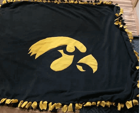
Recently I’ve been turned on to these DIY fleece tie blankets. They don’t require any sewing and are very easy to make (there are good tutorials here and here). You just need two identically sized pieces of fleece and some scissors.
Basically, you align the two pieces, cut strips of fringe along all four edges, and then tie all the top fringe strips to their corresponding bottom strips. Presto — a fleece blanket! You can also personalize them. A few years ago I cut out an Iowa tigerhawk logo and sewed it onto one of the pieces of fleece fabric:
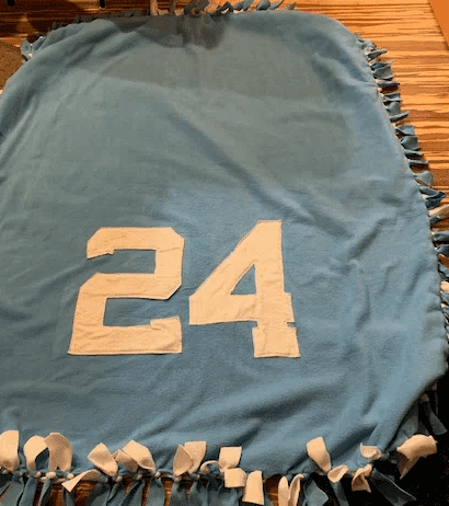
My daughter recently got into blanket-making at her after-school program, so in 2017 the two of us made a blanket for my fiancé, Lori. Lori had played basketball in college, so we used her school colors — Columbia blue and white — for the two pieces of fabric, and then we sewed her jersey number onto the blanket:
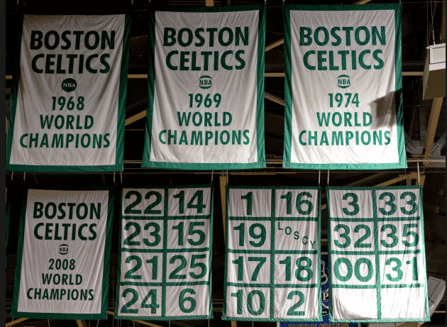
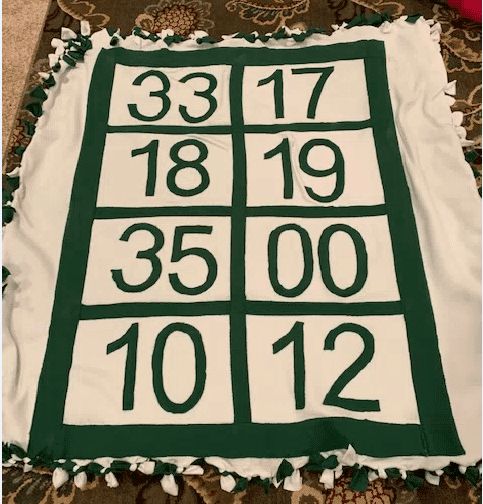
This got me thinking some more about different ways to approach this. While I’m not a Celtics fan, I’ve always loved their retired number banners, with the numbers appearing on a grid. My brother-in-law is a big Celtics fan, so I thought it would be cool to give him a fleece blanket patterned after the these banners as a Christmas gift.
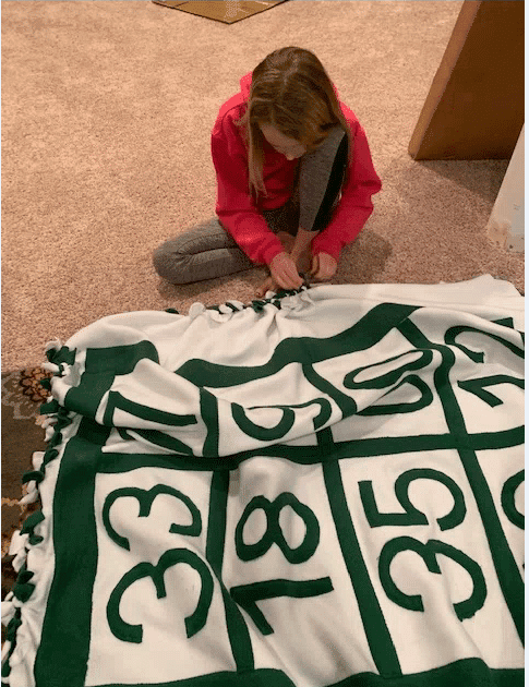
My take on this was that I wanted to honor his favorite players, not just the guys who have their numbers retired, because I figure we all have favorite players who never made it to the all-time-great category. So months and months ago, I sent him a text and asked him to name his 10 favorite Celtics. (It’s not out of the ordinary for the two of us to text about stuff like that, so it didn’t really throw up any red flags.) He provided his list of 10 players, which I then wrote down, along with their uniform numbers. Then I looked at an actual banner and realized they only had eight players per banner, so two names would need to be cut! A month before Christmas, I asked him to “just narrow it to your top eight,” which he eventually did, although I had to bug him about it several times.
I purchased the fleece — one sheet of white and one sheet of green, plus extra green for the numbers and the grid — and started on the grid by cutting long strips of fabric and sewing them on individually. I was worried they wouldn’t be straight, but it turned out fairly well:
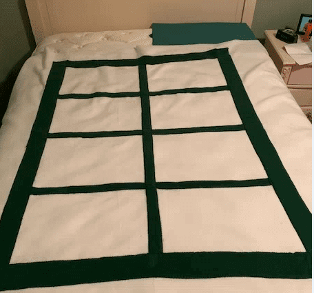
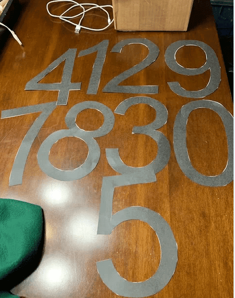
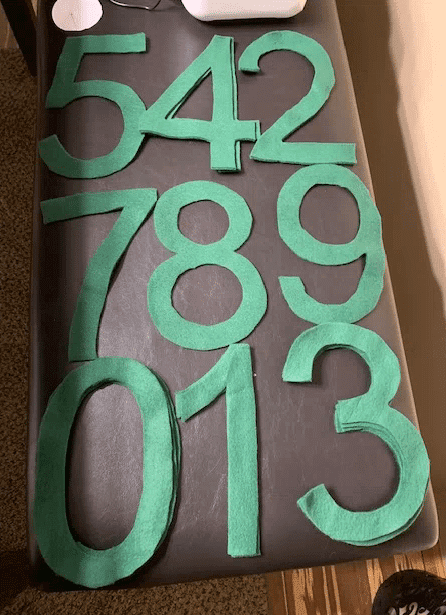
Then it was time for the numerals. I was a surprised that the numbers on the real banners are in Helvetica, instead of the Celtics’ number font, but whatever. I printed out the numbers, cut them out to create paper patterns, traced those onto green fleece, and then cut those out as well:
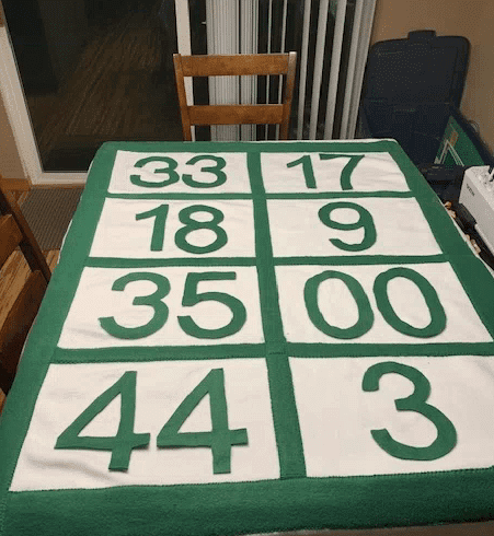
At this point, he hadn’t yet responded with his top eight, so I mocked up what I thought he would say, just to get an idea of how it would look. I didn’t sew anything down — I just put them in their proper positions:
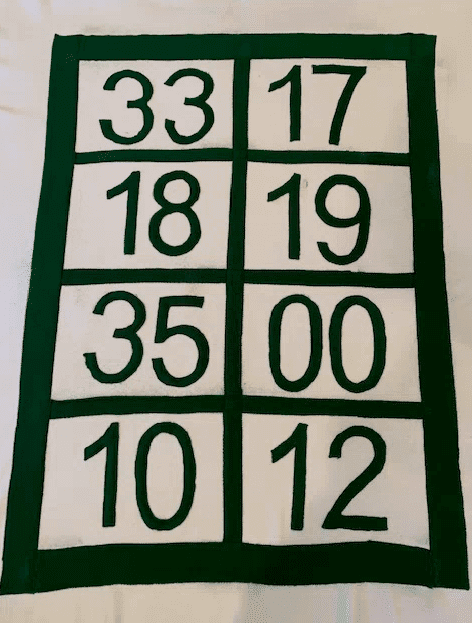
Of course I guessed wrong, so I had to change up a couple of the numbers. Got them all sewed down. It didn’t look perfect, by any means, but I always say it’s the imperfections that really make something like this:
The last step was to tie the front to the back, I enlisted the help of my daughter, as the tying can wear on your fingers!
———
Paul here. Very nice stuff! Big thanks to Brad for sharing this with us.
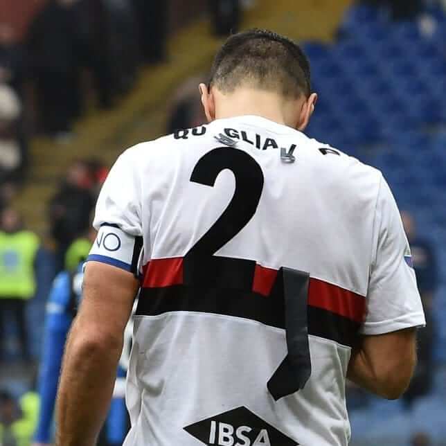
Just a slight quality-control issue: It’s one thing for a numeral or letter to come loose on a jersey, but it’s something else when virtually everything comes loose. That was the situation yesterday for Fabio Quagliarella a forward on the Italian soccer side Sampdoria. (The uniform was apparently a throwback or retro design.) I don’t usually like to use “fail” as a noun, as in “jersey fail,” but the term does seem appropriate in this case.
(My thanks to Anthony Nuccio and Mike D. for bringing this one to my attention.)
Click to enlarge
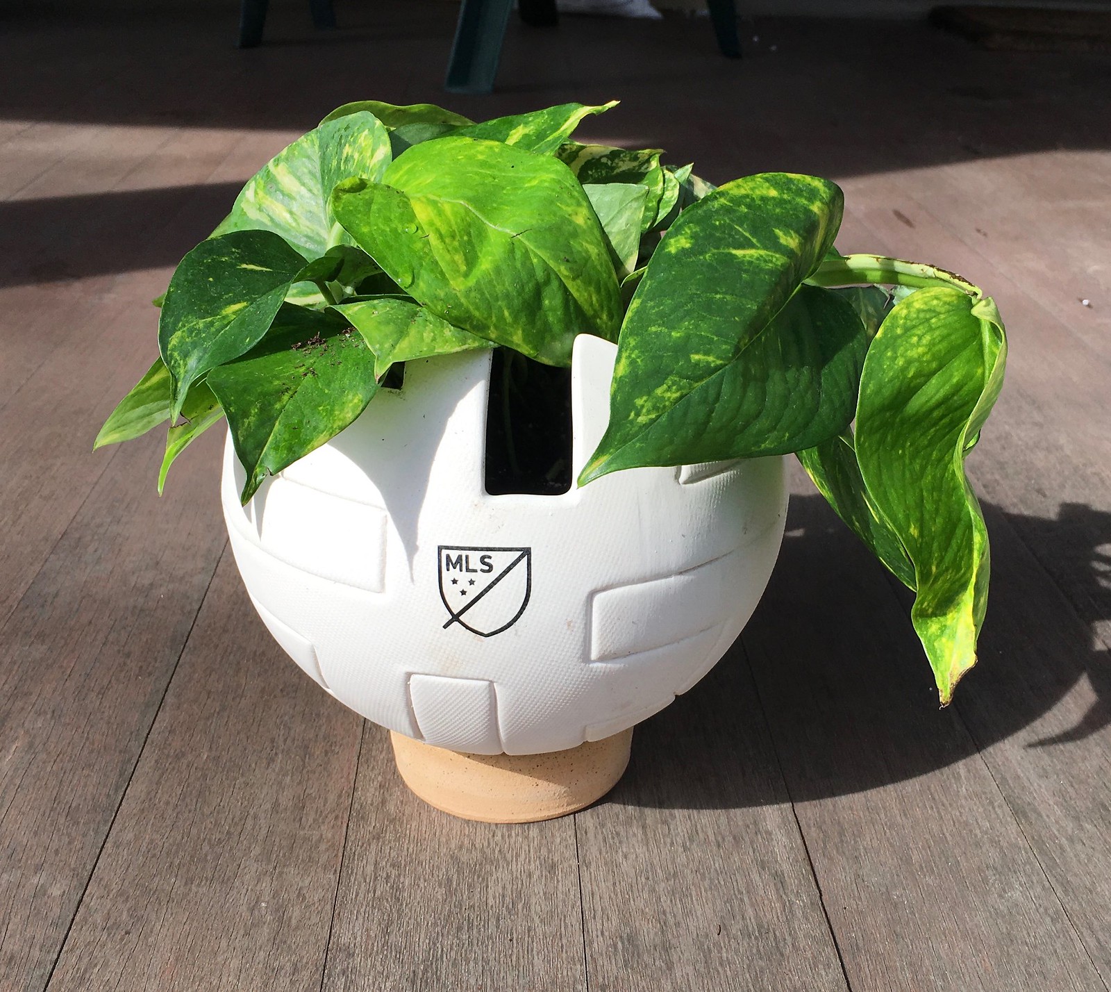
The weirdest promo item I’ve ever received: The FedEx guy showed up with a package on Friday. Inside, packed very snugly and securely, was a houseplant in an MLS ball planter. Who FedExes a houseplant? Crazy.
The funny part is that natural light is pretty bad here at the new Uni Watch HQ (you may have noticed that I’ve been taking most of my photos, including the one of the houseplant, outside on the porch), so plants tend to do very poorly here. But the plant they sent is a pothos, which we’ve found is the one variety that the apartment can’t kill. We have several of them around the place, and we’re happy to have another. Thanks, MLS!
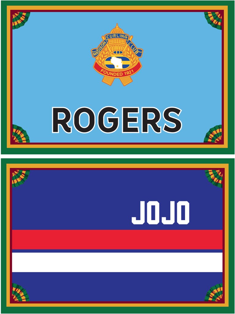
Membership update: Most of our membership cards are based on jerseys or, occasionally, football helmets. But two of our most recent requests were based on jackets.
R. Scott Rogers’s latest card (it’s something like his fifth one, dating back to 2007!) is based on his curling team’s jacket, complete with the logo of the Madison Curling Club. And Joseph Gustafson’s card is based on the Detroit Pistons’ old warmup jackets, which had the players’ first names on the front.
These two cards are among several that have been added to the membership card gallery, and I expect to be adding a bunch more in the next couple of days. (We had a slight pause while card designer Scott M.X. Turner, who lives in New Orleans, was busy enjoying Mardi Gras.)
Ordering a membership card is a good way to support Uni Watch (which, quite frankly, could use your support these days). And remember, a Uni Watch membership card entitles you to a 15% discount on any of the merchandise in our Teespring shop and our Naming Wrongs shop. (If you’re an existing member and would like to have the discount code, email me.) As always, you can sign up for your own custom-designed card here, you can see all the cards we’ve designed so far here, and you can see how we produce the cards here.
The Ticker
By Jamie Rathjen

Baseball News: Stirrups were spotted on Marlins minor-league P Tommy Eveld. … SportsLogos.net did an overview of all the spring training caps and team variations of the spring training logo (from Tom Turner). … Iowa wore mono-black yesterday. … Ole Miss softball wears really nice powder blue Sunday alternates (from multiple readers). … Florida Atlantic had a Twitter poll to choose their combo to be worn on Wednesday (from Noah Goldberg). … Because Virginia has baseball uniforms made by Rawlings and softball uniforms made by Nike, they have slightly different versions of the script “Virginia,” especially in the V and the G.

NFL News: The TV show Family Guy had a scene that showed several characters sitting at a table while decked out in Patriots gear, complete with a rather minimalist interpretation of the team’s Flying Elvis logo (from Griffin Smith).

Hockey News: The Capitals wore what were at first glance standard St. Patrick’s Day warm-up jerseys, but the numbers had a pattern of tiny recycling symbols as part of an environment-related promotion. … Former Rangers center Ron Duguay participated in a skiing competition wearing his No. 10 jersey (from Alan Kreit). .. The AHL’s Wilkes-Barre/Scranton Penguins wore superhero-themed jerseys Saturday (from @thatPAguy). … Here’s a place where you might not expect to see the Florida Panthers’ logo: on a dry cleaner’s hanger.

Basketball News: The Chicago Tribune sports section ranked Big Ten basketball uniforms based on “letters and numbers,” “accents,” and “overall impact”. … North Dakota State and Oral Roberts went color-vs.-color at the Summit League tournament (from David Brown). … Nebraska wore throwbacks yesterday. … Nameplates are rare in basketball, but Canisius apparently uses them. … Here’s a look at all of the Final Four logos, dating back to 1957 (from James Gilbert).

Soccer News: Germany’s women revealed their World Cup shirts; the first shirt is based on that worn at Euro 1989, while the second shirt is maroon. … Spain’s women revealed one shirt as well. … Reprinted from yesterday’s comments: New USL League One team Forward Madison weren’t satisfied with their shirt designs from Hummel, so they gave a staffer four days to come up with something better, and I would agree she succeeded (from R. Scott Rogers). … The women’s team at Scottish club Motherwell now has its own advertiser. … Drou Goff of the MASL’s Orlando SeaWolves goes FNOB.

Grab Bag: This article ponders how a new California elementary school, which writer/submitter David Taub’s children would theoretically attend, should choose its nickname and mascot. … BC Place in Vancouver hosted this weekend’s Canada Sevens, part of the World Rugby Sevens Series, and the stadium’s outside lights were lit up to form the flags of the participating countries; you can also see all the teams’ kits in that picture (from Wade Heidt). … Also from Wade: the NLL’s Colorado Mammoth wore their state-flag alternates; we’d only seen the jerseys before. … The women’s team at Australian Football League club Carlton wore orange socks to bring awareness to violence against women (from Graham Clayton). … Pakistan’s cricket board is upset that India wore camouflage caps for a One Day International against Australia on Friday, given the current political tensions between the countries (from Sam Heddle). … New logo for Conference Carolinas, a Division II conference that also participates in Division I for men’s volleyball (from Jim Vilk). … A YouTube channel tries to explain why 3D logos came into and fell out of favor rather quickly, arguing that Apple’s iOS, which suddenly changed from 3D to 2D app icons in 2013, was responsible (from Mike Chamernik).
For anyone who didn’t read yesterday’s post, it had a Celtic (the soccer team)-themed DIY project, so now we’ve gone from Celtic to the Celtics.
Also, yes, Sampdoria wore throwbacks, to one of their predecessor teams. Didn’t realize until today.
That Sampdoria jersey is a perfect example of a design that is begging for the NOB to be below the number. You could put the NOB in white inside those stripes.
The blanket is very cool. Who does the #12 represent though? Cannot be Terry Rozier. Maybe Don Chaney?
There is a link in the post that shows the number and name (link). There are a few surprising names. I’m curious what it was about some of them that made them personal favorites.
Nicely done project.
I use currency more than most people and, being attentive to odd details, I’ve noticed that I have yet to see any series 2017 bills. Even crisp new twenties right out of the atm are still series 2013.
FWIW whenever there is a change in the officeholder for either Secretary of the Treasury or Treasurer of the United States, there’s a new series of currency to include the correct facsimile signature. (there are also new series with a significant redesign such as the upcoming Harriet Tubman ten-dollar bill.) Those political appointments change over with new presidential administrations or on the retirement, resignation, or death of the officials in question. Research indicates that series 2017 currency has been produced. So where the heck is it?
Have you asked your bank?
not yet, but i may head over there later today
Me: Paul, I’m out of milk.
Paul: Have you tried the grocery store?
Me: Why didn’t I think of that?
I didn’t care for that YouTube about why 3d logos became 2d logo’s. It was happening as early as 2007 when Coca-Cola and Pepsi in 2008 changed their logo’s and labels to be simple.
Apple did not start the trend, it was already happening.
The Nebraska video quick cuts to every aspect of the uniform and then slows down for the Adidas emblem. Disgusting!!
Apostrophe catastrophe?: “David Taub‘s children”
No, that’s his name. It’s possessive.
RE: the Bad Boys era Pistons warmup jackets – not only did they have the players’ first name on the front, last names were on the back in a vertical arch, exactly the same as the Red Wings. That was courtesy of East Side Sporting Goods, the one-time supplier for both teams.
I definitely noticed the vertically arched NOB when I was doing photo research but I never put two and two together. Awesome stuff!
Paul, I think you will like this Humboldt Hawks jersey – link
Very similar colours and style as the Wafflebored & Uni Watch collaboration. Their green and yellow stripes are reversed from the Uni Watch version.
Nice! But I like our shoulder yoke better!!
I do remember the U. of Regina Cougars men’s hockey team wearing jerseys in the late 1980s that was basically a match to Wafflebored & Uni Watch collaboration. New York Rangers template white jersey with green and yellow trim.
Tried and having a real tough time finding photos of this online now without needing to do some serious research.
#33 Larry Bird
#17 John Havlicek
#18 Dave Cowens
#19 Don Nelson
#35 Paul Silas
#00 Robert Parrish
#10 JoJo White
#12 Paul Silas
Nice job with the blankets!
Sorry!! Yes, #35 was Paul Silas and #12 was Don Chaney.
You listed Paul Silas as both numbers 35 AND 12; is that correct? I know he was a great player, but to have two numbers retired for him….
According to your handwritten list, 12 is Don “Duck” Chaney.
Nice job on the blanket.
I used to live in Boston and was always curious why some of the NBA patches on the banners are totally green (1968) and others are outlined in green (1969, 1974, 2008). You guys know anything on this?
The logo matches the uniform the team wore when/where they won the championship – green on the road and white outlined in green at home.
Now that the whole uniform coloring scheme has been blown up by the NBA I wonder what might happen if they won while wearing a black uniform or green with gold uniform? Would they stick to the same color construct of “where” or color the logo on the banner to match the “what?”
(1969 NBA patch should be totally green, then, since they won Game 7 at the Forum.)
I almost never email in ticker items because I assume someone else will have beaten me to it, and likely someone who has the capability to grab a screenshot from their TV. I should know better. It’s like the Uni Watch equivalent of not reporting a crime because you assume someone else is taking care of it.
Anyways… at the Bay Hill Invitational PGA event this weekend, Aaron Baddeley wore a totally logo-less outfit. His hat was literally just a blank white cap. I can’t tell you the last time I saw that on the PGA tour. If you do a Google image search of him, though, it looks like he’s worn the plain white hat before.
link
I saw that…. between his attire, his hair length, and his facial hair, I said to my brother-in-law that it looked like they picked Joe Schmo off the street and threw him into the final round of a golf tournament.
Maybe he didn’t play well because he was logo-less?
Teams with the most retired numbers in the 4 major sports:
The New York Yankees have retired 21 numbers (for 22 players).
The Boston Celtics have retired 23 numbers.
The Montreal Canadians have retired 18 numbers.
The Chicago Bears have retired 14 numbers.
Interesting that a sport with 5 players on the court has retired more numbers than a sport with 9, 6 and/or 11 players on the field…
Really, football has 22 starters when you include both offense and defense. Add in special teams starters, and you’ve got a few more.
….and of those 22+ only a few are very good to Great. that’s a smaller percentage.
One other note on this subject, all of the Celtics retired numbers are between 00-35.
Since the NCAA and most High Schools only allow 0-5, 10-15, 20-25, etc, this means that many of the “traditional” numbers are off limits. Watching Celtic’s games these days looks very strange, with players wearing 7, 9, 27, 28, 36, 37, and 46.
Sixers fan so cant stand Boston with a passion but awesome blanket I must say! Well done
Is anyone else confused by the fact that elementary schools have mascots? There are no sports teams and I’ve never heard a single soul proud of the fact that they attended FillintheBlank Elementary, home of the Dolphins. Shouldn’t they just be referred to as the name of the school?
Not particularly…I think it’s more about having a focal point to rally around and build a sense of community and identity for the kids at that age. Hadn’t thought about it in forever, but my elementary school mascots were: (K-2) – Peterson Tigers; (3) Ingalls ___(?); (4-6) McCollom Buffaloes. In fact, and I haven’t thought about this in probably 45 years, I remember the contest we had for the Peterson mascot. My suggestion was Don…not really getting the gist of it in 1st grade…and Don (& Dawn) were the names of our neighbors to the west so, when they asked for suggested names…
But that was a larger school system. Small towns usually (but not always) adopt the high school mascot down to the middle and elementary school levels. This is the case in my grandchildren’s schools where all are the Racers. One mascot and identity to rally around from kindergarten to graduation, regardless of whether the school offers competitive sports or not.
We had mascots in elementary school. School colors, too. Even though we didn’t take on any of the 3 other schools, we were Dragons through and through.
Someone must do a Fabio Quagliarella membership card.
It’s Interesting that Ron Duguay’s jersey in that ski pic has the 1994 all star game logo patch on the shoulder. He was long-retired by then, so it must’ve been a special-issue jersey of some sort.
“Ole Miss softball wears really nice powder blue Sunday alternates (from multiple readers”
I’ll say!!
I hate to be that guy — I really do — but that’s not Helvetica on the blankets; that’s its knockoff cousin, Arial.
(Still, fantastic project!)
Dammit Mark!Looks like you are correct! Normally this would bother me, but sewing fleece on fleece was miserable, so I’m totally fine with it. I looked the differences between the two fonts. UN less I’m missing something, I think it’s just the number 1 with only major difference?
Brad, yes, 1 is the digit that looks the most different; the others are closer. You can see some comparisons in this “war” link.
When the Cubs did all those throwback jerseys in 2014, I happily bought a game-used 1937 jersey in my size and was disappointed to see that they used link, rather than the link that they actually wore.
The Celtics themselves aren’t perfect — the 00 on the banner isn’t the same weight of Helvetica as all the other numbers are. Look at the zero in “10 and the ones in “00”. The 10 is “correct”.
And I don’t mean to get all nit-picky; that’s a wonderful project you did and I’m sure everyone who sees it will be impressed!
Glad someone posted the Iowa baseball mono-blacks. AFAIK that’s a first for the Hawkeyes.