
I got a note last night from reader Rich Friedman, as follows:
Has anyone ever looked into why the chest script and the NOBs on the Pitt Panthers’ black basketball uniforms are virtually unreadable?
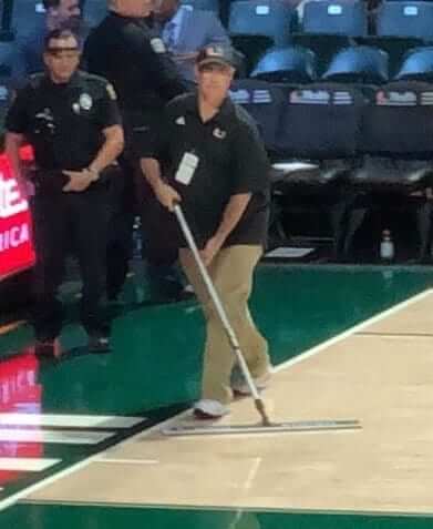
I am the mop guy for the Miami Hurricanes basketball team, so I have arguably the best seat in the house, and I couldn’t really make out the NOBs [in Tuesday night’s Pitt/Miami game], even when these guys were right in front of me. I thought maybe they are made of some sort of super-reflective material that shows up perfect on TV, but I spoke with my niece and she said it was no better on TV.
I confess that Pitt’s blackout uniforms had somehow escaped my consciousness, so I looked at a few photos to see what Rich was referring to. And sure enough:
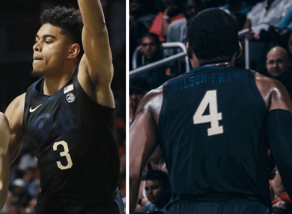
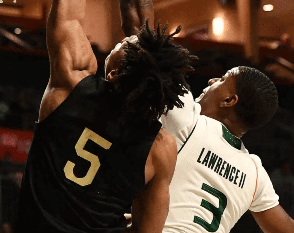
That’s pretty ridiculous right there. It’s one thing if Oregon does it (which, of course, they have), but Pitt?
Some quick research reveals that Pitt has had this uniform for two years now and I just hadn’t noticed (or maybe I’d instinctively blocked them out of my mind). In fact, they used to be even worse, because they were sweatbacks. Anyway, that school-wide royal-and-yellow makeover can’t come soon enough.
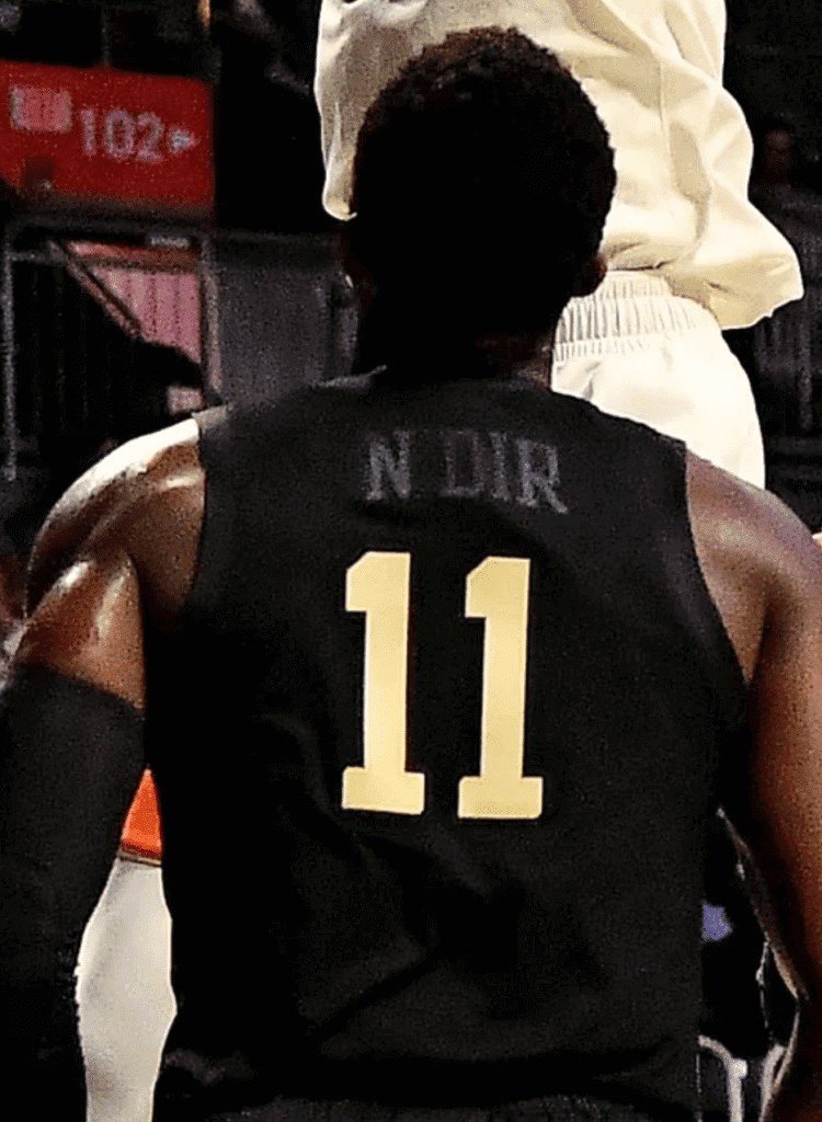
My cluelessness notwithstanding, the best part of this is that Pitt has a guard named Sidy N’Dir, whose barely legible blackout NOB looks like “Noir” — perfect:
Meanwhile: Rich is the mop guy! That’s a job that for some reason has always intrigued me. He provided a photo of himself at work:
I bet Rich has a lot of good stories to tell. I’ve asked him if he’d like to share some of them — “Tales of the Mop Guy,” or something like that. He said he’d be happy to talk, so I’ll be following up with him when both of our schedules allow. Stay tuned.
Click to enlarge
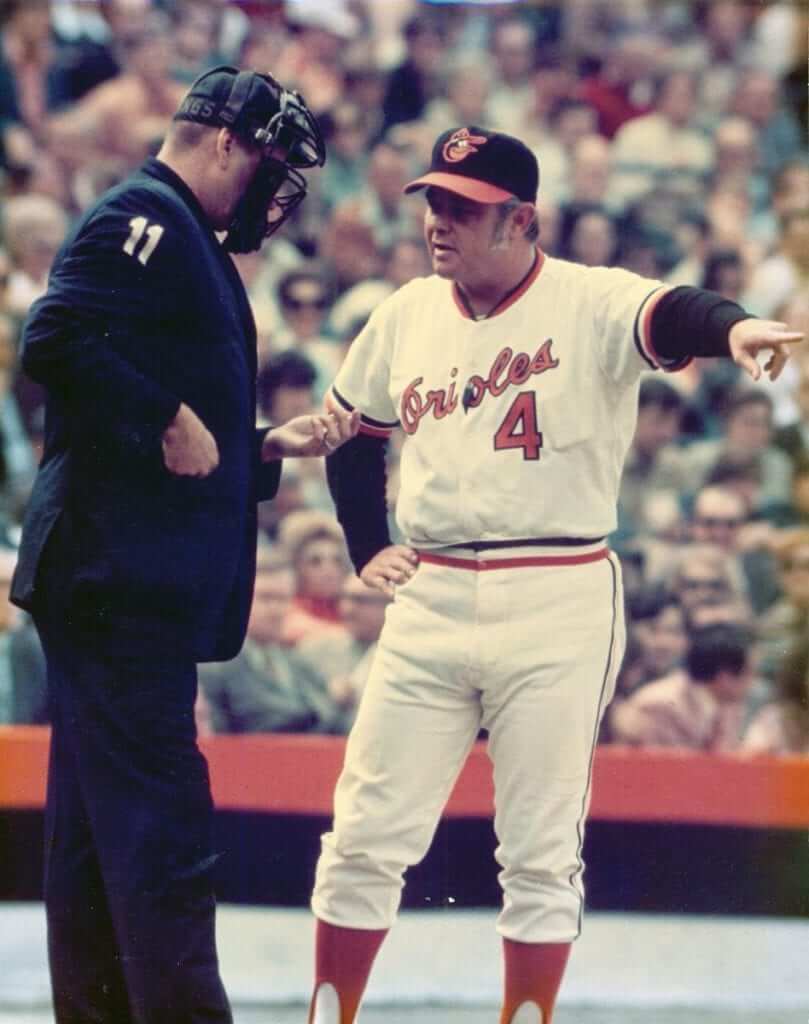
Rockets in his pocket: Former Orioles skipper Earl Weaver famously had a little cigarette pocket sewn into the inside of his jerseys. The pocket is always shown when his game-worn jerseys come up for auction, and the Orioles even included an outline of it on their statue of Weaver. But it’s rarely as evident in game photos as it is in the shot shown above (which, based on Weaver’s uniform, has to have been from the early 1970s). They usually tried to hide the pocket behind his number and/or chest script, but on this jersey it was fully exposed.
(My thanks to @TwoStrikeNoise for this one.)
Click to enlarge
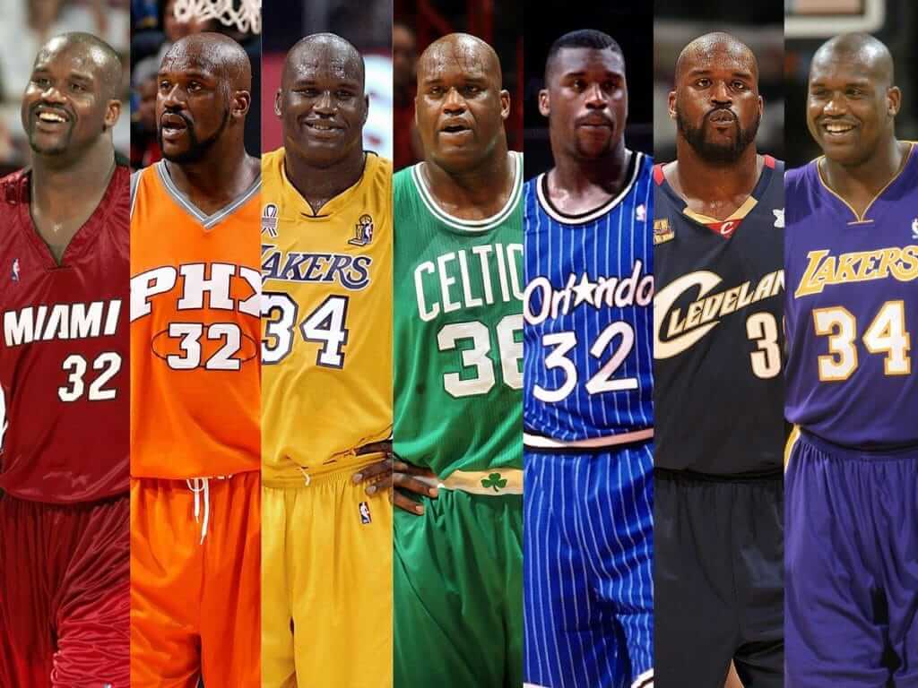
Too good for the Ticker: Let’s hear it for the folks at @SportsNation, who created this Shaq uni rainbow — and in the proper color sequence to boot!
Are there any other athletes who’ve worn the full rainbow spectrum of uniform colors during their careers? Hmmmmmm…..
(My thanks to @CLEVELOVE1 for the tip.)
Two great tastes that taste great together: In case you missed it yesterday, this year’s Uni Watch MLB Season Preview — the 21st annual edition! — will be appearing on the Sports Illustrated website, plus there’ll probably be an abbreviated version in the printed magazine. Full details here (and thanks to everyone for the positive response yesterday).
Click to enlarge
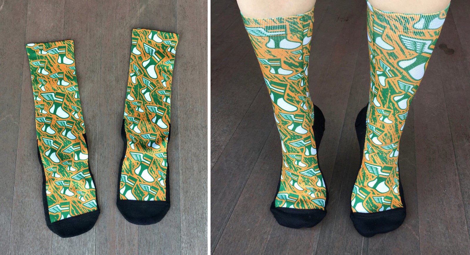
LAST CALL for the socks: In case you missed it earlier this week, Harrison Hall, the NBA armband collector who I interviewed last month, got his employer, Rock ’Em Socks, to make me a pair of Uni Watch socks. A lot of you have expressed interest in purchasing a pair, so I’ve talked to Harrison about that.
Based on the price quote he gave me, it looks like I’ll charge $12.99 a pair, or possibly $13.99, plus $3 for shipping. If you want in, please let me know today, because I’ll be placing the order with Harrison and need to know roughly how many to order. Thanks.
The Ticker
By Paul

Baseball News: Some great bullpen buggy footage in this 1971 documentary about MLB relief pitchers — recommended viewing (from Bob Gassel). … Here’s a look at 1990s high school softball unis from Staten Island. … Mets 1B Dom Smith is the latest player to go C-Flapped. … Very nice 1959 throwbacks for Oklahoma State. … Here’s some footage of the 1970s British prog-rock band Gentle Giant with the drummer wearing a full A’s uniform (from @ballskwok). … Gotta like those striped Tulane stirrups (from Jim Howicz). … The AHL’s Milwaukee Admirals will wear Brewers-themed jerseys this Saturday. … Buried within this article is the news that the Double-A Jacksonville Jumbo Shrimp will wear Miami Vice-themed uniforms on May 11. … Rock star Jack White has donated $10K to help restore a Negro Leagues ballpark near Detroit (from Eric Kissel). … New BP cap for the Fayetteville Woodpeckers (from J. Doubleday). … The teams at La Mirada High School in L.A. are called the Matadores, but they’re going by “Mats” for short, and using a Mets-like script (from Dave Sikula). … Here’s a piece about Phillies P Vince Velasquez changing his uni number from 28 to 21.

NFL News: Reader Don Schauf was watching footage of a 1974 Colts/Steelers game and was surprised to see the Colts’ nameplates riding very low. … Some local chapters of the Browns fan club Browns Backers Worldwide have made some pretty amusing logos for themselves.
College Football News: Whoa, look how the school name appeared on Cornell’s helmets in 1978 (from Griffin Smith). … Clint Richardson’s ongoing decade-by-decade look at Auburn’s uniforms has reached the 1980s.

Hockey News: For many girls, figure skating is now losing out to hockey (paywalled link). … Purple anti-cancer jerseys this Friday for the Grand Rapids Griffins (from John Elbertson). … Check it out: the Blackhawks’ Winter Classic jersey as a bowling shirt (from Griffin Smith). … Cross-listed from the baseball section: The AHL’s Milwaukee Admirals will wear Milwaukee Brewers-themed jerseys this Saturday. … Superhero jerseys upcoming for the Hartford Wolfpack (from Mike Lucia). … Really good article on how the NHL trade deadline can be very hectic for a team’s equipment staff (from Corey Buck).

Basketball News: Warriors G Quinn Cook was wearing Duke sneakers on Tuesday night. “Good thing the color (kinda) matches!” says @5th_Factor. … Reader Scott Novosel’s proposed T-shirt design for the WNBA’s Chicago Sky has moved into the Elite Eight in the team’s design contest. You can vote for his design starting at 10am Eastern today on the Sky’s Twitter page. … The official Mr. Peanut Twitter account posted a Planters Peanuts basketball uniform. The shorts aren’t bad, but someone needs to teach them about proper positioning of jersey graphics (from @Throwback_Sport). … Andrew Bogut, back with the Warriors, will wear his old No. 12. … Here’s something I don’t recall often seeing: Michael Jordan with No. 45 socks (good spot by Alex Greenbaum). … Celtics F Jayson Tatum and Kings F Harry Giles, who’ve been friends going back to middle school, exchanged jerseys after last night’s Boston/Sacramento game.

Soccer News: New retro shirt for Granada C.F. (from Ed Zelaski). … New shirt and scarf for North Carolina FC. Here’s the away version. “No ads, yet,” notes Josh Hinton. … Also from Josh: New league-wide lettering/number font for USL Championship and League One. … Still more from Josh: Inaugural home kit for Memphis 901 FC. … Another inaugural home kit, this time for USL League One’s Greenville Triumph (from Ed Zelaski). … “It appears Manchester United debutant Mason Greenwood had a different NOB font than his teammates during yesterday’s Champions League match,” notes our own Anthony Emerson.

Grab Bag: A close-up of President Trump shows that he has “45” embroidered into one of his French cuffs. … Yesterday was Ash Wednesday, so Ed Boda sent a photo of this display of nun’s habits, along with an explanatory placard. … I don’t think this is new, but Chris Hickey notes that all the paint schemes for JR Motorsports (Dale Earnhardt Jr.’s livery) come with faux-door handles. … The Oklahoma Dept. of Agriculture, Food and Forestry is inviting the public to submit designs for a new logo. It’s not clear, at least to me, whether any compensation is being offered. … Community members in Walton, Ind., are not happy about a proposed rebranding redesign of the local high school’s logo. … The new Premier Lacrosse League has announced a partnership with helmet maker Cascade (from Travis Hood). … New logo for the Virginia State Fair. … At the bottom of this article is the news that the U. of South Carolina will retire four numbers across several different sports this spring. … The Springbok Experience Rugby Museum in South Africa, home to many classic rugby jerseys, is closing.
The NOB font for Greenwood seems to match the font used by PSG on their Champions League kits. Good catch. After looking at the other photos of him, it seems that the NOB *and* number font are both PSG’s (the PSG crest was blacked out). The shorts had the correct number font for Manchester United’s Champions League kit.
If I had to guess, his kit was possibly prepped the day of the match in Paris.
Another pic of Greenwood, showing the number and NOB: link
A pic including #44 Tahith Ching, note the difference in the #4: link
My thoughts exactly. It’s weird, though. Nike/Jordan make the PSG kits and Adidas make Man United’s, so the brands wouldn’t have had any contact with each other. Not sure how the number variation happened…
I saw a photo that was zoomed in; the PSG crest was at the bottom of the number, meaning that they printed the exact PSG typeface on a Man United kit.
I’m on the work phone so can’t email but count me in for the socks. – P
My guess on the Earl Weaver photo is the 1971 World Series. He is talking to a National League umpire (NL umpires wore navy blazers/navy pants in the 70s while AL umpires wore navy/grey in the early 70s and maroon/blue in the mid to late 70s. Also, AL plate umpires wore external balloon chest protectors until the mid to late 1970s). Also, if you look at the small “o” in “Orioles”, Earl appears to be miked up (something that would have been limited to a World Series or All-Star Game in the early 70s). It would have to be the 1971 Series as opposed to 1969 or 1970 because 1971 was the first year the O’s wore double-knit uniforms.
Good analysis, Scott!
Great job, plus NL umpires wore sleeve numbers and I don’t believe AL umpires did.
Doing a little research, the umpires for the 1971 World Series were: Nestor Chylak (AL), Ed Sudol (NL), Johnny Rice (AL), Ed Vargo (NL), Jim Odom (AL), John Kibler (NL). Reportedly the policy at this time was for the National League to issue umpires’ numbers alphabetically. Therefore, it would seem John Kibler was most likely the umpire in the photo.
So Game 6; Kibler was home plate umpire
I think you meant Virginia State Fair.
I sure did. Not sure how I swapped in the wrong state, but now fixed.
That display of nun’s habits reminded me that you can date nuns…you just can’t get in the habit.
Yeah, those Pitt unis definitely do not go to 11.
The Nebraska state fair ticket link directs to an article about the Virginia state fair.
Yup. Already fixed.
From the Post-Gazette article: “Nike’s Global Identity Group”. Oh my.
Reading the article about the Lewis Cass Kings logo change makes me wish every community had a public employee whose job was sort of like the opposite of an old-fashioned town crier: Instead of announcing the news, this person would travel the community and slap in the face every citizen unduly freaking out about the news. It’s an elementary school! And there seem to be people clinging to their status as “alumni” of it harder than the most bigoted UND donors. And the school didn’t even change the nickname or anything, it just adopted a different, student-designed crown. Is the new crown a good design? No. But some fifth-grader drew it for her own school, and her fellow students voted and chose it to represent their school, and for a school logo, that’s literally all that matters. It’s not that the school shouldn’t care about the opinions of adults about the matter, it’s that no reasonable adult would even express his opinion about this.
I went to three elementary schools, and I only remember the mascot/nickname of one of them. And looking it up just now, it turns out the Trojans changed sometime between 1981 and now to the Tigers. With a mediocre logo that looks like a student might have drawn it. Good for them!
I nominate you for town face-slapper, Scott!
I couldn’t disagree more.
First of all, the logo change was not for an elementary school. It was a change for the high school. One of the people are posing the logo change mentioned that in addition to changing the logo, the school board had renamed one of the local elementary schools, but the two issues are separate.
Second, the core complaints are that the board made a change without seeking counsel from the community; that the board hired an outside firm, with no connection to the school or its traditions, to design the logo; and that the finished product is unappealing and out of step with school tradition (granted, the Lewis Cass HS crown is no great shakes, but it’s readily identifiable. The new logo looks nothing like it. And it’s not an improvement. It’s less the logo of Lewis Cass High, than the sign in front of a muffler shop).
Third, the school board’s self-defense was shoddy. “We wanted something we could own and market”? We get all sniffy about NBA teams putting logos on their jerseys, but the school board wants to create a brand identity for an obscure high school in Indiana? This is troubling. And their compromise – “ We’ll let students create their own personal logos for the school!“ – contradicts their argument about brand building.
A community perceived that local officials had overstepped their authority, and did something that didn’t sit well, and they spoke up. This seems rather wonderful to me. (As I type this, I’m reminded that the same rationale is used to justify people opposing “confederate war hero” statues being torn down. I’m down with the crown people, but I hate those awful statues. Populism is a vexing thing.)
I think Edwin Jackson would be the best bet to find someone who wore the colour rainbow a la Shaq.
not quite a rainbow but here is a good montage of Edwin
link
link
I’d think any NBA journeyman (Tony Massenburg, Drew Gooden, Joe Smith, Jim Jackson) would probably have a rainbow montage.
missing his stint in Oakland which adds green to the mix.
link
Now we just need him to be traded to the Rockies to add Paul’s favoritest color.
Best candidate I’ve found thus far is Pat Neshek.
Red: Phillies alt
Orange: Astros alt
Yellow: A’s alt
Green: A’s alt
Light Blue: Phillies alt (2019)
Navy Blue: Twins alt
Purple: Rockies alt
octavio dotel has you covered
1.1 New York Mets BLUE OR ORANGE
1.2 Houston Astros BLUE OR ORANGE
1.3 Oakland Athletics YELLOW OR GREEN
1.4 New York Yankees NAVY
1.5 Kansas City Royals ROYAL BLUE
1.6 Atlanta Braves RED OR NAVY
1.7 Chicago White Sox BLACK OR WHITE
1.8 Pittsburgh Pirates YELLOW
1.9 Los Angeles Dodgers DODGER BLUE
1.10 Colorado Rockies FUKK YOU PURPLE
1.11 Toronto Blue Jays RED OR BLUE
1.12 St. Louis Cardinals RED
1.13 Detroit Tigers NAVY
is there a story behind the Blackhawks bowling shirts, and are they available for purchase?
Charity bowling event. Not sure about purchase.
In the Soccer section, it is Granada, not Ganada. Missing the r.
Thanks. Fixed.
Obviously BFBS is bad for any team that black isn’t one of their colors, but it’s IMHO extra bad for a team that has blue as a primary color. Especially navy blue.
Yep. Navy lettering on black is just a bad idea. (Navy anything on black is a dumb idea, but that’s another rant for later. Looking your way, Butler University.) All they need to do is make a rule: all lettering must be in a contrasting color. No more ghost lettering. Why Nike can’t figure this out on their own is beyond me, but here we are.
Paul, there’s a very good chance that, considering most soccer clubs use a wide variety of colors for away and third kits, that a lot of soccer players have worn a rainbow of colors. If I can find any specific examples, I’ll let y’all know!
Soccer probably would be the best because of the variety of change strips.
Otherwise, hard to find a player that covers all the colours.
Thought about well travelled CFL quarterback Kevin Glenn. He had the red, orange, yellow (Hamilton old third jersey), green and blue jerseys covered in the CFL. 2 shades of green and 2 shades of blue. No purple though.
Think Robbie Keane works.
Liverpool for red, Ireland for green/orange, Inter Milan/Tottenham for dark blue, Coventry for lighter blue, and Tottenham for purple and yellow.
Was thinking it had to be someone Irish because green and orange are the least common.
Didier Drogba begs to differ.
Drogba almost works, but not sure about purple.
Yaya Toure should work:
Blue and red from Barça
Sky blue/navy, orange, neon yellow, and purple from City
Green from Ivory Coast Nat’l team
Jordan 45 socks link doesn’t work for me.
Hmmm. Try this: link
Quinn Cook’s Duke shoes are actually a pair of Kevin Durant’s signature shoes, but made specifically for Duke. Durant is not the only Nike signature athlete who has a special version of their shoes made for Duke, nor is Duke the only Nike school to receive such shoes. I think a big reason for this is that Nike’s current basketball line is made up of mostly signature sneakers now, with only a handful of models that aren’t.
Re: 1971 documentary on relief pitchers.
Aren’t those uniforms shown in the video just terrific? Classics…. simple, elegant, professional (and stirrups too!)
Thanks for the posting.
“It’s like how much more black could this be? And the answer is none. None more black.” ~St. Nigel the Wise
If you count the Nashville Predators’ dark yellow third uniform and Anaheim Mighty Duckss’ plum, Mike Sillinger had all the rainbow colours except missing the green.
“Suitcase” Sillinger was the first player I thought of, too. I think Anaheim’s Wild Wing 3rd jersey gives him the green he needs.
Those Pitt uniforms reminded me of the Toronto Maple Leafs of the 1970s and their blowhard owner Harold Ballard. The NHL mandated in 1978 that teams put the players’ names on the backs of their jerseys, but Ballard resisted until he was threatened with a fine. So he put names on the dark blue road jerseys…in dark type. Classic Ballard: link
Full story on that here:
link
And here:
link
I was wondering if that type of look mightve actually been the goal. Like they wanted the jerseys to be super plain at a glance/distance but detailed up close (which Nike loves to do)
There’s something about this that’s so black, it’s like how much more black could this be? And the answer is none. None more black.
Does John ‘Stumpy’ Pepys still play for PITT, or did he graduate?
Jack White is super involved in baseball, investing in a bat-making company, plays in old-fashioned baseball games (you’ve talked about them before, can’t remember the name), and has done charity games that benefit a wide variety of causes like Native American youth athletics.
On a side note, I LOVE those Cornell helmets!
Yeah those Cornell helmets have always been a favorite of mine… I don’t know why a team would change from something as cool as that.
Between the helmet and the number font, that there is a Top Five uniform for sure. Possibly even Best Ever.
On the other end of the spectrum, the only thing keeping Pitt’s BFBS from being the Worst Ever is they at least had contrasting numbers. Still, it’s a Bottom Five uni for sure.
“School-wide royal and yellow makeover” – What? I assume it is royal blue and yellow, but I am not as tuned into Pitt’s colors.
Anyway, I am looking forward to the mop guy stories. (I am not being snarky. I am legitimately interested.)
Players who wore a rainbow
Did Steve Nash *ever* wear a green jersey with the Mavericks? If yes…
Red Canada jersey or the All-Star jersey opposite Michael Jordan’s last ASG
Orange Suns
Yellow Lakers
Green?
Blue Mavericks when the main logo was a M with a hat on it
Indigo Mavericks redesign with the horse head
Violet Lakers or Suns
A lot of 45 embroidering today…