Click to enlarge

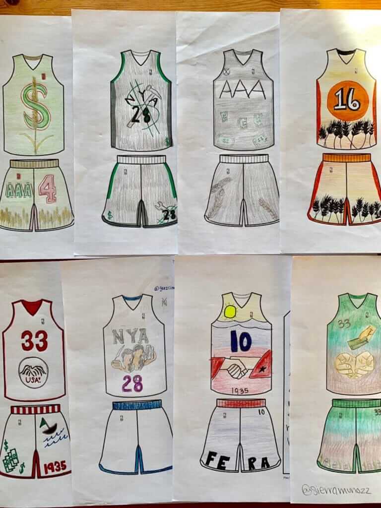
I recently encountered a guy on Twitter named Quinn Rollins (that’s him at right). He’s a high school history teacher in Utah, and he’s devised a series of class assignments that involve having his students design basketball uniforms on a blank template. The ones shown above, for example, were part of an assignment about the New Deal.
I love this, obviously. I’m going to show you more of these student-designed uniforms, but first here’s a quick email interview I conducted with Rollins:
Uni Watch: Please give me some quick background on yourself: age, where you live, where you teach.
Quinn Rollins: I’m 45, live in Salt Lake City, and teach at Cyprus High School in Magna, Utah. I’ve been a teacher for 15 years.
UW: When and how did you get the idea to use sports uniforms as a teaching tool?
QR: I’m a believer in having students use design principles to help them connect to curriculum, especially if it’s a piece of content that they might have a harder time relating to. A lot of kids think war topics are “exciting,” so they have a natural buy-in. With things like the U.S. Cabinet departments or Great Depression New Deal programs, they need a little extra push. After seeing the NBA’s City uniforms debut last year, and the stories and symbolism behind the uniforms, I thought students would enjoy digging deeper into those designs and creating their own.
UW: How have the students responded to this approach?
QR: There are kids who know a lot more about sports and various teams than they ever will about history. And that’s fine. This is an attempt to bridge that gap and help them take the content we’re talking about in class and connect it to something they’re passionate about. With many history assignments, maybe 75% of students turn in completed work; with these assignments it’s about 95%. A lot more buy-in, a lot more interest, and some creative thinking going into their assignment instead of “This is what the teacher wants me to say.”
UW: Does that art teacher know what you’ve been up to? How about the basketball coach?
QR: In large high schools we’re often on the other side of the planet from other departments. I’ve worked with some of the art teachers here and at other schools. With so many cutbacks to the arts, they tend to appreciate any attempt to bring more art into “regular” classrooms. The basketball coach is neck-deep in the season right now, so I’ll get to him after the season is over.
UW: Anything else to add?
QR: Just that as a teacher, the more we find ways for students to express themselves, and give them the opportunity to do that, we find talents and interests that we didn’t know they had. Students are much more than their test scores, and they want opportunities to show that to you and to their peers. Finding ways to engage those talents and interests and connect them to your curriculum is sometimes a challenge, but it always pays off.
———
I don’t know about you, but that sounds like a really good teacher to me.
Rollins’s uni-based assignments have been so successful that one of his colleagues, who teaches a government class, has started doing the same thing with her class. She had her students create a uniform for one of the U.S. Cabinet departments (State, Labor, Agriculture, etc.). Here are five of the best — in each case, you can click to enlarge the photo, plus I’ve transcribed the students’ design statements (and cleaned up misspellings, etc.):
State Department
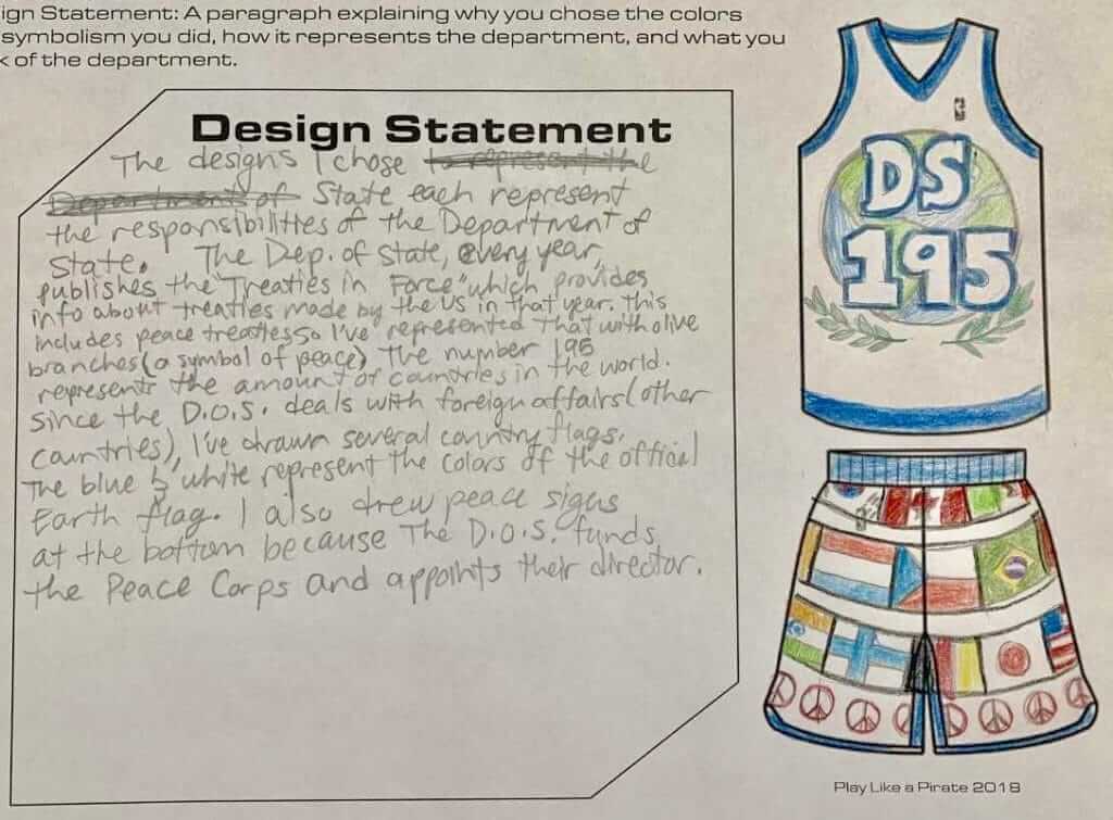
The designs I chose represent the Department of State. The Department of State every year publishes the “Treaties in Force,” which provides info about the treaties made by the U.S in that year. This includes peace treaties. I’ve represented that with olive branches (a symbol of peace). The number 195 represents the amount of countries in the world. Since the D.O.S. deals with foreign affairs (other countries), I’ve drawn several country flags. The blue and white represent the colors of the official Earth flag. I also drew peace signs at the bottom because the D.O.S. funds the Peace Corps and appoints their director.
Department of Housing and Urban Development
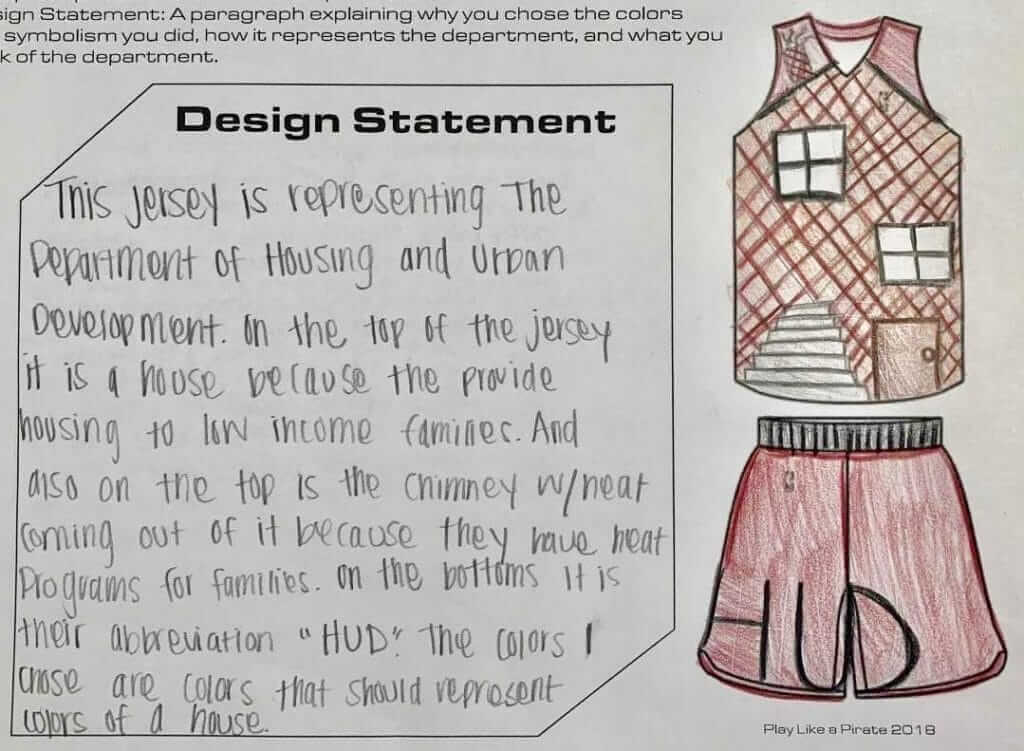
This jersey is representing the Department of Housing and Urban Development. On the top of the jersey is a house, because they provide housing to low-income families. And also on the top is the chimney with heat coming out of it, because they have heat programs for families. On the bottom is their abbreviation, “HUD.” The colors I chose are colors that should represent the colors of a house.
Department of Education
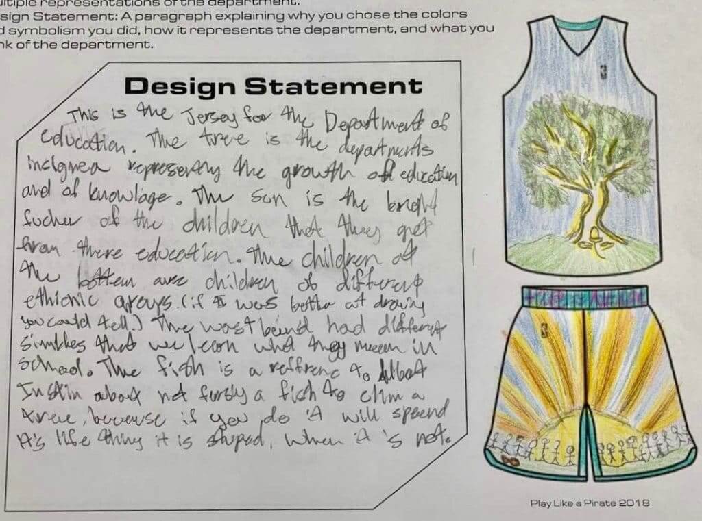
This is the jersey for the Department of Education. The tree is the department’s insignia, representing the growth of education and of knowledge. The sun is the bright future of the children that they get from education. The children at the bottom are children of different ethnic groups (if I was better at drawing, you could tell). The waistband has different symbols that we learn what they mean in school. The fish is a reference to Albert Einstein about not forcing a fish to climb a tree, because if you do, it will spend its life thinking it’s stupid, when it’s not.
Department of the Interior
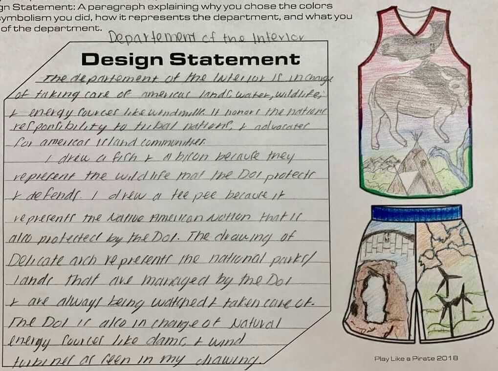
The Department of the Interior is in charge of taking care of America’s land, water, wildlife, and energy sources like windmills. It honors the national responsibilities to tribal nations and advocates for America’s island communities.
I drew a fish and a bison because they represent the wildlife that the D.O.I. protects and defends. I drew a teepee because it represents the Native American nation that is also protected by the D.O.I. The drawing of Delicate Arch represents the national parks/lands that are managed by the D.O.I. and are always being watched and taken care of. The D.O.I. is also in charge of natural entergy sources like dams and wind turbines, as seen in my drawing.
Department of the Health and Human Services
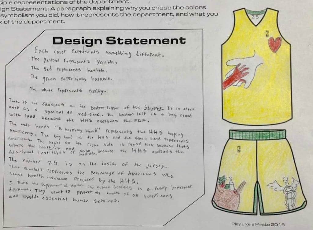
Each color represents something different:
The yellow represents youth.
The red represents health.
The green represents balance.
The white represents purity.There is the caduceus on the bottom-right of the shorts. It is often used as a symbol of medicine. The bottom-left is a bag filled with food because the H.H.S. oversees the Food and Drug Administration.
The two hands: “A helping hand” represents H.H.S. helping Americans. The big hand is the H.H.S. and the small hand represents Americans. The heart on the right side is placed there because that’s where the heart is and also because the H.H.S. oversees the National Institutes of Health.
The number 25 is on the inside of the jersey. That number represents the percentage of Americans who receive health insurance provided by the H.H.S.
I think the Department of Health and Human Services is a really important department. They want to protect the health of all Americans and provide essential human services.
———
It’s hard for me to express how much I love all of this. Uniforms and civics — two great tastes that taste great together!
Big, big thanks to Quinn Rollins for sharing all of this with me. If you like the sound of his teaching approach, you’ll want to check out his book, Play Like a Pirate: Engage Student with Toys, Games, and Comics. It’s available here.
Jets update: The Jets announced yesterday that their unveiling will be taking place on the evening of April 4. I will be attending it (thankfully, it’s taking place in Manhattan, so I won’t have to schlep out to the stadium in New Jersey), and as you can imagine I’m thrilled beyond words to know that the event will be emceed by actor J.B. Smoove and will also feature a special music performance by MAX.
I have not seen or heard anything about the new uniforms. But Jets beat writer Brian Costello, writing in yesterday’s New York Post, had this to say: “I spoke with two people who have seen [the new uniforms]. One said they reminded them of the Eagles’ uniforms. Another said one of the alternate uniforms has black as the predominant color.” Oh boy.
(My thanks to Patrick Sesty for that Post link.)
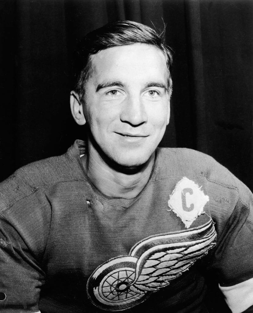
Terrible Ted: Red Wings great, union organizer, and Hockey Hall of Famer Ted Lindsay died yesterday at the age of 93. As various photos of him began circulating around the internet, I was struck by the variety of his captaincy and alternate letters, which appeared in a surprising range of styles and positions.
Let’s start with the “C” designations (for all of these, you can click to enlarge):
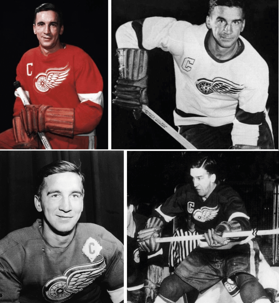
So many different styles! I’ve seen them all before, but it’s interesting to see them grouped together.
And here’s a similar grouping of his “A” stylings:
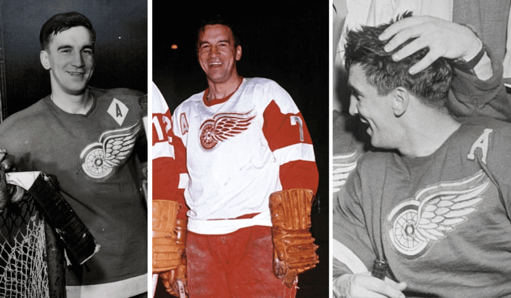
The most intriguing ones, obviously, are the ones with the diamond format. Here’s a closer look at the diamond “C”:
A bit raggedy, but I kinda like it that way. R.I.P.
Collector’s Corner
By Brinke Guthrie
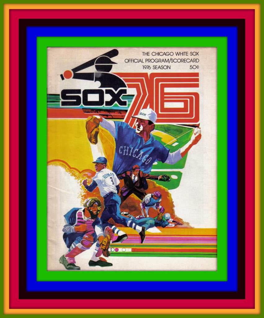
Now you must admit, the cover design of this 1976 Chicago White Sox game program is quite impressive from an artistic perspective. The artist used every color in the kaleidoscope, and then tossed in a few more for good measure. The striping, the baseball in sequence going to the catcher’s mitt, the angular “76” font — match all of that with the Sox logo of the period and this is textbook 1970s cover art.
Now for the rest of this week’s picks:
• Here’s an interesting New England Patriots sideline equipment gear bag. That’s not the team font; perhaps the maker used the same typography style for all teams. And Pat Patriot was never paired with a blue facemask.
• The Brewers’ Barrel Man logo was featured on this 1970s plastic watch — and they wanted $75 for it back then!
• Paul would probably love this 1953 catalog of winter sports apparel — hockey, curling, basketball, and more, from the Athletes Wear Company in Winnipeg. [It’s true, this is soooo up my alley, but I’m gonna live without this one. I hope another Uni Watch reader snaps it up! — PL]
• Cleveland Browns fans often say that their team drives them to drink, so this Browns flask should be just the thing.
• This 1970s Montreal Expos ashtray made by Ornamold is priced to move! This comes in a “Molded in Design” and is “Unbreakable,” and of course, “Made In Canada!”
• This 1960s mug is from the Dave Keon/Billy Harris Hockey School. Both of those guys had long NHL careers, mostly with the Maple Leafs.
• This 1970s Atlanta Braves pennant is rather beat up, but notice how they stuck the modern “feather” sleeve logo off to the side, just…hangin’ out.
• Pepsi was the sponsor for “Hot Shots” basketball tournaments in the 1970s. Way back when, you scored this patch for competing and winning. What, no trophy like PP&K?
• Notice the outstanding (I kid) airbrush technique on this 1972 Don Mincher baseball card, changing his 1971 Washington Senators cap to a 1972 all-red cap. Kids, that’s how they did it back then. Mr. Mincher passed away a few years ago, and Wikipedia notes he also holds the distinction of being the only player to ever play in an All-Star Game as a [Seattle] Pilot.” (Another Pilot was chosen for the game but did not play.)
• Marathon Oil was your sponsor for this 1970s Detroit Tigers bumper sticker, featuring their cartoon tiger taking a big cut.
Seen an item on eBay that would be good for Collector’s Corner? Send any submissions here.
Click to enlarge
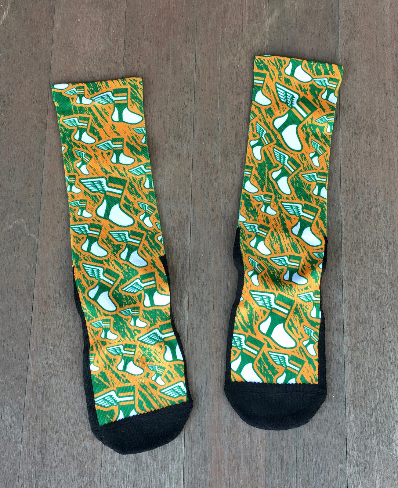
Sockin’ it to me: Last month I interviewed NBA armband collector Harrison Hall. He works as the marketing coordinator for Rock ’Em Socks, and after the interview ran he offered to make a pair of Uni Watch socks for me, so I emailed a few logos to him and told him to knock himself out. The resulting socks, shown above, came in the mail yesterday.
Not bad, right? Here’s how they look with someone wearing them, as modeled by the Tugboat Captain:
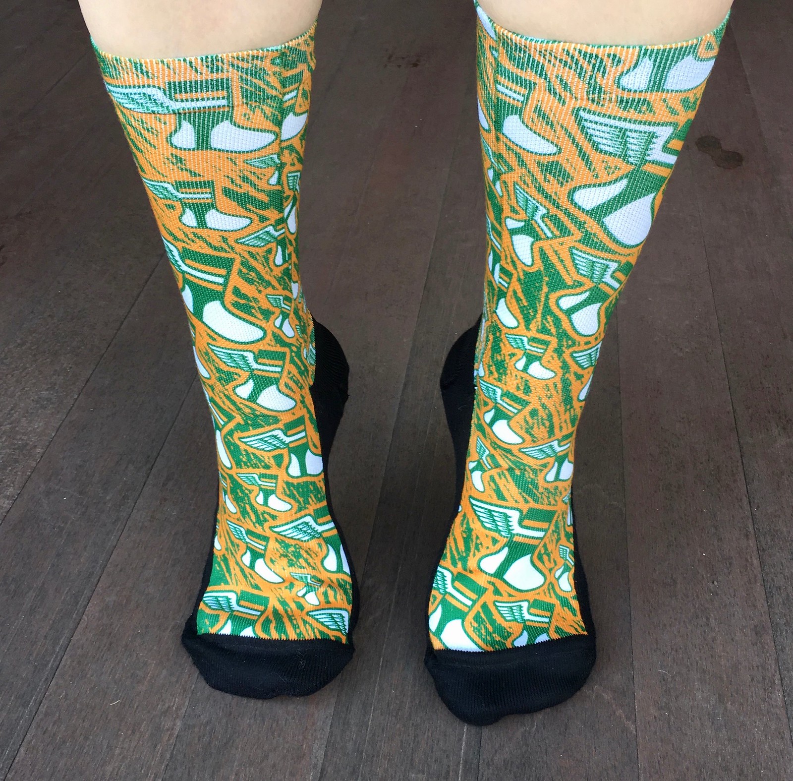
Harrison tells me that this design could be produced for sale if people are interested. If that’s you, let me know. If nobody’s interested, that’s fine too. Thanks!
Click to enlarge
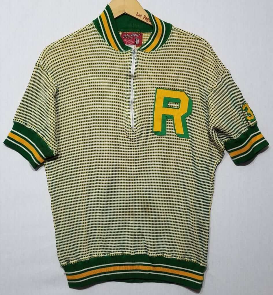
Oh my: Our friend Wafflebored spotted this vintage beauty on Etsy. Looks like it was practically made for Uni Watch, no?
I won’t be buying it, though, in part because of those belly stains but mainly because, as it happens, I already own a similar item — same base fabric, but with different collar, cuffs, and waistband trim, and with lettering on the back (plus mine is “Action-Tailored”). Never seen another example of that same fabric until now!
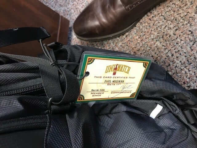
Membership update: Got a note yesterday from reader Paul Weisner, as follows:
I needed a new tag for my work bag. I love my membership card and always lament that so few people see such a neat thing, so I turned it into a luggage tag.
It looks great and is unique compared to what’s out there. I travel a lot for work — can’t wait to run into some more “people who get it.”
How great is that? Here’s how Paul’s card looks from the other side:
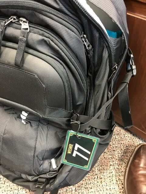
If you want to get your own custom-designed luggage tag — er, membership card — ordering one is a good way to support Uni Watch (which, quite frankly, could use your support these days). And remember, a Uni Watch membership card entitles you to a 15% discount on any of the merchandise in our Teespring shop and our Naming Wrongs shop. (If you’re an existing member and would like to have the discount code, email me.) As always, you can sign up for your own custom-designed card here, you can see all the cards we’ve designed so far here, and you can see how we produce the cards here.
The Ticker
By Alex Hider

Baseball News: According to this Los Angeles Times piece, the Dodgers equipment staff is relieved the team didn’t have to deal with a potential request from Bryce Harper to wear No. 34 (soft paywall). That number is pseudo-retired for P Fernando Valenzuela. Of course, Harper will wear No. 3 with Philadelphia, so it may not have been a issue anyway (from Geoff Poole). … The Astros have released their 2019 promotional schedule. It includes a Nolan Ryan rainbow-shoulder throwback jersey giveaway on Aug. 2, so the ’Stros may be planning to wear throwbacks that day (from Ignacio Salazar). … Monday marked the 99th anniversary of Babe Ruth first donning a Yankees uniform in a game — but that uniform didn’t include pinstripes or an “NY” logo (from BSmile). … New baseball uniforms for Indian Creek School (Maryland).

Pro Football News: Sure looks like the 1975 Raiders enjoyed driving customized cars (from Old Time Football). … Not sure which Rams player this is, but you don’t see sideline caps like that anymore (from Pro Football Journal). … Fabulous, a magazine produced by British tabloid The Sun, ran a cover recently had actor Mark Wright dressed up in a knockoff Patriots uniform while holding a Browns helmet (from Ben Isaacs). … Here’s how Indoor Football League teams have dressed so far this season (from LWOS Indoor Football).
College Football News: According to this article (scroll about halfway down), Nike is unable to make Georgia’s “silver britches” shiny enough for the Bulldogs’ liking while still maintaining high performance standards (from Austin Gillis). … FCS champs North Dakota State visited the White House yesterday and presented President Trump with a No. 45 Bison jersey (from Griffin Smith and Chris Hanson).

Hockey News: Yesterday, we Ticked that the Flames had retired No. 12 for RW Jerome Iginla. But as pointed out in the comments yesterday, Iginla’s banner was rendered in a throwback color scheme with block numbers — a style Iginla would have only worn as a throwback, as he joined the team in 1995. Mike Styczen also points out that the Flames updated their other retired number banners — meaning Lanny McDonald’s No. 9 is on its third new design. … Blackhawks G Collin Delia has a stick with a generic ’Hawks wordmark because his stick manufacturer no longer pays NHL licensing fees (from @Pappy_Hour). … Lots of uni tidbits last night in Minnesota, where they honored the 1945-46 Granite Falls Kilowatts (from @TheLuckySkulls). … The Springfield Thunderbirds of the AHL are dying the ice pink and will wear pink jerseys for breast cancer awareness on Saturday (from Mike Lucia).

NBA News: The Jazz and Pelicans both dressed up in green, gold and purple on the eve of Mardi Gras last night. The Jazz wore their purple throwbacks and the Pels wore their Mardi Gras “City” uniforms (from @unittron). … Philadelphia’s Wells Fargo Center hosted a Villanova/Sixers doubleheader on Sunday. Early in the day, Villanova played on the Sixers floor that included temporary college basketball 3-point lines. By the time the Sixers played later in the day, the excess lines had been removed (from Andrew Cosentino). … The Indiana Fever of the WNBA have a 20th-season logo this year (from @tasty_magic). … Hawks G Kevin Huerter wears No. 3 because he grew up idolizing Heat G Dwyane Wade. Wade knew this and surprised Huerter with a jersey exchange after last night’s game in Miami (from Mike Chamernik).

College Hoops News: At one point on Sunday, four of the five Michigan players on the court were wearing pink shoes. The team did wear them out of superstition during last year’s Final Four run, and it looks like they’re carrying that into this season (from @walbergLines). … Cross-listed from the NBA section: Philadelphia’s Wells Fargo Center hosted a ‘Nova/76ers doubleheader on Sunday. The Wildcats hosted Butler on the Sixers floor that included temporary college basketball 3-point lines. By the time the Sixers played later in the day, the excess lines had been removed (from Andrew Cosentino).

Soccer News: The third kit design for Argentinian club River Plate varies from jersey to jersey. That’s because Adidas cuts multiple jerseys from a single large piece of fabric, so the patterns don’t always match (from Josh Hinton). … Monday marked the 86th anniversary of the first time Arsenal wore their trademark white-sleeved jerseys. Read more on the history of the white sleeves here. … Reader Ryan Keberly spotted this T-shirt of Liverpool F Mo Salah in the style of Che Guevara at a resale shop in Dearborn, Mich. … Spanish club Real Betis wore purple jerseys in pre-match workouts Sunday for International Women’s Month (from Ed Zelaski). … Czech club Slavia Prague has made the rare in-season manufacturer switch. They’re going from Umbro to Puma (also from Ed Zelaski).

Grab Bag: Pitt’s long-rumored re-adoption of royal and yellow appears to be set for an official announcement on April 7 (from Sean Gentille). … Reader Jamie Tallman found this amazing color photo of USA boxers Muhammed Ali, Eddie Crook Jr., and Wilbert McClure, taken by his grandparents at the 1960 Olympics in Rome. All three won gold medals that year. … The United States Census has released the logo for the upcoming 2020 count (from Bernie and JohnMark Fisher). … Kody Staples made a fantasy football trophy for his league using a football helmet, using merit decals to mark champions. He said he didn’t use traditional materials to make the decals and is looking for advice on how to get them to stick without ruining the helmet. … The website Goat Jerseys had a nice Q&A with Paul. Check it out here. … Walker spotted a truck with a Houston sports logo mashup tailgate cap yesterday. … In yesterday’s Ticker we touched on the uniforms and caps that will be worn by different teams at this year’s Brier, the Canadian curling championships. We missed team Wild Card, which takes inspiration from the joker card (from Wade Heidt).
the link for the ’75 Raiders item isn’t working
Fixed. Here’s the proper link:
link
Excellent idea on the luggage tag. On my gear bag will be a perfect use when I get my card.
There’s no way that Browns flask is “vintage 1970s.” Face mask is from late 90s
And that Brewers watch can’t be from earlier than about 1998, and is probably post-2010. Packaging material, logo and type style for the maker, price sticker, and the material and design of the watch are all very contemporary.
I was just about to say the same thing. Modify Watches is an active company, the recycle symbol and holographic MLB logo didn’t exist back then.
Wait, the recycle symbol is post-1970s? When was it introduced? I can’t remember not seeing it, but then again I also can’t remember life before Post-It Notes, and I know that they were invented during my lifetime too.
Modify Watches (the maker of that Brewers watch) was founded in 2010 and acquired by CustomInk
link
link
No doubt. I was in a buddies wedding in 2004. Instead of name tags marking our spot at the head table, he got us all stainless steel NFL can koozies since we all liked different NFL teams. This is the same logo on my Browns koozie.
The part you weren’t able to decipher in the design statement for the Department of Education uniform says (in part) “…about not forcing a fish to climb a tree…”.
Thanks. Text now updated.
“…a reference to Albert Einstein about now forcing a fish… (refers to a popular quote attributed to Albert Einstein, see link below)
link
Ah, excellent. I love how we puzzled this one out as a group effort!
I loved this post! The kids uni designs were just fantastic. The Ted Lindsay write up, the socks, the shirt, the DYI luggage tag, plus a regular feature like Collector’s Corner all in one post? This was for me a perfect Uniwatch post.
Thanks, Morgan — glad you liked!
I don’t get the idea of indefinitely pseudo-retiring a jersey number. Either do it or don’t. Fernando isn’t making the Basebal HOF, so if that’s part of the Dodgers’ criteria, then let someone wear it.
As a Phillies fan, I wouldn’t have had a problem had Bryce Harper asked to wear #34. I loved watching Roy Halliday pitch (I was at the playoff no-bitter and always wanted to get my ticket autographed), and he died too young, but he pitched for the Phillies for 3 1/2 years. Bryce is contracted to be here for 13 seasons. at a certain point, you have to put the numbers into circulation so current players can wear them. You can’t keep numbers out of use for decades because a guy people liked who was good but not great wore it.
I don’t know about anyone else, but I am still reeling from yesterday. I never knew of the existence of cupped salami. I find it slightly disturbing.
Typo – several “Deparment”s on the pic titles
Weird that I made the same mistake multiple times! Now fixed.
Here’s a Harper story, the Phillies team shop can’t make any more Harper jerseys because they ran out of the letter R.
link
link
Do all or a lot of goalie sticks have the little notch where the thick part of the paddle meets the shaft? Never noticed that before.
A relatively new development. Used to be a custom modification (no clue who did it first) but now it’s catching on in popularity. Index finger goes there for a better grip. But few goalie gear innovations (aside from mandatory changes like size restrictions) get adopted 100% off the bat, because some goalies are creatures of habit.
Thanks Mike! Figured it might be a new development but wasn’t sure.
The ‘trigger’ cutout is nice…. until that first time your finger is in the wrong spot, and it gets pinched between the stick and, well, anything else. Personal experience….
To see how recent it is, I found an article calling the notch a “Subban cutout,” because Vegas Golden Knights goalie Marc-André Fleury tried it out, inspired by backup Malcolm Subban. That doesn’t mean Subban was the first, but it only caught on last year!
link
A great lede today! As a (now retired) teacher I love anything that shows off a fellow teacher’s creative and unique methods to reach their students. And the kids did a super job. Nicely done all around. Thanks Paul!
Notice in the North Dakota State awards White House visit…it seems fast food is becoming a tradition…..
Paul – as the foremost purple hater around, does it get a pass for Mardi Gras? That Jazz/Pelicans game must’ve made you pass out.
I’m on record as loving most of the Mardi Gras uniforms that have come out in recent years. All in for Mardi Gras!
My best guess on the identity of the gentleman in the denim sideline cap is 9-time Pro Bowl linebacker Maxie Baughan, who wore no. 55 for the Eagles and Rams in the 60s through mid-70s before finishing his career in Washington.
yes it is. played college ball at georgia tech.
The Rams player with the engineers hat is Maxie Baughan #55 – linebacker.
I Remember watching a game from that era and he was wearing a hat made of newspaper – like the old time press operators would make and wear to keep ink out of their hair and eyes.
Back in the 60’s & 70’s you’d see several engineer’s caps on the Georgia Tech sidelines, and around campus.
Plus – Maxie was pretty much bald by then
Are you testing the waters for interest in the Uni-Watch socks by chance, Paul? If so…mark me as interested.
I’ve added a note to that effect. Not really looking to grow the Uni Watch merch empire here, but I’d be willing to do so if enough people are interested.
Interesting that the White Sox program depicts those uniforms with the jerseys tucked in since they were not worn that way.
Hat tip to Mr. Rollins… As a fellow HS social studies teacher, I love the idea… Well done!
Agreed! If I was still in the classroom, this one would be going into the rotation. It’s the kind of thing that makes the guided reading sheet teachers lose their minds, so it must be good. I used to have one where kids were assigned a school named after a historical figure and propose a mascot that was better than the one the school had. No more Eagles or Tigers for Franklin Roosevelt High! It was great. Kids, when turned free to be creative, are awesome. Kudos to Mr. Rollins and to Paul for running this on a national level!
RIP Mr. Lindsay; one of the nicest people in the world…. off the ice. Played in a beer league for twenty years, and my first year in it was Ted’s last; he was booted from the league for bad behavior on the ice. Not a shock; over the years, I think Ted was kicked out of every beer league in Metro Detroit. Once the adrenaline started to flow, he couldn’t control it; God help you if you took the puck away from him, and even God couldn’t help you if you affronted him physically.
As a teacher for the past 12 years, I absolutely LOVED today’s lede! When I get to the New Deal in the coming weeks, I am definitely going to use this lesson (I wish I knew of it for Federal Agencies/Cabinet Departments earlier this year!). I also downloaded the templates/kits for other sports as well. Such a great idea, thanks again!
The “off to the side” logo on the Braves pennant appears to be a variation of the 1972 ASG logo.
“…emceed by actor J.B. Smoove and will also feature a special music performance by MAX.”
I have no idea who that is/they are. Am I officially ‘old’? :)
JB Smoove is Leon from Curb Your Enthusiasm!
…no idea who MAX is.
ah OK. Never watched Curb Your Enthusiasm.
Death, taxes and The Jets screwing up there uniform re-design… I am fearful.
I’ve got a feeling they’re going to go with emerald green like Philly with black accents. Probably a wacky custom number font as well. As a fan of classic and clean units, I’m not optimistic.
The cryptic message that the new Jets uniforms resemble the Eagles is scaring me that the ones leaked back in January may be all too real. The green helmet with the swept back rear wing design could (to the casual observer) resemble the Eagles wings on a green helmet look.
OUCH!
Plus the jerseys pair with it were atrocious as well. To my knowledge, the Jets and/or Nike have not come forward saying those are a hoax either… Or have they and I didn’t catch it? Their non-comment on those leaked photos [to me] would suggest they are legit.
I would certainly buy some socks if they were in the striped style of the actual logo itself (with the wings integrated comehow) rather than the collage design as shown. Can he do that? I think people would be stoked to wear them!
I bought my first three NHL team – Buffalo, Boston and Atlanta – jerseys (sweaters) at Athlete’s Wear in the mid 70s. They had moved to Market Ave by then.
Great, great lede today. I would have latched onto that back in school. Thanks so much for sharing it with us, Paul. I shared with my brother-in-law, a middle school history/government teacher.