Click to enlarge
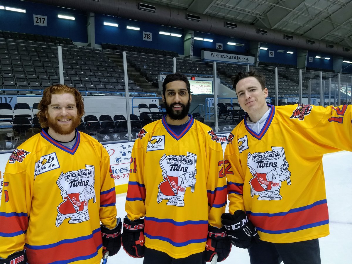
Sometimes the simplest little thing can lead you down a deep, deep rabbit hole. That’s what happened to me a few weeks ago when one of my Twitter followers, @drryanbohannon, let me know that the Carolina Thunderbirds, who play in the Federal Hockey League and are based in Winston-Salem, N.C., were wearing throwbacks that honored an earlier team from their hometown, the Winston-Salem Polar Twins.
That could have been a one-sentence item in the Ticker (“The FHL’s Carolina Thunderbirds wore Winston-Salem Polar Twins throwbacks last night”), but I was intrigued by the throwback design, which appeared to feature a really fun logo. I wanted to know more, so I began poking around — and I found all sorts of interesting stuff.
Let’s begin with the Winston-Salem Polar Twins. According to Wikipedia, they played in the Southern Hockey League from 1973 through 1977. And yes, their logo was a doozy. Check this out:
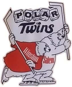
Oh man, I love that, especially the ice cube lettering. Also: The lettering on the bears’ sweaters appears to have been based on the logos used at the time by Winston cigarettes:
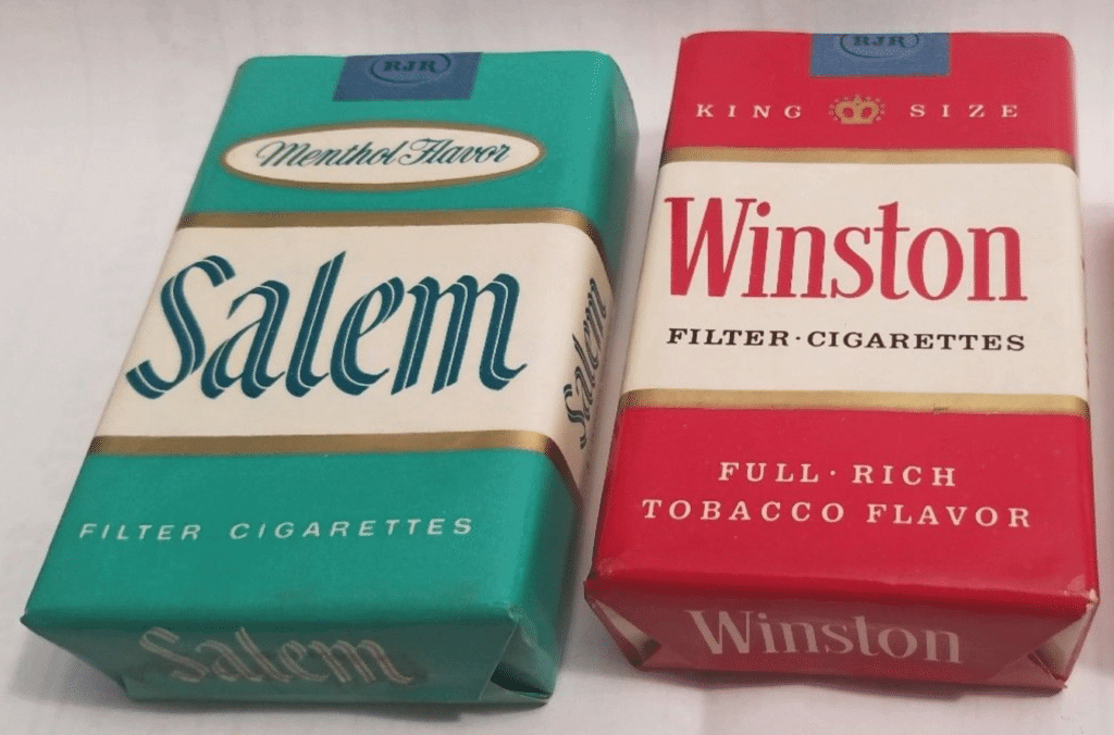
Obviously, that’s problematic from a corporate-encroachment standpoint (to say nothing of a lung cancer standpoint), but Winstons and Salems were actually manufactured in Winston-Salem (and maybe still are..?), so they’re a huge part of the local culture and identity. I took a factory tour there in 1996 — just weeks before most tobacco companies stopped offering public tours, as it turned out — and it was completely fascinating. I bet lots of local businesses there crib the lettering from the cigarette packaging. Perhaps someone who lives there can tell us..?
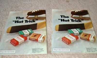
The cigarette connection also led to some amusing advertising on the back cover of the team’s programs:
Meanwhile, the programs’ front covers featured more of the excellent ice cube lettering:
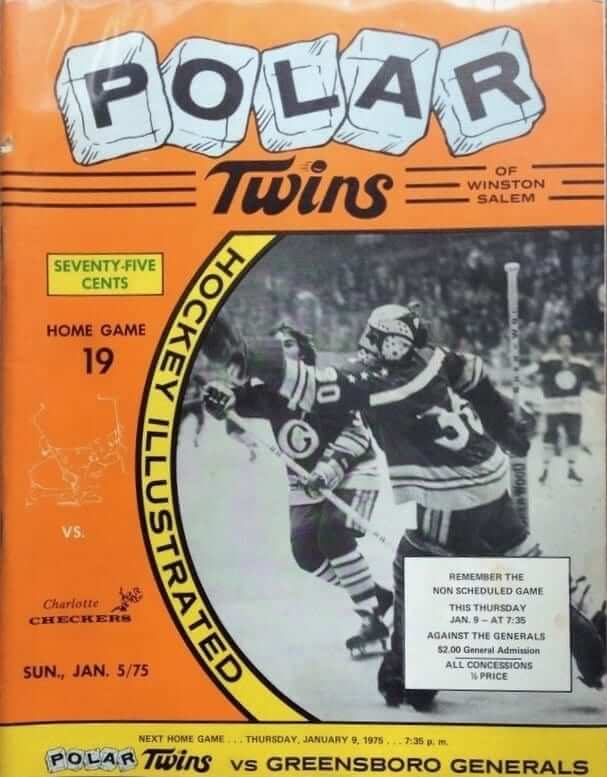

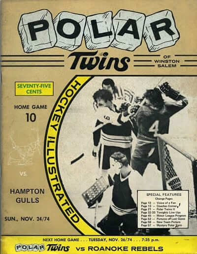
Look closely at the word “Twins” on the covers. At first I thought that the dot on the “i” had a little smiley face, but then I realized it’s a speeding puck!
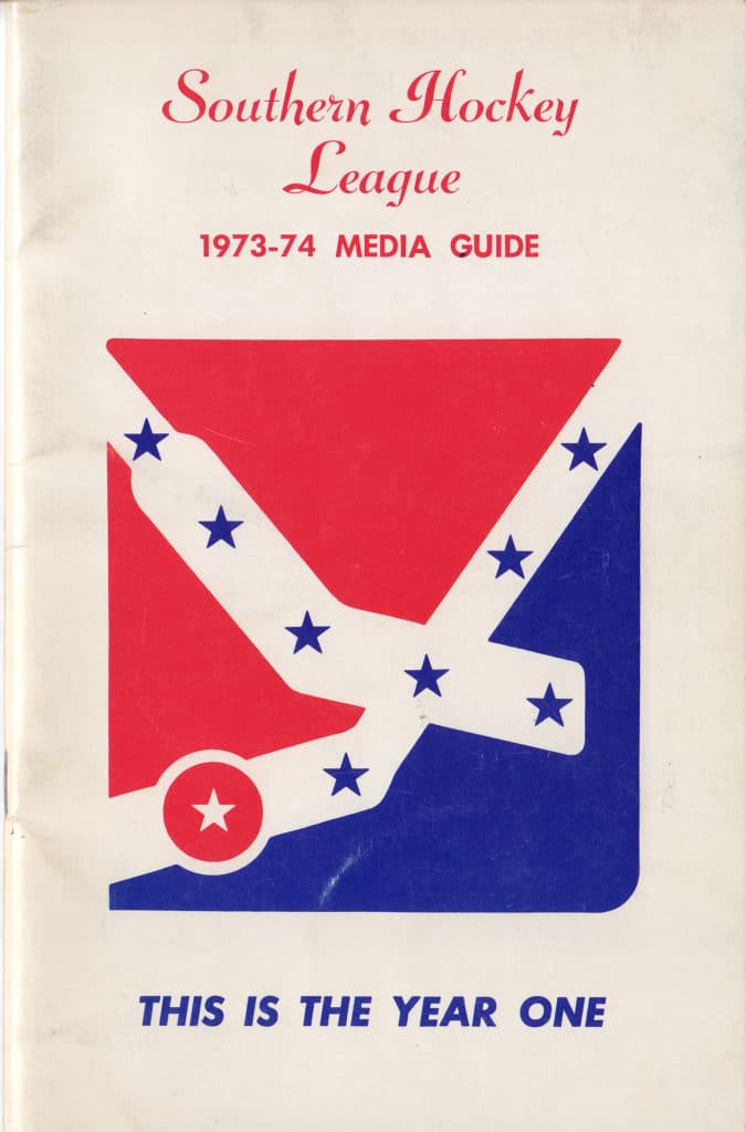
As I mentioned earlier, the Polar Twins played in the Southern Hockey League, whose logo lived up to the league’s name by evoking — imperfectly but unmistakably — the Confederate battle flag:
The team that won the league championship in the SHL’s first season, the Roanoke Valley Rebels, went with a more direct approach for its Confederate imagery:
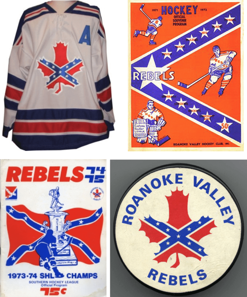
I find that a lot more problematic than the cigarette lettering on the Polar Twins’ logo.
Anyway: That’s a lot of really interesting info, all because some minor league hockey team I’d never heard of decided to wear throwbacks honoring some other minor league hockey team I’d never heard of. Educational!
Click to enlarge
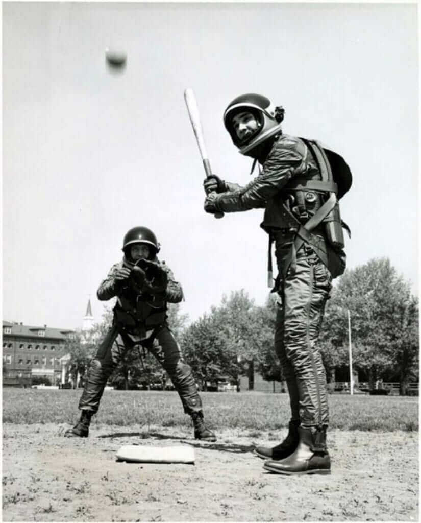
The Astros before there were Astros: In the late 1950s, a few players took to the baseball diamond in a different kind of uniform: spacesuits!
Specifically, they were B.F. Goodrich Mark IV spacesuits, and the ballgame was a demonstration to show how flexible they were. Here’s another photo:

As MLB.com writer Jordan Shusterman notes, these would make a great throwback uni for the Astros — or maybe for their grounds crew:
Great color shot of the Astrodome space/grounds crew c. 1966. #Astros pic.twitter.com/Tsujg392bN
— Dugout Legends (@DugoutLegends) February 4, 2014
(My thanks to Phil for bringing this one to my attention.)
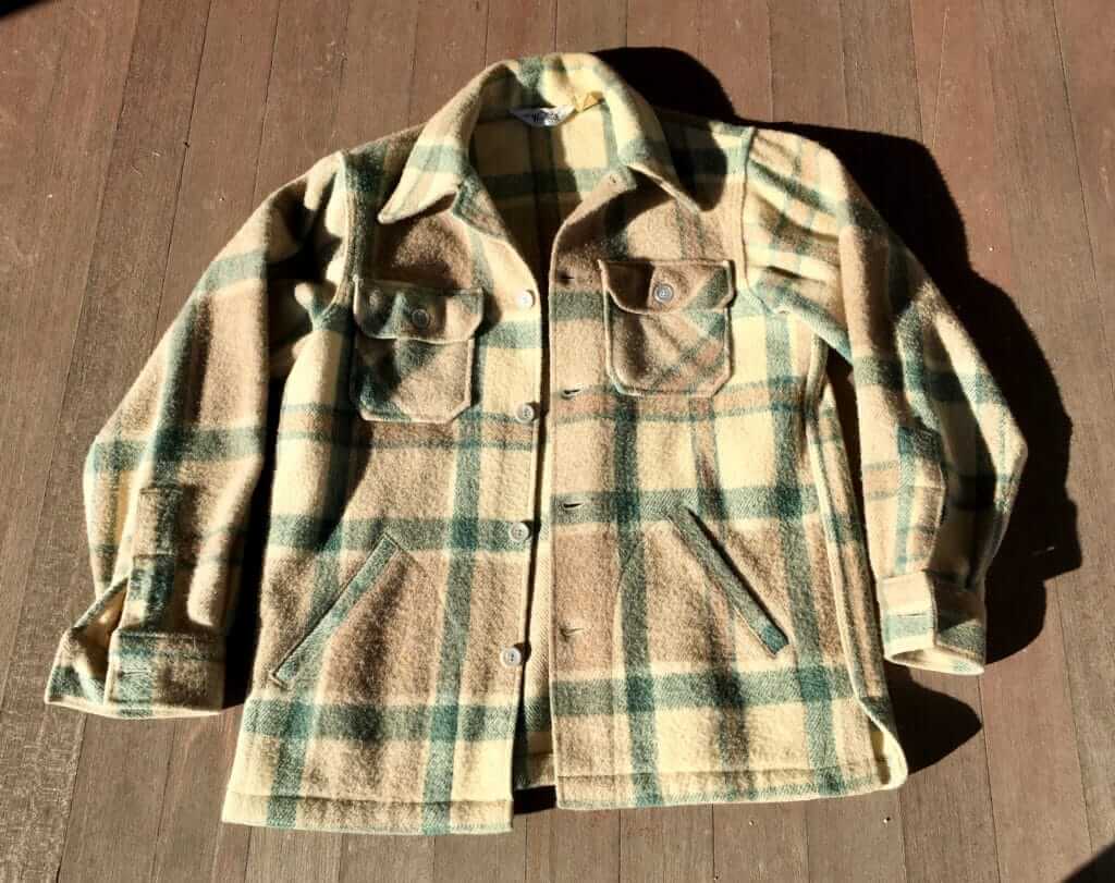
Best supporting jack-tor: Two nights ago I hopped on my bike and headed off to see the movie If Beale Street Could Talk at a local theater. I was wearing the jacket you see above — a vintage Woolrich model that I got at a thrift shop a little over a year ago. Judging by its label, it’s probably from the late 1960s or early ’70s (which is pretty amazing because it’s in incredibly good condition, almost like new).
I arrived at the theater, took off my jacket and put it down on the empty seat next to me, and settled in to watch the movie, which is set in the 1970s. About half an hour into it, there was a scene in which this exact jacket — the same jacket laying on the chair next to me — was visible hanging from a coat rack for maybe 30 seconds. I was tempted to grab my phone and take a photo of the screen, but I resisted the urge.
It was just a random scene, but it turns out that it’s captured in one of the promotional stills that the movie studio’s been distributing. Check this out (click to enlarge):
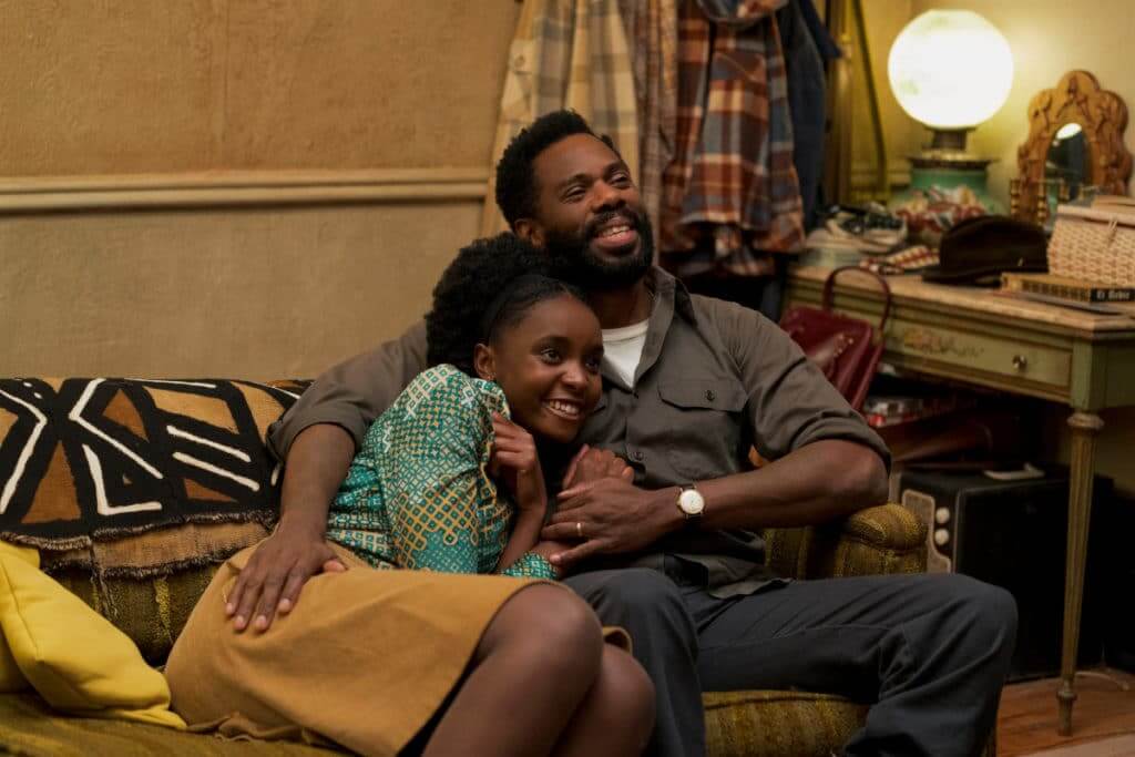
See the jacket hanging farthest to left in the background? That’s totally my jacket!
This movie, incidentally, features a ton of gorgeous clothing — a real feast for the eyes. My favorite item was this shirt, which had matching trim at the sleeve cuffs and hemline:

More importantly, If Beale Street Could Talk is a powerful, excellent movie. Don’t miss.
(My thanks to Scott Davis for finding the movie still that shows the jacket.)
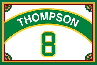
ITEM! Big membership news: If you keep an eye on the membership card gallery, you may have noticed that we’ve been approaching a milestone, as the number of cards in the gallery hit 1,970, 1,980, 1,990, and so on. We recently hit the 2,000 mark with reader Brad Thompson’s card. By nice coincidence, Brad chose a Seattle SuperSonics motif, so this milestone card was rendered in Uni Watch colors.
I thought we should do something special to mark this occasion. Longtime readers may recall that when the membership program started way back in 2007, we gave a little faux-foil seal for the “centennial” members (100th, 200th, etc.), like this:
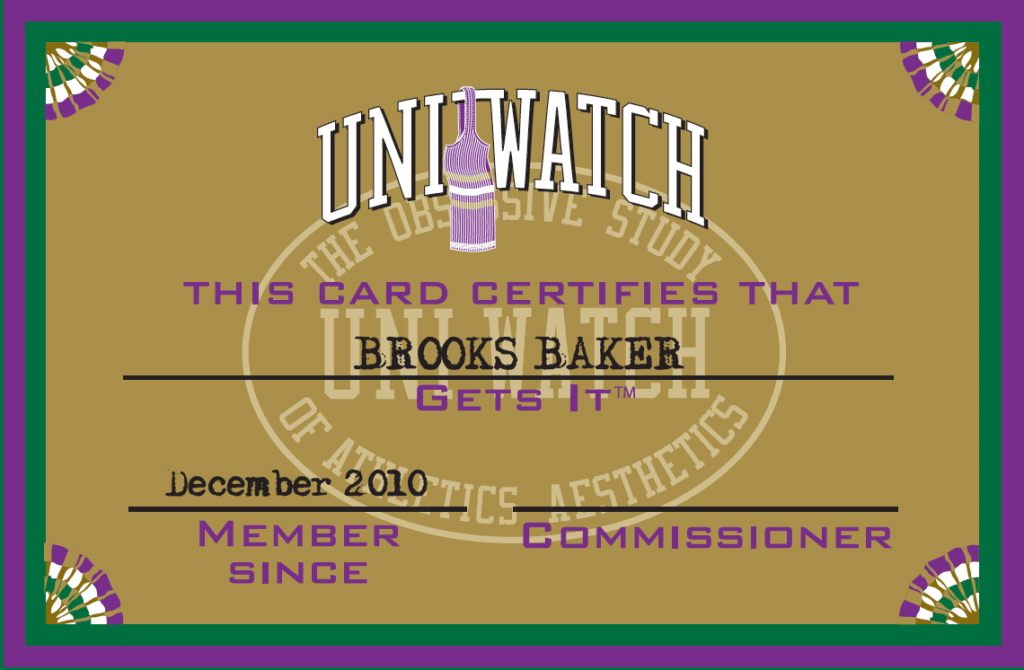
When we hit the 1,000th member, we poked fun at ourselves by creating a gold card with purple trim (I much prefer silver to gold, and you all know how I feel about purple). This was before the advent of Purple Amnesty Day, so the 1,000th card was the first and, for a while, the only purple-inclusive card in existence:
In addition to wanting to do something special for the 2,000th card, I’ve also been thinking that our front-card design is looking a bit long in the tooth. The “Uni Watch” lettering is based on the site’s original logo, which we haven’t used in years, and the watermark is a secondary logo that ended up not being used in any other capacity. I wanted something that felt more up-to-date, so I had some back-and-forths with membership card designer Scott M.X. Turner. Here’s what we came up with (click to enlarge):
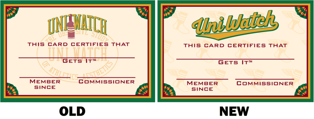
As with any design change, I’m sure some people will like it and others won’t, but I’m really happy with it. I love the winged stirrup as a repeating watermark, and the script feels nice and bold.
Brad Thompson’s membership card will be the first one to be rendered in this new design. He’s also getting a commemorative seal:
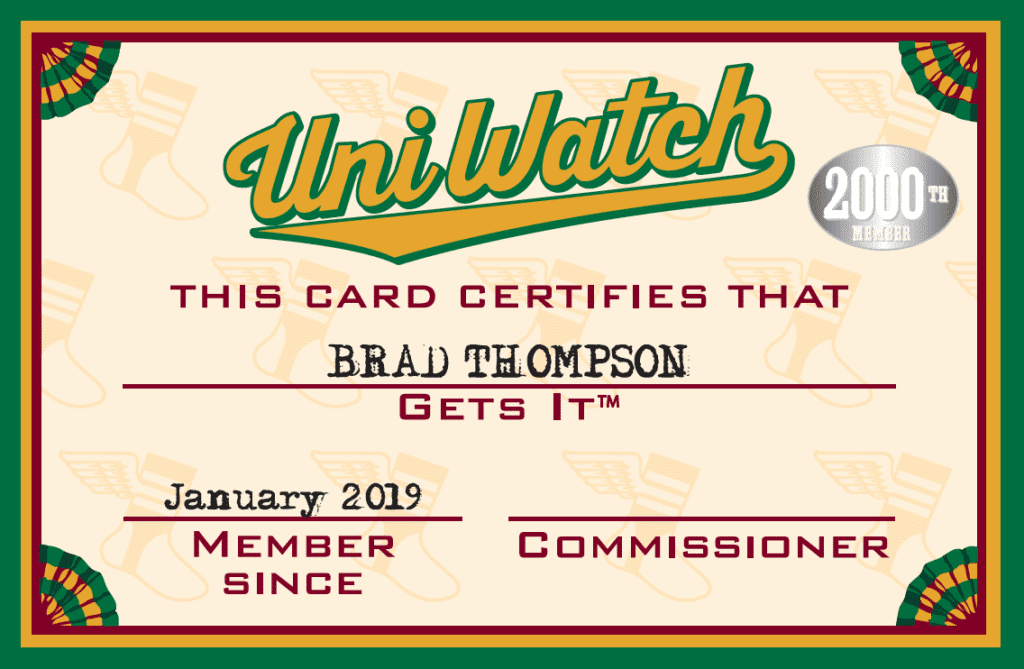
All subsequent cards will also get the new design (but not the seal, obviously).
One slight asterisk to all of this: Technically speaking, the number of cards in the gallery probably does not match up exactly with the number of members we’ve had. That’s because some members have gotten multiple cards over the years (which means there are fewer members than the number of cards in the gallery), and other members have asked for various reasons that their cards not be included in the gallery (which means there are more members than the number of cards in the gallery). I haven’t kept track of those discrepancies, but I think it’s fair to say that they more or less cancel each other out, and that Brad’s 2,000th-member status, while perhaps imprecise, is nonetheless fully legit.
On a personal note, it’s pretty awesome that the membership program has been going for nearly 12 years now, and that literally thousands of you have enrolled. I love scrolling through the various designs in the card gallery, many of which trigger fond memories of design research, or of getting the details just right. A very satisfying project!
If you’d like to help get us started toward the next thousand, ordering a membership card is a good way to support Uni Watch (which, quite frankly, could use your support these days). And remember, a Uni Watch membership card entitles you to a 15% discount on any of the merchandise in our Teespring shop. (If you’re an existing member and would like to have the discount code, email me.) As always, you can sign up for your own custom-designed card here, you can see all the cards we’ve designed so far here, and you can see how we produce the cards here.
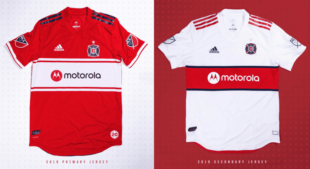
Click to enlarge

LAST CALL for the Chicago Fire raffle: In case you missed it on earlier this week, the Chicago Fire are generously offering one of their new jerseys for a Uni Watch raffle. The lucky winner will be able to choose either the primary red design or the secondary white design, both shown above. You’ll also get your choice of size, from S to XXL.
To enter, send an email to the raffle address by 7pm Eastern tonight. One entry per person. I’ll announce the winner tomorrow. Good luck!
The Ticker
By Paul

’Skins Watch: Two hockey teams — the Winnipeg Jets and Manitoba Moose — will hold promotions that celebrate indigenous culture later this month. Further info on that logo here (from Mike Styczen). … Iron County, Utah, is that latest school district to retire its “Redmen” team name and mascot (from @GRTx3).

Baseball News: A new exhibit at the Museum of the City of New York features lots of previously unseen photos of Jackie Robinson. Additional info here (NYT link). … The Lakewood BlueClaws will have their first-ever Pride Night on June 8, including a giveaway cap with a rainbow-themed logo (from John Cerone). … If you look at this familiar footage of the NFL’s famous Immaculate Reception play and follow it for a few seconds, you’ll see that a coach on the Pittsburgh Steelers sideline was wearing a black Pirates cap and a member of the chain crew was wearing a similar gold cap. Never noticed that before (from Ethan Hopkin). … 3D front logo and West Virginia-themed back logo for Marshall (from @F5_CUSARefs). … The Northwoods League’s St. Cloud Rox are asking fans to vote on the team’s annual Pink in the Park jersey (from Elijah Stenman). … A prospect who’s been working out with former MLBer Jesse Barfield wore stirrups for a training session (from J. Daniel). … Lots of bobblehead and jersey giveaways on tap for the Astros (from Ignacio Salazar). … A skull made of old baseballs and softballs? Sure, why not (from @ohhhsourry). … The Lansing Lugnuts will honor Lansing native Burt Reynolds with Smokey and the Bandit-themed jerseys on July 20 (from Greg Facchini). … While watching some 1999 Cardinals highlights, Elias Coblentz noticed that P Kent Bottenfield was clearly wearing a 1998 road jersey (red beaks, no front number) rather than the proper 1999 model (yellow beaks, front number). The game took place on April 13 of that season. … The Kannapolis Intimidators are asking fans to help choose a new brand team name (from James Gilbert). … The Hartford Yard Goats will be the Screamin’ Goats for one game this season (from sflunaticfringe). … SunTrust and BB&T have merged and will have a new name, which will presumably have implications for the Braves’ ballpark and Wake Forest’s football stadium. “This is why corporate names on sports stadiums are a bad idea,” says Jake Tilley. “There’s constant confusion and no identity for the fans.” And, I would add, no civic equity for the city. Bad news all around.

NFL News: Newly crowned NFL MVP Patrick Mahomes has a new personal logo. … Cross-listed from the baseball section: If you look at this familiar footage of the Immaculate Reception and follow it for a few seconds, you’ll see that a coach on the Steelers sideline was wearing a black Pittsburgh Pirates cap and a member of the chain crew was wearing a similar gold cap. Never noticed that before (from Ethan Hopkin). … Diego Yanez-Laguna DIY’d himself a Rams Super Bowl T-shirt. … Check out the huge lapel pin once worn by Falcons then-owner Rankin Smith. That’s the team’s 20th-anniversary logo on the bottom of the pin (good find by Charles Noerenberg). … Eight NFL coaches have been hired since the regular season ended, and most of them wore team-colored neckties for their introductory pressers (from Brian Spiess).
College Football News: Cross-listed from the baseball section: SunTrust and BB&T have merged and will have a new name, which will presumably have implications for the Atlanta Braves’ ballpark and Wake Forest’s football stadium. “This is why corporate names on sports stadiums are a bad idea,” says Jake Tilley. “There’s constant confusion and no identity for the fans.” And, I would add, no civic equity for the city. Bad news all around.

Hockey News: Oilers fans continue to be so frustrated with the team’s performance that they’re throwing their jerseys onto the ice. … The Connecticut College hockey team wore green jerseys for Green Dot Week, which raises awareness of sexual assault. … The Ontario Reign will wear L.A. Kings throwbacks tomorrow (from Jakob Fox). … Here’s an interview with the guy who was the box cover artist for the old Blades of Steel video game (from Jason Hillyer).

NBA News: Former Hawks great Dominique Wilkins has partnered with an Atlanta brewery to create a new IPA with a uni-themed label design. … Here are the uniforms for the NBA Celebrity All-Star Game. … Autism-awareness uniforms this Saturday for the D League’s Maine Red Claws. … The studio show First Things First showed newly acquired 76ers F Tobias Harris Photoshopped into a Sixers uni with an Adidas jersey and Nike shorts, plus the jersey had a retired number (from Zach Schlesinger and Pablo Jawnscobar). … In reality, Harris will wear No. 33, and his newly acquired teammates Boban Marjanović, Mike Scott, and Malachi Richardson will wear No. 51, No. 1, and No. 22, respectively. … Meanwhile, G/F Reggie Bullock will wear No. 35 for the Lakers, and new Clippers Wilson Chandler, Mike Muscala, and Landry Shamet will wear No. 22, No. 41, and No. 20, respectively. … The Trail Blazers will be using this 50th-anniversary logo next season. Honestly, the pinwheel has never struck me as being numeral-like. If anything, it looks more like a 6 than a 0. … The “2” on the back of Bucks G Sterling Brown’s jersey was upside-down last night.

College Hoops News: Throwbacks on tap for Arkansas (from Christopher Jones). … Wake Forest had pink socks last night (from James Gilbert). … Missouri will retire Derrick Chievous’s No. 3. “But that number is currently being worn by Ronnie Suggs,” notes Kyle Chisholm. “Seems pretty unusual to retire a number when a another player is already wearing it.”

Soccer News: New Chinese New Year kits for Paris Saint-Germain. … The LA Galaxy are putting five stars above their jersey crest this year, as opposed to just one. Also their second kit will launch on Feb. 17 (from Chris Cruz). … MLS teams will no longer wear or sell long-sleeved jerseys (from @jason3thousand).

Grab Bag: Journalists in Raipur, India, are wearing helmets as a form of protest against Bharatiya Janata Party officials who were recently arrested for assaulting a journalist. … A ton of old Nebraska high school sports photos — mostly basketball and football, but other stuff as well — can be found on this Twitter account (from TJ Harris). … New black and red helmets for Maryland lacrosse. … The D.C. expansion team for Major League Rugby, the U.S./Canada rugby union competition, will be called Old Glory DC. “They’re supposed to start play in 2020,” says our own Jamie Rathjen. … Here’s a rugby union match that takes superhero advertising to a new level. “According to this article, these ‘unis’ will be used in most all games between two RSA clubs in the upcoming Super Rugby season,” says Evan Stewart. “Pretty awful, really.” Indeed. … The great 99% Invisible podcast has a new episode about color, which includes some uniform-related content (from Andrew Cosentino). … New car livery for the Haas F1 team (from Jack Wade).
I still remember right after cancer stick ads were removed from TV, ABC was covering a bowling tournament (remember the Pro Bowlers Tour?) from Winston-Salem. Just to be on the safe side, Chris Schenkel never said the city named, saying things like “from the beautiful rolling hills of North Carolina…”
well well. The bank that chose to pay $10 MILLION per year for 25 years ends up getting bought out by another bank. Good on you, Suntrust. Great use of your resources, jokers. Have fun slapping BB&T all over your Suntrust swag if they even bother to keep you around.
Is there any indication that Suntrust was bought out because it was failing? I quickly skimmed that article and just saw they were merging as equals. Not sayings naming rights deals are good investments (no idea if they are or not given what various institutions pay for marketing), but there is nothing that indicates Suntrust needed to be bought out due to poor investments, perhaps naming rights deal among them.
Just from personal experience of working for two firms that were acquired and three firms that did the acquiring, no one is going to MERGE AS EQUALS. Look at the headline:
“BB&T Corp. has struck a deal to buy SunTrust Banks Inc.”
When A buys B, B is OWNED by A and that is that. B will do what A tells them to do.
The board of directors will be split evenly from the two companies.
Neither bank’s current home city will be the home for the new bank.
The BB&T chairman is the new CEO of the combined firm – but then the SunTrust guy takes over after that.
That doesn’t sound like SunTrust was the ‘loser,’ at least to me. Especially with the board split.
To add to this, the new headquarters of the BB&T/SunTrust bank will by my hometown of Charlotte (BB&T was based in Winston-Salem and SunTrust in Atlanta and apparently the company wanted a “neutral” city within their footprint for the new headquarters).
At least from the stories I’ve read here, it’s not clear if the combined company will go by BB&T, SunTrust, or create a new name altogether.
The Charlotte Knights, as it turns out, play in BB&T BallPark.
The piece I linked to says the merged company will have a new name, to be determined later.
I didn’t realize Roanoke was known for their maple trees, and I’m not sure what kind of maple leaf that even is. Interesting choice for a logo.
I was wondering the same thing. Did they just take the maple leaf logo because hockey is associated with Canada? Obvious problems with the use of confederate imagery aside, it seems really odd to superimpose it on a symbol very much associated with Canada, it would almost be like seeing a confederate flag logo in the shape of the state of NY, or another northern state.
Sadly, but not really related to your point, Confederate flags are prevalent in upstate/central NY. I took a road trip through the Southern Tier a few years ago and saw quite a few in people’s front yards etc.
I still see Confederate flags in Chambersburg, PA. The same Chambersburg that the South burnt to the ground on the way to Gettysburg. Go figure.
We vacation in the UP of Michigan and the sheer amount of confederate flags is astounding. There’s a LOT of that stuff up there.
I think it’s pretty well-established that Confederate flags can be found just about anywhere. Let’s please not beat a dead mule. Thanks.
Dale Earnhardt Jr. is not down with the rebranding of the Kannapolis Intimidators.
“I remember how proud dad was of this. What a shame it has to end.”
link
Nor is his marketing guy.
THIS IS A FANTASTIC IDEA!
Sincerely,
People who double park, skinny-jean designers, fans of boy bands, drinkers of Pumpkin Spice Lattes, fans of Geoffrey Bodine, liars, cheaters, bank-robbers, and basically any asshole ever.
link
Everyone knows Teresa Earnhardt is behind this ;)
The K logo was not one of Sam Bass’ better works, but the name is great; its’ replacement will surely be a downgrade.
The new downtown stadium is just a short walk from Dale Earnhardt Plaza, so there’s that.
PS-Geoff “DNF” is often credited for introducing the full-face racing helmet to NASCAR Cup.
I like the Haas F1 livery, but they couldn’t make the Peak logo white/grey/gold? Looks out of place.
The font used for the logo on my water bill (link) matches the typeface on the Polar Twins logo, but is not an exact match for the cigarette packages.
Perhaps it’s meant to evoke the Winston logo without actually copying it. It seems like the website (link) has changed to a small-caps treatment, while the paper bills still have lowercase lettering like the cigarette packs.
I’ve lived in Winston-Salem for the past three years. It seems like the majority of old tobacco infrastructure has been turned into condos and tech-industry office space. Along with that, it also seems like most cigarette branding has disappeared. Or, maybe the local corporate giant stamped out random use of those typefaces and trademarks.
I’m a little confused about LA Galaxy changing their star layout above the crest. MLS updated the guidelines to that back in 2016. Can individual clubs still do what they want?
link
The last thing you should try to do is: understand anything MLS does.
Comment of the day, Ponchat!
One star for 5 championships in a league that young was always a dumb idea. Rendering it in a different color that happens to be the same color as the defending champ star is confusing. I really like the placement of the stars around the Galaxy badge but they should all be silver the one gold one makes no sense.
“MLS updated the guidelines”.
Thats what MLS does, c’mon.
Lee
Our local outdoor music amphitheater in South Jersey gets to keep its name at least with the bank merger. For the record, this is the 5th name for the building in 24 years. Yay, naming rights!
And those Marshall helmet numbers are YUUUUUGE. Scale it back, Herd…
I still call it the tweeter center, at least that corporate sponsor was music themed.
I call it the E-Center. E – for Entertainment! And my kids look at me like I’m weird.
When it was the E-Center I never knew that was also a corporate name. Turns out the official name back then was the Blockbuster / Sony Music Entertainment center. I think I figured that out after it changed from the Tweeter center. At that point when it was on its third name I gave up stuck with Tweeter Center. But I think most people old enough to remember it being called the E-Center call it that still. It will be a new bank as a result of the merger, so prepare for yet another name for it.
I’m starting to wonder if coaches wearing team-coloured neckties at introductory press conferences is really a ticker thing anymore. It seems to just be common place now.
It has been pretty much the same situation with the 4 new head coaches hired in the CFL this offseason, including most recent head coach hire Craig Dickenson of the Saskatchewan Roughriders (on the right)
link
Great stuff on the Southern Hockey League. I never knew it ever existed, cool! On the first program of the Polar Twins vs Charlotte Checkers at the bottom of the page the fraction “1/2” price caught my eye right away. I rarely see the fraction 1/2 anymore on advertising, it’s mostly spelled out.
Random, unrelated uniform opinion… I guess growing up, I never much respected some of the good uniforms I got to witness. This morning I was looking at a photo of HOF receiver Steve Largent in the classic Seahawks uniforms. You know, the ones with the Seahawks logo sleeve stripes. What a beautiful uniform that was and it baffles me why those great looking colors were dropped in favor of the drab uni-tards they’ve went with ever since. I’ll go so far as to say I even like the original logo better than the polished “angry Seahawk” logo we have now. The original fits better with the region’s feel and history… The only advantage I see the new one having is how it connects at the back of the helmet, but hey, that could be accomplished with the old logo. Just my random two cents. A great uniform probably gone forever that shouldn’t be.
Great point on that Steve Largent look. You would have loved the year they wore plain silver helmets (though pics are hard to come by).
Paul,
FANTASTIC DEEP DIVE on the Polar Bears, the cigarette background, and that rebel hockey team. GREAT stuff today
Pics are hard to come by because It. Didn’t. Happen.
You guys with this stale joke are like the Ned Ryersons of my own personal Groundhog Day.
Always love a Needle nose Ned reference.
I do wish they would do the plain silver on a throwback sometime. Brings back lots of memories from my time in the Pacific Northwest.
Also, here’s a link to a little more history behind that space suit if anyone is interested:
link
Great article!
Typo…Renholds should read, Burt Reynolds
Fixed.
Love those Southern Hockey League designs. Heritage, not hate!
Yeah, a heritage of slavery.
It’s more complex than that, Dan. Honestly. -C.
Let’s please not go down this road today. Thanks.
Bit of a shocker to see the big picture of the Salem menthol pack this morning. Those goddamed things killed my Dad.
Come for the uniforms, stay for the cigarette ads!!
(Paul has to monetize this somehow!)
In the Grab Bag video item on the rugby super hero uniforms, I found myself a bit weirded out when I saw “Captain America” saluting with his left hand.
I’d be curious to hear (if not breaking confidences) why people would not want their membership cards displayed.
I can see if you were giving one as a gift and didn’t want the surprise ruined.
Personally I didn’t do it because I was worried about potential identity theft.
1) The Wake Forest pink socks were worn two nights ago (Tuesday), but I didn’t see the info until Wednesday.
2) I toured Reidsville’s American Tobacco Company plant in the mid-70s while in elementary/middle school. The plant was only a few blocks from my school and I can still remember the aroma of the tobacco wafting over. Cured tobacco has its own scents. Think cigars not cigarettes.
Anyway, what I remember most was the display of other products owned by the company, specifically Sunshine Biscuits, the makers of Hydrox.
As MLB.com writer Jordan Shusterman notes, these would make a great throwback uni for the Astros — or maybe for their grounds crew:
Grounds crew, definitely. And I’d wear that, but not for playing baseball. I don’t see the Astros doing this but I bet some goofball minor league team will try it.
Technically speaking, the number of cards in the gallery probably does not match up exactly with the number of members we’ve had.
Neither does the “one millionth customer” of a store match up with the number of people who shop there, nor the “one millionth fan” at the ballpark. Just do as McDonald’s does with its burgers and say “Over 2,000 cards sold.”
Former Hawks great Dominique Wilkins has partnered with an Atlanta brewery to create a new IPA with a uni-themed label design.
The last thing this world needs is yet another IPA. But we could always use more uni-themed labels.
MLS teams will no longer wear or sell long-sleeved jerseys
Apparently David Beckham’s never coming out of retirement. And now I have another reason not to buy one of their
corporate billboardsjerseys.Notice that the game programs say “Polar Twins of Winston Salem” and not “Winston-Salem Polar Twins.”
Good catch, I was just about to post that. A forerunner to the “Mighty Ducks of Anaheim”?
-Jet
Paul, curious to know why you consider the Winston-Salem cigarette font on the old hockey jerseys to be excused due to the brand being a “huge part of local culture and identity” when not long ago you were trashing people saying pretty much the same thing regarding Miller Park. For the record I’m pretty solidly against both.
I didn’t “excuse” it at all. If you read what I actually wrote, I said that it’s “problematic.” Which it is.
I then explained why it probably happened, but explaining is not the same as excusing or justifying.
Using a similar font is not the same as being directly sponsored by a team.
Miller bought the rights to put their font on a stadium. The hockey team *might* have used a similar font to a known brand. It’s not like they had to reach for a name. They are from Winston-Salem. I’m not even convinced that the font is supposed to be the same. Look elsewhere in the comments for a Winston-Salem water bill, and the font there is a better match.
I think it is super important to know that not only will the Suntrust and BB&T merge impact the Atlanta Braves and Wake Forest Football stadiums, it will also impact BB&T Ballpark: Winston-Salem Dash minor league, another BB&T Ballpark: Charlotte Knights minor league, BB&T Soccer complex: Home of the Carolina Dynamo a minor league soccer team, also has 20 other soccer fields for youth soccer. BB&T Sports park: a 13 field soccer complex for youth soccer just west of Winston-Salem. BB&T Center home of the NFL Florida Panthers. BB&T Point: Future home of the Atlantic league High Point Rockers baseball team slated to open May 2019.
I believe that is 7 BB&T athletic facilities and 1 Suntrust Facility
Too bad the Kannapolis Intimidators need a new name. I’m reading Dale’s widow Teresa (Junior’s stepmom) owns the trademark, and Teresa sold her ownership stake a long time ago, so the team needs a name free and clear of IP challenges. So FWIW, I proposed the Kannapolis Threes. For a stupid bit of Brandiose verbosity, I offered “three strikes, three outs, and Dale Earnhardt.”
The Federal League and this old Southern League has the same names of teams that were in the East Coast Hockey League in the late 1980’s and early 1990’s, when I first started watching hockey at Erie Panthers games. And if I remember correctly, the Erie Golden Blades played against the Roanoke Rebels in their last year in the North American Hockey League.
Ah, nostalgia. :)
In terms of BB&T, it’s also the name of the home of the Florida Panthers (BB&T Arena) and a music amphitheater in Camden, NJ (BB&T Pavilion)
Great dive into the Polar Twins. I didn’t read all of the comments but did anyone else get reminded of Minnie and Paul with that logo?
No one has mentioned yet that the phrase “Polar Twins” is a play on the common phrase “polar opposites,” which is a bit clever in the case of Winston-Salem, but “polar” is not a word commonly associated with the rolling hills of North Carolina. It might make more sense if we called them the Minnesota Polar Twins, but “polar” is not a word we commonly associate with baseball (except in some early-season games!).
RE: Polar Twins – was there any connection with a local ice manufacturer? Some years back you posted a reader’s collection of ice bags, and on my road trips I’ve begun collecting them too. They’re one of the few common products that’s really local, and therefore I find bags to be different from city to city and state to state, and often very playful just like the logo on the hockey jersey.
Just wanted to point out that the lapel pin Rankin Smith is wearing is actually for the Falcons’ 25th anniversary, not 20th. Thanks for all the content, Paul, and keep up the good work!
I grew up about 20 miles from Winston-Salem in Mt. Airy, NC (known for being the birthplace of Andy Griffith). I have no recollection of the Polar Twins as I was too young, but my first hockey game was a Carolina Thunderbird game in the early 80’s not long after their founding. As a NC youth, tobacco and the cigarette industry was a major part of life. The start of county school was delayed until after the final tobacco harvest so that students could help. We had smoking areas in school from Middle School on, and our 7th grade field trip was a tour of the RJ Reynolds plant. Thanks for the trip down memory lane.
We had smoking areas in school from Middle School on…
For the students? In middle school??
Following up on that piece about the artist who did the Blades of Steel artwork, here is an excellent video on the man himself, Tom DuBois from the equally excellent and very worth your subscription My Life in Gaming channel.
link
Fascinating stuff and what an impact this man had on so many people.
What a great read. I have lived in Winston-Salem all my life and definitely enjoy the history it comes with. Nice to have a hockey team back. It has been amazing to see the original Reynolds building has turn into condos and a hotel while the old factory has been rebuilt and redesigned into a brewery and has more available space for restaurants I believe.
I loved Blades of Steel back in 88-89-90 and played it on my NES with my neighborhood buddies all the time. I created teams based on the team color schemes in the game (Blaze, Captains, Wolves, Triumph, can’t remember the rest) and even drew logos for each. Also made up 10-12 players per team and kept team stats on index cards. Man, those were good times!
@Paul – The “Winston” and “Salem” on the Polar Twins on the fauxbacks is not based on the lettering from the Winston and Salem packs. That lettering is derived from the logo for the city of Winston-Salem. However, I do think the original SHL Polar Twins (not to be confused with the SPHL Polar Twins we had in town in the mid-2000s) did lift the pack lettering at one point. (Source: link)
Maybe I’m just missing it, but I don’t see anything about the lettering in that post you linked to.
You’re right…nothing is spelled out in the post about the lettering. If you look closely at the black-and-white image shown in the post, you’ll notice that the lettering on the bears’ sweaters are lifts of the Winston and Salem logotypes. My comment was to follow up on “The lettering on the bears’ sweaters appears to have been based on the logos used at the time by Winston cigarettes.” The lettering for “Winston” and “Salem” in the bears’ sweaters for the 2019 T’birds is actually based upon the logotype for the city of Winston-Salem (link). I can’t recall how far back the use of that lettering for the city goes, but just calling out that I think the 70s Polar Twins used the cigarette logotypes, and the T’birds fauxbacks use the city’s logotype on the bears’ sweaters…probably because in 2019 (and for a while now) cigarette logos and brand elements are off-limits for merchandise.