NFL helmets — is there anything they can’t do?
Over the years we’ve seen helmet phones, helmet snack bowls, helmet pencil toppers, helmet chairs, and a lot more. But I don’t think we’ve ever seen an NFL helmet Ferris wheel — until now.
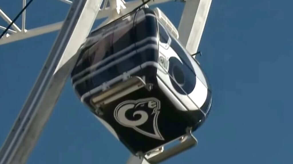
The Ferris wheel in question is SkyView Atlanta, whose 42 climate-controlled cars have been spinning in downtown Atlanta since 2013. With the Super Bowl taking place in Atlanta this Sunday, 32 of those cars have been vinyl-wrapped to look like NFL team helmets. (I don’t know why they didn’t just use throwbacks whatever to fill out the remaining 10 cars.)
You can see some of the helmet-themed designs in the video above, and there are additional views in this next video clip (skip ahead to the 22-second mark):
And here’s yet another short clip:
I kinda love this — in part because I like Ferris wheels (here in Brooklyn, we have the magnificent Wonder Wheel out at Coney Island) but mainly because I love how football helmets can represent, or be represented by, almost anything. If they haven’t shot a helmet-themed satellite into space yet, that must surely be coming soon, right?
One thing I don’t think I’ve seen: a bowling ball that looks like a football helmet. I’ve seen bowling balls with helmets depicted on them, but not bowling balls that mimic a helmet’s design. Come on, people, that’s a natural!
Anyway, where were we? Oh, right: the Ferris wheel in Atlanta. A ticket costs nearly $14, which seems a bit steep (the Wonder Wheel is only $8, and you get a view of the beach and the ocean instead of a bunch of buildings), but maybe you can just stand nearby and watch the helmet-y cars as they go around, because that’s the real attraction here anyway.
Interestingly, they made one big mistake: The Rams car is based on the team’s white-horned helmet, not the yellow-horned design that they’ll be wearing in the Super Bowl:
Click to enlarge
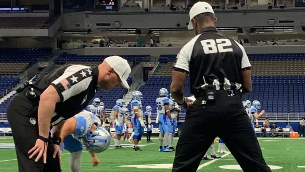
Can a zebra change its stripes stars?: Remember, the Super Bowl isn’t the end of the football season — the NFL is just the glorified preseason for the start of the real football league, the AAF, whee! And yesterday we got our first look at the uniforms for the AAF officiating crews (see above).
That photo isn’t great, but there’s enough visual information there for me to offer the following reactions:
• Stars on jersey shoulders? Seriously? When’s the last time a ref or ump in any sport wore stars? Looks seriously rinky-dink.
• That American flag patch is a mistake. Technically, of course, it’s properly oriented, but lots and lots of people don’t know that, and you know a bunch of them are going to say, “Wait, that flag is backwards” (two such people have already asked me about it), or even, “Ha-ha, moronic amateur league has its refs wearing a backwards flag!” Look, if you insist on making your officials wear a flag patch to prove how patriotic you are, or to emphasize the second word in your league’s name, or whatever, just put the patch on the left sleeve, so people won’t mistakenly think it’s backwards.
• What is the deal with those jerseys? It almost looks like they’re wearing black pinnies over their zebra stripes, but I’m pretty sure it’s a one-piece design because of the raglan sleeves. Looks seriously weird, but maybe we’ll see a method to the madness once we get a look at the front view. But having the officials wear black pants and mostly black jerseys is going to cause problems for any game involving the Birmingham Iron.
• That striping on the brim and crown of the cap (which is presumably matched by a corresponding stripe on the other side) looks like a textbook example of trying to reinvent the wheel. Just let it be a white cap without the gewgaws.
• Speaking of the caps: At least two guys on the crew wearing white! In the NFL, the ref wears white and everyone else wears black. Ditto for the NCAA.
• On the plus side, the maker’s mark is on the back of the cap, instead of the side. Back of the pants, too. (Yes, that’s the Starter logo. They’re also making the players’ uniforms.)
That’s a lot of bang for one photo’s worth of buck, right? And hey, while we’re at it, here’s what the AAF’s football will look like (click to enlarge):

Take a good look at all of this, because it probably won’t be around very long.
(My thanks to Jim Polacek for pointing me toward the photo of the officials.)
EXCLUSIVE! NHL 2019-20 news: Last month I had some info from a Chicago-based source who said the Blackhawks would be changing the collar on their red jersey next season. I can now confirm, via another source, that the Blackhawks will have new home and road jersey designs for 2019-20. I don’t have any details on what the changes will be, but I think it’s fairly safe to assume that they’re changing the collars (because really, what other changes could they possibly be making to a jersey as iconic as this one?).
Also:
• One team — I’m not yet ready to say which one — will have new home, road, and alternate uniforms next season.
• One team will have a new road uniform.
• Seven teams will add new alternates. That group includes the Golden Knights, who’ll be expanding their wardrobe for the first time.
That is all, at least for now.
Collector’s Corner
By Brinke Guthrie
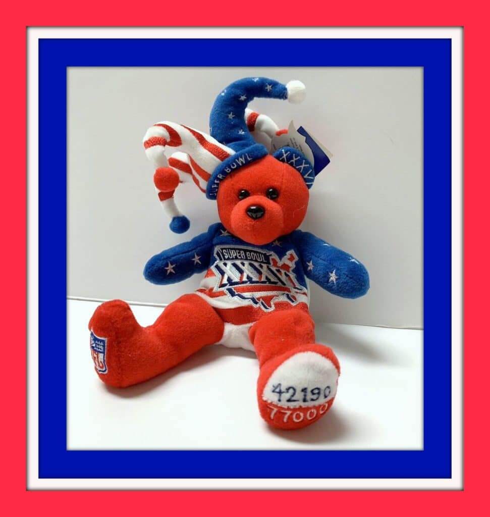
The last time the Pats and Rams faced off for all the marbles was in Super Bowl XXXVI, so we have a few items from that game to lead off this week’s Collector’s Corner. First up, this Jester Beanie Baby (remember when Beanie Babies were all the rage?). This little fellow comes complete with the official game logo. There’s also this T-shirt, this denim shirt, and this official Supe XXXVI jacket.
Now for the rest of this week’s picks:
• This 1960s POS (that’s “point of sale,” kids) NBA sign for Colt 45 malt liquor was designed so that “Colt” and “45” looked like the team name and player jersey number — clever!
• Late-1960s NHL Oakland Seals fans would bundle up for a chilly night with this scarf/muffler. The team was founded in 1967, and Wikipedia says “the team was renamed Oakland Seals partway through the 1967–68 season,” after originally being named the California Seals.
• Here’s a terrific-looking 1970s Packers pom hat from Sears. (But you knew that.)
• WIth the Padres bringin’ back the brown in 2020, here’s a Wilson-made brown jacket from 1969, their first season.
• Also from 1969, a pair of pillows featuring the 24 then-current MLB teams.
• Nice artwork on the cover of this January 1968 Pro Bowl game program.
• This NBA Bas-Ket game promises “Real Basketball in Miniature” for “Fast Action Sports Fun!” Obviously not 1960s, more like 1990s, right?
• These 1973 NFL placemats featured generic football teams.
• Someone stuck a bunch of 1970s NFL Chiquita team stickers on a football-shaped piece of wood.
• It looks like this 1970s Atlanta Falcons helmet radio has been in the trenches a time or two. Still works, though. (Maybe you’d prefer a Miami Dolphins football phone?)
Seen an item on eBay that would be good for Collector’s Corner? Send any submissions here.
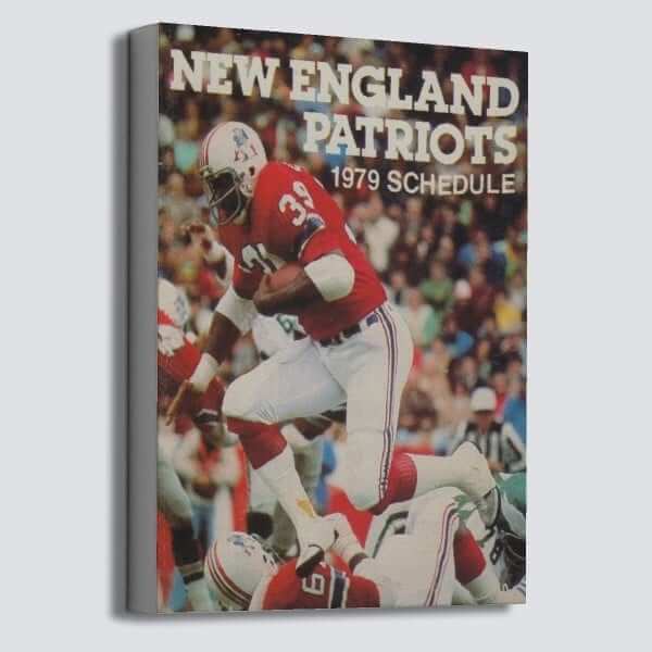

Raffle reminder: The good folks at Vintage Brand are using the week leading up to the Super Bowl to run another raffle. The lucky winner will get to choose any item from the Vintage Brand site (like the cool Patriots canvas shown above, for example).
To enter, send an email to the raffle address by this Thursday, Jan. 31, 7pm Eastern. One entry per person. I’ll announce the winner on Friday. Good luck!
The Ticker
By Anthony Matthew Emerson

Baseball News: We already know that Adam Ottavino will be the first Yankee ever to wear No. 0. But according to Quentin Ellis, he’ll also be the first Yanks pitcher to wear a single-digit number since 1930. The last to do so? None other than George Herman Ruth. … The Missoula Osprey of the Pioneer League are rebranding and are asking the public to help choose their new name (from Clark Barnier). … USF has unveiled new all-black unis (from Cedric Padilla). … This Twitter thread shows off Arizona softball’s 2019 unis. Note that there are no visible buttons (from Rocky De La Rosa). … Toledo softball also released their 2019 unis (from Josh Claywell). … New batting helmets for Mizzou softball (from Steve Johnston). … Can you tell the difference between New Era caps made domestically and made overseas? This guy can (from Andrew Primeau). … A tequila sunrise-based design really loses something when it’s plastered with ads (from Travis Peterson). … Anyone know what these extra numbers on the Pirates’ vests would be for? (From Jerry Wolper.) … New 70th-anniversary logo for the Yokohama DeNA BayStars. “The design uses elements from uniforms in each era,” explains @BigDaddy45.

NFL News: We got our first full view of the Super Bowl field all decked out for the big game (from @christmasinatra). Note that the Rams end zone has the team’s helmet, not the team’s logo. @Keyvon212 points out this is the first time a Super Bowl end zone has had a helmet design since SB XXXIX, 14 years ago. … Speaking of helmets, it appears the Rams are making heavy use of their helmet logo, which is even appearing on the “interview sweatshirts.” Also note that the sweatshirts have team font uni numbers (from Alan Kreit). … The Patriots have posted a video on their Facebook page showing the work being done by their equipment manager (from Nick Jones). … When you put “pats rams” in the Instagram .gif search bar, it gives you two helmets that look sort of like the Pats’ and Rams’, but are far enough away to avoid a lawsuit from the NFL (from Griffin Smith). … The Super Bowl popup store in Atlanta is selling a Rams jersey that the team even doesn’t wear anymore (from Alex Barth). … Meanwhile, if you’re in the market for St. Louis Rams merch — including a Rams thong — there’s a shop in Missouri that can help you with that (from Tris Wykes). … Notice anything odd about this photo of Bill Parcells, Brian Griese and Joe Montana announcing the NFL’s “Cholesterol Screen Team” before Super Bowl XXXV? Check above the facade — it’s lined with jerseys! Perhaps those were the jerseys of other members of the Cholesterol Screen Team? (Excellent find by Mike Colvin.)
College/High School Football News: The font used in Clemson’s national championship logo (gif warning) makes the “IO” in “national” and “champions” look like the number 10. That can’t be intentional, can it? What would the “10” be referring to anyway? (good spot by Frank Mercogliano). … The first installment of Auburn Through the Years, a retrospective of Auburn football uniforms, has been posted (from Clint Richardson).

Hockey News: Here’s our first look at the Pens’ and Flyers’ Stadium Series sweaters, which look pretty much like everyone expected (from @ImAnimated). … Oh my god, so many things going on in this pic of Jorma Valtonen at Leafs camp in 1972. Uni No. 100, a crest I’ve never seen before on a Leafs sweater, and the oddest mask I’ve ever seen (many thanks to Chris Mizzoni for sending this our way). … Billy Cole’s mom found this old Colorado Rockies — the NHL Colorado Rockies of course — hockey puck in her basement. … Color-on-color alert in the AHL All-Star Game (from Jakob Fox). … Check-out this gorgeous 125-year-old hockey sweater, from the Rat Portage Thistles, which might be the most punk-rock-band-sounding hockey team name ever (from @mixedmediashop).

Hoops News: Here’s a really interesting piece on “Ninja-style” headbands, which are slowly becoming more and more prominent throughout the NBA (from Ryan Frazer [as an aside, I wish I’d written that piece myself — PL]). … This butcher’s shop in Dubrovnik, Croatia, has Bulls logos on its awning and street lamp. “Must be old Kukoc fans,” says @mmmmmmboy. … Radford men are debuting these awesome throwbacks on Thursday (from Doug McKinney).

Soccer News: The Philadelphia Union released their new away kit (from Andrew Dillon and Josh Hinton). … Sporting Kansas City teased their new kit in the most frustrating way possible (also from Josh Hinton). … Argentine side Rosario Central has new kits and a new kit provider in Under Armour. The club had been using temporary kits manufactured in-house (from Ed Żelaski). … Good article about the 23-year-old designer who created a new jersey for Nigeria (from Kary Klismet). … River Plate’s new away kit has leaked (Josh Hinton again).

Grab Bag: Joe Gibbs Racing will have memorial stickers on each of their cars in honor of former organization president JD Gibbs, who passed away on Jan. 11 (from Christopher Hickey). … This Atlantic article about lines from women’s restrooms has a somewhat odd choice for a header image: the women’s restroom line at Yankee Stadium during the 2014 NHL Stadium Series game between the Rangers and Devils (from Chris Flinn). … Jason Torban spotted a sign in Ambler, Pa., that’s shaped like a Brannock Device, Paul’s favorite object. … Speaking of things Paul likes, Thomas Schroeter discovered this abandoned psychiatric facility in Wingdale, N.Y., with old-timey bowling lanes and old-timey baseball fields. … New lacrosse helmets for the Washington club team (from Anthony Edwards).
What happened to the Lightning alternate uniform for this season? Was it scrapped?
Probably not. We’ve seen photos on Icethics of a Lightning practicevwith the team wearing black helmets and black pants/breezers with a silver-gray lightning bolt down the side.
Couldn’t one argue that the American flag patch on the AAF officials’ jerseys is in fact backwards? The reason being that the custom of always having the flag “moving forward” has military symbolism (that the US forces are never retreating) that don’t apply to civilian use of such a patch.
I don’t think that’s right. Pretty sure it’s oriented that way because it’s supposed to give it movement, like the flag is blowing in the breeze. Maybe the military has retroactively assigned that connotation.
This is correct. Civilian uniforms (EMT, security guards, etc.) keep the field of stars in the upper left. If I remember later I’ll ask our guards up front at work to snap a pic.
“Here’s a terrific-looking 1970s Packers pom hat ”
i really thought this said porn hat. Fonts are everything.
Local landmark Randy’s Donut was repainted in Rams colors to celebrate their Super Bowl appearance. Unfortunate Logo creep that you see at the end of the clip. It was also painted on the Donut itself.
link
I think the 10 in the Clemson championship logo would have something to do with it being Dabo’s 10th year/full season running the program.
If I had to guess, I’d say the Blackhawks are probably going to go lace-up with their collars.
Though, really, the only thing I want to see is the stupid front panel changed to match the collar color instead of the jersey color. As it is now, it just looks ugly as all hell.
Was anyone really screaming for this Adidas collar “innovation”, anyway? That’s something I just don’t get.
Agreed. The collars are just silly. Dying for the Isles to change the collar on their home uni. It sticks out like a sore thumb.
Hoping the Blackhawks get rid of the Indian head on the front. It’s time.
Maybe AAF official uniforms have been influenced by the other pro league with regards to the more than 1 white hat?
CFL refs wear the black hats while all the other official wear white hats:
link
NHL Thoughts:
– The Blackhawks switching up their collars probably points to an end of that dumb Adidas multi-colored collar template. I *could* see them switching to a lace-up but that being one of the few details they can use to make their jerseys into throwbacks/fauxbacks I doubt they will.
– The Sharks and Senators feel like the teams most likely to unveil entirely new uni sets. The Sens have been workshopping new logos for some time and the Sharks unveiled new ones recently. Also, the Sharks jerseys have felt kind of bland since they changed to their current (less stripey) look in 2013.
– We already know the Canucks are adding a new 90’s throwback. I bet they also test out a new 3rd jersey that could replace their current home look beginning in the 2020-21 season.
The Sharks have had one of the best logos in hockey in their toolbox for 12 years now and have never featured it as anything more than an afterthought on the pants:
link
The Hurricanes are getting new roads.
Canucks are getting a new third in addition to the throwback.
Rumour is there could be a change to primary home and road next year. No detail that I have come across. Could be a small as the collar or some other small detail, or maybe more.
I think it will be Vancouver as well, and be more substantial
On Icethetics under the Jersey Watch 2019 header, it has this to say:
“After the Blackhawks, the other big surprise from the Adidas catalog was seeing new primary sweaters listed for the Canucks in 2019-20! It’s unclear whether the Canucks are working on sweeping changes or maybe just updating the crest to remove the superfluous “Vancouver” arched across the top. But I also wouldn’t be that shocked to see a new primary logo to coincide with the 50th Anniversary.”
No, the ref sleeve flags are backwards. The exception to the Flag Code and to flag etiquette on the orientation of the field of stars is on the right sleeve of U.S. Army uniforms. Not the right sleeve of any garment, but the right sleeve of U.S. Army uniforms. The U.S. Flag Code has not been changed to permit backwards flags on the right sleeve; U.S. Army regulations have been changed to permit backwards flags on the right sleeves of U.S. Army uniforms. The relevant question to ask when you see a backwards flag on a sleeve: Am I looking at a U.S. Army soldier in uniform? If yes, then the flag is correctly oriented. If no, then it’s backwards.
This is not a case where the practice is technically correct but many people incorrectly believe it’s wrong; this is a case where many people incorrectly believe that the wrong practice is right.
That is almost *literally* what he wrote.
OK. But AAF officials have a lot of company in this regard, including link, the link, and lots of other examples.
Bottom line: The Flag Code is silly. It has no force of law and just creates confusion, to the point where it’s now impossible to put a flag ornament on the right-facing side of anything without someone plausibly being able to claim it’s wrong, no matter which orientation it has.
So my larger point remains: If the AAF insists on having its officials wear a flag patch, they should put it on the left sleeve, not the right.
God knows we have to have flags on stuff in ‘Merica. We can’t have anyone thinkin’ this is some sort Euro-fied, or Mexican, or Canadian, or Argentonian version of a ‘Merican football thing goin’ on!
This game is ours! (Yeah, I know we put flags on everything else in ‘Merica too. Everything should be ours!!)
Kind of a random (but slightly relevant) observation:
I’ve lived in six different states, and five of them (AZ, CO, NM, PA, TN) have cultures that seem to put a high emphasis on their state flag. You see them everywhere.
Now I live in Florida, and I’d be hard-pressed to find you a Florida flag anywhere. For whatever reason, the state flag is just not important to people here.
I lived in PA for 11 years and never saw a whole lot of PA flags. You’re night about TN (they love the tri-star logo) though.
well, AZ and NM have very snazzy state flags, so it’s understandable they get displayed. the ubiquity of the CO flag is pretty recent. not that long ago, the license plate motif was much more common.
also IIRC the Florida flag looks a lot like the Alabama flag.
I still see the Florida and Alabama flags for what they are…”splitters!”
Living in Charlotte, which is close enough to the South Carolina border so a lot of people commute to work here from there, I see an awful lot of SC state flags, or at least the palmetto/moon standing alone on the backs of cars. Vary rarely will I see an NC flag decal.
Even more interesting is that it’s common to see the palmetto logo done up in orange/purple for Clemson or scarlet/black for USC. The actual flag is navy/white.
On the other hand, practically every county in North Carolina has a flag based on the state flag, and they put those flags on the interstate highway signs denoting county boundaries, which I’ve always thought was cool.
Do we know for sure the flag patch isn’t on both sleeves?
I don’t think even a newfangled football league that’s desperate for eyeballs would be stupid enough to engage in that degree of overkill.
“Interview sweatshirts”: The moment NFL players’ primary role as highly paid mannequins for retail merchandise became abundantly clear.
Too bad the Rams car on the Skyview Atlanta Ferris Wheel is different than what they’re wearing during the Super Bowl.
Good point — let me add that to the text.
New road uni for the NHL is almost certainly the Hurricanes, whose owner doesn’t like the look of their white uniforms and has basically asked the team to stop wearing them. That has resulted in some color versus color games this year, with presumably more to come.
Anyone else see that old-timey bowling alley and think of the final scenes from “There Will Be Blood”?
If the “10” in Clemson was intentional (I don’t think it was), it could stand for the alumni association’s IPTAY campaign, which encourages all alumni to donate $10/year. IPTAY (I pay ten a year).
“The Super Bowl popup store in Atlanta is selling a Rams jersey that the team even doesn’t wear anymore.”
I know the Rams got permission to wear their throwbacks more often, but I thought the navy/gold jerseys could still be worn on the road if the opponent was wearing white (and the Rams used up their throwback allotment).
Right, but they literally didn’t wear them at all this season, and their stated goal was to avoid wearing them.
The Ticker item isn’t saying that the navy jersey isn’t technically part of the Rams’ wardrobe (it is); it’s saying, quite literally, that the navy jersey isn’t worn anymore (it isn’t).
Will it fly high like a bird up in the sky?
@GC I got a song that ain’t got no melody….I’m a-gonna sing it to my friends….
Billy Preston Lives.
Pete,
Good one.
Right on, right on.
“Let the bad guy win every once in a while.” – I hope Billy wasn’t meaning SB 53.
It looks like the “I” in the Clemson is consistent with the font of the other letters. The Pirates photo seems to have those numbers superimposed after the picture was taken.
It’s similar to the Paw Hammer font used for Clemson Athletics, minus the bottom serifs.
link
The bottom serifs are removed on both “I”‘s in the video.
link
I like soccer.
I would like to have an MLS team to root for.
I do not live in an MLS city (although Austin will get a team soon).
I lived in Philly for awhile.
I would love to support the Union.
I cannot bring myself to buy anything that has “BIMBO” emblazoned across the chest.
I wish you could buy a sponsor free jersey.
I know that will never happen.
That is all.
PS- nothing against Bimbo bread. It’s good bread. Bread good!
@Jim H. There’s a joke there about ‘(Chicago) Fire Bad!’ but I’m not touching it.
That’s very funny!
I notice the Ferris wheel cars in division order, then alphabetically.
I wonder if the Rams are using the helmet logo because the primary logo is a similar shape and color to the Patriots’ flying Elvis.
I also realized the Rams don’t have a version of their primary logo in royal and yellow.
I think the latter observation is the real reason.
I was thinking the same thing, albeit along the lines of there being no registered trademark of the Rams’ primary logo in royal and yellow. This is along the same lines, if you recall, of the issue with alternate-colored versions of the Cubs logo not having the ® or ™ symbol; only the standard one is trademarked. Not that the NFL couldn’t use a non-trademarked logo if it wanted to, but using the helmet is probably a way of keeping everything in the realm of IP that the NFL actually owns.
Could have still rendered the logo in just white, as they have done since they moved to LA. I was thinking they went with the helmet because that was the their primary logo during the era of the throwbacks they’ll be wearing.
Option two, if the Rams insisted on doing the helmet in the endzone, just put the Pats helmet in the opposite endzone to match it.
Of course this, and the white horned ferris wheel car is all due to the Rams refusal to make a full uniform change until they move into their new stadium, and half-assing it now. Absurd that this stuff happens given how much the NFL focuses on branding.
Former Rams fan from St. Louis here. The Rams’ current emphasis on the helmet logo reminded me of their early years in STL, before they had a primary logo to reflect their then-new home. At that time the helmet logo was all they had, so it was on *everything.* (They eventually came up with a primary logo that incorporated the Gateway Arch; this was in use at the time of their SB win over the Titans.) Then they created the Rams head primary logo when they did their uniform redo.
I wonder if using the helmet now is one part de-emphasizing anything that had to do with the STL history of the team — after all, the Rams head logo was in use the last time they played the Patriots in the Super Bowl — and one part a signal that a new logo will be part of the much-discussed uniform redo that’s coming when they move into Stan’s Wonder Palace. Presumably they are going to keep the ram horns on the helmet (though what color they will be who knows) so emphasizing the helmet now will provide some continuity.
P.S. Screw you Stan Kroenke. Go Patriots.
I remember that arch logo being around since the team moved, but it was definitely interesting that they didn’t have a logo including an actual ram for at least 5 years.
link
This was their initial field design which, incidentally, used a slightly different font than the logo above:
link
Why do I have a feeling that the Missoula Ospreys contest will be rigged like the others and Brandiose has already come up with something ridiculous for them?
The way the survey is set up looks to me a lot more like an actual gather-input-from-people exercise than a harvest-emails exercise. Which is what most “rigged” name-the-team surveys are.
The Ospreys could definitely stand to have a top-to-bottom refresh for their logos, uniforms, colors, the whole shebang. But good gosh the “Ospreys” nickname is fantastic. A shame to lose that nickname from the ranks of pro baseball.
And we’ll soon be reading about the new nickname and how the team merchandise is being sold in every state in the country because it’s the coolest thing since Trash Pandas. I guess I should never be surprised at the appetite people have for buying caps and shirts for sports teams.
So, an additional set of news for NASCAR… Jayski’s silly season site, a long-time NASCAR news blog, is shutting down tomorrow. The website has been around over 20 years, and is most famous for tracking Paint Schemes for all 3 series. I know this website has done Paint Scheme features before, but Jayski’s has archives dating back to 1990. They’ve been owned by ESPN since 2007, but ESPN has recently announced cutbacks with regards to NASCAR. There’s probably thousands of paint schemes in their archives, and it’s sad to see them go.
I read it had already ceased operation (yesterday).
I’m hoping that those folks land on their feet too, and that the site stay open without updates.
Absolutely. I read that the site has been updated every day since 1998. The site is one of the most consistent, trusted NASCAR news sites around. Definitely hope that the site can somehow be saved.
The reason I mentioned it is because it’s been somewhat like NASCAR’s equivalent of Uni Watch. Seeing a uniform database go out is sad, no matter what.
Ugh, that really was a great site.
Regarding the Padres return to brown: I’m at the age (40) where I always associate the brown with orange, or yellow and orange. I’m biased towards that over the brown/yellow only combo. Anyone else in the same boat, or just me?
The Predators and Stars have to be two of the teams set to unveil an alternate next year since they’re playing in the Winter Classic. Right?
Probably not. WC unis are usually considered to be their own distinct type of uniform, separate from typical “alternates”.
I feel like those AHL All Star uniforms would be a nice clean upgrade for the Washington Capitals.
I’ve always found your reporting on the Blackhawks’ sweaters interesting. You seem to really love them–the colorful chain stitched crest in particular. Today you said that the design is too iconic to imagine ever being changed in any substantial way. It’s an assessment I totally agree with.
How do you reconcile this with your general disdain for native names and imagery (a view I disagree with but respect)? Do you think that the Blackhawks should change their name and/or logo? Or does the fact that neither the name nor logo are caricature give them a little leeway? I think your general reasoning for opposing names would label both Blackhawks and Redskins as unacceptable, though maybe there is a matter of degree or compounding sins (misappropriation + offensive name) that can make some cases worse than others. Or is it something else?
I’ve always found your reporting on the Blackhawks’ sweaters interesting. You seem to really love them–the colorful chain stitched crest in particular.
Actually, I’ve always said, many times, that I don’t much care for the red uniform, which I find too loud. I’ve taken a fair amount of abuse for that opinion. I prefer the white uniform from an aesthetic standpoint but am opposed to the Native-based design.
Today you said that the design is too iconic to imagine ever being changed in any substantial way.
What I meant was that I find it hard to imagine that the team would choose to change it. That doesn’t mean I don’t think it *should* be changed — I do.
I would prefer not to see an Indian’s head on any sports uniform, including this one. And as is the case with all teams using Native American imagery, we will not do a Blackhawks-based Uni Watch membership card, so I’ve put my money where my mouth is.
I do appreciate that they’ve kept the chain-stitching. But I’d gladly trade that for a non-Native design.
I’ll take the opposite opinion here regarding the Hawks’ home vs. road. I like the red one, but the white uni has always bothered me because the red becomes invisible at a distance. On TV, for example, the waist of the jersey looks like it just has three black stripes, and the uni as a whole looks merely black and white.
-As a buff of both sports uniforms and theme park attractions, the Ferris Wheel scratches a particular itch of mine.
-I’m surprised that the NFL shop doesn’t have an abundance of Rams throwback Super Bowl jerseys. Considering the blue/yellow helmet logo was used on the NFC Championship caps/tee shirts that were on the field/on sale directly after the title game, it’s obvious that the decision to use the throwbacks if the team made the Super Bowl was made ages ago and was in the retail pipeline on some level.
-Relatedly, like a previous commentor said, I’d imagine that the helmet logo is being emphasized because it uses the royal blue/yellow of the throwbacks as opposed to the white and muted blue Ram head logo.
Not uni-related, but other-sports-related, The Wingdale/Harlem Valley facility was Frederick Exley’s Avalon Valley in “A Fan’s Notes”. Just plugging Exley. Thanks for your time!
FC Cincinnati season ticket holders got emails this morning confirming your info from yesterday, kit release will be Feb 11 at 7pm at Music Hall
Why can’t the Blackhawks use an image of a bird as the logo? That way they can keep the uniform design.
Those MLB pillows can’t be from 1969 – they have the Milwaukee Brewers on them as well as the updated Phillies logo, both of which didn’t debut until 1970. And they have the Senators on them, so they can’t be later than 1971.
And the Bas-Ket game – the game itself probably dates to the ’60s as I had one in the early ’70s. But this particular edition would appear to be from 1983-84 based on the Cavs logo (debuted ’83-84) and San Diego Clippers logo (moved after the ’83-84 season).
Is it me, or has the person who was in charge of the Color Rash took over the stadium series unis?
That NBA BasKet game is from either 1984 or 1985 (not the 90’s). The box features the Kansas City Kings who moved to Sacramento for the 85-86 season – And the Los Angeles Clippers which moved from San Diego to LA for the 84-85 season.