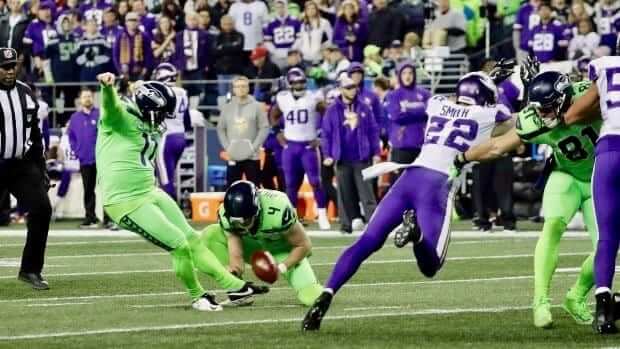
We’ve known for a while now that the Seahawks were planning to wear their mono-neon uniforms last night — the first and I believe only time they’ll be wearing them this season. This marks the third straight year they’ve trotted out this design, and a bit of the retina-searing novelty has now worn off.
But there was an important new element added to the mix for 2018: Sebastian Janikowski is on the team this year. And there’s something inherently funny about the sight of Sebastian Janikowski in mono-neon.
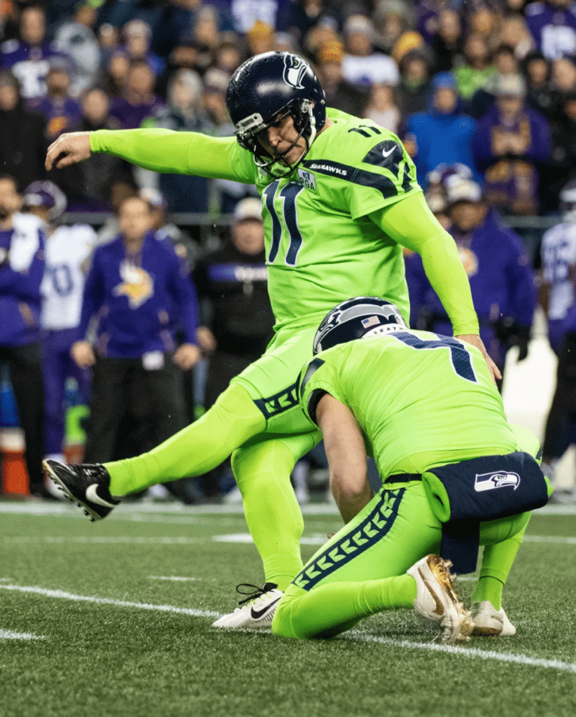
To be fair, nobody looks particularly good in Seattle’s neon uniform, especially men of a certain size and girth. And Janikowski, who’s now 40 years old and spent his previous 17 seasons with the Raiders, is certainly not the biggest player on the Seahawks. He’s listed at 6’1″, 260 pounds, which means he’s dwarfed by many of the team’s offensive and defensive linemen. Those guys look pretty funny in neon, too.
But not the same way Janikowski does. Part of it, I’m pretty sure, is that he’s just atypically large for a placekicker, which has always made him appear incongruous and sort of clunky. Another part is that he doesn’t wear thigh or knee pads, which reinforces his Everyman physique — the pad-less pants make him look less like a football player and more like some guy who was watching the game on his sofa and somehow got drafted onto the field. And part of it is that he’s never fully shed his image as the hard-partying guy from Poland who got into lots of bar fights during his time at Florida State.
Shoehorning a 40-year-old guy like that into the Seahawks’ sleek superhero costume is just too good (especially when he goes the extra mile by wearing a neon long-sleeved base-layer shirt, as Janikowski did last night). Much like Boog Powell in the blood-clot uniform, it’s such a massive mismatch of player and uni that it achieves its own kind of perfection. I’d say it might even justify the neon uniform’s existence.

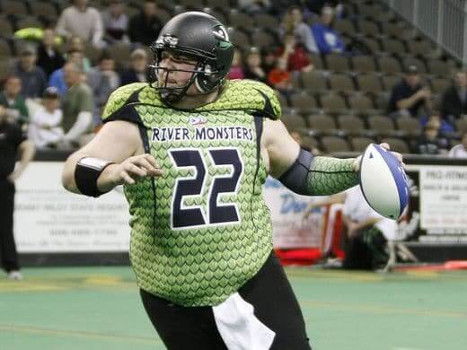
Another atypical thing about Janikowski: He kicks with his left foot. That led Twitter-er @RF_1071 to compare him last night to another famously hefty neon-clad lefty — Jared Lorenzen:
None of this is meant to diminish Janikowski’s considerable skills as a kicker. He’s 10th on the NFL’s all-time points list (if he plays another season, he’ll likely jump to sixth), he has a whopping 105 career field goals of 50 yards or more, and he’s likely headed to the Hall of Fame (that should be a good induction speech). I hope for his sake he never has to wear the neon uniform again. But I’m glad I got to see him wear it last night.
An excellent DIY project: Reader Scott Steffes’s office had an ugly sweater contest yesterday, so he and his family decided to make a different play on the word “sweater” by customizing his Wisconsin hockey jersey for the occasion. “The colors are perfect,” he says, “and it’s a great base jersey that allows for unique modification.”
Here’s the jersey he started with (for all of these, you can click to enlarge):
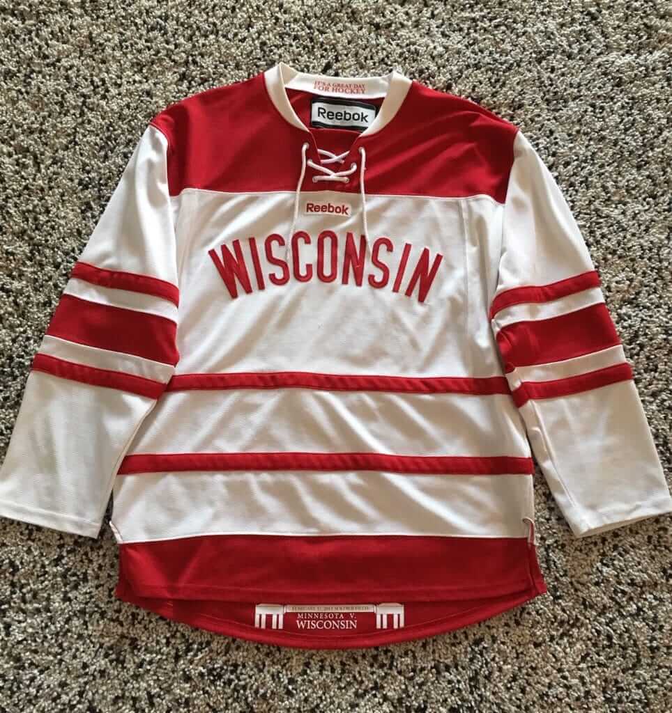
And here’s how Scott modified it for a fictitious team called the Wisconsin Reindeer:
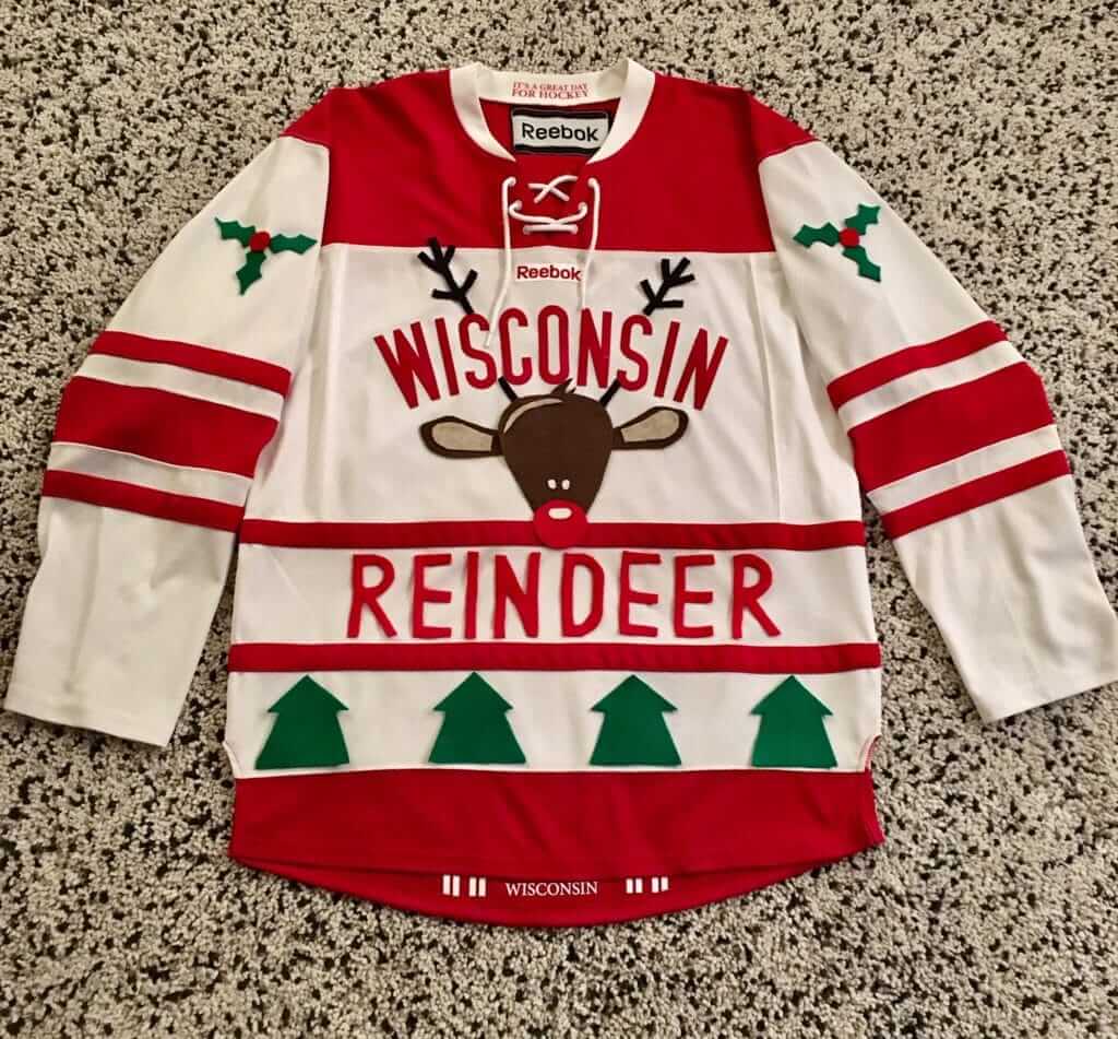
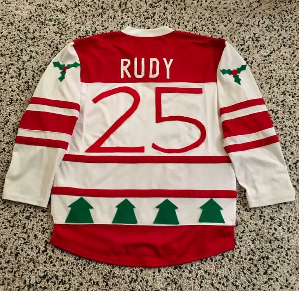
As you can tell from the photos, Scott didn’t sew the graphics onto the jersey. “I was thinking about sewing it, he says, “but I wanted the changes to be temporary, as this is my favorite jersey. Found a roll of double-stick fabric tape that worked great. Everything is holding up pretty well so far.”
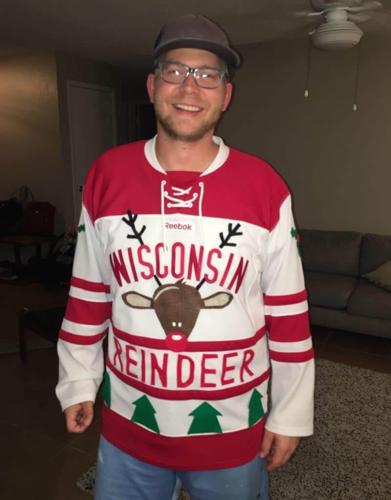
Nicely done. Here’s Scott wearing his finished design, followed by a shot of him and the other contestants at the small architecture firm where he works:
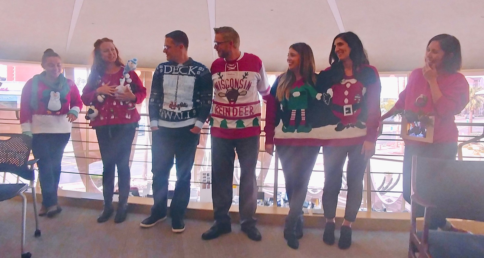
The two women in the one sweater were named the People’s Choice, the one at far left with the penguin on the front won for Cutest Sweater (Scott says he was in the running for that one), and the one at far right with the battery-powered mini-fireplace won for Most Innovative.
Despite not winning, Scott enjoyed making his sweater.”We really had some great fun coming up with it,” he says. “Makes me think of WaffleBored — though my skills are nowhere near his, I can certainly see the intrigue in making a custom design. Kinda makes we want to make a permanent custom jersey — either Wisconsin hockey or Milwaukee Brewers.” We all look forward to seeing how that turns out, Scott.
Click to enlarge
Collector’s Corner
Brinke Guthrie
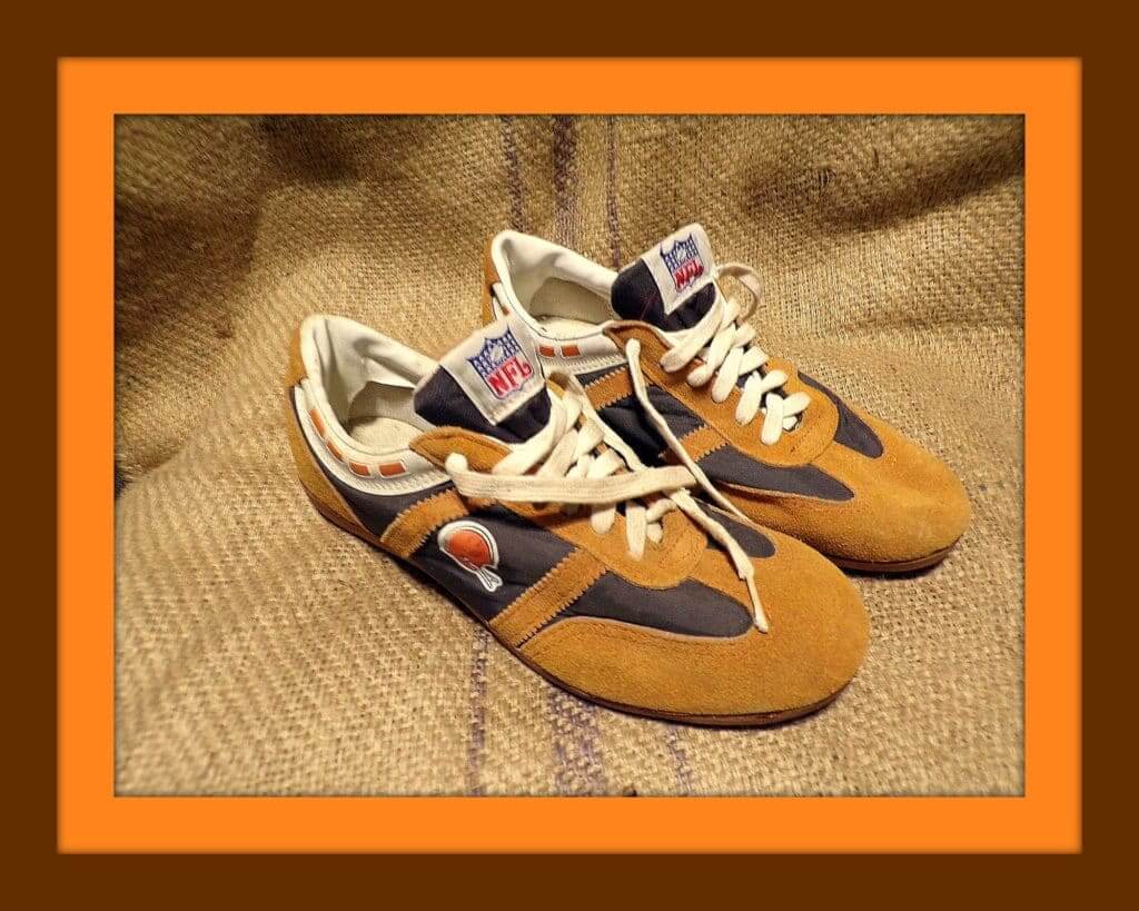
Gaaaaa, take a look at these! A pair of 1976 Cleveland Browns suede leather “cleated sport tennis shoes.”. Ponder why you need “cleats” on tennis shoes for a moment. Now, the tongue says, “NFL Action Footwear,” and these were from Sears and NFL Properties. You can see a similar style of these right here. If you wanna go full-tilt gonzo on retro Sears NFL stuff, I recommend this MeTV article. And for the ultimate in 1970s NFL insanity, WishbookWeb has it all. Be forewarned — you will kill an entire day looking through that site.
Now for the rest of this week’s picks:
• Here’s a misspelled 1972 pennant for the Minnesota Nort Stars. One more for ’em — this 1970s hockey skate/puck/stick radio!
• Here’s a 1970s 7-Up store display with Hollywood Henderson of the Cowboys and Pat Haden of the Rams. The Henderson helmet and jersey are way off, while the Rams treatment looks accurate.
• Square Pan Pizza was your sponsor for this 1979 Padres thermal cup, featuring the Swinging Friar!
• This 1970s Pittsburgh Pirates buccaneer logo mug looks to be in perfect shape.
• Never seen these before: a collection of 1970s NHL logo trays. Rangers, Caps, Blackhawks, and North Stars here. Each measures 10-3/4″ in diameter. Points taken off on the seller for having the North Stars’ logo upside-down in the photo!
• This 1970s watch by Jubilee features a red helmet with the NFL shield.
• Speaking of timepieces, here’s a pricey stocking stuffer: This “Back to Back” Super Bowl Champs watch was given to 49ers personnel in the late 1980s.
• Another one for the Niners: This retro ski cap is from the Sears NFL Shop.
• Check out this Buffalo Bills draft day helmet phone! The seller notes the facemask is “very coveted,” although maybe you have to be a serious helmet or facemask aficonado to appreciate that. (Thanks to @HelmetAddict for the tip.)
• Way back when, this Magnetic NFL Standings Board was a great way to keep track of the the standings. You could move the helmets around from week to week. (Note that the Seahawks are included in the photo and the Bucs aren’t — Seattle was an AFC team at that time.)
• Want some outstanding early-1970s NFL poster art? Doesn’t get any better than this one for the Kansas City Chiefs.
• Check out the cover of this 1976-77 Knicks game program. Yes, kids, players really did wear their shorts like that back then. Side note: Clyde sinking the jumper wearing his signature Pumas.
• From reader Will Scheibler: We often feature NFL bedsheets here on CC, but how about a set of CFL sheets!
Seen an item on eBay that would be good for Collector’s Corner? Send any submissions here.
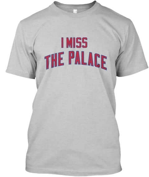
Naming Wrongs update: Someone on Twitter asked me why we didn’t have any shirts for the Palace of Auburn Hills? Good question! Not sure why hadn’t done that one before, but we’ve now rectified that oversight. It’s available in blue and grey:
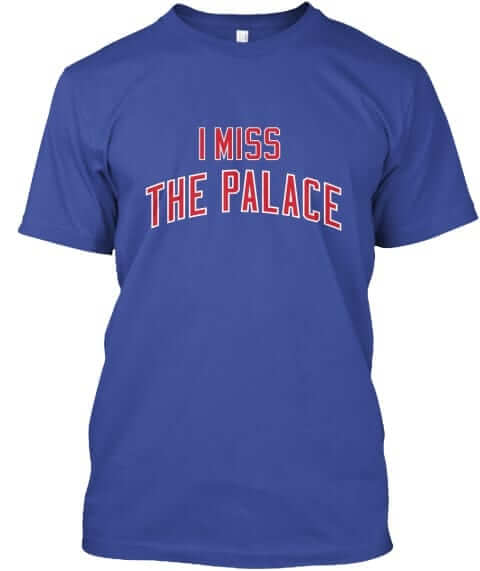
These shirts are now available in the Naming Wrongs shop (where card-carrying Uni Watch members get 15% off). My thanks, as always, for considering our products.
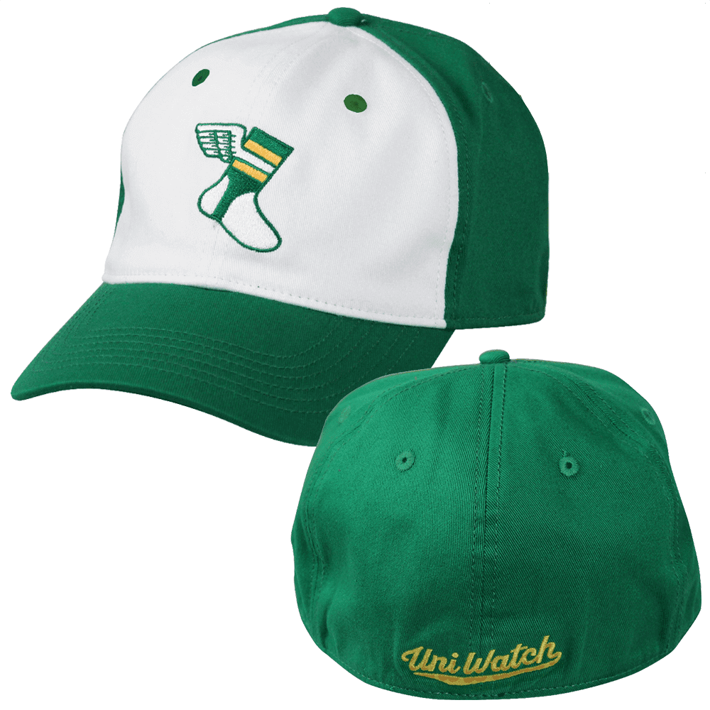
ITEM! Hats almost sold out: The good news is that our efforts to generate some sales momentum on our flex-fit Uni Watch Alternate Caps have been successful! We now have fewer than 10 L/XL caps left. So if you want one, I strongly suggest ordering one now. The price is only $19.99. Update: L/XLs are now sold out!
The bad news is that we badly miscalculated how many of the S/M caps to make. We still have about 90 of those. Please feel free to order one! Thanks.
While we’re at it: All of our fine Uni Watch products, including a few that you may have forgotten about, are listed on this one handy page.
The Ticker
By Alex Hider

Baseball News: Reader Jake Jahimiak contacted the Rays and asked if they’ll be reviving their fauxbacks for 2019. The response: “At this time we do not plan on wearing on the fauxbacks again and will be wearing the same Devil Ray [throwback] uniforms as this season.” … Baseball card heads might know this, but for the uninitiated: Topps airbrushed the Angels’ lowercase “a” logo on Nolan Ryan’s baseball card after his trade from the Mets prior to the ’72 season (while leaving his blue Mets pinstripes intact), but the team actually switched to a capital “A” logo cap starting that year (from BSmile). … New logos for the Dupage County (Illinois) Pistol Shrimp of the Prospect League, a wood bat college league. … Here’s a great old shot of Orioles 1B Boog Powell with an orange Dymo Tape name tag on his sunglasses. … Always interesting to see the Reds’ odd-looking radially arched drop-down NOBs. William Luck got those screen shots from a video of Jim Maloney’s 10-inning no-hitter from 1965. … New Hall of Fame inductees Harold Baines and Lee Smith have now dutifully gone through the ritual of wearing those miserable Hall of Fame jerseys. As you may recall, Uni Watch readers came up with some much better designs early last year.

NFL/CFL News: Former Seahawks QB Matt Hasselbeck raised the “12” flag before last night’s game and wore an era-appropriate jersey for the occasion (from Mark Simoncelli Jr.). … Vikings WR Adam Thielen had cleats made featuring a coffee ad for last night’s game. Now, Caribou Coffee does donate 10 percent of proceeds for every sale of the coffee pictured there to the University of Minnesota Masonic Children’s Hospital, but you’d think his cleats would just mention the hospital and not a coffee company. In any case, it turns out that he didn’t wear them in the game. Maybe just for pregame..? … Packers CB Bashaud Breeland had something wedged in between his facemask and visor, near his ear hole, on Sunday. Was that a mouthpiece? An extra chinstrap cup? A piece of plastic to prevent his eye from being poked? He also had it for Green Bay’s previous game, which appears to have been the first time he wore it. (from Taylor Warntjes). … Ayden Mahar noticed that ESPN’s playoff machine has some bugs that cause old logos to appear for some teams. … The CFL’s Winnipeg Blue Bombers are letting season ticket holders try to win a chance for their last name to be on a player’s jersey during pregame warmups for a preseason game (from Moe Khan). … Bears coach Matt Nagy was asked about wearing a visor while being bald (from Mike Chamernik). … Judging by this 1973 screen shot, it looks like the Oilers’ nameplates were made from a different kind of fabric than the rest of the jerseys (from Mike Selock).
College Football News: Ohio State will wear its traditional home scarlet jerseys in the Rose Bowl (from Phil). … North Carolina A&T will wear all white in the Celebration Bowl this weekend.

Hockey News: The NHL Winter Classic will feature color-changing pucks that will indicate when the pucks get too warm and need to be replaced to reduce bouncing (from Jack Wade). … The Oilers and Flames have played each other twice so far this season — on Nov. 17 in Calgary and on Sunday in Edmonton. Both times, the home team wore vintage sweaters/colors (from Wade Heidt). … The upcoming U18 Women’s World Championships in Japan have a super-cool manga-style logo (from Stan from Manhattan).

NBA News: Does this cap indicate what the Raptors’ “earned” uniform will look like? … New Nuggets guard Nick Young will wear No. 34, and new Suns F/C Eric Moreland will wear No. 23 (from Etienne Catalan).

Soccer News: Reader Bryant Ramirez noticed that Atlanta United had some patch placement inconsistencies during the MLS Cup Sunday. … The U.S. Soccer Federation Foundation and the U.S. Soccer Federation may sound like the same entity, but they’re different groups — and the USSF Foundation (a group advocating for the growth of the sport) is suing the USSF (the governing body of soccer in the US) seeking a declaration that its name and logo do not violate copyright law (from Ignacio Salazar). … Liverpool is selling a new line of “retro” shirts with no makers’ marks (from Gabriel Hurl and Alex). … Doncaster Rovers of England’s League One have a new third kit that includes a charitable ad for mental health awareness (from Jamie Rathjen). … These are all the uniforms that will be worn during the 2018 FIFA Club World Cup (from Josh Hinton). … New shirt sponsor advertiser for the Chattanooga Red Wolves (from Ed Zelaski).

Grab Bag: These are the bibs the US ski jumping team will wear at the upcoming Continental Cup (from Jim Vilk).
What always seals the fat-kicker look for me is the facemask. So many linemen have the larger, more complex bar setup on their facemask, it sort of fits in with the rest of their body (though that trend is slowly fading as newer helmets continue to be invented and players are starting to prioritize helmet weight a bit differently than before). But kicker masks almost always seem to be the super thin, smallest setup available. Just imagine if Sebastian was legally able to go single-bar last night.
Sp: Lorenzen
Got it.
Packers CB Bashaud Breeland no doubt had his mouth piece wedged in the facemask. It’s one of the pacifier-looking ones. Players will always get caught placing them in the air holes on the helmets or wherever. Never seen it there, in the side of the mask, though.
Definitely a mouthpiece. You can just make out the “mouth” portion in the first photo. Also, he does not have a mouth piece in his mouth in either photo.
Good call. It would seem to be disadvantageous for a DB to obscure his vision like that for the sake of nominally more protection.
Here’s a picture of him with said mouthpiece in his mouth.
link
The thing with Atlanta United’s crests on their shirts happens regularly. I think it might be different between different sizes. There’s supposed to always be five stripes, so for larger sizes I guess they would be thicker.
Not really the place to debate this, but there’s no way Janikowski makes the HOF. Yes, he has a big leg (ha!), but his career FG% is actually below average for the era he’s kicked in, and this is true even if you adjust for the average distance of his attempts. In addition, since he’s played on terrible teams for most of his career, he’s never had a signature playoff moment like Vinatieri has. If you replaced Janikowski with a league-average kicker in every season of his career, I’m not sure anyone would have noticed, and that’s not a flattering thing to be able to say about a purported HOF candidate.
Interesting analysis. I admit I was going mostly by longevity and his accumulation of points. Thanks for the more nuanced assessment.
Adding to that, there are only two true place-kickers in the HOF: Jan Stenerud (1991) and Morten Andersen (2017). Vinatieri is probably next, and then it’s probably a long wait.
He’s the Harold Baines of kickers.
The fat version of Harold Baines.
I’ve never been a kicker in my life, so does that make me the Clifford Baines of kickers?
(Sorry.)
Here’s a 1970s 7-Up store display with Hollywood Henderson of the Cowboys and Pat Haden of the Rams. The Henderson helmet and jersey are way off, while the Rams treatment looks accurate.
OK, this is really weird, but I have some copies of some old NFL games in my possession, and I was watching a Saints game from 1979 last night that had a 7-Up commercial with Henderson and Haden. Pretty bad commercial, and I was trying to figure out if Henderson had been cut by the Cowboys for his drug problems before this commercial ran. I guess he hadn’t been cut yet, but I think he was cut at some point in ’79.
What I find most interesting about the Liverpool throwbacks is that the actual throwbacks HAD maker’s marks on them – Reebok on the white, and adidas on the red. Since New Balance makes their current kits, the lack of maker’s marks on the throwbacks is not altruistic to preserve historical authenticity. I’m cynical but it is common sense – NB doesn’t want competitors splashing their logos on Liverpool equipment. But to take it one step further, the red jerseys aren’t “truly authentic” without the Three Stripes on the sleeves!
Nothing stops a team from selling manufacturer appropriate throwbacks.
Example: Tottenham Hotspur is currently a Nike outfitted club. Their official site sells retro shirts, of which there are Hummel and Admiral tops. Both have the makers mark. The Admiral shirt even has the logos along the sleeve and collar.
link
Hmmm. So is it spite then?
The font for that “Official Game Puck” is rather poorly chosen. Looks to much like the “P” is…not a “P”.
PROOFREADING: An extra “this weekend” in the North Carolina A&T football item.
On the MeTV article with NFL gear, I sensed a pattern of “also available, not shown: Cardinals and Chiefs.” Getting Chiefs gear from Sears was huge back when I was a boy in Kansas City. I guess they didn’t sell as much of it nationwide.
Wow, two Boog Powell references today. Kind of forgot he played for Cleveland. Looked him up and was surprised that he ended his career with the Dodgers in 1977, Tommy Lasorda’s first season as manager. He only played in 50 games with 41 AB, as a pinch hitter. He was released on August 31, so didn’t play in the NLCS or World Series.
Confession: I found the shot of Boog’s sunglasses while looking for the blood-clot photo. Used the blood-clot shot in the lede and added the sunglasses shot to the Ticker.
Love the new naming wrongs offering! Just a heads up that it was The Palace of Auburn Hills not “at” as referenced in today’s post.
Ah, thanks. Text fixed. Doesn’t affect the shirt, thankfully!
I’m a Seahawk fan, and they should wear these only once a year. And Janikowski looks like a telatubbie in that uniform
I’m also a Seahawk fan. I dont mind the green uniform i just wish they would wear them with blue socks and blue under shirts.
You don’t find his number 11 to be slimming?
Great job on the ugly sweater design, Scott! I’d have voted for yours for the cutest, if not best over all–penguins don’t belong on holiday sweaters!
It seems the artist that drew the figures on the CFL bed sheet may have never actually seen a quarterback throw a football. Perhaps the artist has never even seen a football before.
I still like the art work though! Charming.
Lee
Also, the bed sheets have Saskatchewan’s name wrong with it broken into 2 words. Ottawa Rough Riders right. Should be Saskatchewan Roughriders.
It didn’t occur to me until seeing the lede photo – last night’s uni matchup was essentially the Constructicons playing football.
All we need is Blitzwing on the sideline coaching them. “Zone Defense! The Long Bomb!”
“Triple Takeover” is still a hilariously ridiculous episode of the original Transformers series.
My wife asked me in a serious voice if the Seahawks are sponsored by Mountain Dew.
Janikowski’s jersey # also contributes to his ridiculousness in neon. 11 is a skinny man’s number. It could only be worse if he went single digits.
At this time we do not plan on wearing on the fauxbacks again
Then you’re dead to me, Rays. Move to Montreal and become the Expos.
Move Washington to the AL (DC’s ‘traditional’ league) to make room in the NL East for the Expos?
Sounds ok to me.
But then do these new Expos get to (re) claim the all of Montreal’s MLB history from the Nats and also retain all that goes with their Tampa Bay past?
Thought-provoking to say the least.
If the Rays hadn’t been around before the Expos moved, maybe the history thing might work. However, they not only co-existed for several years, they actually played each other in interleague play.
I say keep them in the AL. Then they’ll have a regular thing going with the Blue Jays.
The Seahawks spent their inaugural 1976 season in the NFC West and the Bucs in the AFC West. They swapped conferences in 1977.
The CFL bedsheets and Cleveland Browns sneakers reminded me of a pair of CFL themed sneakers I owned when I was 6, as a youngster in British Columbia. They were similar to Converse allstars and the CFL helmets were all facing outward around the rubber soul. Wish I still had them. If I can rustle up a photo from the web, I’ll send it to you.
I owned a pair of those Cleated Sport Tennis Shoes in the 1970s. Not anything fancy like the Cleveland Browns ones, just generic ones.
They sucked. The bottoms were like hard little nubs that all broke off the first time I wore them to play street hockey.
My best guess is that in the 1970s everything was called “tennis shoes”, whether you were using them to play tennis or not. Any sneakers for everyday use were tennis shoes.
link
Orlando Thunder lime green with navy trim unis > Seahawks lime green with navy trim unis.
link
I wish I would have had a black and white HD TV last night…
I’m looking forward to seeing how that turns out