
Way back in June of 2016, I did a blog post about Bucco Bruce’s name. Reader Matt Sammon responded a few weeks later by sending me some really interesting Bucs info — which then got buried in my in-box, where I kind of forgot about it. Two and a half years later, I’m finally dealing with it.
At the time, Matt wrote to me, “I was able to get over to the John F. Germany library in downtown Tampa and go through the old newspaper collections they have. In the 1960s and ’70s, someone at the library had cut out and cataloged every story in the local papers. I found a treasure trove of info on the Buccaneers’ name, colors, and uniform.”
Here are the primary things Matt discovered:
1. “Buccaneers” won two different name-the-team competitions. According to a Tampa Tribune article from Feb. 16, 1975 (a good year and a half before the team’s first NFL game), “a 14-man advisory committee sifted through 400 names” and quickly settled on “Buccaneers.” But that wasn’t much of a surprise because, according to that same article, “WFLA Radio held a Name-The-Team Contest in 1974. Its judges selected Tampa Bay Buccaneers as their pick. … Dr. Richard Molloy of Tampa Carrollwood sent in the first received recommendation of that name and 45 more suggested the same name.” Here’s the full article (click to slightly enlarge):
2. St. Petersburg residents resented the name. On that same day — Feb. 16, 1975 — St. Petersburg Times columnist Hubert Mizell suggested that sportswriters use the shorthand term “Bay Bucs” for the team. “There has always been a battle between Tampa and St. Pete (not all that different from Minneapolis and St. Paul), and this was supposed to placate them,” says Matt. “According to a team timeline from the special edition of the Tribune, a month after the name was announced, St. Pete business leaders tried to get the name changed to be more regionally appealing.”
3. The Bucs’ current logo is exactly what the original management team tried to avoid. An article from the July 25, 1976, edition of The Tampa Tribune-Times described how the team drew a distinction between a pirate, which was considered “scruffy” and “hairy-legged” and “sweaty-looking,” and a buccaneer, which ownership described as “high-class” and “devil-may-care.” The article says that Lamar Sparkman, who created the logo mascot, originally came up with a skull and crossbones design, but management rejected it because it was too pirate-y. The Bucs’ current logo, of course, is a skull and crossbones.
4. There were separate left- and right-side versions of the mascot. According to that same article, “[T]wo different symbols had to be drawn to go on the sides of the Bucs’ helmets. The plum feather has to be facing backwards on both sides, so it was necessary to redraw the logo to fit those specifications.”
Plenty of teams have separate logo variations for the two sides of their helmet, of course, but I hadn’t realized that the Bucs had done this. Sure enough (click to enlarge):
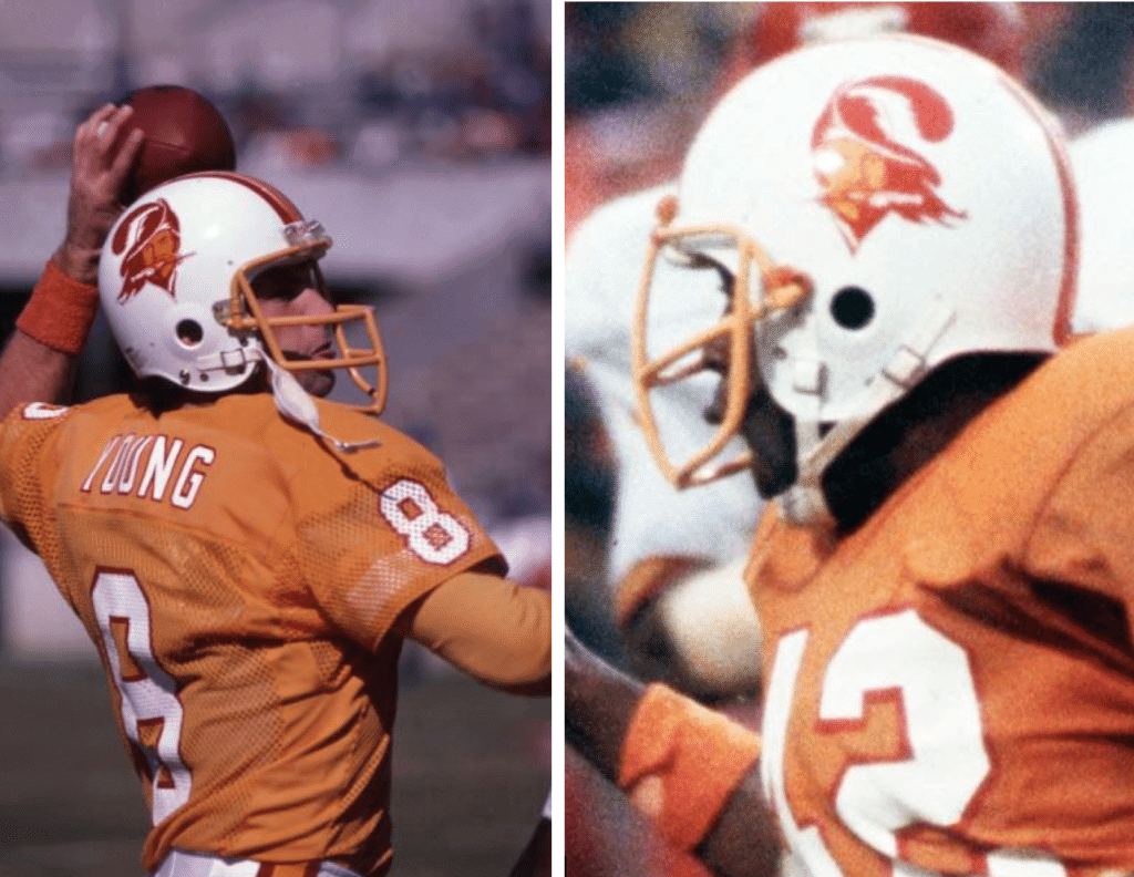
5. At least one female team employee thought the mascot was sexy. There’s been debate over whether whether Bucco Bruce is gay, and/or whether the nickname “Bucco Bruce” (which was never the mascot’s official name) was intended as a gay slur. But according to that same article, a woman named Glenna Hancock, who worked in PR for the team at the time, thought the mascot’s wink “looked like a leer, and that it was kind of sexy.” Of course, lots of women find gay men sexy, but you get the idea — the team clearly thought the character epitomized a kind of classy masculinity.
6. The original team colors were slated to be orange and green. At one point in 1975, after the team name had been chosen but before the logo or uniforms had been settled, a St. Petersburg Times artist came up with a placeholder logo and a mascot. Both featured orange and green:
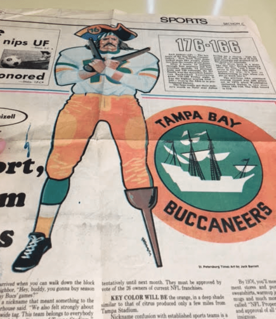
While these renderings weren’t official, the team really was planning to go with that color scheme at the time. A 1975 Tampa Tribune article explains that green was later scrapped “because of possible conflicts with colors now used by the Miami Dolphins and Florida A&M University.” Matt says he saw another article that mentioned a similar concern regarding the University of Miami.
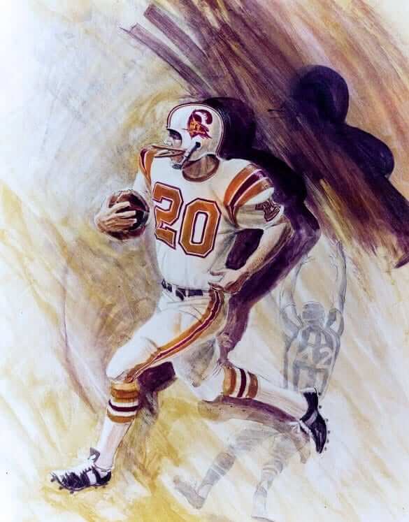
7. The uniforms were originally supposed to have shoulder stripes. On June 15, 1975, The St. Petersburg Times published a team rendering of what the Bucs’ uniforms would look like. It featured shoulder striping, among other details that never made it to the finished uniforms:
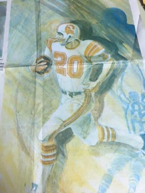
Update: The great Pro Football Journal has provided a higher-res version of that image (click to enlarge):
All very interesting! Big thanks to Matt for all of this research, and even bigger apologies for my sitting on it for so long.
Raffle results: The winner of the Vintage Brand raffle is Joey Shemansik. He says he’ll probably choose something Notre Dame-related as a Christmas gift for his brother. Congrats to him, and thanks to all who entered.
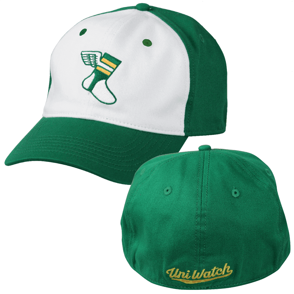
ITEM! Free shipping: We recently offered a one-week additional $5 price break on our flex-fit Uni Watch Alternate Cap, knocking the price down to $19.99. While the price has now gone back to $24.99 (still cheaper than the original $29.99), we’ve decided to offer free shipping, which is more or less the same thing as maintaining the price break. If you’re thinking, “Wow, he must really have a lot of unsold caps that he’s trying to move,” you’re right! Get yours here.
Meanwhile: All of our fine Uni Watch products, including a few that you may have forgotten about, are listed on this one handy page.

For all photos in this section, click to enlarge
And speaking of that cap…: Longtime reader Joe Werner (that’s him above) and his family have an annual Christmas ritual. “We always cut our own tree,” he says. “And every year when we go to the tree farm, I wear the same flannel shirt (I’ve had it for over 20 years!), and one of my many sports caps. In the past I’ve repped the Pirates’ 1971 throwback, a generic Steelers hat, an RIT Tigers hat (my alma mater), and a Rochester Red Wings FC (Flower City) alternate, just to name a few. This year, it was the Uni Watch Alternate!”
How cool is that? I’m genuinely honored that Uni Watch was part of Joe’s family tradition. And Joe wasn’t the only participant — he let one of his daughters wear the cap while he cut down the tree, so the cap wouldn’t get dirty:

And there’s more: “This picture of my family next to our tree will go in our annual picture calendar,” say Joe, “so the cap will be immortalized in our 2019 calendar!” Here’s that photo:

This is all pretty amazing. Big thanks to Joe for sharing all of this — it’s very, very special.

KRC update: The latest installment of Key Ring Chronicles is actually sports-related! It’s about an Atlanta Thrashers key tag, and there’s also a Red Sox angle. Check it out here.


Rabbit hole becomes wormhole: Back in 2011, I participated in sports-themed “issue” of the performance series Pop-Up Magazine (which, incidentally, was purchased earlier this week by Steve Jobs’s widow). One of the other participants that night was a Bay Area-based artist/writer named Jenny Odell (that’s her at right), who I’d never heard of before, but I’ve followed her work since then and have decided that she’s sort of a genius. It doesn’t hurt that her “About” page begins by saying, “My work is generally an argument for the rewards of close observation,” something I wish I’d come up with as a description for my own work.
The article is lengthy, and you’ll have to spend a NYT click on it, but it’s so, so worth it. Best thing you’ll read today, guaranteed. Don’t miss.
The Ticker
By Yianni Varonis

Baseball News: Incredible visuals from this new video footage of a Babe Ruth and Lou Gehrig barnstorming tour that was recently discovered. … You probably know that there was a baseball centennial patch that major and minor league teams wore on their sleeves in 1939. What you might not know is that the patch design had to be revised — the original version featured a ballplayer who looked too much like Joe DiMaggio. But two teams — the Philadelphia Athletics and the minor league Baltimore Orioles — used the original version. So in this photo of Orioles manager Rogers Hornsby and Toronto Maple Leafs manager Tony Lazzeri, Hornsby is wearing the original patch while Lazzeri is wearing the revised patch, although we can’t quite see it on his sleeve (from Will Shoken). … Here’s a look at the Astros’ uniforms through the years. … Rapper Jay-Z is in a legal battle stemming from the agreement between Major League Baseball and his clothing brand company, Roc Nation, to sell New Era baseball caps with the Roc Nation logo (NYT link).
College Football News: Navy will wear a uniform featuring its mascot, “Bill the Goat,” against Army on Dec. 6. … Vanderbilt TE Turner Cockrell unfortunately passed away yesterday after his year-long battle with cancer. His high school teammate, Citadel QB Brandon Rainey, has been wearing No. 82 in honor of Cockrell. … Despite being the designated home team, Oklahoma will wear its cream alternates vs. Texas in the Big XII championship game. It’s worth noting that the Sooners lost to the Longhorns earlier this year while wearing their crimson jerseys (from Sam McKinley). … In its regular season finale, South Carolina will wear its script Carolina helmets with black jerseys and garnet pants (from Brett Shugart). … We mentioned earlier this week that Cal will wear a helmet decal this weekend honoring the victims of the Northern California wildfires. Now it turns out that the opposing team, Stanford, will wear the same decal, but in cardinal. … A site that documents Auburn sports now features football uniforms dating back to 1933. … Wearing No. 25 for Virginia Tech this week will be WR Tre Turner (from Andrew Cosentino).

Hockey News: The Bruins retired Rick Middleton’s No. 16 last night. All Bruins players wore No. 16 jerseys during pregame activities, and the team wore a commemorative patch during the game (from Anil Adyanthaya).

NBA News: The Thunder’s fifth uniform set — the “Earned” design — may have leaked. … A young girl and fan of Warriors PG Steph Curry wrote him a letter expressing her disappointment that his shoes weren’t available in girls’ sizes. Curry wrote a letter in return, assuring her that he’s addressed the problem and inviting her to join him on International Women’s Day in March (from our own Brinke Guthrie). … CBS has ranked its view of the best City alternate uniforms from top to bottom. … Reader Andy Vander Meulen reports that there’s a store in Seattle dedicated to selling Sonics gear, even though the team left town a decade ago. He also used to run a camp gift shop that sold out of this T-shirt design reminiscent of the old Sonics skyline logo. … The Hawks’ e-team, called the Hawks Talon Gaming Club, unveiled its logos and colors yesterday. … The Pacers wore their Hickory throwbacks, which include yellow shorts, against the yellow-clad Lakers last night. … Lakers coach Luke Walton and Raptors coach Nick Nurse supported former broadcaster Craig Sager’s foundation by wearing wacky sportsjackets last night (from WB Young). … New uni number assignments: Brandon Goodwin will wear No. 6 for the Nuggets, Alec Burks will wear No. 10 for the Cavs, and Kyle Korver will wear No. 26 for the Jazz.

Soccer News: Footy Headlines says it’s confirmed that Nike’s 2019-2020 kits will feature a classic Nike logo. It’s rumored that the kits will be influenced by designs from the 1990s. The article also features a graphic showing the evolution of the Nike logo (from Josh Hinton). … Also from Josh: Details about French club PSG’s new away kit might have leaked, including that it will feature the Jordan Brand logo. … Scottish club Celtic normally wears the logo of an online betting company on the front of its jerseys. But in a match yesterday in Norway, where gambling advertising has been regulated, Celtic instead wore its foundation logo (from Ed Zelaski). … The Michigan Bucks of the USL League Two are asking fans to vote on a potential new name for the team and possibly a new logo and colors.

Grab Bag: The Vancouver Warriors of the National Lacrosse League unveiled a new uniform set (from Wade Heidt). … Prada is attempting to give the America’s Cup, the global yacht racing competition, a more modern “visual identity” (from Jeremy Brahm). … This fashion designer reuses old military uniforms and turns them into bags, with some of the proceeds donated to veterans’ organizations. … The U.S. Air Force’s new physical training uniform may have leaked. … Vogue featured a design duo who partnered with Fila to develop a line of Indian-inspired athleisure clothing. … Also in the baseball section: Rapper Jay-Z is in a legal battle stemming from the agreement between Major League Baseball and his clothing brand company, Roc Nation, to sell New Era baseball caps with the Roc Nation logo (NYT link). … George Washington University’s water polo team has some pretty nifty robes (from Matt Eliot).
I’m going out to the Meadowlands this morning to interview someone connected with the Giants (no, not Joe Skiba). Play nice while I’m away, okay? Thanks. — Paul
The peg-legged Bucs mascot in the pre-logo newspaper article is one of the greatest things I’ve ever seen.
Agreed. I’m not even a Bucs fan and I would 100% buy a t-shirt with that logo.
Yes, and on that same newspaper graphic is a roundel logo featuring a pirate ship; the Bucs started using a pirate ship as an alternate/secondary logo in 1997, the same year the primary logo became a red Jolly Roger (featuring a skull, crossed cutlasses & a football) attached to a cutlass.
Good stuff! Thank you Paul & Matt!
that paragraph in the MLB section about the dimaggio patch seems like it was pasted in there twice (though worded somewhat differently). feels like part of it is redundant perhaps?
Yes, my bad. Fixed.
“The plum[e] feather has to be facing backwards on both sides, so it was necessary to redraw the logo to fit those specifications.”
Just looks like a mirror image to me. No real reason to “redraw” (ala the Chiefs, Ravens)–unless we’re talking about ancient 1974 graphic art technology being the reason.
Am I missing a “redraw” detail?
I actually think it is just mirrored, but back then, mirroring meant actually redrawing it, vs today just flipping it on your computer. I don’t think there’s any actual differences in those pics above.
Agree. Same thing as the Cardinals or Seahawks “mirrored” images on their helmets.
In The Ticker it looks like there are two versions of the same story about the 1939 baseball centennial patch.
Yes — sorry, Will. My bad. Fixed!
“The Bucs’ current logo, of course, is a skull and crossbones.”
The current logo has a skull and crossed swords. Though the sentiment stands that the logo is a bit more scruffy/pirate than the jaunty Bucco Bruce.
“Of course, lots of women find gay men sexy, ”
Please explain. Is it because they are gay?
It’s a common cultural trope — a cliché, really — that a single woman will be attracted to a man, only to discover that he’s gay. (Naturally, there’s a Seinfeld episode devoted to this.)
Got it. Perhaps I should have taken the “Of course” part in a different tone.
aka The Keith Hernandez cameos
No, actually — this one:
link
“Not that there’s anything wrong with that.”
That Bucs piece was great!
What is up with Steve Young’s shoulder stripes? Is that a practice jersey?
Looks like they are cuffed inside the sleeve?
Wow, yeah… looks like Steve wanted shorter sleeves, and instead of just cutting off and hemming, they folded them up inside with a hard crease at the edge and maybe sewed it up in there. The mesh allows us to see the backside of the stripes through it. Interesting, inadvertent quirk in that pic.
Love today’s entry on the Bucs. As an additional note, the name “Bay Bucs” was indeed championed by sportswriters for several years on the west side of the bay. While doing research for a story I wrote years ago (and was ticker-linked here, I believe), I found that the St. Pete Times used “Bay Bucs” regularly for the first three seasons. But some other Pinellas County papers were still using the name as late as 1984.
In that same story we found out that the Tampa Bay Rowdies were the first pro team to use “Tampa Bay” over “Tampa,” beating the Bucs by about a month. Although both were beaten to the punch by Tampa Bay Tech High School.
link
I love those little newspaper quirks. Like how the Milwaukee Journal used to call the Minnesota Twins the “Twin Cities Twins” for their first few changes, or how the two Milwaukee papers couldn’t agree on a nickname for the city’s AAGPBL team, with the Journal calling them the “Schnitts” and the Sentinel preferring “Chicks”.
I always thought that kind of thing had died out by the mid-1960s; I’m pleasantly surprised to see it lasted a couple decades longer in St. Petersburg.
“first few changes”? No, their first few seasons.
My kingdom for an edit button….
Kawhi Leonard signed with NewBalance but I was hoping he would wear Palessi shoes instead
link
Thanks for the “A Business With No End” link via the New York Times. It was a fun piece to read.
Glad you liked, Drew! It’s sooooooo fascinating!!
I loved it. It was well written and entertaining. I enjoyed the not so subtle snarkiness and dry humor. It was very thought provoking. I will have to remember her name and read some of her other writing.
She’s completely brilliant — as much for her art projects as for her writing. Explore the “projects” section of her website. Amazing stuff!
Thank you very much for today’s blog on the Bucs, you’ve addressed an issue that has bothered me for years, their original colors. The one thing I find still a little unsolved. – apologize for the length for what I’ve copied below – this paragraph from a 1976 Sports Illustrated article on the Seahawks – indicates the original green for the Bucs – was to be a pale green. Maybe the article is wrong, or maybe the above picture qualifies as pale green
Copied from the article:
The list was reduced to seven names—Cascades, Evergreens, Mariners, Olympics, Pioneers, Sockeyes and Seahawks—and Seahawks was judged to be most suitable and to have the most graphic potential. The team colors also had to be approved by NFL Creative Services (Tampa’s first choice, orange and pale green, was discarded for being too similar to the Dolphins’ colors). Seattle settled on silver, blue and green, the last two representing the waters and the forests that surround Seattle. And Creative Services came up with a wonderfully fierce Seahawk logo. It is creative, indeed, because The National Audubon Society insists that the sea hawk is a thief, a skua or a jaeger that specializes in robbing other sea birds of their food. Thompson, however, claims his Seahawk is a dashing, handsome, graceful osprey that swoops from the sky to snatch fish from the sea.
On the ornithological note, the highlight of a trip to George Washington’s birthplace a few years ago was the view over the nearby river, where a pair of osprey were elegantly fishing, and after almost every catch, a bald eagle would alight from the riverbank treetops to try to steal the catch. The osprey dropped most of their catches, and the eagle managed to catch a few of the dropped fish. But mostly, the eagle just frightened the osprey to drop the still-living fish back in the river. Avian catch and release.
I do love the Seahawks logo and their original colors.
It still puzzles me why they didn’t put the logo on their helmet until their second season.
“… they didn’t put the logo on their helmet until their second season.”
are you trolling us?
or are you looking at your Topps cards?
The higher-res version of the Bucs uniform seem to be incorrect colors. Instead of orange and red, it appears to be orange and maroon or purple.
I agree. First thing I thought was it looked very Virginia Tech-y.
Love me some Jenny Odell and some Bucco Bruce, so this was an especially good entry for me.
Bruce is on the top of my list, followed closely by Pat Patriot, of “uniforms that should come back as the standard uniform for a team currently in a crappy uniform”. I remember vividly the 1979 Tampa Bay Bucs season, with Ricky Bell, Doug Williams, Jimmie Giles, and Lee Roy Selmon, ultimately losing 9-0 to the Vince Ferragamo-led Rams in the NFL Championship.
If I remember correctly the back of the helmet stripe, where it met the base of the helmet, was rounded, and for some reason that sticks with me, 39 years later.
Uniform solution for the Bucs. Bring back a uniform that more closely resembles the original, but keep some of the aspects of the newer look.
In other words, need to go back to the white helmet/orange jersey/white pants. More traditional striping and number font.
However, Bucco Bruce needs to stay retired. Red as the dominant trim colour but also a bit of pewter as an accenting colour. The current logo would work fine with this redesign, albeit it needs to be much smaller on the helmet.
Wade, I’m curious why you feel Bruce should stay retired? I find him a lot more memorable than the current logo, which always looked like a Raiders secondary logo to me.
Hey Winter,
I would not be a fan of the original Bucco Bruce as a modern day logo. It is a bit different than simplier, classic logos that may be just letters that transcend eras, Bucco is such a detailed logo. Bucco just has a dated look to me that seems to not age well to being a primary logo in 2018. Just my opinion. Fine to wear it as a throwback once in a while.
The Bucs have had the flag on the sword logo now for over 20 years (though I understand there have been some modifications). They’ve had some of the best seasons in their existence with a version that logo, including a Super Bowl win.
My pitch for the uniform I cited earlier would be a great mix of the 2 uniform eras. A brand new uniform. We get back the unique, classic Bucs look, but with some accenting pewter and keep a rendition of the current logo which has some history and a championship season attached.
I always liked this concept:
link
Yes please!
The NLL’s Vancouver Warriors uniform kind of has this New Orleans Saints feel to it with the stripes on the jersey. What the Saints jersey could look like if it was a lacrosse team.
Striping quite similar to the Saints jersey back in the 1980s.
link
“There’s been debate over whether whether Bucco Bruce is gay…”
Really? I am sure people called him “gay”, or said he looked “gay”, but there is no way in hell that anyone in the Buccaneers organization (or NFL) at the time said “hey, our mascot is gonna be gay, let’s start there!”.
Hopefully thats just weird phrasing.
Lee
Another thank you for the “A Business With No End” link.
Several years before Tampa was awarded a franchise in 74 Bob Irsay took ownership of the Colts and was immediately involved in a dispute with Baltimore over replacing Memorial Stadium. Tampa officials invited him to have a look at their city. Bumper stickers started appearing in Baltimore with the Colt horseshoe and the words ‘Don’t TAMPA with our Colts’. In 84 the Colts moved to Indianapolis.
Ticker Typo: The Army/Navy game is Dec 8th
I really enjoyed the Key Ring Chronicles entry today (as I usually do). I don’t have anything on my key ring besides keys, but I enjoy reading the stories of those who have something with personal meaning that they carry with them.
Buccaneers is a great team name. I always picked them for my team in Madden because of their Jon Gruden era uniforms. They are my second team next to the Giants but watching the Bucs in their current uni’s bugs me. Those uniforms could clean up very easily I don’t know why it’s so difficult for the design team to get it.
IIRC, at the Pro Football Hall of Fame, the original prototype for Tampa Bay’s helmet is on display, with Bruce painted by hand on the white helmet.
You can check out some early designs by going to the lobby if their building.shows various helmet designs that were never used.
Re: military bags
This isn’t the first company to do this. There is a company, R. Rivieter, that was on shark tank a few years ago that does the same thing. They employee military spouses from all over the country to make their products
Minor quibble: The current Bucs logo shows crossed swords, not crossbones.
Really? Not a single mention of the gorgeous Saints/Cowboys game last night? Cowboys CR set is gorgeous.
The Pac12 championship game between Utah and Washington tonight is a really nice looking game uniform-wise.