When I was a kid, I spent hours poring over the book The Pros, which one of my brothers had purchased years earlier and left behind in our house after he went off to college. It featured tons of great NFL photos from the late 1950s (and also lots of great illustrations and tons of fascinating info — highly recommended). Naturally, I paid close attention to the uniforms, and I was particularly intrigued by a shot of Giants linebacker Bill Svoboda, who wore two single-bar facemasks in an odd configuration:
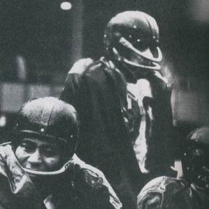
So I’ve known about that mask since I was a little kid. But it turns out that the 1950s Giants had another player with an unusual mask — one that I’ve never seen until now, and that the good folks at Helmet Hut have brought to light.
The player in question is offensive lineman Bill Austin. Check out what he wore in 1955:
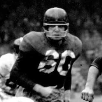
As you can see, he had a Lucite bar down at his jaw (lots of NFLers wore this accessory in 1954 and ’55, after which the NFL banned them because they tended to shatter during cold weather) and a traditional single-bar attachment up around his eyes — bizarre! The Helmet Hut crew has put together a reproduction of this design, so we can get a better look at it:
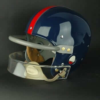
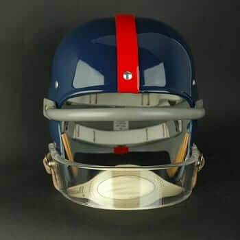
It’s hard to imagine how you could play with that setup. Wouldn’t the upper bar interfere with your vision? I’ve never seen anything like it. Has anyone else?
Incidentally, Helmet Hut also created a reproduction of Svoboda’s helmet — the one I obsessed over after seeing it in that book when I was a kid. (And if you don’t know it already, the Helmet Hut site is full of great photos and info — definitely worth exploring.
(My thanks to reader Bill Kellick for letting me know that the Austin design had recently been added to the Helmet Hut site.)
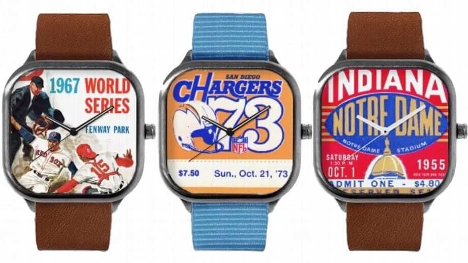
Gift Guide reminder: In case you missed it on Monday, my annual Uni Watch Holiday Gift Guide, filled with all sorts of cool uni-related gift items (including the retro-styled wristwatches shown above), is now available. Check it out here.
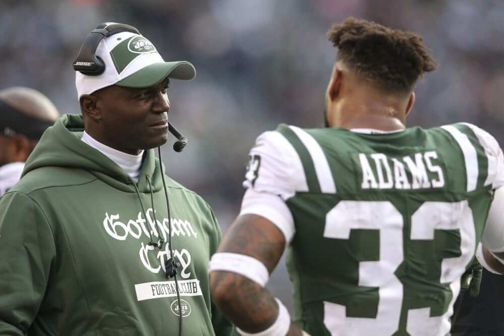
Click to enlarge
Holy lame-o merchandise, Batman! I neglected to mention in yesterday’s MMUW report that Jets sideline personnel (including coach-for-now Todd Bowles, shown above) were wearing “Gotham City” pullovers. My first thought when I saw this on Sunday was, “Okaaaaay — the Jets, who don’t actually play in New York, are repping a fictitious city that’s supposed to be New York, only it’s in a comic book. Yeah, that sounds about right.”
Later in the day I learned that there’s a Jets fan club called the Gotham City Crew, so I guess that’s the connection. But what I didn’t realize until yesterday, when reader Kevin McLaughlin pointed it out to me, is that the typeface on the sideline pullovers is modeled on — but is not an exact match for — a sign that appeared in the old 1960s Batman TV show (click to enlarge):
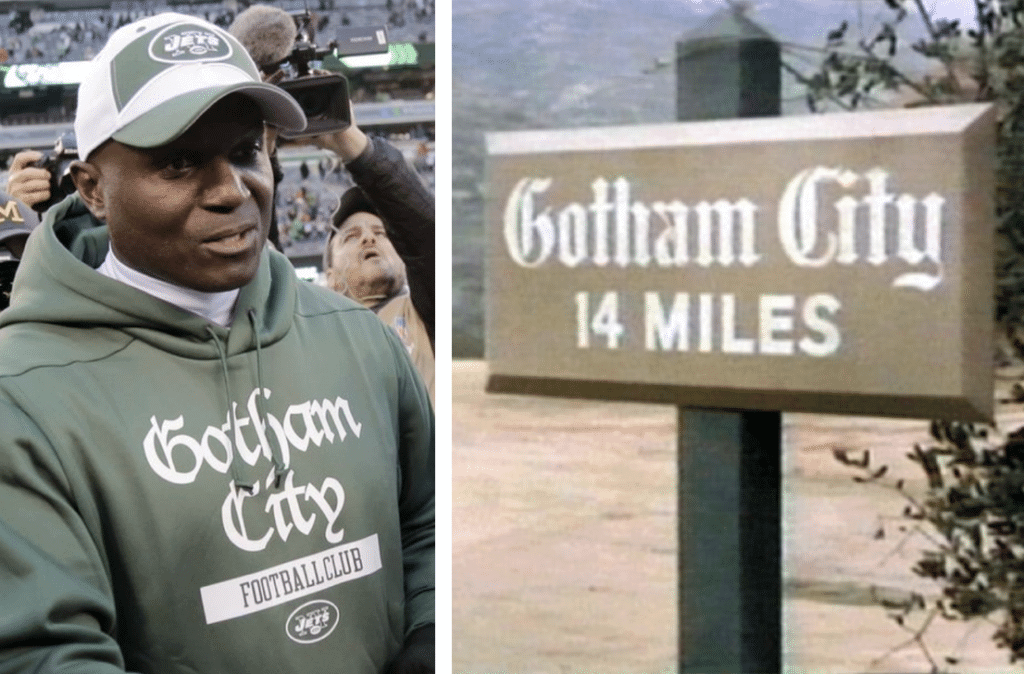
It’s usually pointless to try to apply any kind of rational thinking to the Jets, so I’m just gonna leave this out here and let everyone else figure out what, if anything, to say about it.
(This is the part where I have to say that at least this pullover is better than the nonsense they wore for their previous game, but that’s almost too obvious, right?)
[Editor’s Note: Two weeks ago, reader Bryan West-Whitman showed off the Pittsburgh-colored socks that his wife had knit him. Now he’s back with his own DIY project. Enjoy. — PL]
My DIY Tulane Cap
By Bryan West-Whitman
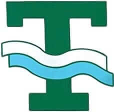
When I was a freshman at Tulane, they had a block “T” logo with two waves washing over the stem of the letter. I used to have a green cap with that logo, which I wore until it basically fell apart. By that time, the school had changed logos, so a replacement cap was hard to find.
My wife, in addition to being a great knitter, is an accomplished embroiderer. Watching her gave me the idea to just make my own retro logo hat. I found a nice plain green hat and then plundered my wife’s supplies to get the job done.
My original cap — the one that fell apart — had a white “T” with green and blue waves that were outlined in white. I knew I wouldn’t have the talent or patience for that, so I decided to go with white and blue waves over a black “T.” I think the black looks good on the green, and it also hides my mistakes. Here are some photos showing various stages of the cap [for all of these, you can click to enlarge]:

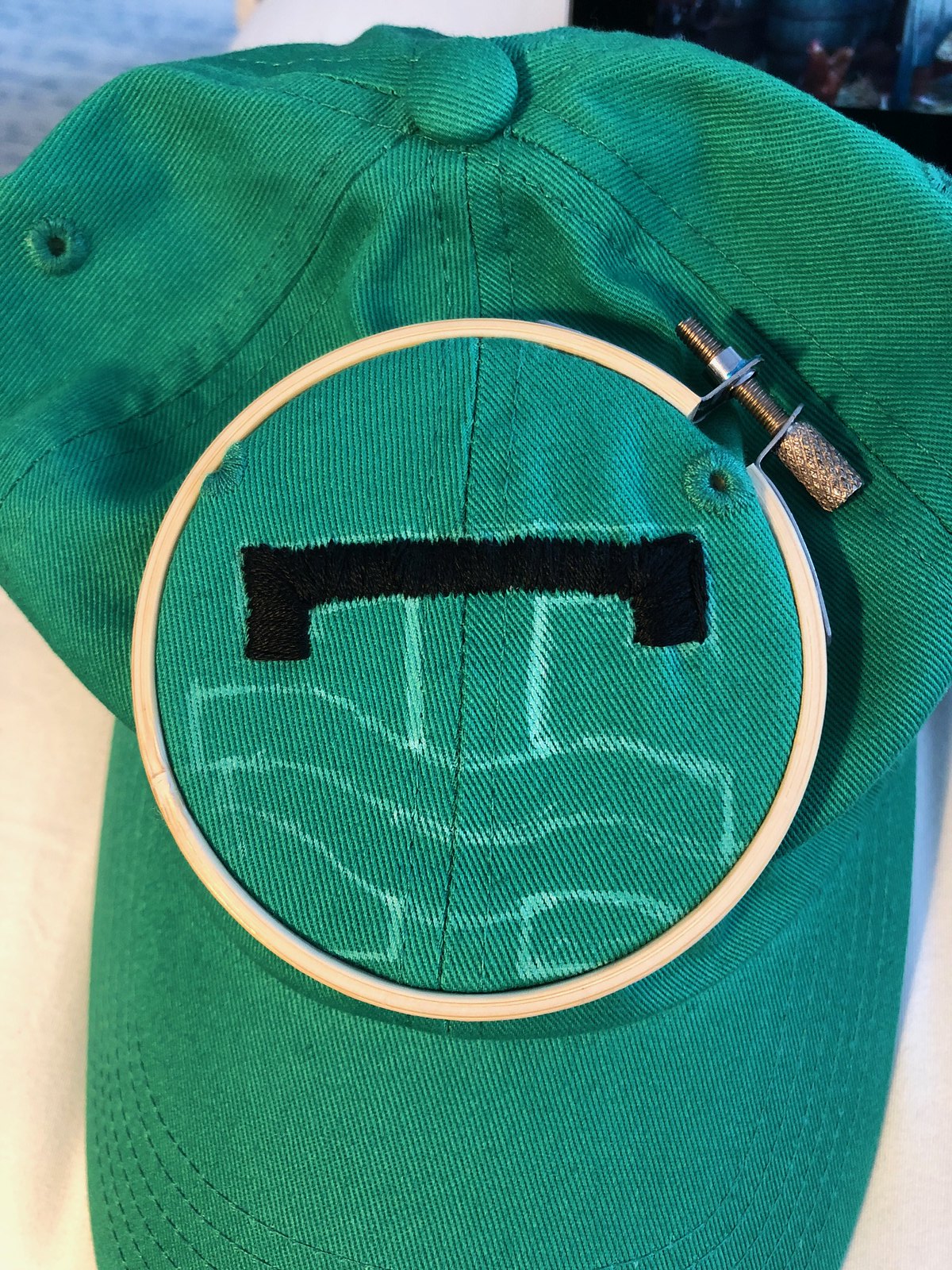
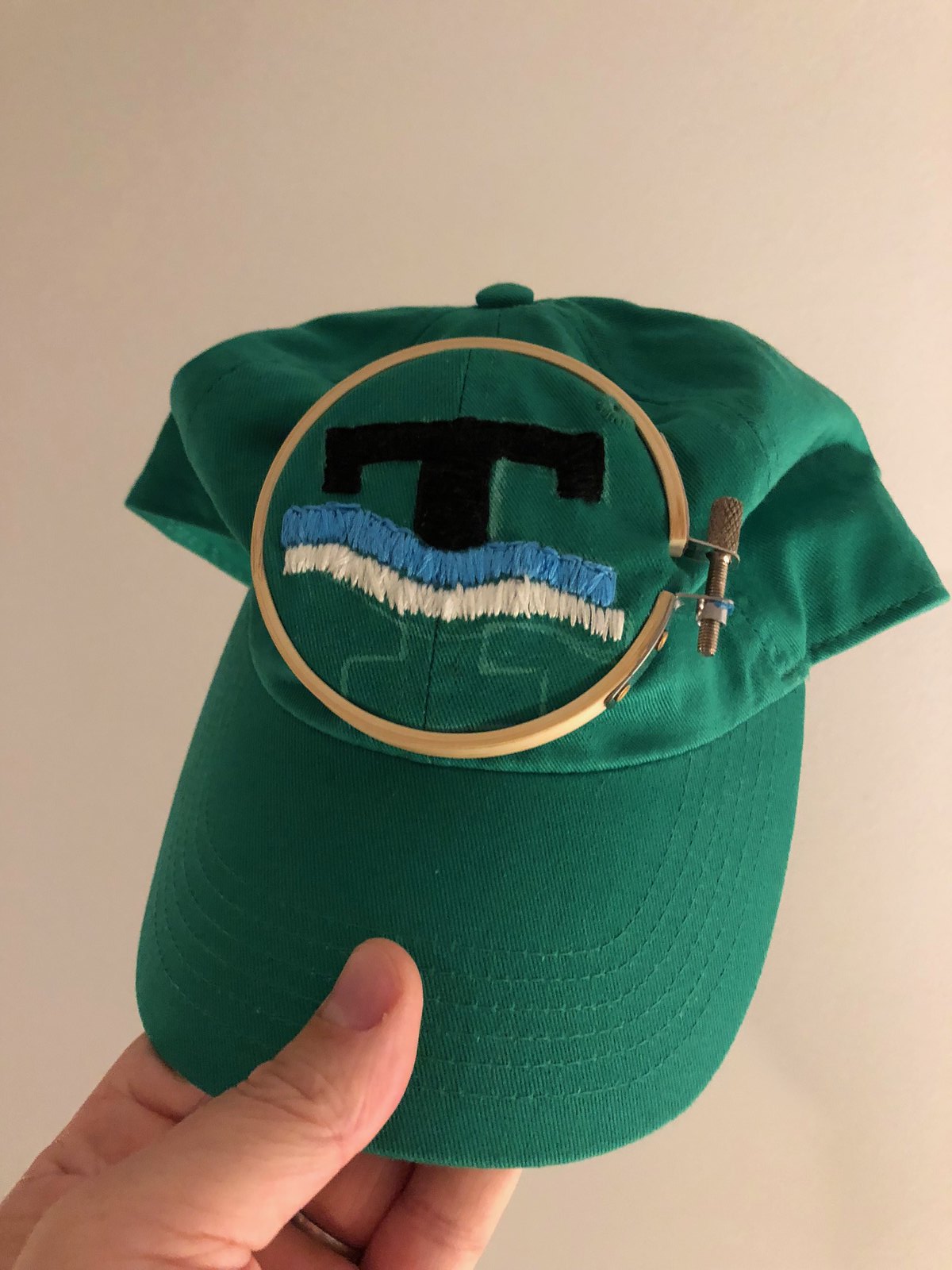

This was my first time embroidering. It was difficult, and it shows — the quality is not perfect. But it was fun, and the effort I devoted to it makes me appreciate it even more.
Collector’s Corner
By Brinke Guthrie
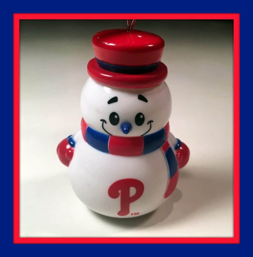
’Tis the season to start decorating your Christmas tree. Phillies fans will love seeing this little snowman dude on their tree, no? See more ornaments for the NFL, NBA, NHL and MLB.
Now for the rest of this week’s picks:
• This 1960s Boston Celtics hand fan (green on one side, white on the other) says, “The Celtics Are Fan-tastic.”
• Put these 1970s “puffy stickers” in your favorite Dodgers fan’s Christmas stocking.
• This 1970s Baltimore Orioles ski cap is perfect for freezing O’s fans counting the winter days until spring camp.
• This 1970s Raiders helmet bank is still in its original box.
• This set of eight vintage 49ers drink coasters also comes with a 49ers/BMW keychain.
• Registration on the Steelers logo is just a tad off on this 1970s key case.
• Wendy’s Hamburgers gave away these 1970s “I’m Colt Proud” caps.
• Here’s a great-looking late-1970s or (more probably) 1980s Cincinnati Reds Starter jacket.
• Take your pick from this variety of 1970s NFL helmet tie tacks. Eleven to pick from.
• Check out this complete set of 1971 Chiquita NFL helmet stickers.
Seen an item on eBay that would be good for Collector’s Corner? Send any submissions here.
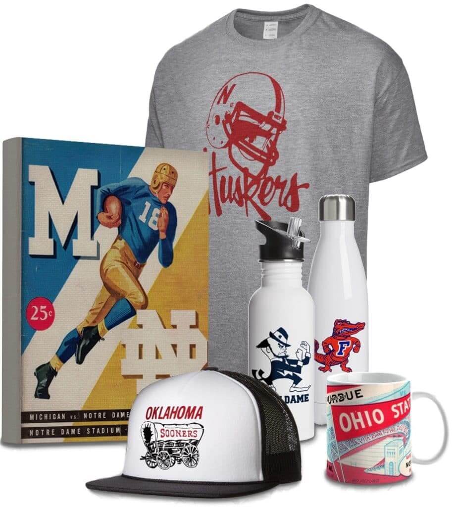
Raffle reminder: In case you missed it yesterday, we’re doing another raffle with the folks from Vintage Brand, who specialize in retro-styled sports stuff (like the items shown at right; click to enlarge). The winner will get to choose anything from the Vintage Brand site.
To enter the raffle, send an email to the raffle address by this Thursday, Nov. 29, 7pm Eastern. One entry per person. I’ll announce the winner on Friday.
In addition, Vintage Brand is offering a site-wide 30%-off sale. The discount will automatically be applied to your order at checkout — not bad!
The Ticker
By Alex Hider

Baseball News: Reader Andy Connelly DIY’d this awesome early-1900s Red Sox bench sweater. Great stuff! … New uniforms for Transylvania University, an NCAA D-III school in Lexington, Ky. … Back on April 3, 1998, Expos 1B Brad Fullmer was wearing an NFL-style hand-warmer pouch for a cold game at Wrigley Field (from @MBDChicago).

NFL News: The Texans debuted their “RCM” memorial decals for team owner Bob McNair last night. In addition, team employees wore ribbons and the memorial logo also appeared on the 25-yard line (from Ignacio Salazar). … Texans WR DeAndre Hopkins tore his glove during last night’s game (from Chris Perrenot). … Staying with Monday Night Football, ESPN used the wrong Titans helmet in a graphic. I may be wrong, but I think ESPN did the same thing earlier this year during another MNF game involving Tennessee (from Matt Shevin). … Reader Tyler Evans was watching Monday Night Football previews and noted this shot of former Oilers WR Ken Burrough wearing No. 00. For those wondering, the only other person to wear that number was former Raiders C Jim “Aught-O” Otto. … We may have ticked this before, but Robert Morris University in Chicago is basically poaching the Philadelphia Eagles’ logo (from Michael Kinney). …
College Football News: Red River Rivals Oklahoma and Texas will square off in the Big XII Championship game this weekend. However, the Golden Hat, the teams’ rivalry trophy, will not be on the line.

Hockey News: Rangers players wore purple chinstraps for Hockey Fights Cancer last night. In addition, the ads on the boards at Madison Square Garden went purple (from Alan Kreit). … Remember the jerseys the Jets wore during the 2016 Heritage Classic? They’ll wear those sweaters again on Dec. 31 and Feb. 26. … This Bruins’ Patrice Bergeron bobblehead possibly gives us a first look at Boston’s full Winter Classic uniform. We had previously seen just the jersey (from Okie). … Cross-sport tribute alert: The Calgary Hitmen of the WHL wore helmet decals to support the CFL’s Calgary Stampeders, who won the Grey Cup Sunday (from Moe Khan). … Goalie Colin Dunne of Allan Cup Hockey’s Hamilton Steelhawks has an awesome Gerry Cheevers-style paint job on his new mask (from Ross Taylor). … The rock band Metallica sold Golden Knights-themed T-shirts for last night’s shown in Las Vegas.

College Hoops News: San Diego State will wear turquoise jerseys for Native American heritage month and Nike’s N7 program on Nov. 27 (from Phil Hecken).

Soccer News: After an outcry from fans, Bayern Munich has announced that it is sticking with red and white and dropping the navy shorts from its home kit rotation (from Josh Hinton and Phil). … Cool move by Ekstraklasa, Poland’s top soccer league, which is partnering with the Warsaw Museum of Sport and Tourism to make a retro soccer league, complete with era-appropriate uniforms (from Ed Zelaski). … Here’s a deep dive on Forward Madison FC’s new logo. The team will begin play in USL League One next season (from JM Fisher).

Grab Bag: Aaron Bold, a goalie for the Vancouver Warriors of the National Lacrosse League, has a new mask (from Wade Heidt). … Coca-Cola published a Q&A with Justine Fletcher, a historian with the company who was recently named the company’s chief archivist (from Ted Arnold). … These are the uniforms Italian volleyball club Diatec Trentino will wear at the FIVB Men’s Club World Championship (from Jeremy Brahm).
“ESPN used the wrong Titans helmet in a graphic.”
And the Texans helmet isn’t much better. Royal blue and red decal?
…and black facemasks on both.
In re: Ken Burroughs, I think I’ve stated before, but I see no reason why zero and double zero shouldn’t be currently in use in the NFL.
As for the Jets’ Gotham City sweathshirts, I believe that’s all part of the weekly/monthly merch promotion — the same thing that has the Chiefs staff wearing “Chiefs Kingdom”, the Steelers staff wearing “Steel City”, and the one I really couldn’t understand, the Jags wearing “Bold City”. Do people really call it that?
Yeah but Gotham *City* is a fictitious comic book city.
“Gotham” is (one of) the nickname(s) for New York, NY.
So forgive my lack of comic book knowledge if I’m totally wrong on this, but “Gotham” as a nickname for NYC always bothered me, because I always thought that Superman’s Metropolis was supposed to be the fictional equivalent of NYC, and Gotham was supposed to be the equivalent of Chicago.
As for the sweatshirt itself, Winter is right that it’s a part of this line of merch: link
The Gotham City moniker isn’t great, but honestly it might be one of the better ones. “Go Pats”, “Bolts”, “Belong”…how clever.
As for where Gotham City is in the DC universe, think southern New Jersey. Metropolis is actually in Delaware. This is at least according to DC maps from the late 70s/early 80s.
link
And then us Rams fans just have “Go Rams”.
It’s a sad day when not even the Rams themselves acknowledge our main colloquial nickname; “The Mob Squad”. I mean, I don’t even work in the marketing department, and I could come up with something better than just “Go Rams”. Like how about “Head Rush” or “Angel City Football?” Heck, even “Greatest Show on Turf” (although lots of people cross-country would be up in arms about that, but it’s definitely better than just “Go Rams”.)
Man, and I thought there was some individuality going on. While “Gotham City” is corny, I’m all for individuality. I detest MLB’s “Train to Reign” merch that all MLB’ers wear during Spring Training. But if this “Gotham City” merch is part of a league-wide promotion, then forget it.
Nike doesn’t do individuality. Sure, every team has their own awful saying, but they’re all wearing the same shirt. It’s just like the Celtics shooting shirts with “C Us Rise” on them.
These types of apparel graphic ideas are usually a team or league initiative, not the apparel manufacturer.
“Some days you just can’t get rid of a bomb!”
Speaking of city names, does anyone call Charlotte “Buzz City”?
Yes — everyone in the Hornets’ marketing department.
NBA fans – the Hornets
The Ravens had “Charm City” hoodies.
Baltimores nickname is charm city and is used a decent amount in local stores, sports, etc
The reason the Jets were wearing Gotham City Football Club is because that was the name of the group that founded the Jets back in 1963.
“On March 28, 1963, the Gotham Football Club, Inc., purchased the franchise and its assets for $1 million in a sale approved by the bankruptcy court and by the American Football League. The Gotham Football Club was a corporation owned by five men: David (Sonny) Werblin, president of MCA-TV, Donald Lillis, partner in a stock brokerage firm, Townsend Martin, a banker; Philip Iselin, an officer of Monmouth Park racetrack in New Jersey and Leon Hess, an oil executive”
link
Ah, didn’t know that — thanks for the history lesson!
All of you quotes don’t use the term “Gotham City”.
I have no beef with the word/name/city “Gotham”.
It is the phrase/name “Gotham City” that take it into the DC comic realm.
To *me* they are not interchangeable.
what’s even crazier is that it’s a $125 hoodie
Bill Austin’s face mask looks like the inspiration for F1’s Halo device.
excellent DIY cap!
Thanks!
single 0 was worn by one of my Dad’s favorite Broncos: Johnny Olszewski, better known as link
Speaking of odd facemasks and Jonny “O” and Helmet Hut……..
link
Happy to see the Winnipeg Jets bring back the vintage-style uniforms for a couple of games.
The team was wearing the red pants and the gloves that go with these jerseys during Monday’s practice:
link
Happy to see the relocated Thrashers bring back the Winnipeg Jets vintage-style uniforms for a couple of games.
FIFY :)
It bothers me when teams that take another teams identity (Winnepeg Jets, Hornets, Nationals to a degree…) and pass it off as their own history.
shoot —– forgot to close that tag.
Should look like……
“Happy to see the relocated Thrashers bring back the Winnipeg Jets vintage-style uniforms for a couple of games.”
FIFY :)
It bothers me when teams that take another teams identity (Winnepeg Jets, Hornets, Nationals to a degree…) and pass it off as their own history.
The team that plays in Winnipeg is going to wear throwbacks The fans there want to see/have an emotional investment in:
A. old Atlanta Thrashers uniforms
B. old Phoenix Coyotes uniforms
C. old Winnipeg Jets uniforms
The answer is easy.
Replying to Shaftman…
It bothers me not in the least.
The NFL is better for having the Browns in Cleveland and the Ravens in Baltimore. It would be even better with the Colts in Baltimore and the ??? in Indy.
MLB is better for having the Nationals in Washington and will be better with the Expos in Montreal.
The NHL is better for having the Jets in Winnipeg.
The NBA is better for having the Hornets in Charlotte and will be better for having the Sonics in Seattle.
The CFL is better for having the Alouettes in Montreal and would be better with the Rough Riders in Ottawa.
I get that you’re technically correct, but this is better.
Paul has argued from time to time that a sports team is more than just a franchise or a corporation, its a civic asset that over time becomes inseparable from the identity of that city. The history and identity of a team doesn’t just belong to a team’s owners, its not a fungible commodity that can be bought and sold and moved. The identity of the Jets also belonged to the people of Winnipeg, not Gluckstern and Burke who bought the team to move it to Phoenix.
Thankfully, odds are good we may not ever see an Atlanta Thrashers throwback. I would consider the Thrashers having the least attractive collection for a uniform history during their brief existence.
The Winnipeg Jets do not hide their history as the Thrashers. All time team records are attached to the Thrashers and not the previous Jets. Winnipeg fans are smart hockey fans and know this.
However, they are the Winnipeg Jets. The throwback uniform looks great and there are Winnipeg fans that saw the team lift the Avco Cup wearing similar uniforms. The Coyotes are not going to be wearing these.
For what its worth, it is the uniform of the WHA Winnipeg Jets. Seems that Arizona Coyotes/NHL Jets don’t really recognize that team history as part of their existence as far as all time stats. 1979-80 Winnipeg Jets were technically an expansion team.
Regarding Thrashers unis… While they definitely got worse over time (their 2007-08 white uni may be the worst in NHL history), I really liked their original set. The navy jersey with the flying bird was especially slick, I think.
Bill W-W, I wear a size 8 or 8.25 hat so I can’t wear the traditional any size fits all or the fitted that only go up to XL so almost all my non MLB hats are homemade. To do it I order a blank cap and then go on eBay and look for a patch I like which I find better than 50% of the time to sew on. You might have luck with the Tulane T you are after. If that doesn’t work it’s costly but there are bunches of Chinese patch embroiderers with good prices. You can submit the logo you want and get 10 for about $100. Either might be easier than the embroiderer for the next experiment. Good luck.
Bill. That’s an excellent idea! Thanks for sharing!
The Gotham City wordmark for both the Jets and Batman is in a Gothic-style font, hence the connection
Ahh, yes — good call, Mike.
Bryan- Great Cap! That was the Tulane logo when I was in grad school there. I have to admit that I prefer a restrained use of Greenie as the primary logo, but the Wave T is classy.
Love the Tulane cap. BTW, I recently attended a college volleyball game in which Tulane was the visiting team. Very disappointed to see Tulane in BFBS with minimal green and zero powder blue. What a waste of a gorgeous and unique color scheme.
I hear you! I really like what they have done with their football uniforms, but I wish they would ditch the black jerseys and pants. The colors are unique, show them off. And BE THE GREEN WAVE, not the black wave. (PS- it’s kinda scary that I am actually excited that they might go to a bowl game.)
Thanks! I like the angry wave logo too. The all green with the wave eyes is crazy though. I prefer the white helmet.
That logo on the St. Louis Cardinals helmet tie tack is way off…looks to be a closer match to the University of Louisville’s.
It’s definitely Louisville!
But according to this site L’Ville didn’t use that logo on helmets until the 80’s.
???
link
Some of the Jets silliness has spilled over to the otherwise uni-sane Chiefs. While among the best unis and color combos around, it seems this season they’ve confused sovereignty models. Chiefs lead Tribes and Chiefdoms (duh), not Kingdoms as they have been featuring on sweatshirts and other sideline apparel (example link below). Next they’ll put an iron throne in Arrowhead.
link
The Chiefs’ PR department has been using “Chiefs Kingdom” for several years. I don’t know the reasoning, though.
Stephen Bagarus(Washington Redskins & LA Rams)also wore 00:
Redskins:
link
Rams(scroll down a bit):
link
Don’t forget this guy was OO also.
He also went NickNOB.
link
That’s so cool to see someone take on an embroidery project.
My mom taught me how to embroider when I was about 5. I’m the 3rd of 4 boys, so she picked me to be the one to learn the more traditionally feminine skills. I haven’t done a project in a while, and your cap makes me want to.
If I can provide some hopefully helpful feedback…you need to do more stitches, bro! Once you get used to it, it goes a lot quicker. But you have to embrace the tedium and put in the stitches. I basically never make a stitch longer than a half centimeter or so. For example, if I were doing that Tulane logo, I’d use probably 2 (maybe 3) stitches for the vertical stretch of the blue or white wave. It takes practice but then you get this cool ripple effect formed by the “channels” between stitches. It does take hours though. I like to watch movies at the same time.
Also, you might be surprised how easy an outline is. Especially for that T, you could just kind of spiral around the perimeter. It may take a half hour.
Thanks for the feedback! I’ll take any advice I can get! It definitely takes patience which I lack at times. I did this hat over the corse of two Saturdays watching football. I already bought another hat to try another project. I’ll try your technique!
In re: the face mask, is it still legal to wear a face mask like Roger Staubach’s?
link
No, the old two-bar model is no longer allowed.
Ok, thanks. Interesting that you refer to it as a “two bar”. Guess the connecting bars don’t count.
“Gotham” was a popular nickname for NYC in the nineteenth century – originally coined by Washington Irving. Irving also coincidentally coined the term, “Knickerbocker”!
So you could theoretically say that the Knicks are the only NBA team with a remotely uni-centric name.
Typo (soccer ticker)
“…will begin play in USL One…”
Should be “will begin play in USL League One…”
Cheers!
Got it.
Paul – Not sure if others find this too, but I have tried the website in multiple browsers and multiple computers and find two things happen pretty consistently – the web page freezes often and a fake google chrome message (i.e. a virus) pops up and doesn’t allow you to continue browsing. Not sure if others have reported this, but thought you’d like to know in case it isn’t just me.
Cheers.
Thanks, Hank. Sorry to hear that. Happy to say nothing like that has happened to me, nor have I had any similar reports. If possible, please send me screen shots – link
I noticed the Titans played two Monday night football games this year, both on the road against the two Texas teams, both of whom wore their navy jerseys against the Titans. The Titans went mono-white against both opponents.
That’s interesting. Thanks for pointing that out.
Thanks so much Paul for featuring my Tulane hat so prominently! I was thinking it would be a grab bag link at best. This is really awesome and I am psyched about all the great feedback in the comments.
Hopkins has had torn gloves all season, he purposely tears them to improve how far he can stretch his hand.
“Gotham City” font: According to my Speedball textbook*, the font used on the shirt is Chancery Cursive. The one on the sign is more of a Blackletter, or maybe Old English.
* link
Paul, please be nice to the Jets. I come here in part to escape the pain my fandom decisions bring me non-aesthetically.
Metallica had Sabres themed t-shirts when they played Key Bank Center in Buffalo last month. link I’m assuming they have similar team themed designs for all the cities they play.