By Phil Hecken and the SMUW Crew
Follow @PhilHecken
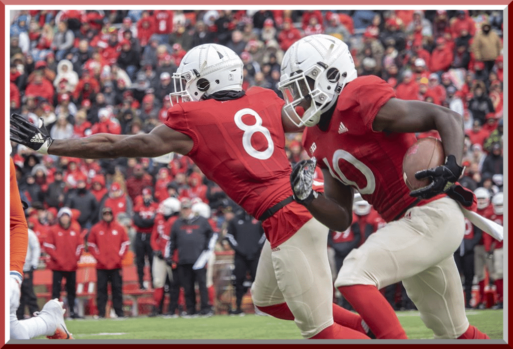
Sometimes — probably oftentimes — an idea (and even photoshoots) looks a lot better than its execution. Such was the case, as I’d feared, with the throwbacks worn yesterday by Nebraska. If you read yesterday’s post, I had a sub-lede on the Huskers uniforms (worn to mark the end of World War I, but actually closer to the 1923 unis the team wore). The unis attempted to replicate two of the classic features of the period: leather helmets and jerseys with friction strips. Up close (if you enlarge the splash photo), they kinda pulled it off. From any kind of distance, however, it simply looked like the team was wearing white helmets and red jerseys (and tan pants too — meant to emulate the wool pants of the day).
The further you got from the action, the more difficult it was to see the details. The friction strips actually showed up better than the faux leather hat. I’m pretty sure everyone in the stands — and probably most on the sidelines — couldn’t make out the clear plastic strips on the helmets, meant to look like stitching on the old leather lids.
There was one cool feature on the helmets though — faux giant earholes, which were indeed a feature of the old school toppers. A nice effort, but unfortunately, on tv or in the stands, all I’m sure people saw was a white/red/tan ensemble. That didn’t mean the unis themselves didn’t look good — on the contrary, I rather rather liked the look. It just didn’t give off a faux (or throw)back look at all.
Here’s TJ with the rest of your…
Sunday Morning Uni Watch
By Terry Duroncelet, Jr.
From Thursday:
• The NC State Wolfpack became the Wolfblack on Thursday night and came out in BFBS uniforms against Wake Forest.
From Saturday:
• Wisconsin honored late volunteer firefighter Captain Cory Barr with a jersey that had his badge number and department patch. Here’s Wisconsin’s original tweet, which includes a video and some additional photos.
• It’s hard to see from this angle, but Eastern Michigan had their Senior Day against Akron, and wore the numbers of all of their seniors in their block ‘E’ logo. And again, I want to give a HUGE thank you to Blaise D’Sylva for the numerous helmet tips throughout the season.
• Iowa wore S&S decals, but also wore Nile Kinnick’s #24 on the side of their helmets (he fought in WWII).
• Mizzou’s military appreciation demonstration was a delightful change-up from the usual “flagify all the things” and “camouflage all the things” approach. They replaced their standard decals (but i today’s college football uniform landscape, is any decal standard at this point?) with medals rendered in decal form (closer look). This medal was rewarded to all Missourians who served in WWI. Additionally, players forwent their surnames in favor of the names of the 117 Missouri students who died in WWI. And as a reminder, today (Nov. 11th, 2018) marks 100 years since WWI ended.
• While not basketball, the Duke vs UNC game looked about as great as it should look.
• I dug the hell out of Notre Dame’s green jerseys in their game against Florida State. I wonder what they would’ve looked like if they used gold numbers edged in navy?
• Nebraska wore their outstanding Memorial tribute uniforms against Illinois. Read more about ’em here.
• Standard issue military appreciation demonstrations include (but obviously not limited to): Texas State, Northwestern, Minnesota, UAB, Northern Illinois (from Thursday), Utah State, and undoubtedly several others. Also, Iowa wore S&S decals, but also wore Kyle Kinney’s #24 on the side of their helmets.
• Touching on Minnesota again for a brief moment: cold weather and decals always make for some type of carnage. I can’t help but to think of the Snorks.
• Utah wore their beautiful Red Tail helmets against Oregon, who also wore Utah’s Lauren memorial decal. Class move. In that same pic, you can see the seal of the Marine Corps on the back of the Utah helmet. There were several Armed Forces seals on display, but I found the Marines especially fitting, as it was the Marine Corps’s birthday yesterday.
• Arizona State wore retro-inspired uniforms in their game against UCLA. The left side of the helmets featured the Pat Tillman “shield” (or is that a badge?).
• Pitt wore their JUST MAKE THESE THE FULL-TIME ALREADY retros against Virginia Tech, and you know the drill at this point.
• I loved Oklahoma State’s look from their in-State rivalry game against the Sooners. One of the best orange pant teams in the nation, IMO.
• Some D3 love, featuring USMMA’s throwback uniforms (courtesy of John Kimmerlein).
• Penn State has a student-run philanthropy called THON. Admittedly, I know nothing about it, apart from this FAQ that I found online. At any rate, the Nittany Lions wore THON decals on the back of the helmets in their game against Wisconsin (h/t/ Blake Fox).
• Calvin Johnson is going into the College Football Hall of Fame this year, and Georgia Tech marked the occasion by adding a small, gold ’21’ (his number during his time as a Yellow Jacket) to the field in their game against Miami, who wore BFBS. Listen Canes, if you’re gonna do black, this is the only correct way to do it. P/C for the field photo goes to Sean Bedford.
• Boston College wore their throwbacks against Clemson, who wore orange pants. Gorgeous game, the photoset of which can be found here. Although, BC’s helmets looked to have glitched some in terms of color.
• Houston wore throwbacks against a rather grey-heavy Temple squad.
• Not enough can be said about Air Force’s uniforms from their matchup against New Mexico.
• Doesn’t LSU know that they’re supposed to toast marshmallows in this weather?
Thanks, TJ! OK, now on to the rest of your SMUW…


Joe Ringham’s 5 & 1
Following in the footsteps of the original “5 & 1,” Jim Vilk, and Catherine Ryan after him, Joe Ringham returns for 2018 to make his “5 & 1” (five good looking and one stinker) uni-vs-uni matchups. Sometimes he’ll have some “honorable mentions” and sometimes there will be more than one “bad” game. You may agree and you may disagree — these are, after all, just opinions and everyone has one. Feel free to let him know what you think in the comments section.
Here’s Joe:
Happy Sunday everyone! No need to wait, let’s get right to the list for this second Saturday of November..
5) Purdue at Minnesota — I had a good feeling about this one, when looking through the week’s schedule. The Gophers looked great in maroon/maroon/gold at home. I didn’t think I’d like the Boilermakers in gold/white/grey. However, it actually worked quite well here.
4) Washington State at Colorado — Ok, for those of you who got on me a few weeks ago for slamming Wazzu for not wearing school colors… THIS is a perfect example of them wearing their school colors (with the right shade of grey on the lids). It matched up quite well against the silver/black/silver home look of the Buffs.
3) Ohio State at Michigan State — Caught a little bit of this on the way out the door Saturday morning, and very much liked what I saw. The Buckeyes always seem to look great when wearing their usual road unis. But Sparty really came out looking great here, going white/green/white at home.
2) Oklahoma State at Oklahoma — Bedlam always seems to be one of the best looking match-ups annually, and this year’s edition is no exception. OSU looked fantastic on the road in black/white/orange. The contrast of that against the classic home look of the Sooners made this game look quite awesome.
1) Clemson at Boston College — This one surprised the hell out of me with how good it looked. Clemson came out with my favorite road look of theirs, going orange/white/orange. BC looked equally as awesome in gold/maroon/gold at home. Put that together and you have the best looking game of the weekend. Simply beautiful in Chestnut Hill.
And, finally…
+1) Tulsa at Memphis — Just something about this Memphis home uni that screams “we just threw this together at the last minute”. Just… not a good look.
Enjoy the rest of your football Sunday. I’ll see you around next week!
Thanks Joe! You can follow Joe on the Twitter and let him know what you think of his choices or make a 5 & 1 suggestion of your own!
NCAA Uni Tracking
Uni Watch will again track the uniform combinations worn by the “Power 5” conferences. All of the 2017 trackers are back!
We’ve got Rex Henry (tracking the ACC), Dennis Bolt (tracking the PAC-12), Kyle Acker (tracking the Big XII), and Ethan Dimitroff (tracking the B1G AND the SEC). Rex, Dennis, and Kyle and are all returning from 2015, and Ethan is back after joining the NCAA Uni Tracking a couple seasons ago. Ethan continues his dual role of tracking both the B1G and the SEC.
Here are the Uni Trackers for the Power 5 Conferences:
Rex is up first today (ACC):

ACC
More Here.
Follow Rex on Twitter here.
And now, here’s Dennis with the PAC-12:

PAC-12
More here.
Follow Dennis on Twitter here.
And here is Ethan, with the SEC:

SEC
And be sure to check out Ethan’s WVU Mountaineer Tracker.
Follow Ethan on Twitter here.
And here is Kyle with the Big XII:

Big XII
Follow Kyle on Twitter here.
And here’s Ethan with the B1G:

B1G

Welcome to the 2018 Oregon Ducks Uni Tracker. This little project was originally begun way back in 2008-09 by Michael Princip, who retired after several seasons, whereupon the project was continued by Tim E. O’Brien. He, too, retired from the tracking, but the project has been ably kept up by the man who also tracks the Pac12, Dennis Bolt.
Here’s this week’s Uniform Combo for the Ducks (you can click to enlarge):

You can read about this uniform, and MUCH MORE, by checking out the Duck Tracker here!
Thanks Dennis!
And now a few words from Paul: Hi there. In case you missed it on Friday, my take on the latest round of NBA alternate uniforms is availble here. If you want to see my thoughts on the previous two batches of uniforms that were part of this same rollout, those are avaialble here and here.
Uni Watch News Ticker
By Phil

Baseball News: Hmmm. Check out this photo. That little teaser comes from the Miami Marlins — in what I presume to be an aqua alternate jersey. Interestingly, the banner at the top of their twitter account makes reference to this as well (thanks to Mike Kampf). In fact, the team will announce a new logo & unis on Novemer 15th. … “A Flickr group I follow posted home movies with an unidentified baseball stadium in them,” says Charles Rogers. “I though Uni-Watch readers could surely identify the stadium and possibly more info.” Those images are here, here, here, and here. … Samurai Japan is wearing uniforms made by Asics, the previous unis were made by Mizuno (from Sons of Johnny LeMaster).

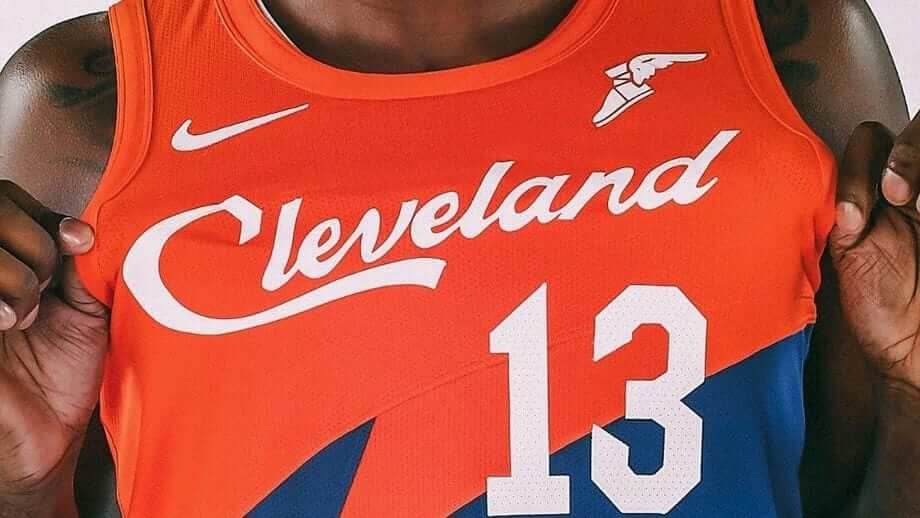
NFL/CFL News: “About a week ago (Paul) posted a photo of a little used logo at the middle of Cleveland stadium,” says Joseph Bailey. “I remember liking the logo and bought a hat that had it. I think I bought this in ‘94 or ‘95.” Gotta say, that’s a lot more pleasing to the eye than that more well-known “CB” logo we’ve all seen many times before. … Also from Joseph Bailey: “I’m officiating a high school state playoff game at Clarence High school near Buffalo. I saw this stuff in the display case. Mark Murphy (I think VP of the Packers) was a graduate of this place and it looks like the NFL sent this stuff to the school. Note the cutout of the helmet stripes due to the vents in the helmet.” … “Interesting (Colts/’skins) program I found inside a table top at a bar in Baltimore,” says Eric Arnold “Date says it’s from their game on September 25, 1960. Imagery is definitely questionable.” … The pre-game press conferences for the CFL Western and Eastern Semi-Finals took place on Saturday. Wade Heidt grabbed this photo of the 4 head coaches for the teams in the Semi-Finals. Wade adds, “A nod to Hamilton Tiger-Cats June Jones for the press conference attire. Looks ready to head out on holiday to the beach. Likely influenced by his days coaching in Hawaii. Will not be that warm in Hamilton. Sunday’s daytime high to be 4 degrees C (39 degrees F).”

Hockey News: Dear God, I hope this doesn’t become a thing: ECHL’s Reading Royals are ready to debut special 3D jerseys (via Paul). I have a feeling this is one of things that looked really clever on paper, but when it comes to the actual execution…well, let’s just see how they look on ice. … The WHL’s Lethbridge Hurricanes have new 3rd uniforms. They were worn for the first time on Friday (from Wade Heidt). … The Philadelphia Flyers wear black/orange gloves with their third jerseys, but Claude Giroux wears his standard black/white gloves (good spot from Kevin Kurz). … Last evening the Fargo Force wore Honor Flight jerseys (from Patrick Thomas). … In yesterday’s Flyers/Blackhawks tilt, both teams wore “29” stickers on their helmets (here’s how the Blackhawks’ looked), in tribute to Ray Emery, who played for both teams (from Stevie P.). … The Minnesota Wild will be wearing a memorial patch for the original owner Bob Naegele who passed away last week (from Mike Menner).

NBA News: “This was the Nets logo that was being used on YouTube TV (Friday) night,” notes Joshua Edney “It wasn’t a throwback night so is YouTube TV using a logo that hasn’t been in circulation since 2012?” … Year two for the ABA’s Akron Aviators. Jimmer Vilk notes “they’re wearing their road blues in South Bend. Still with the crotch lettering (🙄) but at least the numbers contrast, unlike the big A on the front of the jersey (look closely, it’s there).”

Soccer News: Reader Ryan Madden was watching Leicester City v Burnley yesterday morning, and noticed they had tributes for club owner Vichai Srivaddhanaprabha, who died in a helicopter crash outside the team’s stadium a couple weekends ago. One of the more unique ones was the LED ad boards surrounding the pitch, “with only one exception I noticed (a DHL ad that featured, more prominently, a quote from someone about Vichai, still used their yellow and red logo), without exception featured messages of condolence from the advertisers, and were rendered entirely in black and white.” You can see Ryan’s screen grabs here, here, here and here. … Argentine club Estudiantes de la Plata is wearing all-white jerseys with grey shorts and socks (as opposed to vertical red and white stripes) last night in honor of their 1968 victory over Manchester United in the Intercontinental Cup (from Timoteo Cobertizo).

Grab Bag: Thanks to reader Will Scheibler, we have some news on the Pinty’s Grand Slam of Curling. “Have this taking place locally (to me) in Thunder Bay, ON Canada,” he writes. “click on the picture or text for teams to get a photo of the whole team (showing the jacket fronts). More pictures here (besides curlers includes a pic of the mascot and a pic of a fan with green beard that has Remembrance Day poppy coloured in).”
AAAAAAAAAAAAAA I forgot to mention UCF’s decals from yesterday. Oops
Also, Claude Giroux’s gloves, as talked about in the Ticker, are by STX, but still have orange palms instead of natural Nash clarino leather. Giroux was a longtime head to toe Bauer client, and I thought the colored palms were a special custom Bauer quirk (Boston’s David Pastrnak has gold palms). Guess not!
Oh hell yeah! Time for some college football uni tracking Canadian rules style.
Road to the Vanier Cup continues. Eight teams left on Saturday to battle it out in the conference finals.
-Loney Bowl (Atlantic) in Halifax:
Saint Mary’s Huskies went white/maroon/white. St. Francis Xavier X-Men wore white over navy.
link
-Coupe Dunsmore (Quebec) in Quebec City:
Laval Rouge et Or wore their alternate shiny gold helmets. Went red over red. Montreal Carabins went white/white/blue.
link
-Yates Cup (Ontario) in London:
Western Ontario Mustangs went silver/purple/purple. Guelph Gryphons wore their red “marble” design helmet (looks like a bowling ball). Guelph wore white over white.
link
-Hardy Cup (Canada West) in Calgary:
Calgary Dinos went mono-red. Saskatchewan Huskies wore their standard road white over green.
link
The Minnesota vs Purdue game gets extra points because of the game being played in the snow.
And the Gophers FINALLY decided to use white numbers. In their other jerseys, Those gold numbers just disappeared into the maroon. Kudos for the white.
Were Iowa’s decals in honor of Nile Kinnick or Kyle Kinney?
“Iowa wore S&S decals, but also wore Nile Kinnick’s #24 on the side of their helmets (he fought in WWI”
“Also, Iowa wore S&S decals, but also wore Kyle Kinney’s #24 on the side of their helmets.”
Definitely Nile Kinnick. He’s Iowa’s only Heisman winner (’39) and the stadium is named after him. He died in flight training during WWII as a naval pilot, in ’43. Not sure who Kyle Kinney is but Kinnick’s a legend around Iowa City!
Just to be accurate… Mark Murphy is president of the Packers. In short he’s the CEO of the Packers Corporation and is considered to be the team’s owner in league meetings.
Just to be accurate… Mark Murphy is president of the Packers. In short he’s the CEO of the Packers Corporation and is considered to be the team’s owner in league meetings.
Triple deck and apartment buildings beyond the outfield walls make me think it is Yankee Stadium.
It is.
And very early YS to boot. The right field upper stands haven’t been extended yet.
More teal for the Marlins is more gooder.
I concur. That outfield stand was the set up before they make changes to the set up it was the rest of the life of the stadium.
It’s Braves Field in Boston.
Uh, no; Braves Field was never more than a single deck ballpark, and the photos showing the sideline are clearly have three decks. Have to agree, this is Yankee Stadium prior to 1938; the main grandstand ends just shy of the foul pole, and the bleachers tapered down as they approach the scoreboard just right of dead center.
Uh, yes it’s Boston. Check out the billboards. It even says Boston on one of them. The Gem Razor ad in right field is the giveaway. Some pics look like it’s got three decks but look closer.
“A Flickr group I follow posted home movies with an unidentified baseball stadium in them,” – That’s Yankee Stadium, probably during a World Series game.
Re: Norte Dame numbers. What would they oook like in gold with navy trim? READABLE!
Re: your comment about Miami in black. There is no right way to do the wrong thing. The colors. May go together nicely, but as long as black is not a school color, it doesn’t belong
Whenever Notre Dame wears green jerseys, they should look like this: link
watched some of the early morning game. Drew Brees looked like a nascar driver with so much clutter on his jersey.
“About a week ago (Paul) posted a photo of a little used logo at the middle of Cleveland stadium,” says Joseph Bailey. “I remember liking the logo…”
When there was talk of the Browns revival in ’99 I heard on a CLE radio program that the logo in question was commissioned by Art Modell in a (last ditch) effort at creating a team logo. I know friends that have the lid and it’s a great clean, retro logo. The story at that time was that Modell owned the artwork, not the NFL, and refuse to give up the rights for the new Browns use.
Of all the new, somewhat gimmicky uniforms, I have to admit the Titans have pealed out multiple appealing and unique, good looking uniforms. Not for everyone, but today was another interesting look.
Congrats on the 10 year anniversary Phil