When the 2017-18 NBA season tipped off a little more than a year ago, 17 of the league’s 30 teams had sold space on their jerseys to corporate advertisers. Another four teams joined the ad patch bandwagon during the 2017-18 season, plus three more during the offseason, one more during the 2018-19 preseason, and three more during first few weeks of the new season that’s now underway, bringing the total number of ad-clad teams to 28.
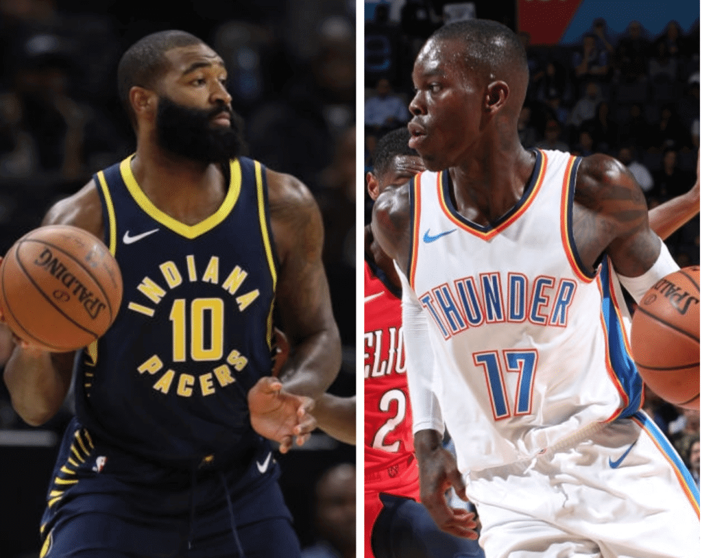
That leaves us with two remaining ad-free teams — the Pacers and Thunder. I was wondering how those two teams felt about being the final holdouts. Was it a conscious choice on their parts, or was it just how things have worked out? Did they have plans to eventually go ad-clad, or did they plan to remain ad-free?
So I got in touch with both teams. The Thunder replied very quickly, with corporate communications VP Dan Mahoney telling me, “Currently we have no plans for a patch.” I asked if he’d be willing to elaborate on that point or answer some additional questions, and he declined.
Then I heard from Todd Taylor, the Pacers’ senior VP for sales and marketing. Smart guy, interesting guy. A good talker, but also a good listener. It had been a few years since the last time we’d spoken, and it was good to reconnect.
Taylor and I had a wide-ranging discussion about the ad patches. Here are the major points he told me:
• When the ad patch program was introduced, the Pacers were initially unsure if they wanted to participate in it. They ultimately decided that they were okay with it, but they’ve been very picky about finding just the right advertiser. It’s not a matter of holding out for a certain price, Taylor said. It’s more about finding an advertiser that feels like a good fit for the team and for Indiana.
• That said, Taylor hopes and expects the Pacers will have an ad patch at some point this season. After telling me that, he joked, “And with you writing stories like this, pointing out that we’re one of the last two teams, that probably makes my owner call me and tell me to get it done.”
• Nobody from the league has put any pressure on the Pacers to “get with the program” or anything like that. They’ve been free to set their own timetable.
• The Pacers have not done any outreach to find out how their fans feel about ad patches, and Taylor isn’t aware of any fans who’ve voiced their opinions, either positively or negatively, about the team being one of the last ad-free holdouts.
• Taylor hasn’t heard anything about whether the three-year pilot program for the ad patches will be renewed, expanded, or dialed back. “I assume it’s going well, and I don’t know why they wouldn’t continue it, but I don’t know that for a fact,” he said.
———
Obviously, I was hoping the Pacers and/or Thunder would say, “We’ve decided this ad patch thing is not a good fit for us,” but I realized that was unlikely. In any case, enjoy these last two ad-free teams while you can, because it appears that at least one of them will be joining the ad-clad ranks sooner than later.
Click to enlarge
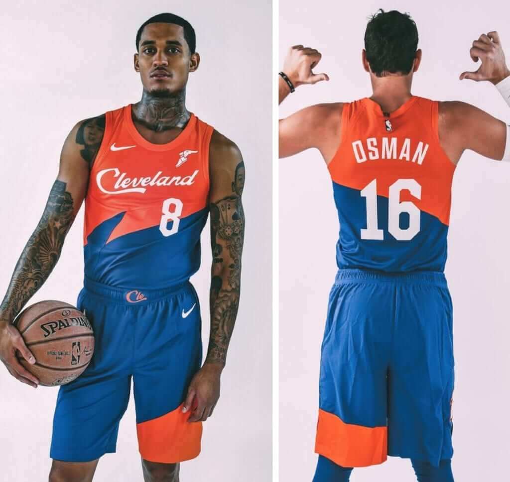
NBA stuff, continued: Lots of teams released their City alternates yesterday. By the time you read this, I think all of them will have been unveiled. You can see my assessments of this latest round in this ESPN piece.
The most interesting design was the Cavs’ (shown above) — in part because it’s based on one of the worst uniforms in NBA history, but also because of the chest script. At first I thought the script was a nod to the team’s original chest script from the early 1970s. But it turns out that it’s actually the same script used by Destination Cleveland — the city’s tourism bureau.
I find that particularly interesting in light of something I wrote when the Pacers unveiled their then-new logo and uni set in the summer of 2017. Here’s the relevant passage:
As I looked through [the Pacers’] marketing materials, which talked a lot about Indiana’s “work ethic” and “pride” and “early morning sunrise” (the sun apparently rises in the afternoon in the other 49 states), I suddenly realized why I dislike Nike’s uni-marketing style so much: They sound exactly like a tourism bureau. The boilerplate clichés and bromides, the inevitable references to “hard-working people,” the mentions of local landmarks and history and heritage, the reduction of a complex place into a caricatured confection — it’s all tourism marketing 101, like they want you to book your flight right now and come visit Indiana (or Cleveland, or wherever the latest uniform is being unveiled). …
And just to be clear, I’m not saying there’s anything wrong with visiting Indiana. I’ve visited there several times myself! I’m just saying that the way Nike markets local culture has a lot in common with tourism marketing (which is something that really should have occurred to me a long time ago).
I’ve thought about that a lot over the past year and change, as uniform unveilings have sounded more and more like tourism pitches. And now we have the Cavs literally wearing the logo of the local tourism marketing group. It wouldn’t surprise me if this turns out to be where uniform design is heading, at least for alternate unis.
The team’s press kit for this uniform uses the word “pride” five times, which is pretty much the definition of trying too hard. On the plus side, there are no references to the “hard-working” people of Cleveland, so at least there’s that.
For all photos in this section, click to enlarge
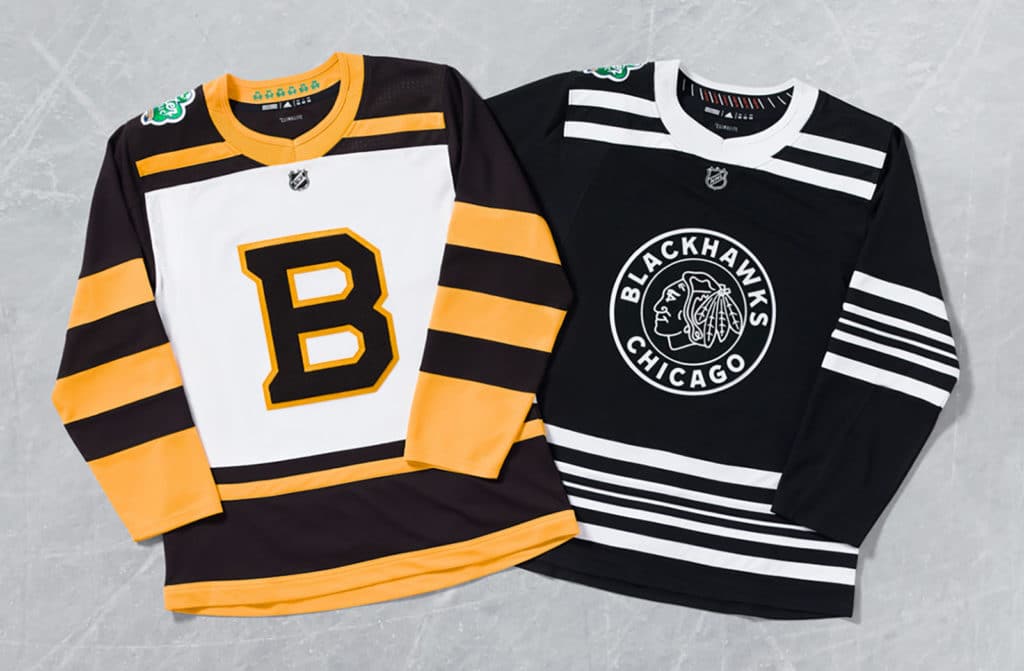
Winter Classic jerseys: The Bruins and Blackhawks yesterday unveiled their uniforms for the Winter Classic, which will be played on New Year’s Day.
I got to see these jerseys at an Adidas event last month, so I was able to take some photos showcasing a few details that aren’t evident in the official press pics. Let’s start with a rear view of the Bruins jersey:
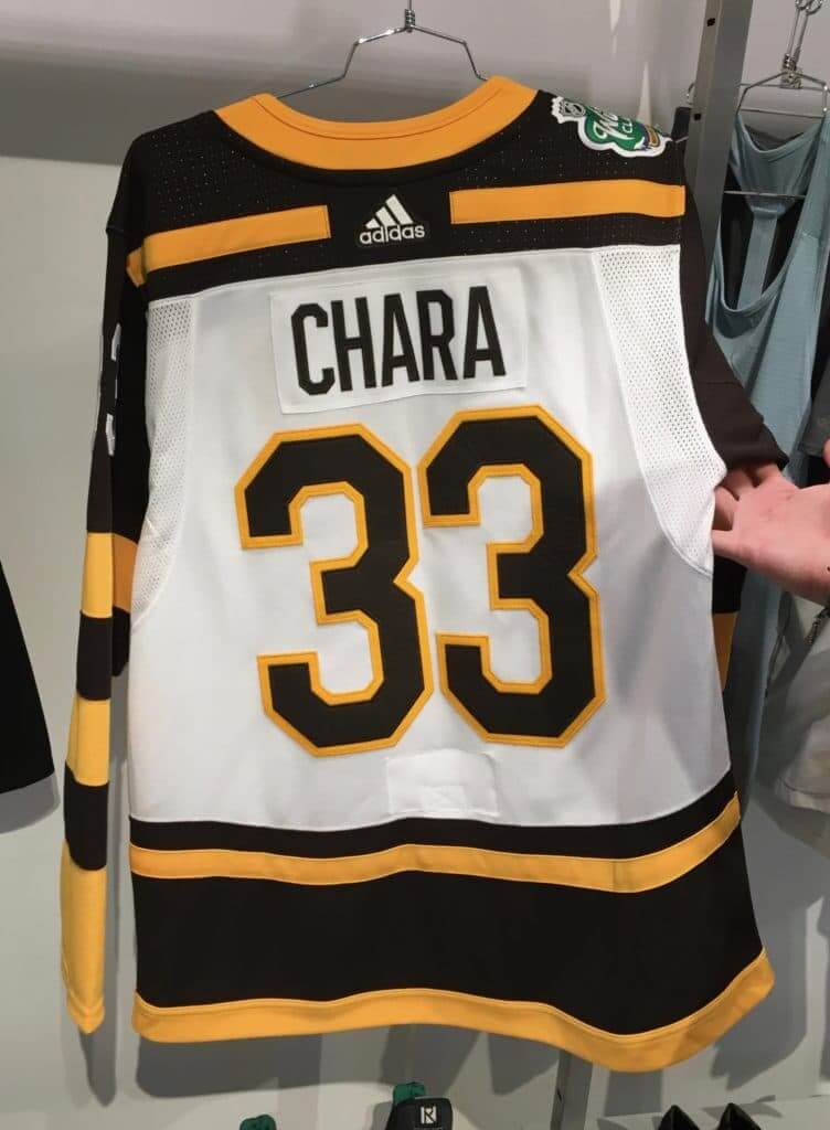
All of the numbers and NOB lettering are rendered in felt, and the crest is rendered in chenille:
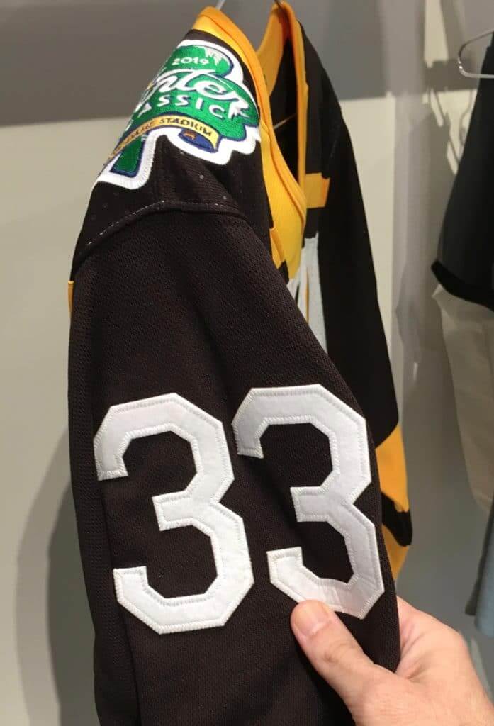
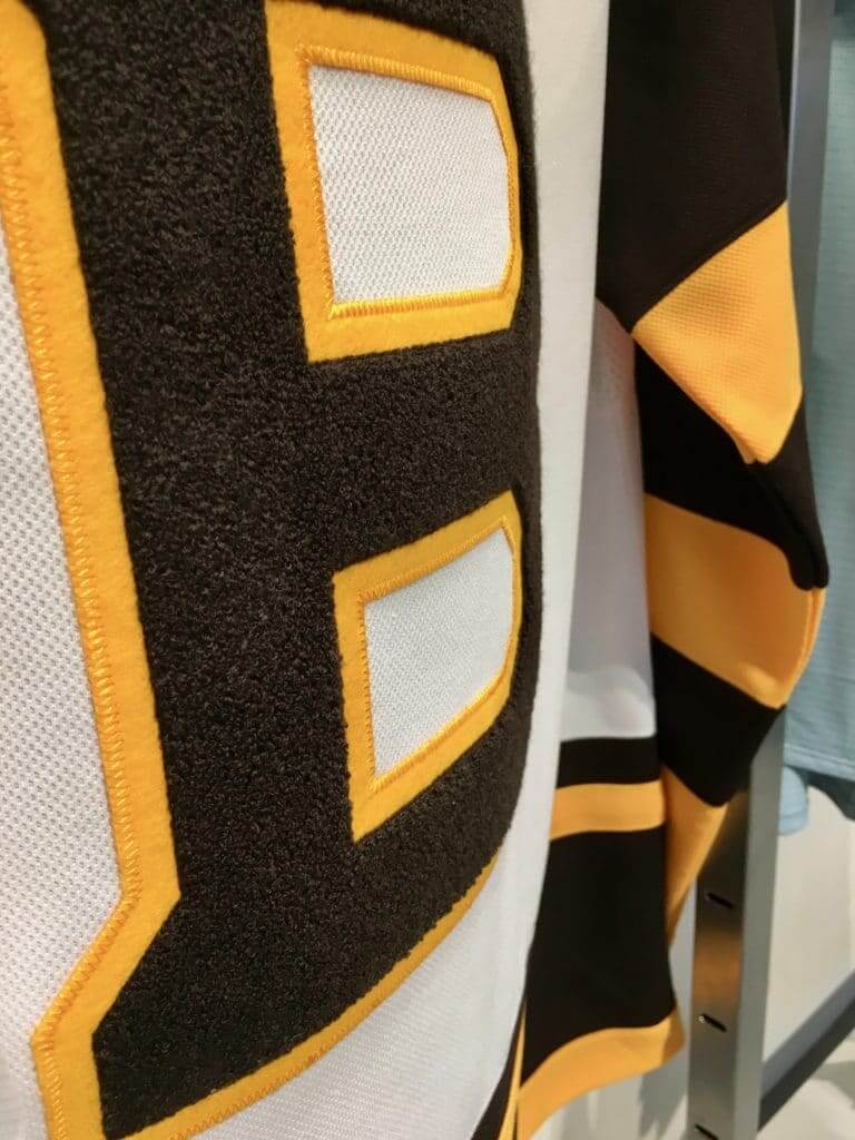
I don’t know how the players can possibly function on the ice without the performance-enhancing qualities of more lightweight numbers, letters, and crests, but I guess they’ll manage.
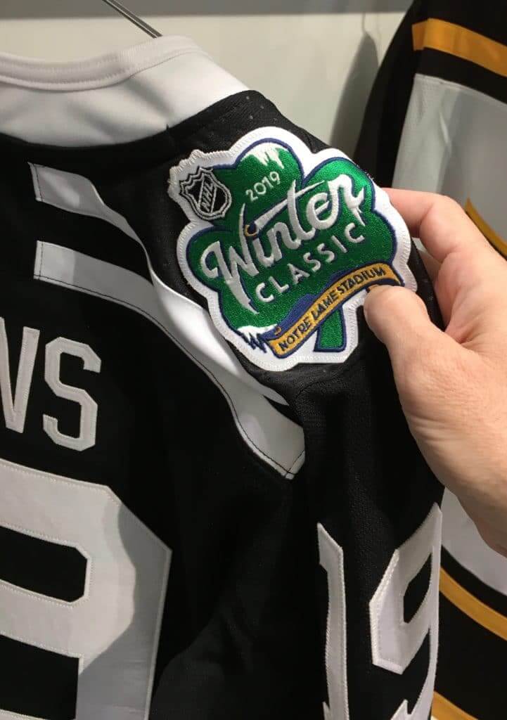
For some reason I didn’t get a rear-view photo of the Blackhawks jersey — sorry about that — although you can get a hint of it in this shot I took of the Winter Classic patch, which features a shamrock because the game is taking place at Notre Dame Stadium:
The Blackhawks’ numbers and letters are likewise rendered in felt, and the crest features chain-stitched detailing:
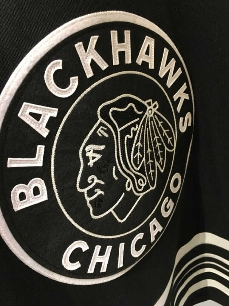
You can see the full Blackhawks uni in this video clip.
At that same Adidas event, I got to see the jerseys for the 2019 NHL All-Star Game, but I’m not allowed to show those to you yet. Soon!
The Ticker
By Yianni Varonis

Baseball News: This writer believes that it’s time for baseball uniforms to evolve in order for them to better help players perform. … The Rangers will wear a home-uniform patch next year commemorating their final season at the Ballpark (from multiple readers). … Here’s a weird one: The press pass design for the 1974 World Series (Dodgers/A’s) featured Mr. Met at the top of the pass. They apparently used the same template from 1973 (great find by Russ Havens). … Earlier this week we mentioned some uniform irregularities at the Japan All-Star Series. Here are a couple more as the Yankees uniform features a maker’s mark (from Dan Friedman) and the Nationals uniform was worn with a red cap and road greys (from Bill Durdach). … It could happen to you. A man won a $100,000 lottery by playing the jersey numbers of his favorite Red Sox players (from James Shannahan). … The Wisconsin Timber Rattlers, a Class A affiliate of the Brewers, have new logos and caps (from local reporter Brian Kerhin). … The Jackie Robinson Foundation will have a commemorative logo in 2019 marking what would have been Jackie’s 100th birthday (from Ignacio Salazar).

NFL News: The Steelers wore their mono-black alternates last night, and QB Ben Roethlisberger once again wore cleats honoring the Tree of Life synagogue victims, but this time with a blue Star of David instead of the yellow star he’d worn in the Steelers’ previous game. Panthers QB Cam Newton also wore cleats honoring the synagogue victims, but only during pregame warm-ups. … The Eagles will wear black jerseys and pants this Sunday. … The Bengals will wear orange jerseys and black pants, which they are 6-0 all-time when wearing.
College Football News: Wake up the echoes: Notre Dame will wear green vs. Florida State this week (from Jeff Cox). … In that same game, FSU will wear white pants for the first time since 2014 (from Rex Henry). … Clemson HC Dabo Swinney was inspired by Alabama when he simplified his team’s uniform combinations to eliminate “wasted energy every single week.” … This is one opinion on the best alternate uniforms in college football this season. … Northern Illinois wore American flag-themed helmet logos on Wednesday. … Miami (OH) also made a helmet edit Wednesday. … Utah will wear beautiful, hawk-winged helmets this week (from @Howlr and Benson Hatfield). … South Carolina will bring back script-“Carolina” helmets for its next game. … Here are the other uniform combinations this week for Syracuse (from Dark Wahlberg), North Carolina (from James Gilbert), Texas State (from John Beck), and Virginia Tech, which will have the No. 25 worn by DB Divine Diablo (from Andrew Cosentino). … Faux-leatherhead helmet this week for Nebraska.

Hockey News: New commemorative uniforms for the Huntsville Havoc of the Southern Professional Hockey League. … The Green Bay Gamblers of the United States Hockey League will wear military-themed sweaters (from local reporter Brian Kerhin). … Penn State G Oskar Autio has a new mask, the back of which features the distance between his hometown in Finland, his junior hockey team in Illinois, and the campus in State College (from Maria Canales). … Wisconsin will retire No. 10 in honor of Mark Johnson, who is the men’s program’s all-time leading scorer, a former member of the U.S. “Miracle on Ice” team, and the all-time winningest coach in NCAA DI women’s hockey. … Here’s a rarity: The San Diego Gulls’ new military appreciation jersey doesn’t have camouflage or a flag pattern (from Drew McClintock).

Pro Basketball News: A military veteran who was being honored at a Trail Blazers game wore a shirt protesting the team’s affiliation with a company that makes military sniper scopes. … The newly-formed Wichita Wizards of the Minor League Basketball Association unveiled their inaugural uniform set (from Blake Cripps).

College Hoops News: Chicago State still hasn’t received its road uniforms from Nike, forcing the team to wear grey again last night, while host Notre Dame wore navy at home (from Jeff Cox). … This article debates which mid-major programs made the best visual changes this year. … New alternate uniform for Arizona. … New Mexico State debuted new throwbacks last night.

Soccer News: Earlier this year, Paul offered a behind-the-scenes look at the design process of Inter Miami CF’s new crest and color palette. This team-produced video featuring owner David Beckham discussing that process is also worth checking out. … Here is what we know so far about the kits that will be worn at the 2019 FIFA Women’s World Cup (from Josh Hinton). … A British clothing brand is selling a Christmas sweater that mimics the personal style of England Manager Gareth Southgate (from Ted Arnold).

Grab Bag: This should make you smile: NASCAR’s Team Penske and Brad Keselowski got in the seasonal spirit by designing their No. 2 Ford to look like an ugly holiday sweater. … Architectural Digest takes an interesting look at “the growing Nexus of politics and design.” … This op-ed opines that with the U.S. Congress becoming more diverse and changing leadership, “the Congressional uniform is about to change” (NYT link). … A charter school in North Carolina is being sued because it doesn’t allow female students to wear pants or shorts. … Russian soldiers wore World War II-era uniforms in a parade reenactment celebrating the nation’s historic victory in the Battle of Moscow. … This is how you can discern between Special Forces operators in the U.S. Military. … The woman who illustrated Harry Potter and the famous lightning-bolt logo never spoke to the series’ author, J.K. Rowling, until after the completion of all seven books.
On a personal note, earlier this week was the 10th anniversary of when Phil Hecken became my right-hand man on this site. In that time, he’s staked out his own uni-centric turf, turned the Uni Watch weekends into their own sub-community, and become a good and valued friend. Happy uni-versary, Phil!!
“…writer believes that it’s time for baseball uniforms to evolve in order for them to better help players perform. ”
George Costanza and I agree.
no cotton though
Weren’t the form-fitting pullover shirts and sansabelt pants of the 1970s an attempt to make the uniforms more suited to an athletic endeavor? And now the pendulum has swung back to buttons and belts. If the bagginess of today’s uniforms are hindering performance, then why are players choosing to wear them that way? The tailoring of the uniform is something the players have say in.
The guy says that uniforms are too baggy and hefty, using CC Sabathia as an example. Doesn’t he realize that is Sabathia’s choice? Players used to wear more form fitting uniforms (look at MLB in the 80s and 90s). The NBA did too but now it’s back to tighter/form fitting uniforms.
If uniforms are such a problem for the players then stop wearing jerseys that’s three times the size, button up your uniforms to the top, and go high cuffed instead of having your pant bottoms flapping all around.
I can’t tell if that article is a poor attempt at humor or just ill-conceived and poorly researched. Either way, it stinks.
Why not both!
Lee
I can’t believe I actually read that piece. I want those five minutes back.
One, wear a properly fitted uni and you have little to no problems. Two, players need to focus on the fundamentals instead of getting bigger, stronger, more flexible, etc. Get too big and too strong and you’ll need bigger fields and more protection for infielders and spectators. Enough with the constant need to physically upgrade and improve…it’s a simple game. Go out there and just play.
Cheers to Phil for 10 great years!
Likening Nike’s marketing drivel with that of a tourism board is spot-on. The way they try to spin every single element of the uniform into some sort of story is nauseating.
FYI Paul: on my Mac I always get a message that Uni Watch is using significant memory
Talking to my webmaster this morning. Will mention this to him.
I’ve had to switch from reading it in Safari to reading in Chrome. Otherwise, the site would reload CONSTANTLY.
Is Phil wearing a 10th anniversary patch for his 10 years? I think it is worthy.
Like!
Maybe there should be a 10th anniversary patch design contest…
Cheers Phil! Thank you for everything you do!
In a posed picture I saw of Jonathan Toews in this WC uniform, he was wearing standard Blackhawks gloves, black with red lines and white branding. Do you know whether special gloves will come later, or will they use the standard gloves? Because that little pop of red on the equipment looks like a lazy mistake in context.
I do not know. But I strongly suspect game-specific gloves will come later.
Figured I’d ask, given your advance photos and knowledge that isn’t embargoed anymore. And based on how Winter Classics look, I think I agree on the suspicion. Thanks Paul!
Bruins are showing off the brown gloves and the Winter Classic toques in a released photo. Curious if it will be a brown helmet or a white one.
link
I would expect and hope for white helmets. Black and brown won’t contrast enough. White will work.
About the best alternate uniforms in college football piece. Out of the 10 on the list, Tulane “Friday Night Lights” not close to the #1. I’ll put the throwbacks of Oklahoma State and North Texas at top of my list.
Time for baseball uniforms to evolve? Uni Watch design contest!
TURN AHEAD THE CLOCK!
“Earlier this week we mentioned some uniform irregularities at the Japan All-Star Series. Here are playing the jersey numbers of his favorite Red Sox players”
Typo alert: there’s something missing from that second sentence, I don’t know what.
Fixed.
Hey Phil! Thanks for all you do. This site has been a daily source of enjoyment for me for well over ten years. I really appreciate it.
Did uni-watch ever do a holiday sweater design? That would be something!
link
The Gulls Jersey appears to have US flag stars on the side.
Yes. But that’s different than a full-on flag-desecration stars/stripes pattern.
Happy Bday Phil!!
Wish the Bruins had brown instead of black since its an under utilized color but I do like the jersey design.
Do you mean their regular jerseys? Because their Winter Classic jerseys are brown.
Would love to see the Bruins celebrate their original colour scheme in a regular 3rd uniform in brown. It is underutilized as we do not have an NHL team regularly in brown. They could do a modern rendition of the original jersey.
Have their secondary logo be the main crest on a 3rd again:
link
Worn on an updated version of the original brown jersey:
link
The red cap looks SO much better with the Nats road uni than their multicolored blue/red cap. The darker cap made sense in their original color scheme, which featured blue predominantly on the road uni, but now that it’s mostly red, the red cap looks much better (and yes, I know the original Nats road cap was all-blue and was switched to blue with a red brim when they switched to these unis. Just still think the red cap is better).
If there’s a team that can justify and pull off the whole contrasting home/road cap thing, it’s the Nats. While I tend to agree that their current uniforms would look better with a single all-red cap home and road, an all-navy road cap would also nicely set off their beautiful road script by contrast. A navy cap with a red W might be even better than the red cap. Regardless, among the caps they have, the regular home is their best, and ought to be worn home and road unless or until they come up with a more thoughtful design.
Worst cap in Nats history: The navy cap with the red bill, or the “Barves” cap as it was locally known. The Nats should never, ever wear a navy cap with a red bill. A red cap with a navy bill could work for the Nats, but not with the road uniform as-is, and not with blue eyelets.
The cap I’d really like to see the Nats wear is a version of this: link but with a red or navy bill. Even if only for batting practice.
I still call him LI Phil.
When skimming the comments I always read it as “Lil Phil” and it’s always stuck with me. Congrats on the 10 years! Cheers Phil
Same here!
The Arizona Cardinals will wear their red pants with the white jersey. The first time they have worn this combo since December of 2010. This is probably their best look of what they have, which makes one wonder why it has taken this long to bring it back out.
link
I’m sorry, when talking about the Arizona Cardinals, only terms like “least atrocious” is allowed.
Thank you.
Lee
I agree.
It’s just a shame the Adidas maker’s mark completely breaks up the shoulder striping on the back of those Winter Classic unis. The same thing has happened with the Rangers’ white unis and their WC unis from last year.
The only time Reebok ever Reeboxed the Rangers was for the 2014 Stadium Series jersey, but that was a non-standard template shared with several other teams. (Though, could we still call it the Reebox now that it’s Adidas making the jerseys?)
As a Notre Dame hater, I appreciate that it looks like the stitching on the “D” in Dame on the Blackhawks patch is missing the top half so it reads “Notre Lame Stadium”
I absolutely read the comments on this post to agree with whoever pointed this out. First thing I noticed about the patch… It says “Notre Lame”
“I don’t know how the players can possibly function on the ice without the performance-enhancing qualities of more lightweight numbers, letters, and crests, but I guess they’ll manage.”
I’ll be laughing all day every time I think about this line. Thanks, Paul!
Re: “The Rangers will wear a home-uniform patch next year commemorating their final season at the Ballpark (from multiple readers).”
I find it hard to believe a stadium as modern as the Ballpark is being replaced (same with Turner Field). Put another way my Blue Jays have officially been lapped on the stadium front.
I’m almost surprised to hear myself say this, but in a vacuum, I think I kind of like the Cavaliers’ new alternate uniform. Simplifying the “diagonal slash” concept and color scheme of the old mid-’90s uniforms makes the design elements “pop” quite a bit more. And the diagonal script lettering (even if it is a blatant marketing ploy) maintains the design theme better than the clunky block lettering from the original uniforms. Now if only they’d get rid of the swoosh and jersey ad…
Cleveland’s new uni: a Good Beach Volleyball uniform
Now if only they’d get rid of the swoosh and jersey ad…
If they did, I’d wear that.
ESPN piece on the latest round of City uniforms is up:
link
At this Adidas Event you mentioned, did they give you at least a ballpark estimate of when they’d be releasing said ASG Jerseys?
Yes, but I’m not allowed to tell you that. Sorry!
What are these special “City” NBA uniforms?
Congrats, Phil!
Happy anniversary, Phil, & thanks so much for all you do around here! Hard to believe it’s been 10 years already – also difficult to think about this site w/out your contributions.
Happy anniversary, Phil! In honor of the occasion, here’s a link to a photo of one of the truly great 10th anniversary patches of all time:
link
NBA…please…..enough with the “edition” jerseys. What, next year 6 different jerseys? How about 10? How about a new one for each game?
Thanks Phil and congrats on your UW anniversary!
Cricket, a similar sport to baseball, also has uniforms that have hardly changed. Collared shirts, knitted wool jumpers and long loose trousers.
This is the England team in 1969 link
And here is the same team in 2018 link
the 10th anniversary patch is so good and performance of players was amazing.Thanks for sharing!
link
link