For all photos, click to enlarge
By Paul, pinch-hitting today for Phil
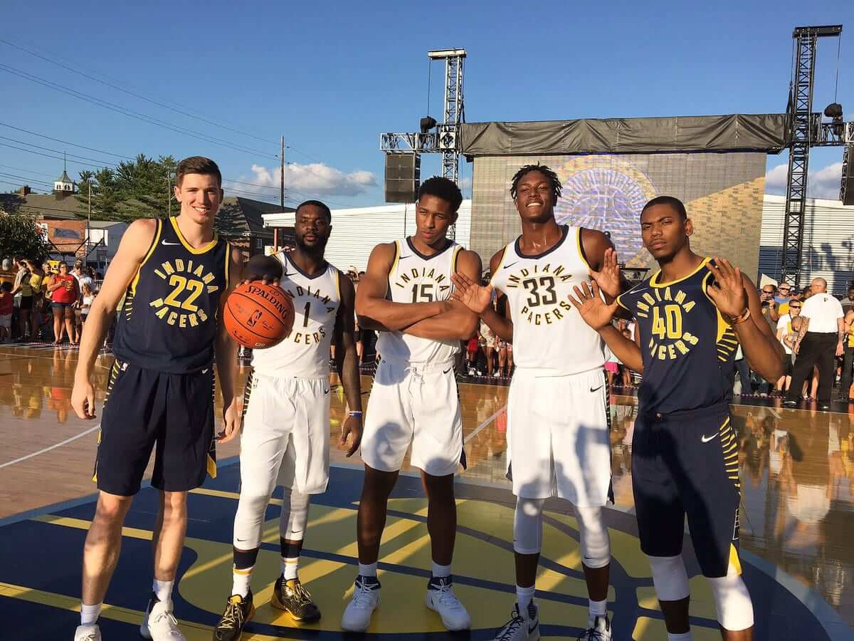
Who the hell does a uniform unveiling on a Friday night? The Indiana Pacers, that’s who. While I was out doing, you know, Friday night stuff (more on that in a minute), they revealed an entirely new team identity.
Okay, one thing at a time:
1. As you can see above, there are new uniforms. You can see the rear view in this next shot:
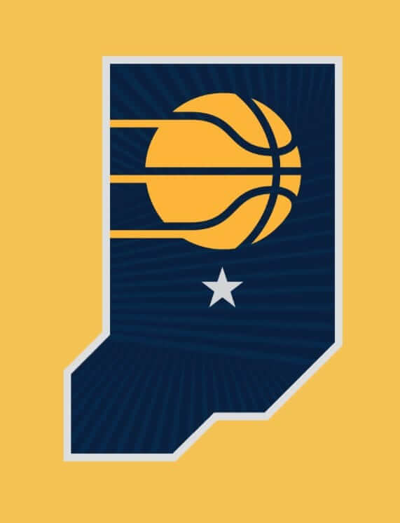
2. Those lines on the sides of the uniforms are echoed in two new secondary logos and a new “seal”:
Dimensional farmland. It represents the rising sun rays on top of the Indiana farmlands. These lines are sense of home and represent growth. pic.twitter.com/V985Wu8ca7
— Indiana Pacers (@Pacers) July 28, 2017
The Seal of Basketball in Indiana is a symbol of unity, bringing together all with a shared devotion to the game. #WeGrowBasketballHere pic.twitter.com/QeVWMwmizm
— Indiana Pacers (@Pacers) July 28, 2017
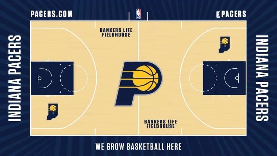
3. The lines are also visible on the outskirts of the new court design:
All of these new visual elements are explored in greater detail in this site that the Pacers have put together. You can also get a closer look at some of the uniform details and see how the court design has changed in this video clip:
Introducing the new look of Pacers basketball.#WeGrowBasketballHerehttps://t.co/nq0ocBgCTb pic.twitter.com/hs431HC1gf
— Indiana Pacers (@Pacers) July 28, 2017
Okay, some quick thoughts:
• I like the circular type treatment on the chest. A lot! However…
• The uniform would be so much stronger if they had gone with a different number font. The font they used, Agency, is badly overused in the uni-verse these days. I suppose I should be happy that Nike didn’t come up with some godawful custom font — that would definitely have been worse. But still, this could have been better.
• I’m generally a fan of horizontal lines on side panels. But the treatment here feels a bit collegiate, no? Reminds me of Marquette, among others. Also, the Pacers helped pioneer the vertical racing stripe look, so I find it a bit jarring to see them wearing horizontal lines. I don’t think the lines are a dealbreaker, but I do think the uniform would be stronger without them.
• That said, I do like all the new logos with the lines — even the seal, which I think works surprisingly well. Yeah, some of the marketingspeak is eye-roll material (gee, how many times can they mention “pride”?), but the designs themselves aren’t bad. It’s odd, though, that the two state-based marks take different approaches Indiana’s shape — one literal, one stylized:
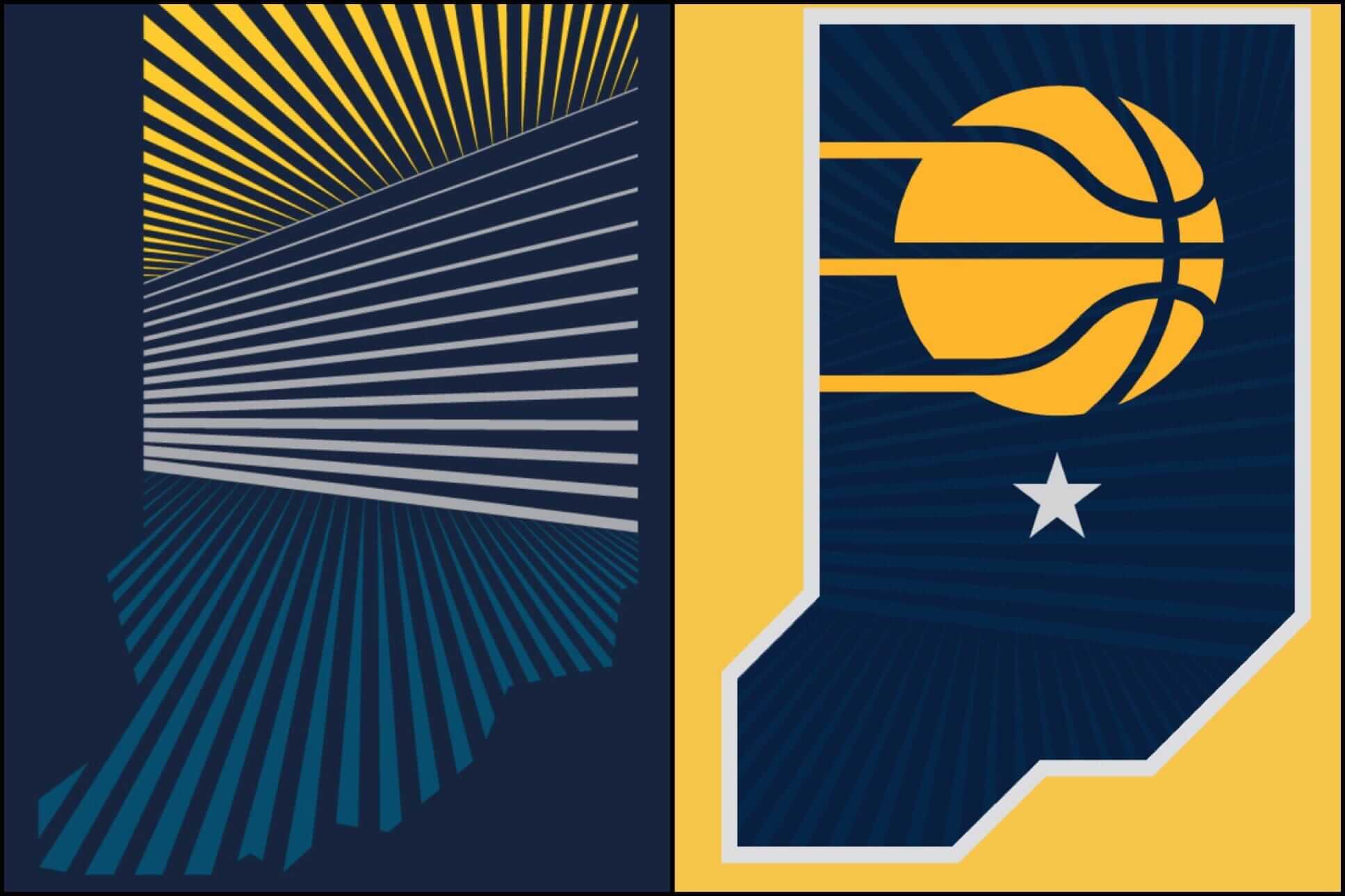
I think the one on the left is much, much stronger.
• Nike appears to be using two collar treatments. A simple, gentle V-neck, which we’ve seen being used by the Thunder, Kings, and now the Pacers, and the more wishbone-y one being used by the Pistons, Warriors, and a few others. The simple V-neck is clearly the better option.
• Yet another team with a waistband logo. Looks like it’s gonna be a league-wide thing.
• At least one player at the unveiling — forward Lance Stephenson — was wearing Stance-branded socks:
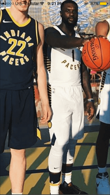
That’s a no-no, as Nike is now the league’s sock provider.
• Another team without a corporate uniform ad. Let’s count our blessings.
• One final thought: As you’ve no doubt noticed by now, the new identity package leans heavily on a slogan. It’s not the worst slogan in the world, although it got sort of tedious to see it invoked over and over and over again in the marketing materials, so I feel no particular need to repeat it here. As I looked through those marketing materials, which also talked a lot about Indiana’s “work ethic” and “pride” and “early morning sunrise” (the sun apparently rises in the afternoon in the other 49 states), I suddenly realized why I dislike Nike’s uni-marketing style so much: They sound exactly like a tourism bureau. The boilerplate clichés and bromides, the inevitable references to “hard-working people,” the mentions of local landmarks and history and heritage, the reduction of a complex place into a caricatured confection — it’s all tourism marketing 101, like they want you to book your flight right now and come visit Indiana (or Cleveland, or wherever the latest uniform is being unveiled). Of course, the people they’re marketing to — the local fans — already live in Indiana, so they don’t need to book a flight. But they presumably feel good about their home state being packaged so attractively.
And just to be clear, I’m not saying there’s anything wrong with visiting Indiana. I’ve visited there several times myself! I’m just saying that the way Nike markets local culture has a lot in common with tourism marketing (which is something that really should have occurred to me a long time ago). Speaking of which: How long do you think it’ll be before Indiana’s real tourism bureau starts using the Pacers’ new slogan?
(My thanks to Erick Kriewaldt and Neal Dorfman for their contributions to this section.)
Naming Wrongs update: In case you missed it earlier this week, we have a new batch of Naming Wrongs designs. Full details here, or just go straight to the Naming Wrongs shop.
The Ticker
By Paul

Baseball News: Check out the uniforms worn by the ushers at Jarry Park, the Expos’ original stadium (from BSmile). … The Bowling Green Hot Rods will host a solar eclipse promotion on Aug. 21 (thanks, Phil), and the Lincoln Saltdogs are doing the same thing (from Zach Peterson). … The Brooklyn Cyclones will wear Nickelodeon Night jerseys on Aug. 23. … Ever wonder what Randy Johnson would look like in a current D-backs uniform? Right, me neither, but here you go anyway. That was at a Hall of Fame event in Cooperstown (from BigDaddy45). … Whoa, the Fresno Grizzlies Tacos have taken the tequila sunrise concept to a new level! (From Mike Givler.)

NFL News: The Vikings’ horned “V” logo is being used by a San Antonio appliance delivery company. … Several readers have reported that the Jets’ new yearbook cover design uses a kelly-ish shade of green, leading them to wonder if the team is changing its official colors. I am not aware of any such change being in the works, but it’s interesting that they went that route with the yearbook (thanks to Steven Presser). … The Bears have worn the annoying Nikelace collar since 2012. So why does this 2015 photo show RB Matt Forte wearing a completely different collar? (Good spot by @sadcarolinafan).

Hockey News: NASCAR driver Corey Lajoie will have Lehigh Valley Phantoms logos on his car this weekend (from Blake Pass). … This is pretty wild: When Lightning G Andrei Vasilevskiy’s new mask gets wet, the team’s 25th-anniversary logo appears.

NBA News: The Trail Blazers will unveil their new uniforms this afternoon (I’ll have coverage here tomorrow) and it appears that that Hornets will follow on Monday. … New game ball for the G-League I still call it the D-League (from Zach Loesl). … Man, if you weren’t already convinced that the AAU scene is a corporate cesspool, just read this. The only consolation is that all the people involved clearly deserve each other.

College Hoops News: New floor design in progress for Virginia Tech. … Looks like Maryland G Anthony Cowan is going with JrOB this season.

Soccer News: A color clash in German’s fourth-tier league resulted in one team having to wear practice jerseys. … Arjen Robben of FC Bayern wore running sneakers for the team photo (from Doc Serph). … New third kit for Norwich City (from Brian Mazmanian).

Grab Bag: A Virginia high school named for a slave-owning Confederate general will be getting a new name — sort of. “For now, J.E.B. Stuart High School will become Stuart High School, with the school board set to adopt a permanent new name by 2019,” explains R. Scott Rogers. “In the meantime, the school’s team name will remain the Raiders, but a teacher I know in the district tells me that the principal hopes to change the school’s athletic identity from a Confederate cavalryman to a Scottish Highlander or possibly just a horse.” … Finland is going through a boom in unusual sports, including swamp soccer and phone throwing. … The Republican National Committee is accusing a Virginia politician of trademark infringement because his campaign materials include a GOP-style elephant, even though he’s an independent (from Tommy Turner). … Repeated from the hockey section: NASCAR driver Corey Lajoi will have Lehigh Valley Phantoms logos on his car this weekend (from Blake Pass). … The New Westminster Salmonbellies — that’s a box lacrosse team — have their jerseys depicted on their floor. … Hmmm, could these new mobile ink-jet printers be used on uniforms? “Imagine if you need to quickly get a new player’s name and number onto a jersey for that night’s game,” says Brice Wallace. … New rugby kits for the Leicester Tigers (from Eric Bangeman). … Here are the car designs for this weekend’s Honda Indy 200 (from Tim Dunn).

What Paul did last night: While the Pacers were unveiling their new uniforms, I was having dinner with my friend Carrie in my backyard, because that’s the sort of thing people are supposed to be doing on a Friday evening.
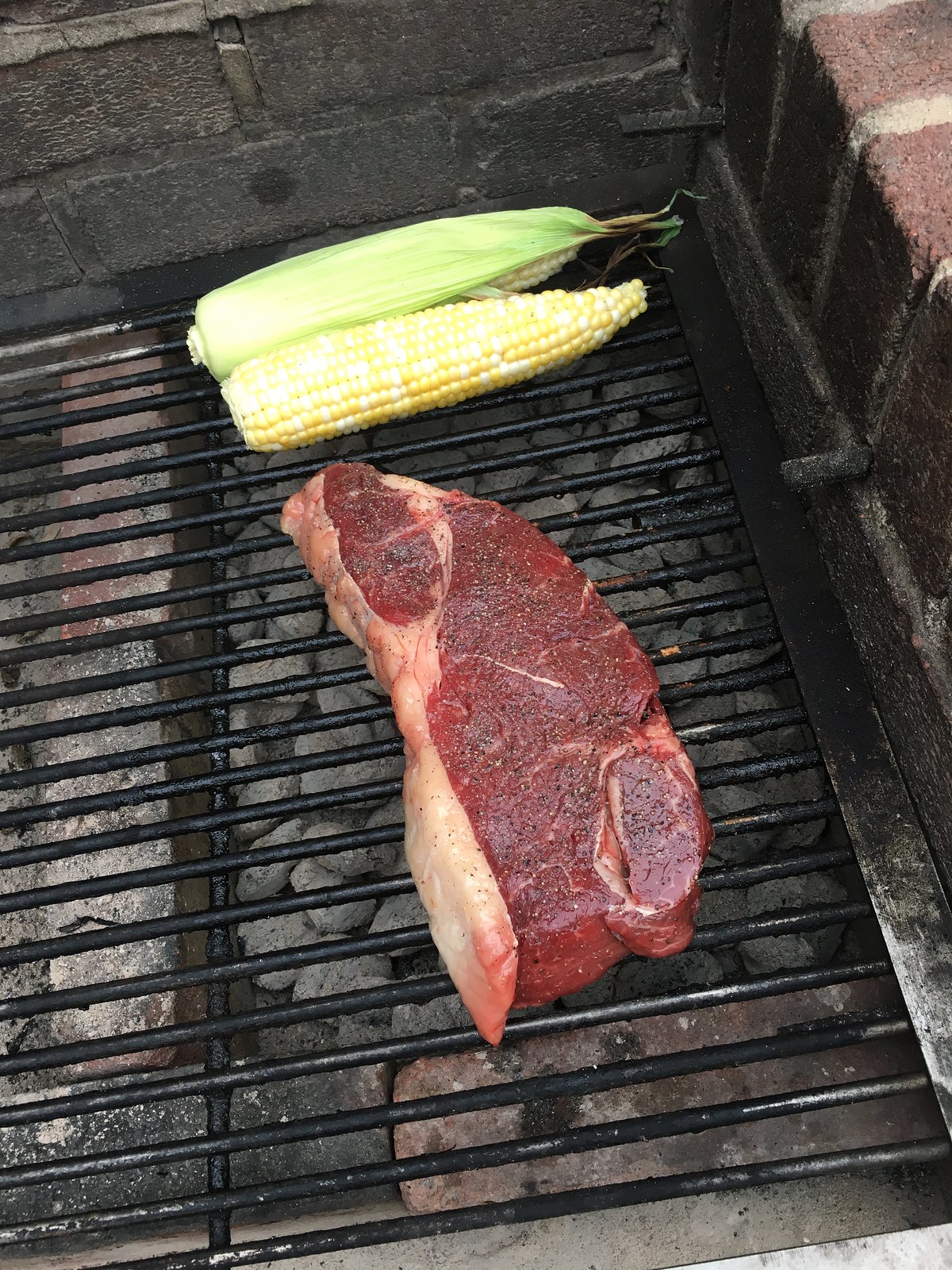
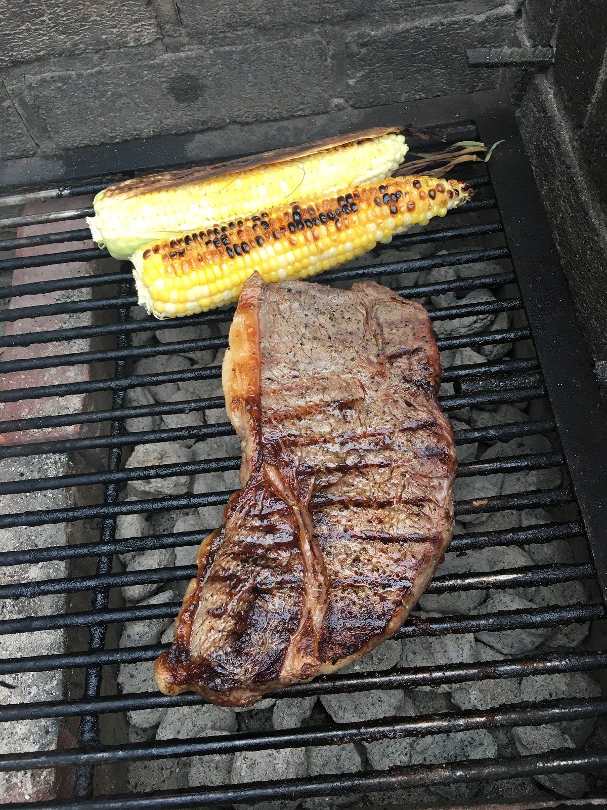
I’d picked up a really nice slab of top sirloin from Fleisher’s, and we also got some corn and some scallions. Oh, and Carrie brought some very nice local cherries. That’s all we needed. So simple but soooo good (for all photos, click to enlarge):

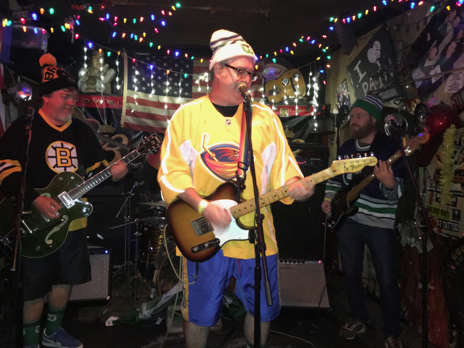
After dinner, I biked over to Hank’s Saloon, because the great Connecticut hockey-rock band the Zambonis were in town. As usual, their attire was highly uni-centric (although I was a bit disappointed that nobody was wearing Cooperalls this time around):
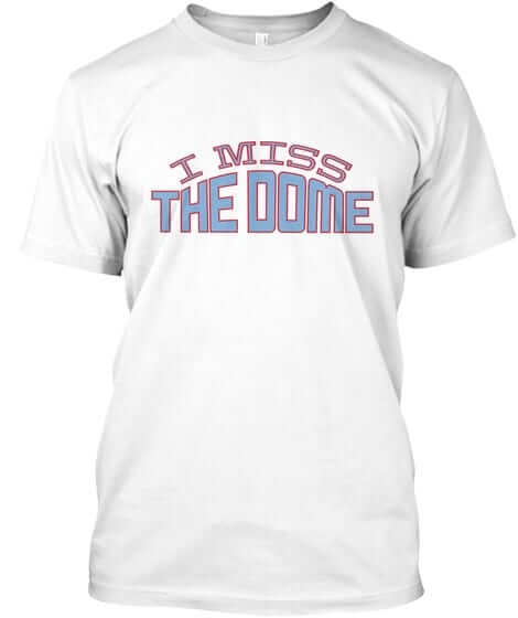
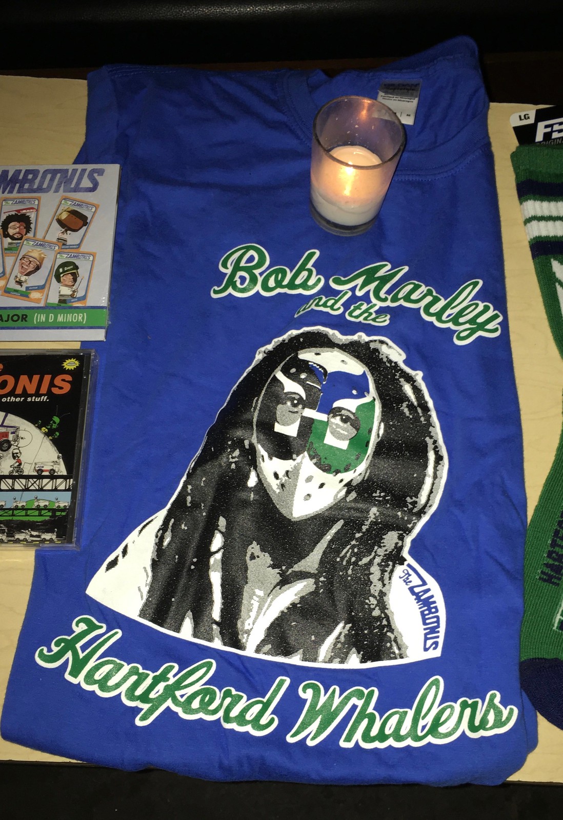
Bonus points for this very cool item at their merch table:
I would’ve loved to hang out with the band after their set, but I had to scurry home to cover a breaking story. (Have I mentioned that it’s nuts to unveil a uniform on Friday night?) So that’s what I did for the next few hours. Wrapped up just after 1am. The things I do for you people! See you back here tomorrow.
Fresno “Tascos”. Those jerseys are outstanding, though.
Fixed.
“Is there a way we can give the uniform a Filmation vibe”
I wish; it’s too bad you can’t make “INDIANA” and “PACERS” rotate on each uniform so neither element gets top billing.
Number 1 in the Stance socks is Lance Stephenson, not Kevin Seraphin.
Fixed.
Yes re: Stephenson. And Seraphin changed his number to…13 (Paul George’s old number).
I’ll say this again (said it on Twitter last night):
Words can’t describe how much I HATE that circular wordmark. I almost can’t even look at those things.
(Pacers fan since the early ’70s)
Donovan, a question: Do you hate the circular design in general (i.e., would you hate it for any team), or do you just think it’s not right for the Pacers?
I really like it strictly from a design standpoint. But I do find myself wondering if it feels right for this particular team (which is how I also feel about the stripes on the side). Of course, I’m not a Pacers fan like you are, so I’m not coming at it from the same place.
I’ve been thinking about this a lot this morning.
I think it has to do with the tiny letters, spaced far apart in a circle. Visually (at least, to me) it looks weak. Someone with no knowledge of the team or the league won’t be able to tell what team it is, until they get close enough to read it.
The lettering is one of the (many) reasons why I hate the Raptors’ unis as well. Also has tiny letters, spaced somewhat far apart.
My fix would be to have “PACERS” (on the home jerseys) straight across the front, with right-aligned numerals below (ala Flo-Jos), and “INDIANA” on the roads. Probably in the minority with that I suppose.
I actually don’t mind the patterns on the sides.
I also agree that the star for Indianapolis is way too far south, but my biggest complaint with that new secondary mark is that it’s missing the notch in the upper left-hand corner for Lake Michigan.
the name in circle is a unique (to the modern NBA, at least) way of skirting the “big ass logo on the front” trend that the warriors brought back (and has been comparatively weak in it’s modern iterations) while following a similar visual composition to that trend. that i like, as well as the more abstract state outline logo (the “seal” is a bit “parks and rec” for my taste). but what i’m not getting here is why there are three new logos in this graphics package, when they actually seem to be doubling down on their old P logo, relegating the “flying ball indiana” logo to a distant second fiddle, and ignoring the “farmland at sunrise” and circular “seal” altogether. all in all i think this is pretty decent, but does unfortunately add another uniform to the NBA’s growing list of teams that have a dysfunctional imbalance between retro and modern (warriors, kings, and nets immediately come to mind).
Re: Indiana Pacers new uniforms. Though unexpected, I do like the full name around number treatment. Has an old school grass roots feel to it. Gives them a distinct uniform feature compared to other teams in the league.
The striping design on the sides may remind some of Marquette. First thing it reminded me of is the similarity with NLL champions Georgia Swarm. With the same colour scheme and the side stripes, this is like a basketball version of the Swarm lacrosse uniforms.
link
I think any slogan gets tiresome when you hear it many many times and its drilled in your head. We grow basketball here is actually one of the better slogan’s but I’m sure thats all pacers fans will hear all season long and however long it it on their court, kinda liked the slogans being on the inside collar like the NFL & NHL was doing. (As a philadelphian, I dislike the slogan “Trust the process” and hope the 76ers never officially adapt that into their court and anything else)
But anyways, I think the pacers did a great job, its different from their previous look while still keeping their colors and for now in the NBA it’s very unique and not in the bad sense like we see too often.
Your second steak picture looks like the bovine version of the Pacers’ new state logo.
We grow steak.
Exceptionally witty comeback, Paul!
A study in contrasts here. You grow steak. I grow fat. You grow a slab of culinary perfection. I grow a slab of coronary granite.
By coincidence, there are three raffle tickets atop my refrigerator for today’s local firefighters’ softball tournament, and two of the prizes are half a pig. (I hope to win the half with the head.) Had it been beef, your superb presentation photo would have induced me to commit suicide by sirloin.
As it stands, the village butcher will be selling a nice cut of beef within the hour because of you.
two of the prizes are half a pig. (I hope to win the half with the head.)
Can’t tell if you’re joking, but are the halves really front and back? Not left and right (which is how a carcass is usually split)?
In any case: Say hi to your butcher for me, and enjoy your beef! Hope you cook it at least as rare as I did.
Yep, I was joking. (If we are what we eat, this ham prefers the half with the tail.) But you are correct; the halves are right and left.
Most of the other prizes are firearm-related. Which means that, in the event of a pork shutout, yours truly might score a trusty Red Ryder and bag the first-ever wild boar that decides to invade our town.
Speaking of lacrosse, a thank you to Wafflebored for the WLA submission. Looks like you did make it out to a game this year.
WLA teams have some great uniforms. Many traditional teams with simple/attractive colour schemes.
The New Westminster Salmonbellies jersey on the top right on the tweet is their regular jersey. They have basically worn the same jersey for decades with minor tweaks. Since at least the 1960s. This jersey will likely never change moving forward. Kind of akin to how the hockey’s Red Wings and Canadiens do not make major changes to their jersey:
link
The Salmonbellies have worn a few throwbacks. One throwback that is not a featured jersey on their floor is their red and white (minus the blue trim) with the lone salmon on the front. Here is that throwback in action:
link
For the jersey depicted in the middle-right photo on the tweet, here is a shot of that jersey in action in 1911 when the Bellies were still playing the outdoor game:
link
Yes and I really need to make an effort to do it more, but with such a short season and during the summer it can be easy to miss. I haven’t been to a game for a few years.
The Salmonbellies history, uniforms, arena, everything is just so good. I always get a kick out of the giant goalie jerseys. Are they the biggest jersey in sports?
Pacers new unis look very collegiate to me. Could have done something to better represent an actual pacer like in their past. Not the Indiana Farmers.
Reminds me of the Calgary Flames shoulder patch. It’s not bad looking but what the heck does it have to do with a flame? Go Indiana Farmers.
I’m guessing you’re referring to the one from their cowboy-themed alternates with the script logo from a few years ago, and not their regular jerseys and the Flames’ STUPID FLAG PATCHES?
(Guess what uni element I don’t like?)
(Hoosier checking in)
I like the new uniforms more than I probably should and really, really like the circular seal (the rising basketball sun). However the star in the “modernized” logo meant to represent Indy in the middle of the state is too far south. Like Bedford or Crane too far south. Maybe even farther. A really glaring over-sight but probably (hopefully) only Hoosier and/or geography nerds will notice? I noticed immediately and I can’t unsee it. Otherwise I’m a fan of the new identity.
The picture of the Zambonis reminds me of a tour The Cure did a few years back. Robert Smith would wear the NHL jersey of the city the band played in for that particular night.
I like the phrase “visual identity package” because it pretty much sums up what I see in the mirror just before I walk out the front door of my house everyday. I’ll give the Pacer’s credit for one thing — they come up with a new look more often than I do.
Sorry leaving this & going to see if the Zambonis have a website to buy that Bob Marley & the Hartford Whalers t shirt.
I like the Pacers new uniforms. I only wish that they added a yellow third jersey hat could be worn as well with the NBA foregoing the white uniforms at home directive. Does anyone else agree with me?
Goddamn yes, this. I’ve tacitly wished for them to wear gold as their primary home uni since 1998 (or ’99?) when they introduced the gold pinstripe alt.
The Pacers can have two more uniforms. I assume Gold will be one. Maybe they will stick with the ‘hickory’ uniforms for the fourth.
Correction: Both the Hot Rods and Saltdogs are hosting solar eclipse promotions at day games, not “Solar Eclipse Night” as the ticker states, which makes sense if you think about it. Interesting that both teams are giving away solar eclipse viewing glasses to the first x number of people. What about the people who arrive later? Do they just risk serious eye damage? Or are you supposed to bring your own glasses if you aren’t going to be there early enough?
Right-o. Now fixed.
The Hot Rods actually have a really early start time of 10:35 am, timed so the eclipse happens right after the end of the game. The Saltdogs, meanwhile, start at noon, and say the game will be paused during the eclipse… kind of like a preplanned rain delay, I guess.
The opposite of the old “sun delay” that used to happen at Wahconah Park in Pittsfield, Mass.!
link
The whole early morning sunrise nonsense in the marketing makes absolutely no sense, and in fact, is completely backwards. Indiana is one of the farthest west Eastern Time Zone states, so if anything they have a really late morning sunrise compared to most states. Not surprising the Nike nonsense machine would do something that dumb. That said, I dig both the state shape alt logo and the seal logo. Well done on those.
Indiana is one of the farthest west Eastern Time Zone states, so if anything they have a really late morning sunrise compared to most states.
Ah, except for the handful of western-Indiana counties that are in the easternmost portion of the Central Time Zone! They really do have early sunrises!!
But of course it’s still bullshit.
Agreed. And it immediately made me think – what do the dark lines on the bottom represent? The post-George descent to the depths of the conference?
.
The uniforms are fine. But I HATE that striped logo.
I have to say, so far so good with Nike’s treatment of the NBA (the actual unis, not the marketing BS). Or at least, it could be a LOT worse.
If a tourism bureau actually used any of this they would likely have c&d filed against them by the nba/Nike.
Holy cow. I generally do not leave comments but the Pacers re-brand is so aweful that I just had to come out of my shell. These simply do not belong in the NBA and I’m beginning to wonder if Fila or And1 was responsible for such amateur work.
It’s seems that Nike tried to simplify things and instead gave birth to this, identify confused (a sign of our times?) hybrid GSW/OKC/Wolverines jersey. And what an oversight, the “22” jersey is basically touching the circular wording (are you kidding me?) The only upside to this I suppose is that their NFL neighbors in Cleveland will be ecstatic someone has taken the throne from them. Enjoy the next 5 years Indiana. If I were a FA with an identical offer from 2 teams, one being the Pacers, I would actually sign elsewhere just so to avoid looking like an idiot for the next 5 years. Yes, I’ll even take a purple jersey.
*identity confused
Correction: missing the “e” on the end of Lajoie for the NASCAR driver.
Fixed.
It seems odd to me that the secondary logos on the opposite ends of the Pacers’ new court are facing the same direction. They typically face the seats on whichever side of the court they’re on, no? Or is this common and I’ve just missed it?
Nashville Sounds are hosting an eclipse party…
link
t-196093378
…with the obligatory tee shirt too
link
Interesting that they are keeping the eclipse viewing party separate from the baseball game later in the afternoon. Also, everybody who comes to the eclipse party gets the special glasses, which makes more sense to me.
We grow basketball here….and then send the balls to Oakland, Cleveland and San Antonio where CHAMPIONSHIPS ARE HARVESTED
“I have planted, Apollos watered; but God gave the increase. So then neither is he that planteth any thing, neither he that watereth; but God that giveth the increase.” I Corinthians 3:6-7
TYPO The Bowling Green Hot Rods will hot a solar eclipse promotion on Aug. 21
The Bowling Green Hot Rods will HOST a solar eclipse promotion on Aug. 21
Fixed.
Matt Forte (and a few other Bears) wore that template. It was the same template used for the Pro Bowl in 2015.
Other than the garish “swoosh”, the Pacers uniforms and logo updates look perfect to me. Good job, Nike.
Paul! Your sirloin accurately predicted the Pacers’ new logo. Right down to the shape of Indiana and the sunrise grill marks. Good work as always!
Regarding sports in Finland–check out pesäpallo. It’s a Finnish version of baseball that’s almost insane. Uniform ads are rampant, like a lot of sports leagues in Scandinavia.
Balls are pitched upward and the base pattern is a zig-zag. It’s gets weirder from there.
I like the Indy round/full name unis. It does somewhat remind me of Golden State. I’m usually a fan of team name home uniform, and city/state name on road uniforms, but I guess that designation no longer applies. I also like that the Pacers are “Indiana” instead of “Indianapolis”. I like when a team represents the entire state when it’s a state that will only have one professional team in that sport.
I would never tell a man how to cook a steak but I am surprised to see that you grill your corn on the cob unhusked.
I left the husk on one of the ears, but Carrie shucked the other ear and had removed all of the husk before I could say anything!
The “Seal of Basketball” immediately reminded me of this:
link
Which…ok, I guess. (Detlef would probably approve.)
Proofreading:
“The Bowling Green Hot Rods will hot a solar eclipse promotion on Aug. 21”
– will have
“Oh, and Carrie brought very nice local some cherries.”
– drop “some”
Fixed.
Re: Matt Forte, he and a few other Bears, as well as a few Dolphins, tested out the new template the last few years. I think the Chargers also had a few players wearing it.
Ugh, Pacers decide to go with the JV uniforms and a map for a logo.
“I suddenly realized why I dislike Nike’s uni-marketing style so much: They sound exactly like a tourism bureau. The boilerplate clichés and bromides, the inevitable references to “hard-working people,” the mentions of local landmarks and history and heritage, the reduction of a complex place into a caricatured confection – it’s all tourism marketing 101.”
So do you dislike tourism marketing to begin with or do you just dislike it being co-opted for sports marketing?
Both.
As far as the Pacers go, personally, give me an update to the Flo-Jos!
The simple V-neck is clearly the better option
Always!
About the Pacers: I mostly like the new look. My one quibble is a constant one when it comes to the swooshketeers…Make. The. Letters. And. Numbers. Bigger.
But. Then. They’d. Compete. With. The. Maker’s. Mark.
;)
I think the Indiana uniform is, technically, illegal. I seem to remember a rule saying that, if you draw a horizontal line at the top edge of the numbers, that line was not supposed to intersect a wordmark. It’s why the “NEW YORK” on the Knicks jersey has not had so protracted a curve during the Carmelo Anthony years.
I’m pretty sure this is a regulation that started in college; you’ll notice how many workmarks are straight across the front of the jersey (Brigham Young, San Diego State) or are less-curved (North Carolina) than in previous years.
I have never heard of this rule. I’m not saying it doesn’t exist, but it would be news to me.
What is the supposed point of this rule?
C:3 on this PDF:
link
I do not know what the rationale of this is. Mind you, this is just high-school, but I noticed it in college and the NBA in recent years.