Click to enlarge
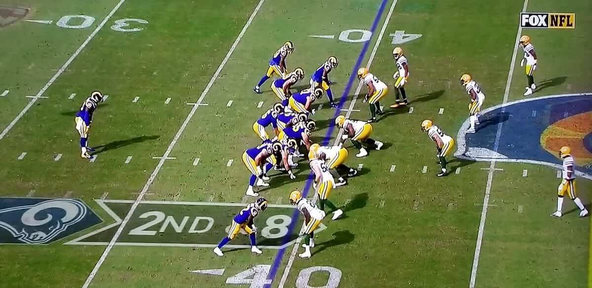
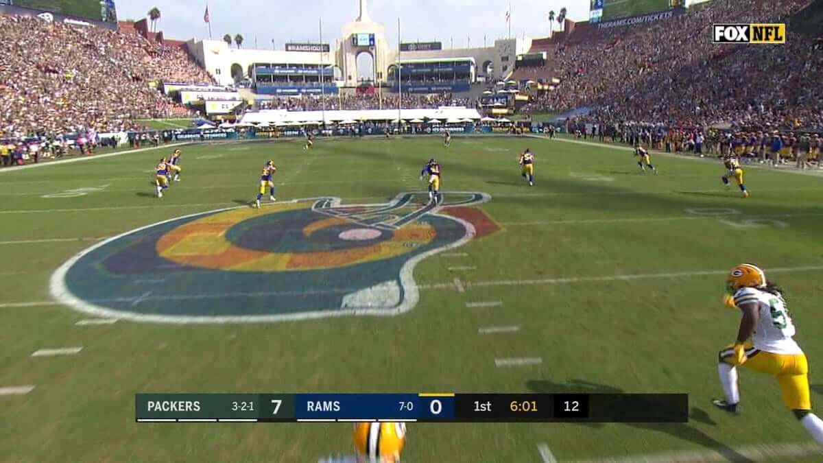
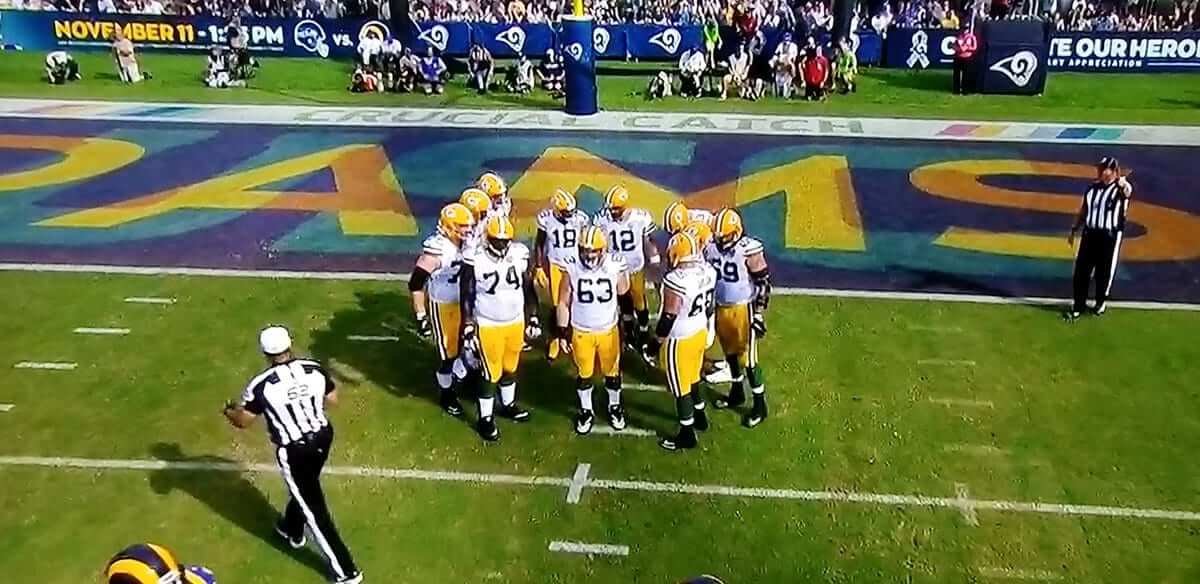
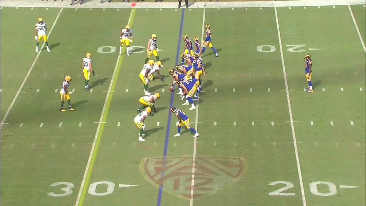
Good-looking uni matchup yesterday in L.A., where the Rams wore their throwbacks while hosting the Packers. But oy, that field — as you can see in the far-right portion of that screen shot, the midfield logo from USC’s game on Saturday was bleeding through the Rams’ midfield logo. Here are some better looks at that:
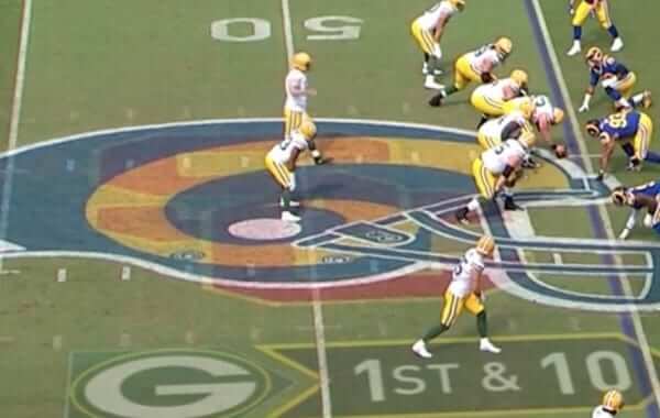
The same problem (which was apparently due to overnight fog) afflicted the end zones, and the Pac-12 logo was still plainly visible on the gridiron:
In other news from around the league yesterday:
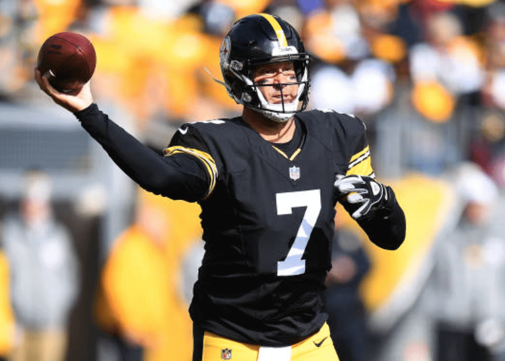
• There was another throwback game in Pittsburgh, where the Steelers debuted their 1970s-80s jerseys with the block numbers:
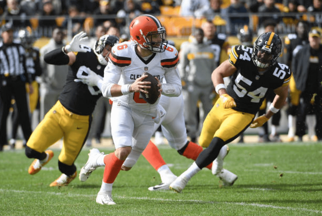
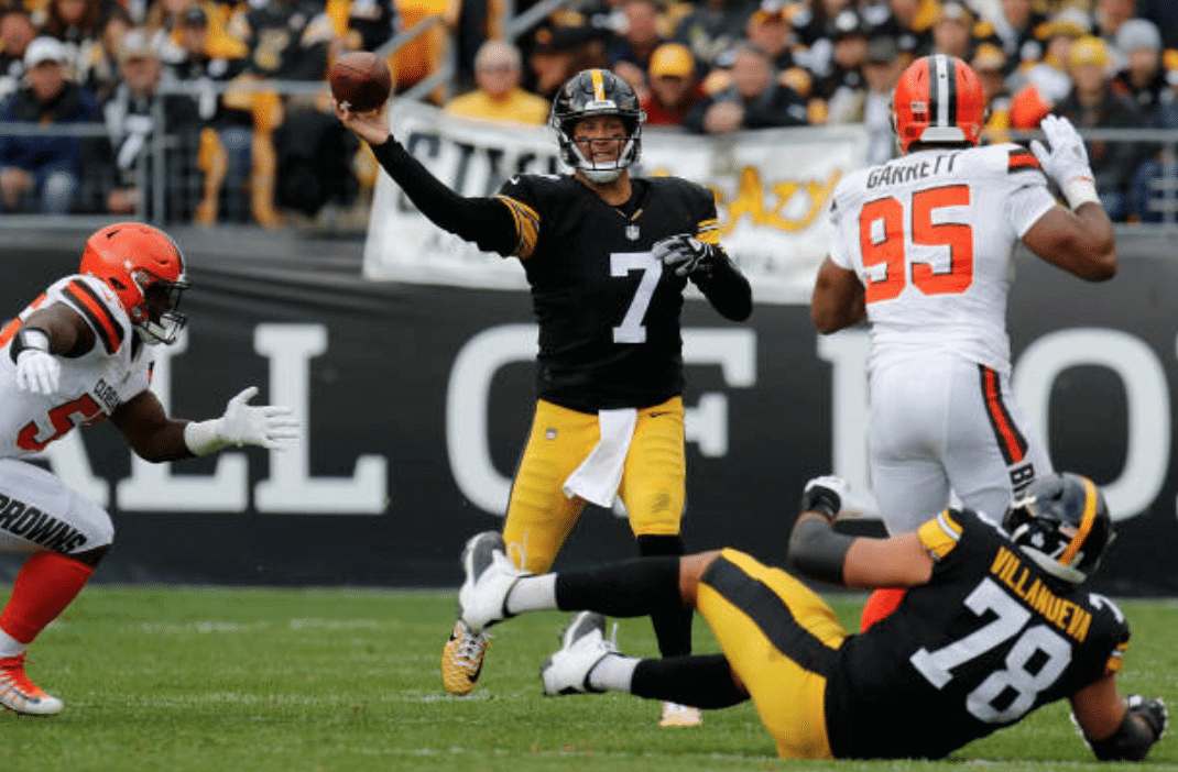
Interesting note: Although the Steelers upgraded to Nike’s new template last season, quarterback Ben Roethlisberger has continued wearing the old template because he prefers the fit. That continued with yesterday’s throwbacks:
Another note from that game: Steelers offensive line coach Mike Munchak wore a strip of black tape as a memorial to the victims of Saturday’s massacre at Pittsburgh’s Tree of Life synagogue (click to enlarge):
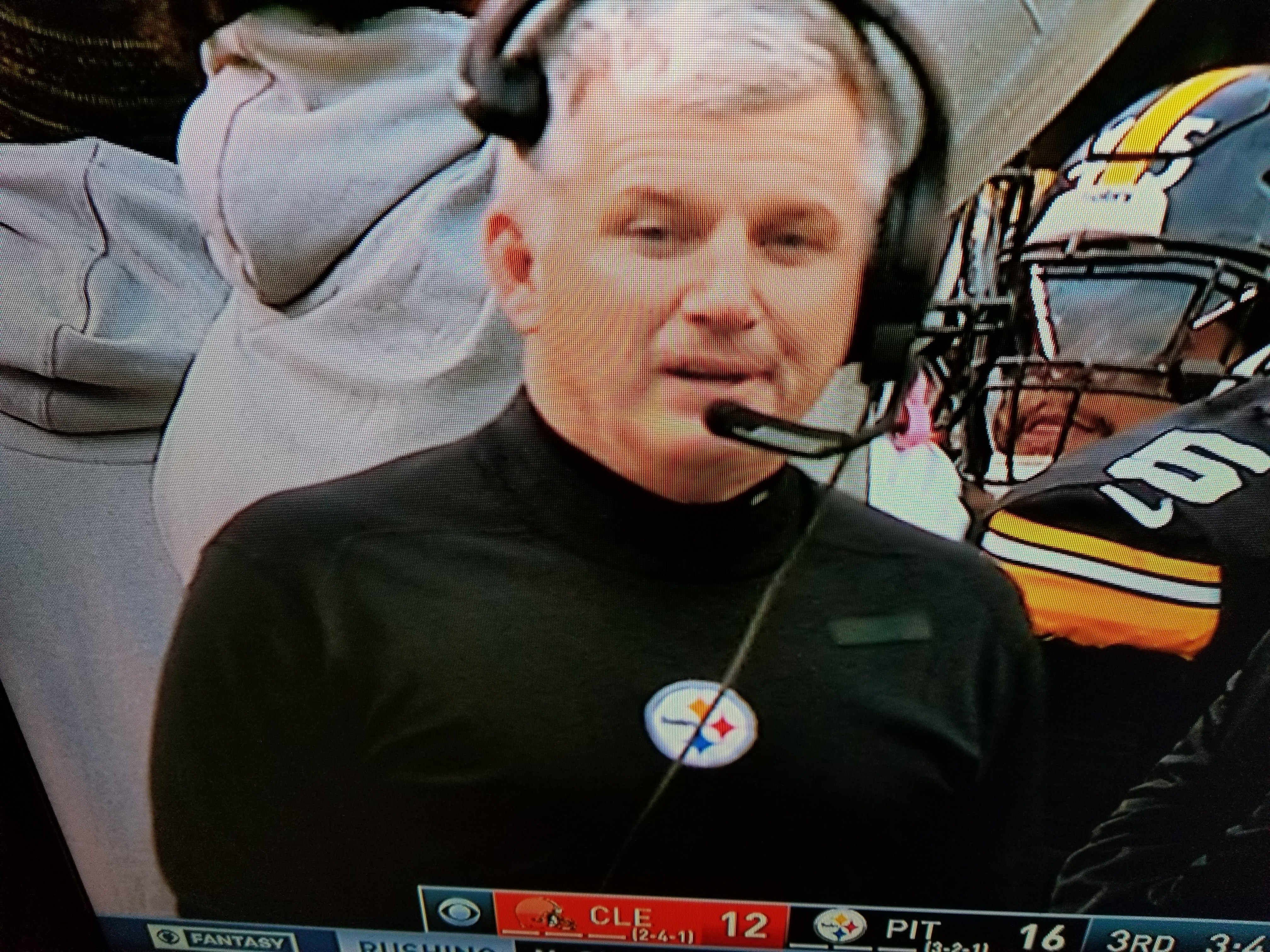
I’m not sure if anyone else on the Steelers’ sideline staff made this type of gesture. Head coach Mike Tomlin apparently didn’t, but I couldn’t find good photos of anybody else. Anyone know more?
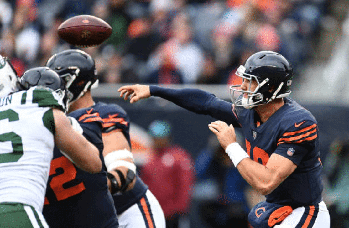
• In yet another throwback game, the Bears wore their Monsters of the Midway design:
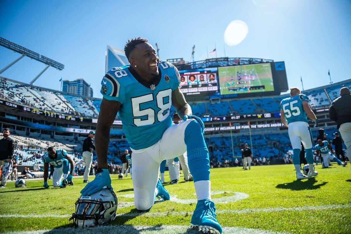
• The Panthers rolled out yet another previously unused uniform combo by pairing their blue alternate jerseys with white pants. In the past, the blue jerseys had only been worn with silver pants.
TRICK OR TREAT 🍭 pic.twitter.com/aMa8A6lXCX
— Carolina Panthers (@Panthers) October 28, 2018
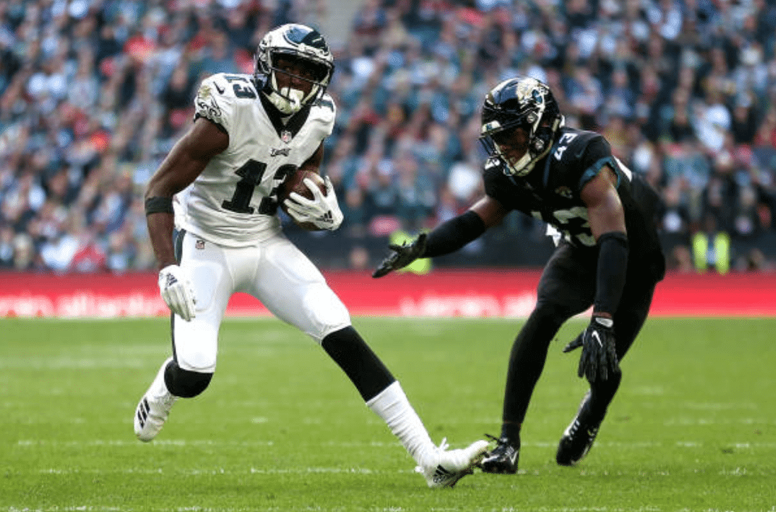
• After the Eagles broke out those kelly green-trimmed jackets for their trip to London, some hopeful/gullible Philly fans deluded themselves into thinking the team would wear kelly throwbacks for yesterday’s game against the Jags. The kelly jackets had to be a hint, a sign, right? Nope:
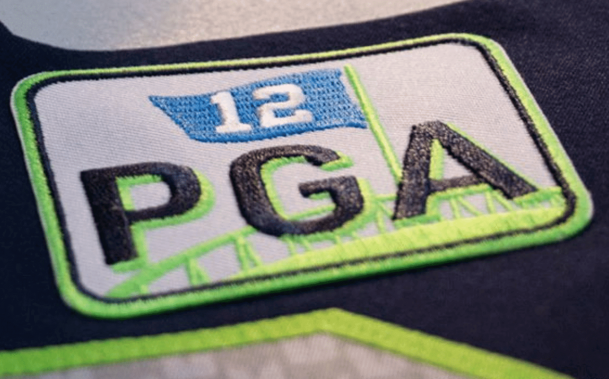
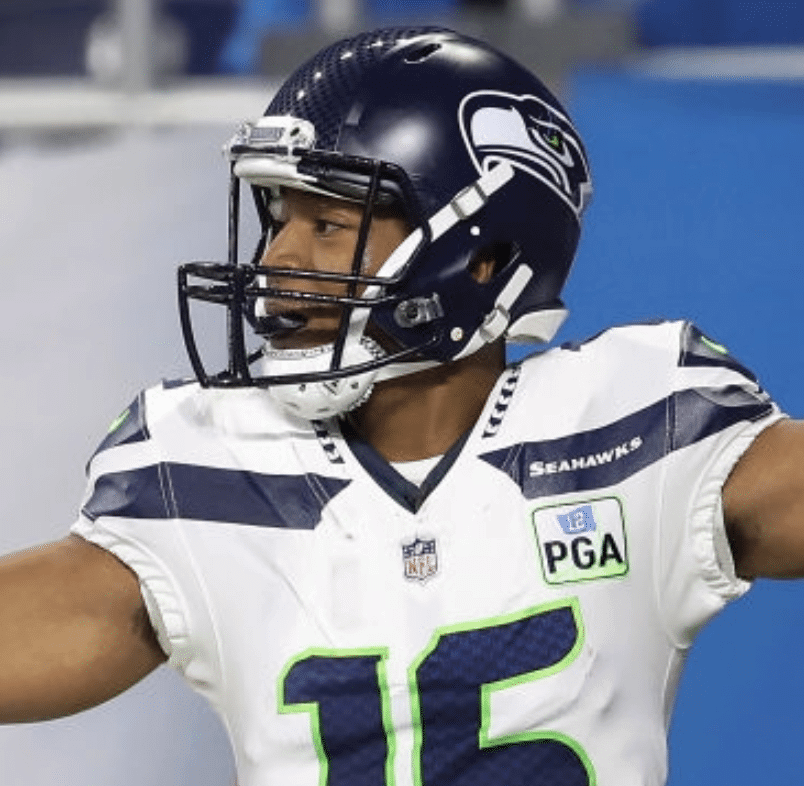
• The Seahawks debuted their memorial patch for owner Paul Allen (which, unfortunately, looks like it has to do with the 12th hole at a PGA Tour golf event). They’ll wear it for the remainder of this season:
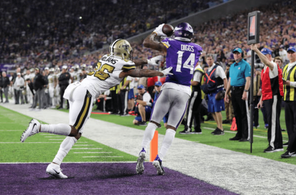
• The Saints wore their mono-white alternates in Minnesota:
• No teams wore white at home.
(My thanks to all contributors, including Andrew Cosentino, Ethan Dimitroff, Noel Fliss, Bob Frigiano, Mark Gonillo, and David Shirley.)
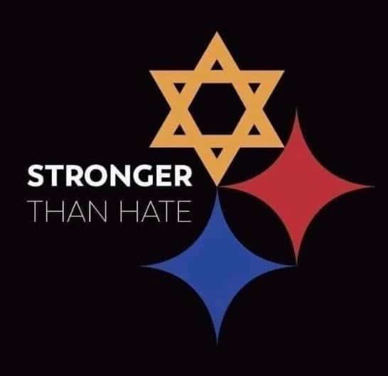
Hypocycloids of David?: In the hours following Saturday’s massacre at the Tree of Life synagogue in Pittsburgh, designer Tim Hindes created the logo shown at right, which quickly began circulating around the internet.
The Steelers had a moment of silence before yesterday’s game. But aside from the strip of black tape worn by offensive line coach Mike Munchak (scroll up to see photo in today’s lede), the team didn’t wear any sort of memorial decal or patch yesterday. That’s understandable — there probably wasn’t enough time to get a patch or decal made. But they’ll almost certainly wear something next Sunday. Will it be Hindes’s design?
If so, here’s a thought: Instead of putting a tiny decal on the back of the helmet, they should consider swapping out their standard helmet logo for Hindes’s design. Or, even better, they could leave their standard logo on the right side of the helmet and put Hindes’s logo on the left side, which is usually blank. That’s what I’m hoping for.
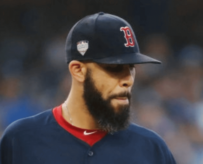
Squatch watch, continued: Red Sox pitcher David Price once again had a squatchee on his cap during last night’s World Series game. That makes five straight squatchee-clad games for him after he went squatchee-free for most of his career. Unfortunately, he once again pitched quite well, which means he’ll likely stay squatchee-clad next season, which in turn means that we’ve probably seen the last of one of MLB’s most enjoyable uniform quirks. Dang.
In other news from last night’s game:
• The Red Sox wore their navy softball tops for the third straight game (i.e., for all three games in Los Angeles). So much for the dream of an old-school white-vs.-grey Series.
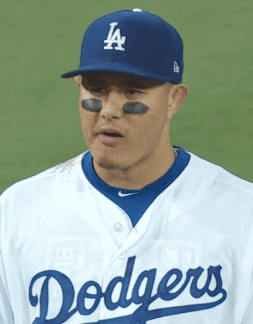
• After spending the past few weeks wearing an “October” undershirt that lots of people mistakenly thought was an Orioles undershirt, Dodgers shortstop Manny Machado appeared to have a different base layer last night:
• The Red Sox winning last night continued a streak of MLB teams clinching the title while wearing softball tops on the road:
Random jersey nerd moment: this is the third year in a row the World Series was clinched by a team wearing their alternate jerseys. All on the road, too. Only other pro team to win a championship in alternates the last 5 years is the 2016 Cavs, also on the road pic.twitter.com/J6EAkKY0eQ
— Casey Bryant (@CaseyBryant51) October 29, 2018
Congrats to the Red Sox and their fans. The Sox were clearly the best team in baseball from wire to wire — good for them! Now then, how many days until pitchers and catchers?
Click to enlarge
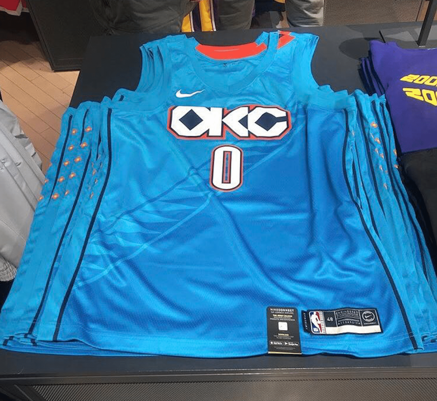
Still more NBA leaks: An Instagrammer who goes by @talksole has leaked a bunch of additional NBA alternate jerseys, beginning with the Thunder’s Native American-themed design, which matches the leak we saw about six weeks ago.
Next up are the 76ers:
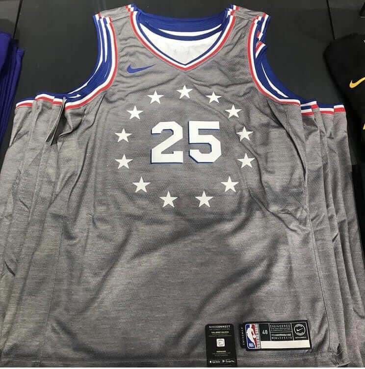
Love the simple design of the uni number surrounded by stars; hate the use of grey.
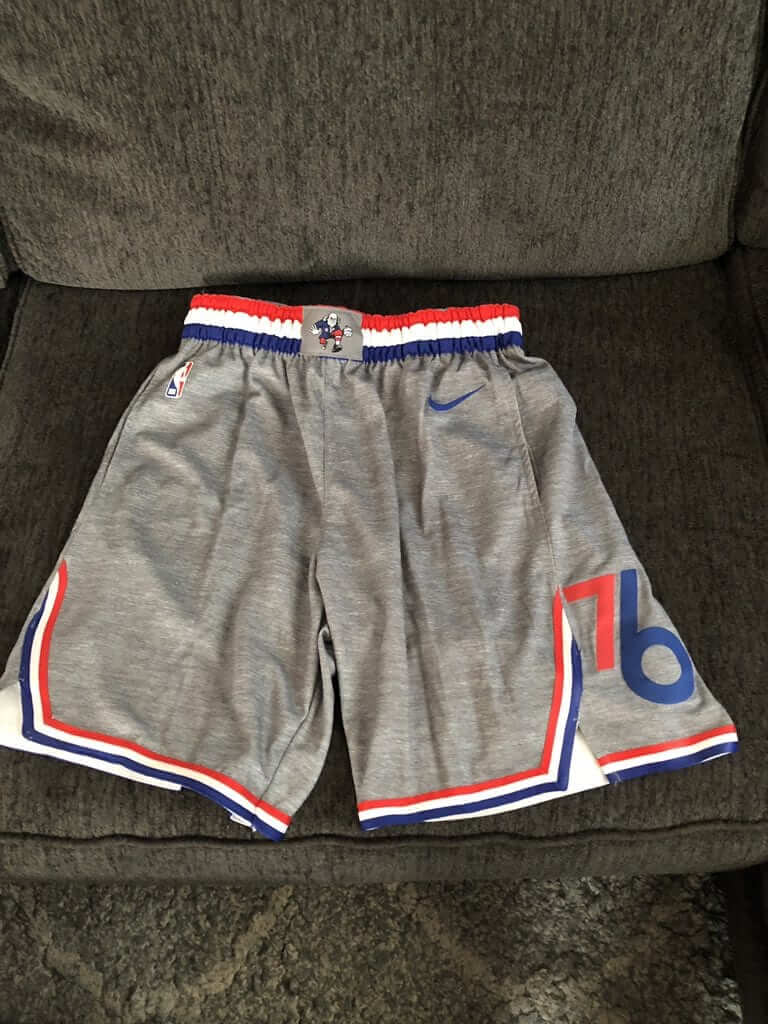
Update, 11:15am: The 76ers’ shorts have now surfaced, courtesy of Twitter-er @S_Woods32:
And we wrap things up with the Pelicans:
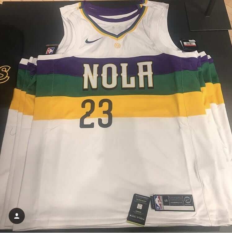
Love this, although the flush-left number is odd.
The new alternate designs are scheduled to start appearing on the court on Nov. 9, so the official unveilings will presumably happen sometime between now and then. At least one team — the Bulls — will be unveiling theirs this Thursday.
(My thanks to Jason Triplett for bringing these to my attention.)
Coming soon. #GoDucks pic.twitter.com/qNeYF9QYwP
— GoDucks (@GoDucks) October 29, 2018
Nikegon to become Jordagon: The U. of Oregon released a teaser video last night (shown above) indicating that the Ducks will soon carry a Jordan logo.
And so it has come to this: The Ducks, having trotted out every bizarre uniform gimmick imaginable over the past decade, have now scraped so hard against the bottom of the creative barrel that all that’s left in their bag of tricks is swapping out their maker’s mark. Oh boy!
As we all know, switching to the Jordan logo automatically starts a bold new chapter for a team’s visual identity. Look at the NBA, for example, where the Hornets wear Jordan — radical! And how about those new Houston hoops uniforms — an exciting new direction! Ditto for Oklahoma’s new hoops unis — innovative! But hey, we’re talking about college football here, so let’s look at those Michigan Wolverines — really pushing the envelope! I’m sure Oregon’s Jordan-fied look will be every bit as groundbreaking.
Side note: Since the start of the 2016 season, Oregon has a cumulative .500 record. They lost two days ago, to a conference opponent, by 29 points. But never let reality get in the way of some pointless corporate theater.
(My thanks to and Jeffrey Rivas and Josh Poe, who were the first two to bring the teaser video to my attention.)

Click to enlarge
Stickin’ it to the lamb: On Friday and Saturday I attended the 2018 edition of the Food Film Festival, an annual event that I’ve been enjoying for over a decade now. There were lots of great little food-centric movies, but I was particularly intrigued by one with the unwieldy title D’Abruzzo: The Meat, Fat, Meat, Fat, Meat, Fat Lamb Skewers of Abruzzo. The screen shot you see above, which shows 256 lamb kebabs, is taken from that film.
The intriguing thing is how the chef featured in the film, Tommaso Conte, creates these skewers. It involves layering slices of lamb meat and fat in a plastic box that has grooves running down all four sides, plus a lid with 256 holes. It’s all very simple but also very clever, and it yields an extremely satisfying result. To see what I mean, watch the movie from about the 4:05 mark through about the 8:25 mark. There’s a lot of stuff about Conte talking about his grandfather, but it also shows the kebab-making process (the embed below should start right at 4:05):
Cool, right? I wondered if this type of box was available for purchase, so I sought out Conte during the festival’s after-party and asked him about it. He said he’d had the box custom-made — dang (although, realistically, I guess I won’t often, if ever, have the need to create 256 kebabs in one shot).
They served us the kebabs during the film and at the after-party, incidentally. Soooooo good!
Click to enlarge

Old raffle, new raffle: The winner of the Art of Words print is Michael Witiw. Congrats to him, and thanks to all who entered. (As an aside, I hope to be running an interview with Art of Words artist Dan Duffy in the near-ish future.)
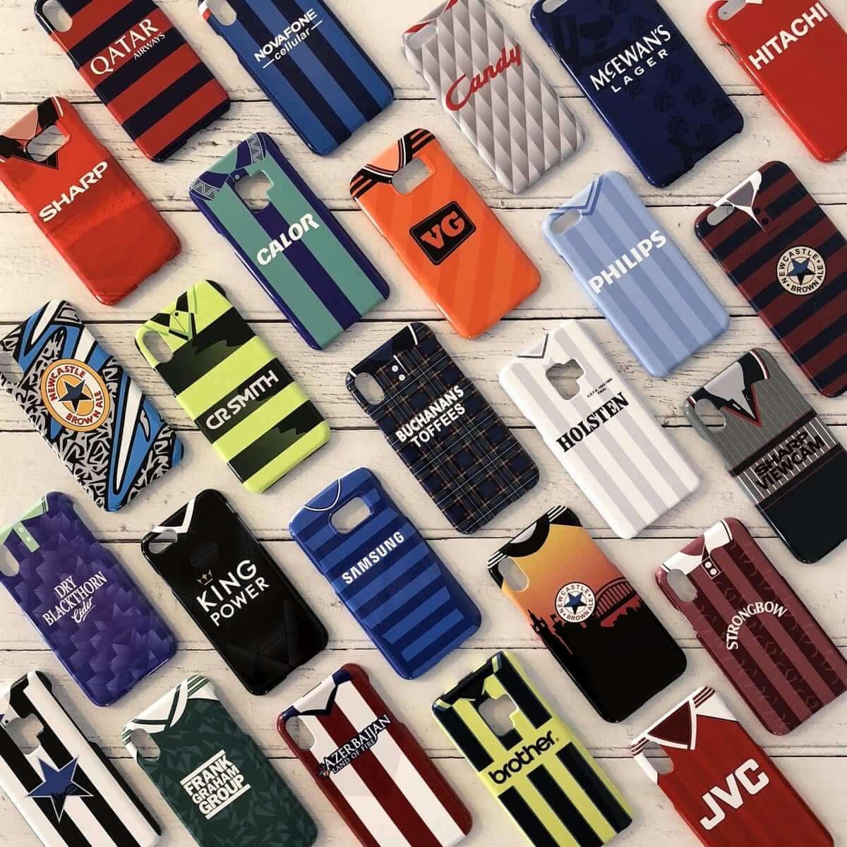
Meanwhile: Last week our friends at Nostalgia Cases offered Uni Watch readers a 10% discount. That went so well that this week they’ve decided to give away one of their soccer jersey-based smartphone cases to a lucky UnI Watch reader.
To enter the raffle, send an email to the raffle address by this Friday, Nov. 2, 7pm Eastern. One entry per person. I’ll announce the winner next Monday.
In addition, if you don’t want to wait and see how the raffle plays out, the 10% discount has been extended another week. To get the discount, just go to the Nostalgia Cases site and use the checkout code UNIWATCH.
The Ticker
By Jamie Rathjen

Football News: Reader Jay Braiman was watching some old Jets footage and noticed some interesting stuff, including LB Pepper Johnson with what appears to be merit decals on his helmet during a 1998 practice, DT Kimo von Oelhoffen with small caps on his NOB in 2006, and RB Bob Gresham missing one of his TV numbers in 1976. … A bar in Los Angeles has a Southern California helmet cutout with a backwards logo (from @2EP0L). … The field at Gateway (Pa.) HS has black yard numbers and lines (from @SpeedStickMusk). … Also posted in soccer: A similar situation to the Rams’ poorly painted field is going to happen today at Wembley Stadium, where Tottenham Hotspur/Manchester City takes place the day after the Eagles/Jaguars game. The pitch is already in poor shape. … New military-tribute uniform upcoming for Kansas (from Matt Tait).

Hockey News: The WHL’s Swift Current Broncos are wearing Humboldt Broncos-themed uniforms on Nov. 2. The designer also gave Humboldt a largely similar uniform, but it’s unclear if it’s just a concept or will actually be worn. Here’s a close-up of the chest logo on both.

Basketball News: Heat G Dwyane Wade and Trail Blazers G C.J. McCollum swapped jerseys after their game Saturday (from Mike Chamernik). … Also from Mike: Thunder G Russell Westbrook gave his shoe to a young fan after offering to trade it for a piece of pizza first.

Soccer News: Here’s a rundown of the kits for Australia’s W-League, which runs during the Australian summer and the American offseason, and is therefore graced by a decent contingent of NWSL players each season. Every team in the league except Canberra United has a counterpart in the men’s A-League. … The final day of the MLS season, where every game starts at 4:30 4:45 Eastern, has its own logo and advertiser. … Stanford’s women’s team wore a dark grey third kit with red numbers outlined in white, but red NOBs not outlined, which made them illegible. … A similar situation to the Rams’ poorly painted field is going to happen today at Wembley Stadium, where Tottenham Hotspur/Manchester City takes place the day after the Eagles/Jaguars game. The pitch is already in poor shape.

Grab Bag: Reader Ed Hahn was at the Heard Museum in Phoenix and saw an exhibition about federally-run Native American boarding schools in the 19th and 20th centuries which included uniforms from many different sports. Unfortunately, we don’t have any context or identification for them.
Thought the Raiders and Colts was an excellent looking game yesterday.
And I guess the 76ers alt is supposed to evoke a sweatshirt?
I’m guessing Nike is going with a “Rocky” connection on the Sixers uniforms, hence the sweatshirt look. Yikes. At least angry Ben Franklin finally makes an appearance, even if it is just on the waistband.
114 days till pitchers & catchers-& a question for fellow Uni Watchers-is this year 1st time that a team never wore their road greys in WS?
Didn’t the cubs only wear their blue jerseys on the road a few years back?
In 2016, the Indians wore their navy blue jerseys for every game (home and road). The Cubs wore their royal blue jerseys for three out of the four road games, but wore the grey in the first game. See this link to the uni-tracking: link
“As we all know, switching to the Jordan logo automatically starts a bold new chapter for a team’s visual identity”
Would like to add Paris Saint-Germain’s Champions League kits – exactly the same, but now with extra black and white.
“A bar in Los Angeles has a Southern California helmet cutout with a backwards logo”
But it’s not backwards from inside the bar, right? ;^)
I really like the Thunder’s City jersey, if only because it has some sort of visual identity. The actual design is kind of bland (as are many of the newer Nike designs), but even that is better than their normal uniforms and logos. The Sixers jersey almost looks like it’s made of sweatshirt material with that gray shade. Yikes.
Fitting that the guy who wins “Art of Words” has a palindrome for a name!
Editing: That’s Pepper Johnson.
Johnson went to Ohio State, and had played in the league for 11 seasons with 3 other teams before he got to the Jets in ’97. I wonder if he ever wore these in training camp with the Giants, Browns or Lions…
Right. Fixed.
The Panthers rolled out yet another previously unused uniform combo by pairing their blue alternate jerseys with white pants. In the past, the blue jerseys had only been worn with silver pants.
Or blue pants… since the blue jersey is what they’ve used for the Rash.
A quick search on the GUD turns up that it was, however, the first time the Panthers have ever worn the white pants with a jersey other than their white one.
Yup – this is first regular season game with the combo. However, they did previously wear the blue jersey over white pants in the preseason this year against Miami.
Yep, you’re right. Though it looks like that game flew completely under the radar back in August… more attention was paid to their breaking out black pants for the last two preseason games.
I remember it being mentioned here when they wore the blue over white in the preseason. Maybe it was just in the comments, but it was mentioned.
It didn’t fly under the radar — it was duly noted here on Uni Watch, on my Twitter feed, and in my NFL season preview. But preseason is still, you know, preseason.
I didn’t see it in the main posts when I looked up the few days after it happened in August, but I did find it in the comments the day after it happened.
And I wasn’t going to go through old Twitter posts, because Twitter is quite frankly abominable to search through for old posts.
As a Pittsburgher and Steeler fan, I would love to see the Steelers forgo tradition and place that logo on the left side of the helmet. Alas, I expect a patch or helmet decal to be used instead.
While I hope that the Steelers use the logo for the next game(s), I do NOT hope they place it as a logo on the left side of the helmet.
A patch or helmet decal with a dignified placement would be suffice.
Lee
That Steelers “stronger than hate” logo has to be a major trademark violation.
No way the team uses something like that.
Simply creating the logo is not a trademark violation, since it’s not being used in commerce.
And it doesn’t seem at all unlikely that the team would be happy to partner with the local designer who created the logo.
As Graf Zeppelin points out, it’s not really the Steelers’ trademark. link
Nor is it at all likely that a consumer buying merchandise bearing the logo (assuming any such merchandise exists) would be confused into thinking he’s buying Steelers, NFL, or link merchandise.
The LA Coliseum has a construction cam (link), and there was indeed fog overnight Sat/Sun: link
Re: the hockey news ticker item. The Humboldt Broncos will be wearing that uniform as a alternate third for the remainder of this season. More detail about the uniforms in this article prior to the recent unveiling.
link
Maybe I’m being charitable because I’m sleep deprived/euphoric from that win last night, but I like the navy Sox jerseys. Yes, it’s an alt, but it’s still really clean, and looks sharp with the gray pants.
And speaking of the Sox winning–this continues the weird trend of a Red Sox world championship every time the World Series logo contains two pennants: link
Thank you for saying pennants. Creamer kept saying flags.
Harrumph.
Saints should use the shade of gold from the alt in their usual uniforms, especially for pants.
Yes, but they would probably need to darken the gold on the helmets to lessen the mismatch if they went with those full-time.
surmised
The Saints mismatch of gold is really noticeable in those
color rush uniforms. it looks almost as bad as the all Navy Rams
joke of a look from last year.
The old gold was so much better. This Vegas Gold look for Saints
never looked good.
I found the Steelers’ block numbers harder to read from the upper deck than the italic numbers.
I emailed Paul about those numbers yesterday during the game, mentioning how they just looked a bit “off” somehow vs. their block numbers worn up until the mid 90’s. I think it’s because of a couple reasons: 1.) the numbers were about 10% too thick; 2.) they were kerned too close together; and 3.) they actually appear too bright (at least, on my TV anyway). Also, the TV numbers on the shoulders were definitely too big and I’d even swear the font for the players names looked wrong as well.
You weren’t the only one who thought they weren’t as perfect as most of us who love the Stillers hoped they’d be.
-C.
I thought they looked great, but I also thought they looked more like 1980s Iowa Hawkeyes than 1970s Pittsburgh Steelers.
Apparently Oregon isn’t actually “switching” to Jordan uniforms, it’s a one-off collaboration.
The NFL is a zillion dollar business. It’s an industry unto itself. That field at the Coliseum is an amateur hour disgrace.
I was very surprised Paul didn’t find it endearing to be honest.
I found it endearing! Football is a once-a-week sport, but football is played at multiple levels during the season, and each level typically plays on a different day. So we can either live in a world in which we have one football field that’s used three days a week, or a world in which we have three football fields that are each vacant six days a week. I mean, if one loves waste and inefficiency, then by all means, rant against the slightly visible signs that the facility doesn’t sit empty 86% of the time. But otherwise, the show-through painting is a quirk to be enjoyed.
FOX mentioned the issue on the telecast. I was making dinner at the time, so only half paying attention, something to do with weather overnight severely limited the time they had to convert the field – I guess USC played the day before.
Don’t quite get the general dislike for the current Steelers font. It’s very similar to the Bears, and people are OK with that uni.
I liked the Carolina look yesterday
Seems a bit harsh, there, Jeff…we’ve seen plenty of examples over the years of “ghost” logos and what not on grass fields when grounds crews have to switch up field designs on very short notice. I always assumed that there is only so much you can do to remove paint from grass without damaging the turf.
Really, the Rams/Trojans should have worked out a neutral field design that both teams could have used, similar to the way they do it in Pittsburgh and Miami. Granted, it is easier there since both the pro and college teams go by the same names. Perhaps the LA Coliseum could have just gone with a retro design with stripes in the end zone like Notre Dame uses.
There are plenty of examples where compromises were made for dual use. The Superdome used to have “Saints” in one endzone and “Tulane” in the other. During the Panthers inaugural season at Clemson, one endzone had “Clemson” and the other had “Panthers”. In the 1970s, “Texas Stadium” and “Orange Bowl” were used in the endzones at their respective stadiums. And last year, the grounds crew at Joe Robbie Stadium painted white diamond shapes in the endzones for the Orange Bowl on Saturday night and the Dolphins’ home game the next day.
USC and the Rams should have some sort of agreement for weekends when both are home on the same weekend. Use white diamond shapes in the endzones and they could still be trimmed in each team’s colors as long as blue is painted over any red areas and the yellow/gold colors are fairly similar. Painting “The Coliseum” in both endzones could also be an option or just leaving them blank altogether.
I don’t ever recall seeing any shadow of the “U” logo at mid-field for Dolphins’s games which makes me wonder if that area of the field is swapped out between games. And if there’s any area that knows how to deal with wet weather, it’s Miami.
When Stanford women’s soccer or Nike (or whomever) are designing a new uniform, don’t they do any beta-testing with an actual uniform? Whether it’s ghost numbers or dark crimson lettering on dark gray, it would cost very little to have some mock-ups and see how they look on the field, from the stands and on TV, for day games and night games. Some designs may look nice but are impractical. Now, Nike and Stanford look foolish rolling out a design that is fundamentally flawed.
Indeed. The Premier League did beta testing of their new number font, including having Peter Drury do play by play of a closed-door practice match at Watford’s Vicarage Road ground as part of the process.
While I understand the Seahawks new patch is for memorial purposes, when I saw it it struck me as a bad omen for NFL uniforms getting ad patches pretty soonish especially as a new bargaining agreement looms. Are we in the last days of ad free uniform era?
I’m not sure what you’re basing this speculation on. The NFL has shown exactly zero appetite for ads on game uniforms. When asked about it, Goodell has said he has no interest in it. Unlike the NBA, where Adam Silver was floating trial balloons and hints for literally years before the ads appeared (including while David Stern was still commish and Silver was simply his right-hand man), to my knowledge no NFL exec has even wondered aloud about the vague possibility of jersey ads.
Let’s stick to facts and not engage in baseless speculation.
Was it ever confirmed whether the WS celebration bottles were champagne bottles re-labeled with Budweiser ads (bad), or extra-large bottles of Budweiser (good)?
Have we talked about the “undershirt sticking out from under the jersey” trend in the NFL yet? I know it’s been a thing this year but the Rams game yesterday was the first time I really noticed just how many players are doing it. Maybe because the shades of blue were just a little off, e.g. #37 in this tweet:
link
Is it just the latest uni fashion trend or is there a practical reason?
Fashion/style. Certainly predates this season.
ugly as a mud fence. (my wife said it looked like one guy was wearing a tutu) one of four uniform topics I would address by rule if I could:
1. at least 1/3 of the visible portion of the sock must be a noticeably different color than the primary color of the pants;
2. pants must cover the kneecap and can’t extend more than two inches below kneecap;
3. shirts must be tucked in to pants at all times player is on field;
4. sleeves (or undersleeves) must cover the upper arm such that no portion of the arm more than three inches above the elbow is uncovered
I will support your commissionership candidacy!
Untucked jerseys in football would seem to me to be counterintuitive to the whole “let’s make them tighter and less grabbable” mentality behind modern jersey construction.
With Boston winning last night, every playoff series this year ended with the visitors celebrating on the home team’s field. The only team to advance at home was the Yankees in the AL Wild Card game.
In my opinion a yellow Star of David has a negative historical connotation of Jewish victimization. The Nazis forced the Jews to wear a yellow star. I believe all three hypocycloids should have been transformed into stars or only the blue one.
The problem with that is that a blue Star of David could be seen as symbolic of the State of Israel (and/or its current right-wing government) as distinct from Judaism; i.e., as a political symbol rather than a religious one. (That has happened to me before.)
The red might be slightly more appropriate, as it’s the symbol of Magen David Adom, essentially the Israeli equivalent of the Red Cross. But the red hexagram has other meanings as well.
In the end I think the yellow makes the most sense. The yellow star that the Nazis forced the Jews to wear was actually a link; this is the opposite. And it bears the closest relationship to what happened on Saturday.
Anyone with a functioning pair of eyes sees the yellow star of the Holocaust as a yellow star not a black star with a yellow background. The blue Star of David is a Jewish symbol, not strictly a symbol of the State of Israel. The color blue is specifically mentioned in the Bible, a unique blue dye was used on the threads of the fringes of prayer shawls. An appropriate reaction to this terrible crime is not more wallowing in victimization, the yellow star should not have been used. The blue star symbolizes pride and should have been.
Anyone with a functioning pair of eyes can see the difference between link and link.
I never said it was; I merely said that it “could be seen” that way. As I mentioned, I have been accused in the past of making an “inappropriate political statement” by displaying a blue Star of David without intending to reference the State of Israel.
By that reasoning, wearing something like link would constitute “wallowing in victimization”.
I have never read, been told or understood that a blue Star of David “symbolizes pride“, specifically. If an individual wishes to express pride by wearing or displaying it (as I did on the aforementioned occasion), that’s fine, but that doesn’t mean it “symbolizes pride” per se; it simply means that person takes pride in whatever it symbolizes, be that Judaism, the State of Israel, or some particular aspect thereof.
There is a clear graphic (and I say symbolic) connection between the yellow Stars of David in the Pittsburgh logo and the Holocaust era star. It’s obvious, you can choose to ignore it. Your example of someone accusing you of an “inappropriate political statement’ is also an example of obtuse political correctness. Why even sink to that level or give it credence? A gold necklace Star of David in no conceivable way resembles the Nazi imposed Star of David. The blue Star of David has become a symbol of ethnic pride just as the stars and stripes is a symbol of American pride.
Neither does link.
Do you have any empirical research or anecdotal evidence to back that up?
I knew something was different about the Panthers unis but I couldn’t put my finger on it!
I thought the Red Sox looked just great clinching in their navy shirts.
With white and grey, the problem is the players are matching the shoes to the pants. So the long-pantsed players are completely devoid of color from the belt down. Colored jerseys help redress the balance.
Some of the Dodgers looked like Good Humor men or hospital orderlies in their scrubs. Shoes should match the cap. Until they do, alternate jerseys are keeping baseball colorful.
I think its funny/ironic that Oregon paired the Jordan video with the song “Wing$” by Macklemore. Listen to the song and you’ll see what I mean.
The fact that the S in the title is rendered with a dollar sign is a good enough clue.
link
Here’s a link to a similar apparatus used to create and slice kebabs.
Oooh, and for a more reasonable number of sticks. Excellent — thank you!
Premier League teams wore black armbands yesterday following the Leicester City helicopter crash. Would presume Man City and Spurs will also wear them today.
Also, managers have started wearing poppy pins. Didn’t see them on any kits (in matches I saw).
THFC said they would wear poppy shirts on the 10th.
Would guess poppy season may be spread over the next two weekends (I didn’t see any either except on managers) because some teams playing away on the 9th/10th might want to wear them at home.
The bar with the backward USC helmet in its window also has a vertical apostrophe catastrophe
While I know it Paul’s suggestion that the Steelers swap out their usual logo for the “Stronger Than Hate” version was made with the best of intentions, I can’t help but think that would be a can of worms that the team would rather not open.
A few reasons:
– The Star of David is both a religious and political symbol, and some players will no doubt object to wearing it for those reasons.
– Imagine if the tragic mass murder in Pittsburgh involved a mosque being targeted instead of a synagogue. Is there any way in hades that a team would ask their players to wear a logo with a star and crescent moon?
– there have been 98 homicides in Pittsburgh this year. 68 of those victims were black. At some point, somebody is going to ask why those victims are not worthy of mentioning but the Jewish victims are.
Probably best if the Steelers stick with a more neutral/traditional way of memorializing the attack. One idea might be to remove the gold stripe across the helmets and replace it with a black one.
Dan, what was/is your opinion on the Jets’ Dennis Byrd memorial decal?:
link
To be clear, that’s the ‘show of support’ decal for Byrd’s career-ending neck injury.
The memorial decal (used by the Jets following his death in a 2016 auto accident) looked like this:
link
Thanks, Chris. But while the purpose of the decal may be different, the larger issue is the same: The team asked its players to wear a Christian symbol. So in light of Dan’s comment, I’m asking him what he thinks of that.
Re: Byrd, I had forgotten about that one, but my take would be that they should have used a design that did not feature a religious symbol
Thanks, Dan. I appreciate your consistency.
I’m not sure if there were any Muslims on the ’92 Jets but Muhammad Wilkerson was on the 2016 team, so maybe that factored into the design (absence of the ‘Jesus fish’) of the Byrd memorial logo?
Are you suggesting that every single member of the ’92 team was Christian?
Not at all…just wondering if maybe the Jets took Wilkerson’s (and perhaps other players?)religious affiliation(s) into consideration in the design of the memorial decal, something the team wasn’t that mindful of in 1992?
I don’t know if the issue is the players refusing to wear it so much as it being interpreted as a “political symbol” by observers, particularly if they changed the blue hypocycloid instead of the yellow (see discussion above).
I actually think the players would be willing to wear a star-and-crescent-moon symbol in that circumstance, as a show of solidarity; don’t forget there are and have been a good number of Muslim players in the NFL.
And I’ve never been impressed with whataboutism, viz., “either everyone is worthy of a memorial decal or no one is.”
Well, I’m not particularly impressed with the trend of dismissing somebody else’s concerns out of hand by referring to it as “whataboutism”…
I think it’s fair to ask why we value some lives more than others.
My intention wasn’t to dismiss your concerns. Sorry if it came across that way. And “whataboutism” was the wrong term to use because this really isn’t that, so I apologize for that too.
I think what I was getting at was that I’m not sure it makes sense to not have a memorial decal for [X] because we didn’t have memorial decals for [A] through [W]. It’s certainly “fair to ask why we value some lives more than others” but I’m not sure this is trenchant example or a clear indication of that, i.e., that it’s the right or best context in which to ask that particular, valid, heavily-loaded sociopolitical question.
Much better stated, Jay.
I also think a random shooting (or even several random shootings) vs. an act of mass-murder terrorism is a bit of an apples/oranges comparison.
THIS
“– Imagine if the tragic mass murder in Pittsburgh involved a mosque being targeted instead of a synagogue. Is there any way in hades that a team would ask their players to wear a logo with a star and crescent moon?
– there have been 98 homicides in Pittsburgh this year. 68 of those victims were black. At some point, somebody is going to ask why those victims are not worthy of mentioning but the Jewish victims are.”
I fail to see the difference between asking players to wear a Jewish symbol and asking them to wear a Muslim symbol. You may find them both equally unacceptable (or equally acceptable), but why exactly would one be considered better or worse than the other?
I have a little different take on it. I’m uncomfortable with the idea of fans of Steelers’ opponents rooting against a team who is wearing a Star of David. As a Jew myself, I’m uneasy with putting my faith’s religious symbols on the a sports team uniforms.
I lived in Amsterdam for a few years, not far from a main tram station that fans used to get from the central city out to the stadium for Ajax games. Ajax had the nickname “Super Jews,” and while for pro-Ajax fans it was mostly fun and games and waving Israeli flags, by the turn of the century overt anti-Semitism had become common among fans rooting against Ajax. To the point that opposing fans would regularly hiss in imitation of the sound of gas. When I lived there, the league had all but given up on trying to dissuade fans from anti-Semitism and was instead pushing Ajax fans to drop the whole Jews thing. At least when Eindhoven came to town, it made attending games very uncomfortable. But watching joyous home crowds stream out of the tram station below our apartment window singing and waving the Israeli flag after a victory was kind of cool.
But for a brief commemoration? I don’t see the harm. I mean, sure, some actual anti-Semites might use the excuse of cheering against the Steelers to express their evil opinions. But bigots are going to bigot, and we can’t let the fear that silent bigots might speak up prevent us from showing solidarity with the victims of bigotry.
RS Rogers–I had forgotten about the Ajax stuff. Thanks for reminding me, interesting parallel.
Is it wrong that the he first thing I thought when I saw the picture of Mike Munchak was that he was covering up a rival apparel logo? That’s how uni-cynical I’ve become.
The Panthers can mix and match their gear any way they like. It won’t change the fact that their uniform isn’t nearly as good as they like to think it is.
Did anyone know what was up with turner from the dodgers uniform? It has this weird black mark from game three on it and he wore it throughout the series with it getting washed/repaired.
link
If only there were a place, perhaps on the internet, where one could look up this type of information….
link
I would think a simple decal on the back of the Steeler’s helmet is the way to go. Messing around with the main logo on the helmet or adding an alternate memorial logo to the other side of the helmet would seem to me something Uni-Watch would usually be against? A simple helmet decal would seem to be the norm or black arm band, etc. As well, there is another Pittsburgh team playing right now, how would you incorporate the Star of David into the Penguins logo with dignity? Seems like both teams should get the same simple (team generic) helmet decal.
This has nothing to do with unis, but am I the only one who really LOVE the way the light/sunshine is in the LA Coliseum? I know it has a bit to do with smog/air pollution, and also the Rams throwback colors. You kind of but not really get it at the Rose Bowl as well, but not at Dodger Stadium.
It also has to do with the way the Coliseum is laid out, only one level, no luxury suites, the oval, again the Rose Bowl is similar, but there’s just something about the Coliseum.
Am I wrong about this?
No, you’re not. The Coliseum does have a certain aura in daylight. -C.
I love the Coliseum. Reminds me of pre-renovation Soldier Field, where the one level of seating afforded you a great view of Lake Michigan. Just can’t beat a stadium with Roman columns.
You are not alone… Football in the fall in LA truly is a scene to behold. That’s the only thing I like about the Rams going back.
Lee
I did a walking tour of the Coliseum when I lived in L.A., not long after the Rams’ return was announced but well before they did any work on the building. It was very cool.
The Coliseum’s playing surface just has a great look to it on television. Doesn’t matter if the Rams are wearing their white or throwback unis or if it is sunny or rainy. I can’t say that I’m a fan of their current endzone font though. Just looks cheap.
The Panthers Unis looked more powder blue than teal. I thought they looked great. So did the Rams. Steelers need to stay with the block numbers.
The Seahawks patch with the CLINK in the lime green accent doesn’t show up well against a white background. Perhaps someone in the Seahawks org should look at something different. Nothing you can do about Paul allen’s initials (unless they went with PA).
Was teal mentioned somewhere that I missed?
They are definitely blue.
Carolina blue, specifically. Think UNC. Carolina blue is not teal.
They were originally Teal, until 2012.
link
“The new logo has a darker shade of blue over the black logo, compared to the former logo, which had teal on top of black.”
Rams at the Coliseum with the gold trim, just looks right, even when the USC markings bleed through, USC does remain the primary tenant.
Fitting momentum turned with safety in Fred Dryer end zone (two safeties on different Packers QB’s in about five minutes in 1973).
Dread when Rams move into new digs, there will be advertising all over the place).
In the 1970s, USC, UCLA and the Rams played at the Coliseum, there were usually just no markings, except for USC/UCLA game and Rams late season/playoff games.
When the Chargers played at the Coliseum in 1960 there was also a baseball infield.
Chargers/Rams/Dodgers/USC/UCLA – quite a time.
Yesterdat;s Premier League games (Burnley-Chelsea, Crystal Palace-Aresnal, Manchester United-EVerton) playeeers wore black armbands in honor of Leicester owner Vichai Srivaddnanaprabha, killed Saturday in an helicopter crash at Leicester’s King Power Stadium.
I wish the Rams would make these their permanent unis and be done with it. So clean.
I have been a Rams fan since the mid 60s and prefer the Roman Gabriel era blue and white but would be very happy if they go with blue and yellow. Rams vs. Packers was a great looking game.
An amusing thought occurred to me whilst browsing Nostalgia Cases’ wares… I wonder how many cases they sell with shirt advertisers for rival phone manufacturers? So, for example, a relatively recent Chelsea case for an iPhone.
link
On the flip side, I wonder if anyone’s gone out of their way to buy a case that matches their phone’s manufacturer.
The Haskell basketball jersey from the Native American museum photos could be from Haskell Indian Nations University in Lawrence, KS. School colors and mascot match, at least.
Flandreau Indian School (SD) may be represented in the collection as well.
What’s the deal with the pockets on those 76ers shorts?
Looks like something a 70 year old working out in the YMCA would wear.