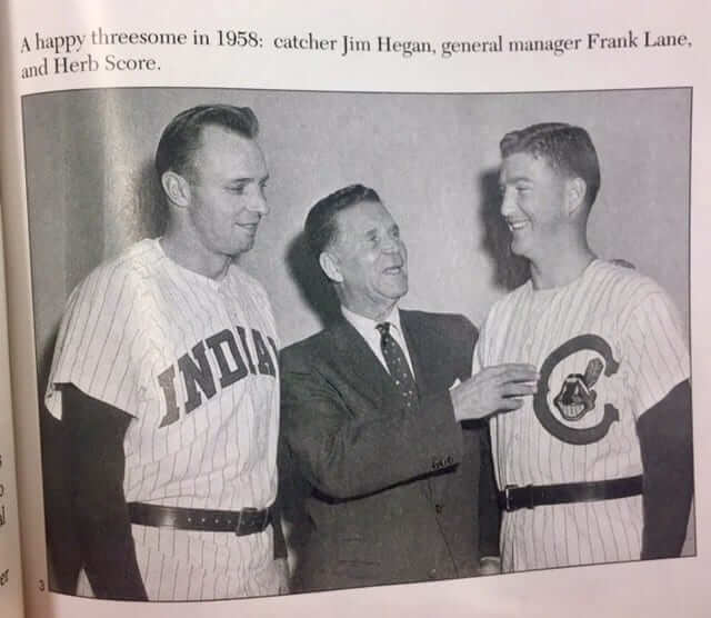
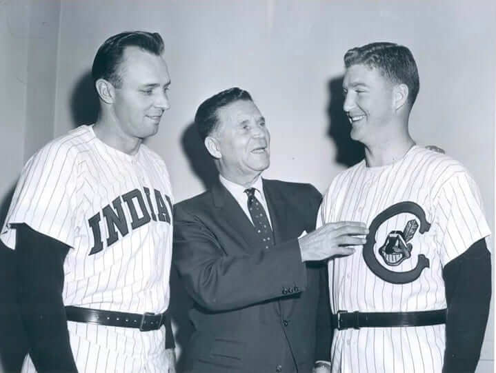
I recently received a communique from longtime reader Marc Viquez, who sent along the photo shown above (which he said was from this book). As you can see, it appears to show the Indians unveiling two uniforms for 1958, including a design with an unusual-looking “C.” I’d never seen that one before. Was it a prototype that never made it onto the field?
I asked uniform designer/historian Todd Radom if he’d seen this one before. He said yes — and provided a slightly higher-res version of the photo, along with the caption that accompanied it in The Cleveland Plain Dealer (click to enlarge):
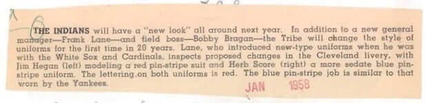
Here’s a transcription of that caption:
The Indians will have a “new look” all around next year. In addition to a new general manager — Frank Lane — and field boss — Bobby Bragan — the Tribe will change the style of uniforms for the first time in 20 years. Lane, who introduced new-type uniforms when he was with the White Sox and Cardinals, inspects proposed changes in the Cleveland livery, with Jim Hegan (left) modeling a red pin-stripe suit and Herb Score (right) a more sedate blue pin-stripe uniform. The lettering on both uniforms is red. The blue pin-stripe job is similar to that worn by the Yankees.
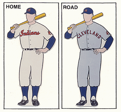
Let’s back up for a second and take a look at the uniforms that the team was moving away from. According to Dressed to the Nines, here’s what Cleveland wore in 1957 — the season before this unveiling photo was taken:
And what did they end up wearing in 1958? Let’s take a look:
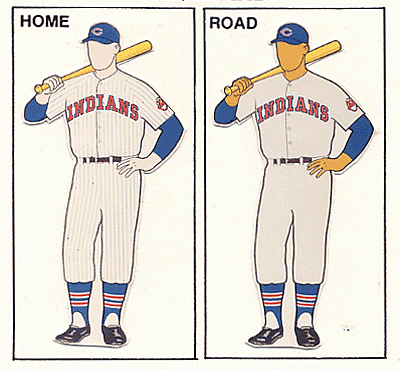
At first glance, it appears that the home uni is the design worn by Jim Hegan in the unveiling photo, and then they used a modified version of that for the road uni.
But not so fast! The photo caption said that Hegan’s uni had red pinstripes, while the Dressed to the Nines mockup has blue pins. Of course, uniform databases can sometimes be wrong, but here’s a game-used 1958 jersey that clearly has blue pins:
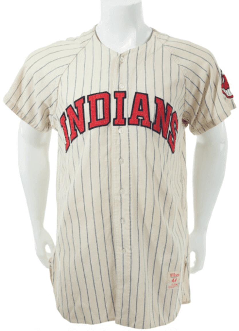
So it turns out that the Indians didn’t use either of the designs shown in that 1958 unveiling photo — although they retained the essence of one of them. They ended up wearing these home and road uniforms for five seasons.
A few other notes:
• If you look closely at the photo, it appears that the players wore their belts over their untucked jerseys, presumably to simulate the look of uniform pants.
• An even subtler detail: Hegan’s jersey had raglan sleeves, while Score’s had set-in sleeves. Perhaps they were from two different manufacturers..? (The 1958 gamer shown above is raglan, and additional photo research indicates that that’s definitely the route they took.)
• I’m intrigued by the caption’s mention of GM Frank Lane introducing “new-type uniforms” during his stints with the White Sox and Cardinals. Let’s take a closer look at that, shall we?
Lane was GM for the White Sox from 1948 through 1955. Here’s what the team wore from the year before he arrived through the end of his time as GM:
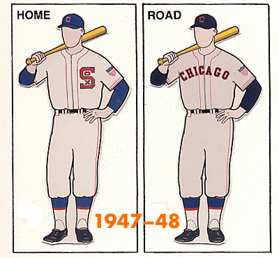
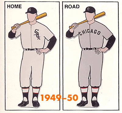
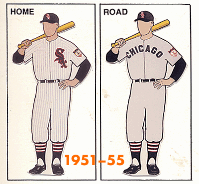
So the Sox underwent two uni changes during the Lane era. (Interestingly, they were using zippered jerseys, rather than button-fronts, before he arrived and kept zipping up throughout his tenure.)
And what about the Cardinals? Lane was GM in St. Louis in 1956 and ’57. Here’s what they wore in those two seasons, plus they year prior to his arrival:
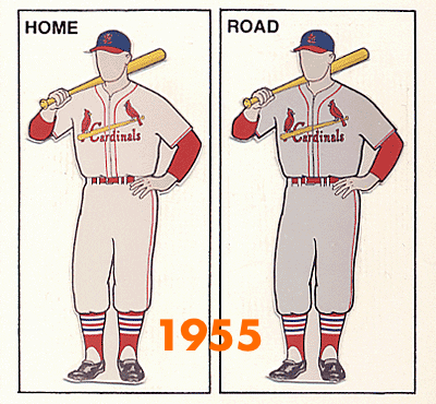
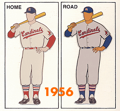
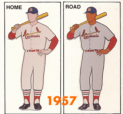
Ah, so it was under Lane’s watch that the Cards wore their infamous one-year style in 1956! As you may recall, they also exhibited a prototype road design for that season, which never made it onto the field. So between the Cards and then the Indians, Lane had a habit of unveiling prototypes that didn’t end up coming to on-field fruition. (Also worth noting: The Cards used zippers the year before Lane arrived but switched to buttons once he came on board. He apparently had his fill of zippers from his time with the White Sox.)
I’ll admit that I was completely unfamiliar with Lane until now. There’s no direct evidence indicating that he was the prime mover behind any of these uniform changes, but that’s clearly the implication of the Plain Dealer caption. He may have been a major but largely unacknowledged force in midcentury MLB uniform changes.
All of which makes me wonder if there were other GMs who left a trail of uni changes in their wakes. Anyone..?
(Big thanks to Marc Viquez and Todd Radom for their key roles in leading me down this new rabbit hole.)
Jets-redesign reminder: Remember, I’m currently running a Jets-redesign contest. Full details here.
The Ticker
By Paul

Baseball News: Giants OF Gorkys Hernandez got an infield hit the other night when a piece of his broken bat distracted Braves SS Dansby Swanson (from Mike Chamernik). … Captain America jerseys yesterday for the Somerset Patriots (from Michael Romero). … Here’s a 1952 shot of two Pirates players examining the then-new batting helmets (from Jerry Wolper). … Some misguided Tigers players somehow decided that Sept. 11 was a good day to wear the Independence Day socks (from Chris Huff). … Here’s a weird one: Everyone knows that the ball-in-glove logo on the Brewers’ 1980s caps had a white baseball in the center. But longtime reader Kurt Rozek found several shots of Brewers P Pete Vuckovich with a blue baseball, not white. Vuckovich didn’t always do this, but it shows up in enough game photos to make me wonder if he went through a stretch where he superstitiously colored in the ball with a blue marker or something like that. … Bruce Broderson spotted a 1980 shot of Mets OF Claudell Washington without an NOB. I know that moment well — it was June 11, 1980 — Washington’s first game with the team, and they hadn’t yet bothered to get him a nameplate. I was at that game and still have the stub! A 10-inning complete game by Craig Swan, ended by a Mike Jorgensen walk-off grand slam.

NFL/CFL News: New Era is branching out beyond caps. The company will become the official uniform outfitter of the CFL in 2019 (from Joel Horn). … Whittier High School in California poaches the Cardinals’ helmet logo (from James Noone). … The Charlotte airport has Panthers-themed baggage carousels (from Don Muret). … Dolphins coach Adam Gase wore a throwback-logo cap and a current-logo shirt at his presser yesterday (from Trey Meadows). … No photo, but this article says ’Skins CB Josh Norman exchanged jerseys with Washington Capitals star Alex Ovechkin. … The Bills will wear mono-white for their home opener (from @bonesJ0nes). … The Jags will wear their teal alts against the Pats this weekend, and they announced it with a really nice watercolor illustration. Anyone know if they did something similar for Week 1? (From Phil.)
College Football News: Here are this week’s uni combos for Arizona State, North Texas, Washington State, Utah State, Vanderbilt, Arkansas, and Missouri State. … The head coach at Alma College, a DIII school in Michigan whose teams are called the Scots, wore a kilt for the team’s home opener (from @famousneckbeard). … New gloves for Nevada (from Damon Hirschensohn). … James Madison is adding a memorial helmet decal for Darius Minor, the UMaine freshman player who died during summer workouts. JMU coach Mike Houston got to know Minor during the recruiting process (from Phil). … Arizona State coach Herm Edwards had some interesting footwear habits when he played for San Diego State.

Hockey News: The Blackhawks are adding memorial patches and ice logos for Stan Mikita (from many people). … The Red Wings have “refreshed” their Hockeytown logo. The new version will not appear at center ice (from Mike Cole). … A photo of what might be the Sharks’ new third jersey leaked yesterday, and SportsLogos.net quickly confirmed its legitimacy. … New uniforms for the USHL’s Omaha Lancers (from @PensChronicles). … Cross-listed from the NFL section: No photo, but this item says Caps star Alex Ovechkin exchanged jerseys with Washington ’Skins CB Josh Norman. … Very cool retro-themed mask for Ducks G John Gibson. … New uni number assignments for the Predators (from Lee Wilds). … New uniforms for the AHL’s Colorado Eagles (from Kristopher Sharpe).

College Hoops News: New uniforms for Miami, and they’re a big upgrade over last season’s set (from @Vec18). … New uniforms for Colorado (from @SodaPopinskiCU).

Soccer News: Police in Eagan, Minn., are looking for the owners of three dozen stolen soccer jerseys that they recovered during a recent incident. … New G.I. Joke jersey for D.C. United — with two corporate “presented by” advertisers to boot. A lose-lose (from Darian Somers). … Here’s 1860 Munich’s annual Oktoberfest kit. … Paris-Saint Germain has a new partnership with Jordan, which includes PSG’s new Champions League kits. Additional info here and here.

Grab Bag: New cabin crew uniforms for Turkish Airlines. … Adam Childs got a sticker of the University of Nebraska-Omaha’s “O” logo, with a logo explainer on the back. … New logo for Uber. … I still call it Memorial Gardens. … New championship logo for MLL’s Denver Outlaws (from Zeke Perez Jr.). … There’s some debate about whether sheriff’s deputies in Brown County, Wis., should change their uniforms from polyester to something less flammable (from Jeff Ash). … North Central, a DIII school in Illinois, has some crazy striped cross country uniforms (from Paul Friedmann). … Cars that qualified for the NASCAR Cup playoffs will be trimmed in series-sponsor green and will feature driver emoji/hashtag decals (from Chris Hickey). … Johnny Strike, frontman of the important San Francisco punk band Crime, died on Monday. The band was notable for, among other things, wearing police uniforms onstage.
As I mentioned yesterday, the Uni Watch team’s thoughts are with our readers and everyone else in the Carolinas and the surrounding regions. Be safe. — Paul
It wouldn’t surprise me if Pete Vuckovich used a blue marker to color the baseball on his Brewers caps. Vuke’s use of a marker caused us to stop the presses one night at the Wisconsin State Journal in Madison. I think this was spring training. We’d used a picture of Vuke in which the outside of his glove was prominent. What we did not see on the slide but saw all too clearly when the paper came up was that he’d drawn the finger on the outside of his glove. So when he brought up his glove to the set position while pitching, he was giving you the bird. We had to stop the press and etch out the drawing on the glove.
He’s also wearing the yellow-paneled cap in all of the examples where he has the blue ball, and the all-blue cap in the example shown where he has the white ball. That’s a funny/good story, but my guess is that he was just issued a cap with the white thread accidentally omitted and just wore it for a bit, since players didn’t get a new cap pretty much every game back then like they can now.
Here’s a baseball card with Vukovich wearing the home cap with a blue ball:
link
And while not conclusive, the ’78-’84 Brewers may have often worn all-blue caps for home and road spring training games:
link
Does this relate to the rule that a baseball can’t be part of the uniform — causing confusion for batters? Maybe an ornery manager complained and Brewers colored it in on purpose?
Now that’s quite a stretch…
To clarify, PSG is only outfitted by Jordan for their Champions League kits (the black and white ones with a stripe down the middle). Nike made their standard home and away kits to be used in Ligue 1 as well as the French domestic cup.
Text now updated/clarified.
Nobody needs CL-specific kits, but especially not a team with more or less unlimited money.
Also, since the CNBC article says this is a multi-year deal, the possibility (however remote) exists of PSG not qualifying for the CL and still being stuck with those kits.
About the new uniform deal with the CFL and New Era, rumour has it that the designs will all remain the same for the first year in 2019. Would see teams looking at possible redesigns for 2020.
link
The Jags watercolor effect uses two of Photoshop’s Artistic filters (Cutout and Dry Brush), both found in the Filter Gallery, along with the Median filter and various layer blend modes.
That and a football picture and you too can produce this effect, which by the way is not as easy to produce as it sounds, but is nicely done in this example.
Everybody stay dry in NC and SC today.
Ah, that’s disappointing. I was hoping it was a real watercolor.
New white helmets for Southeast Missouri State (SEMO)
link
Josh Norman is a ‘skins CB, not QB ;)
Indeed.
Nice gesture by JMU.
Also, this is what they will be wearing tonight.
(Game moved to tonight because of Hurricane Florence I believe).
link
Here is the helmet decal (and plenty of others!)
link
Pretty interesting lede today. Of course, the first name that comes to my mind when talking about GMs changing uniforms is the late John Ferguson, Sr. with the New York Rangers and Winnipeg Jets.
As a Red Wings fan, I am honestly glad to see the old Hockeytown logo go. That font was just so massively outdated. It screams of the 1990s and the “EXTREME!” trend. I also like that the updated logo is based on the Wings’ vertically-arched NOBs. Maybe the new logo will help remind people that the straight, serifed preseason NOBs are a preseason thing only.
(Hopefully this doesn’t end up being a duplicate post, because the page hung when I tried to submit it initially [“taking too long to respond” error] – I did refresh the page again before submitting this post.)
GM Frank “Trader” Lane is still loathed in Cleveland by folks who were around back then as the architect of the Rocky Colavito-for-Harvey Kuenn trade. If I’m not mistaken, I believe Lane traded away Norm Cash, Roger Maris, and Colavito, which could’ve been the starting outfield for the team in 1960. Not a bad group, eh?
If anyone is interested, there’s a lot about Lane in Terry Pluto’s excellent book, ‘The Curse of Rocky Colavito: A Loving Look at a Thirty-Year Slump.’ The second chapter (‘Trader to the Cause’) is named for Lane.
Fun fact: My college girlfriend’s surname was Colavito. She was a distant relative of Rocky.
That’s cool. He was my dad’s favorite player as a kid.
Kevin, your memory is perfect. Lane made all of those trades and to echo your comments, I cannot stress enough how reviled Frank Lane is in Indians lore. It was under his watch that the Indians began their descent from competitive AL team to also ran status, a position they would hold for nearly 40 years. “Trader Lane” as he was known not only got rid of fan favorite Rocky Colavito (why does he not have a statue at Progressive Field?) and the guys Kevin mentioned, he took the team from 2nd in attendance in the AL to near the bottom. Horrible GM.
His tenure in Chicago is much more liked. Although he never won a title, he got the White Sox out of their lengthy post-scandal torpor and made them a First Division team. And sartorially speaking, he was responsible for what became beloved as the uniform of Bill Veeck’s Go Go White Sox that won the American League in 1959 (and which is also the basis for their current set).
But, yes, Lane loved to trade. Often for its own sake. Veeck himself said that whenever he thought he needed to make some sort of trade, even just to shake things up, his first call was to Frank Lane because he was such a ready partner.
I second the endorsement of Pluto’s book, I read that years ago and then gave it to someone and didn’t get it back. I enjoyed the book and the Colavito trade, as you can guess, was the overarching theme of the book.
I always liked a quote Pluto had put in there from Bob Hope, who was famously a part-owner of the Indians back then. Don’t remember it exactly but it was Hope saying he never went to the Indians’ offices because “I’m afraid Frank Lane will trade me.”
I love the raglan sleeves that align with the torso pinstripes. That kind of pride in workmanship doesn’t exist anymore.
Not only does Whittier steal the Cardinals logo, but it looks like their opponent San Dimas takes San Diego State’s.
Nice spot Lobo!
High school coaches (and their overseers) continue to have a blind spot when committing fraud and copyright infringement with NCAA and NFL iconography. The hard and relentless Cease and Desist action by the NCAA has reduced the amount of theft on the HS level somewhat, but it still rages on today.
Poaching logos that mega sport entertainment companies spend large amounts of coin creating/producing is not going to go unnoticed. See the 2015 article here…
link
Uni Watch has been at the forefront of this subject as most of it’s dedicated readers in the Uni Verse already know and Paul specifically has always been at the ready to provide solutions to solve this scourge.
Committing Intellectual Property theft is not a good lesson to be teaching student athletes, or students in general. We are better than that.
Is there a solution to remedy this thorny issue you say? Of course there is.
Step 1.
STOP stealing logos. Set a good example for your students. Just don’t do it Bernie Madoff!
Step 2.
ASK an artist and/or Uni Watch editor for assistance. There are lots of ways to provide good designs on the HS level so that all parties benefit. In the olden days we used to work with “Booster Clubs” and did things called FUNDRAISERS. For the younger WOKE peeps out there lets call them Kickstartin’ or Go Fundin” solutions. The Uni Verse contains some of the best young designers (and best in the bidness artists /editors/sportsmen who regularly view this site) to seek assistance/and or ideas from.
Would that be so hard to do Coach?
Beats ripping off the Flying Elvis.
There are much better ways to look good on the field than trying to look like Tom Brady, cuz you don’t, in the hopes you can play like Tom Brady, cuz you can’t.
It is better to look good than to steal good.
But San Dimas is where Bill and Ted went to school!!!!
Winner! Winner! Chicken Dinner!
BONUS or BOGUS FUN FACT:
Pre-production of Bill & Ted Face the Music was started in May 2018, with both Reeves and Winter confirmed to return to reprise their roles. The United States distribution will be handled by MGM under their Orion Pictures label.
More on Frank Lane!! He was also involved in the NBA: He took over as GM of the Chicago Packers after their first year in 1962, and oversaw the name change from Packers to Zephyrs
link
link
He was not involved in the franchise’s move from Chicago to Washington, though.
link
Given that Frank Lane was notorious for constantly making trades, not too shocking that he would want to shake things up sartorially as well.
Never realized how much thought went into the UN-Omaha logo. Very clever, even if some of it is hyperbolic corporate speak.
In the link where Whittier High School uses the AZ Cardinals logo, it looks like their opponent San Dimas is poaching San Diego State’s logo. (With different colors and sans spear)
I’m surprised that the Indians uniform with the giant C and Chief Wahoo is called “more sedate” just becuase the pinstripes are blue rather than red.
-Good thing that remained a prototype for the Indians in my opinion. The C is way to comically large.
-The 1956 Cardinals uniform was actually pretty decent, but it can’t complete when you have with the birds on the bat design in your arsenal.
Here’s the video of Ovie and Norman exchanging jerseys: link
Interesting that Norman or whoever got the Redskins’ jerseys customized for Ovechkin and Kuznetsov but Norman got a stock Ovechkin Caps jersey in return.
Also here’s Holtby’s new lid: link
Looking forward to seeing PSG on the pitch with Air Jordan!
Man, part of me wants to give this a chance, but everything feels off to me. Simple and, to be frank, boring kits, basketball company making the kits, the fact that have UCL-specific kits, it all seems wrong…
Pete Vukovich? Didn’t you mean Clew Haywood?
“How’s your wife with my kids?”
If you look at the latter script for the Cardinals, It’s essentially what they wear now with minor alterations. They had used the birds on bat but never a cursive script with the “C” curving under the first few letters.
By the same token, the Gothic S-o-x that Lane helped introduce has remained the motif for the White Sox for all but 15 of the past 69 years.
“All of which makes me wonder if there were other GMs who left a trail of uni changes in their wakes. Anyone..?”
I don’t know how influential he was in the process, but Bill Parcells was nearby when the Patriots adopted the 1st iteration of the “Flying Elvis” look in 1993, when the Jets went with the Namath-era-inspired uniforms in 1998, and when the Cowboys brought back the white-helmeted Thanksgiving throwback in 2004.
Heck, can he be given some credit/criticism for shoeing the Dolphins with black cleats in 2009?
I realize Parcells wasn’t a GM per se when all those changes occurred, but I couldn’t help but wonder.
I know for sure that Parcells brought back the old-school Jets look. Don’t think he had anything to do with Flying Elvis (that was more of an ownership thing).
John Ferguson – G.M. of New York Rangers & Winnipeg Jets
link
link
Not a sports team, but airline CEO Stephen Wolf changed the liveries of US Air/Airways and United when he was head of both:
US Air –> US Airways
Older:
link
Newer:
link
United
Older:
link
Newer:
link
ed
Just a Uni observation. I am not a WNBA follower but was surfing sports sites this morning and passed a photo of the champs. A few seconds later I stopped and thought “Did a team from Sweden sponsored by Verizon win the WNBA? That doesn’t sound right” I scrolled back and read it was a team from Seattle called the Storm. That wasn’t real obvious from the photo.
I most enjoy the post that are rabbit holes that keep going. This definitely fits the bill. Very much enjoyed today’s post, Paul.
Thanks, Matt! I enjoyed this one, too. I love how it started with a photo in a book, and then Todd supplied the newspaper caption to the photo, which led me to investigate Lane’s history, etc. Fun to follow the breadcrumbs and see where they lead.
Re. “…crazy striped running shorts…” : in the 1970’s striped running shorts by a company named Dolphin were de rigeur for top level runners in cross country and long distance running:link
frank lane tried to trade Stan Musial to the Phillies for Robin Roberts.
I’m finally getting a look at that Claudell Washington jersey — couldn’t see it at work, where anything Twitter-related is blocked — and it’s a little unusual.
It looks like it never had space for a nameplate. Look at the other jerseys, with their super-low-riding numbers and massive nameplate space, and then look at Washington’s “15”.
So I think it wasn’t a case of just his nameplate not being ready yet.
The Mets had only recently added names; was it an older jersey that they had given him to wear until they could prepare his real one?
Are there any photos of him, showing his back, from later that season, so we can see if a nameplate was added onto that same #15 jersey?
I remember the San Francisco Giants acquiring a pitcher, wearing #49, who also got into a game before a nameplate could be put on his jersey, and in his case the number was positioned so that a name could be added (so it was all the way down his back). It looked so bizarre; this would have been in the late ’80s or early ’90s.
Claudell Washington had worn #15 in the past, so it’s a little weird that the Mets happened to have a NNOB jersey with that number still sitting around. Unless their seamstress, knowing that they didn’t have time to add a name, did the super-diligent job of placing the number in a normal-looking spot, and re-doing it after the game!