[Editor’s Note: Paul is on his annual August break from site. Deputy editor Phil Hecken is in charge from now through the end of the month, although Paul is still on the clock over at ESPN and may be popping up here occasionally.]
By Phil Hecken
Follow @PhilHecken
I should have figured this was coming. In the afternoon yesterday, the Oregon Ducks released a teaser video for their new uniforms…
Oregon Football 2.0 is coming. #GoDucks pic.twitter.com/scOAhjMYqY
— GoDucks (@GoDucks) August 15, 2018
For about 7 hours after that, all was quiet on the Western Front.
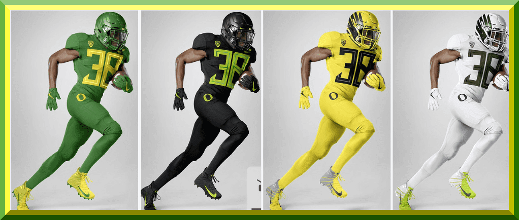
Then, boom. The team released four new uniforms (green, white, bfbs and yellow). I’m pretty sure they don’t use “thunder” and “lightning” to describe the green and yellow unis anymore. But boy do these uniforms (and of course, four matching helmets) look nice and bright, and they put the school who invented the whole genre of a different combo for every game back in that game.
Let’s get a look at each of the unis (click to enlarge) and then some thoughts…
Green


Yellow


White


Black


Phew. The helmets are not new, but the uniforms certainly are. They’re extremely “plain” (especially for a Ducks uniform). The two most notable “features” are the lack of any wing or other pattern on the shoulders, something for which Oregon had been famous for a number of years (decades, even, it seems); also, the numbers are gigantic. The font is new, and, unsurprisingly, it has a unique name: “Mighty Oregon.” No, seriously. That’s what they’re calling that font face.
The jersey is remarkably clean, featuring no stripes or piping at all, and only the Nike swoosh and PAC12 patch on the front (and a contrasting-color “DUCKS” nameplate above the swoosh). The pants are also completely stripe-free, having just the big “O” logo on the right front and the mark of the beast on the left. Socks are solid color. Only the shoes (coincidence?) it looks like will stand out.
It’s only barely visible in one shot, but very clear in another, but it appears these uniforms will also feature contrasting color nameplates (similar to the look the Philadelphia Flyers have used at times (including currently) on their uniforms, but the Flyers contrast-color nameplate is slightly different in style. I’m not really a fan of this style, but I’ll wait to see it on the field before rendering a final judgment. That same style is repeated on the “DUCKS” nameplate.

In my (almost 10 years!) writing for Uni Watch, I may have written more about the Oregon Ducks than any other team. I’ve had a love/hate relationship with their uniforms for years, and weekend readers know the team is (oftentimes) featured. I still have guys who operate the “Duck Tracker,” which has kept track of Oregon’s combos since 2009. I’ve covered their spring games and fall games, and rivalry games and bowl games, and they’ve had some great unis and some clunkers over the years. I’ve even written I thought the team had jumped the shark, uni-wise, a few years ago.
But I have to say — I really like this set. I’m assuming all the elements (helmet, jersey, pants, socks) will have interchange-ability with the other elements, yielding (*can’t find calculator, makes rough estimate*) 10 billion different possible combinations. The team that went from more is more seems, at least from a bells/whistles standpoint, to a “less is more” mantra.
The new number font reminds me a bit of the original Toronto Blue Jays. It’s not quite the same (as the Ducks’ font appears to have a single thin line completely inside a fat full border), but similar.
The new uniforms with the gigantic yuge big numbers continues a trend with Nike, who have been putting very large numbers on the uniforms of many of its outfitted schools, but these may be the biggest yet.
I’ll need to see them in action to give a final verdict, but right now I like them.
Your thoughts?
Also: Oregon was not the only school to reveal new unis yesterday. Scroll down in the ticker to see some offerings from UTEP and Grambling, plus new hats for Tulsa and some weird shit with VT.


Griffins Design Contest
In case you missed it, I’m running the third annual “Grand Rapids Griffins Jersey Design Contest,” in which readers are asked to submit jersey design concepts for a third (or alternate) jersey for the team.
Like past years, the team is asking for a jersey (only) design, but other than that, it’s pretty wide open.
All of the details are here in this post, but the important big detail is the contest submission deadline, which is Tuesday, August 21st, 2018 (by 11:00 pm E.D.T.). Everything else you need to know is in that post.
OK? OK!

Too Good…
for the Ticker
Got an e-mail from reader John Fitzgerald, who sent in a couple items with which you may be familiar but the backstories are still pretty cool. It’s a bit too long, and too good for the ticker.
Here’s John…
I was wondering if you ever wrote about Carl Yastrzemski’s helmet or Bob Montgomery, former catcher of the Red Sox, who was the last person to bat without a helmet. Montgomery had a specially fitted hat that he wore at bat for protection. When he played his final game (September 9, 1979), he earned the distinction of being the last major leaguer to ever bat without a protective batting helmet on his head.
Best,
John Fitzgerald
Braintree MAYaz Batting helmet with larger ear hole.


Bob Montgomery
Inside View

Baseball Card

Great stuff, John. For those of you not aware, Montgomery’s cap with protective liner is on display at the National Baseball Hall of Fame Museum in Cooperstown.
OK. Now, on to the ticker…
The Ticker
By Anthony Emerson

Baseball News: The Eastern League has unveiled their new logo. Here’s the old one for comparison. … Great find by @BSmile: NPB legend Sadaharu Oh was wearing a Yomiuri Giants helmet with an embroidered, 3D logo during a 1977 covershoot with Sports Illustrated. … In what was a laugher of a game at the time, the Mets tv broadcast of last evening’s Mets/Orioles game showed a history of the Orioles cap logos (from Lauren Meyer). … Check out this tour of the Giants Clubhouse with Jeremy Affeldt (thanks, Brinke). … It looked like one of the Mets coaches was wearing the home softball jersey last evening (from Billy King). If that was the home jersey (as opposed to a pullover), it’s yet ANOTHER reason for the stupidity of TWO same-color alternate jerseys. In the Mets case, they have this royal blue home and this royal blue road. This is what the Mets royal blue pullover looks like — so it’s possible the coach could be wearing that.

NFL News: The Titans’ QBs wore light blue non-contact jerseys during their joint practice with the red-clad Buccaneers (from Preston Penn). … Ads on down and distance graphics? I guess it was only a matter of time (blame goes to Brice Wallace).
College Football News: Virginia Tech’s new unis will have some weird nonsense going on with the back shoulder yoke. Not a fan (from Andrew Cosentino). … New unis for UTEP, complete with dumb names (from Michael Briones) They’ve also subtly altered their shade of orange (from @rcb05). … Tulsa will have new helmets. A white version is also in the works (from Sam Laz). … … The Grambling Tigers showed off their new uniforms and it looks like they could wear a different combo every game (from HBCU Gameday).

Hockey News: B-E-A-utiful new sweaters for Northeastern, to go with their new logo set, which is linked in the Grab Bag section (from Mike Bodsky and Tom Leyden). … Steven Schapansky found some great footage of the Canucks wearing their road black socks at home agains the Bruins in 1978. … Army has new sweaters, and they kind of look like more badass versions of the Golden Knights’ sweaters (from Trevor Wilson Patton). … Illinois unveiled their “heritage” sweaters last night.


NBA/College Hoops News: It appears the Cavs have made a slight alteration to their number font, making it bolder. … UNC has released their uni numbers for the 2018-19 season (from James Gilbert).
.

Soccer News: Miami’s potential MLS team’s owners have trademarked a whole bunch of logos (thanks to Alfie Ramirez, our own Alex Hider and everyone else who sent this in). … Parma’s new kits are absolutely gorgeous, some of the best in the top leagues this year (from Ed Żelaski). … Footy Headlines has the leaks of Manchester City’s third kit, Juventus’ away kit and both of River Plate’s kits. … A Newcastle United fan bought a DeAndre Yedlin jersey from Newcastle’s official website, and this is the result. Yedlin himself is trying to help the guy out (from Moe Khan).

Grab Bag: Northeastern has a whole new set of gorgeous logos (from Michael Samaha). … Kenton City (Oh.) Schools have a new a logo set (from Alan Elwood). … South African rugby team Cheetahs has new kits (from Eric Bangerman). … How are the Beijing Olympic facilities looking now? About as good as you’d expect (from Kary Klismet). … Not uni related, but here’s a great article on some of the Bicentennial signs still up in Philly (from @PhillyPartTwo).
Overall, I like the new Oregon set. Not too flashy while still being the Oregon we all know and love/hate/are ambivalent toward.
What I don’t like are the little nametags on the shoulder. Why? What’s the purpose of that? It’s out of place and just ruins the flow of the jersey. Seattle had something similar when Nike took over the NFL uniforms, and it’s just not a good look.
I also dislike the “ducks” tag on the shoulder. Presumably they did it because the numbers are so large they prevented any sort of logo above them, as has become customary. There’s not even an “O” on the jersey.
Those numbers aren’t huge. They aren’t freakin’ huge. They are YUUUUUGE.
I think the only ones which compare are the 49ers of the 1950s, especially the back numerals.
Throw the whole Virginia Tech jersey away!
I find the advertising creep on the down and distance markers distasteful, but I’m not sure people believe in “good taste” any more in that sense. Taste and preference are not the same, but people keep asking “why not” when it comes to more places to put advertising and not having any sort of line they won’t cross.
Next thing you know, it’ll be the Pizza Hut ™ First Down Line and the American Standard ™ End Zone.
This cranky old man will now go back to looking for kids to tell to get off his yard.
Right now, anything that keeps ads off of jerseys will have to do. I’m with ya, and I’m just as crotchety when it comes to tradition and taste.
Unfortunately, I don’t think adding ads to down and distance markers will help keep ads off of uniforms. It’s not like the league found a different revenue stream to keep them afloat so that they don’t have to advertise on the uniforms. If anything, the increased advertising associated with every aspect of the game only gets the average fan desensitized to it, so they are more likely to accept it on the uniforms. As Winter said, they will think “why not” when asked to cross that line.
I remember the days when there where no ads on websites, but then ads started to creep in on the sides…then banners…then they started to pop-up…and then the auto-plays…sure they tell you “I say “no” to certain advertisers”, but any kind of revenue is revenue…what are you going to do…even when you have a paid subscription…they will start sneaking ads in…give 5 bees for a quarter…
Most preseason games are not broadcast by the TV networks (ESPN, CBS, FOX, NBC) that do the regular season games. Each team when having a non network game partners with a local TV station in their market to produce and air the games. So in this game you would have had a local Pittsburgh and Philadelphia stations doing the production of the game. The teams sales departments are responsible for any of the in game ads and commercial breaks, plus tgey have a large amount of control of the broadcasts. This is very different from how the regular season works as teams and local stations have no say in those broadcasts. The league and the networks do.
So in short the down and distance ads were sold by the team dnd dictated to the station to run them per their contractual agreement.
The NASCARization of the NFL may be upon us.
Cup race coverage has plenty of ads built in…I’m conditioned to accept that since it’s been that way for decades, but I find the more-recently added “(corporate sponsor) race restart” and the “(corporate sponsor) one-lap to go” highly off-putting.
Those gigantic digits look great!
Now what is that under-layer beneath the pants and above the socks? Are those colored athletic tights that go all the way up to the player’s waist, or are they knee coverings? I see them a lot in football these days; they look from a distance like socks but they aren’t because they only go down to the player’s ankles.
I’m pretty sure they’re leggings which go to the waist. Most NFL players wear them, too.
The only negative I have out of the box for Oregon’s new set are the size of the numerals. But that may change once I see them in an actual game.
The numbers are all but unreadable in the promotional pictures. They won’t be more legible in action; numbers never work that way.
But huge credit to Oregon for almost sort of wearing school colors this year.
Yeah, I know that Jim Vilk is a big proponent of larger numbers for increased legibility, but the Oregon numbers stretch that concept too far and actually become more difficult to read as they wrap around the body and you can never see the whole number in one shot.
It’s quite a feat that they made the numbers that enormous, and they’re sill hard to read. The Nike braintrust does it again!
Yes. I love what most people consider “large” numbers. I call them normal, but more accurately they would be “optimal.” Oregon, of course, had to go beyond optimal and into the realm of “huge.” But it’s Oregon so I shouldn’t be surprised that they don’t grasp the concept of normal/optimal.
That’s not an enlarged 3-D logo on Oh’s helmet; it’s a Cubs-style embroidered helmet patch.
Oregon uni: Not the worst thing I’ve seen them wear. I don’t really like the shade of green, but the Ducks are gonna Duck.
The Army hockey jerseys look more like the team is named the Spartans, not the Black Knights. I really like them, just not for a tram called Knights.
Curious how those giant number will look on the field, aside from the mono look, the green, yellow, and white aren’t bad. Of course I could do without the extra-highlightery colors on the BFBS.
And it is 64 different combos with the helmets, jerseys, and pants (not counting different combos of the socks, in which case, it think it goes to 256!).
I think that combining any of the elements with something other than the monochrome is going to look bad. There’s three different greens, and none whatsoever on the yellow set.
Good point, and more indicative of house silly these costumes are. Even if you are going to have BFBS, their school colors are green and yellow, those specific shades of green and yellow should be found in the uniform. I know it has been discussed on this site regarding the NBA uniform ads, that various advertising companies won’t allow their logo ad to be rendered in team colors because of how important their colors are to brand recognition. If advertisers get that, why doesn’t Oregon/Nike get that?
Both Oregon and Grambling unveiled four jersey colors and four pants colors. That gives each of them 16 jersey/ pants combinations they could wear. That’s not counting the additional looks they could get by wearing different helmets or socks. While Oregon looks to have 5 helmet colors (I think I saw silver in addition to the white, black, green, and yellow), it looks like Grambling was only showing black helmets as an option.
Greg correctly states that 4 helmet colors would give them 64 combinations, but the first two pictures of the white uniform seem to show a silver helmet while the third picture of the white uniform clearly shows a white helmet. If they have 5 helmet colors, that would give them 80 possible combinations.
I can remember from when I was a kid that the Chicago Cubs also used an embroidered patch on their batting helmets. (about the same time period as the Oh picture) It was one of my earliest uni detail finds. At the time, the unis were fairly traditional still (except for my White Sox), so you had to take pleasure in the little details.
Still do: link
I’m also a fan of the new Oregon set. I’ve always been & considering my age, is probably a surprise. :)
The larger numbers don’t bother me too much and is certainly better than numbers that are too small.
I’m also loving that neon green on the BFBS set.
My biggest issue with the Oregon uniforms is the fact that only one set includes both school colors. They’re probably not going to go monochrome every game, which means that the various elements aren’t going to look too good when combined. What’s wrong with a white uniform with both green and yellow?
Re: Miami MLS.
Just call it Inter Miami and be done with it.
Damn.
I would have loved to see Miami Vice as the choice.
link
It’s already been trademarked, I think…
As on Oregon fan I love these unis. I still think the best over all sets, helmets and jerseys were from the Mariota days. I love how “simple” the new sets are. I don’t mind the number font but like most others if it would of been scaled down a size or two it would be better. I love that the wings are back on the helmets. I’ve seen two different pics of the white unis. One pic makes them look like they have black numbers and the others look more like an OD green. Green and yellow numbers on the all white would of looked sweet. Also the helmets for that combo. I’ve seen what looks like white and OD green and then pictures were the helmets look chrome. Also an all yellow looking helmet. Maybe it’s the lighting? Overall very happy with the new look.
We’ve kind of seen what the huge front numerals look like because Arizona wore that last year.
link
The result is about what you’d expect. It looks ok if its a single digit or where one number is a “1” but for other numbers it gets hard to read.
I think the big lead is the winged helmet coming back full time after a mild hiatus.
Looks like someone didn’t read the full article ;)…
I remember seeing Yaz’s weird helmet on the early 80’s Topps cards, and really never thought anything of it.
And Oregon? Woof…and people thought the 2000’s Mets had too many uniforms…
Mark Malone was a Quarterback.
Two things:
Is it just the lighting or is the font on Oregon’s BFBS different on the pic of the RB. All the others are definitely highlighter green. But in that pic it looks yellow with a green in-line. The O on the pants look yellow as well.
Second, I think the ads on the down and distance graphics are just a preseason thing. The broadcasts are local and thus they pull out all the revenue stops they can. It seems I recall this in the preseason games the last couple of years. I don’t think you see it on National preseason broadcasts but do on locally produced preseason games.
There is set of “running” photos that use the same model player but the uniform has been photoshopped (that is the first image in blog) so the colors are bit different than the “real” photos of players. And the detailsa re a bit different (white helmet?, different shoes, shades wrong) The official GoDucks website does not use those “running” player pics, which leads me to question their realness? GoDucks social meadi has more pics, but not the photoshoped ones?
I always thought Yaz had the larger ear hole because he was an old man and couldn’t hear well.
This was when he was 43, the same age I am now.
Probably covered here before, but speaking of Yaz, he was wearing mismatched cleats when he got his 3000th hit:
link
I never remember him wearing a “normal” ear flap, although that doesn’t cover his entire career, maybe about 1972 or so.
While the new Oregon set isn’t terribly offensive, I just don’t understand what legitimate problem it is solving with gigantic numbers, other than to stand out and make a ‘bold statement’. In a time when more people are watching games on TV and live game attendance is down, I don’t see the need for huge numerals that would only serve to aid people in the stands. I guess I prefer these to the teeny-tiny numbers favored by Under Armor, but I don’t know why everyone has to go to extremes. I’m also getting a little tired of the ultra-square number trend and grow more sure every day that it will soon look very dated…
That VT shoulder thing reminds me of the shoulders on the Northeastern hockey jerseys that were unveiled yesterday. Weird that Nike and UA are doing the same thing in different sports.
It’s a reflection on the state of the uni-verse and the effect Oregon and Nike have had in it that these are considered good. I like them too, but if I’d seen these in 1989 I would hardly recognize them as football unis.
For anyone who missed it:
link
Looks like there is more blue around the word Cleveland on the jersey now, too.
The Bob Montgomery card caught my attention because that also happens to my the name of my late grandfather.
Then it caught my attention again because there appears to be a ball cap floating in the air a short distance behind him!
I hate to say this being a Sun Devil fan!!!!!
But I like the new Oregon uniform…
Go Devil’s!!!!!!!!!!
I think the “weird nonsense” on the VT uni is actually a ‘V’.
I like that Grambing State brought back the red shirts. I wish it was with Nike like they had before the whole SWAC signed up with Russell. Im not an adidas fan. Oregon is simply gorgeous. I love the black hats, shirts and britches. Don’t know why U Take’em Points got new gear. I guess they have to give a reason why the Sun Bowl is still open.