By Phil Hecken
Follow @PhilHecken
It was one of the craziest promotions ever dreamed up — and unfortunately it spawned one of the worst league-wide promotions ever one year later — but at the time it was genius: The Seattle Mariners 1998 “Turn AHEAD The Clock” night versus the Kansas City Royals. And it took place 20 years ago today, on July 18, 1998.
Before we get into this lookback, I wanted to draw your attention to a piece penned by Paul, 10 years ago, which gives a nice recount of the promotion and also a wonderful interview with Kevin Martinez, the brainchild behind the promotion. Kevin’s still with the Mariners today (back then he was the team’s Marketing Director; today he’s VP of Marketing). Kevin actually extended an invitation to Paul and me to join with him and the team tonight (they’re reprising the entire evening from 20 years ago! More on that below and I’ll hopefully have a full report tomorrow on tonight’s Back To The Future Part II) but without airfare thrown in, it simply wasn’t feasible. (But thanks for the thoughts, Kev!)
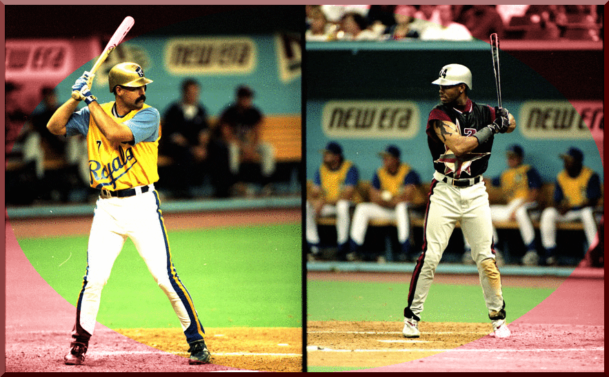
Anyway, I digress. If you didn’t read the linked article by Paul, the gist of the June 30, 1998, promotion was this: What would the Mariners look like in 2027, when the team will celebrate their 50th Anniversary? Instead of the (still relatively new, then) Turn Back The Clock (or “throwback” as we like to call them) games, Martinez decided to turn that concept on its head and look ahead to the uniforms of the future. And it wasn’t just the uniforms, though they were gloriously awful in the “so bad they’re good” kind of way.
As Paul noted in his article
Martinez and his team also made some adjustments inside the Kingdome — or, rather, the Biodome, as it was renamed for the evening. Here are some of the other special provisions they made:
• The ball for the ceremonial first pitch was delivered to the mound by a robot, which was constructed at the University of Washington. “We named the robot Mr. Scraps, because it looked like a garbage can on wheels,” recalls Martinez. “Not exactly what we were expecting, but it served its purpose.”
• The first pitch was thrown by James Doohan, who played Scotty on “Star Trek.” He made his way out to the mound in a DeLorean that entered the Biodome through lasers and dry ice in the left-field tunnel.
• “You might remember that the Kingdome had standings banners hanging off the upper deck,” says Martinez. “On this night, we added three new teams to those standings banners: the Pluto Mighty Pups, the Saturn Rings and the Mercury Fire. We even included an Interplanetary game on the out-of-town scoreboard. I believe Saturn (SAT) took on Mercury (MER).”
• A futuristic 50th-anniversary Mariners logo was placed on the outfield wall. “We got ripped by some people who thought it looked like ‘5 degrees’ instead of ’50,’ but hey, it was the future, they were using tiny zeroes,” says Martinez. “In hindsight, it would have been really cool to use the logo as a sleeve patch, but we didn’t think of that.”
• The outfield wall sponsor signage was changed to have a more futuristic feel.
• The Mariners borrowed the Astros’ mascot, Orbit, for the game. “The Astros were kind enough to let us deck him out in futuristic Mariners colors,” says Martinez. “Mariner Moose lovers were beside themselves.”
• All the lights in the Biodome were turned out for the pregame lineup introductions, which were done on the video screen with accompanying lasers and pyrotechnics. A synthesizer was added to the PA system, so the announcer sounded like a computer as he introduced the batters.
• The team gave away replica futuristic Mariners caps to the fans. “We still see some of those caps during games at Safeco Field,” says Martinez.
But it was the uniforms that stole the show.
So how did Martinez and the Marketing Department come up with the fifty-year anniversary uniforms? Martinez recalls they didn’t really spend a whole lot of time thinking about it; they worked with Majestic with the following direction: “Here are the colors we want the Mariners uniforms to be, and the Royals should keep their current colors. We Want these to be vests, and we want them to be shiny, we want them to look tech-y — and now you get to tell us what we mean by that.”
And so, the throwaheads were born:


Interesting. The colors (burgundy and black) were selected — an interesting trajectory for a team that has already migrated from royal and gold to northwest green (basically teal) and navy — with the vested jerseys bearing a giant compass logo spanning the entirety of the garment. The undershirts were burgundy and the caps were a handsome black/burgundy mix, also featuring the giant compass logo. Pants were an off-white, sliver/gray color, with giant racing stripes of black/burgundy/black running down the sides. At the base, the stripes flared out to form a solid black color at the base (clearly these were not meant to be worn high-cuffed).


You’ll note the team went with silver helmets with numbers at the front, with a compass logo on the sides. Well, for almost everyone
Watching the @mariners Turn Ahead the Clock Game from 1998 , All the batters but Cora had the numbers on front of helmet, his was on the side. @Kevin_Martinez any idea? @UniWatch pic.twitter.com/N7LCXW5ZXA
— Ben Greaby (@CenterFieldSpts) June 19, 2018
Note that in almost all photos above, the Mariners players have very short undersleeves — but not all. The uniforms were originally designed with longer sleeves typical of those worn under vested jerseys (as seen in this recreation by Junior for the 2018 promo):

It was Ken Griffey’s idea to modify the original uniforms — not only did he encourage the players to take a scissors to the longer undershirts, he spray painted his cleats (and those of several teammates) silver, tried to get everyone to wear the vested jerseys untucked, and wear their caps backwards:


The Royals successfully argued that untucked jerseys would “give the Mariners an unfair advantage” (in terms of being “hit” by a pitch) so the umpires ruled the team would need to keep the jerseys tucked in.
During actual play many of the players kept the backwards caps while others wore them the “standard” way.

For their part, the Royals played along. They were outfitted in similar vested jerseys (though most of the Royals kept their undershirts at their normal length). They, too, had a giant, gaudy logo across the chest and white pants with similar giant racing stripes.

In the same vein as the Mariners had silver helmets, the Royals were given metallic gold lids (which didn’t match the athletic gold of the jerseys).

All in all, a very cool (one game) concept.
Since tonight is the 20th Anniversary of the 50th Anniversary TATC game, the Mariners will reprise the uniforms. Just as the original Turn Ahead The Clock game was unique at the time, this will be the first time a team will be throwing back to the future.
Turning it back to when we turned it ahead.
We celebrate the 20th anniversary of Turn Ahead the Clock Night on June 30 vs. the Royals. https://t.co/VYC3gcBwSe pic.twitter.com/48m009sISF
— Mariners (@Mariners) January 25, 2018
The Mariners are scheduled to wear the exact (or as close as is possible) uniforms as they wore in 1998. The Royals, on the other hand, have updated their future uniforms, and they’ll look like this:


Our Turn Ahead the Clock unis we’ll be wearing tomorrow in Seattle are available now at the Team Store! ✨ pic.twitter.com/GPrLFIpnHW
— Kansas City Royals (@Royals) June 29, 2018
Knowing how the Mariners and Kevin Martinez like to pull out all the stops, I’m extremely interested to see how they handle this game.


Kreindler’s Korner
I had the distinct pleasure of featuring the wonderful artwork of artist Graig Kriendler on two occasions over the summer and fall of 2017.
For those who don’t wish to click the links, Graig paints baseball heroes (and regular guys) from the past, and is an immense talent.
Occasionally, I will be featuring his work on Uni Watch.
Here’s today’s offering (click to enlarge):

Title: “The Luckiest Man”
Subject: Lou Gehrig, 1939
Medium: Oil on linen
Size: 48″ x 84″I think I’ve painted the scenes of Lou Gehrig’s farewell more than any one specific moment or game in my career. After all of these years, I still find it amazing how much what happened on that day transcends the sport and how many people gravitate towards it as subject matter for a piece of art. It’s also still remarkable to me that it’s what we remember most about Lou Gehrig. Forget the fact that he was one of the greatest players ever in the history of the sport, both in the years 1939 and 2018. Still, whenever see his name, what automatically gets conjured up is his New York-accented voice echoing throughout Yankee Stadium on that July 4th afternoon.
Because of the ubiquity of the event in the annals of baseball history, I really wanted to make sure everything was as historically accurate as possible. Of course, I strive for that in every painting I make, but because the date coincides with the beginnings of when color film was made available to the public, I knew that there might be a chance that I’d be able to find that kind of smoking gun to base my color choices off of.
Luckily, I was able to find four different sources of color home movie footage from Yankee Stadium during that year, one of which was from that very day, even. The quality of the films in general wasn’t the greatest, so it did require some educated guessing on my part. But in the end – and especially in this painting – I’m confident that I was able to create an accurate window into what the stadium was like on that day: what the quality of light was like; what hue he sky took on; the myriad of colors depicted in those advertisements; the look of the Seventh Regiment Band and their instruments; and of course, what those players and executives looked like.
And in the end, I hope that if people choose to remember Lou Gehrig this way more than any other, that they’re able to feel like they’re getting a front row seat for it through my work. It sounds corny, I know, but I feel like it’s the best tribute to the man that I could possibly make. To make people realize that he’s more than the grainy black and white newsreels they know him for and was actually of flesh and blood, means more to me than anything.
Thanks, Graig! You can (and should!) follow Graig on Twitter.
Jimmy Corcoran strikes again…
Last weekend, I featured a varsity jacket with a chain-stitched Uni Watch winged stirrup logo that someone had given Paul as a gift. Jimmy Corcoran had photoshopped the logo onto the jacket (which I hope someone decides to make).
Well, this week, Jimmy’s back again with another concept. The Uni Watch flannel jersey featuring the chain-stitched logo front and center over the left breast:

While I don’t love it as much as the jacket (if only because I LOVE the jacket), this one is very cool as well. If UW ever gets a softball team, I’d proudly wear this jersey.
Thanks for the mockup, JC!

Paul’s Latest on ESPN
With Independence Day coming up on the calendar next week, MLB teams will be wearing stars/stripes uniforms on Monday, Tuesday, and Wednesday. With that in mind, Paul’s latest ESPN Friday Flashback piece takes a look back at all of the cap and jersey styles that MLB teams have worn for the Fourth of July for the past 16 seasons (including last year’s sock shenanigans, shown above). Check it out here.
Great read, so be sure to give it a look-see if you missed it!
Enjoy!
The Ticker
By Anthony Emerson

Baseball News: CC Sabathia appeared to still have the Father’s Day ribbon on his uni during last night’s game against the Red Sox (from Zach Katz, Joseph Butash and everyone else who sent this along). … Phillies 1B Rhys Hoskins wore powder blue cleats with the Phils’ powder blue throwbacks (from @PhillyPartTwo). … The Jacksonville Jumbo Shrimp (Double-A affiliates of the Marlins) are wearing Jacksonville Red Caps throwbacks for the second straight year. The Red Caps were a Negro League team (from John McMunn). … The Kane County Cougars (Single-A affiliates of the D-Backs) wore SpongeBob SquarePants-inspired unis last evening (from Steve Johnston). … The Potomac Nationals (Single-A affiliates of the, uh, Nationals) are wearing Cool Runnings-inspired unis on July 7. … Gilbertville-Don Bosco (Ia.) High Gets It™ (from Brad Eenhuis). … Also posted in the NFL section: Odell Beckham Jr got a Yankees uni and took batting practice with the Bombers yesterday (from Ignacio Salazar).

NFL/CFL News: Longtime Vikings seamstress Penny Bryce is retiring (thanks, Phil). … At first glance, this Hamilton TigerCats player appears to have a full name on back. But it turns out, his name is Sean Thomas Erlington — Thomas Erlington is his (unhyphenated) last name. FalseFNOB! (from Cork Gaines). … Cross-posted from the MLB section: Odell Beckham Jr got a Yankees uni and took batting practice with the Bombers yesterday (from Ignacio Salazar). … A couple of CFL notes from Wade Heidt: the Saskatchewan Roughriders have painted white ribbons in the 29 yard line at Mosaic Stadium in honor of the 29 people killed in the Humboldt Broncos bus crash, and the Calgary Stampeders wore their black road helmet and red road pants with their red home jersey in a home game a few days ago.
College/High School Football News: Our first look at the new South Alabama unis comes by way of this schedule image (from Clint Richardson).
.

Hockey News: Cross-posted from the pro-football section: the Saskatchewan Roughriders have painted white ribbons in the 29 yard line at Mosaic Stadium in honor of the 29 people killed in the Humboldt Broncos bus crash (from Wade Heidt). … The Netflix image for the movie Miracle about the 1980 US Olympic hockey team differs significantly from the DVD cover, replacing the “USA” wordmark on the DVD cover with the number 10 (from Todd Richard).

NBA News: It turns out a guy with a Jumpman face tattoo doesn’t make the best decisions (thanks Alex and everyone else who sent this in).
.

College Hoops News: Georgia Tech’s mascot, Buzz, is giving up his signature Chuck Taylors with Tech’s switch to Adidas. Is nothing sacred anymore? (from Michael Zoid).
.

Soccer News: Here’s a great longform story on a soccer ball that survived the Space Shuttle Challenger explosion (from Mike Chamernik). … New kits for German side Werder Bremen (from Ed Żelaski). … Also from Ed: Polish side Zagłębie Lubin have released their new kits, drawing inspirations from Lubin’s mining history. … Sheffield Wednesday released their new home kits yesterday (from Patrick Barnett). … Whole buncha new kits yesterday: Tottenham’s away kit has been leaked and Sevilla’s home and away kits have been leaked.

Grab Bag: Not uni-related, but this is too cool not to post: the Amsterdam municipal government drained a canal, and posted photos of everything they found in said canal. Lots of coins and keys, of course, but also plenty of Hash pipes, a handgun, and a surprising amount of credit cards. … Here’s something you don’t see everyday: a box lacrosse goalie wearing a fiberglass goalie mask (from @Wafflebored). … New unis for the Japanese women’s national volleyball team (from Jeremy Brahm). … Some cricket news for you: Winnipeg Hawks batsman Darren Bravo has “Lil B” as his (nick)NOB. Also note that his cap is totally logo-free. The Hawks play in the Global T20 League in Canada (from Peter Della Penna).
Metallic color helmets, color combinations, oversize logos: What’s to say that baseball uniforms SHOULDN’T look like that by the time it’s actually 2027? I was amused to hear Ken Griffey Jr. got his teammates to play along by cutting their sleeves and leaving their vests untucked, venturing a guess that players would look like that in the future. Also dig Johnny Damon’s tribute to Ted Kluszewski with his cut-off sleeves.
Here’s another view of baseball in the future:
link
Pluto Mighty Pups: I see what they did there, although with Pluto’s derecognition as a planet, maybe the Pups would not be so mighty by then.
Mercury Fires: represented by the New York Mets, right?
Fantastic painting, Graig!
An interesting coincidence between a couple of ticker items today. The photo in Wafflebored’s box lacrosse ticker item was taken at Queen’s Park Arena in the 1970s.
Queen’s Park Arena in New Westminster, BC was the arena used for filming the tryouts scene for the US Olympic team in the movie Miracle:
link
Outstanding work on the painting, Graig!
Thanks to Darren Bravo, Uni-Watch is officially based!
“It was one of the craziest promotions ever dreamed up — and unfortunately it spawned one of the worst league-wide promotions ever one year later — but at the time it was genius: The Seattle Mariners 1998 “Turn AHEAD The Clock” night versus the Kansas City Royals. And it took place exactly 20 years ago today.”
Also, unfortunately, this is incorrect. If you read Paul’s recap from 10 years ago and Wikipedia, the original TATC occurred on July 18, 1998, not twenty years ago today. Today is a 20th anniversary celebration of that event, but not the actual anniversary.
link
Yeah, I thought it odd that as he wrote that sentence (twice, even!) he didn’t realize that the current date was not actually July 18th. Oof.
Totally random question, will the MLB do the players weekend uniforms again and will they roughly look the same? Or was it a one off?
Re: lou Gehrig picture. Great rendering,quite realistic. Did anyone else notice that the trophies were placed on the ground? You’d think they would have a simple table.
16 were killed in the Humboldt bus accident 13 more injured
Yes -I did submit item stating it is for the 29 people on the bus affected, not 29 killed. Looked like it did not get worded right on the ticker.
Anyone notice the Don Bosco (IA) players wearing Nike pants, and Russell tops?
Poor Buzz, another reason why Adidas sucks!
Yo, that flannel mockup is dope. I know UW partnered with Ebbets Field Flannels on the recent cap that was available, is there any chance you guys could partner with them again to make that flannel a reality? I know it’d be hella expensive, but I, for one, would certainly think about opening up my wallet for that. It looks awesome.
Thanks Noah, It wasn’t printed here today but I literally said to Phil in the email I sent him earlier in the week that if you put that jersey with the new green Uni watch hat that it would look like it could have been worn as a uniform around 1968. I know there are a lot of Uni watch readers who are better than me at designing jerseys, I just wanted to do something simple that showcased that great patch and had a clean vintage look to it.