Click to enlarge
As you’ve probably heard by now, the Mets have severed their relationship with pitcher Matt Harvey, the guy who appeared in menswear fashion spreads even though he didn’t know how to tie a necktie.
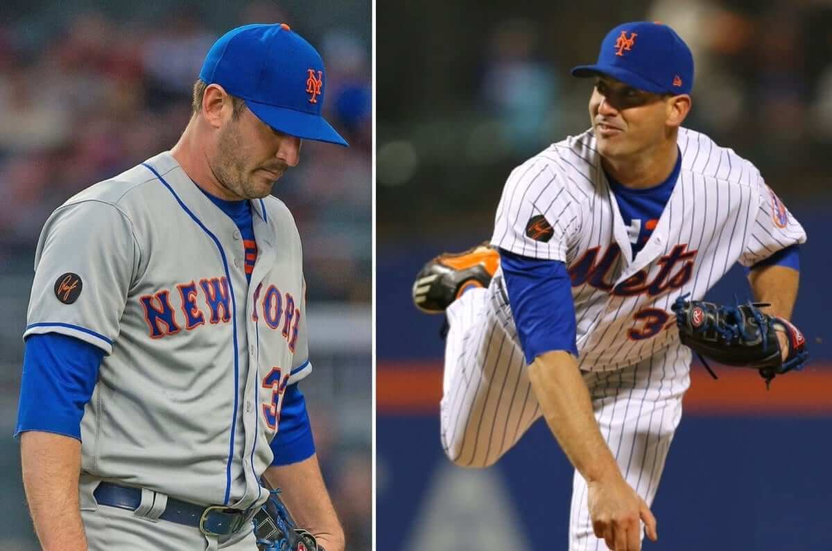
As it happens, there’s a uni-related aspect to Harvey’s game that I’ve been meaning to mention. For about a year now, he’s been wearing a base-layer undershirt featuring some sort of design. You can see it peeking out from beneath his jersey in the two photos shown above.
Is that some sort of Mets logo or design? Nope — it’s Harvey’s personal logo, featuring his initials and uniform number:

Are there other MLBers out there with personal logos? Definitely. Do any of them wear those logos on their undershirts? Maybe. But I haven’t noticed any of those undershirt logos visibly appearing, even partially, during games.
Photo research indicates that Harvey began wearing this undershirt shortly after the start of the 2017 season. At that time, he was coming off of a 2016 campaign in which he’d gone 4-10 with a 4.86 ERA. He continued wearing the personalized undershirt throughout 2017, during which he went 5-7, 6.70. And he continued wearing it this season, during which he was demoted to the bullpen after two starts and is now 0-2, 7.00.
Think about that. While his teammates have suited up in their standard blue undershirts each day, Matt Harvey — who by any objective measure has become a marginal major leaguer at best — has seen fit to trumpet his celebrity stature with a personalized “Look at me” shirt. Every time I’ve seen him wearing it, I’ve thought to myself, “I’m sure that’s a big hit in the clubhouse.”
Looks like I was right. Shortly after the news of Harvey’s impending release broke on Friday, New York Post columnist Joel Sherman made it clear that Harvey’s teammates weren’t exactly broken up to see him go. Here’s a key passage:
Think about when CC Sabathia went through lost effectiveness on the field and a battle with alcohol off of it in the 2013-15 span. The Yankees organization bled for him. The clubhouse and front office were pulling for the lefty to work through his problems on the mound and in life. It spoke to who Sabathia had been as a teammate — giving, team-oriented, convivial, supportive. He was feeling the return, a baseball quid pro quo.
Harvey never enjoyed such traction within the Mets’ walls. He put some great pitching in the bank, but not much goodwill.
A scout said something recently that stuck with me: “Mantle and Namath carried on off the field, but they were beloved in their clubhouses. They included their teammates in the good times and were great teammates. So, their teammates would go to war for them. I wonder if anyone has ever told Matt Harvey that.”
Matt Harvey was, briefly, a very good pitcher. Then he had two major surgeries that have left him as a very bad pitcher. But while his ability as an athlete has changed, his self-regard as a celebrity has not. He’s continued to not be where he should be and be where he shouldn’t be, and he’s continued to exhibit an attitude of ego-driven entitlement. That attitude was annoying even when he was a good pitcher. Now that he’s a bad pitcher, the attitude is completely tone-deaf.
I think all of this is summed up very nicely by the personalized undershirt. It captures the disconnect between Harvey’s fantasy of self-importance and the reality of his situation.
Some team will no doubt take a flier on Harvey and scoop him up for the remainder of this season (here’s hoping it’s a small-market team in a city without much of a nightlife scene). When that happens, it’ll be interesting to see if Adidas makes a new set of “MH33” undershirts in his new team’s color scheme, and if he continues wearing them on the mound. I’ll be watching to see how that develops.
Brand canyon: Amanda Hess, one of the best and most interesting young journalists currently working, has written an excellent piece about branding. I strongly recommend reading the whole thing, but here’s the best passage:
In her 1999 book, No Logo, Naomi Klein presents the acceleration of corporate branding as a kind of hollowing out: Companies that used to manufacture wares or harvest foods — that used to sell things — became brands, which sell ideas. Actual production processes became secondary, outsourced to far-flung subcontractors. The brand’s real investment was to imbue the products with meaning. “Nike isn’t a running-shoe company,” Klein wrote in the 10th-anniversary edition [of the book], “it is about the idea of transcendence through sports.”
At its core, branding is a process of humanization: It imbues companies with personalities. Often the personification is overt. Once there were Aunt Jemima and Betty Crocker; now there’s the Trump Organization and Fenty Beauty. As the celebrity adman Bruce Barton once said: “Institutions have souls, just as men and nations have souls.” A company with a soul becomes relatable, but in a deceptive way: The more we think of it as a “brand,” the more our focus shifts away from things like labor practices and supply chains and onto issues of narrative and identity.
This aligns nicely with something I wrote a few years ago: “Branding is, for the most part, about lies and deception. It’s about presenting a false image (the Wizard of Oz) that lures people into buying something less exciting than that image (the man behind the curtain).”
It seems fitting that this item should run on the same day we’re talking about Matt Harvey, who was clearly obsessed with his “personal brand” — and failed to live up to it.
Brannock update: In case you missed it on Friday, you can get the full scoop on the Syracuse Chiefs’ upcoming Brannock Device Night promotion, including a look at the custom uniforms, here.
In addition, here are a few new developments:
• The team has released this promotional video:
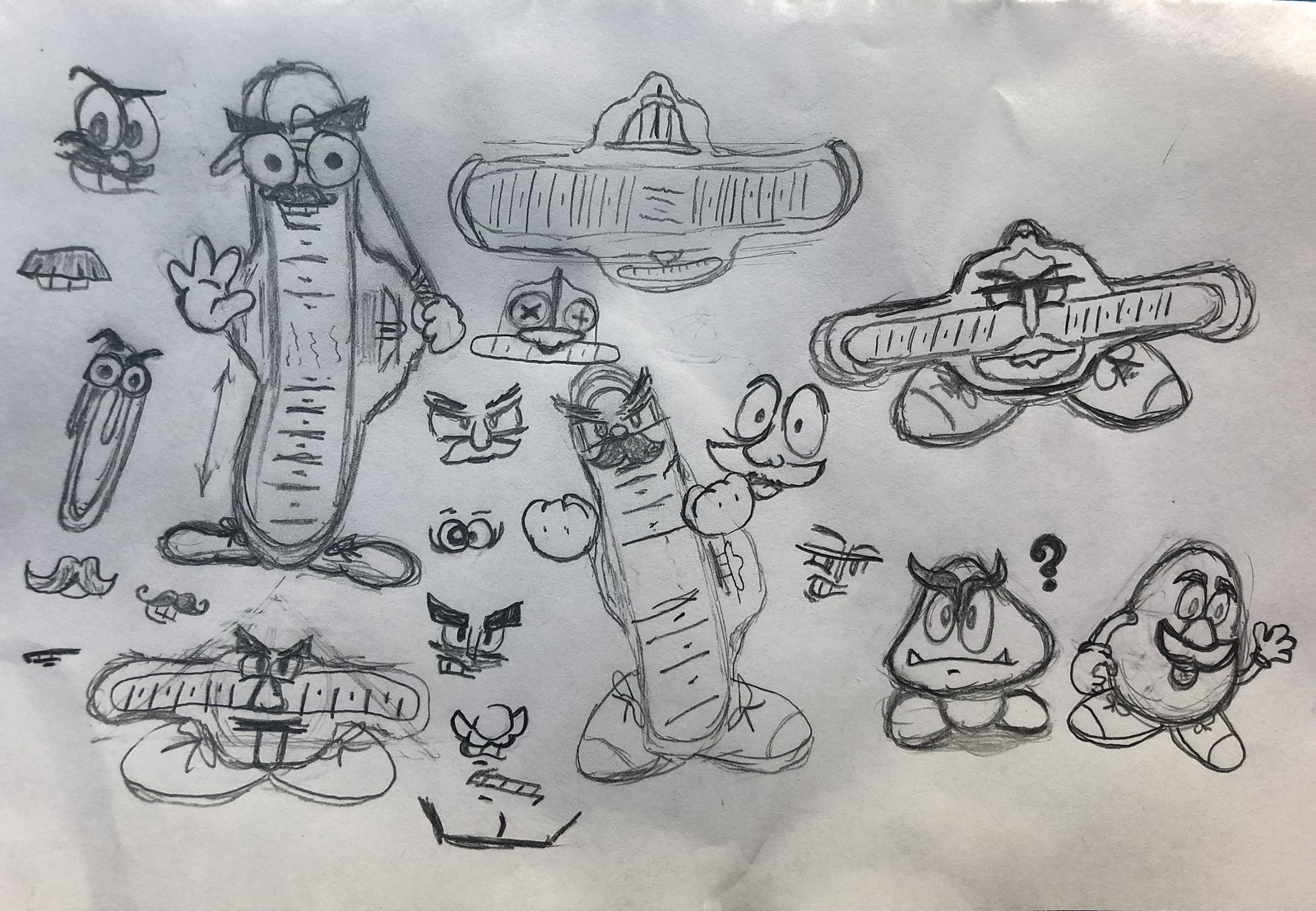
• On Friday I interviewed Danny Tripodi, the in-house designer who created the Brannock mascot logo, named Chuck, that the Chiefs will be using for the game. After we spoke, he sent me a shot of some of his preliminary sketches (click to enlarge):
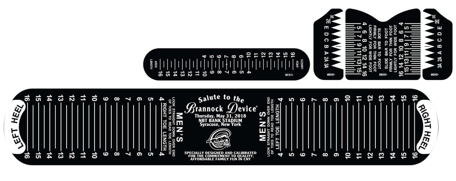
• Danny also told me that the team will be raffling off a few Brannock Devices with custom inserts, like so:
Meanwhile, I’m getting my Brannock tattoo touched up today, so it should look sharp for the big game on the 31st.

Auction and raffle results: The winner of the blind auction for the Uni Watch T-shirt box set is Jim Kohler, who generously entered a bid of $500. Big thanks to him, and to all of those who bid — the funds will help make Uni Watch sustainable this year.
Meanwhile, the winner of the raffle for the Fort Worth Cats T-shirt from Ebbets Field Flannels is Eric Ebels (a very Ebbets-like name!). Congrats to him, and thanks to all who entered. More raffles coming soon.
Click to enlarge
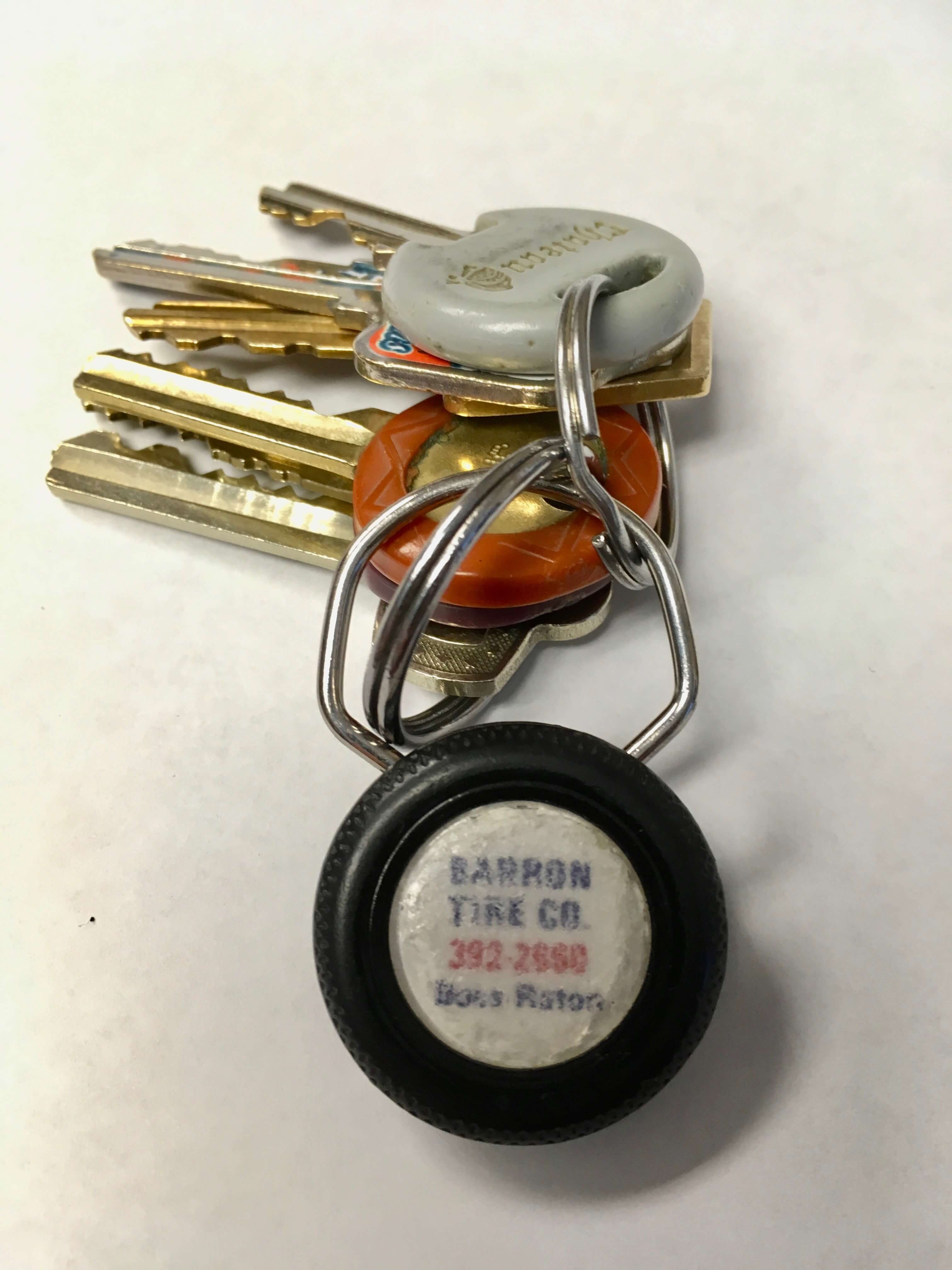
KRC update: The latest installment of Key Ring Chronicles is a very sweet story about a promotional plastic tire. Check it out here.
The Ticker
By Jamie Rathjen

Baseball News: The Royals and Tigers wore Negro League throwbacks yesterday. Reader Tom Juettner points out that previous Royals throwbacks to the Kansas City Monarchs emulated a sun collar, which was common in the early 1900s to protect players’ necks from sunburn. … Unfortunately, the Tigers didn’t wear throwback batting helmets in that game (from @JonDeno2). … The Threads of Our Game 19th-century uniform website came up with a list of the 10 most influential uniforms from that century. … Reader James Shannahan was an extra in the upcoming movie The Catcher Was a Spy, about major league catcher turned World War II-era spy Moe Berg, and sent us the trailer, which includes a brief view of vintage Red Sox and Senators uniforms. The film is to be released June 22. … I don’t have a picture, but that last item reminded me that Berg briefly appeared last year in the Nat Geo show Genius, about the life of Einstein, in which I believe his ca. 1939 Red Sox wore the period-correct baseball centennial patch. … Similarly, a recent episode of the FX show Atlanta was a late-’90s flashback in which a John Smoltz jersey made an appearance (from Andrew Cosentino). … The Charlotte, N.C., fire department uses the Reds’ logo (from Will Lawson). … The single-A Wisconsin Timber Rattlers will become the Wisconsin Brats and wear faux-lederhosen on June 9 (from Matt Hiepas). … The Brewers will honor broadcaster Dave Nelson, who passed away in April, with a memorial patch on June 21-24 (from multiple readers). … Iowa wrestling All-American Michael Kemerer threw the first pitch at Saturday’s Hawkeyes baseball game wearing wrestling shoes (from Dan Hillary).

NFL News: New Packers WR Marquez Valdes-Scantling, who Green Bay recently picked in the fifth round of the draft out of USF, might have the longest NOB in Packers history (from Michael Princip). … Here are the uni numbers for the Ravens’ draft class (from Andrew Cosentino).

Hockey News: A brewery in New Haven, Conn., uses the name and logo of the former New Haven Nighthawks, who played in the AHL with that identity from 1972-1992 (from Stan Capp). … One of Golden Knights G Marc-André Fleury’s jerseys was used to make three baseball caps. … At last night’s Sharks/Golden Knights game, referee Brad Watson had a taped-over logo on the rear of his jersey, rather than an Adidas logo (from Willie Gabel). … A South Korea fan at the world championship in Denmark just hopes his team stays up, probably. South Korea is playing at the top-tier tournament for the first time after earning promotion from the second tier, Division I Group A, last year, but would be relegated back there if they finish last in their group.

Basketball News: The movie Space Jam has been mentioned around here many times, but we’ve apparently never noticed that all the Monstars wear No. 0 (from Julia Hider). … Cory Gibson has amassed a collection of over 850 NBA media guide covers, dating back to 1958.

Soccer News: It wasn’t as much of a color clash as some thought, but West Bromwich Albion and Tottenham Hotspur played a white/dark blue vs. white/dark blue matchup in the Premier League. It was easier to tell them apart from the back (from Josh Hinton). … New kit launches: Scottish teams Dundee (first kit) and Greenock Morton (first; the red second shirt is unchanged), Dutch team AZ (first), and new German 2. Bundesliga team SC Paderborn (first) (the last one from Josh Hinton) … Newly promoted Premier League team Wolverhampton Wanderers are to have a new shirt advertiser next season. The old one, a payday lender, was controversial, but the reasoning behind the move is instead that the team’s owners think they can find a better deal with their PL status (also from Josh Hinton). … A logo for a several-years-in-the-making Northern Virginia USL team, Loudoun United, was trademarked last week.

Grab Bag: Also posted in baseball: Iowa wrestling All-American Michael Kemerer threw the first pitch at Saturday’s Hawkeyes baseball game wearing wrestling shoes (from Dan Hillary). … Cycling’s season-long points standings, the UCI World Tour, has a violet leader’s jersey only for its women’s edition. There isn’t an equivalent on the men’s side, but the Giro d’Italia, which started Friday, reintroduced a similar-looking jersey for its points classification last year. … New jerseys for the National Rugby League’s Indigenous Round (from Johnny Foreigner).
Hey Jamie,
Love the soccer effort in the ticker! I’m a big USL fan (Louisville City FC) and I haven’t heard any confirmation about DC United’s USL team. Is this just a rumor or did I just miss it?
From what I gather, it’s in the “DCU is definitely making noises about it happening but that’s it” stage. The first incarnation, Virginia Cavalry FC, surfaced in like 2010-2011 and disappeared for a few years before the idea came back.
So it’s not a rumor, but it hasn’t been officially announced with a start date or anything yet.
MH33 gear reminds me of TB12
link
Yeah. Except Matt Harvey doesn’t remind anyone of Tom Brady (except maybe in Matt Harvey’s mind).
One wonders if he got a pass for so long because he fulfilled the same sort of role that Lee Mazzilli and John Franco did…local (in his case, half) Italian-american kid that did good.
Propaganda – or at least the ‘Murrican Advertising/PR variety was popularized by Ed Bernays early in the last century with a large assist link (not the sea monster).
At it’s core, the ad/brand model is centered on creating an “emotional” connection to a product/character/idea.
We see it used everyday in our culture for bad, good, and sometimes evil, although todays examples are mostly (with a few exceptions) ham-fisted, god awful, and constantly plagiarized… I mean tributes, in it’s execution.
p.s.
Sad to see that the Dork Knight has ended his stay in Gotham – he was great copy
Loving that Brannock logo with the bat and cap. I think that is the best of the set, though considering the constraints of a design for a ballcap, I can see why they went with potato head / goomba version.
As someone who grew up going to Syracuse Chiefs/SkyChiefs games, and someone who with a love for weird Minor League Baseball hats, I’m very sad to miss the Brannock Device night (I moved to Boston a few years ago). I might just have to order one of the hats though.
The Moe Berg story has intrigued me for years and I’m thrilled that there is going to be a movie about him, with an all-star cast too. (Giamatti son of former commissioner!)
The trailer doesn’t mention his pre-war activities where he filmed Japan factories from rooftops while on an all-star tour with MLB players. Maybe a pre-quel with lots more uniforms?!
If that prequel were made, we would get to see the link! (Trivia: this actually looked gimmicky even at that time; Western-import sports typically had Western lettering and numbering from the beginning.)
I love how he got to be the backup catcher on the all-star tour not because he was such a great catcher, but because he was the only player in the big leagues who could speak Japanese well!
As a native Washingtonian, the son of a journalist, and a love of spy stuff, I’ve been fascinated by the Moe Berg Story for YEARS. I had no idea there was a movie, so … thanks for the tip!
I hope the film includes my favorite quote about him: He could speak seven languages, but he couldn’t hit in any of them
Or his last words,”How did the Mets do today?”
Matt Harvey would have a tough time with that shirt if he got picked up by Baltimore, Houston, or Pittsburgh, where 33 is retired.
Though it would be more amusing if he got picked up by one of the 14 other teams that have a 33 on their roster currently, and that player told him upon being asked by him for the number to go soak his head (or whatever colorful metaphor you might prefer).
On branding:
“No Logo” is one of my favorite reads, and while branding gives an organization a human soul, I would argue that personal branding takes away from one’s humanity.
As Paul said, brands are selling something. When you try to build a personal brand, it really requires a “buy-in” from someone else; you’re trying to — either literally or otherwise — get someone to buy an idea (i.e. “I am the Dark Knight,” or, “Look at my Instagram, I’m such a family man). When every moment becomes for sale, nothing is real. It’s why Matt Harvey’s nonsense didn’t even ring true when he was good (“I am here to talk about Qualcomm.”). It’s why the arm’s race for social media “likes” does more harm than anyone realizes. It’s a real hollowing out of the soul.
Anyway, a quick aside: This isn’t the first time Harvey’s undershirt has come up. I can’t remember who exactly (a beat or a broadcaster) said something along the lines of, “If you want to wear your own undershirt with your initials, you gotta back it up.” Usually media people have had some kind of background conversations with other players on the stuff to just casually drop that in there. I think the undershirt is a pretty great microcosm of a man that has always been way too big for his breeches.
Noticeable in the vid of the Iowa wrestler throwing out the first pitch is that Iowa, which wears a Pirates-style template, has abandoned the Pirates number and letter font for something Nike created for the Hawkeye basketball teams that features weird notches cut into the numbers and letters. Thanks Nike :(
Of course, the Steelers abandoned their classic block font for a silly font as well so what comes around goes around
I bet referee Brad Watson was wearing a Reebok or other brand jersey from last year and had to cover up the logo
Manchester City wore their normal sky blue jerseys for their home finale against Huddersfield Town, but then changed into a version with gold NOBs and numbers for their trophy presentation afterward:
link
link
It’s not the home finale, we host Brighton on Wednesday. PL trophy ceremonies are always on weekends, and it’s our last home weekend match. I know it’s nit picky, but that’s what UW is for
I’d love to spend an afternoon going through Cory Gibson’s NBA media guide collection. That is so cool!
Holy shiggity. Those National Rugby League uniforms are garish.
Where can I get one for the Eels?
Serious question: has any athlete ever had a personal logo that wasn’t an absolutely awful piece of design? Usually it’s just the initials and number mashed together in some horrible configuration.
Yeah, Bryce Harper’s under armour logo is essentially that. Big 34 with some connections to make it a BH. The whole idea is a negative, even when the player is good.
Michael Jordan’s “Jumpman” comes to mind.
Jack Nicklaus “Golden Bear”.
Arnold Palmer “Umbrella”.
Fred Perry “Laurel Wreath”.
Rene’ Lacoste “Crocodile”.
The one thing these all have in common is no initials. I don’t want to wear someone else’s initials.
The Jordan Jump Man logo.
I have always liked Greg Norman’s Shark logo …
i dont hold personal logos against golfers or tennis players since they are not on teams. some of these PGA players logos aren’t too bad
link
Greg Norman’s shark logo.
Alexander Ovechkin’s is nice.
Baseball players put their names and numbers on everything. Numbers on the knob of their bats, signatures carved into the barrels, numbers (and everything else imaginable) on their cleats, names/nicknames and numbers embroidered on their fielding gloves, numbers on their wrist bands.
Some players even have cartoon versions of their own faces on their wrist bands, and Matt Harvey’s initials and number on a shirt no one sees outside the clubhouse is somehow over the top? Please.
COMMENT OF THE DAY goes to bd!
Literally every player has his name on his bat.
Almost literally every player has his name on his glove.
No player that I’m aware of — except Matt Harvey — has a discernible personal logo on his undershirt.
So yeah, that’s the very definition of “over the top,” because it’s a significant deviation from the norm.
I’d argue it’s an insignificant deviation, in keeping with baseball’s long standing tradition of slapping your name and number on everything within reach.
We’re going to have to agree to disagree on that point.
Machado has or had his personal logo on his undershirts last year (it was a ticker item here too). Robinson Cano had one when he was endorsed by Nike on the Yankees. Bryce Harper has his logo on his cleats and he may have one on his undershirt. All those logos were usually placed on the center of the shirt, but small not too be too visible.
But Harvey’s logo is definitely large enough that it speaks for itself, for better or for worse.
If Harvey buttoned his jersey properly this might not even be a story.
I’m fairly sure Gary Sanchez has a personal logo / merch. Can’t find any photos of him wearing it, though.
Well, Matt Harvey might be hoping that Baltimore isn’t the only team interested since 33 isn’t an option.
While not worn on the field, it’s worth mentioning that John Buck made t-shirts with a Dark Knight logo in 2013 and sold them on his own website.
link
Was likely less of an issue in the clubhouse when he was dominating. Harvey for sure hasn’t done himself any favors, but this site has been a longtime hater of anything he does.
this site has been a longtime hater of anything he does.
This site has long disliked people who are dislikable. Matt Harvey happens to fit the bill. I would *prefer* to have liked him — until a few days ago, he played for my favorite team — but his continued dislikable behavior made that impossible. His teammates apparently felt similarly.
It is not fun when your favorite team has a distasteful player, and it doesn’t help that much even if the player is really good. Eg. Bill Romanowski, Aqib Talib.
Fair! As a longtime reader and Mets fan I can definitely empathize. Had so many “OH COME ON” moments off the field that were easier to ignore when he was playing well.
I’m sure more and more clubhouse drama will be revealed now that he’s off the team.
Check out this picture for sale on Ebay of goalie Al Smith of the Sabres (70’s) — his mask has the logos of the four previous teams he played for (and one of them is the WHA Whalers first logo, not their famous one) as well as crossed sabres in the middle of it.
link
-Jet
Hey Paul….
You have the wrong date for todays post. Today is the 7th.
Not sure how that happened. Fixed!
I feel for the South Korean fan at the World Hockey Championships. Saw the highlights of Canada-South Korea game. Sorry man, but would be really surprised if they stayed up in the top tournament from what I saw on the ice.
Yeah, I left out the part where they’ve been outscored 18-1 by Finland and Canada.
I felt the same way years ago when teams from Japan, Korea and China were being laughed off of international curling sheets.
I’m not laughing anymore.
no to Matt Harvey because he is not liked by paul
but OK to aaron judge for personal logo on compression sleeve
GOT IT
Surprised?
It was Phil and not Paul but they share the same liberal stance on uniforms, but the feather logo on the 70s Braves uniforms was deemed “cool” this weekend even though it is just as much of a stereotype as Chief Wahoo.
Dude, get a clue. Phil and I do not walk in lockstep. He can think whatever he wants about the Braves, and so can I. Just because he has deemed something “cool” does not mean I agree.
Think harder.
Lots of players have visible personal logos on equipment; exactly ZERO players aside from Matt Harvey have visible personal logos on their undershirts.
Aaron Judge is a very good player, so he gets to strut a little; Matt Harvey is a very poor player, so maybe he should try some humility.
What part of those two comparisons do you not understand?
Great read all around today.
Ordered a Syracuse Bannock cap several days ago if for no other reason but to honour my Dad who was in the shoe trade for over thirty five years with Clarks Shoes. At first he was in shipping/receiving with Clarks Canada, and in the lean years he worked part-time selling shoes in the Clarks store in a nearby plaza and was very proficient wielding a Bannock device.
That Moe Berg movie looks pretty good…I’ll plunk my money down for this Paul Rudd flick before wasting any money on that Antman sequel Disney and Marvel will be shovelling down our throats in the near future.
I’m doing a ranking of the IIHF Worlds uniforms. Here goes:
16. Germany- The Germans have some very not-Uber uniforms. The mustard yellow sets have no white on them at all, so there is nothing to break up the horrible onslaught of colors. The white ones are better, but no good enough.
15. Russia- The ruskies finish second to last, because their uniforms have no stripes whatesover. It just makes for an overall boring look.
14. Korea- The Korea’s IIHF debut isn’t lackluster, and so are the uniforms. I get that the stripes are meant to invoke Korean architecture, but they come across as the jerseys being ripped. Then again, that’s normal for Nike ;)
13. Finland- Never liked the Finns unis, never will. There is just not enough contrast between the two shade of blue to not make it look dull.
12. Canada- This iteration with the houndstooth-esque pattern on the shoulder yokes is OK, but not great. They need to ditch the black. 2010 Olympic jerseys, please.
11. Slovakia- The large shoulder yokes work much better on some other teams, and Slovakia’s sets are just a tad too boring for me.
10. Czech Republic- Ok, here come the good uniforms. Czechia’s are well designed, but a little too top heavy, with the arm stripes crowding the yoke.
9. Switzerland- That logo is just so bold and timeless.
8. Norway- The weird sleeve stripes/bands work best in this case because of the outline around them. The Norge text is great.
7. USA- The uniforms look incredibly better with the great USA hockey crest. Hopefully, the team will rock these improved sets to a gold medal.
6. Latvia- The burgundy looks fantastic on the ice. I’m surprised more NHL teams don’t employ it.
5. Austria- The cuff-to-cuff yoke looks great on the color jerseys. Oh, but the whites, those are just fantastic. The piping-style sleeve stripes are beautiful.
4. Belarus- Gotta love that waist stripe, the only team in the tournament (besides Canada) to actually use one. That coat of arms placed front and center is great.
3. France- There’s a Chicken on their uniforms!!!!!!!!!!!! But seriously, that logo is so good, and the shoulder yoke frames it so perfectly, they just had to make the top three.
2. Denmark- That logo is just too good. The yokes work best when they are left simple, and the clean red and white scheme compiments the design perfectly. The whites, with the lion head at the bottom, are great as well.
1. Sweden- Never change, Sweden. I am on record saying that the Swedes 2018 Olympic unis are the best they’ve ever worn, and they do not disappoint.
Bullpen Buggy in action in Arizona!
link
D’oh…now I see that was in yesterday’s ticker.
I was surprised that was not the lede today!!!!
Such a great story!