For all photos, click to enlarge
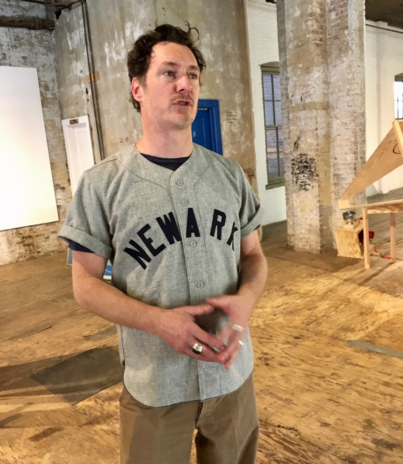
Meet Mac Premo. He’s an artist and TV commercial director whose studio is about a five-minute bike ride from Uni Watch HQ, although I’d never heard of him until a few days ago and never met him until yesterday. I went to check out a new installation that he’s about to debut: an array of machines that turn a 6-4-3 double play.
Premo is an interesting cat. Straddles the art world and the corporate commercial world and seems comfortable with both (here’s a video where he discusses that). Very smart, very ambitious, very “Life is one big art project, so let’s make it an awesome one.” He’s also a big baseball fan and, it turns out, a Uni Watch reader (it was the hottest day of the year so far, but he wore that Newark Bears jersey just for me). Really enjoyed spending a few hours with him.
As for his 6-4-3 project, Premo says it’s basically his way of paying tribute to something super-beautiful — a double play. Here’s how it works: He feeds a ball into a pitching machine labeled No. 1 (the pitcher). The ball bounces off a sheet of plywood (the batter) and feeds into another pitching machine labeled No. 6 (the shortstop), which shoots the ball into another pitching machine labeled No. 4 (second baseman), which shoots it into yet another pitching machine labeled No. 3 (first baseman). That machine then shoots the ball back to the pitcher, and then then whole thing repeats, ad infinitum (or until the ball goes astray, which happens occasionally).
This is all set up in the ground-floor exhibition space of the building where Premo has his studio. You can’t see the plywood/batter in this next photo, but it’s positioned beyond the right side of the frame:

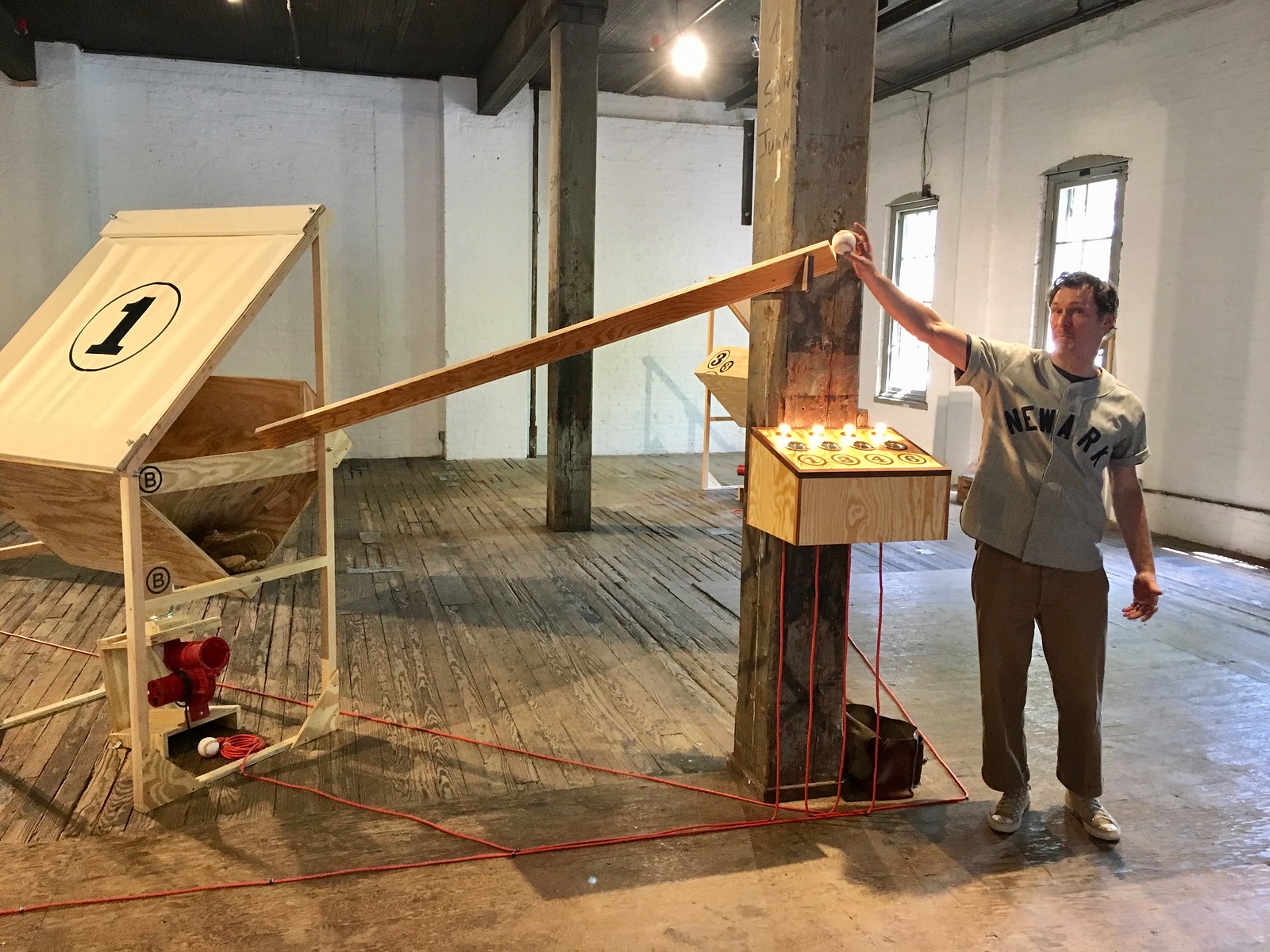
And here’s a minute of it in operation:
Okay, so it’s not quite as fast as a real double play, but let’s go along with it and assume that the runner is really slow. The whole thing is fun, although I think it could be better, or at least more baseball-y. For starters, I think the sheet of “batter” plywood should have a batter painted onto it (Premo says he’ll probably do that), and I’d probably paint a baseball diamond on the floor (he might do that too, plus he talked about putting the pitcher on a mound).
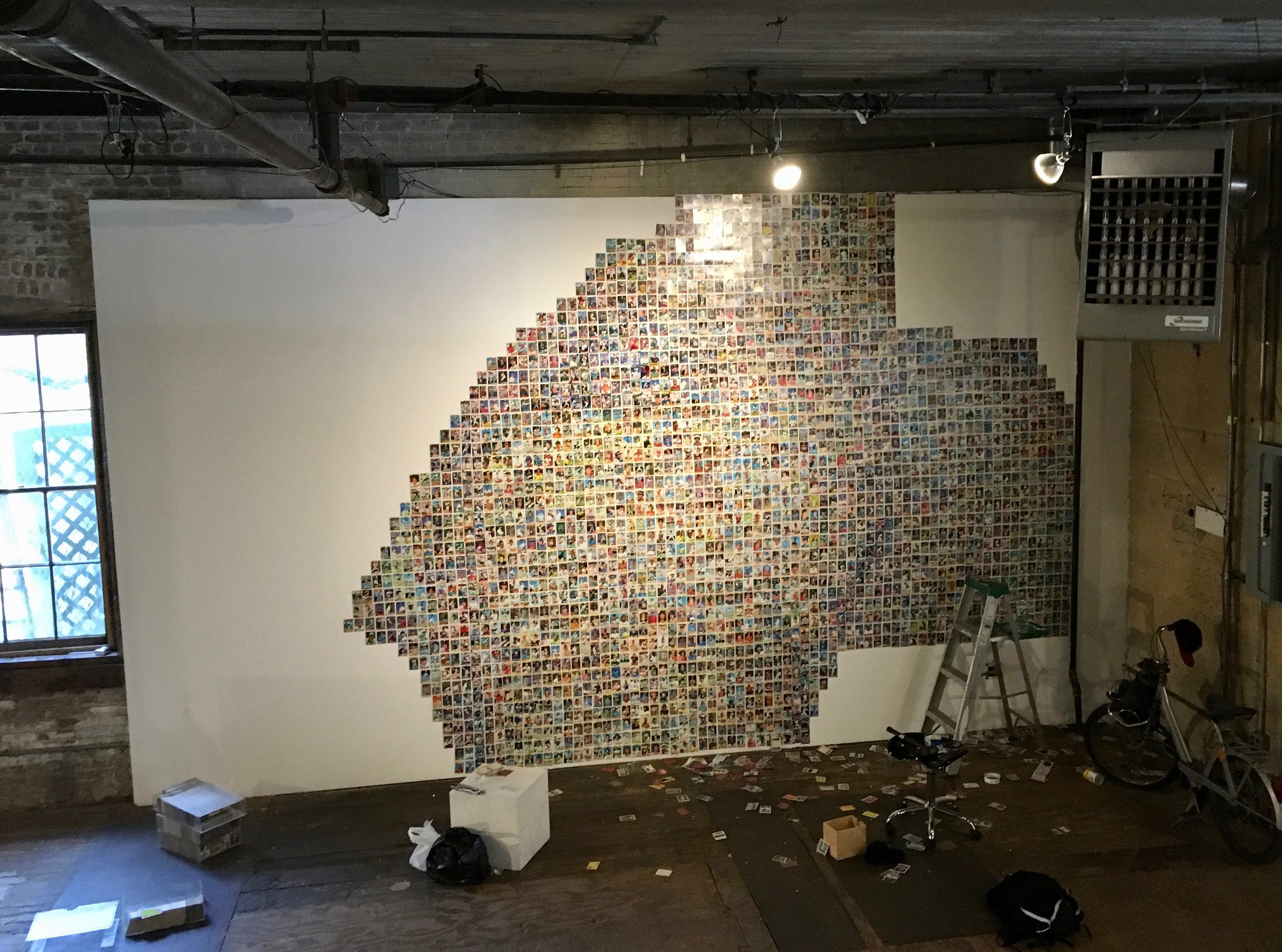
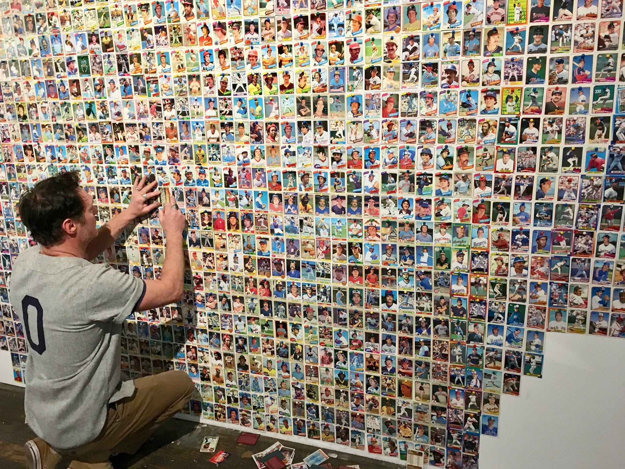
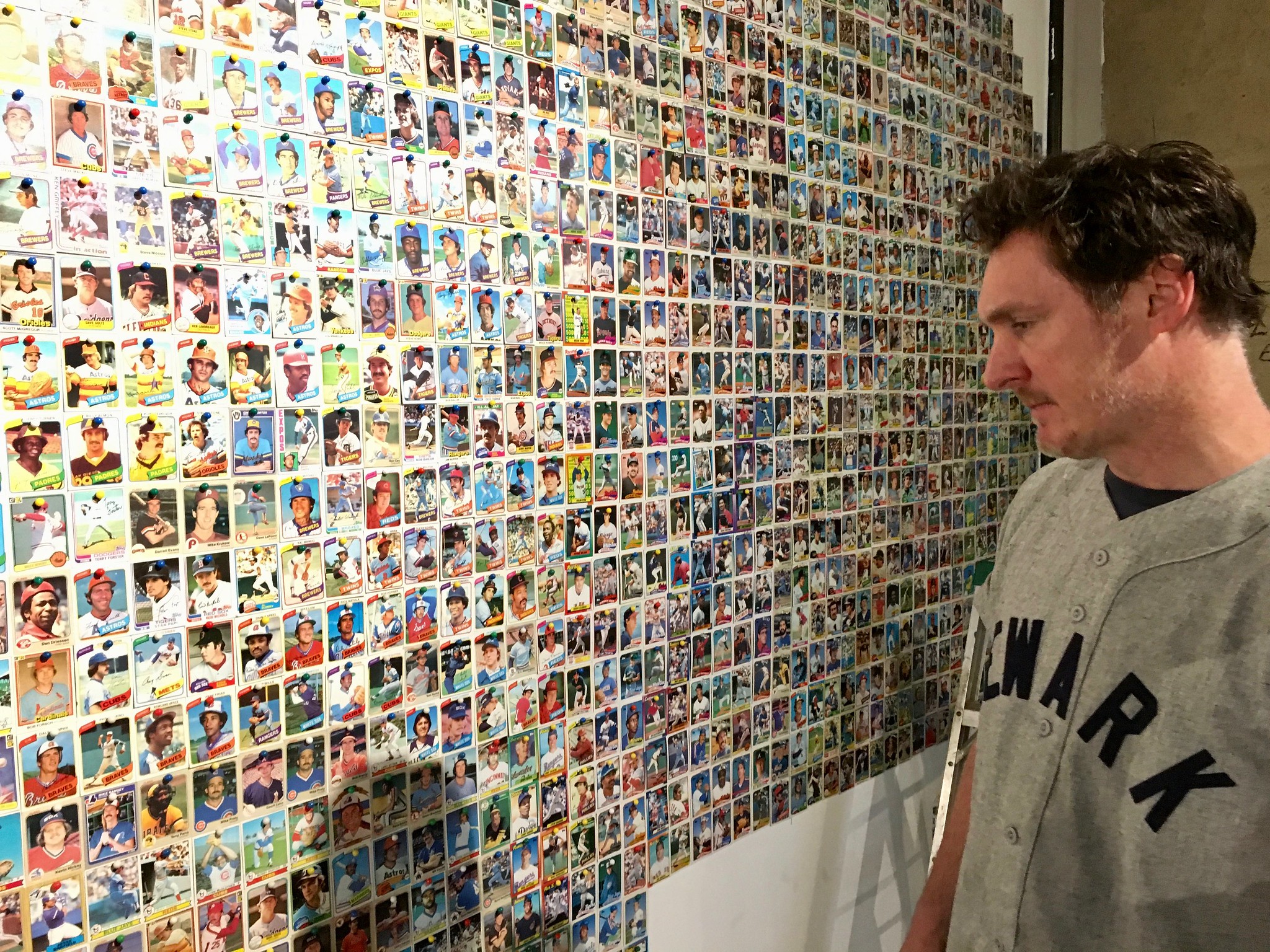
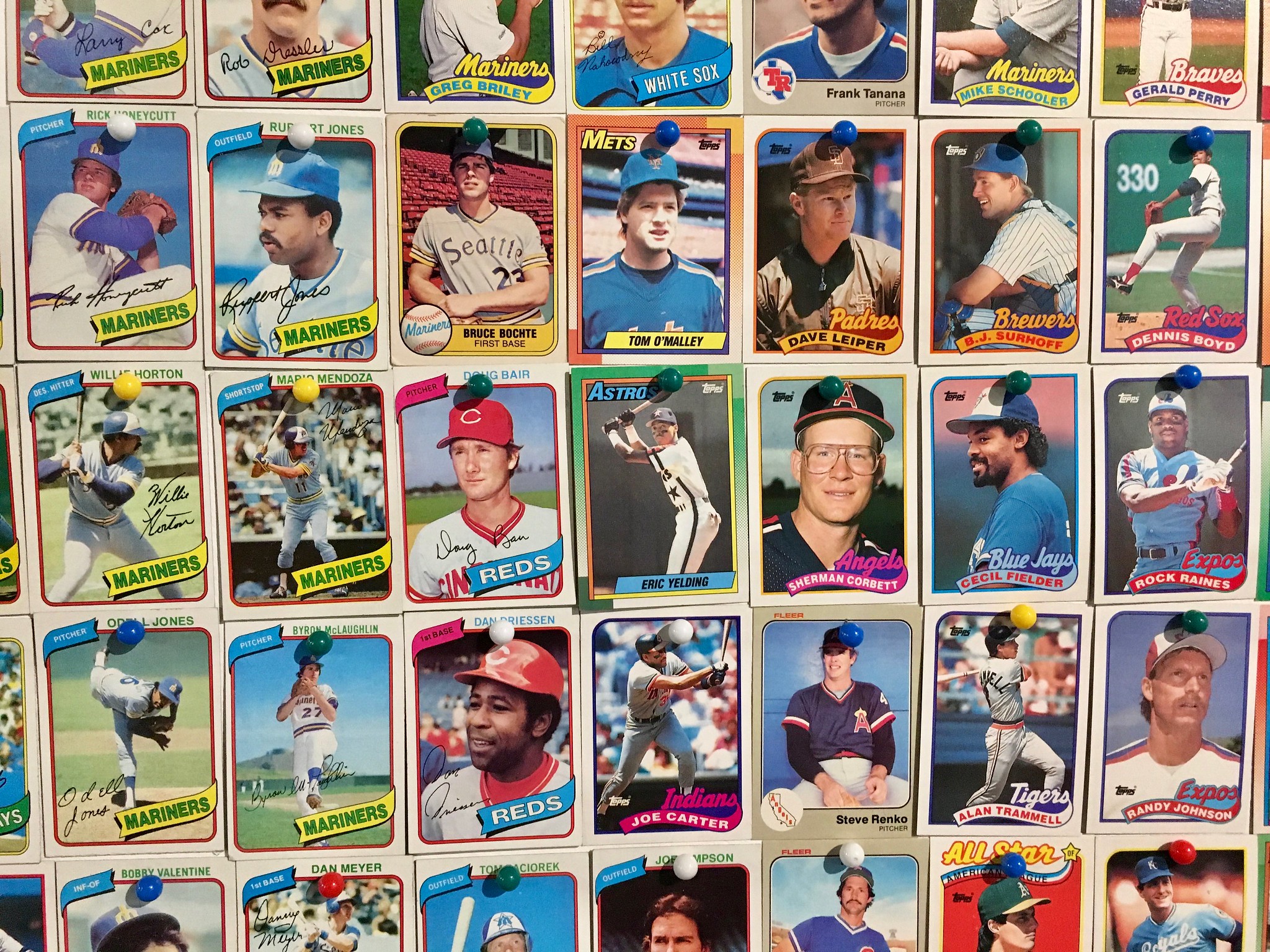
Premo also plans to have crowd noise and maybe play-by-play calls piped in. And over on a side wall, he’s using over 4,000 of his childhood baseball cards (and over 4,000 pushpins) to create a huge mural:
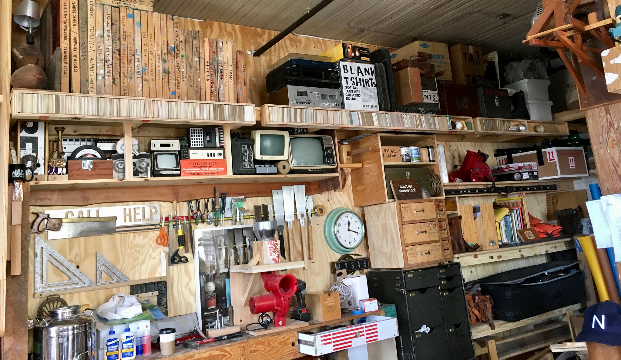
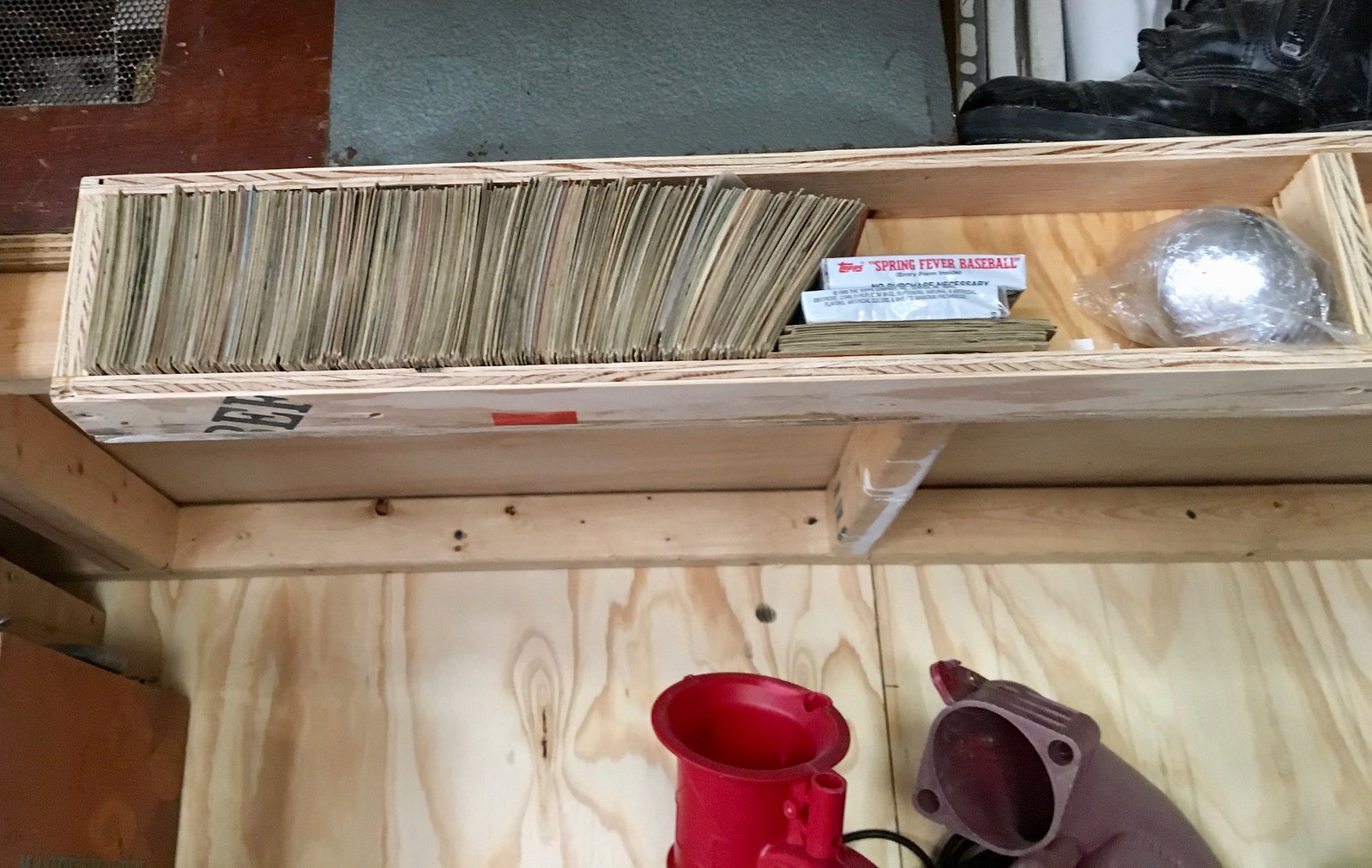
Premo also took me upstairs to see his studio, where I immediately noticed that he’d built special shelving to hold more of his baseball cards. Not sure I really see the point of storing cards this way, but it’s very visually satisfying, so maybe that’s the point (for the first photo, look along the top of the image):
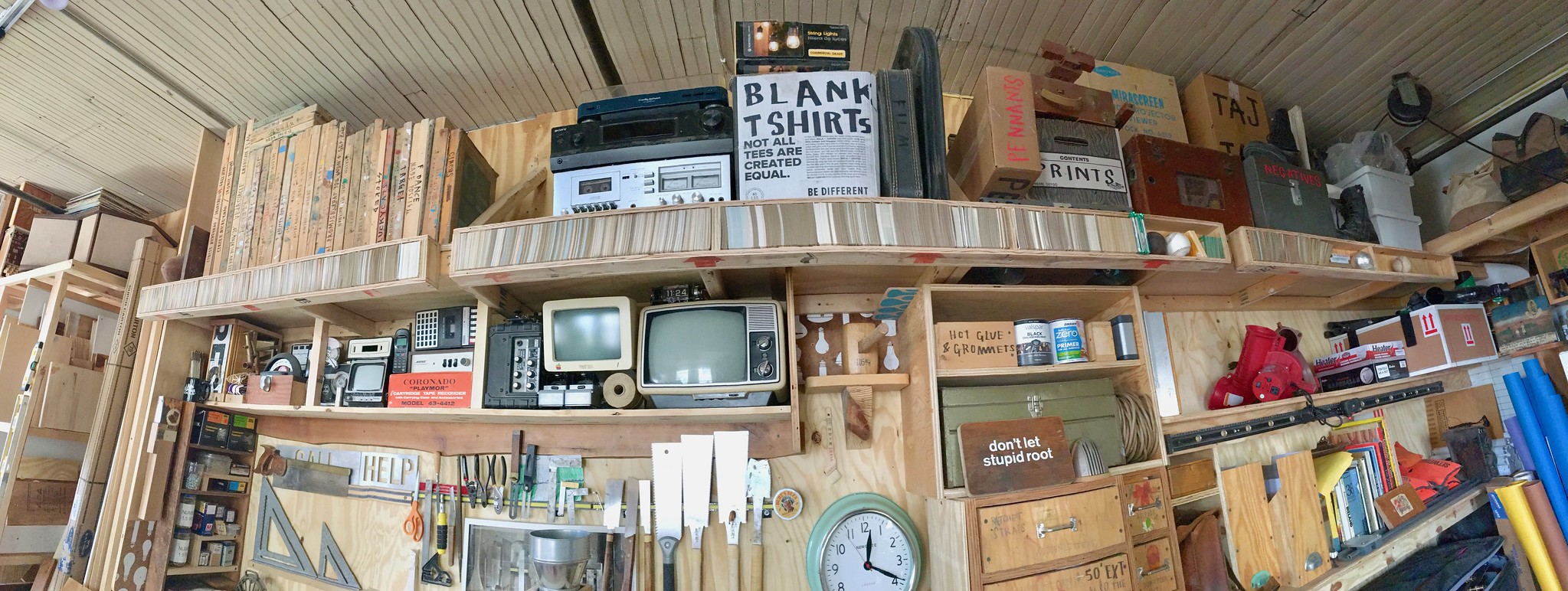
Getting back to the 6-4-3 installation: The building where Premo’s studio is located is called the Invisible Dog (because this was invented there). They’re having open studios on Saturday and Sunday, and the double play machine will be doing its thing. If you want to see it, here’s how to get there.
It’s possible that this weekend will be 6-4-3’s entire lifespan, but it’s more likely that Premo will make some improvements and adjustments to it (he’s very interested in getting some audience feedback) and try to get it in some group exhibitions. There’s also talk of taking it on the road.
I leave you with a shot of Premo’s new baseball glove, which says it all:
Click to enlarge
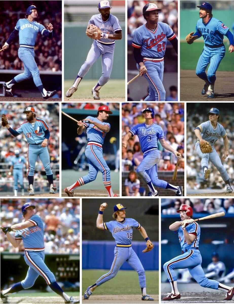
Feeling blue: With the Phillies new powder blue Thursday throwbacks generating some recent buzz, my latest ESPN column looks at the past, present, and possible future of powder blues (including 1980 and ’81, when a record 11 teams wore them, as shown above). Check it out here.
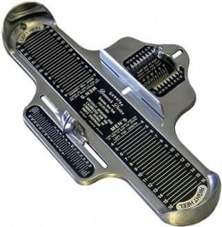
Brannock update: Yesterday the Syracuse Chiefs announced the details of their Brannock Device Night promotion, which will be taking place on May 31. Here’s the skinny:
1. The team will be renamed for the game as the Syracuse Devices. Obviously, this is not as good as the Syracuse Brannock Devices, but the full name would have violated MiLB rules, because it would essentially be a giant ad on the uniform. They could have gone with the Syracuse Foot Measurers, but that didn’t roll off the tongue so easily. So the Syracuse Devices it is.
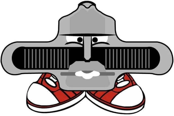
2. The team’s in-house design staff has created a new logo for the game — an anthropomorphized Brannock Device mascot character. They’ve named him Chuck, after the device’s inventor, Charles F. Brannock. He’ll be featured on the caps that the team will wear:
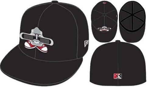
3. The team worked with OT Sports, which provides the one-off specialty jerseys for many MiLB teams, to create Brannock-themed jerseys for the occasion:
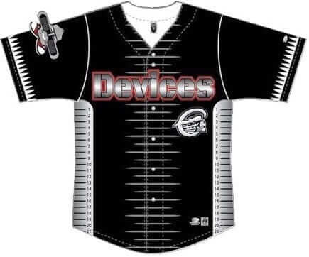
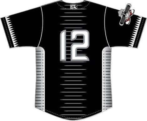
I know some of you were hoping we’d have a Uni Watch design contest for the uniforms. I was hoping for that too, and I pushed for the team to go that route. But they said there wasn’t enough time. Too bad. Maybe next time, if this becomes a recurring promotion!
4. I will be throwing out the first pitch.
5. The team has generously reserved the first base terrace area for me, so uni and/or Brannock fans can gather and mingle. I’ll be there for most of the game. Here’s a Facebook event page if you want to indicate that you’ll be attending.
6. The Syracuse Devices have their own Twitter feed, and you can buy Devices merch here.
I think that’s it. Today I’m going to look into getting my Brannock tattoo re-inked — it’s gotten a bit faded after 15 years, so I’m thinking a touch-up might be good, although I’m not sure how practical that idea is. We’ll see.
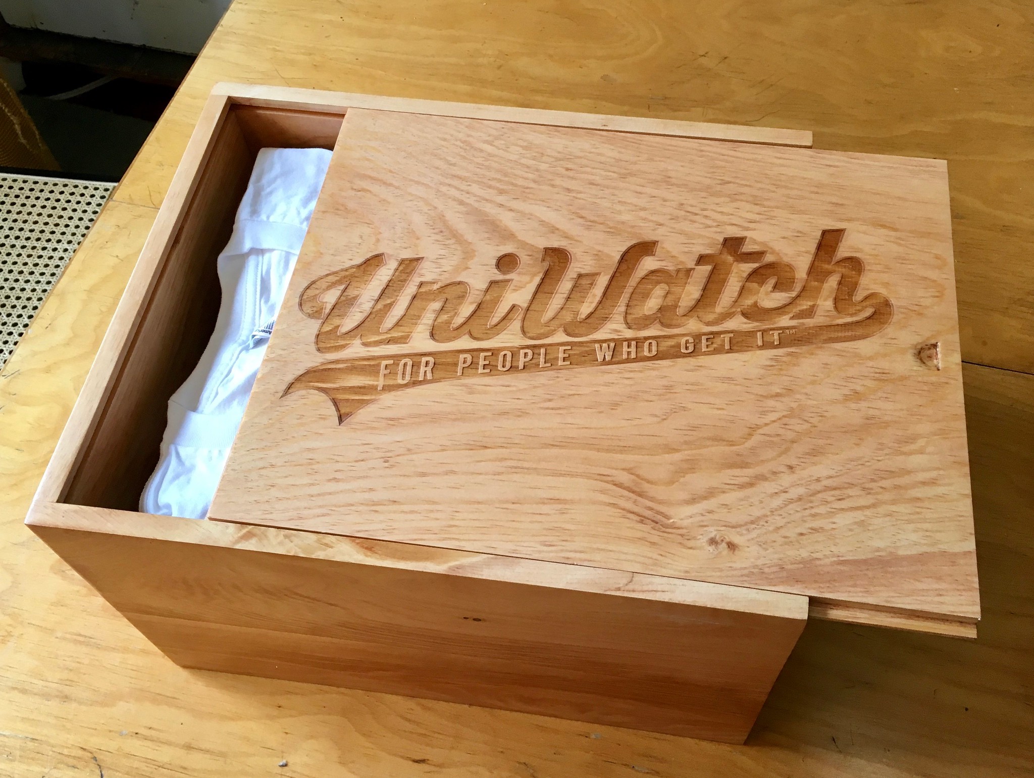
Assorted reminders: Today is the final day the auction for a full set of 2015 Uni Watch T-Shirt Club shirts in a custom-made pine box (shown at right). Remember the minimum bid is $425, but I can tell you we already have bids that are higher than that. Full details here.
Also:
• Our friends at Ebbets Field Flannels are currently raffling off a very cool-looking Fort Worth Cats T-shirt. Full details here.
• Bobblehead doll restoration artist extraordinaire Chris Callan is willing to make custom Uni Watch bobbles for up to three customers. One customer has already placed an order, which leaves two slots remaining. Full details here.
The Ticker
By Kris Gross

Baseball News: The Indians and Blue Jays were rained out on Jackie Robinson Day, so they made that up yesterday, with full 42s (from Samuel Selker). … Mariners OF Ichiro Suzuki retired from playing baseball yesterday and will move to a front office role, but he’ll still wear a uniform and take batting practice. … Former NYC mayor Rudy Giuliani, wore Yankees cufflinks in a TV interview yesterday (from Brian). … Joe DiMaggio made his MLB debut on yesterday’s date in 1936. Did you know he wore No. 9 during his first season, instead of his familiar No. 5? (From BSmile.) … Here are the Fort Wayne TinCaps’ Thursday alternates. … Lots of teams wear Star Wars jerseys, but the Sugar Land Skeeters are taking things a bit further by going with storm trooper batting helmets this weekend (from Shay). … An Adair County (Oklahoma) Little League team is paying tribute to the Rockford Peaches (from @nharvill). … Ray Hund came across old TV Guide covers featuring MLB and NFL athletes. … Artist Shawn Wolfe is selling a bunch of rock posters, and two of the ones for Guided by Voices have Reds themes (from Rob Walker). … According to this article, Brewers OF Christian Yelich’s grandfather is none other than Fred Gehrke, who invented modern football helmet design by painting the first horns on the Rams’ helmets. Who knew? (From Don Schauf.)

Football News: Browns players have to earn their helmet stripes during training camp (from @Believeland1994). … Speaking of the Browns, they’ve begun looking into new stadium sites (thanks Brinke). … We have draft class number assignments for the Bears and Titans (from @BigJ52, RL Ely). … Also listed in the baseball section: Ray Hund came across old TV Guide covers featuring NFL and MLB athletes. … Good spot by Steven Woj, who found this Rutgers football helmet with the face mask covering the bumper. … Cross-listed from the baseball section: According to this article, Brewers OF Christian Yelich’s grandfather is none other than Fred Gehrke, who invented modern football helmet design by painting the first horns on the Rams’ helmets (from Don Schauf).

Hockey News: Penguins winger Bryan Rust wears No. 17, which explains why this fan was wearing a No. 17 Pens jersey with an NOB showing the chemical compound for ferric oxide — rust (from Dylan Barcus).

Soccer News: Here are some notes from Ed Żelaski: Leyton Orient unveiled their 2018-19 kits, new home kits for FC Magdeburg, and Cleveland SC has unveiled their inaugural season uniforms. … Barcelona is joining the fight against child obesity. They’ll wear “Eat Like a Pro” on their sleeves, instead of their normal advertiser (from Josh Hinton). … Also from Josh: New home kit for PSG, new away kit for Liverpool, and Tijuana goalie Gibran Lajud wears ads on his gloves.

Grab Bag: The Adelaide Crows of the Australian Football League unveiled their indigenous-themed guernsey (from @tedkerwin). … Stetson University has new logos (from Michael Rodriguez). … Belmont is moving from Nike to Under Armour (from Clint Richardson). … These are some sweet lacrosse helmets for Georgetown lacrosse. … Indian Premier League cricket team Delhi Daredevils with major cap and jersey inconsistencies (from Bill Blevins). … People are confused about the era-incorrect style in the new Robin Hood movie (from Jim Vilk). … Check it out: cornhole uniforms! (From Esther Cepeda.)

What Paul did last night: We had record high temperatures in NYC yesterday, so the Tugboat Captain and I decided to cool off in the evening by grabbing a few beers and riding the Staten Island Ferry back and forth. Aside from being providing a nice ride on the water, it’s also the best bargain in the city: free.
The ferries have some very old school lettering painted on their sides. I’d seen it before, of course (they’ve been using the same design for many years now), but last night I was really struck by how anachronistic it seems. There’s nothing else like it in the NYC transit system (click to enlarge):


Anyway: It was a swell way to spend the evening, and one of the nice perks of living in a waterside city.
Fe2O3 is Ferric Oxide, not Ferrous Oxide.
Thanks for schooling me! Fixed.
Curious if that was a Dustin Jeffery jersey that letters were removed and an o and the numbers were added as it seems off centered plus it’s the older style jersey not the current one.
Typo: Indian Premier League cricket team DELHI Daredevils
Update: The North Dakota Fighting Hawks decided on their new mascot’s design yesterday, as students voted for Mascot Design Z.
link
Got it.
You haven’t lived until you’ve been to the men’s room on the Staten Island Ferry. – Rodney Dangerfield
Those Cleveland Soccer Club unis have something I’ve never seen before: a logo inside the numbers. I’m also not sure if the CLE clothing logo is an ad or a makers mark. I guess in a way, it’s both.
link
You’ve never seen that before? I know less than nothing about soccer and even I know that’s not uncommon on soccer jerseys.
Yeah, I was just going to say, team logos in numbers are pretty commonly seen on, for example, the U.S. national team shirts, or for clubs such as Real Madrid/Bayern/Man U/Tottenham that use exclusive fonts at least sometimes.
Also league logos, right?
Yup, in leagues such as MLS/NWSL/the Premier League that use a standard font.
Oh. Sorry. Honestly, I haven’t seen that before. I’ve not been a huge soccer fan, I’m just getting into it.
Yeah, most leagues will feature the logo at the bottom of the number on the back. International teams usuallly have their crest/logo there, too. Some youth team uniforms that are made by adidas (not sure about Nike, Puma, Umbro, etc) will have an adidas logo at the bottom of the numbers.
No inconsistency in the IPL Paul, The orange cap is awarded/worn by the leading run scorer of the tournament throughout said tournament. Think the yellow/other coloured jerseys of the tour de France etc.
There is also a purple (I know you’ll shudder) for the leading wicket taker.
link
Browns angling for a new stadium already? How did 20 years become the useful lifetime for stadiums? I had thought that in the post-cookie cutter boom the sport-specific stadiums were supposed to have staying power? The Dolphins seemed to have proven you can just reinvest in the stadiums to upgrade and modernize.
I blame the Braves.
Paul, I hope you practice before you throw out the first pitch on Brannock Device Night. You don’t want to pull a Baba Booey: link
For sure. Haven’t thrown a baseball (as opposed to a softball) in many years. Gonna start getting the ol’ wing in shape tomorrow!
… or Fiddy: link
I think the common denominator here is obviously being a Mets fan, so maybe that should have you spooked.
Makes me think of one of my favorite TV-related sports moments. On the West Wing, when Martin Sheen’s President Bartlet is tossing a baseball inside the White House to practice before throwing out the first pitch at an MLB game. Classic.
I was at the O’s game the night they filmed that. He tried 3 times, and bounced all 3. We were in the nosebleeds and the couple in front of us we’re super excited to see the “president” throw out the first pitch, and super confused the second and third time he tried :)
*were
Today’s blog was one of the more fun ones in a while, and another one of those that reminds me why I read daily.
I have long believed the double play is one of sports’ greatest moments. A series of circumstances come together that result in a group of humans, almost instantaneously, becoming a machine of parts where each action triggers another immediately. If the ball is hit hard enough, there are no variables. It’s not like a pass play in football or a basketball play where a defender’s decision impacts what everyone else does. The stars align, the batter gets over the ball and the gears start churning. Fielder moves to ball, other fielders move to bases, ball is picked, throw, catch, pivot, throw, catch, bang. Sure, the machine breaks once in a while: A ball gets thrown into right field or past the first baseman. There’s even a fail-safe built in: If the pivot man sees the batter is nearing first, he can hit the ‘abort’ button and just eat the ball. But it’s a thing of beauty when it’s executed, and it’s amazing how often it’s executed well. Not only that, it truly changes the tenor of an inning in just a few seconds of time. It’s quick, efficient, mechanical, impactful and beautiful. A unique thing to baseball and I never fail to appreciate when it happens, even if my first reaction whenever a Brewers player hits a grounder in such a circumstance is to groan.
I can only picture a blog like this finding an exhibit that literally turns that work of art into a work of art, then I can only picture a blog like this finding legit reason to rightly nitpick it a bit. Same thing for the card display. I bemoan the fact there’s not enough critical thinking in the world, but it’s comforting to know I can come here and get satiated with it every morning.
If I would have written the words, they probably would have come out just about the same. That’s cool.
Keep on keepin’ on, sir.
Thanks, Dan — great to hear from you (it’s been a while!), and I appreciate the kind words.
What I love about the double play is that it (usually) looks routine, the announcers often call it a “routine” double play, but that hides the fact that the players made it routine through endless, endless practice. How much work went into making it look simple is completely invisible.
Power Blue for Power Blue’s Sake was the original BFBS.
Well, no, because BFBS is driven almost entirely by retail merchandising, while powder blues were a thing prior to the merch era.
Enjoyed the ESPN article.
Another detail to note about those ferries: The ferry in the first photo has the old NYC Department of Marine and Aviation insignia on top. The ferry in the second has the more recent NYC Department of Transportation logo.
The newest ferry in the fleet was made just north of Green Bay at a shipyard that uses a side-saddle launch – not a long slide in. It looks like it will capsize in its first few seconds:
link
Oh, wow — that’s awesome!
Thanks, Brian. This is another one of those moments when my strange fascinations collide. Here’s a gallery of one of the Staten Island ferries making it’s way out of the Great Lakes.
link
Hey Paul,
There’s actually a couple of interesting explanations for the uniform inconsistencies mentioned in your column this morning.
In the IPL, the league’s leading run-scorer season-to-date is honored by wearing an orange cap when his team is in the field. Only one player in the league gets to wear it at a time, and in the picture, you’re looking at Rishahb Pant, who was leading the IPL in runs scored when that photo was taken. During yesterday’s Chennai/Kolkata game, SuperKing Abmati Rayudu overtook Pant for the lead, so now Rayudu will have the honor of wearing an orange cap unless and until someone overtakes him for the league’s runs scored lead. [Incidentally, the league’s leading bowler (think pitcher) who has taken the most wickets (think outs) has the distinction of wearing a purple cap on the field.]
o From the website: “The Orange Cap will be worn while fielding by the batsman who has scored the most runs in the league (including the Playoffs) during the season to date. It is first awarded once each team has played at least one match and then changes hands when another batsman becomes the highest run scorer in the league to date. The Orange Cap is presented to the batsman at the end of the innings in which he achieves this feat (either at one of the flash interviews or at the post-match presentation). In the circumstance where two or more batsmen have scored the same number of runs during the season to date, the Orange Cap will be retained or awarded, as appropriate, to the batsman (of those who are tied) who has the higher strike rate during the season to date.” link
link
As for the sleeve logos, the location of the sleeve logos depends on whether the batsman is right-handed or left-handed. While batting, the IPL league logo always faces the TV camera. Imagine a telecast of a Major League Baseball game… in the picture, you’ll see that #88 must be right handed so the league logo on his left sleeve faces the camera, and Pant (#777) must be left handed batsman because as the league logo must be on his right sleeve so it faces the camera when he bats.
This placement is outlined in the style guide (which I found myself thumbing through a few weeks ago.) I’ve attached the links here (pretty interesting stuff):
Clothing And Equipment Regulations: link
Logos section: link
Guided By Voices is from Dayton, not far from Cincinnati. Lead singer Robert Pollard was a Reds fan and a while back, did the score for a Pete Rose documentary.
link
I bet that was a good score!