By Phil Hecken
Follow @PhilHecken
Back in 2016, I began undertaking a series of entries looking at a team’s “signature” uniform. Loosely defined (and subject to interpretation) a “signature” uniform would be a uniform which one might definitively associate with a team, the one which stood out the most over the years. A signature uniform is not necessarily a team’s best uniform, or one which the team has worn the longest (although either of those could still apply), but rather the one uniform that, when you think of how a team looked at their most distinct, you have their signature uniform. Earlier this year, I resumed the series with the Montreal Expos, the Arizona Diamondbacks, the Oakland A’s, and the Kansas City Royals.
If you missed the previous 2016 entries in the series, you can see them at the following links: Indians, Pirates, Astros, Mets, Rays and Padres.
Today we’ll look at the Washington Nationals. Although the franchise history dates back to 1969 (they were “born” as the Montreal Expos), the team has played baseball in the nation’s capital since 2005. Previous iterations of Washington baseball have moved (in 1961) to Minnesota and (in 1971) to Texas. When it became clear the Expos could no longer viably host a team in Montreal, DC became the target relocation city — a move that was opposed by the Baltimore Orioles (who believed market competition would be detrimental), but approved by MLB over the Orioles objections.
The name “Nationals” was probably more of a compromise than a first choice — the previous Washington MLB team (which became the Rangers) had been called “Senators” and the original team (which became the Twins) was known both by “Nationals” and “Senators” over the years. Some folks hoped for a new “Senators” while others thought the team should be called “Grays” in a nod to the Negro League franchise which played many games in DC. Still others thought “Federals” should be the franchise name. Ultimately, “Nationals” won out.
The original uniforms were somewhat disjointed — Uni Watch pal Todd Radom designed their first set, which featured a white home uniform with red cap and elements, and a gold dropshadow for the beveled wordmark and numbers. These were outlined in blue. The road gray featured the same beveling with a blue cap and elements, using the gold dropshadow and red outlines. Normally the cap would have a somewhat similar logo to the style of the uniform, but the previous iteration of the Senators wore both red and blue caps with a “curly W” logo. This proved popular with fans so a slightly tweaked “W” logo from the one worn by the Senators was used for the caps. I hope to get an interview with Todd at some point in the near future to discuss whether his original design included a cap which would match his beveled dropshadow font and why the retro “W” design was ultimately chosen. Either way, the original look lasted for six seasons at home and four on the road.
UPDATE: Reader Scott Rogers has some additional information concerning the original uniform/cap combination:
(T)he 2005 Nats unis were designed by Todd Radom with a matching beveled W:
Sources at the time, when I was running a Nats blog, told me that Bud Selig, who as commissioner was also in effect the owner of the team, personally intervened to insist on the old curly W logo in place of the beveled W. This came after Selig lost a short but intense negotiation with city officials who threatened to walk away from the nascent stadium deal if the team adopted the name Senators as Selig strongly wanted. He couldn’t have the old name, but he could insist on the old cap, so he did. In the reporting I did at the time, I got the sense that Selig was basically working out youthful trauma over the Braves by proxy with the Nats.

2005-2010 Home

2005-2008 Road
The wordmark (“Nationals” at home and “Washington” on the road) in that particular style is known as a “bridge” design. By itself (or perhaps on paper or a computer screen) it looks rather regal and handsome; unfortunately, I don’t think it every quite translated well to a jersey, perhaps due to the beveling. The style attempts to give the letterforms and numbers a three-dimensional look and up close it likely does. From any distance however, the wordmark loses its depth. As the numbers are larger, their 3-D effect is better attained. This would be the last time “Nationals” appeared on the uniform until 2018.
If you’ve watched any Nationals games over the past decade-plus, you are probably aware they’ve introduced a number of alternate jerseys (each in either red or blue). While we bemoan the (over) use of blue and red in baseball these days, for a team based in Washington, D.C. and named “Nationals,” the R-W-B color scheme makes absolute sense. The team’s first alternate jersey came along in 2006, and featured at “DC” logo on the cap and left breast of the jersey (in the same beveled font as the other uniforms).

2006-2008 Red Alternate
On April 17, 2009, the uniform achieved immortality (or perhaps eternal ignominy) when not one but TWO players took the field wearing uniforms with the typo of the decade. To this day, we still sometimes jokingly, or derisively, refer to the team as the “Natinals.” Paul covered the event in spectacular fashion.

By 2009, the team would be ready to make some changes and additions to their uniform set. They would introduce a new blue alternate, a new red alternate, and a new road uniform. The blue alternate was similar to the red alternate in that it kept the “DC” chest logo and number, but red and white piping was added and the DC logo was given a stars-and-stripes motif.

2009-2010 Blue Alternate
While the team kept the “Nationals” wordmark and beveling on their home jersey through 2010, the new red alternate and new road alternate would both ditch the front beveling and font face in 2009. The new red alternate featured, for the first time, the curly W which had appeared on the caps. It would be rendered in white (with blue outline) on the red jersey, which would also have solid white piping. The beveling wouldn’t completely disappear, however, as the uni numbers on the backs of the jerseys were still rendered with that style. Front uni numbers removed all 3-D appearances. The alternate beveled “DC” logo would also appear on the sleeves. The team would also introduce a new cap style, with a blue crown/red brim. The stars-and-stripes logo motif would stand out as unique to the team.

2009-2010 Red Alternate
The new road uniform would see the most radical changes. Gone was the beveled bridge “Washington” font, and in its place was the new road wordmark “Washington” featuring a script font, with the “W” in Washington in the same style as the “W” on the caps. Washington would be in red, outlined in blue and white (the same as the front number). The back would keep the beveled number style, and the sleeve would have the beveled DC logo. 2010 would spell the end of the original beveled fonts but the team kept them on all uniforms from inception through the end of that season.

2009-2010 Road
After six years of uniform tweaking and tinkering, the Nationals would redesign their look for the future. They had given hints of the new uniform sets with their prior unis, and in 2011, they’d begin to make the final changes which they would keep (with many alternates and new caps) through the present time.
In 2011 they would introduce a new home uniform — a white jersey/pants set with a red cap — which kept the “curly W” logo on the upper left chest and the block number on the lower right torso. The logo, front and back numbers, and NOB would all be rendered in red with blue outline. A red/blue piping down the placket, over the shoulder and on the ends of the sleeves would be added as well. Pants would also have the red/blue striping.

2011-Present Home
The new road uniforms wouldn’t see much change, as they’d already been given the “script” Washington treatment previously. They were kept much the same as before, but instead of the beveled number on back, it was made solid red, with a blue and white outline to match the front number and wordmark. In a move that Jimmer Vilk undoubtedly loved, they also slightly moved the script on the jersey so that “Was” appeared on the right while “hington” went on the left. This eliminated the problem of the split “h” from the previous set.

2011-Present Road
Of course the team would need to add alternate jerseys to the mix, and in 2011, the red alternate was updated. It kept the same basic characteristics of the previous red alternate, but instead of solid white piping, a thin blue pipe was added to the white. The beveled number on back was now solid white, with blue outline (as would be the NOB). They would wear this jersey both at home and on the road, and with several different cap styles (the red crown/blue brim and blue crown/red brim with curly “W” were both added as alternate caps over the years, beginning with the blue crown/red brim in 2011).

2011-Present Red Alternate
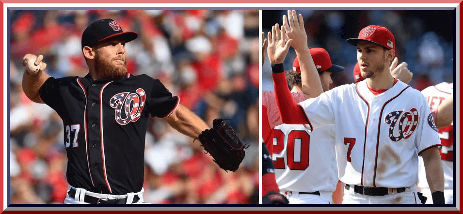
Still, to this point, the team would be lacking what I would consider a “signature” look. That would change in 2011, when the team introduced a new blue alternate jersey — similar to the previous one, but with the all important change to the “curly W” logo. This one would slightly darken the shade of blue from the previous iteration, and the “DC” (rendered in stars-and-stripes red/white/blue) would move to the curly W. Like other jerseys, the blue alternate would be double-piped with red and white on the placket, over the shoulder and on the sleeve ends. Numbers were in solid white with red outlines, as would be the NOB. The uniform with the stylized red-white-and-blue curly W would be, due to its distinctive look, the team’s signature. Eventually the team would add a cap with similar flag-motif elements.

2011-Present Blue Alternate
While the team would continue to wear the blue alternate with the R/W/B curly W since 2011, it wasn’t until 2017 that the team decided to add that element to the white jersey, giving the team a new home white alternate. This was identical to the current home jersey, save for the S&S curly W. They could add this to their “signature” look.

2017-Present Home Alternate
I don’t normally concern myself with spring training looks, but in 2017, the team introduced a pullover which, for the first time since 2010, had the name “Nationals” on it, only this time it was rendered in a script font similar to the current “Washington” road script. It would be on a red pullover with a white wordmark outlined in blue.

2017 Spring Training Pullover
The reason bring up the 2017 pullover is because the team would (apparently) like to look so much, this spring they added another blue alternate, featuring the same “Nationals” script, rendered in white with red outline. It would be a button front and, like the gray jersey, would have no placket piping. The neck and sleeves would have a thin red-white-blue striping. NOB would be white with red outline, but front and back uni numbers were reversed, with red numbers outlined in white. 2018 would mark the first time “Nationals” would appear on an official in-season uniform since 2010.

2018 Blue Alternate
And there you have it — for a team that has only existed in its current locale since 2005, that’s quite a number of jerseys and caps. One might argue the team either lacks a signature look or none is “strong” enough to qualify, but I would argue that for a team based in Washington, DC, and wearing a logo with a red-white-and-blue motif (the only one in the majors to do so), the blue and white jerseys would qualify this as their signature. It would have been interesting to see how Todd’s original unis stood the test of time if the cap design mimicked the uni wordmark (as it did with the “DC” alternate), but once the team moved to basically standardize the curly W and script “Washington” it all seemed to gel. Throw in the patriotic logo and you get yourself a signature look. YMMV.
Thoughts?


New Hoos Unis
Yesterday, to very little fanfare (possibly due to an earlier leak), the Virginia Cavaliers unveiled three new football uniforms. In fact, at least as far as I could tell, the reveal was done only via video, without any accompanying still photos (a rarity). UPDATE: I was able to find four photos late last evening. They follow the video grabs.
Here’s the hype/teaser video:
THIS IS THE NEW STANDARD
⚔️🔷🔶🏈🔷🔶 ⚔️ pic.twitter.com/ofzAsF1lKL— Virginia Football (@UVAFootball) April 27, 2018
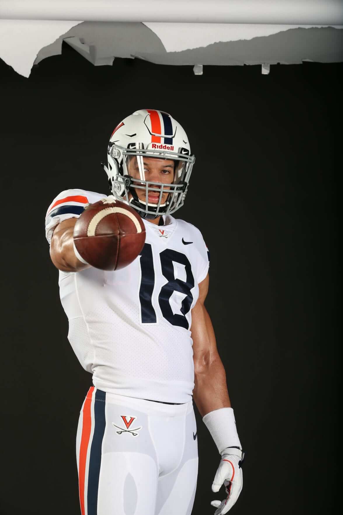
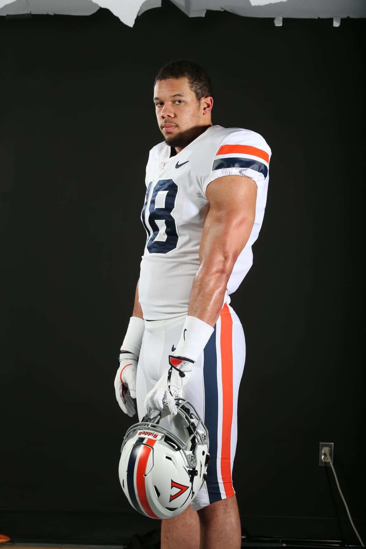
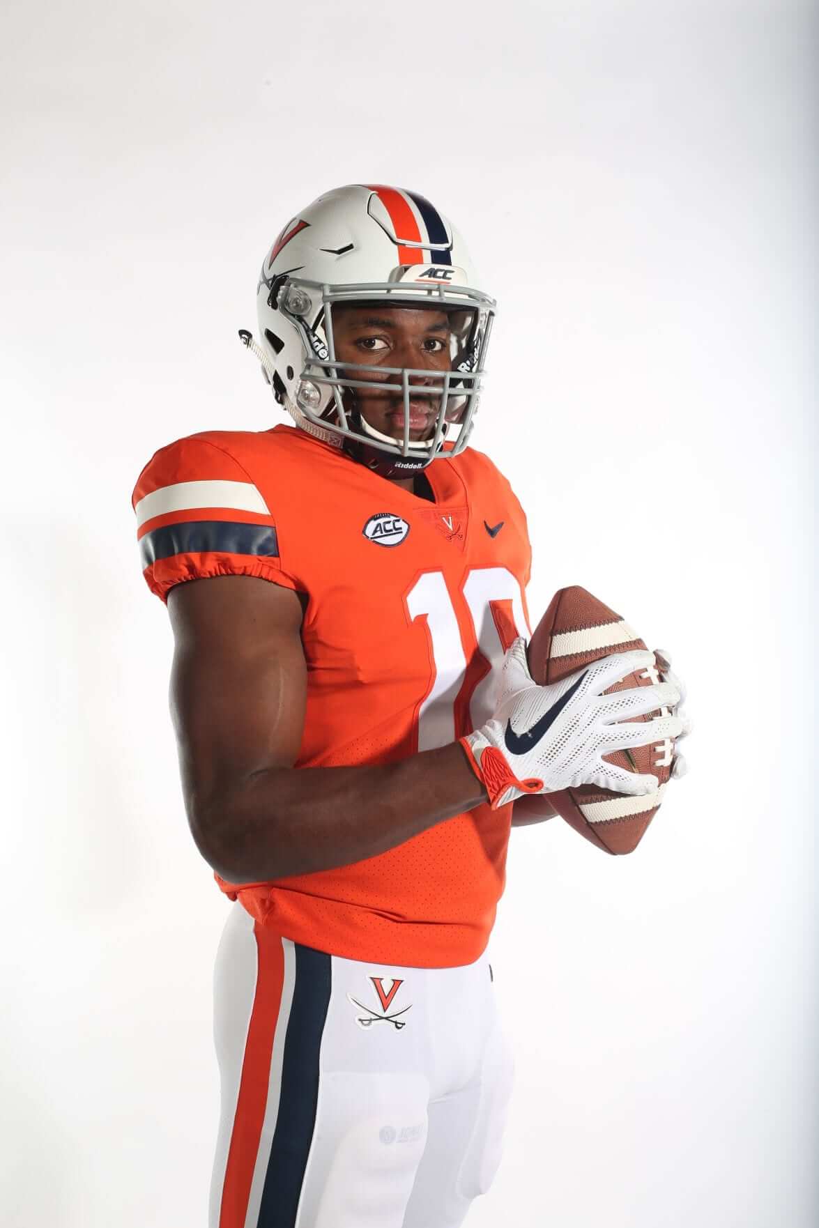
The team will have three new jerseys and (apparently) three new sets of pants: one each in blue, white and orange. The helmet is white and is also new. The former blue/orange/blue center stripe has been replaced with a thick blue and thick orange stripe (this pattern is mimicked on the shoulder caps and pants).
This will give the team nine potential uni combinations for the 2018 (and beyond) season. Last year, I commended the team for being one of the very few in NCAAFB who went through their entire season wearing only two uniforms. This was a departure from years past when they’d worn many, including as recently as 2015, when the team wore 10 different combos.
Since there were no photos photos which only became available late, I took a couple screen grabs to show the new uniforms. They’re very basic (which is nice): each jersey has two stripes on the shoulder caps (white has orange & blue, blue has orange & white, and orange has blue & white). The new pants will now have the V and crossed swords logo on the upper right thigh. The pants, which one could barely glimpse in the video, may still have the triple stripe (so the white pants have blue/orange/blue, etc.) can be seen clearly in the photos following the screen grabs. Blue and white pants were shown, but it has been mentioned there will also be an orange set. I didn’t see any orange pants in the video.
The helmet features the (now en vogue) asymmetry of school logo on one side, player number on the other.
Here’s a look at some of the video grabs. The fonts are a modified block, with what appear to be some “notches” (for lack of a better term) within the interior sections. I’m pretty sure we’ve seen this font before:


 0
0
Notice these uniforms (like those on the mannequin below) have the shoulder stripes, whereas the jersey given to the recruit who “leaked” the uni, did not have them. Since Virginia didn’t wear an orange jersey in 2017, it was unclear whether or not that was the “new” jersey. The recruit also has last year’s helmet — you can see the difference by looking at the old hat on the floor and the new helmets on the mannequins. But now it’s official: these jerseys have no contrasting color outlines around the numbers and stripes on the sleeves.

Update: Below are four photos I was able to track down. They show the pants striping much more clearly (only white pants are shown). Click to enlarge for much better detail:

From what I’ve seen, I like the new uniforms, but then again, I liked the old uniforms. I don’t really see these as an upgrade nor a downgrade. It would have been nice if the team had also put out still photos, but for now, I guess this reveal will have to do. Now that we have a few photos, I can confirm that this was a lateral move — not demonstrably better or worse than the prior set. If they stick to non-monochrome looks (other than all-white, which looks good), this should do just fine.
And now a few words from Paul: Hi there. In case you missed it on Friday, I’m auctioning off a full set of 2015 Uni Watch T-Shirt Club shirts in a custom-made box. Full details here.
Also: Bobblehead doll restoration artist extraordinaire Chris Callan is willing to make custom Uni Watch bobbles for up to three customers. Full details here.
Also-also: Sunday is the last day to enter the raffle for a super-cool Santurce Cangrejeros T-shirt, courtesy of our friends at Ebbets Field Flannels. Full details here.
Thanks for listening. We now return you to your regularly scheduled PhilFest.
The Ticker
By Anthony Emerson

Baseball News: Whoa, check out these gorgeous San Antonio Knights of Columbus baseball unis from 1916! Full article here (from Tim Dunn). … Look at how faded the Yankees wordmarks are on Lou Gehrig and Babe Ruth compared to Joe McCarthy’s. This picture is from 1931 Spring Training, McCarthy’s first year as manager. I guess McCarthy’s jersey is new and Ruth and Gehrig’s are from the season before, and faded from the sun? Faaaaaascinating (from Graig Kreindler). … Kris Bryant appears to have adopted a faceguard during his time on the DL (from Adam Bowen). … The Cubs’ Stance socks are significantly darker than the team’s actual shade of blue (from Steven Luft). … Michael Paolucci notes that the Philly Phanatic wore powder blue for what might be the first time ever on Thursday, as the Phanatic doesn’t go to road games and the first time the Phillies wore the powder blues at home last week the Phanatic was in white. … Umpire Cory Blaser has a Canadian flag on his chest protector (from Jerry Kulig). … The West Virginia Power and Lexington Legends of the South Atlantic League will have a Hatfield & McCoy-themed series, referencing the most famous family feud in American history (from Josh Hinton). … Pitt and LIU Brooklyn will honor the Homestead Grays and New York Black Yankees on Sunday (from Doug Keklak). … NC State broke out the 1968 throwbacks and some nice stirrups to go with them (from @backthepacks). … The Pirates Triple-A team in Indianapolis is going with Pirates-inspired unis on May 5, June 2 and July 28 (from Mike Grainda). … Not uni related, but the Pirates are honoring longtime usher Phil Coyne on his 100th birthday by painting “Phil 100” on the foul line. He had been with the team for over 80 years before retiring (from Jerry Wolper). … Richard Subrizio sends along these YouTube videos from ex-MLBer Matt Antonelli, talking about his gloves, his MLB debut jersey, what kind of gear MLBers receive, a general video about MLB uniforms, and his favorite MLB memorabilia.

NFL News: Da Bears put out a Madden video of first-round pick Roquan Smith and video game Smith’s helmet has an orange facemask (from Adam Grad). … As part of their redesign, the Titans have very subtly changed the shading on their wordmark (from @TitansUni). … Already got some rookie numbers for you: Ravens’ rooks Lamar Jackson and Haden Hurst will wear Nos. 8 and 81 respectively (from Andrew Cosentino) and Bucs’ rook Vita Vea will wear No. 50 (from @MarkWaltonGOAT). … Sports Illustrated apparently forgot that the Bills wear white masks in their photoshop of Josh Allen (from Matt Dunn).

Hockey News: Someone on Twitter’s wife ordered an LA Kings jersey from a Chinese knockoff site. When asked what name and number she wanted, she put “none.” This is what she got (from Matt Shevin).

Basketball News: The Minnesota Lynx officially launched their new uniforms yesterday (from @grahamthoughts). … The Raptors wore their “North” jerseys in Washington last night, leading Erik Morris to ask if this was the first time they were worn on the road.

College/High School Hoops News: Here’s an excellent story about how the only surviving John Wooden Purdue jersey has been preserved over the years (from Hudson Slaby, Dave Bangert, @Jffdmrly and everyone else who sent this in).

Soccer News: Real Madrid’s new home and away kits have been leaked to Footy Headlines (from Josh Hinton). … Other leaks: Newcastle United’s away (inspired by the famous mid-90s kit), Morocco’s World Cup, Internacional’s home, Ajax’s away and Borussia Mönchengladbach’s home. … The new Canadian Premier League has debuted its visual identity (from @PureLipschitz). … German side Eintracht Frankfurt have released a special cup final kit (from Ed Żelaski and Josh Hinton). … The Faroe Islands’ new kits were released, manufactured by Macron, who makes kits for the smallest European teams through the UEFA Kit Initiative (from Josh Hinton).

Grab Bag: Which Little Debbie snack is the best? Kentucky Sports Radio ventured to find out (from Josh Hinton).
Washington is too new to have a signature look, IMO. Their unis are all pretty boring to me. They have the consistent red and white look, but unlike say, the Cardinals, there is no distinctive feature (like the Card’s birds a bat) that makes the red work.
I like the new UVA unis. A nice play on their one of their classic looks. The notch thing on the number font is probably some Nike gimmick and it is the only downside of an otherwise nice upgrade.
I get it. the Nats are a patriotic team and multiple RWB unis are appropriate, but I think the closet is now too cluttered. Their ‘signature look’ should be the current home whites. They need to dial back the alternates. They don’t need two whites, two blues and 1 red jersey. 2 patriotic alternate unis, and they can’t wear them on memorial day or July 4th. Lame. And for the love of God, please give me an alternate cap or jersey featuring the ‘DC’ logo. They were the most popular cap in town when available. I think the brass thought it too generic and doesn’t immediately convey “Nationals.”
Re: football ticker comment about the photoshop of Josh Allen. The Bills wear grey masks, not white.
You beat me to it… I was like “wait, what? White now?”
The Nats should use royal blue and have a white front panel cap like the Expos.
The Nats solid blue cap was the best.
The Bills wear grey facemasks, not white.
Phil, I’m quite sure the DC logo on the chest and cap are interlocked, no? I guess I wonder what your criteria is for interlocked versus overlaid? There’s no stroke or outline defining where the letters intersect, but the bevel detail shows what looks to me like interlocking.
You are correct — I must have been staring at either a sleeve or cap when I wrote that. It’s link. I’ve updated the text.
Thanks.
I read this on my phone in a home improvement store and within 30 seconds, I saw someone wearing a red Nats sweatshirt and someone else wearing the “Barves” road cap with red bill. I am wearing the solid blue roadie I bought in a trailer in the RFK Stadium parking lot.
The variety of color combinations probably keep any specific look from being the consensus signature look, though the home whites probably come closest. The curly W generally is the signature.
The interlocking DC certainly has cachet, but it never looked as good as the curly W to me – maybe because I’m named William. I’d love to see the Nats go back to the 2009-2010 road uniforms with the solid blue cap and DC on the sleeve, just not beveled. That was the best road uniform in DC baseball history. I think the 1959-1960 Senators had the best home look. The current home jerseys would be improved with removing the number or at least aligning it.
I locked up my ideas here in 2012 link
Yurasko’s uni concept linked above is the just about beau ideal of Nats unis, and would be their signature look of they adopted it. (Along with a white BP cap with red piping and a red curly W.) The W on the chest is a signature Washington look, but teams tha wear left chest logos need to respect the logo. No numbers on front.
Aside from the history-tribute white BP cap, the only change I’d make to William’s concept would be changing the number font. Either a thin regulars block like the Rays wear or the original Expos numbers would be a good match with the shape and lines of the curly W.
I wish the Nats would use the cursive “Nationals” script on their primary home jerseys.
I’ve never been a huge fan of the logo-on-upper-left-chest look (with or without numerals on the lower right torso); the Yankees, Cubs, Reds and White Sox have made it work for decades, but some logos don’t lend themselves well to that template, and the Nats’ curly “W” (which I’ve never really liked either) is one of them.
I wonder if they’ll come out with script Nationals on gray uniforms for the All-Star Game since DC is hosting, but AL is home.
The link to the Senators cap on “slightly tweaked “W” logo” is all kinds of wrong. First, it links to a modern replica cap, not a 1963-71 original. Second, it links to a modern replica cap that uses a logo that’s nothing like anything the Senators ever wore. Plenty of pictures of actual Senators caps exist, and they all show that the modern curly W is essentially a recreation of the original curly W:
link
Coooerstown Collection Senators caps are notoriously poor reproductions of the real actual Senators logo.
Also, the 2005 Nats unis were designed by Todd Radom with a matching beveled W:
link
Sources at the time, when I was running a Nats blog, told me that Bud Selig, who as commissioner was also in effect the owner of the team, personally intervened to insist on the old curly W logo in place of the beveled W. This came after Selig lost a short but intense negotiation with city officials who threatened to walk away from the nascent stadium deal if the team adopted the name Senators as Selig strongly wanted. He couldn’t have the old name, but he could insist on the old cap, so he did. In the reporting I did at the time, I got the sense that Selig was basically working out youthful trauma over the Braves by proxy with the Nats.
Thanks, Scotty!
I should have consulted you for this one! I’ve added your info on Todd’s original design to the main article. Maybe the three of us can do a deep dive on Todd’s original uni concept & final execution!
Curly W > beveled W in original 2005 concept.
The cap beveled W doesn’t match the jersey beveled W any better than the curly W does, save the little flashes of gold.
If you reference a teams’ spring training jersey in a quest to determine its “signature look,” you should stop right then and there and appropriately determine the team must not have a “signature look.”
Patrick, I wasn’t listing it to determine the signature look — I just wanted to show it formed the basis for the new 2018 alternate. It’s a fair point, but I wanted to show the new “Nationals” script didn’t just materialize in 2018.
There actually is a bit of a uni-related twist to the Pirates honoring Phil Coyne on his 100th birthday. He was wearing a Pirates jersey with his NOB, and 100 for the number. A little cliché, but it’s also unique to see a baseball jersey with a 3-digit number. I tried to get a screen shot, but the MLB At Bat app seems to have disabled that functionality. Maybe there are pictures available elsewhere.
The Phillie Phanatic traveled to Memorial Stadium for the 1983 WS in Baltimore. For rainy game 1 he wore a raincoat. For game 2 he wore the home jersey.
YouTube links here.
Go to the. 2:30 mark for game 1
Go to the 6:10 mark for game 2
link
link
Good stuff. I figured he’d traveled before but was pretty sure they never got him a road uni.
As a Nats fan for their entire existence I am sure that their signature look must be the current home whites. That was the uniform for some of the biggest moments in club history including the Jayson Werth 2012 playoff walkoff, Scherzer’s 20 strikeout game, etc. It is the uni featured at Nats Park on all those huge player photos in the sides of the parking garages. It is the most ubiquitous Nats uni in history for people who actually follow the team.
Go back to outlined, traditional block numbers and a blue facemasks and those would be excellent uniforms, UVA.
The Nats’ signature look is the Expos uniforms of the late ‘70s/early ‘80s.
Die Adler with the shout-out in the ticker. I’m so here for this.
great work on another super signature series feature!
thanks phil!
Am I the only one who forgot that the Nationals used gold as an accent color their first few years?
Really like Virginia’s new uniforms. Simple, clean, classic.
The whole “what’s your signature?” has worn very thin. No I just scroll straight thru it.
I somewhat agree, especially when it focus on the Nationals or Diamondbacks. These teams are too new. They exist in an era where there are constant uniform tweaks and a bazillion alternate jerseys. There is no way to have signature looks. I would prefer this series focus on teams with more extensive or actual history.
Count me among the DC-area readers that think the Nationals signature look (if even appropriate for a team with a 14 year history) should be the current home white uniforms. In a very short and diverse set of uniforms since they’ve been in DC, they’ve managed to wear these for over half the time the team has existed.
The red alternates introduced in 2009 are a close second, they are my personal favorite, especially when worn with the white pants. It seems like the popularity of these uniforms inspired the change to the current home set.
As for the S&S logo, I find them too cluttered. I’ve come to accept them as “special day” logos, but they’re doing that for every team now. It hardly feels like a signature item for one team. And I wouldn’t mind if they dropped the blue alternates all together.