Bob Andrews was the first of several readers who recently alerted me to some amazing footage that has just been posted to YouTube. It’s from Opening Day at Yankee Stadium on April 14, 1931, when the Red Sox were in town. I definitely recommend watching the whole video (see above), but here are some choice visual details that I picked out along the way:
1. The Yanks were using what many people now call “the Red Sox font.” The font is actually called McAuliffe, and has been used by many MLB teams over the years:
As for the Sox, here’s the number font they were using at the time:
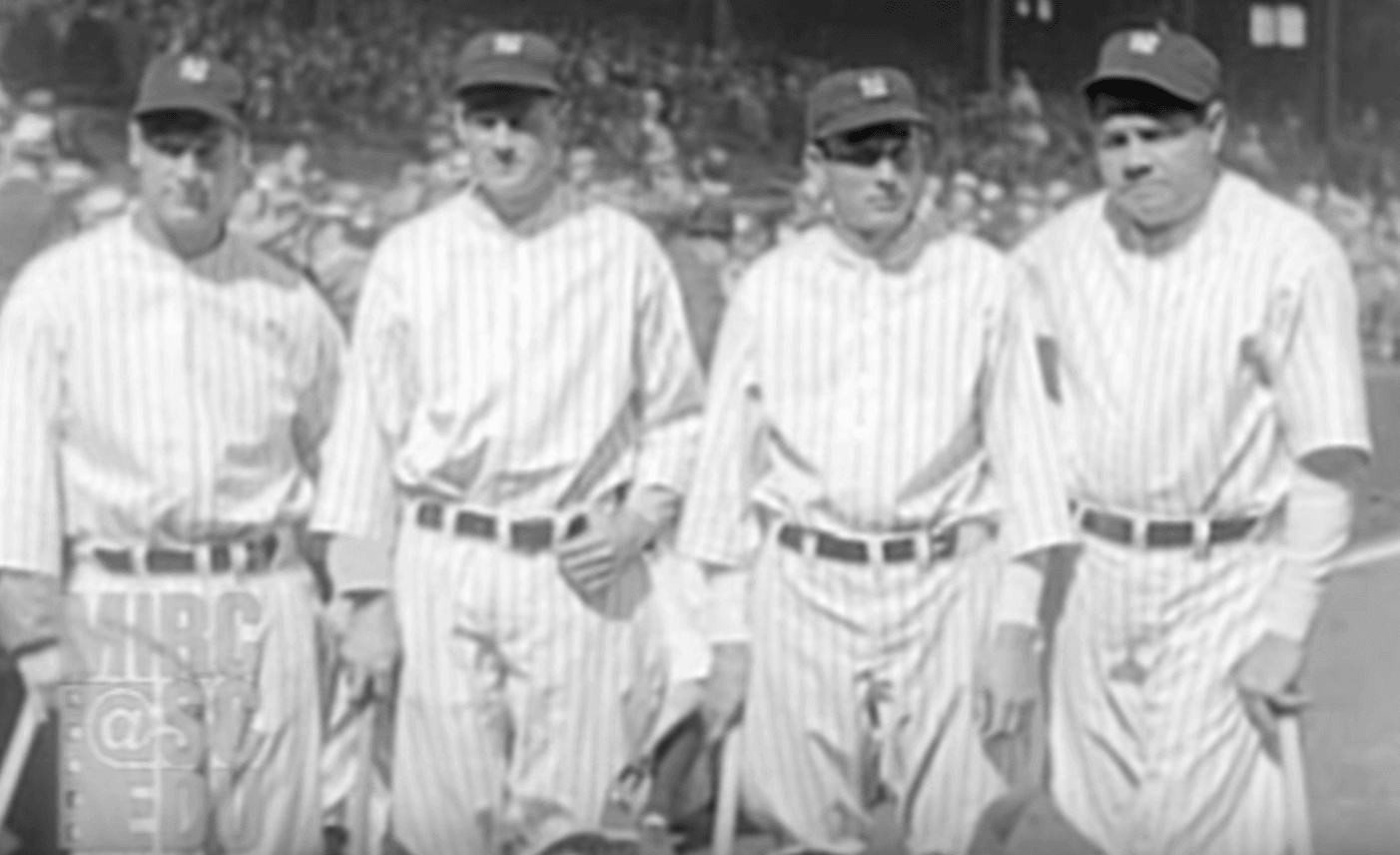
2. Here’s a good pregame shot of the Yanks’ Earle Combs, Tony Lazzeri, Lou Gehrig, and Babe Ruth. As you can see, their pinstriped jerseys were blank. The interlocking “NY” wouldn’t be added until 1936. Also, note the centered belt loops, the grey and white undershirts, and the varying sleeve lengths.
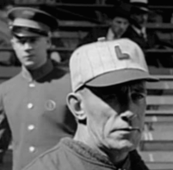
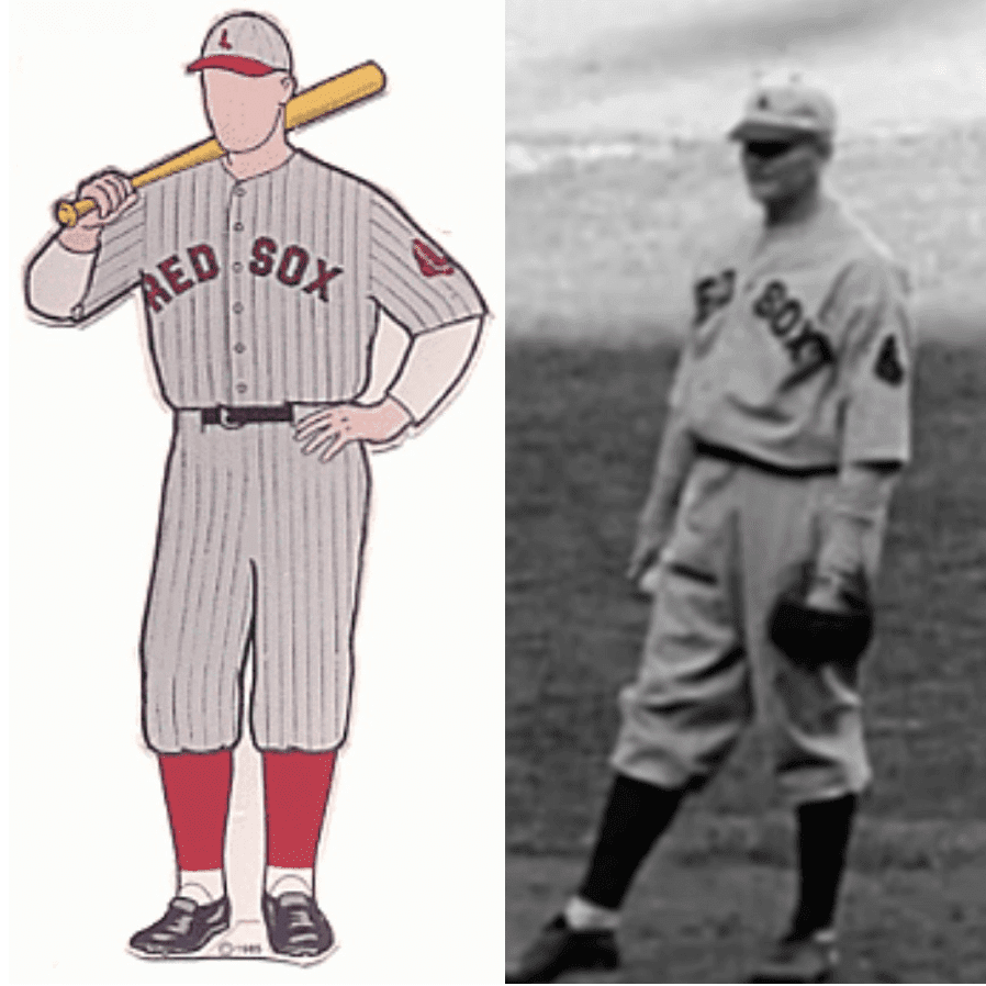
3. Here’s a good look at the Red Sox cap (along with a nattily uniformed usher in the background). 1931 was the only year that they wore this cap design:
4. As for the rest of the Sox uniform, the video doesn’t provide many good looks at it, but here’s a decent shot, alongside the Dressed to the Nines mock-up for reference:
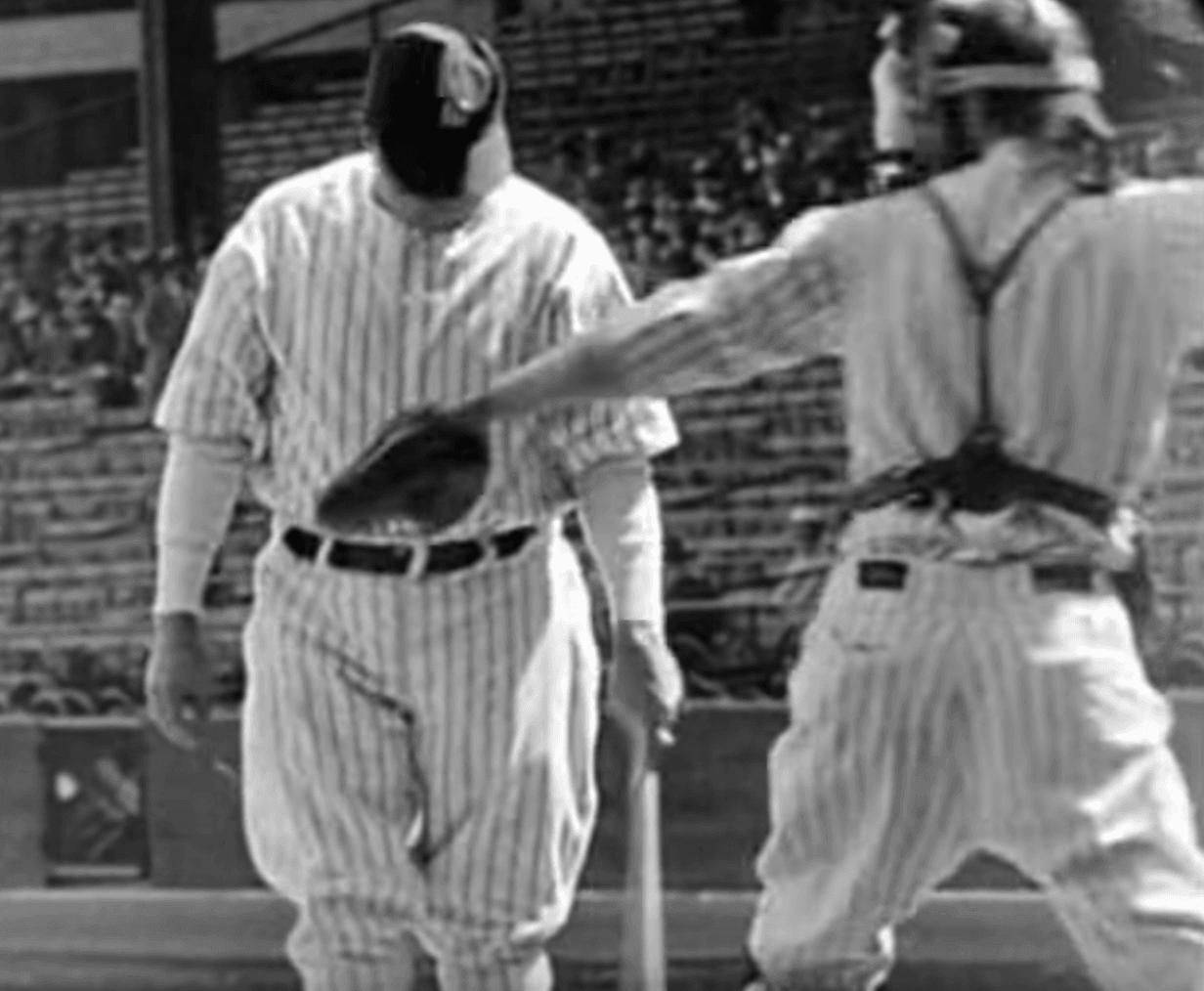
5. This is interesting: The video shows Babe Ruth taking batting practice — with a catcher! The catcher is wearing an unnumbered jersey.
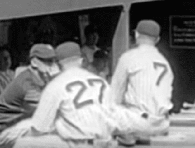
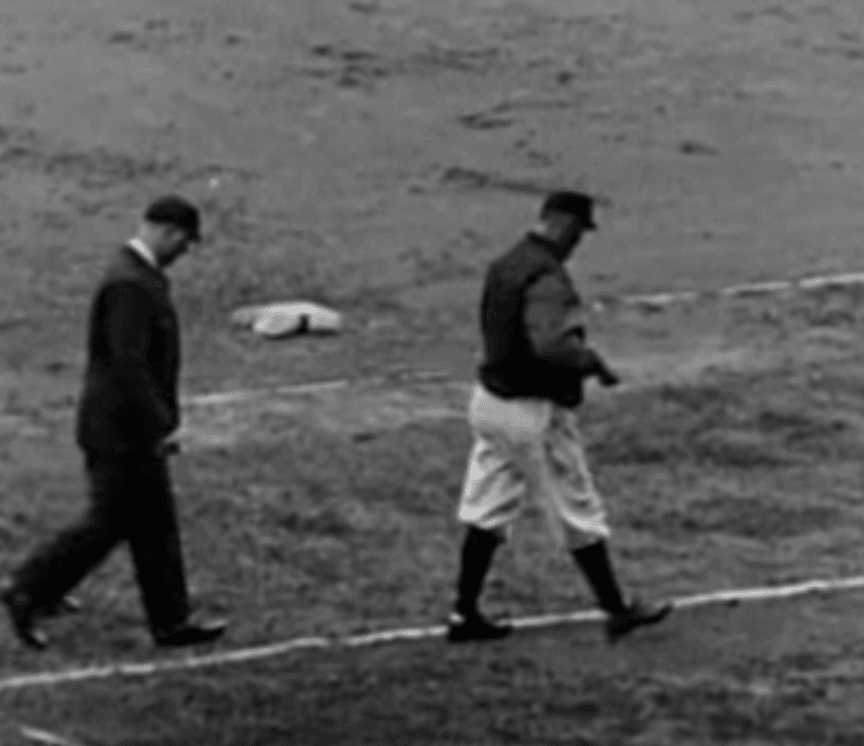
6. There are several shots that show the Yankees’ first base coach wearing a dugout jacket:
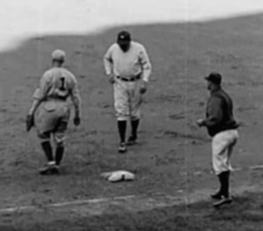
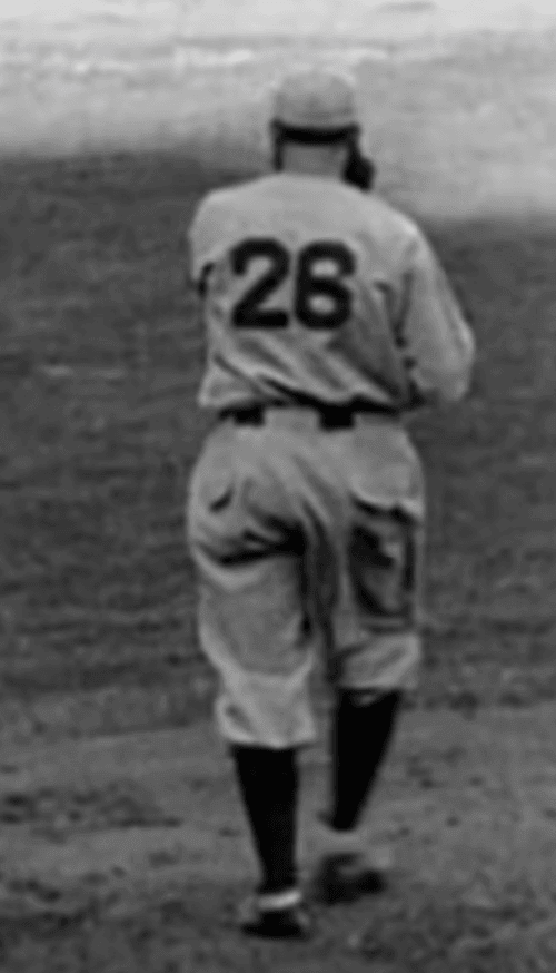
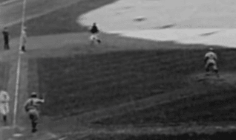
7. Speaking of jackets, in this next shot you can see Yanks pitcher Red Ruffing wearing a jacket on the bases as he advances from second to third. Nothing unusual about that, of course — we’ve all seen pitchers wearing jackets while running the bases — but it got me wondering when pitchers started doing that. Anyone know? Also, this shot shows that Yankee Stadium, like many ballparks of that era, had a dirt path from the mound to the plate.
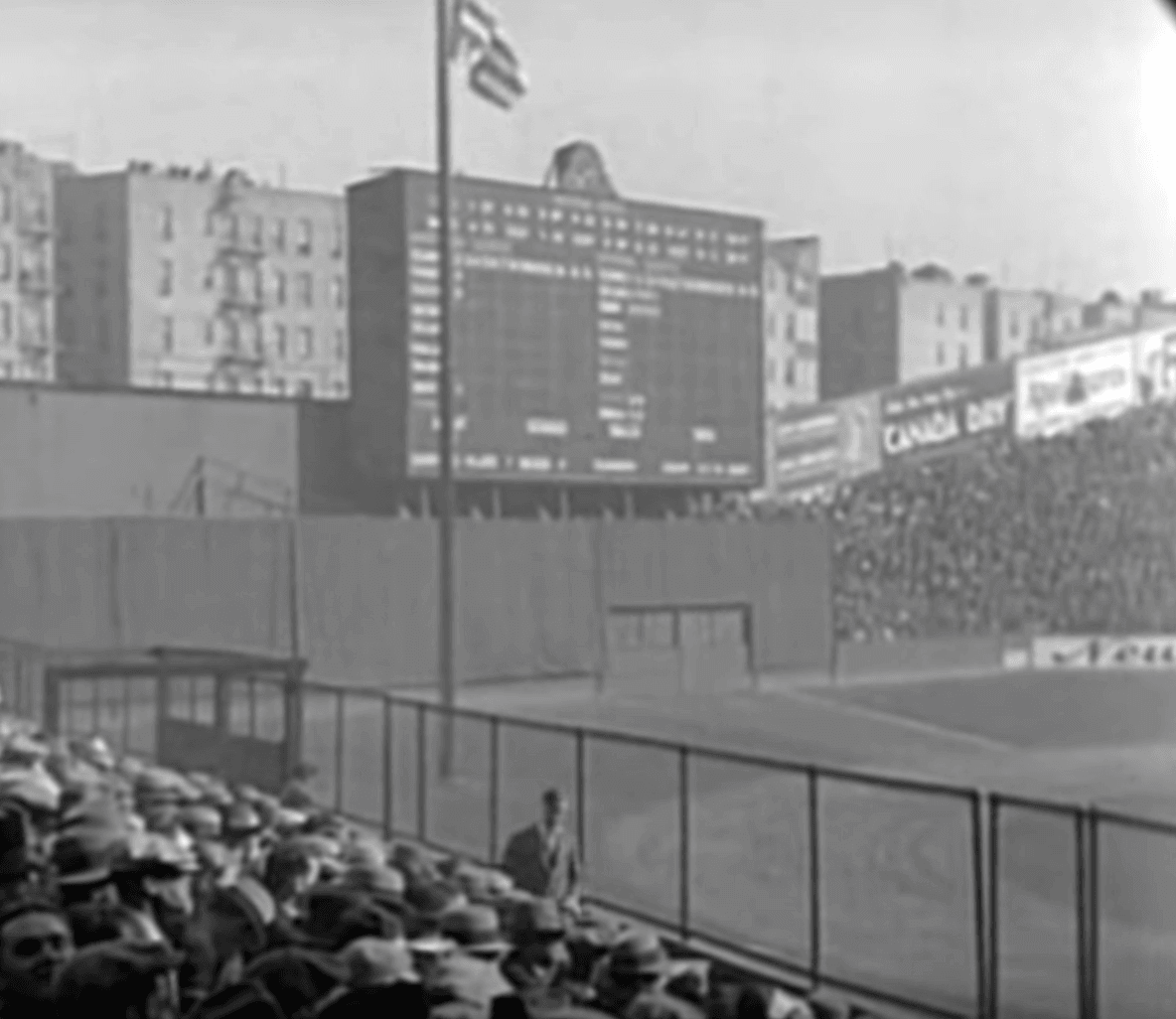
8. Prior to the start of the game, a brass band came out and played the national anthem while both teams stood at attention and the American flag was raised on a flagpole — all of which took place in deepest “Death Valley” reaches of centerfield. Yes, the flagpole was in centerfield:
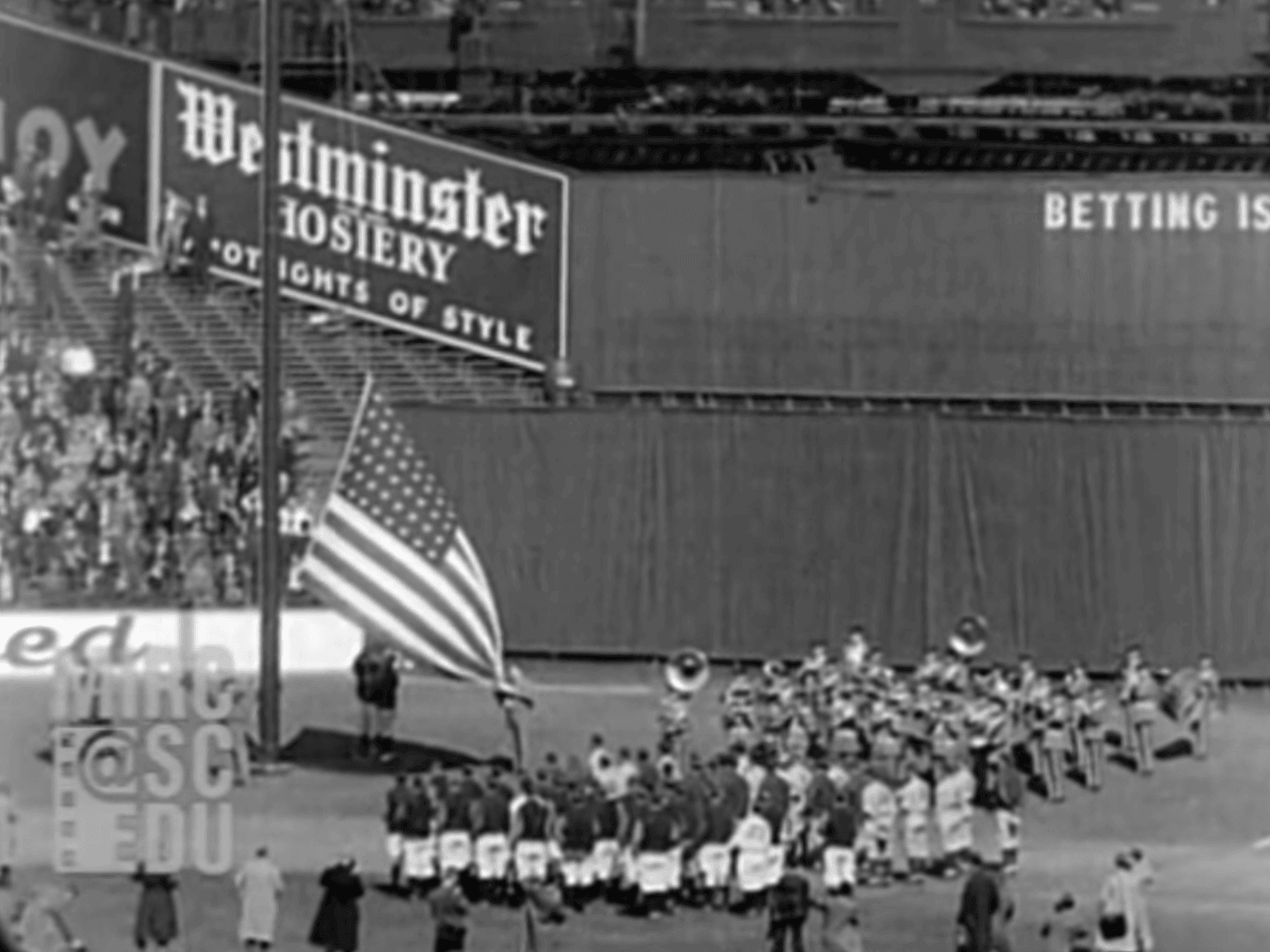
Here are two more shots that show the flagpole. In the second one, you can see that the Yanks’ first base coach removed his jacket later in the game:
(The centerfield fence was later moved in a bit, and the monuments — which were in play — were added.)
9. Behind one of the dugouts — I’m not sure which one — there were some bigshots seated in what appear to have been “normal” chairs, rather than stadium seats:
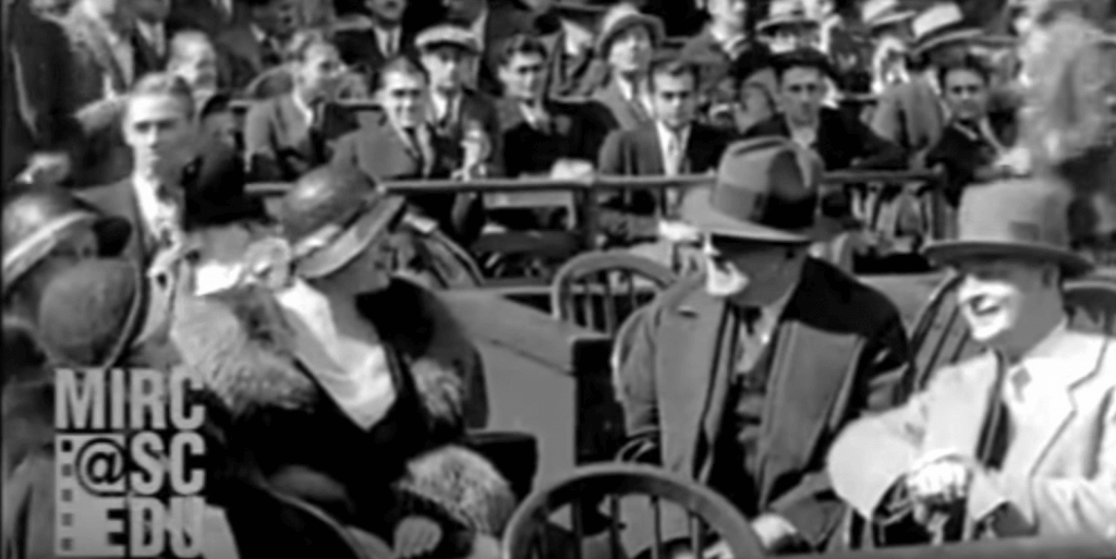
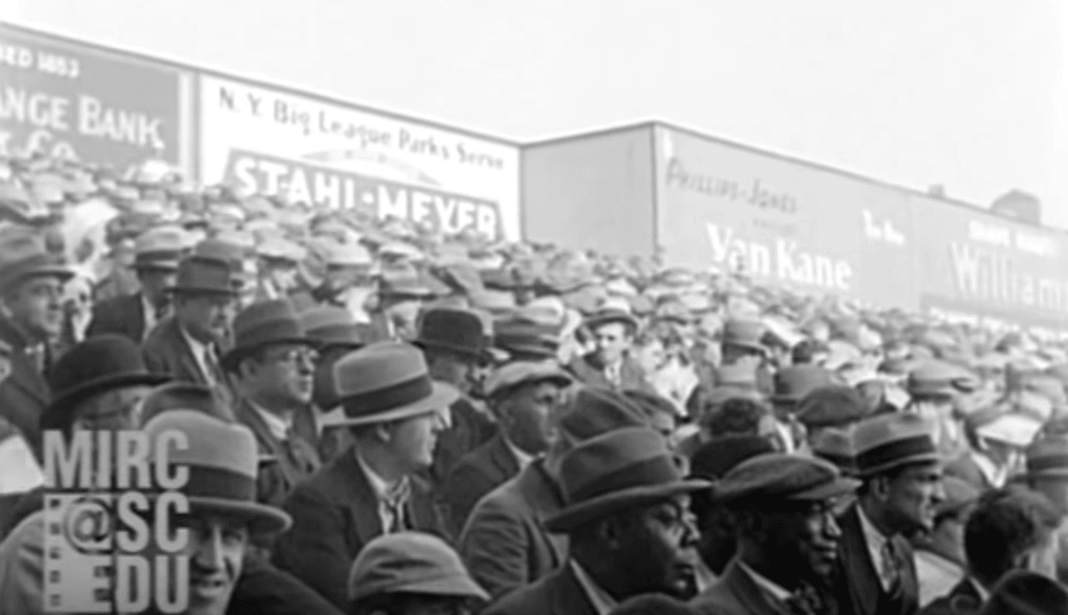
10. Finally, here’s a shot of the crowd that shows two African American gentlemen in the foreground. When I spotted them in the crowd, it made me realize that old baseball crowd shots almost always show nothing but white people — something I hadn’t thought about before. Interesting to see that these black men were there on Opening Day.
That’s it. Again, I strongly recommend watching the whole video — great stuff. My thanks to everyone who brought it to my attention, and especially to Bob Andrews, who was the first to do so.

Raffle reminder: In case you missed it yesterday, our friends at Ebbets Field Flannels are raffling off a super-cool Santurce Cangrejeros T-shirt. Full details here.
While we’re at it: As you may have noticed, Ebbets is currently running an ad in our right-hand sidebar, and they’re partnering with us to create and sell the first Uni Watch cap, which should be available in about three weeks. They have great stuff — please consider them, and the rest of our advertisers, for your shopping needs. Thanks.
The Ticker
By Alex Hider

Baseball News: Stance is releasing a new line of MLB mascot socks. We’ll see if any of these designs actually make it on the field. … The good news? Yankees SS Didi Gregorius is getting his own commemorative bat day. The bad news? The Yanks misspelled his name on an ad behind home plate (from @njmaxrod and Chris Riz). … The Mets wore their blue road jerseys for the first time all season last night. That Rusty Staub memorial patch kind of gets lost, doesn’t it? (From Tyler). … Mike Colvin spotted a DIY Gleyber Torres T-shirt at the Yankees game on Monday. … Jose Bautista is currently playing Triple-A ball in the Braves’ system, and has been wearing a single-flapped Braves helmet with a Gwinnett Stripers logo. Minor leaguer helmets are normally double-flapped. MLBers can wear their single-flapped MLB helmets while they’re on rehab assignments, but Bautista isn’t rehabbing an injury — he’s just getting into game shape (from Steve Vibert). … Brad Eenhuis has noticed that the Mariners’ NOB lettering leads to some kerning issues. … Bryan Brunsell came up with a series of MLB concepts based on city nicknames. … At least a couple of Texas Southern players were wearing Tulane batting helmets when the two teams met last night (from Andrew Alvarez and @MrCatsPatrick). … Penfield High School and Hilton High School in New York played each other on Monday in nearly identical black-and-red uniforms (from @kurtblumenau). … And that wasn’t the only red/black-vs.-red/black matchup this week. Two high school softball teams near Lafayette, Indiana, also dressed similarly (from @Jffdmrly). … Pleasure Ridge Park High School in Kentucky has added a memorial patch for the team’s coach, who passed away on Monday (from Josh Claywell). … Jack 9 Baseball Magazine saluted this year’s Hall of Fame class on its latest cover design but, oddly, chose a shot of Trevor Hoffman in a Marlins uni. … Angels rookie P Justin Anderson’s left-sleeve team logo patch was missing last night (from Chris Cooper).

NFL News: This graphic about the NFL Draft chatter on Twitter uses a strange logo to represent the Bears. I believe this graphic took the logos from team Twitter avatars, but the Bears have since changed theirs. Anyone know what this logo is? (From Danny Pedroza.)
College Football News: Liberty University has a new logo to commemorate its inaugural season as an FBS program (from Noah Crouch). … This is one juicy Wisconsin jacket (from Tanner McGowen).

NBA News: Someone went full Larry Legend at the Celtics/Bucks playoff game in Boston last night (from Martyn Bailey). … Rapper Meek Mill was released from jail yesterday afternoon and subsequently rang the bell prior to last night’s Sixers playoff game. According to Blake Fox, the Sixers usually give the ringer a customized jersey, but Meek Mill was presented with an Embiid jersey — probably due to the short notice.

Soccer News: Couple of 2018-19 kit leaks from Josh Hinton, including Dortmund’s and Newcastle’s home kits. … FC BATE Borisov of the Belarusian Premier League unveiled 2018-19 kits yesterday (from Ed Zelaski). … Still don’t understand soccer’s offsides rule? This scarf, made by supporters of Chattanooga FC of the NPSL, will help you out (also from Josh Hinton). … The San Francisco Glens of the Premier Development League have a new jersey advertiser. …This podcast packs lots of soccer kit talk, and features Classic Football Shirt’s Douglas Bierton and Museum of Jerseys’s Denis Hurley. … Remember that time when Manchester City’s Joey Barton had his shirt stolen by an opposing team’s fan and couldn’t enter the game? (From James Gilbert).

Grab Bag: All Blacks, New Zealand’s national rugby team, are adding rainbow hues to their iconic black kits as part of a “Diversity Is Strength” campaign (from Michael Scebold). … The Melbourne Demons and Richmond, both Australian rules football team, wore uniforms commemorating Anzac Day — a holiday commemorating fallen Australian and New Zealander soldiers — during yesterday’s match (from James G). … The Chicago Steel, a junior hockey team in the USHL, are keeping fans updated through the playoffs with a bracket that includes all the team’s logos (from Steve Johnston). … The teams at Bradley-Bourbonnais High School in Illinois go by the Boilermakers, and they take plenty of inspiration from Purdue (from Jim Stone).
That Wisconsin jacket is nothing short of gorgeous!
I was about to ask why the Red Sox wore an L on their cap but then I looked just a little bit closer and realized that it’s supposed to be a sock.
If I were a Red Sox fan, that would be the only cap I wore to games.
It’s interesting that the stocking makes such a sharp L-shape on the cap, whereas the stockings on the sleeve take a much more natural, less letterform, shape.
link
Looks pretty good. Just a super weird shape on the sock.
I was also just going to ask why the L on the Red Sox hat. Really doesn’t look like a sock.
Also note the Yanks dugout was on the third base side of the field.
A Yankees/Red sox throwback game from 1931 would be awesome but you know they’d miss so many of the little details (centered belt loops, the Red Sox not wearing McAuliffe numbers).
I think the Red Sox numbers are McAuliffe; it just looks odd because it has a border around it. Look at the serif on the 6; it clearly has a diagonal taper like it does now. I wonder if the proportions are just a little off.
The Cubs have done something similar with making minor tweaks to their Eurostile-like font. In past decades all the round-edge numbers were rounder than they are now. Now 0, 6, 8, and 9 are more squarish but 3 is still round. Once you see it, you can’t unsee it.
That Yankees bat day is actually for:
link
ed
I’ve never seen that Bears avatar before. It looks like a set of bear’s teeth. It kind of forms an M, so maybe it represents “Monsters of the Midday”?
Yep, this is exactly right
yea. the bears released their schedule using a comic book style video on twitter. the logo that was used in that graphic was part of their “comic-book” style branding for that
correct-o. twitter video: link
the standstill picture of the schedule shows the players with their jacket on the back with said twitter avatar link
That Chattahooligans offside-explainer scarf is brilliant! The world also needs baseball caps that explain the infield-fly and balk rules.
link
It started off as an April Fool’s joke!
I like how it has the entire text of the rule on the other side so you can quote from it (though that covers every possible situation and most calls aren’t nearly that complicated).
It also needs to be “offside rule,” not “offsides rule.” A player is either in an onside position or offside position.
Semantics, I know. Just nails on a chalkboard with the bastardized terminology. No one says, “I’m going to go outsides to play with my friend” or “It’s too cold, I’m going to go warm up insides.”
I can think of lots of other examples besides that one. :)
Probably! But, I’m a soccer guy. That terminology just needs to go away…forever!
This graphic about the NFL Draft chatter on Twitter uses a strange logo to represent the Bears. I believe this graphic took the logos from team Twitter avatars, but the Bears have since changed theirs. Anyone know what this logo is
When the schedules were released, the Bears used a comic book superhero-themed animation to represent each game and opponent. It appears they have formed a partnership with a comic book company started by former lineman Israel Idonije:
link
As a Bears fan, and a traditionalist, it’s awful (to me). I’ve always loved that da Bears hung in there in terms of tradition. But that skips going modern and jumps the shark into appeasing (what I believe to be) a small segment of fans. I was hoping someone in the organization would lie to us and tell us that it was all a big mistake and/or Ditka’s mustache…
So basically just more “athletes as superheroes” nonsense…
“…a strange logo to represent the Bears…”
It’s from this Monsters of the Midway comic thingy (thus the “M” shape).
You can see the logo on the players’ jerseys.
link
link
Bryan Brunsell came up with a series. … MLB concepts of based on city nicknames.
Shouldn’t that be “…a series of MLB concepts based on…”?
Most of those were pretty good, but he really needs to Respect The Placket with his lettering.
Silicone Beach? 61X? Never ever heard those before today.
Guessing DC fans would take The District over Capital City.
“The T.O.” I’ve heard of, but not “61X”. Is it pronounced “six”?
I was going to comment that The District would be a more appropriate nickname.
Nice call (as ever), Jim Vilk!
Should have been Silicon, not Silicone, and 6IX, not 61X. (Though my inner Rush fan would have preferred YYZ)
What killed me was the forced tails when they didn’t really work, and then even worse, adding a tail to a tail on any that end in Y
“Should have been Silicon, not Silicone”
are you sure?
Also, as for the 61X, Internet to the rescue.
According to Urban Dictionary, (link), It has NOTHING to do with the area codes 416 and 647, but about how Toronto was formed. Up until 1998, the city that is now Toronto was broken up in to six different cites; Toronto, Scarborough, North York, York, East York, and in 1998, the Government of Ontario decided to combine the six cites, proposing it was a cost saving measure.
Drake, apparently, is credited with popularizing calling Toronto as “The 6”
The Beantown uniform would not fly in Boston because the only people who call Boston “Beantown” are people who are not from Boston.
Should have been “The Hub”.
Silicone Beach for San Diego? I’ve never heard that nickname in my life. Should have been America’s Finest City (or Finest City, I guess). Even Gaslamp may have played since Petco Park is located in the Gaslamp.
Silicon Beach is a term used for the tech area in LA’s Westside, Playa Del Rey, etc. I have never, ever heard San Diego referred to as Silicon Beach, let alone Silicone Beach.
Should the Angels really be the City of Angels? Shouldn’t that be the Dodgers given that the Angels play in Anaheim. Maybe it should be something related to Disney, or the city slogan – “The Anaheim Way.”
“The Heim.”:)
Re: New Zealand rugby, are we sure those are actually new/modified uniforms or just a uniform-based visual effect for the video? Didn’t see any sign of new uniforms (an announcement or whatever) otherwise.
Yep Jamie, I am not convinced that there is any change to the uniforms. After all, this is an All Blacks uniforms.
It appears to be visual effect for the video and the message. We need more evidence to make me believe that there is an actual change on the uniform.
When is Uni watch going to the payed model, and will I be able to access older posts?
Not going to a hard paywall after all. This was explained in this post:
link
The Patreon-like model is probably at least a month away yet. Soon.
Interesting to see a number 0 jersey (link) in the NZ diversity ad
*paid
Angels rookie P Justin Anderson’s left-sleeve team logo patch was missing last night (from Chris Cooper).
Addition by subtraction, if you ask me. The Angels are over-logoed.
The “Betting is prohibited” signage on the wall in the outfield is interesting in the video. As are all the hats the spectators wear, men and women. Notice how all the fans are also dressed up mostly in suits and ties. Also notice how the pitcher’s mound to the plate had a dirt path back then in Yankee Stadium. Also interesting how the train track was right above the center field wall. Awesome video!
Also notice how the pitcher’s mound to the plate had a dirt path back then in Yankee Stadium.
That part was called out in today’s text.
Came to the comments section to see what the “Betting is…” message was. It is interesting, I can’t fathom seeing that anywhere on a contemporary outfield wall
“Betting is technically mostly illegal but tacitly encouraged” nowadays?
Angels rookie P Justin Anderson’s missing left-sleeve team logo patch is good idea.
Frankly the Halos uniform is boogered up (technical term) with way too much iconography. I mean we get it, the Big “A” logo works well on a (thanks Todd Radom)- but do you have to beat it to death by placing it everywhere?
Back in the day, the Angels had the charming red map of California with the gold halo as their sleeve patch; but they’ve succumbed to the logic of “if fans like patches a lot, it then follows that they would like a lot of patches”. I’m prejudiced, but the Mets are one of the few teams whose sleeve patch seems necessary. Also, the Royals, Cubs, Rangers, and Twins. Plus, the Dodgers always seemed to commemorate one anniversary or another on the left sleeve. But enough with the patches, already.
The Athletics’ elephant is cool, too, so he gets a pass. Wahoo on the Clevelanders’ sleeve makes my day, but he’s being shown the door. The Cleveland Thunderbirds, or Pathfinders, or Imperials, or whatever name they choose, ought to go with unadorned sleeves when that occasion comes.
HAT!
Free Hat!
Few things that caught my eye. THe outfield dimensions are very strange – incredibly short porch in LEFT field and then jutting out dramatically in straight-away left – how many inside-the-park HRs were hit in this place???
Also, LOVE the way they throw the ball around the infield at 12:45 mark (looks like around seven throws).
Finally, I always heard players left their gloves on the ground between innings and you can see them tossing their gloves and picking up their gloves (even in the field of play) at 13:10.
I noticed that as well. The third baseman for the Sox just throws his glove into foul territory at the end of the 2nd inning. When I was a kid, I remember my dad telling me that they did that in the old days, but this is the first time I’ve seen visual proof!
According to Clem’s
301 down the line
402 to left centre
460 closer to centre
490 to straightaway centrefield.
Did any one else notice chief Wahoo is featured on the hat of Cleveland’s mascot socks?
Sure enough. I guess that’s still “legal” through the rest of this season under Cleveland’s agreement with MLB. Next year, those socks can old be sold at Progressive Field.
Stance’s MLB collection doesn’t include the Colorado Rockies’ link. Disappointing.
Nothing should ever feature Dinger. Even the Rockies themselves have figured that out.
Stance also has an extensive collection of college mascot socks. Not sure if that’s been mentioned around here before, but here’s a link for everyone’s perusal:
link
That Yankees spelling error was a-Gregious
The Bryan Brunsell MLB concepts of based on city nicknames…
Only outsiders call Chicago “Chi-town.” How about using Second City or Windy City. Heck, Hog Butcher to the World would have been sweet.
For St Louis, I still don’t understand why locals have taken to calling it “The Lou” in the past few decades. It makes it sound like a British toilet. Ugh.
Yeah, many of those nicknames seemed very forced. Kind of seems like he might be part of the department at Nike who came up with all of those abomination city pride NBA uniforms.
was thinking the exact same thing re: Chicago names.
Some suggestions in addition to Windy City & Second City.
-Lakeview (Cubs, neighborhood Wrigley Field is in)
-Brideport (WhiteSox, neighborhood Comiskey/US Celluar/Guarntee Rate is in)
-City of Big Shoulders (see Carl Sandburg poem)
-Third Coast
-The Go (which is a nickname some teens from Morgan Park have been pushing to help local image and civic pride link)
I just wonder when people started calling Columbia, MO “COMO”. Every time I hear it, I think of Perry Como.
While we’re on the topic of nicknames for cities in MO, I think a superior nickname for KC would be “Cowtown.”
Hopefully the bears logo will be their new alternate logo, maybe even appear on the helmets of their new orange alts.
Not trying to be negative, but I’m not feeling those MLB concept unis. It seems like most of them have that same diagonal script with tails, which kinda defeats the purpose of being unique, no?
Totally agree. Nice idea and I dig a lot of the nicknames (especially the Bay Area teams, The Town and The City) but the logos are all very similar and overall have a template-type feel (like Nike or Adidas soccer does). I’m sure Bryan spent a lot of time on this but none of them do it for me and most seem like a step backward – especially LA.
funny that when you search “philadelphia” on the Stance site, a bunch of Oakland Athletics gear shows up in the results.
I find it interesting, though not surprising, that the Rev. Jerry Falwell Jr. would include a subliminal though prominent “cross” in the windows of the stadium for their inaugural FBS logo of his christian university. Still not as cool as the Hartford Whalers…..
Am I the only one who sees prison guard towers on the ends of the stadium’s facade?
From the NY Daily News, an overhead photo of Yankee Stadium on opening day 1931
link
The flagpole is technically in centre field, but (according to Clem’s) 490 feet from the plate.
Crazy dimensions.
there is no Embid jersey posted at the hoops link below:
****************
“Rapper Meek Mill was released from jail yesterday afternoon and subsequently rang the bell prior to last night’s Sixers playoff game. According to Blake Fox, the Sixers usually give the ringer a customized jersey, but Meek Mill was presented with an Embiid jersey — probably due to the short notice.”
*************************
I see a crawford and a haskins jersey in the pic but no idea who the people are holding them. Maybe they are Crawford and Haskins?
here is a pic of Meek Mill in Embid Jersey ringing the bell before 76ers game
link
I believe the man throwing out the first pitch is Jimmy Walker, who was the mayor of NYC during that time. At ~11:40 the announcer says something like “Looks like Jimmy Walker is able to forget his troubles down in City Hall today,” while showing the folks in the box seats. Just a year later, in the midst of a corruption scandal, Walker would be forced to resign due to pressure from FDR, who was running for President for the first time.
Looks like someone also went full Isiah Thomas in the Larry Legend picture – and is that Jae Crowder working the concession stand?
Goddam that is funny, chuck!
Spit milk all over my keyboard!
This is also the very first game with numbers on Red Sox jerseys.
Ah, did not realize that. Thanks!
Pretty sure Bautista’s helmet is an Atlanta Braves helmet with a Stripers logo.
Red is one of the Stripers’ colors, but I don’t believe they don’t have a cap/helmet combo with a red bill.
Derp!
Just saw that was what was said in the original entry.
In the words of Emily Litella, “nevermind…”
That Bear’s logo is a M for Monsters of the Midway.
Great Yankees-Red Sox film – and sound film, yet! Some years back the University of South Carolina was bequeathed all of Fox Movietone News footage. But with a catch as explained here: link. They don’t have all the Movietone holdings – Fox News holds licensing rights to the bulk of the collection – but what the Gamecocks do have is impressive. They’ve licensed the films for professional use for years, but their recent push into digitizing (and publicizing) their holdings is exciting.