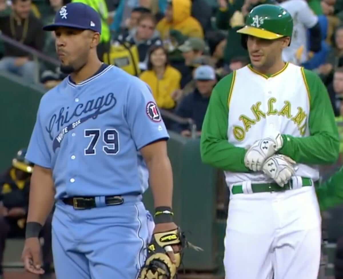
Last night was the 50th anniversary of the Athletics’ first game in Oakland. To mark the occasion, the A’s and White Sox wore 1968 throwbacks.
Generally speaking, it was a very good-looking game. Here are some details:
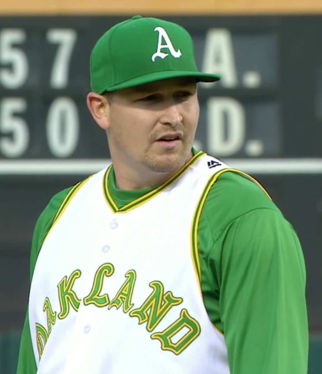
• The good news is that the A’s wore true vests (not just regular jerseys without sleeves), tailored with large armholes and narrow shoulder straps. The bad news is that the Majestic logo — which for some reason was rendered in black — really stuck out like a sore thumb on those narrow shoulders:
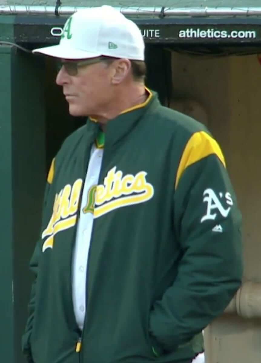
• The good news is that the Oakland manager and coaches wore period-appropriate white caps. The bad news is that the New Era logo looked particularly bad on the pristine white headwear (and also, get this guy a throwback jacket!):
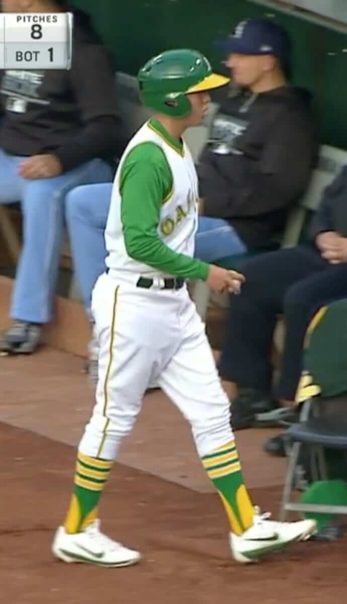
• Unfortunately, most A’s players wore pajama pants. I saw only one person wear the classic 1968-style stirrups, and that was the right field ballboy:
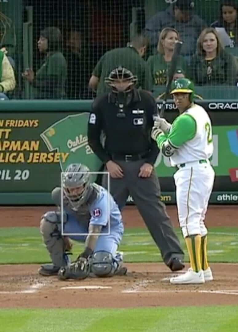
• A’s DH Khris Davis went high-cuffed, but with brutal two-in-one faux stirrups:
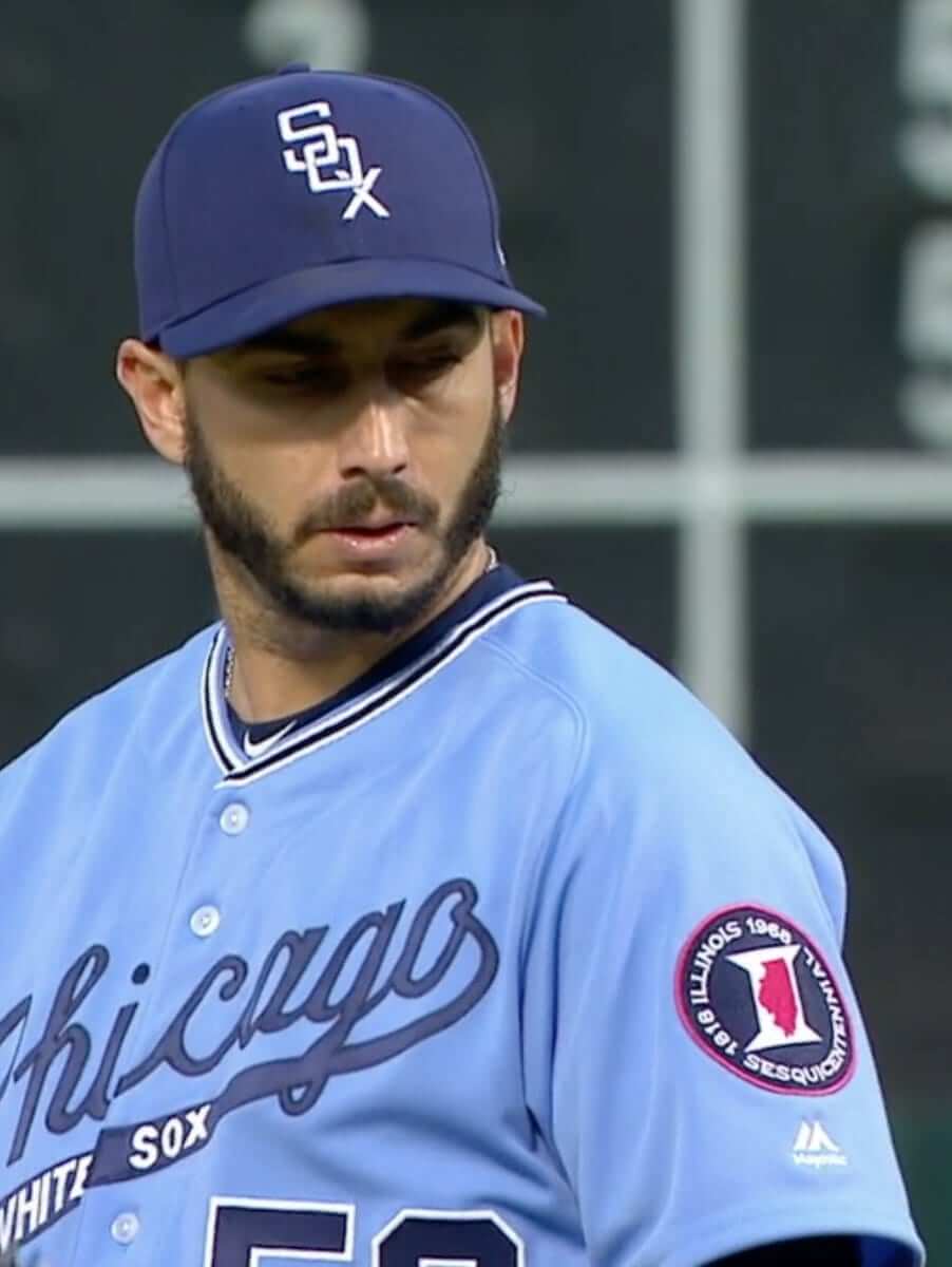
• Chicago’s jerseys included an Illinois sesquicentennial throwback patch (which as I noted last week has the wrong text font):
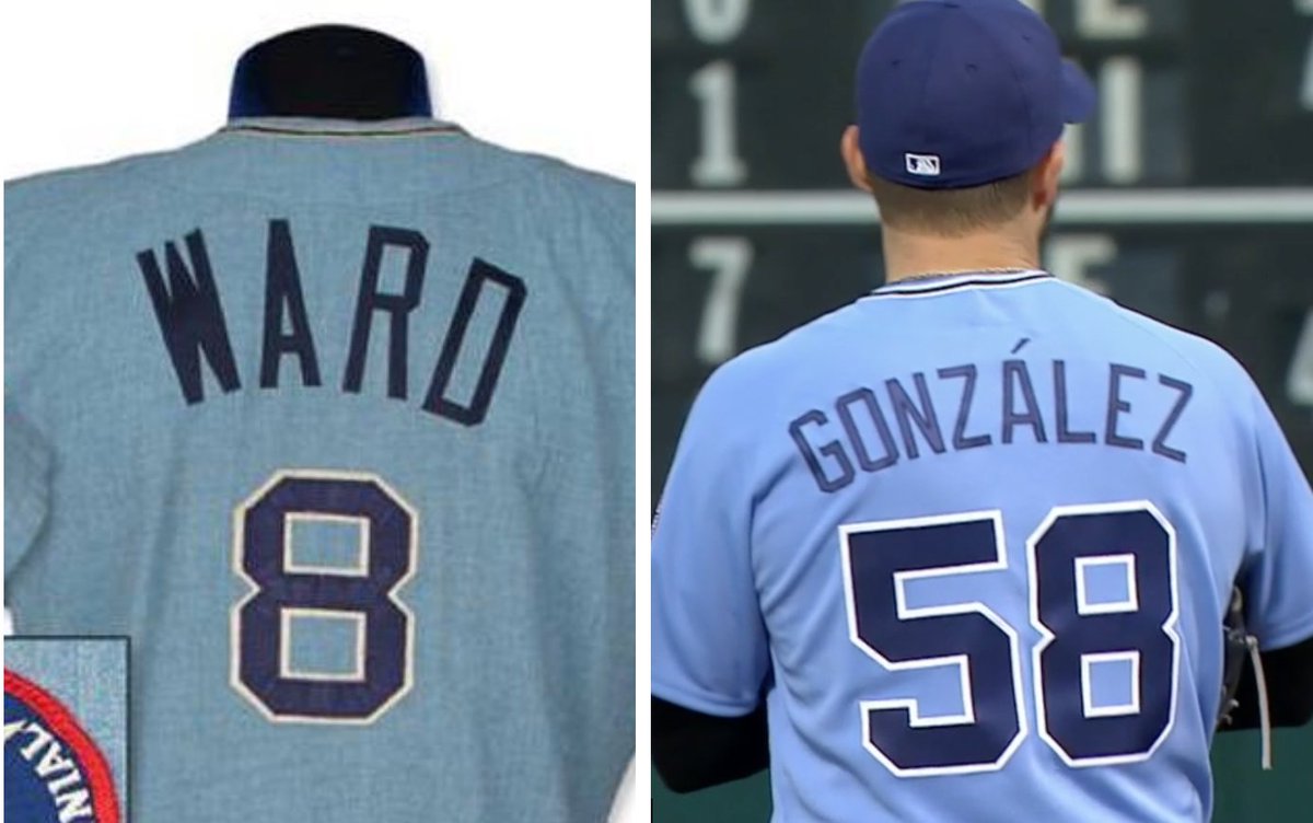
• Speaking of the wrong font, check out the Sox NOB and number typography compared to the original — looks like they used the numbers from the Braves’ navy alternates:
• Despite all of these little quibbles, the game was very easy on the eyes. Here’s some video, so you can see the uniforms in action:
What better way to celebrate 50 years in Oakland than with a 5-0 lead in the first inning?#RootedInOakland pic.twitter.com/Vc6tbF50f9
— Oakland Athletics ⚾️ (@Athletics) April 18, 2018
• As you may have heard, there was no admission charge — tickets were free. Even better, some fans were sitting in the same seats where they sat 50 years ago:
50 years apart, a few dozen fans will enjoy the game from the same seats they sat in 1968. Be mindful of seats marked off as you enter the ballpark today. pic.twitter.com/Gu5Akj4Q2E
— Oakland Athletics ⚾️ (@Athletics) April 17, 2018
Nicely done, Oakland. Here’s to your next 50 years.
Click to enlarge
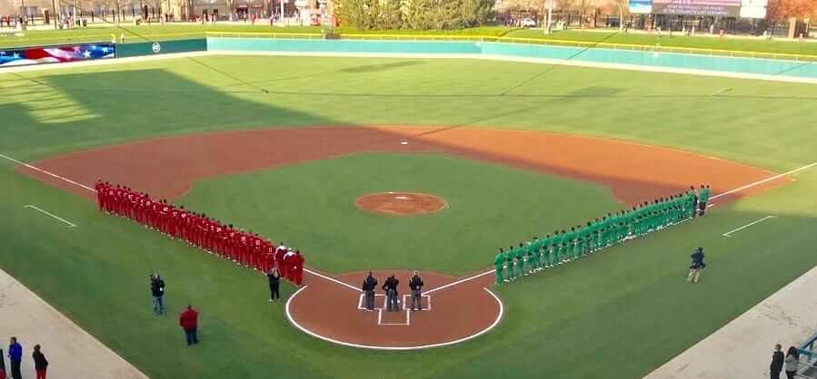
Christmas in April: Strange-looking ballgame last night in Indiana, as the Hoosiers hosted Notre Dame and the teams went mono-red vs. mono-green. It was like a replay of the NFL’s infamous colorblind game.
Interestingly, both teams’ Twitter accounts promoted the game with a #ColorRush hashtag. Given that (a) this was not a football game and (b) neither Notre Dame nor Indiana is a Nike-outfitted school, the hashtag offered depressing evidence of how Nike’s marketing newspeak has spread.
There are lots of game photos available here.

Assorted reminders: In case you missed it yesterday, there was news on a variety of fronts. One at a time:
• Our friends at Ebbets Field Flannels are raffling off a New York Knights T-shirt to a lucky Uni Watch reader. Details here.
• There’s updated news regarding the upcoming Uni Watch cap program, which will likely feature at least three different designs. Details here.
• And we also have updated news regarding the Syracuse Chiefs’ upcoming Brannock Device Night promotion, where I’ll be throwing out the first pitch. Details here.
The Ticker
By Alex Hider

Baseball News: Cleveland and Minnesota kicked off a two-game series in San Juan, P.R., and wore a patch on their caps to mark the occasion. … The Blue Jays wore Jackie Robinson No. 42 jerseys in the first game of yesterday’s doubleheader after rainouts Sunday and Monday. The Royals wore their standard road greys. KC had also been rained out on Sunday, but that was for a home game — they only have white No. 42 jerseys on hand, not grey. They’ll wear the No. 42 whites at a later date. … Speaking of, Jackie Day caused some number confusion, as Blue Jays P Joe Biagini was called up to pitch the second game and was briefly listed as wearing No. 42 by MLB.com. Biagini ended up wearing No. 31 (From Barry Katz). … Umpire Mike Estabrook has been wearing a black batting helmet, instead of a cap, behind the plate this season (from Chad Johnson). … The Royals entered the American League in 1969, the same year as the Seattle Pilots. Next Tuesday, the Royals will play the Pilots’ descendants, the Brewers, and will give away a T-shirt honoring the birth of the two franchises (from Ignacio). … Here’s an interesting look at how players’ autographs change throughout their careers (from Michael Rich). … Marlins Man continued to take potshots at Miami ownership yesterday by wearing a Derek Jeter Marlins jersey to the Yanks/Marlins game in New York (from Kary Klismet). … Red Sox CF Jackie Bradley Jr. was wearing a blue undershirt this weekend against the Yankees. The rest of the team was wearing red (from Pete Clark). … Reds 3B Alex Blandino wore PF Flyer cleats on Sunday. Here’s a better look at the shoes. … Add former Mets P Turk Wendell to this list of pin-wearing baseball players (from Alex Shuman). … The Chicago Sun-Times ranked White Sox uniforms over the years from worst to first (from Phil). … Looks like the Las Vegas 51s are planning a name change (from Mike Chamernik). … The Single-A Florida Fire Frogs wear hand-me-down Braves pants (from Joe Owen). … Ugh: South Alabama is selling the naming rights to softball players’ lockers. Is it still a player’s locker if it has someone else’s name on it? (From Clint Richardson.) … Dennis Healy’s retro MLB wallpapers now have their own website.

Football News: NFL Network photoshopped Louisville QB Lamar Jackson as a Patriot, but forgot to airbrush over Jackson’s Louisville chin strap (from @notthefakeCasey). … Broncos LB Von Miller attended Monday night’s Colorado Avalanche hockey game Monday in a personalized jersey (from Kary Klismet). … Ryan Bower points out that former Steelers CB William Gay and San Antonio Spurs SF Rudy Gay both wear No. 22. Any other name/number coincidences out there? … Texans DL J.J. Watt was wearing a Houston Rockets cap with Chinese lettering during a press conference yesterday (from Ignacio). … The headline of this column (WaPo link) says it all: Adidas’s Colin Kaepernick tease is a master class in corporate cynicism (from Phil). … Pro Football Journal sent a good shot of Rams WR Ron Brown’s double-decker FNOB from the ’80s. … A group of eighth graders in New Jersey have developed a sensor that can be placed in a football helmet and detect a concussion (from David Kendrick).

Hockey News: Philip Pritchard, the designated “Keeper” of the Stanley Cup, tweeted a picture of old cup carrying cases and added that it’s “time to get a new one” (from Jerry). … Cross-listed from the football section: Denver Broncos LB Von Miller was at the Avalanche/Predators hockey game Monday in a personalized jersey (from Kary Klismet).

NBA News: Former Celtic Gerald Henderson once played a game in a neck brace — and wore a gold chain underneath! (From Brad Eenhuis.) … Cross-listed from the football section: Houston Texans LB J.J. Watt was wearing a Rockets “City” jersey cap during a press conference yesterday (from Ignacio). … Also from the football section: Ryan Bower points out that Spurs F Rudy Gay and former Pittsburgh Steelers CB William Gay both wear No. 22. Any other name/number coincidences out there?

Soccer News: Inter Milan players wore their Instagram handles on their NOBs yesterday against Cagliari (from @True2Atlanta). … Tottenham and Brighton went blue-on-blue in a Premier League matchup yesterday (from our own Jamie Rathjen). … New logo for the Russian Premier League (from Josh Hinton). … Currently, FC Cincinnati stands for Fútbol Club Cincinnati. But if the club earns an MLS expansion bid, it could change its name to Fussball Club Cincinnati, using the German translation for “soccer.” Makes sense, given the German heritage in town and branding with the team and supporters clubs (from Andrew Cosentino). … Celtic FC will unveil their kits for the 2018-19 season next Monday (from Ed Zelaski). … New trophy design for the CONCACAF Champions League (from James Gilbert).

Grab Bag: Many think the composite sketch of the man who allegedly threatened Stormy Daniels to keep quiet about President Trump looks like Tom Brady. Personally, I think it looks like Nashville Predators C Mike Fisher. … Ford will change the body style of its NASCAR entries from the Fusion to the Mustang in 2019 (from Josh Hinton). … We’ve seen this before with other cities, but someone re-drew the Baltimore subway system but made the stations Subway sandwich shops (from Andrew Cosentino).
The Brewers aren’t the Pilots’ ancestors, the Brewers are their successors (or, to keep the metaphor, descendants).
Right. Fixed.
“New trophy for the Champions League”
It’s the CONCACAF Champions League. “Champions League” unqualified means the UEFA Champions League, which had the name first (every continent except South America has since borrowed it).
Thanks for schooling me, Jamie!
No problem!
Technically, it’s the “Concacaf” Champions League. They changed it from all-caps.
There could be the advertiser before it too, but I left that out for obvious reasons.
They may choose to write it like that, but either way it’s still an acronym.
It bothers me just a little that they’re using mixed case with an acronym. If it doesn’t look like an acronym, is it still really an acronym?
It’s an acronym until it loses meaning, a la ESPN going from Entertainment and Sports Programming Network to ESPN, Inc.
“NFL Network photoshopped Louisville QB Lamar Jackson as a Patriot….”
Apparently Jim Mora had nothing to say about it.
link
But he did say it with bad quotation marks.
These White Sox and A’s throwback uniforms look beautiful on both sides (we need more powder blue in this game!), but for the A’s they seem to have left even more space above the number than link.
I think the #ColorRush game looks great. Why would you find this entirely reasonable appropriation of the terminology “depressing”. You’re constantly introducing terms eg. BFBS, Naming Wrongs, Color Rash etc. which I’m sure you delight in seeing perpetuated. Main difference being yours come with a large layer of snark.
Main difference being yours come with a large layer of snark.
I think what you’re trying to say is that mine are a form of commentary, which is true. But Nike’s corporate newspeak is not a form of commentary; it’s just corporate newspeak. And yeah, I find the spread of corporate newspeak depressing (which is why many of my commentary terms are, in fact, comments on corporate newspeak).
He even included the hash tag. Tells you all you need to know.
Reggie and Rafael Bush both wore #25 for the Saints.
The depressing thing about that Baltimore metro map is it serves as a reminder of just how useless our actual metro is. It only has one line.
It’s still more than what we have in Detroit – one People Mover looping around downtown, and one light rail train that goes back and forth down one street for just over 3 miles.
Even with their throwbacks the Sox can’t get their socks right. At this point I’d rather they all wore long pants. Congrats, Chicago…you managed to replace Boston as my new least favorite team.
The White Sox wore three white stripes on navy stirrups in 68 (thick/thin/thick), but last night all I see were a few of those goofy blue Stance socks.
Because of socks? Seems a bit harsh. Those White Sox units were sharp!
This is Uni Watch, after all… or am I the only one who has liked or dumped a team based on its uniform decisions?
The fact MLB listed a player as wearing 42 tells you everything you need to know about how ridiculous everybody wearing 42 is
So I started thinking about “Powder Blue”.
What powder is blue???! Baby powder? Face powder? Talcum powder? Gold Bond powder?
No, No, No, No.
I guess this is the answer:
link
You don’t hear about “powder [insert any color here]” do you?
If I ever have a team, its colours will be powder blue, pitch black and blood red
Powder Pink – link
So much for only hearing about powder blue.
The stirrups that the Oakland ballboy wore look awesome. Too bad no one else wore them.
Somebody tell that Sun-Times writer that they overlooked the 1969-70 White Sox unis – the ones with the reversed sock colors (which irk a certain MotherVilker to no end) but also feature the unique white script on the road set.
“Ryan Bower points out that former Steelers CB William Gay and San Antonio Spurs SF Rudy Gay both wear No. 22. Any other name/number coincidences out there?”
Well, Greg Bird of the Yankees is 33. Then again, the Yankees are NOB-free …
-Though they were a not throwback that matched the uniform, glad to see the Athletics invested in a kelly green batting helmet. I imagine this will be worn with their alternate kelly green jerseys moving forward. I remember seeing them wear the kelly green jerseys with the darker green helmet earlier this year, which was not pleasant.
-Love powder blue road uniforms in baseball. Would be nice if this would spark the idea for some teams that wore powder blue road uniforms in the past to consider it again for future uniform changes.
-Speaking of batting helmets. Some disappointment when I saw highlights of the second Blue Jays game yesterday. They were wearing the white front panel hats but solid blue batting helmets. Last year they had a set of white front panel batting helmets. Why not this year?
link
I didn’t get a chance to comment on the Uni-Watch caps yesterday. They both look phenomenal, Paul.
Thanks, Blake. Glad you like!
Red Sox CF Jackie Bradley Jr. was wearing a blue undershirt this weekend against the Yankees.
As God intended; now please bring back the striped stirrups.
Hear Hear. The blue undershirts/striped stirrups look a million times better than the current look. Way too much red.
They’ve never looked better than they do now because they’re finally wearing red socks. Don’t bring back those stirrups, please.
The shirt is actually black. Jackie wears a black arm sleeve when it’s warm on one arm and they all match his batting gloves which are black.
Biggest thing the Sox need to do is bring back those beautiful striped stirrups.
I went to the game last night — was a lot of fun. (I go to a few games each year, but this was the first crowded game I’d been to since the A’s made the playoffs several years ago.)
Despite the lack of stirrups, the game just looked really good. And while the A’s jersey was nice, A’s jerseys are basically always nice, to my eyes at least. However, the visitors just looked so much better than visitors usually look. Powder blue just looked way better than grey. Made for a much more colorful and entertaining matchup. I can’t remember why visiting teams stopped using powder blue (nor why they started wearing it).
Lack of stirrups was kind of sad. The only guy showing anything for the A’s was the DH Khris Davis, and even from my distant seats they didn’t look like they matched the jersey.
A fun game. A great crowd, including the very friendly family sitting immediately behind my family who persisted in trying to start the wave until they succeeded.
I forgot to mention: Mark Canha wearing a black ski mask with the throwback jersey on a warm 60-degreeish evening was just horrible. He should be sent to the minors for that.
I was at the game as well. Really too bad that the only A with the proper hosiery was the bat boy.
Regarding Canha, while it was chilly (damp wind and in the lower 50s towards the end), I wondered he was wearing it more for luck than for warmth. Looked like he had worn it earlier in the week when he had a good night and he went 3 for 4 last night with it. Wouldn’t shock me to see him in it again if it’s not too warm—as Crash Davis said, never mess with a streak.
Re: the umpire with the batting helmet, I’ve always wondered why more umps don’t do that, or wear the hockey-style mask. Batters used to only wear hats but now wear helmets, catchers used to wear hats under their masks but now wear helmets, but for some reason the third guy 60 ft away from a 90+ mph projectile still usually wears just a hat. Not to mention the potential of an umpire getting bonked on the head by a bat
Also, site’s been loading slowly on my iPad this morning, and I got a 502 Bad Gateway error at one point
Yes, we’re having a server issue. Working on it.
Odd technical glitch(?) with the site today. I normally get Uni-Watch through an RSS feed aggregator program (Feedly, if that matters). Up until a few weeks ago, I could read an entire post through the RSS feed. Then, shortly after Paul discussed possible subscriptions, this changed, such that the feed only shows the first paragraph or so and I have to click through to the website to read the whole post. I assumed this was so readers like me get the full page including ads, and I completely understand that move, no problem with it whatsoever.
All that is to lead up to today, when the entire post was again available on the RSS feed. So, someone may want to look into that, so the site provides a consistent look and feel.
J.J. Watt is not a linebacker.
True. Fixed.
“A group of eighth graders in New Jersey have developed a sensor that can be placed in a football helmet and detect a concussion.”
Hallelujah!!! Thanks to a bunch of pre-high schoolers, the NFL can now do away with the one-shell rule, Bucco Bruce can return with the creamsicle jerseys, and all is right with the world.
What a great Wednesday. Way to go, kids!
IIRC, Ford recently decided to soon end North American production of the Fusion and potentially exit the mid-size sedan market altogether, hastening the switch to the Mustang for the Cup Series?
I forget how long a discontinued body style can be used in competition (I think there’s still a team running Dodges in the Xfinity Series, with no manufacturer support I suppose).
FC Cincinnati will change the F to Fußball instead of Futbol, imo it’s just a matter of when. They are heavily influenced by German soccer, and their 2018 kits pay heritage to the German part of the fan base. Furthermore, their largest supporters group is written in German.
link
Here’s a look at their kits
The White Sox 67 to 75 “Chicago” script with the team name in the underline still looks fresh 50 years later. The navy on powder blue rendition works nicer than bold red on powder, or the white on grey version. The piping around the neck and down the sides of the legs looked right, but the numbers… Majestic can be forgiven for not having a duplicate of the Sox’s weird font from that era, but the backs… come on! They look identical to the ones worn in the 2009 Civil Rights game, when the White Sox threw back to 64. Big varsity numbers and standard-sized letters for the names. The front looks good, but those five inch numbers and tall names would have possibly upstaged the A’s vests.
The A’s look great, but while I’m harping on the numbers, theirs seem a bit low. They have the “leave room for the names” syndrome, when in fact the A’s didn’t have NOB’s in 68.
I’d love to see the White Sox return to a version of these powder blues with the classy curly “C” script and “White Sox” in the underline flourish. But when they revised the idea of powder blue roads in 64, it necessitated a change of team color to navy blue. Black doesn’t go with light blue as well as navy (or red!) does and that’s too bad. I’d hate to see the Sox go back to being another “blue” team just for those uni’s to make a full time comeback.
Just think – the A’s also wore yellow jerseys/pants in 68 – now THAT would have made for a colorful game!
Light blue can work with black; think of Johns Hopkins. But I think you’re right that navy blue works better. And on a somewhat related note, I don’t think the White Sox will go with Under Armour’s heather gray pattern; their current light gray represents the team color of silver too well.
I hope you’re right, DJ. Black on light blue might be palatable. They might want to use the silver/grey as secondary color, but white accents on powder blue show up better. They might continue to subject us to grey in those god-aweful two-color tuxedo stripes, but I rather they went with actual soutache piping. Maybe just the Under Armour logo in grey/silver!
Any other name/number coincidences out there?
In 2006, I had an issue of Eastbay that had a No. 15 “Anthony” Team Canada jersey for sale. Say what, Melo is Canadian? Nope, that is Joel Anthony, a journeyman NBA center. Eastbay didn’t note that it was Joel, and I always thought that was dirty.
A bit off topic, but a while ago you mentioned a track you’d fallen in love with by the band Say Sue Me. I went and Googled the band after listening to a few tracks, and saw they were going to be in Glasgow shortly thereafter. That “thereafter” was last night – I went to go see them live, along with Leggy and the headliner Otoboke Beaver. It wasn’t the sort of concert I’d normally go to, but I had a great time and loved all the music.
Just wanted to let you know sometimes the random notes can be a force for good!
Awesome. Glad you enjoyed!
“Any other name/number coincidences out there?”
From 2011-13, Tony Parker played for the Spurs and midfielder Scott Parker played for Tottenham Hotspur – who are frequently called “Spurs.” So you could write a headline starting with “Spurs’ Parker…” and be referring to either of them. I remember seeing at least one such headline on ESPN.
Also, Tony wears No. 9 and Scott wore No. 8 at THFC.
Adam Wainwright was wearing a C-Flap last night. It’s the first pitcher that I have noticed wearing it while batting.
link
At least one other Cardinals pitcher has done it this season — Carlos Martinez:
link
I’m pretty sure he was the first pitcher I saw wearing it (but that doesn’t mean he was necessarily the first pitcher to wear it).
Amir Garrett wore one for the Reds last season.
link
He hasn’t had any plate appearances yet this year, so it’s not clear if he’s still wearing it or not
Adam and Chipper Jones #10
One interesting detail about those 67 Sox jerseys was that they have collar piping but no sleeve piping.
No current MLB has that arrangement. Some teams have sleeve piping but no collar piping. Some have both. But none have what the 67 Sox had.
Not sure if it has been mentioned but the best part of the A’s throwback ensemble is the cap with just the “A” with no apostrophe and “s.” I first saw those in spring training and my jaw dropped, they were so sweet! Just my two cents.
Name/Number coincidence:
Deion Sanders: #21, Falcons
Deion Sanders: #21, Reds
Bob Gibson: #45 Cardinals
Paul Gibson: #45 Mets
Carlton Fisk: #72 Chicago White Sox (C)
Jason Fisk: #72 Minnesota Vikings (DL)
Bobby Orr: #4 Boston Bruins (D)
Pete Orr: #4 Braves, Nationals, Phillies (INF)
Tony Dorsett: #33 Dallas Cowboys (RB)
Brian Dorsett: #33 Cincinnati Reds (C)
In the 2014 Stanley Cup Finals, both the Rangers and Kings had a #22 named Boyle–Brian Boyle for New York, Dan Boyle for LA. Brian had played for the Kings before the Rangers; after the season, Brian left the Rangers as a free agent, and Dan signed with the Rangers and, yes, wore #22. The Boyles are not related.
While real stirrups are always the ideal choice, I cannot call two-in-ones “brutal”. They look like stirrups. That’s good enough for me.
RE: UA taking over MLB unis. Do teams have an option for where the MM is placed? I can’t imagine Yankees, Dodgers, Red Sox, Cubs, etc. being happy about it being the on the chest.
No, teams do not have an option. And their happiness is not a consideration.
I assure you they’re quite happy about getting their share of the revenue from the UA contract, however.
I laugh at the thought anybody still thinks there is any sanctity in Yankees, Red Sox, Cubs, etc. uniforms.
That ship sailed long ago…
I am most disappointed they announced the Under Armour delay in the haze of Jackie Robinson day since UA is such an urban brand. Seems like they could have waited a few days.
Are you kidding me? Those uniforms for sure still have their sanctity intact. Just because teams want to introduce alternates to compliment their primary jerseys does not mean they disregard their classic uniforms. They did not introduce BFBS or GFGS uniforms or try to match a league-wide trend. When thinking of some of the teams with classic uniforms try to remember that the Yankees haven’t made a uniform change since 1973, the Tigers have made minor tweaks throughout the years (the most major being the changing of the “D” this year), the Red Sox have only recently added alternates and tweak their primary jerseys for different amounts of navy and red, the Dodgers have barely touched their jerseys (execption of the new D logo hat), the Cubs have only tweaked their jerseys in the past twenty years (when they introduced the blue alternates), and the Phillies have also only tweaked their uniforms in that time (adding different alternates). I happen to be biased and love the Cubs blue jerseys, the Phillies cream alternates and Red Sox red and blue jerseys. What does Under Armour being an “urban brand” have to do with Jackie Robinson Day. Are you implying that because UA is an urban brand that this move could upset African-Americans whatsoever? I have no idea what that could possibly mean. I would love a clarification of that. I am very curious to see other people’s thoughts on this.
Maybe I am wrong but they have always been a black brand to me – the whole click clack thing.
I know white athletes like Tom Brady endorse them now so maybe they have expanded.
One more thing – probably 90% of the people I have seen wearing UA are black, but that is obviously not scientific.
I am most disappointed they announced the Under Armour delay in the haze of Jackie Robinson day since UA is such an urban brand. Seems like they could have waited a few days.
They didn’t announce it; I broke the story. If I hadn’t, the announcement would likely have come later.
A’s should go back to those uniforms permanently.
I like the A’s current set. Especially all the alternates.
Bobby and Barry Bonds #25
One more name/number coincidence: The Hannah brothers
John: #73 New England Patriots (OG)
Charley: #73 Buccaneers, Raiders (OL, DL)
Number coincidence:
Harold Baines, #3, Chicago White Sox
Leighton Baines, #3, Everton FC
On the same team:
Cliff Johnson / Randy Johnson: #41, Yankees
Jack Clark / Will Clark: #22, baseball Giants
Lester Harris / Joe Harris: #12, Nets
Ted Williams, #9, Boston Red Sox
Matt Williams, #9, SF Giants
Chili Davis, #30 SF Giants
Terrell Davis, #30, Denver Broncos
The photo of A’s DH Khris Davis is broken. It extends under the categories list in the right column.
Got it.
Walter and Eddie Payton both wore number 34.