As I’ve continued to explore the topic of road teams wearing white against the 1963 A’s in Kansas City, several readers have decided to search newspaper archives for additional examples of white-clad visiting teams. Along the way, they’ve turned up some additional info that adds valuable new chapters to the historical record. We’re going to look at some of those today.
The info in this post comes from readers Roger Cormier and Greg Mays, who found some fascinating old articles and generously shared them with me. Here’s the rundown:
1. The A’s did indeed encourage visiting teams to wear white in KC. A key part of this ’63 A’s storyline came when Uni Watch reader Jim Wagner shared his father’s recollection that the A’s invited visiting teams to wear white during their road trips to KC. Thanks to a UPI item that ran in The Springfield (Mo.) Leader and Press on Jan. 30, 1963, we now have confirmation of that. A’s owner Charles Finley even offered to pay the extra freight costs that teams would incur from the extra uniforms (click to enlarge):
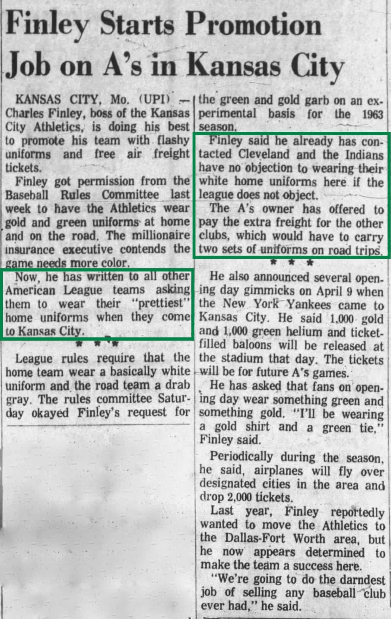
Note that Cleveland had already agreed to wear white in KC. So that pretty much confirms that the Indians were indeed wearing white in that 1963 home movie footage.
2. Finley originally wanted the A’s to wear white on the road. Finley didn’t just want road teams to wear white in KC — he also wanted to practice what he preached by having his own team wear white on the road. Check out this AP item that ran in several newspapers on Jan. 25, 1963:
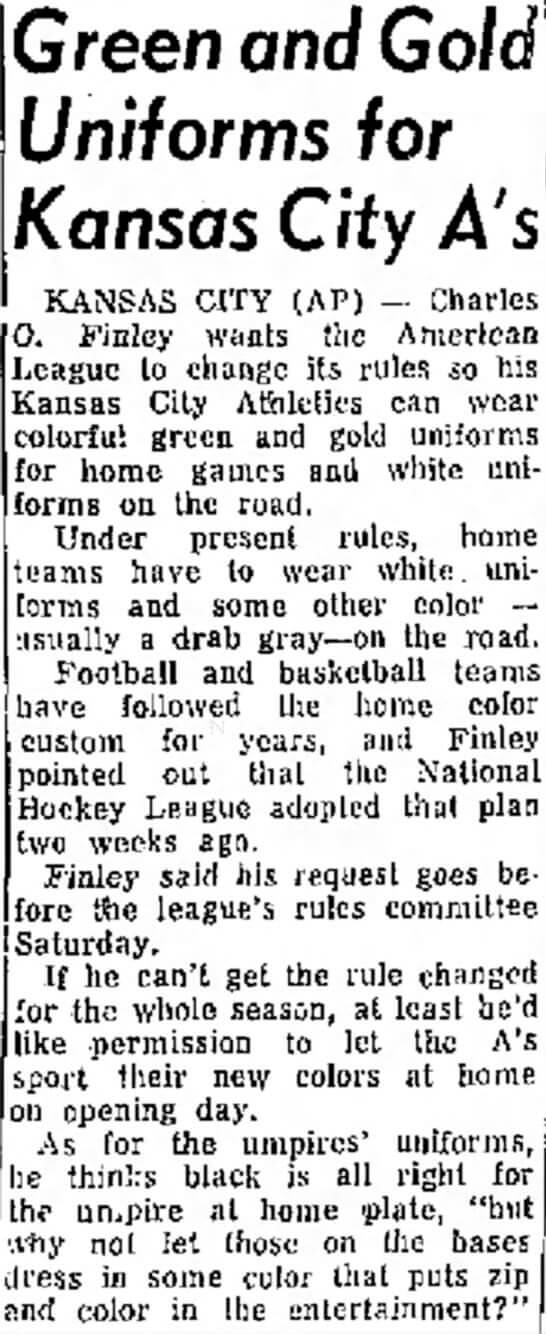
The American League granted its permission for the A’s to wear green and gold at home but apparently denied Finley’s request to wear white on the road, presumably because they didn’t want a spate of white-vs.-white games.
3. The A’s TV numbers were controversial (and pitchers didn’t wear them). One unusual feature of the 1963 KC uniforms was the use of large white TV numbers on the undersleeves — a first for an MLB vest-based uniform. According to an article that ran in The Kansas City Times on March 25, 1963, the TV numbers were originally approved by the commissioner’s office but were then disallowed because they ran afoul of a rule that bans decorations on undershirts. The article is a bit lengthy, but I strongly recommend reading the whole thing — lots of good stuff in there (click to enlarge):
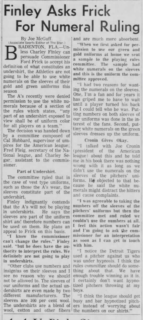
Obviously, Finley’s appeal succeeded, because the A’s did indeed wear the TV numbers in ’63.
Another interesting wrinkle is the bit toward the end of the article about A’s pitchers not wearing the TV numbers because batters might be distracted by the white numerals. I hadn’t noticed this before, so I went back to that 1963 home movie footage that got us started on this whole ’63 A’s rabbit hole. Sure enough, the pitchers had no TV numbers — something I’d totally missed until now!
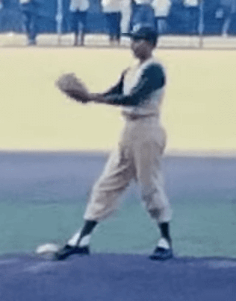
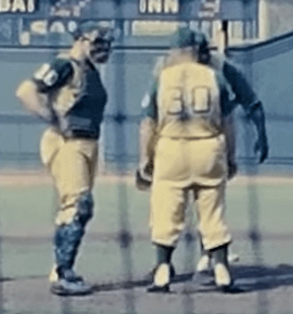
Indeed, if you look at baseball cards from this period, the pitchers don’t have the TV numbers while the position players do. Again, I’d never noticed that.
4. The A’s didn’t add their nickNOBs until early June. I’ve written many times about how the ’63 A’s used nickNOBs, and I’ve often illustrated that by linking to this photo and caption. I always assumed that the NOBs were a season-long thing (because why wouldn’t they have been, right?), but it turns out that the A’s went NNOB until early June, at which point the NOBs were added. All of this was spelled out in a Kansas City Times article from June 5, 1963:
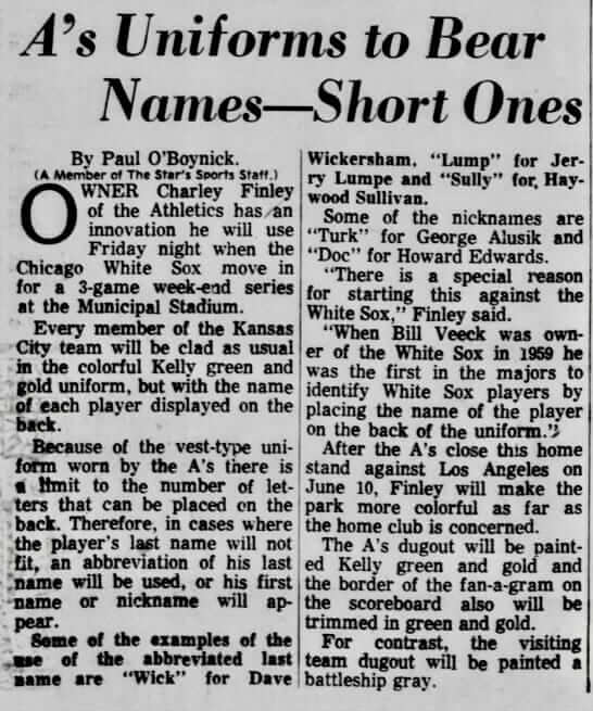
I love that Finley said he decided to introduce the NOBs for a series against the White Sox as a nod to Sox owner Bill Veeck, who had pioneered MLB NOBs. (But Finley got the year wrong — the Sox introduced NOBs in 1960, not 1959.)
Speaking of the nickNOBs, here’s an excellent new photo of them (interesting to see that the bat boy is named in the caption — a rarity; click to enlarge):

As you can see, the one pitcher in that photo — Diego Segui — does not have the TV numbers, while the other players do.
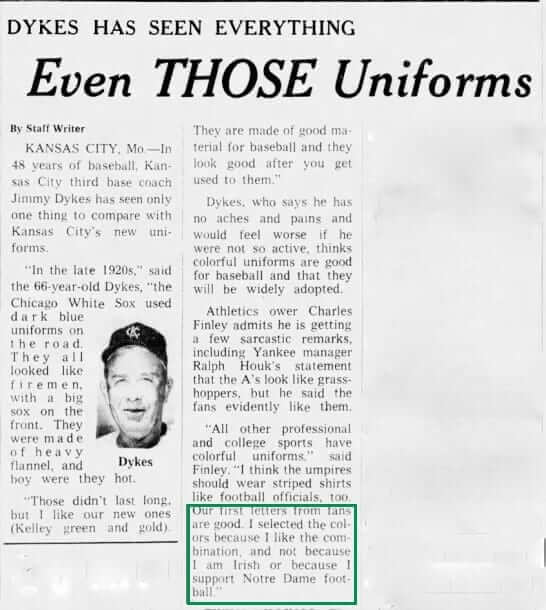
5. Finley chose green and gold simply because he liked that color scheme. The A’s green/gold color combo, which Finley later used when he owned the California Golden Seals, had no symbolic significance beyond Finley’s personal taste:
That’s a lot to process, so let’s stop here for today. But we’re not done with this topic — next time around I’ll show you some new examples of road teams wearing white in KC.
(Doubleplusthanks to Roger Cormier and Greg Mays for sharing the fruits of their diligent research.)
NBA Uni Tracking
By Collin Wright
[Editor’s Note: Collin is off on his honeymoon (big congrats!), so he doesn’t have an updated chart this week, But before he left, he checked out the NBA’s new LockerVision site, which maps out what each team wears for each game, and sent in some thoughts on that. Enjoy. — PL]
It’s really interesting that the NBA is publishing this information. I looked at 20 games and compared what was shown on the LockerVision site with pictures from Getty Images and my own records. LockerVision was accurate in regards to the uniform “edition” being worn by each team in each game, but it wasn’t necessarily accurate when it came to the accessories or socks being worn.
For example, here’s what LockerVision shows for the March 2 game between Milwaukee and Indiana:
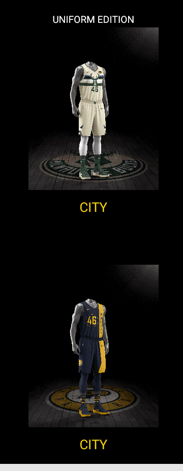
Those were in fact the uniforms worn that night, but the Pacers wore yellow tights (not blue), and the Bucks wore white socks (not green). In fact, my records show they’ve only worn white socks with the cream uniform.
Similarly, for the March 1 Lakers/Heat game, LockerVision shows the Lakers in purple tights and white socks (they actually wore white and white) and shows the Heat wearing white tights and pink socks (they actually wore black and black).
One last thing I noticed: Some upcoming games aren’t yet scripted. For example, here’s a Bulls/Bucks game where the Bucks image is listed as “Coming Soon.”
In short: LockerVision provides good documentation for basic uniform matchups, but not for accessories.
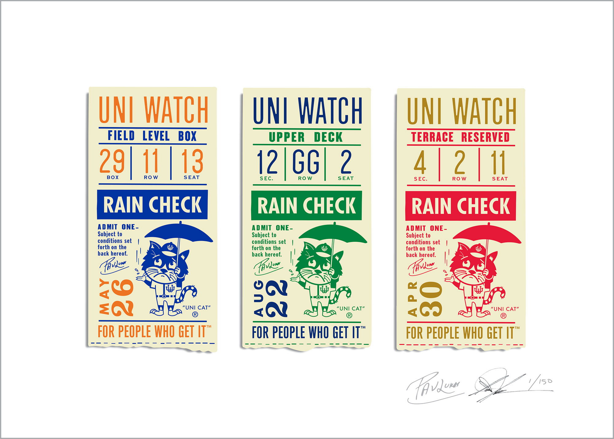
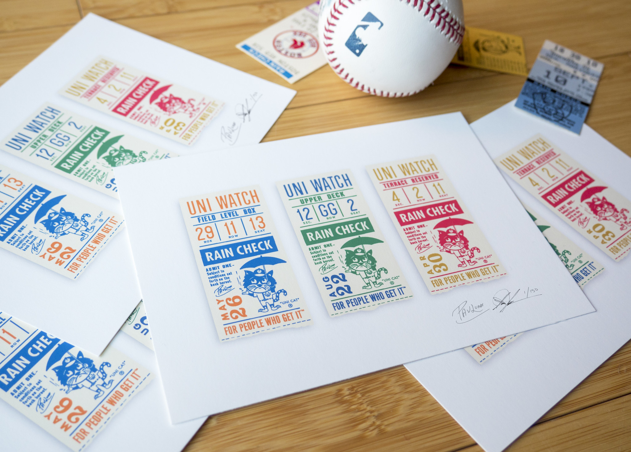
“Rain Check” print update: I’m very happy to announce that the limited-edition “Rain Check” print, designed by Todd Radom, is now available. Here’s a digital rendering of it, followed by a photo (for both images, you can click to enlarge):
Notes:
• The prints are 7″ x 5″. They’re being printed on Todd’s museum-quality 10-color digital printer using archival pigment-based inks on archival 100%-acid-free art paper.
• This is a limited edition of 150 prints. Once they’re gone, they’re gone. Each print will be hand-numbered and signed by Todd and myself.
• The three ticket stubs are filled with numbers and dates that carry extra significance to Todd and myself, as follows:
First stub: The box, row, and seat numbers are all prime numbers, which I always like. And the date, May 26, is when the very first Uni Watch column was published in 1999.
Second stub: The section, row, and seat numbers match the seat where Todd sat at his very first game at Fenway Park in 1978. And the date, Aug. 22, is Todd’s dad’s birthday.
Third stub: The section number, 4, is for Todd’s oldest daughter, Hannah, whose birthday is Feb. 4. The row number, 2, is because Todd and Hannah were both born in February. And the seat number, 11, is for Todd’s other daughter, Kate, whose birthday is Dec. 11. The date, April 30, is the birthday of Uni Watch mascot Caitlin — the original Uni Cat!
• The price is $19, which includes domestic shipping. Todd, who’s handling the fulfillment on this project (thanks, Todd!), is taking requests for international orders on a case-by-case basis. If you live outside the U.S. and want to order, you can get in touch with him and plead your case.
• Todd and I still have to meet up to sign all of the prints (the signatures in the images above were Photoshopped in, just to give you an idea of how it will look). That will take place either this Friday or in early April. Either way, the prints will ship out in early April.
I have tremendous respect for Todd’s talent and professionalism, and it’s a real privilege to collaborate with him. Hope you all like the results as much as we do.
Again, the prints are available here. My thanks for your consideration.
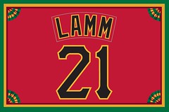
Membership update: A bunch of new cards have been added to the membership card gallery (including Greg Lamm’s card, shown at right, which is based on the Pirates’ old red vest — pretty sure that’s the first time we’ve had that request). The printed/laminated versions of these cards should mail out in a day or two.
Remember, a Uni Watch membership card entitles you to a 15% discount on any of the merchandise in our Teespring shop. (If you’re an existing member and would like to have the discount code, email me.) As always, you can sign up for your own custom-designed card here, you can see all the cards we’ve designed so far here, and you can see how we produce the cards here.
The Ticker
By Jamie Rathjen

Baseball News: The SEC is participating in an experiment where catchers wear wireless devices during conference games this season to receive pitch signals from the dugout (from Kevin Zdancewicz). … New red uniforms for Youngstown State (from Robert Hayes). The team also wears black hats and stirrups with red jerseys this season. … Here’s a very comprehensive look at the evolution of the Tigers’ Gothic “D” logo (thanks, Phil). … Royals P Ian Kennedy appears to have blued out the New Era logo on his hat (from Jeff Moulden). … The Alabama Sports Hall of Fame in Birmingham has some “incredible pieces of uniform history,” says Stetson Pevear, including a 1939 White Sox jersey from 2B Jackie Hayes. … Iowa wears a sleeve patch of mascot Herky the Hawk batting (wearing stirrups) on at least two (white and black) of its jerseys.

Football News: The Titans’ new uniform set, slated to be unveiled on April 4, will reportedly include a navy blue helmet (from Mike Chamernik). … The Lions are looking for a practice jersey advertiser (from Brian Merlos). … The BUCS (British Universities and Colleges Sport) football Premier Division championship was color-vs.-color between Durham (purple) and Derby (orange/blue) (from @JayJayDean). The game was played at Sixways Stadium, the home of rugby union team Worcester Warriors, and the field retained some of its rugby markings. The goalposts also remained at the front of the end zone and still featured padding from rugby’s English Premiership.

Hockey News: Boston University wore throwbacks for four games in a row in the Hockey East and NCAA tournaments until losing yesterday to Michigan. … Oxford and Cambridge renewed a hockey rivalry this weekend that dates back to 1885 and, as with much between the two universities, is conducted as a blue-vs.-blue matchup, though Cambridge’s team uses a more conventional light blue than is commonly associated with them.

Soccer News: New NWSL kits for the Chicago Red Stars (first and second), Orlando Pride (second and goalkeeper), and Seattle Reign (first and goalkeeper). Additionally, the Washington Spirit (second) debuted the first of the remaining kits that weren’t revealed in preseason. … The spate of national team kits unveiled lately coincides with the only opportunity to see them in action until late May. Some teams changed at home or when they normally wouldn’t have in order to wear a new kit, including Germany (green), Mexico (white), both Italy (white) and Argentina (black), and Northern Ireland (light blue). … Speaking of national teams, here’s a roundup of all the released kits for World Cup participants (from Josh Hinton). … USL team Bethlehem Steel have a numbering system that denotes players’ statuses with regard to the team’s MLS owners, the Philadelphia Union (from Greg Franklin). To clarify the tweet, only Bethlehem Steel players numbered 36-49 have a contract with the team. Any lower-numbered players have Union contracts and higher-numbered players are Union youth team members. … The font for Brazil’s new uniforms has been revealed (from Josh Hinton).

Grab Bag: The NLL’s Saskatchewan Rush wore superhero-themed jerseys Saturday (from Wade Heidt). The jerseys are to be auctioned off to benefit a children’s health-care foundation. … Tris Wykes found a very cool vintage plywood roller skating sign outside a venue in Enfield, N.H. … Australia cricketer Cameron Bancroft appeared to rub the ball with sandpaper, a violation of the rules, during Saturday’s third day of a Test against South Africa. He then took the sandpaper out of his pocket and shoved it down his pants before the umpires came over to talk to him. … The U.S. field hockey teams wear both red and blue in equal numbers, but the under-21 women’s team managed to turn out in white with red and blue in an away game against Ireland.
for the BUCS football… endzones are in front of the rugby posts, but game played with only 80yards of infield length…
also, shame about the braves/head-dress decal BS… just because we are on the other side of the Atlantic doesn’t make it ok…
(ps Derby suck… mandated comments as I am a Uni of Leicester Alum who played for their american football team when we were Leicester Lemmings :-) )
Majority of BUCS games are Colour/Colour, unless both teams have the same colour jersey in which case the home team changes.
To quote the old National Forum, Durham are Shit.
Yeah, Derby’s helmet might be a thing for Skins Watch this week.
Re: most games being color-vs.-color, I figured that was probably the case, but it’s still rare in football in general.
Titans going navy blue helmet, if true, is disappointing. There’s already 8 teams who primarily wear navy blue at the moment, and Texans, Seahawks, Bears, and Rams all go with navy helmet over a navy jersey. Seems like teams really don’t appreciate having a visually distinct color scheme. Somehow they prefer being distinct with crazy designs than through color scheme. They don’t get that color schemes tend to stay the course and are recognizable on first glance, while the wacky designs come and go.
Don’t understand this reasoning. There are currently 6 teams with navy blue helmets, Denver, Houston, Seattle, Chicago, NY Giants, and the LA Rams even though most believe the Rams will go back to royal blue when they move into their new stadium. There are currently 7 teams wearing white helmets if you count Tennessee, with Arizona, LA Chargers, Indy, Buffalo, Miami, and the NY Jets. So Tennessee going navy blue will make it 7 navy blue and 6 white instead of 6-7. And once the Rams go back to royal blue it will be 6-6. Now if you really want a unique color they should go with light blue helmets.
My point was, at this time there are 4 teams that go with navy helmets and navy jerseys. It is the only helmet/jersey combo that more than 2 teams share in common, and not only that, it is associated with Bears more than anyone. They’ll just be copying someone else’s style.
Certainly there are lots of white helmet teams. But of them, only two pair it with a navy jersey. And since the Titans were going with the white helmet and navy jersey well before the Chargers were, I’d say it is a signature look for them. Say nothing of nature of white helmets and pants compared to color in football, they are simply more common and that’s ok since white is sort of a blank color for this purpose.
I agree with your assessment, as there are no teams wearing light blue helmets, and as an added kicker, it would be a nod to the Houston Oilers powder blue period.
Agree on this. I think they’d look great in a columbia blue helmet. Would be a great nod to their history and very distinctive.
Light blue helmets with navy jerseys would be cool – like the really old school Toronto Argonauts’ look.
link
link
I have a thing where I don’t like White helmets on any team in football. I think all teams should be colored.
In my world, the Bills are still red, the Chargers are still Navy and the Jets are still Green.
I embrace the titans going Navy (although powder blue would be unique).
Agreed! If white is a predominant team color, fine, a white helmet can be OK. It’s still by definition ugly, but at least it makes sense, as for the Colts. But when a white helmet is just a blank canvas for a team whose colors are mainly not white, that bothers me. I’d much rather the Titans go for a hue of blue other than navy, but better navy than white.
I can’t imagine the Dolphins with anything other than a white helmet.
When it comes to white helmets I think some teams work; Colts, Jets, and Cardinals, as they really only have one other color. As already noted I can’t imagine the Dolphins with anything but a white helmet. And I think the Bucs would be wise to go back to go back to their orange and white days (but keep the pirate flag type logo). Likewise hard to argue with Charges old powder blue look. Only other team I think would work well with a white helmet is the Browns, with the player numbers on the side. Just something really oldschool about that look that I think would work well for them.
Terrific piece today. Thanks to the folks who did the research.
A great entry on Detroit D. Seems they preceded the crop of ” hey, it’s alternate, buy it now” uni hucksters by a century.
Kennedy’s Royals hat is just a gold NE logo with poor lighting. All the Royals’ ST hats have a gold NE logo.
“…a very cool vintage plywood roller skating sign ”
Not Plywood. It’s OSB–oriented strand board.
I don’t know how “vintage” the sign is because it is OSB. My recollection is that OSB started replacing plywood as the preferred sheathing/sub-flooring material in residential applications somewhere in the late 80s – early 90s.
From the second newspaper article:
Football and basketball teams have followed the home color custom for years, and Finley pointed out that the National Hockey League adopted that plan two weeks ago.
That’s rather odd, because we’ve known for ages that the NHL, after mandating that every team had to have a white uniform in 1951, adopted the color-at-home, white-on-road practice in 1955, a date that has been repeated in official NHL publications such as the annual Official Guide and Record Book.
Maybe the NHL’s uniform arrangements had only been by agreement of the member teams, and hadn’t been formally codified in the rules until January 1963?
I’m a little surprised that the Ticker item about the Lions doesn’t mention that Paul was quoted in the article.
Not only that, but there’s another uni-related article on Crain’s Detroit quoting Paul. This one is on the Tigers and Red Wings retiring the Mike Ilitch “Mr. I” memorial patches: link
Just ordered the print. First Uni-Watch thing I’ve ever ordered. Loved the design and it will look good on my home office wall.
If I had the scratch to own an NBA team or any other professional team for that matter, I just don’t see how I would let Nike decide what uniform my team was going to wear. Seems a bit strange to me. I can’t believe the owners of the teams actually let them wear some of the garbage that they do. But thats just me…..
I think at this point the owners see the uniforms as merchandise to sell, rather than a brand identity that should look timeless and aesthetically pleasing.
If your uniforms are only merchandise, than your players are only guys modeling said merchandise in 3 hour commercial. At that point you might as well let Nike do whatever they want. It is a sad state of affairs.
I’d like to add in my own personal thanks to Roger Cormier and Greg Mays for picking up my slack. Well done!
I just read about the A’s numberless pitchers’ sleeves over the weekend. But you guys scooped me. I was really hoping to get more research done over the weekend, but it just didn’t happen.
Nice job on the ticket art as well. I won’t be getting one (due to both an extremely tight budget at the moment, and lack of usable space to display such an item), but it’s pretty cool nonetheless.
I went back to the original post where you had the poll to decide on the one- or three-ticket version, and noticed that nobody really mentioned the color change for the third ticket, in contrast to the original T-shirt color concepts (red and gold instead of green and gold). Obviously, two tickets with green ad the primary color would look weird next to one ticket with blue as its primary color, so the color change makes sense.
I see those tickets, though, and the colors as arranged make me think of the Mets, Whalers, and 49ers.
“Iowa wears a sleeve patch of mascot Herky the Hawk batting (wearing stirrups) on at least two (white and black) of its jerseys.”
Iowa wears the Herky patch on their grey jerseys as well:
link
It’s been a while since we’ve made this comment but it’s especially true as it comes to mind today: The ugliest jerseys make the best Uni Watch membership cards. And man, those red Pittsburgh Pirates vests were not good.
Was it just 1963 that visiting teams in Kansas City would wear their home whites? And did teams do this for every trip, or just for select games?
Judging by the research that’s been done so far:
1) If a visiting team wore white for one game in a series, it wore white for *every* game in the series.
2) Visiting teams that wore white in one series did not necessarily do so for every visit during the 1963 season.
3) It’s not yet clear if the practice extended beyond 1963.
BU has been wearing those red throwbacks for all “trophy” games (Beanpot, Hockey East conference tournament, NCAA tournament) for several years now. There’s also a “home” white set.