By Phil Hecken
Follow @PhilHecken
Readers will recall a short while ago I featured artist Andy Brown, who shared his paintings and drawings from PyeongChang, Korea, during the past Winter Olympics. In the lede graf of that article, I wrote, “I was first drawn to Andy through his baseball-related paintings and sketches. I figured once we got closer to Opening Day (the holiest of holy days, dontchaknow)…” as I had planned to bring you Andy’s art around this time. Since we’ve already “met” Andy (you can go back and read that article, and the accompanying Q&A, or just feast your eyes on his sketches, drawings and paintings), we’ll get to today’s article straight away. Like in the past article, I had difficulty embedding the gifs, so I’ve included the relevant tweet which shows Andy’s start-to-completion of a few of these works.
I asked Andy to share some of his favorite pieces with us, and to give us some descriptions. He didn’t disappoint. It’s (almost) baseball season. You can click all photos to enlarge. Let’s do this…
Painting Baseball
By Andy Brown
To me, within Baseball I see a great reflection of life itself. There are the ups downs, heroes and villains, moments of great happiness and sadness, and all other human emotions on display. It is these dramas and twists which I seek to depict in my work.
Players
Houston Astros World Series 2017 Game 7
Charlie Morton – Winning pitcher
Oil on Canvas

I have always enjoyed painting within a series when I work. Before the World Series 2017 I decided I would paint the winning pitcher from each game. It made for a great set of paintings, two of which were sold to Tony Watson, who then played for the LA Dodgers. This image of Charlie Morton, (game sevens winning pitcher) being mobbed by his teammates after the final out, instantly became an iconic image of the game and season. It was a great photo to work from, the mass of legs, arms, shoes, hats, numbers, logos and all else all added to the atmosphere and energy of the composition. I love the sense of drama and movement here, something I often try to capture in my work.
2) Ichiro
Oil on canvas

I like to, and often vary my approach to my work. I do this depending on what I am trying to show, or the feeling I am trying to create. This work is part of a series looking at poses, mannerisms or characteristics within baseball. Here I wanted to look at Ichiro’s iconic preparation in the batting box. I love the way he presents himself and his bat towards the pitcher before taking his bat behind his shoulders, readying himself for the forthcoming pitch and the mental duel with the man on the mound.
The great #ichiro #イチロー @Mariners @MarinersUKFans @suzukinews @JCoskrey @JenTalksSports @TNT_Mariners @JDaniel2033 @ClaytonTrutor @BaseballAmerica @ToddRadom @PhilHecken https://t.co/JB9NM5xtna pic.twitter.com/i57nppVGSK
— Andy Brown (@andybisanartist) January 28, 2018
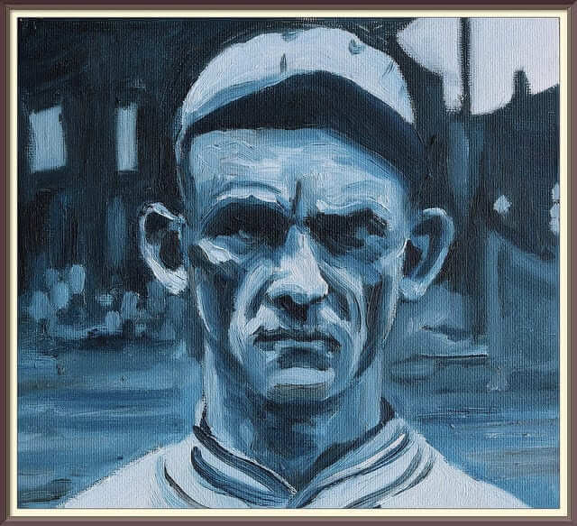
3) Chick Gandil
Oil on canvas

A more detailed portrait. Chick Gandil’s appearance interested me, even before I knew his story as the ringleader of the 1919 Black Sox scandal. His face is one on which his life seem to have been carved out, giving his features an intensity which was great to paint.
4) Lou Gehrig
Oil on canvas

The tragedy of Lou Gehrig and the way in which he dealt with his own decline is an incredibly inspirational story. It is a moment bigger than the game of which it is from, showing how all of life’s many experiences play out within it. Well mannered and dignified in his appearance, this moment from his ‘luckiest man’ speech is the perfect moment to capture the humility of the man.
5) Willie Mays
The Catch
Oil on canvas

Possibly one of the most talked about moments in baseball. Here I wanted to create a sense of the anticipation of the ball dropping from above the canvas. Despite knowing the outcome (he caught it) I wanted to recreate the uncertainty of that almost impossible catch and whether Mays would make it, or not.
Time lapse of #williemays #thecatch @SFGiants @SFGiantsFans @PhilHecken @OTBaseballPhoto @sigg20 @ToddRadom @JDaniel2033 @TheSkimmers @BeautyOfAGame @okrent @sabr @GeorgeWill #SanFranciscogiants #baseball https://t.co/4ZVpLL2zR8 pic.twitter.com/3ZoV71adSV
— Andy Brown (@andybisanartist) January 21, 2018
6) Jackie Robinson
Oil on canvas

One of the (if not the) most significant player in baseball history, Jackie Robinson was a must to make a painting of. A lot of decisions have to be made however with such a great story and man. Here I wanted to capture his number – forever associated with Robinson but also the way in which he is breaking out of the batter’s box. For me a perfect metaphor or symbol of the the lines and confines in which he and other African American players were held in for so long.
Time lapse of oil #JackieRobinson @nlbmprez @PhilHecken @ToddRadom @OTBaseballPhoto @jamie_heap @ClaytonTrutor @sigg20 @JDaniel2033 @okrent @GeorgeWill @BeautyOfAGame @DodgersNation @LADodgersHQ @TheDodgersFans @court_with_a_K @YasielPuig https://t.co/fkNc6ziBuk pic.twitter.com/a24CZqap2N
— Andy Brown (@andybisanartist) January 20, 2018
7) Ryosuke Kikuchi
Oil on canvas

Kikuchi plays for the Hiroshima Carp in the Central League of Nippon Professional Baseball (NPB). He is an incredibly exciting player to watch. An acrobatic second baseman, with a strong forward step, socks pulled up and a ripe swing of his bat which dissects the infield from the batter’s box.
8) Eri Yoshida
Oil on canvas

Yoshida fascinates as a baseball player. Originally from Yokohama, Japan she learnt how to be a knuckleball pitcher watching Tim Wakefield on television.. She was also the first female drafted by a Japanese men’s professional baseball team. A real character of the game, and one whose posture, mechanics and uniform I wanted to make a study of.
9) Justin Turner
Oil on canvas

Here I wanted to capture Justin Turner’s majestically smooth swing, placing another ball into orbit. A real figurehead for the Dodgers and an instantly recognisable character within their organisation he is very much a superstar of today’s game.
Ball Parks
Along with paintings of players of the game I travel the world documenting baseball stadiums. At this time I have painted over 50 pieces in many different countries. I have painted all but one of the stadiums used by the Korean Baseball Organisation (KBO) and Nippon Baseball Organisation (NPB), one in China, and a growing number in the US.
Of course the same game is being played, but the structures, backdrops and fans all vary a lot, which make for an interesting subject matter.
I would love to document more fields all over the world, and am always looking for new stadiums, leagues and countries to work in.
Here are two of my favourites that I painted last season.
Stadium: Yankee Stadium
Team: New York Yankees MLB
Medium: Acrylic on paper

This painting was completed on site, squatting on the very hot concrete in New York City last summer. I love the grandeur of the stadium and the imposing facades. Painting this was as ever a great experience, meeting the locals and watching the events of a Sunday in the Bronx go by. Unfortunately I lost the feeling in my big toe for 4 days after squatted on the sidewalk for so long, but seemed worth it for a fun day out.
Stadium: Fukuoka Yahuoku! Dome
Team: Soft Bank Hawks NPB
Medium: Acrylic on paper

Painted at the Dome on the first Saturday of the NPB last April. Ever present was the loud and vibrant atmosphere inside all Japanese ballparks. Balloons were being flown, horns being blown and the Hawks proceeded to win this game, and eventually the Japan Series last year.
All originals pieces, and prints available from www.andybrownstadiums.com
For more also see:
Twitter: @andybisanartist
Instagram: andybrownisanartist
Wow. Tremendous work Andy — really wonderful. Thanks so much for sharing. Andy will be traveling to many ballparks (here and abroad) as the season progresses, so I’ll be pleased to have him back with more new works during the baseball season! Thanks, Andy!
Readers? What say you?

.

Old Time Base Ball Photos
Readers will recall I featured Ronnie Bolton (who posts on Twitter as @OTBaseballPhoto and who you should definitely follow) earlier this year with some great football played on baseball field photos and writeups. As his twitter handle implies, Ronnie’s specialty is old baseball photos.
I mentioned in that article I’d have Ronnie back periodically, and he returns today. As Spring Training begins to wind down (less that two weeks till REAL baseball dontchaknow), we continue with some spring training pics from years past.
Enjoy. Here’s Ronnie:
Al Lang Field, St. Petersburg, Florida, March 28, 1957

Milwaukee Braves slugger Henry Aaron looks down at the New York Yankees catcher Yogi Berra during spring training action in front of a crowd of 3,997, who unknowingly at the time were previewing a match up of this upcoming season’s Fall Classic. And just like he would in seven months, 23-year-old right fielder would pound Yankees pitching (three hits including a triple) to lead his Braves squad to a comeback 6-4 win in ten innings.
And in that World Series against the Yankees, Aaron would lead all batters in hits (11) and batting average (.393) as the Braves won their first World Series since 1914.
[Also note Henry’s batting helmet — look at the “raised” M on there. Looks like it was applied with a caulk gun! — PH]
Al Lang Field, St. Petersburg, Florida, March 1, 1957

Musial is all levels of happiness as the Cardinals spring training for the 1957 season is underway as Stan is Man is where he should be.

It might be the first intra-squad game of the year for the St Louis Cardinals, but it don’t stop a legend like Stan Musial from giving all he’s got as if it’s the ninth inning of the seventh game of the World Series, in this March 5, 1955, intersquad game.
And Stan the Man’s team, the “Musials” battled the “Schoendiensts” to a 1-1 tie in 11 innings. The winter rust was very visible as both teams combined for just 12 hits and a .149 batting average with Musial going one for two and his archenemy for the day, Red Schoendienst, going hitless.

[Note the jerseys being worn by the Cardinals in the large photo — those are the 1956 one year wonders without the iconic bird-on-bat logo (which the team had worn since 1922). They proved so unpopular, the team switched back to a slightly different iteration of the b-o-b the next season. However, they got one last wearing during the 1957 spring training, a common practice at the time — PH]
Thanks, Ronnie. He’ll be back periodically with more wonderful old photos and the backstories that go with them.
.
Time Is Running Out…

…to pick up your Uni Watch mini-helmet!
If you haven’t already, you can still pick up a Uni Watch mini helmet (and for a couple bucks for shipping, you can have Paul and I sign it and send it back to you). If you’d like either or both of us to custom sign for you, just contact Paul (uniwatching@gmail.com) or Phil (Phil.Hecken@gmail.com) and we’ll give you the details.
Once the helmets are all sold, they won’t be available again, and stock is running low. Don’t miss out on this one and one collectors item! And they’ve reduced prices too!
To order yours from Rocker T. Collectibles, just click here.
.
The Ticker
By Anthony Emerson

Baseball News: This is so cool: the local baseball team in Marion, Ohio was “on more than one occasion” the recipient of Chicago Cubs hand-me-downs. The Cubs wore this design from 1943 to 1956, (many thanks to friend of the program Bill Henderson for sending this our way). … The West Virginia Black Bears of the New York-Penn League will be the West Virginia Moonshiners for three days in the middle of July (from Dan McBride). … Check out Daniel Mengden beautiful socks and Rollie Fingers moustache! (from Adam Thacker). … Cincinnati baseball wore some absolutely gorgeous throwbacks yesterday (from Everett Adler). … The Longhorns added two on-field memorials to the late Augie Garrido, one in center field and one on the pitcher’s mound (from Griffin Smith). … So…how did a Mets cap end up in the Orioles dugout during their Spring Training game? Also note that Buck Showalter is wearing the regular season cap and not the Spring Training cap but as we’ve discussed previously, Showalter’s done this in the past, most notably with the Rangers (from Niko Goutakolis). … The Phillies’ Odurbel Herrera went to bat yesterday in a helmet sans logo (from @seanygrizzle). … Jared Law‘s two designs for the Class-A Columbia Fireflies’ “Soda City Night” jerseys are down to a fan vote. … The Nats are in the process of removing club-level seats, and people looking for souvenirs are eagerly grabbing them up (from JohnMark Fisher). … Also posted in the college basketball section: @BSmile posted some great pics of Jackie Robinson as a UCLA basketball player (look at those shorts!) and Bob Gibson as a Creighton basketball player. … The Lansing Lugnuts are having a Vladimir Guerrero-inspired Father’s Day giveaway, giving away 1,000 Vladimir Guerrero Jr. jerseys to the first 1,000 fans on Father’s Day (from Ryan LeFevre). … Edward Grisham designed some tequila sunrise-inspired jerseys for his local high schools. … Freeport, Il., a small town in the northwest of the state, has a miniature Wrigley Field that people can rent out for whiffle ball games (from Mike Chamernik). … Notice anything wrong with this Nationals sign? To be fair, Washington State has a much more attractive shape than Washington, D.C. (from William F. Yurasko). … It’s hard to tell, but Goose Creek High School in Charleston, SC, has a small tribute to the nine victims of Charleston church massacre on the back of their caps. Goose Creek’s basketball team also honors the victims with a similar memorial on their shorts (from @willchitty4).

NFL News: Recently retired Browns lineman Joe Thomas was on Andrew Hawkins’ podcast, and discussed the Browns’ current uni set at 49:23 in this link. If you don’t want to listen, Thomas basically says he’s neutral on the overall design, but loved having “Cleveland” on the chest. Hawkins dislikes the current set and wants the Browns to return to the classic design (from JohnMark Fisher). … Twitter user The Tao of Steve B. created an awesome fauxback helmet design for the Jags, imagining what the team would look like if they entered in the 1976 expansion instead of 1995 (from Josh Butler). … Gene Sanny writes in with somewhat of a mystery involving this Broncos pennant he found on eBay. Gene says that the pennant “has the AFL logo on it, so we know it’s the 60’s, the striping pattern leads you to think 1967, BUT, it could have been done to leave space so the blue and white didn’t touch in the printing process, like around the facemask, so that’s not conclusive. But, we might be looking at a prototype maybe? I hadn’t seen this block, drop shadowed D version before anyway. Hmmm.” Hmmm indeed, Gene. Anyone in the comments know? … In a related piece, Gene sends along this video on the designer of the Broncos’ “D” logo. … So here’s a seemingly odd picture of Stone Cold Steve Austin in a Parcells-era Patriots jersey with the uniform number 3:16. A Google search came across these two other pics of Austin taken on the same day. Why is Austin wearing 3:16? A subsequent Google searched revealed that in the 1990s he had a rivalry with born-again Christian Jake “The Snake” Roberts. Austin taunted Roberts’ religious beliefs, famously saying in a post-match interview “Talk about your Psalms, talk about John 3:16… Austin 3:16 says I just whipped your ass!” Austin 3:16 subsequently became a hugely popular catchphrase in ’90s WWF. Why he’s wearing a Pats jersey is anyone’s guess, considering he’s a Texan. Maybe this event was in Boston? (from Mike Tucker).

Hockey News: Avs goalie Spencer Martin debuted some of the best team-related pads I’ve ever seen last evening (from Brad Darby). … Patrik Laine of the Jets uses a new stick for every power play because “You only get so much flex on those seam passes.” (from Mike Chamernik). … The Indy Fuel dyed their rink a rather sickly shade of green for St. Paddy’s Day (from Austin Chen). … Particularly garish color-on-color matchup between the San Diego Gulls in St. Paddy’s green and the Milwaukee Admirals in their road light blue (from Gregory Smith). … Here’s an interesting article from 2003 about the decline of wooden hockey sticks (from Ray Hund).

NBA News: Jeff Flynn was going through some old Pittsburgh-area hoops videos on YouTube, and noticed how the floor at the Pittsburgh Civic Arena had the same mismatched areas in 1968 with the ABA’s Pittsburgh Condors and in 1980 with Duquesne. Also note the bleached-out area where the ABA’s three-point line used to be in the second pic. Excellent spots.

College/High School Hoops News: A major tear of Cal State Fullerton’s Josh Pitts’ jersey caused him to switch from 24 to 41 early in the Titans’ game against Purdue (from Chris Howell). … It seems the Thundering Herd’s managers laid out the unis on a hotel hallway floor. Is this a usual practice for March Madness, considering teams may not have a lot of time in the locker room? (from @cDubya242). … Complex ranked all 68 teams in the tourney by jersey, though I’ll let you decide how seriously to take these rankings because they put Marshall dead last and includes the sentence “The NCAA should require every team to have a black alternate”. For shame, Complex (thanks, Phil). … During yesterday’s game against Texas, Nevada was very inconsistent with their Mountain West logos (from @TheReal_AD). … Texas Southern has Russell Athletic unis, but Nike shooting shirts (from Setu Shah). … Jeff Perilman thinks that there are more than enough patches on Michigan State’s jerseys, and I agree, especially considering they’re a Nike school, and therefore have less space on the chest because of the cut. … Movie critic Jeff D. Lowe has been making these awesome March Madness viewing guides for himself, and Darren Rovell shared them on Twitter yesterday. Honestly, if he sold them for like a dollar a pop, he’d probably make a killing (from @MikeLFBCB). … B.J. Millican noticed strong similarities between UMBC’s unis and the unis from the fictional basketball team from Teen Wolf. … @GabeNotDave noted that all teams with script wordmarks on their jerseys have won their games. … Crossposted from the baseball section: @BSmile posted a great pic of Jackie Robinson as a UCLA basketball player (look at those shorts!) and Bob Gibson as a Creighton basketball player. … Well here’s something you don’t see every day: high school basketball player Deontay Long of Milwaukee’s Washington High School appeared to be wearing an electronic monitoring bracelet around his ankle, barely obscured by his sock, during the Wisconsin basketball semifinals. Long plead guilty to armed robbery in January (from @ChipGil12).

Soccer News: Panama’s 2018 World Cup home kit has been leaked. … France’s entire World Cup line has been formally launched. Could that warm-up shirt be any more stereotypically French? Might as well send them out there with a baguette, beret and an old Camus book. … Yeovil Town FC of the English League Two (which is actually the fourth tier of English soccer…it’s a long story) are having a fan vote for their next home kit. One of the options is much, much better than the other two (from Richard Hindle). … Love, love, love this new Minneapolis City keeper kit. At first glance I thought it was camo on the sleeves, but look closely — it’s a murder of crows! And that crest is much better than the one they normally use (from Matthew Bick). … The Tampa Bay Rowdies of the the USL launched their new third kits yesterday (from Kody Allenson).

Grab Bag: The sports governing bodies of Western Australia have expanded their uniform guidelines to allow the inclusion of hijab-observant girls in school sports. … One newspaper columnist thinks its time for the bowling shoe to get a makeover. I, for one, love the unfashionable bowling shoe. Some of them are so bad they loop back around to being cool. … Ray Hund found an old Jay Mariotti column from a 2003 issue of the Chicago Sun-Times on throwback jerseys. … Japanese police are adding women’s sizes to their riot uniforms.
.
Big birthday wishes go out to reader/contributor/friend/fellow curler R. Scott Rogers, whose special day is today. Happy Birthday, Scotty!
.
Why would anyone want Phil to sign their helmet? #FirePhil
Not cool, man. Not cool.
Ah, the damages when Pittsburgh left the ABA, and the Civic Arena had to scrub out the “two-point” areas. Nassau Coliseum sported a similar look when the Nets entered the NBA, and the three-point field goal was not yet adopted.
Sure, give [rental] bowling shoes a makeover, and watch ’em fly off the shelves, as satisfied customers walk off with the winning design!
A three-point line would have gone back to when the Igloo opened in 1961, since the ABL had a three-point basket. The original floor was finally replaced in 1986.
They would’ve had to use more bleach than that to fix the floor from the ABL days- they used an 18 foot wide lane as well, NBA & NCAA at the time were 12.
That article ranking the NCAA basketball unis was atrocious.
The Mets hat in the Orioles dugout could possibly belong to the bat boy, who would have had to swap it out for a helmet during the game. In spring training the home team generally provides bat boys for both teams.
Great work as always, Andy?
By the way, what happened to your painting of ski jumper Kamil Stoch? Didn’t see it on your website.
Oops. That was supposed to be “Great work as always, Andy!”
Excellent explanation for the non-wrestling fans about Steve Austin’s 3:16 jersey and the story behind it. Those Patriots jerseys were brutal (not that the current ones are any better)
Goose Creek High School is not in Charleston; it’s in Goose Creek, a suburb of Charleston. The second linked article explains the connection between the school and one of the victims of the Mother Emanuel shooting.
Wonderful old time baseball photos. A golden era of color and fit. Love the way the Cardinals and Hank Aaron have their stirrups and pants at just the right height. Very “uniform”.
What number is Hank wearing in that photo? Doesn’t look like it could be his usual #44.
I noticed Hank’s number as well. I know he wore 5 for a short time, but that isn’t a five. Looks like 2 or 12, perhaps since it was spring training.
I recently re-heard a story about Aaron as a rookie. originally a second-baseman, Hank replaced a veteran Wally Pipp style, when rightfielder Bobby Thompson broke his ankle.
Minneapolis City went through a redesign of their badge. So, their old one isn’t “one they normally use,” it’s their old one.
“Here I wanted to capture Justin Turner’s majestically smooth swing, placing another ball into orbit. A real figurehead for the Dodgers and an instantly recognisable character within their organisation he is very much a superstar of today’s game.” Majestically smooth swing…very much a superstar…Justin Turner?? Isn’t that description laying it on a little thick?
Mets fans don’t exactly fondly remember that, yes. But if you watched the playoffs last year, I think you’d agree Andy may only be engaging in slight hyperbole.
That Bronco pennant looks like it’s just plain wrong, perhaps the designer was going off a blurry photo. Three things never seen on legit versions of the 60s-90s logo:
1. drop shadow
2. angular D
3. horse has a dumb cowlick
Re: Marshall unis laid out in the hotel…fairly common practice during road trips for players to either pick up their loops after pre-game meal in the hotel or have them distributed by a student manager an hour or two before the bus leaves. Then the players just wear their uniform underneath their sweats on the ride to the gym.
Very interesting. What is a “loop” though?
Laundry loop. It’s a sort of band that players will string all their dirty laundry on and it will be run through the wash together, that way equipment guys can pass back laundry to the right person more efficiently.
A laundry loop. You tie up your dirty laundry in it to keep your items together.
Hi Pedro, a loop is a thin strap that the players string their undershirts, jerseys, and shorts on. it has a buckle on each end so once all the items are threaded on, it is closed to keep each players gear separate in the laundry. Some come with a little zippered mesh pouch attached for socks and ankle braces. Would be shocked if the bundles below each jersey in the Marshall pic arent looped in some way or another.
Game unis are usually washed with different temps and drying times, so they weren’t ever looped at the schools I’ve been at.
What number was Hank Aaron wearing in that photo?
Really like the Ichiro painting and the Musial photo, amazing clarity for a 61 year old photo. Good stuff, thanks.
Freeport IL, also home to the Freeport High School Pretzels
That Stone Cold Patriots jersey was from a 1998 ceremony in front of Tsongas Arena in Lowell, Mass. The arena had only been open a few months, and I think this was before the first then-WWF event, so they “honored” Austin by temporarily renaming a street sign in his honor.
link
The tall building in the background behind his shoulder is an apartment building in which I lived for 11 years.
Andy’s work is absolutely breathtaking. This resonates with me in a deep way. Somehow it captures a feeling/atmosphere of the event or stadium better than a photograph or video ever could.
Andy, keep up the beautiful work. I’ll check out your site and hope you are featured more here. Your art resonates.
Dave, Thank you so much for your kind words here. It’s great to hear what others see in what I do. Keep in touch – twitter: @andybisanartist
Cheers, Andy
Anyone else liked the somewhat old-school look of UMBC? I particularly liked the shorts.
For all of those outside of the USA, you are S.O.L. if you want the Uni Watch mini-helmets shipped to your country.
“We ship anywhere in the continental United States. Sorry, we do not ship anywhere else at this time.”
If you really want one, let me know. I’ll get it and ship it to you (you’ll need to cover all the shipping and purchase costs, but I’ll make sure you get one).
The Tampa Bay Rowdies of the the USL launched…..
France has worn a mariniére jersey in the recent past.
link…2835.11115.0.11948.26.14.0.12.1.0.207.1652.1j10j1.12.0….0…1ac.1.64.img..2.12.1561…0j0i30k1j0i8i30k1.0.vnvAoq-mO54#
Darn google URLs….
link
Any idea when the Dodgers starting wearing green caps for St Patrick’s Day. I would have guessed before 1978. I remember the Dodgers doing this in Vero Beach, and really related it to the owner’s Irish heritage, Walter O’Malley. He died in 1979, but of course his son Peter owned the team after his passing.
I have a question. If newer jerseys are loudly advertised by the manufacturers as having lighter materials, being more performance oriented, blah blah, how is that compromised by loading them up with patches, stickers, decals, etc., including those of said manufacturer? Isn’t that a disservice to the athlete looking for that “extra edge”? Maybe that’s why MSU lost this weekend.