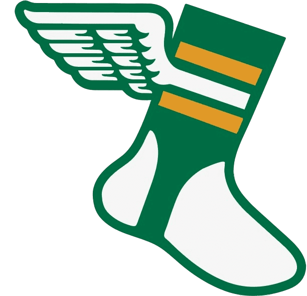
For years now I’ve wanted to have a Uni Watch baseball cap that we can offer for you folks to purchase, but I didn’t know what to use as a logo. I knew I didn’t want to use “UW,” because those initials are so strongly associated with the Universities of Washington and Wisconsin, and I was reluctant to use our old magnifying glass standby, which felt a bit too much like an easy fall-back option. At one point I was going to hold a design contest to create a cap logo, but I never got around to it.
Then last year Bryan Molloy came up with the winged stirrup design that first appeared on the 2017 Purp Walk shirt and was then reprised a few months later on a shirt in standard Uni Watch colors. That logo, which was based on the New York Athletic Club logo, was a big hit with readers, and I really liked it too. So late last year I told Bryan that I wanted to use the winged stirrup as a cap logo. He readily agreed.
The version of the logo that appeared on the shirts had a lot of stippling and shading that wouldn’t translate well to fabric embroidery, so Bryan has simplified it slightly to create the version that you see above. I’m envisioning it on a green cap (duh), but there are lots of details that still need to be finalized, and I’d like your input on that. For example:
1. The logo will need to have an outline. Should the outline be white, gold, or both? (Click to enlarge.)

[totalpoll id=”94619″]
———
2. Should the squatchee be green or gold?
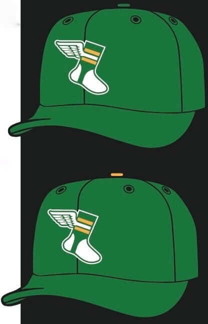
[totalpoll id=”94622″]
———
3. If the squatchee is gold, should the brim also be gold, or should the brim stay green?
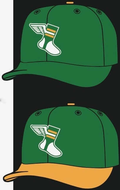
[totalpoll id=”94625″]
———
4. What format should the cap be?
[totalpoll id=”94628″]
———
5. Should the Uni Watch script (another one of Bryan’s designs) appear on the back of the cap?
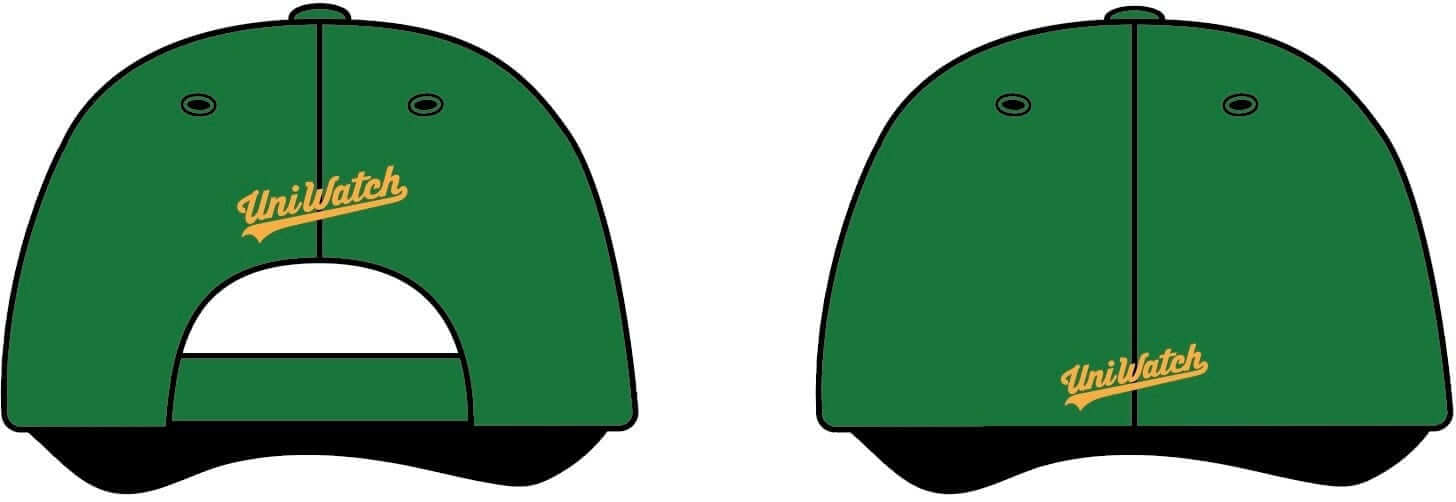
[totalpoll id=”94632″]
———
6 What profile should the crown be?
[totalpoll id=”94650″]
I don’t yet know where I’m going to get the caps manufactured (I have a few ideas, but if anyone has tips, I’m all ears), so I can’t guarantee that I’ll act according to the results of the voting in every case, but I’ll try. Obviously, I’ll also do my best to ensure that the cap doesn’t have a visible maker’s mark. And I’m partial to grey underbrims, so I’m going to try to go that route as well.
I’ve never made or sold a cap before, so I’m not sure how long it’s going to take to get everything set up. Also not sure how much it will cost, whether we’ll need to take pre-orders, and so on. But I’ll get it sorted out soon-ish. Your input on the squatchee, the brim, and all the rest will be very helpful.
If all goes well, we might even be able to offer an alternate cap at some point. But hey, one thing at a time.
I’m excited about this project. Thanks for your feedback.
(Big thanks to Bryan Molloy for coming up with the winged stirrup, and for working with me to create the cap mock-ups.)

Raffle reminder: In case you missed it yesterday, I’m currently raffling off a T-shirt and a pair of retro shorts from the good folks at 19Nine.
To enter, send an email to the raffle address by this Friday, 7pm Eastern. One entry per person. I’ll announce the winner on Monday. Good luck!
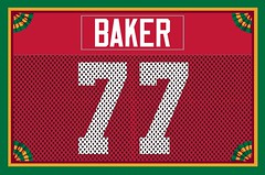
Membership update: Four new designs have been added to the membership card gallery (including Brett Baker’s card, shown at right, which is based on Nebraska’s early-’80s mesh jerseys). The printed/laminated versions of these cards should mail out by the end of the week.
We’ve gotten a rush of membership orders over the past week, so I should have more designs to show you in the next day or two.
Remember, a Uni Watch membership card entitles you to a 15% discount on any of the merchandise in our Teespring shop. (If you’re an existing member and would like to have the discount code, email me.) As always, you can sign up for your own custom-designed card here, you can see all the cards we’ve designed so far here, and you can see how we produce the cards here.
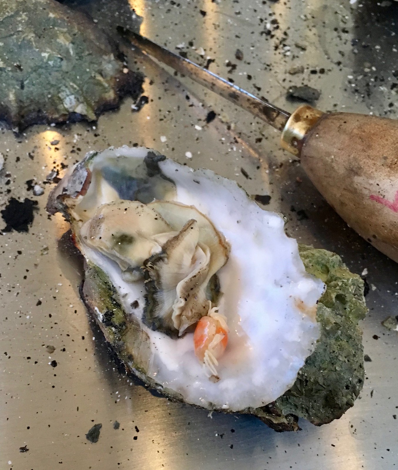
Click to enlarge
A little crabby: You may recall that last November I attended an oyster roast in Virginia, where I had my first encounter with pea crabs — tiny (and delicious) crabs that live inside the oysters. I was completely fascinated by them — so fascinated by them that I’ve now written an article about them for the food website Taste. It was really fun to work on (among other things, I went to the Grand Central Oyster Bar at 8am to interview their chef before the rest of the staff showed up for work), and I’m pretty happy with how it’s turned out. I hope you’ll check it out here. Thanks.
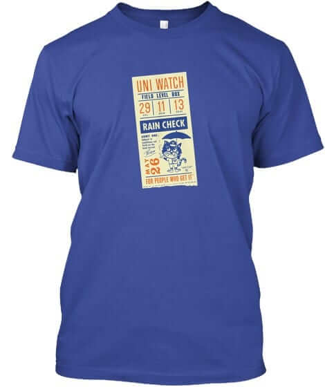
Going, going…: Today is the next-to-last day to get our latest limited-edition Uni Watch T-shirt, designed by the great Todd Radom. It comes in a wide range of colors (including deep royal, as shown at right; click to enlarge) and is available from now through this Thursday, March 15. You can order it here. If you want a color or style that isn’t shown, get in touch and I can take care of you. My thanks, as always, for your consideration.
The Ticker
By Alex Hider

Baseball News: The Marlins took to Instagram yesterday to ask fans if the wordmark on the team’s home jerseys should read “Miami” or “Marlins.” Currently, only the team’s orange jerseys have a “Marlins” wordmark (from Louis M. and Alejandro Areces). … Alejandro also put together his own Marlins redesign concept. Check it out here. … Yankees P David Robertson was wearing a standard cap yesterday, not the team’s spring training cap (from Patrick Lavery). … The Nationals wore their regular home whites, instead of their spring training uniforms, for last night’s game against the Mets (from Kenny Kaplan). … Phillies INF Mitch Walding’s helmet logo was badly askew during yesterday’s game (from Terrence Kuhns). … Did anyone else know that the Pirates had a facial hair ban for minor leaguers? Once prospects make the majors, they can sport a beard (from Jerry Wolper). … We missed this yesterday — the Astros made a logo for their White House visit yesterday (from Ignacio). … MLB is hosting a food festival in New York’s Bryant Park in April, where each team will offer an item sold at its ballpark (from Jason Lefkowitz). … The Lansing Lugnuts will give away Michigan State-green jerseys on May 3. The jerseys will bear No. 3 in honor of former Spartans punter Mike Sadler, who died in a car crash last year (from our own Kris Gross). … Furman debuted new purple pullover jerseys last night.

NFL News: Free agent QB Sam Bradford signed with the Cardinals yesterday. As one Redditor pointed out, this is Bradford’s fourth NFL team (the others were the Rams, Eagles and Vikings), but the first which wears its primary logo on its helmet (from Justin C. Cliburn and Ryan Bower). … 49ers FS Jimmie Ward has agreed to hand over No. 25 to his new teammate, CB Richard Sherman (from Brinke). … If you’ve never noticed this before, this might ruin your day: The outlining on the Dolphins NOB and numbers doesn’t match. Though as Paul points out, if both matched, the NOB lettering may be a bit too clunky (from Eric Wright). … Free agent WR Allen Robinson wore a Chicago Bulls jersey to celebrate signing with the Bears (from Mike Chamernik).

Hockey News: The Wild wore St. Paddy’s Day warmups yesterday (from Mike Chamernik and Kyle Minogue). … The Predators also warmed up in St. Paddy’s unis, and in what is now a yearly tradition, changed their social media avatars into a le-Pred-chauns. … Jay Rupert was at the Capitals game the other night and noticed that the aisle seats at Capital One Arena have old Caps and Wizards logos on them. … The Ontario Reign of the AHL will wear St. Patrick’s Day unis designed by Violent Gentlemen, a hockey-based fashion company based in LA (from Charles Eldridge). … ICYMI: Here are game shots of the ECHL’s Cincinnati Cyclones and Indy Fuel in SpongeBob unis (from Ryan Bower). … Pro bowler Patrick Girard wore a Montreal Canadiens-themed shirt at the PBA Barbasol Championship on Feb. 25. Girard is from Quebec (from Steven Luft). Hip-hop artist Craig Mack, who passed away a couple days ago, was apparently a hockey fan. The cover photo of his debut album, Project: Funk da World, featured him wearing a Charlestown Chiefs jersey, and the video for his “Flava in Your Ear” single shows him wearing a Lightning jersey (from Landon Fried).

NBA News: The Pacers’ arena will have a new name next year. … As of yesterday, former NBAer Brian Scalabrine’s Wikipedia page said the Celtics, Nets and Bulls had all retired his number (from Joey Robertson). … Interesting coincidence: NBB, Brazil’s pro basketball league, is using Jordan Brand uniforms with a black and white color scheme for its All-Star Game, just like the NBA did last month. … With the NBA moving toward standardized logos for the All-Star Game, the draft, the Finals, and so on, SportsLogos.net asked a bunch of designers what they think about that. … Cross-listed from the NFL section: NFL free agent WR Allen Robinson wore a Bulls jersey to celebrate signing with the Chicago Bears (from Mike Chamernik).

College and High School Hoops News: The jersey worn by Radford’s Christian Lutete during last night’s play-in game had clearly been used before (from Leland). … Both SB Nation and Yahoo gave bracket advice for the NCAA Tournament based on team’s uniforms (from Phil and Cole Pessolano). … Meanwhile, here’s a ranking of the scariest mascots in this year’s tourney (from Andrew Hoenig. … Here’s a good look at the NCAA Tournament through the years — a snapshot from each year the tournament has been held (from James Gilbert). … Color-on-color game in the Pennsylvania high school tournament game between Greater Johnstown and Sharon. The refs weren’t amused, however — Johnstown (blue) was slated to wear white, and was issued a technical foul for bringing the wrong color (from Jerry Wolper, @CantankerousRex and @dougkeklak).

Soccer News: New kits for the Tulsa Roughnecks of the USL (from Joe). … The Tampa Bay Rowdies of the USL will unveil new kits on March 19 (from Kody Allenson). … Grand Rapids FC of the National Premier Soccer League unveiled new jerseys yesterday (from Ryan). … With Iceland’s new kit set to launch tomorrow, here’s a look at the history of their uniforms through the years. … Reggaeton singer J Balvin was performing at the Houston Livestock Show and Rodeo last night and was presented with a Houston Dynamo jersey. Note that the NOB includes a period after the “J,” even though his official stage name does not include the period.

Grab Bag: Customs and Border Patrol in Texas is warning people against counterfeit sports merch (from Ignacio). … Gold medal curler Matt Hamilton is getting his own bobblehead— reportedly the first curling bobble ever produced (from R. Scott Rogers). … Delta Airlines employees will be getting new uniforms. Delta follows in the footsteps of Alaska Airlines, who announced uniform changes earlier this year (from Markus Kamp). … The Ohio Machine of Major League Lacrosse unveiled new home and road uniforms yesterday (from John Flory and Dan Siegel). … George Washington’s women’s lacrosse goalie has the DC skyline on her helmet (from Matt Eliot). … Purdue’s marching band was sporting jackets with a ’90s logo over the weekend in Ireland (from Marc Burgess). … New Mexico’s new red and green chile license plates were named the best in the country by the Automobile License Plate Collectors Association (from John Muir). … Cross-listed from the hockey section: Pro bowler Patrick Girard wore a Montreal Canadiens-themed shirt at the PBA Barbasol Championship on Feb. 25. Girard is from Quebec (from Steven Luft).
Will Goodyear be getting a cut of the hat money?
As has been explained multiple times, the logo was actually inspired by the old NY Athletic Club logo, not by GoodYear. In any case, the notion of a winged foot dates back to Greek mythology.
Will Greeks be getting a cut of the hat money?
Honestly, with their economy the way it is, every little bit helps.
(NOT LEGAL ADVICE!!!)
You make a good point Paul that a winged foot dates back to Greek mythology. As a result, a lot of companies use it, and therefore Goodyear (or any company) cannot claim any winged foot as a trademark without adding something more. For Goodyear’s part, its not just a winged foot, but the winged foot with the words “Goodyear.” So, I think you’re good (again, disclaimer, NOT LEGAL ADVICE!)
Cap is a great idea. I know there was talk of a bowling shirt a little while ago, could that idea be revisited?
Thanks for the reminder, Gregg. Maybe this summer. But I’d want it to be chain-stitched, which likely would be v-e-ry pricey.
Pea crab link is missing
Gah! Now inserted.
Remove the stirrup, recolor it, and it would be a perfect secondary logo for the White Sox
If they actually wore white socks it would be perfect…
If the Southsiders insist on not wearing what they’re named after, it’s time for a rebranding, and therefore a new Uni Watch contest.
Yes, they had something similar decades ago. It should be modernized and brought back.
link
Typo in Hockey News – “The coer photo…”
Got it.
Paul,
There are numerous custom cap embroidery companies out there and most will allow you do order a mix of styles of caps. I made a dozen custom caps about 10 years ago and was able to do a mix of styles and colors. If you do pre-orders you can let people choose snapback, fitted, flex fit, etc… I for one, have a problem with flex fit caps as they are usually either too loose or too tight and not deep enough. Doing it the individual choice way, like you do with the t-shirts would be best. I definitely want one of these, but not a flex fit,
Same
agree on the loose/tight with approximate fitted caps. Fitted also is super annoying for ponytail hairstyles.
The Marlins redesign is nice, i’m just personally over the black jerseys, in all sports. Especially if black is not part of their color scheme. Also the hat is a great idea and the voting so far is spot on except for the fitted hat part, old school snapback or strapback all the way.
I would kill for the “swinging marlin” hat in the Marlin’s re-design link. Love itttt.
I’m a fan of the all-green hat with as little gold as possible. And no Uni Watch logo on the back. Those things are clutter and besides, it would be more fun if people went up to you and asked what team the hat was from.
Paul, LOVE this hat. Re: hat style. Can’t speak for everyone, but I find that ’47 brand’s franchise hat is really the only fit that works for me. Not sure what the demographics or preference of your reader base is, but I tend to find that there are people who wear high/stiff crown with a flat brim, and a the people who wear the relaxed/broken in crown with the bent brim. Perhaps you should add that as an option to vote on?
Good point. Will do.
5950 Low Crown perhaps? Doesn’t Lids or New Era make custom caps?
Seconded for the 5950 low crown.
5950 low profile still looks like a high crown to me. All the New Era brand hats look a little stiff in my opinion.
To compare prices/styles, check out Richardson caps as another source.
I think it’d look great on an Ebbets Field Flannels-style wool cap, especially given the pseudo-historic NYAC inspiration.
Rob nailed it. This design screams for Ebbets Field Flannels. It will cost more I’m sure, but it will be worth every penny.
Agreeing with Rob as well. EFF would do a beautiful job with this
39thirty, I think is a happy medium.
I’ve never been able to find a ’47 Brand hat that’s actually large enough to fit my size 8 head. 5950 Low Crown’s are really the only ones that fit correctly. 39thirtys are always too tight.
The only hats that I have that I wear regularly are ’47 Brand’s Franchise, too. I bought a similar-looking style (fitted, low crown) by Nike online and have since regretted it, because (a) the band is elastic… I mean it’s not like I’m going to sit on the couch & binge Netflix and eat Doritos all day wearing it, and (b) at the peak of the cap, it almost seems to come to a point, at least relative to the Franchise or anything else I’ve ever owned… almost as if I’m a secret emergent Conehead.
Also, I vote that, in honor of the reemergence of Lane Kiffin & Jon Gruden, there be a UW visor.
Visor: Yes, thinking about that. But let’s get the cap done first.
That Marlins rebrand is far superior to what they currently have. Nice jerseys & hats.
Ugh. It’s already disheartening that more people are voting to cram as many colors as possible on the cap.
Agreed. Double-stroke on a logo? Looks like an image that would run as the lede on the weekend.
Yeah, please. One color outline on the logo. (I won’t say which one I voted for)
-Jet
“Jay Rupert was at the Capitals game last night”
Uh… you mean Monday night, yes? (They didn’t play last night.)
Got it.
Personally, I might prefer a non-green cap. The logo gets a bit lost despite the outline to *me*.
Was burgundy tested?
No, burgundy was not considered. I realize not everyone likes green as much as I do, but that aspect of the cap is non-negotiable — sorry! We may do other colors in the future.
“…non-negotiable — sorry!”
Understood.
Not a gripe, just a preference.
As much as I’d be OK with a Uni Watch wordmark on the back it would be fun to have people ask about the cap and be able to tell them about where it’s from.
On the Ticker, Radford is mentioned wearing red last night. They actually wore white (actually the UConn design). LIU Brooklyn was in black.
Link to highlights:
link
Flexfit would be a good sizing option; they always fit well on me. They have a pretty wide product line too: link
Flexfit is a good sizing option for some people. Not for others. If it were a universally well-fitting cap format, all caps would already be flexfit.
The only thing that will stop me from buying one, no matter which design details wind up being chosen, is if it’s fitted with S-M-L sizing. Caps sized that way never fit me.
FlexFit gives me a headache.
FlexFit is a better option that actual fitted in my opinion and I’m a hat junkie…own over 100, including one of every MLB team (and some throwbacks).
I want to change my vote on the rear wordmark..as much as it helps Paul advertise…I kind of dig the aura of mystery…
Me, too.
I got one as a gift and ended up making cuts with scissors in the headband at various points to alleviate pressure. It worked for me.
-C.
I’ve done the same…with mixed results.
It’s not white and gold; it looks black and blue to me
Well played.
I’ll give you</i? black and blue, smart alec!
;)
… ugh, and I screwed up the tag, ruining that comment altogether.
*sigh*
Dang, between New Mexico’s flag and their license plate options (I’m also a huge fan of their standard yellow and teal Centennial versions) I’m about to pack up and move there. Amazing design game.
Just noticed that 3 of what I consider to be the top 5 state flags are out there in the four corners states, Colorado, New Mexico, and Arizona.
I know there has been some good state flag talk on uniwatch before. Maybe when the new site goes online we can get a feature on state flags, or a good paywall message board thread going.
Steph Curry turned 30 last night, and it appears someone made a logo just for the party.
The linked tweet appears to have been deleted.
Thanks, Rob. Now removed from Ticker.
For the hats, I’ve had some custom embroidered caps made from the Richardson company in the past. They do good work and offer all styles of hat (snapbacks, fitted, and a great flex fit version that looks just like a true fitted). They do have a small makers mark though. And as I recall they were not expensive (we had a small amount made and they cost us like $20/person, we weren’t really selling to make any profit we just wanted hats for our soccer supporters group so we sold them pretty much at cost)
Really glad to see the Marlins dipping their toes into the rebrand waters. Possibly putting “Marlins” on the home uni and shifting away from the Miami-heavy image they’ve been pushing since the ballpark opened is a step in the right direction. Changing the name to “Miami” was contractually part of the ballpark agreement (basically all the city/county got for what will likely end up costing them a couple billion dollars) so going back to “Florida” is probably a non-starter, but anything they can do to focus on the “Marlins” brand and bringing back the old colors would help bring people back from the northern parts of the metro region. They geographically isolated themselves from the majority of the metro population with the move to Little Havana and the rebrand didn’t help at all (If I recall correctly at the new brand unveiling in late 2011 Loria went so far as to toss a Florida Marlins cap into the crowd as if it was garbage and say he wants people to “forget about the Florida Marlins”). Jeter and Co. may not be so popular on the player-personel front right now but from a branding and listening to fans perspective they are doing well in my opinion.
Forget Loria…I’ll never forget the Florida Marlins.
Hard to forget two-time World Series winners. Maybe Loria tried to distance himself from that identity because he knew he had no intention of trying to get the team back to that level?
Proofreading: in the hockey section, the “Orlando Reign” should be the “Ontario Reign.”
As an aside, I almost always skip over whenever you discuss food/cooking (I’m the world’s pickiest eater and don’t eat meat or a lot of other things), but I read your pea crab article today. Super interesting. Thanks for sharing.
Thanks, and double-thanks!
For cap manufacturers my vote would be either Richardson or American Needle.
The Royals have had a facial hair ban for their Minor League Affiliates for some time. The players in the Minors must also wear their socks up (as they should be) or stirrups. Lastly they need to show up to the park in a collared shirt. Only time you see facial hair is when a big leaguer is rehabbing.
I think a lot of teams have facial hair bans for their minor leaguers. Jason Motte had to shave his beard last year when he pitched in the minors for the Braves.
Dad hat version please
Love the cap idea. I’m in for one.
Likely even a second one if we can get a BFBS option.
The UniCap looks great! Wonderful idea and looking forward to ordering one.
If you’re going to do the cap, do it right! Go with Ebbets Field Flannels in Seattle. Those guys make terrific throwback minor league caps, and I’m sure they could create a great Uni-watch cap. Ideal Cap Company in Cooperstown also does some excellent work. Both EFF and Ideal are a little pricey, but they’re well worth the investment.
Came here to say the same.
EFF hats are the only ones I’ll ever wear, and they work with 3rd parties all the time.
Hip-hop artist Craig Mack, who passed away a couple days ago, was apparently a hockey fan
I’d say that pro hockey has the most fashionable and most practical retail jerseys of all the major sports.
One thing I couldn’t help notice on his Chiefs jersey is that the sleeve stripes are wrong. The Chiefs had two stripes of equal width on the sleeve, gold over blue (or gold over white on the blue jersey), which was identical to the NAHL-era Johnstown Jets on which the Chiefs were based (right down to the similar wordmark on the front). The Jets, in turn, were using the base jersey design of the Minnesota Fighting Saints.
Fighting Saints kept the same template, but made the switch from blue to red uniforms in 1976-77. Curious move and don’t know the reason behind why they did that.
link
The 1976-77 team was actually the continuation of the Cleveland Crusaders, having relocated because they felt they couldn’t compete with the newly-arrived NHL Barons. Too bad they could only last 42 games competing against the North Stars.
It is still odd, though, that the new Saints went with red versions of the previous Saints’ unis rather than recycling the previous Saints jerseys (guessing they were no longer available?), or even recycling the 75-76 Crusaders jerseys (which would’ve made the new Saints purple instead).
Kevin Smith disproves this
I was literally just thinking yesterday about how cool a UniCap would be. Thanks, Paul!
LOVE THIS! TAKE MY MONEY!
Gold Bill + Squatchee, two-color outline, and the script at the back. Would be cool if it was a 59FIFTY, but happy with anything.
Another reason why I love this blog! Mark in Shiga wants all-green; Trevor wants gold bill and squatchee (my preference, as well). Different opinions, reasonably stated, and overwhelming support for the idea! Thanks to all who Get It!!
The fact that the Dolphins’ NOB outline does’t match their number outline really doesn’t ruin my day. While I generally prefer single-color NOBs, a single-color outline is fine by me, so long as it provides sufficient contrast to both the lettering and the background, which in this case the black provides between the aqua and the white.
Paul,
For all the voting options listed in regards to the new Uni Cap, there seems to be one glaring omission. Should the eyelets be green or gold?
(And will there be a Purple Amnesty version?)
I’m thinking the eyelets will be green. But I’ll give that a bit more thought.
Purple Walk version: Quite possibly! Stay tuned.
Fascinating article on pea crabs. I’ve never eaten one before but now feel like I need to.
Cap is a great idea. Looking forward to it.
Maybe this says more about me but the winged stirrup totally reminds me of the Goodyear logo. Ironically up until a couple of years ago I always thought the Goodyear logo was a birds head. Think Arizona Cardinals logo.
The winged stirrup is based on the NY Athletic Club logo. The NYAC logo and the GoodYear logo are both based on the Roman-Greek god Mercury, who had winged feet.
In short: This theme goes waaaaay back. Just putting our own unique Uni Watch spin on it.
Of course, of course. I wasn’t trying to be flippant. Was just my 2 cents and basically making fun of myself for spending 35 years of my life thinking it was a birds head.
Every single one of my hat votes was in the minority. ♂️
I want a Uni-Watch cap!
I love that hat design! I already own the raglan tee.
Bucket hat- for the golf course and those of us who like to protect the ears. Richardson has done a few custom for me.
Please don’t leave me out in the cold here. I have a rather large head and can’t wear the S, M, L, XL fitted hats only the numbered ones. Unless maybe you offer a XXXL one.
I’m a 7 7/8, borderline 8, myself, so I know how tough it is to find a good ball cap to fit my big head.
Same. I have to go fitted with 7 7/8 or 8 since nothing else fits my elongated skull.
This does look super cool.
Like an orange on a toothpick?
link
I cry myself to sleep at night on my huge pillow.
Brian Scalabrine’s Wikipedia page was still showing the retired numbers as of this morning, so I went ahead and logged in and reverted that edit – which dated back to last month, so somehow this went unnoticed for a few weeks.
I came to two possible conclusions as for the posting of the alleged retired numbers – A: simple vandalism; or B: the editor was genuinely confused by Brian’s Basketball-Reference.com page, and thought the icons showing his jersey numbers meant that they were actually retired by the respective teams. If the latter is the case, than I could only imagine that guy being confused coming across Stephen Curry’s page, and seeing two #30s up there even though he’s only played for one team, since the Warriors changed their colors after his rookie season.
Would love to have one but would never get one to fit properly. The equip mgr of the Reds once told me that Lee Smith, Johnny Bench and I had the biggest cap sizes he’d ever seen (7 and 5/8’s I believe.) I have one ’47 Brand Giants cap that fits perfectly (velcro strap) and one Reebok Niners cap (plastic strap) that fits perfectly.
That said, what do people think of having the year UW started on the back? Or “Since (year)”
This is frustrating– these voters don’t know what the hell they’re doing. Low crown/relaxed fit is incompatible with Fitted approximate sizes (also, who the hell would choose an approximate size over true numeric?). FWIW, I chose strapback with relaxed fit, like an adult.
This makes me question the entire community!
Is made-to-order feasible? I will pay more and wait however long is required. What I won’t do is buy a poorly conceived hat. There’s so much potential here.
What makes strap-back with relaxed fit “adult” like?
Sounds like someone who has stopped caring to me.
Lee
Stopped caring? This isn’t a waistline, I can’t “let my head go” haha.
Relaxed fit is incompatible with fitted approximate sizes? What? I’ve been buy ’47 franchise hats for years, and that is exactly what style they are.
Greg, apologies, I have always equated any fitted hats with high crowns, as this is what the players wear at all levels.
Re the UniWatch hat: like it but really loved the potential alternate hat (especially if it a gold brim)
Re the Marlins redesign: Awesome. And I agree with an earlier post to do away with black jerseys unless black is part of your color scheme.
Re the Dolphins outline issues: Personnally, I wish the Dolphins would bring back more orange on their unis and reduce if not stop using the dark aqua/navy color. One of the reasons their throwbacks are so awesome is that the orange really jumps out at you when paired with the aqua. As for the NOB, aqua on white or white on aqua is fine because of the contrast. On an orange jersey, you may need an aqua outline around white letters to create some contrast.
Correction:
Re the UniWatch hat: like it but really loved the potential alternate hat (especially if it HAD a gold brim)
Could we also possibly see unicat from the rain check t-shirts on a cap? I would 100% buy that. I’d probably buy the sock one too though, even if it looks a lot like the Goodyear logo.
One thing at a time! Let’s start with one cap. We can discuss other options once we see how the first one goes. But I appreciate your enthusiasm!
Fitted hats are great, but as an inventory thing it carries a lot of risk unless you’re doing largely pre-orders.
Even then, caps from New Era are all over the place on sizing: I was a 7-1/2 up to 7-5/8, now I’m a 7-3/8 in the minor league hats but 7-1/2 in MLB caps.
This. Stick with the adjustable type.
-Jet
The Dolphins NOB hasn’t matched since before the logo/uni update in ’97. Back then the Fins had white with orange and navy blue outlines on the numbers but the NOB were just white with orange outline. Didn’t ruin my day back then, still doesn’t today.
Flex fit all the way. Has the nice clean look of a fitted, but doesn’t have the Fred McGriff crown.
Plus fitted caps aren’t always consistent in their sizing. If it has to be adjustable, then I’d vote for a leather strap over the SnapBack.
I just love the ideas for the cap, should make ebbets flannel your partner with that project
Has nobody realized that the hat looks a lot like the Oakland A’s new throwbacks? Isn’t this supposed to be something new? link
Last I checked, the A’s have never used a winged stirrup.
Not the logo. The color scheme. If you had used black with orange I would have said it looks too much like the SF Giants.
What’s the point then? Good god, unless you invented your own color or make the hat look like a circus big top, you’re going to be similar to something somewhere.
The hat is reminiscent of a hat the A’s included for people who bought a pair of spring training tickets.
link
Wow – never seen that before!
I luvvvvv caps but hardly ever wear them because I look like a dork in one. (Go ahead, say it) However I will buy this one even if only to put on the dashboard of my car!!
-Jet
Pete, you look like a dork in a cap
For a low crown, 47brand type hat, I like all green.
For a high crown MLB authentic style hat, i like the gold brim and squatchee.
I’m a new era 3930 guy myself prob wouldn’t buy it if it wasn’t.
Also would of loved to do an expos pinwheel style.
Pinwheel style may come later.
As for 3930, we’ll see. Lots of people are posting very specific parameters here (“I’ll only but it if it’s [x]”), so it won’t be possible to please everyone. I’ll try to come up with the option that makes the most sense in terms of the big picture. Apologies in advance if that ends up not being 3930.
When it comes to relaxed crown hats I think “The Franchise” by 47 brand are the best ones around. They do now unfortunately come with small makers marks, but they might be able to at least embroider the makers mark in the same color as the hat so it’s not very noticeable.
please excuse my apostrophe catastrophes. Maker’s mark. Better.
One more hat tip for the visor idea!
Caps/Wizards logos on seats at Cap1 Arena will probably be updated. Slated for a $40mil reno after the season.
link
Loving this cap offering. Another company that makes good stock with a ton of options is Pacific Headwear.
link
Paul,
Love the hat idea but hate the sizing as voted most popular. Those hats never fit us big headed guys. I’ll buy one if they are strap back or something adjustable. Also, I hope the Marlins take a look at the redesign you highlighted. Much better than the current garbage.
I’m going to 53rd the Ebbets suggestion. I have a few of their caps and they’re fantastic (though way too warm for me from about June-September).
Talaria. Look it up.
Thanks!
Too bad Hermes didn’t wear stirrups
Love the cap idea. Count me in!
Why not have people send in the hats they want embroidered? It’d be a giant pain mailing the hats back but with a certain charge…
Hats are cheap, it’s the embroidery
I think you answered your own question.
My hat size is 7 and 1/4 and I can’t stand non fitted caps. I absolutely refuse to wear flex fit as those might be the worst thing ever.
The casual style (s, m, l) never sit right. Only hats I wear are Red Sox 5950. I can’t even do the spring training crap.
Could possibly make an exception for this hat if a 5950.
Also I’m sad to say that I have not seen the Jags new uni’s yet as I did early 5 years ago.
Well all my votes were last or second to last, so I won’t be getting a cap. My dome is a New Era high crown 7 5/8 and no low crown stretch job or snap back will do. Oh well. I picked the losing ticket design too.
I mean if it’s legit, then only a true, MLB New Era 5950 should be the logical choice, right? Why is that even a debate? The Yankees ain’t wearing Sport Specialties snap backs from the 80’s or Mesh backed trucker caps from the Flying J. LOL
With all of the focus on it, I’m shocked there isn’t an option for an Arched lettering of Uni-Watch on the back of the hat
I’d also like to voice my opinion on an unstructured hat, specifically something ’47 Brand. I feel like their hats fit the best universally, although there is the downside of their maker’s mark on the left side.
I’d also like to voice my opinion for eventual color changes. Green and gold are the colors of a big rival, and I vowed to never wear them together ;-). But I understand you want to get this off the ground first before looking into alternate colors.
just want to say as an ex employee, New Era whould more then likely do you a cap, i think the minimum was 120, thats the only issue,
you could then have the exact same hat as the MLB now, or even the 1920 cap thats a take on the older unstructured fitted caps from the past.
Ah, but would they be willing to do it without a maker’s mark?