[Editor’s Note: Today we have a guest entry by Dan Tarrant, who’s examining an intriguing aspect of NBA court design history. Enjoy. — PL]
By Dan Tarrant
For the better part of the last two decades, court design has been an important part of each NBA team’s visual identity. All 30 clubs play their home games on custom-designed floors painted in team colors, usually with the club’s primary logo at center court.
But if you watch highlights from an earlier era, you may notice that this was not always the case. In fact, a good number of NBA teams, playing in municipally owned arenas or civic centers, would play on a floor where the lanes, center circle, and sideline areas were painted in colors that clashed with the home team’s uniforms and logos. Presumably, this was because these arenas may not have had an NBA team as their primary tenant when they were built, and/or the city simply ordered a court that matched the color scheme of the arena itself, to be used for both college and pro games.
Let’s look at some examples (with big thanks to SportsLogos.net message board member “kordinsky,” who created most of the court images that follow):
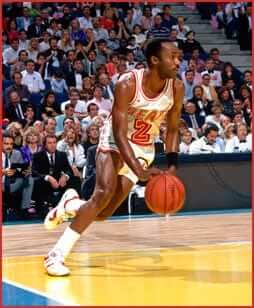
Cleveland Cavaliers: The Cavs, from 1974 until 1982, played on a blue Richfield Coliseum court despite employing wine and gold as their team colors. The court did feature a team logo in the center jump circle, throwing the entire floor scheme somewhat out of whack:
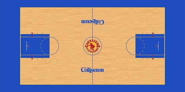
Here’s a shot from 1977 showing how bad the Cavs’ gold uniforms looked against the backdrop of the blue court. Even more interesting is how, in this case, the uniforms of the visiting Buffalo Braves make it appear at first glance that the Braves might in fact be the home team:

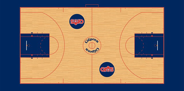
In 1982, Cleveland changed to a blue and orange uniform combination and got a new court to match:
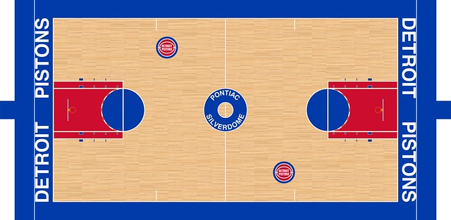
Detroit Pistons: During the 1970s, the Pistons played their home games in Cobo Arena, which featured an aqua-hued design despite the team sporting the same red and blue combo they have today.
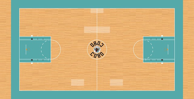
From 1975 until 1978, the Cobo Arena court featured blue lanes and neutral sidelines with a yellow center circle:
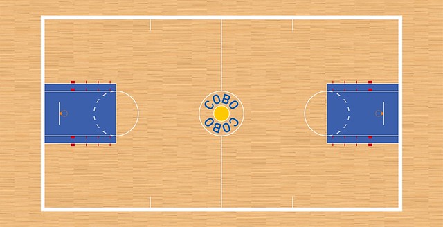
In 1978, the Pistons moved to the Pontiac Silverdome, where they finally got a court painted in team colors:
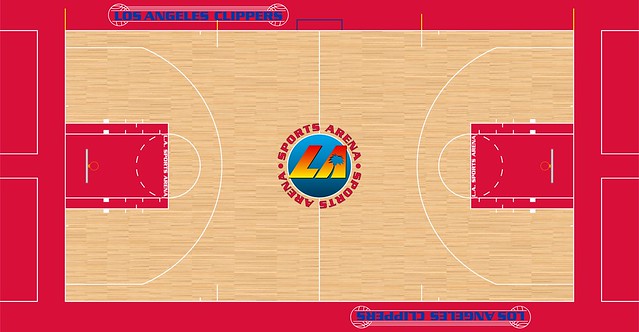
L.A. Clippers: For the most part, the Clippers have played on floors that matched their red and blue (and now black) color scheme. But for a few years in the late 1980s, the floor of the Los Angeles Sports Arena included a garish center logo that didn’t match the team’s scheme at all:
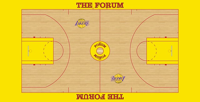
L.A. Lakers: The Lakers are an interesting case. For as long as they have been in Los Angeles, they have played on a floor that featured the team’s signature shade of gold. However, the look was marred by the Forum’s red stripes and lettering, which clashed badly with the team’s purple-accented logo and uniforms:
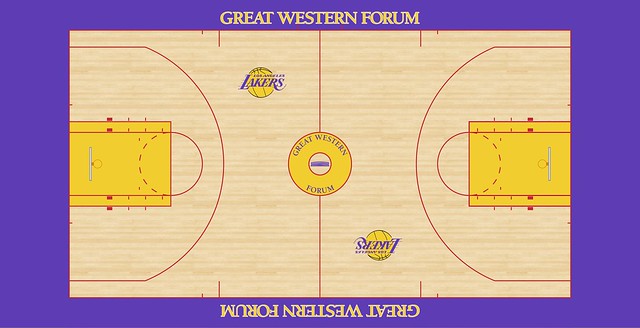
Even stranger, in 1991 the Forum featured a new paint job, with the out-of-bounds areas painted in purple. For reasons that are unclear, however, the red lines remained, making the court even more of an eyesore:
Thankfully, by 1995, somebody noticed the issue and replaced the red lines with black:

Sadly, the current Lakers’ floor now features a red corporate logo, perhaps to remind us of the blistering motif of the past:

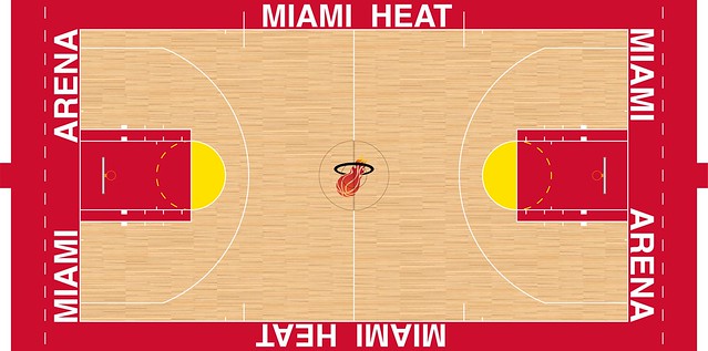
Miami Heat: The most recent example of an NBA team playing on a court with a totally different color scheme is the 1988 expansion Miami Heat:

As this photo shows, the Heat looked totally out of place on the blue and yellow floor, as if their home games were being played at a neutral site:
Fortunately, the team only had to endure this mismatch for two seasons before getting a customized court at Miami Arena in 1990:
Milwaukee Bucks: The Bucks, from 1977 to 1987, played on one of the most famous court designs in basketball history, the MECCA floor designed by artist Robert Indiana.
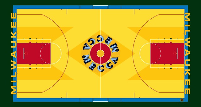
I suppose it’s a matter of opinion as to whether this counts as a mismatch, since the Bucks at the time sported white home uniforms with green and red trim, which seemed to blend in nicely with the court design even if the hues were not technically the same:
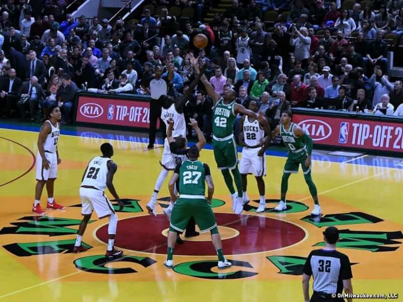
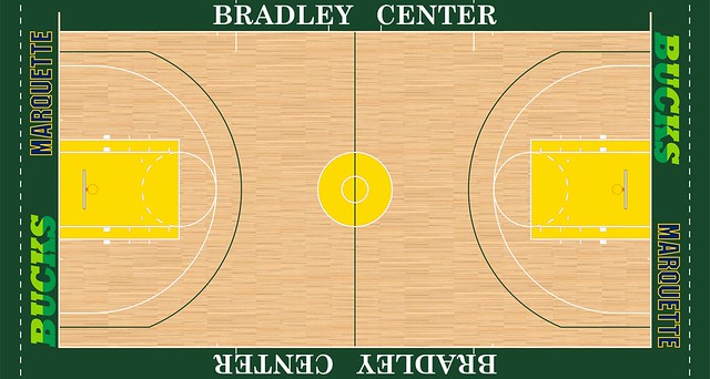
Then, in 1988, the Bucks found themselves in another color quandary as they moved into the Bradley Center, which featured two mismatched elements: yellow lanes and navy Marquette wordmarks (the team was sharing the arena with a local university at the time):
New Orleans Jazz: Before moving to Utah, the Jazz played on a blue-and-red-themed floor at the Superdome for a few seasons:

The court was changed to gold and green for the 1978 season, better coordinating with the team’s Mardi Gras motif.

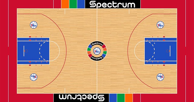
Philadphelia 76ers: The Sixers played on a rather unique court during the 1980s, because while the design featured the team’s trademark red and blue, the overall design seemed to emphasize the arena itself, rather than the team, right down to the “spectrum” of colors:
When viewed from today’s perspective, it seems odd that an NBA team wouldn’t either demand the court to be painted in team colors or ask permission to do it themselves. Maybe they didn’t think it was worth the expense, or it simply wasn’t a big deal; remember that college and pro football teams weren’t really decorating their fields in team colors on a regular basis until perhaps the mid-1970s either.
———
Paul here. Excellent job by Dan on this one. Big thanks to him for illuminating an aspect of athletics aesthetics that I hadn’t thought about before.
ESPN update: In case you missed it yesterday, here are the Jags contest results. My thanks to all who entered.
In addition, my piece on notable uniforms in Big East history is also available. Enjoy.
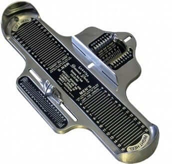
Brannock update! I spoke yesterday with Syracuse Chiefs GM Jason Smorol about the team’s upcoming Brannock Device Night promotion, slated for May 31. Here’s the skinny (and if you missed Tuesday’s post and don’t understand what I’m talking about, look here):
• Smorol said the team hasn’t yet figured out what Brannock Device Night will actually entail (this is pretty standard for minor league teams, which often plan their promotions with a “broad outlines first, specific details later” approach). In fact, he said he hadn’t yet spoken with the Brannock Device Company, although he and his marketing team plan to do that next week.
• I encouraged Smorol to rename the team for a day and go with Brannock-themed uniforms, and even suggested that we could have a design contest here on Uni Watch. He’s not necessarily opposed to those ideas, although he said he’d have to get team ownership and the Brannock folks to go along with it. If they do end up going that route, he said the date of the promotion might need to be pushed back a bit, in order to allow enough time for the custom uniforms to be manufactured.
• Smorol liked the idea of having me throw out the first pitch. “Let’s definitely make that happen!” he said. So, yeah — that’s gonna happen.
As a longtime Brannock booster, this all feels like the culmination of, well, everything. Exciting!

Culinary Corner: We had a nasty winter snowstorm here in NYC yesterday (or at least it was supposed to be nasty; it ended up being just a few inches), so the Tugboat Captain and I decided to hunker down and make a stuffed pork roast. Here’s how we did it (for all photos, you can click to enlarge):
1. First we made a stuffing from dried cranberries, diced dried apples, chopped walnuts, breadcrumbs, and some garlic, onions, and herbs, all of which we sautéed in a bit of butter:

2. I took a pork loin roast — I think it was about 3.5 pounds — and used a knife to butterfly it. The process is sort of like unrolling it. In the end, I was left with a flat piece of meat about one inch thick:


3. We spread the stuffing onto the butterflied piece of pork:

4. We rolled up the pork and used twine to tie it shut, creating a nice little log:


5. We put the stuffed pork in a roasting pan and surrounded it with a mix of potatoes, carrots, and pearl onions. Then we popped it in the oven.

6. While the roast was cooking, we made a glaze, consisting of apple cider, brown sugar, soy sauce, Worcestershire sauce, and mustard, which we periodically brushed onto the pork:

7. Et voila.


As you can see, the pork was a little bit overdone (I took temperature readings, but it’s tricky with a stuffed roast because you often end up mistakenly measuring the temp of the stuffing instead of the meat), but it was still plenty good, especially with the pan gravy we made at the end:

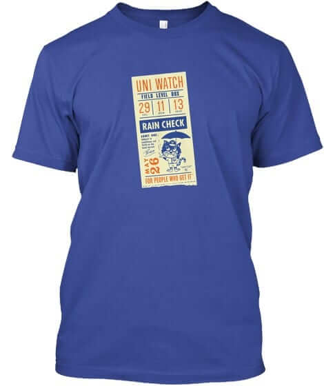
T-shirt reminder: In case you missed it yesterday, our latest limited-edition Uni Watch T-shirt, designed by the great Todd Radom, is now available. It comes in a wide range of colors (including deep royal, as shown at right; click to enlarge) and is available from now through next Thursday, March 15. You can order it here. If you want a color that isn’t shown, get in touch and I can take care of you. My thanks, as always, for your consideration.
The Ticker
By Paul

’Skins Watch: Whoa: Waynesboro (Pa.) High School, whose teams are called the Indians, uses the original version of Chief Wahoo. hard to believe anyone would use that design today. The camouflage is a nice bonus, eh? (From Michael Trautman.)

Baseball News: Update from yesterday’s Ticker: The Mariners’ glossy helmets are only for spring training. They’ll go back to the matte lids when the regular season starts. … Bo Baize recently took a tour of Miller Park and spotted this card certifying a fan’s attendance at Warren Spahn’s 300th win. Since the card indicates the game’s final score, I’m assuming fans obtained it by mailing in their ticket stubs, or something along those lines. … Bo also recently visited the Walt Disney Family Museum in San Francisco and saw Mr. Disney’s 1966 American League pass. … Good piece looking back on the White Sox’s failed attempts to use bullpen carts (thanks, Phil). … Has a team ever done a shinguard giveaway before? The Mets doing one for Yoenis Céspedes this season. … The Pulaski Yankees want to wear their fans’ best memes on their jerseys. … Buried within the piece about the Chattanooga Lookouts’ 2018 promotional schedule is the news that they’ll wear Hispanic Heritage Night jerseys on April 29, featuring flags from all over the world, and Star Wars jerseys on May 12. … The NBA’s Phoenix Suns will give away a Diamondbacks shirt on March 20 (from @igTXSalazar). … The San Antonio Missions are asking fans to vote on three jersey options for fiesta-themed jerseys to be worn on Autism Community Network Night (thanks, Phil). … Padres P Carter Capps had thoracic outlet surgery, which entails the removal of a rib, so he had the rib turned into a necklace (from Mike Chamernik).

NFL News: Reader Bo Baize recently visited the Packers Hall of Fame in Green Bay, which has info on the team’s multiple tailoring cuts for jerseys and pants. … Bo also visited the LBJ Presidential Library in Austin, Texas, which has LBJ’s NFL/AFL lifetime pass. … Here’s something I didn’t know: According to this piece, “The Lions were one of the first NFL teams to embrace player-tracking technology when they had RFID chips sewn into players’ jerseys and sensors installed around the practice field at their Allen Park training facility in 2014.” … More reports about the Browns updating their uniforms, probably in 2020.

Hockey News: More Don Cherry-themed uniforms, this time for the Kelowna Rockets. … The Bruins wore Irish Heritage Night pregame jerseys two nights ago. … Whoa, check out the uniforms worn by the 1908 Pittsburgh Bankers (big thanks to Jerry Wolper). … Holy moly, check out the 1928 MIT team, which had a stripe-o-rama design and a crest featuring a beaver gnawing a tree (big thanks to Phil Johnson). … Check out this late-’40s shot of Rangers G Charlie Rayner wearing a different jersey than the ones worn by his teammates (from Chris Mayberry).

NBA News: Heat fans can now sleep overnight at the team’s arena. … Rockets G James Harden may have leaked the logo for the upcoming video game Call of Duty: Black Ops 4. … A Lakers fan is trying to recruit LeBron James via a series of billboards around L.A. … Demolition has begun on the old Cincinnati Gardens, former home of the Cincinnati Royals, who are now the Sacramento Kings (from our own Alex Hider). … The Heat’s D-League affiliate, the Sioux Falls Skyforce, will wear Corn Night uniforms on March 17 (from Joe Millar). … Cross-listed from the baseball section: The Suns will give away Arizona Diamondbacks shirts on March 20 (from @igTXSalazar). … TNT’s score bug for Tuesday night’s Clippers/Pelicans game showed the Clippers score in red and the Pelicans in blue, but that was the opposite of what the teams were wearing (from Ryan Bower).

College and High School Hoops News: The girls’ team at Bowling Green High School in Kentucky has some pretty wild shorts (from Josh Claywell). … Two schools facing off in the Louisiana High School Athletic Association boys basketball state tournament had a pretty unusual uniform matchup on Tuesday (from David Steinle). … UNC players wore “Woody” NOBs on their pregame shooting shirts last night, in memory of longtime radio man Woody Durham, who passed away earlier in the day (from James Gilbert).

Soccer News: New logo for CONCACAF — that’s the Confederation of North, Central American and Caribbean Association Football (from Ed Zelaski). … New jerseys for the NSWL’s Houston Dash (from our own Jamie Rathjen).

Grab Bag: This faaaascinating article about bricklaying (NYT link) includes lots of photos of bricklayers wearing something akin to uniforms for the Spec Mix Bricklayer 500, the world’s largest bricklaying competition. Teams consist of a mason, wearing blue, and a tender, who wears black, plus there are sleeve numbers, caps, etc. … The United States Bowling Congress Open Championship will be taking place in Syracuse from March through July. “They just finished building a 48-lane facility in the convention center, which will then be removed once the tournament is completed,” says Rick DiRubbo. … Cycling’s world governing body has decided not to scrap the phenomenon of “podium girls,” although some cycling tournaments have already decided to do so. … A contestant on The Price Is Right yesterday had what might be the longest name tag in the show’s history. … Stanford University nixed a request from the school’s branch of the College Republicans to print their logo on T-shirts because the logo features the American flag, which is contrary to the school’s trademark guidelines. … Players on a Pakistani cricket team hate the team’s neon green uniforms. … One reporter’s opinion: The Fort Worth Invitational golf tournament has the PGA’s worst logo. … Interesting story about a new camouflage pattern that confuses the human brain. … A McDonald’s in California has flipped the golden arches on its sign upside-down, forming a W, for International Women’s Day. McD’s social media accounts also sport the upside-down logo today. … Here are the Indy Car liveries for the season-opening race (from Tim Dunn).
Wow! My complements to the chef!
I actually like the miss matched court design. Kind of plays into the old days where every little aspect wasn’t fully branded. The idea of the court design being specific to the arena, with a team logo included somewhere is oddly appealing. The Sixers court in particular is pretty great.
I’m with you, Greg. And part of why everything wasn’t fully branded…most teams couldn’t dream of affording something as frivolous as a team-specific court. The league didn’t really take off until the 80s/90s. Before that you worried more about survival than enhancing your brand.
Sort of like the generic field design in Miami and Pittsburgh, to accommodate for the pro and college teams. There is definitely something pleasing about playing surfaces with minimalist designs, focused more on the city and facility itself.
I’m definitely in the same boat. The Forum, The Spectrum, The MECCA, are all iconic venues and courts. I argue that they’re more memorable and MUCH MORE effective as place-setters for the community during national broadcasts.
It’s an opportunity for a community to create (brand) identity for its place. i.e., surf/waves/palm trees for LA. “Art” as an elements of Milwaukee culture, etc.
I’d also argue that if the venue is owned by the city/county they have the right to dictate its design content. Far fetched in this day and age of corporate sports welfare.
Typo, second graf, “bilt” should be “built.”
Got it.
Here’s a shot from 1977 showing how bad the Cavs’ gold uniforms looked against the backdrop of the blue court.
Pffft. There’s nothing bad about that. It’s called contrast.
I for one miss the days of non-specific court designs. Everything now is SO team-specific and so TV-specific (especially the giant mid-court logos) that they’ve lost some of their charm.
At least when the Cavs did change the Coliseum floor they made it so people sitting on either side of the arena got the same aesthetics. Now if you’re not on the side with the TV camera you’re on the “wrong” side…maybe people on that side should get a couple of bucks off their ticket price, huh?
Obviously, whether or not the colors worked together is a matter of opinion.
My purpose here was mostly to point out where mismatches occurred between courts and uniforms. It always bugged me for some reason, maybe it doesn’t everybody.
Yeah, I should’ve added an “in my opinion” there.
Some of today’s designs are great, but most of them just remind me of how much money gets wasted in sports. On top of the team-specific courts you now have all the alternates, and in the NCAA you have the standardized tourney and one-off Final Four courts. At least they’re giving steady work to the court makers of America and most of the floors get repurposed or sold or donated,, but I still miss a good old multipurpose court.
I see what you mean. I do also miss the days when the NCAA tournament games were played on the host team’s court. Kind of gave each game a reminder of the region it was being played in.
I agree with the NCAA tournament. The home court added a lot of flavor. The blue/black generic court is too bland.
Big “Hell yeah!” to this. Hate the bland uniform court designs.
The lines on the court at The Forum were orange, not red. The yellow and orange color scheme matched the seating in The Forum which was one half yellow and one half orange. A color scheme selected by then owner of the Lakers and Kings, Jack Kent Cook. I’m sure there are many archived photos showing the seat colors.
You may be right, I have never been to the place so I was just going by what it looked like on TV and on the graphics that the guy put together.
Either way, doesn’t match the Purple and Gold and always bugged me.
Great entry! Just following up on Rich’s point [’cause that’s what we do here], the court’s yellow was much lighter than the uniform yellow–it matched the color of the eastern half’s seats exactly. The Lakers gold was always a warmer golden yellow. Funny but the mismatched yellows always bugged me more than the orange stripes.
link
I liked that it didn’t match. Not to be contrarian, but because I don’t like the Boise State Effect. Teams shouldn’t blend in with the field/court, in my opinion.
1. Man, that roast looks insanely good!
2. Any explanation why the Mariners would go to the trboule of outfitting an entire spring training with glossy-finish helmets, only to switch to matte finish a few weeks later? Seems incredibly wasteful, unless adding a matte finish can be done after production.
They had glossy inventory left over in their spring training facility and decided to use that instead of shipping the mattes down from Seattle.
That roast doesn’t look overdone at all; it looks perfect!
Teeny bit dry. Would’ve preferred it with a bit more of a rosy pink interior.
Got any leftovers we can snack on this morning???
Ha! There are definitely leftovers. Will be having those later today, for sure.
I actually made a pork loin roast the other day. First go-around was basic. Thick sliced, served with sweet taters, brussel sprouts (roasted with diced bacon and maple syrup), and a good french roll.
Had a little less than half of the roast left over. Sliced it thin as i could with chef knife (essentially a thick deli slice). Heated that in a pan quickly with a little butter and gave it a little sear. Sauteed some mushrooms and onions. Put all that on a nice Italian sub roll with a sandwich sliced pickle and country dijon mustard. Was better than the original meal.
I forgot to mention the pepper jack cheese
Paul, not sure if this has already been mentioned (and maybe you do it on twitter, as I am not on there) but have you considered doing those short / sped up cooking videos that are very popular on social media?
You make some pretty awesome dishes, I am sure you would develop quite the non-uni enthusiast following just from your cooking!
Not familiar with the short/sped-up genre. Don’t think I want to deal with video, though — it’s enough work just to take photos! Thanks for the vote of confidence, though.
I agree those would be pretty great from Paul. A prominent example of the genre is seen in the “Tasty” social media pages.
I think this is the sort of video Greg is referring to…
link
Seems like it would be a pain to setup the video (especially if all the “action” didn’t take place in one pan), but I agree it would be a very cool addition to the Culinary Corner!
Ah — interesting.
I don’t think I’m cut out for that, but I’ll keep it in mind!
Correct, this sort of thing, and the popular “Tasty” videos are exactly what I had in mind.
Videos or not, it is always enjoyable, and appetite inducing, to see Paul’s culinary skills.
In the Chuck Rayner photo, is he wearing an alternate captain’s A on his sleeve?
Yep, that sure looks like it. This would definitely peg the picture to 1947-48, since the NHL outlawed goalie captains the following season thanks to Montreal’s Bill Durnan.
When they were at HemisFair Arena, the Spurs played on a court with light blue paint. link
We can discuss later whether the “Fiesta” colors at the Alamodome count. :)
And earlier in the 80s…
link
Seattle in the 70s: link
(I don’t mean to nitpick. The post was great. It just sent me down a rabbit hole!)
If you really want to go down a rabbit hole, check out this extremely comprehensive NBA court database:
link
This was featured here a few years ago but has been updated since then.
Guessing Dan wouldn’t like when the Celtics played selected games at the Hartford Civic Center…
link
Always thought the green Used on the parquet in Boston Garden never matched the green on the Celtic unis. It was more of a minty green where the unis were kelly green…..don’t get me wrong, I loved the Garden!
That was the best wasted 20 minutes of my life. Props to the artist. That’s a Herculean effort.
HemisFair… another great venue with an iconic tie to its community. Like the Salt Palace. Or, one of my favorites… The Cow Palace. And how many “War Memorial Coliseums” are there in the US?!
No one will remember the corporate names of recent decades in 20-30-40 years, mainly because they’ll shift every decade.
Bo Baize travels a lot!!
Should’ve thought of it when you posted the high school baseball uniforms on Twitter, Waynesboro only 46-miles from Carlisle., PA.
LBJ’s pass to AFL and NFL is a lifetime pass, and NOT an annual pass. Look at the writing on the pass. The year on the pass is when it was issued. After checking, you should correct the post.
Thanks — got it.
Richfield Coliseum opened in 1974, not 1972.
Correct.
Thanks, guys — fixed.
Typo under court design article: Philadphelia 76ers should be Philadelphia 76ers.
Question for Stanford’s compliance department: If you’re not allowed to use the American flag, then please explain this:
link
And this:
link
And this:
link
Oh boy.
Their compliance is objecting to the use of the flag as part of a design.
In the examples you provided, the flag is not part of the design.
C’mon, this is easy stuff.
Lee
I profiled Jordi Kodrinsky, the court artist, for Uni Watch a few years ago
link
His Flickr page has around 1,500 NBA, college, and international court designs
link
If this internet/uniform journalist thing doesn’t work out, you have a future as a chef!
The Bucks still share the Bradley Center with Marquette basketball (Marquette even out-draws them occasionally). Its just that now the two teams have their own hardwood which gets laid out depending on who’s playing.
Marquette just signed a long term deal to move with the Bucks to their new arena in 2018.
link
Also the photo of the Mecca floor is of Marquette hoops.
Yeah…I think you are right. There are so many colors going on between the court and the uniforms it was tough to find a good photo from the era, let me see if I can replace it.
Also the lane areas on the original Bradley Center court were never yellow/gold. They were green, matching the perimeter.
“For as long as they have been in Los Angeles, they have played on a floor that featured the team’s signature shade of gold. However…which clashed badly with the team’s purple-accented logo and uniforms”
Actually the first six years in Los Angeles the Lakers played at the Los Angeles Sports Arena and their colors were blue and white. Jack Kent Cooke bought the team and they moved to the Forum and changed their colors to purple and gold (yellow). JKC didn’t like the name “purple” and called it “Forum Blue”, which announcer Chick Hearn had to say during broadcasts.
Thanks for clarifying that. I guess you caught me making an assumption there or relying too much on the Chris Creamer database. I wasn’t around at the time when they moved.
It would be interesting to see what the Sports Arena court looked like back then. The Lakers, USC, and UCLA played there. I’m sure they had one court for all 3, where as now if anyone is sharing an arena they all get their own court. Of course there was no 3 point lines. I’m not sure what the keys size was for college vs the NBA back then, but at some point they had keys with lines for both.
While putting myself through college, I worked for a brick mason as a hod carrier. I eventually laid brick and block for a couple of years although I never could match the speed and talent of the guys who were real tradesmen. Bricklaying is an incredible combination physical labor, precision and artistry. Thanks for the link.
Re: the Rangers/Wings pic…the Ranger skater in front of the net has lost his “E”.
Also, Rayner’s sweater is the 1946-47 design, whereas the rest of the Rangers are wearing the 1947-48 version.
Syracuse EEEs
That Price is Right contestants name looks like it is prime pickin’s for an Ambigram!!
Wow that picture of the Rangers goalie in the game vs. the Red Wings is awesome. Colour on colour (color on color) also. Fantastic.
The Rangers were the last Original Six team to add a white sweater, only doing so in 1951 when the NHL finally made it mandatory for teams to have two contrasting sweaters.
It’s weird seeing NBA court designs without the 3-point line. Then again, it’s also weird to see the Lakers’ mid-90s design with the 22-foot arc.
I’d never really noticed before that the lines on NBA courts aren’t a standard colour. Red, black, white, blue, whatever you like.
I guess the NHL allows teams to customize the centre red line, but otherwise its hard to think of another example where the leagues allow you to do basically whatever with the lines. Imagine the Dallas Stars with all green lines or the Predators with all yellow lines.
Michigan State changed the Blue Lines green. The NCAA didn’t allow it for games though
Only other example I can think of is MLB, which allows foul poles of different colors.
What about tennis? Do the lines have to be white?
It looks like no, the lines must contrast with the colour of the surface, so presumably yellow would be ok.
link
“All court measurements shall be made to the outside of the lines and all lines of the court shall be of the same colour clearly contrasting with the colour of the surface.”
I’m a daily, long time reader from the pre-blog days (through middle school to my current employment). Infrequent commentator, but I can’t imagine a morning without Uni Watch. I’ll be subscribing.
Since the announcement, I’ve been perusing some of the ancillary parts of the blog and have several thoughts:
1) It’s nice to have extras to the daily posts — I fully endorse the idea of uniform databases, side entries, etc.
2) Count me as one who loves the travelogues. In fact, I wish there were more. Take more trips!
3) The FAQ needs updating — there is a significant amount of link rot, and most of the “questions” were clearly written years ago (at least to frequent readers).
4) The “you must be gay” FAQ is odd. The answer used to be “shouldn’t you go play in traffic or something,” which was, as I believe you acknowledged, insensitive. The new version is better, but it still seems stuck in the mid-2000’s. That you covering uniforms might “make you seem gay” should not be a question, and, even if it is, it is not something that needs a response. By including a response, you’re legitimizing that bigoted question as something that deserves an answer.
Constructive criticism. Thanks for producing the great content!
Thanks, Michael. I confess that I haven’t looked at or thought about the FAQ in a looooong time. It will likely be scrapped in the new version of the site.
That pork roast looks excellent. Thanks for sharing, Paul!
I agree, looks great. I think, I’m not sure though, the cooking posts might be my favorite part of the blog. They just seem special for some reason. I haven’t got around to trying any of the recipes, but I’ll get around to at some point. Anyway, long, long, time reader, occasional poster….keep up the good work Paul.
great job, dan! thanks for the pics and research on the courts
in the brannock update section i will confess I’ve never seen “this’s” as a contraction. very interesting!
Ugh — that’s a typo! It was originally “that’s,” but then I changed “that” to “this” but forgot to change the contraction. Now fixed!
It seems to acceptable
link
I have always thought of the Portland Trail Blazers’ court from the 70’s as being mismatched, but I’m not sure of the extent to which it was, because video quality from the era was often poor. But in video shots like this, the court looks more orange than red. At the very least, they had a midcourt logo that was multi-colored, with some orange, red, purple, etc.
link
Yeah, one thing I realized when I started looking into this project was that there were a lot of courts in the 60’s through the 80’s that were not exactly customized to the team’s color palatte but not exactly mismatches either.
The Spurs “Fiesta” court I did not include because to me that felt like an intentional design and not just the court that happened to be in the arena. Plus, black and grey kind of go with anything so it didn’t clash too much in my eyes.
Also, the column was starting to get a bit on the long side so I left a couple of possible choices out just for the sake of not overdoing it.
Interestingly, the Blazers posted a higher definition video of the old court on Facebook today. Check it out:
link
It definitely looks a bit orange, perhaps with some of the lines being purple. That would match the colors in the center court logo. And in some shots you can see the Portland Trail Blazers sign at courtside, also rendered in some similar rainbow colors to match the court.
In the soccer ticker, “CONCACAF” should now be “Concacaf.” That’s part of the change they went with. Great branding.
Not liking the new Concacaf logo. I presume that each “spike” represents each member of the conference, but what would happen if any changes occurred (i.e., Guyana and Suriname transferring to CONMEBOL)? Would the new logo be altered to reflect the changes?
It would have been better to change the pentagon in the previous logo to a hexagon (representing the final phase of World Cup qualifying in the conference), and use a more contemporary ball design. Then I realized that “Telstar” was introduced at the 1970 World Cup in Mexico.
I was pretty much resigned to the fact that I wouldn’t be reading Uni-Watch once it goes to paid subscription. Now, with Paul throwing out the first pitch at the Brannock Bombers game I don’t know how I can NOT subscribe! Way to build an enticing narrative!
The Clippers court history always looked mismatched until they moved to Staples Center. Starting in San Diego, the court looked more Orange than Red and center logo was off colored.
link Does anybody know what was painted there before? Then when the Clippers played in LA, they had to share their court with USC, which had their colors as the primary color.
The Clippers’ colors were light blue and orange back then. The court reflected that.
Jim, San Diego Clippers court looked orange. but their first uniforms in San Diego looked more red than orange. Maybe it was an orange red.
The oranges definitely didn’t match. You’re right, it was redder on the unis, but still orange.
Life long Clipper and USC fan, went to many games at the LA Sports Arena. Court was red, it matched the Clippers except for the mid court logo. It did not match USC at all, especially back then because USC used to wear a color closer to burgundy than cardinal.
Pedro, I remember the first LA Sports Arena floor the Clippers played on being USC’s color – burgundy red. Then the next season the floor color was changed to red with the Sports Arena center logo. So yes, you are correct.
Thanks for all the comments, folks. Hope you enjoyed the piece.
Having sat through more than my fair share of SYR Chiefs games from ’13-’16, I’m sure they’ll take any attention and love they can get. They have some of the worst attendance in the minors and a racially offensive historic logo. Some locals want the name changed to the Syracuse Salt Potatoes. They are pairing with the Mets as an affiliate starting in ’19 I think, so perhaps things will change. I can’t make it on the 31st but would consider getting back up that way to see the festivities if the date changes. You can take the train from NYC and end up in the stadium’s parking lot, which I did the last time I saw a game there.
How long before we see rappers wearing Pittsburgh Banker sweaters?
Wish they’d go back to glossy helmets full time.
I enjoyed that ESPN.com piece about the older uniforms of the members of BIG EAST 2.0. As for Xavier, I prefer the uniforms it wore in the early ’90s with the double blue.
Regarding mismatched courts, I actually prefer some contrast and the occasional mismatch. The red Lakers lines at The Forum are iconic. The current court trend (enormous center logos and over-use of matching colors) washes away the uniforms of the home team, especially on TV. The new trend of wearing color at home compounds the problem. Everything matching is lame. Anyone with me on this matching being over-done? Let the uniforms pop.
I see what you mean, but I kind of like the home team wearing white on a matching court with the visiting team wearing their colors for contrast.
It seems to fit in with the psychological “home court advantage”…a custom court reminds the other team they are not in their element.
How about McNichols Arena? Denver’s blue and gold uniforms don’t match the red-painted court in the 80s.