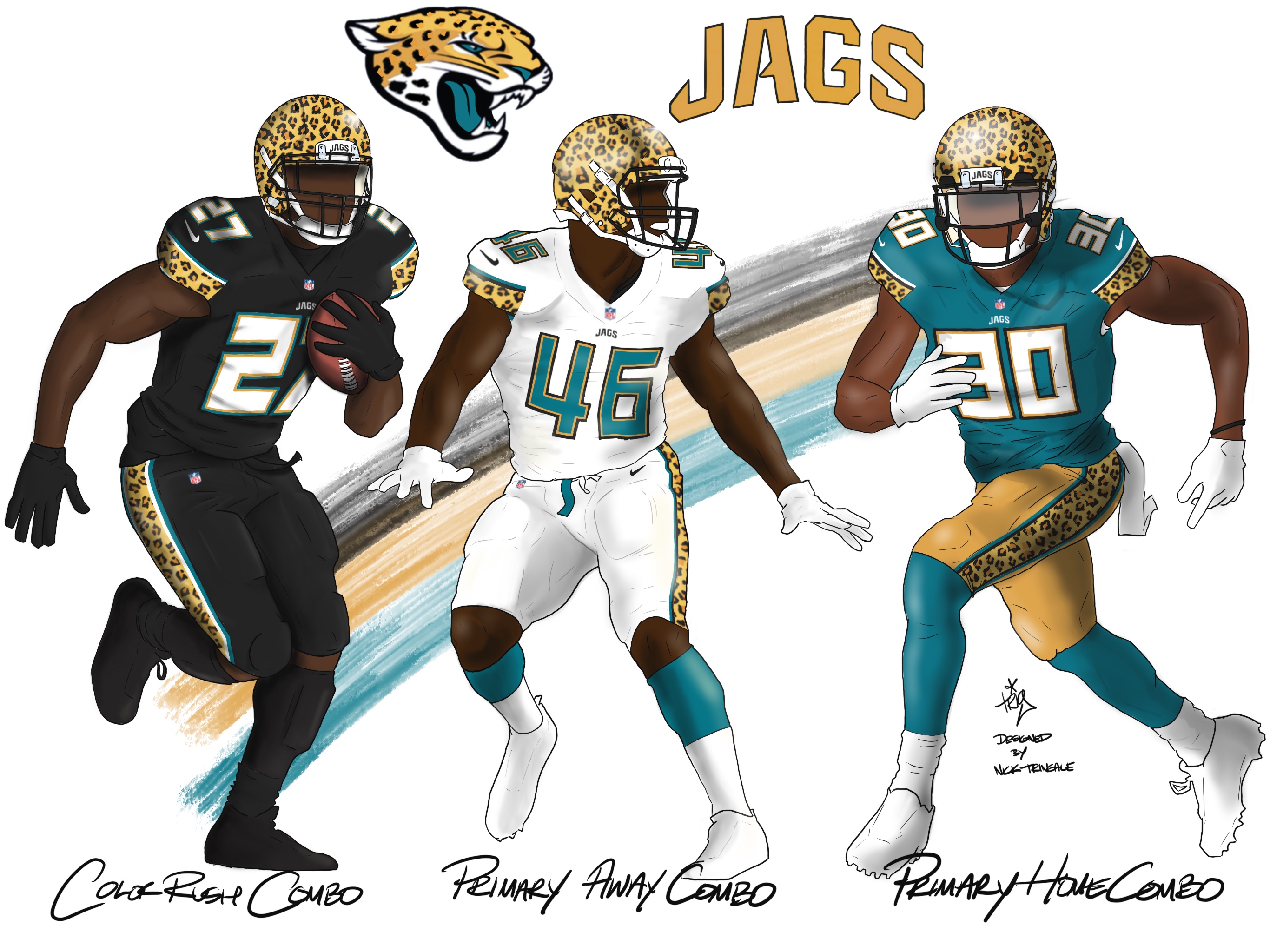
Today we should finally have the results of the Jaguars redesign contest over on ESPN. One of my favorite entries was Nick Tringale’s, shown above, which went heavy on the animal print pattern, to excellent effect. Link coming soon, and in the meantime you can look at all the entries that were submitted.
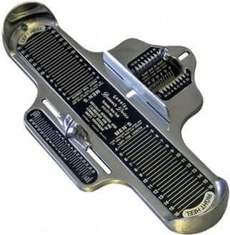
Oh. My. God. As some of you are aware, my Very Favorite Object Ever is the Brannock Device, which most of you know as “that thingie they use to measure your shoe size.” I love it (a) because it’s a gorgeous piece of design, (b) because it’s so functionally specific, a perfect example of what it was meant to be, and (c) because everyone knows what it is but almost nobody knows what it’s called, so it’s simultaneously ubiquitous and anonymous — a very potent combination. I’ve written about it many times, I made sure it appeared on the cover of my 1997 book, I have one hanging on a wall of my bedroom (plus a miniature one that I keep in a display cupboard of tchotchkes), and I even got a tattoo of it on my 39th birthday.
So you can imagine how excited I was when MiLB promo maven Ben Hill reported last night that the Syracuse Chiefs — Triple-A affiliate of the Washington Nationals — will be having a Brannock Device Night promotion on May 31, when they host the Toledo Mud Hens. (If you’re wondering, “Why Syracuse?,” the answer is simple: The Brannock Device’s inventor, the late Charles Brannock, was a lifelong Syracuse resident, and the devices that bear his name are still manufactured just outside of Syracuse.)
It’s not yet clear what Brannock Device Night will entail. The Chiefs’ promo schedule simply says, “Branock Device Night: Have you ever measured your foot in the metal device at shoe stores? Well, that device was invented right here in Syracuse!”
I’ll call the Chiefs today to find out more. Maybe I can convince them to let me throw out the first pitch.
NBA Uni Tracking
By Collin Wright
Here’s our latest weekly chart (click to enlarge):
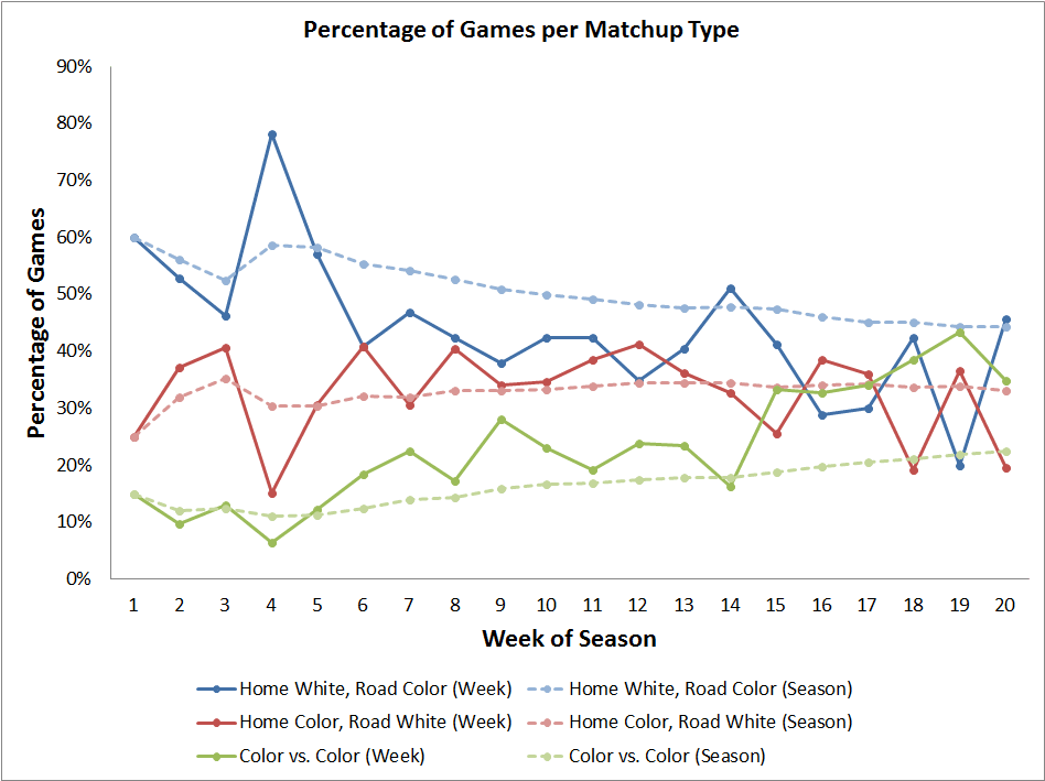
The three types of games were fairly evenly distributed in the month of February. Color-vs.-color games were the most common, occurring in 56 games (35%), traditional games (home team in white) and “inverse” games (road team in white) each accounted for 52 games (32.5%). This marked the first month that traditional matchups were not the most common.
As for the past week:
• We had our 200th color-vs.-color game of the season on Feb. 28, when the Mavericks hosted the Thunder.
• The Celtics wore green leggings and socks with their black uniforms for the first time all season.
• The Grizzlies are now the owners of the most losses in a single uniform without a win. They’re 0-9 in their light blue design. The Mavericks are hot on their heels, at 0-8 in their black set, and the Lakers are 0-7 in purple.
• The Hawks have worn a dark-colored uniform in 17 consecutive games, dating back to Jan. 26. That’s two shy of the longest such streak of the season (19), held by the Rockets between Nov. 14 and Dec. 28.
• The Heat have worn their “Miami Vice” alternate uniform in 10 consecutive games. That is tied for the longest such streak this season with the Pistons, who wore their white set in every game between Oct. 23 and Nov. 12.
Take that, Suzy Chaffee: Apologies if you’ve heard this story before: When I was six years old, I reached into a box of Corn Flakes and pulled out this card of 49ers running back Ken Willard. He instantly became my favorite NFL player, and the Niners became my favorite NFL team (and they still are today, nearly half a century later).
Willard was a first round draft pick (No. 2 overall in 1965) and had a decent career, but he was never a big star. I rarely come across photos or references to him when researching this or that. Yesterday, however, I was poking around on eBay and came across this (click second image to enlarge):
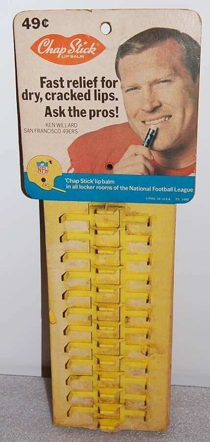
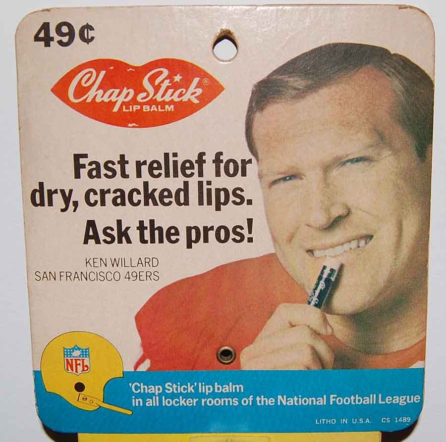
There’s something hilarious about the rough, tough NFL boasting that it had ChapStick “in all locker rooms.” And no matter how often you see someone using ChapStick (I use it regularly myself), there’s no getting around the fact that it looks like someone applying lipstick.
I wondered if there were similar retail displays featuring other NFL players from that era. I couldn’t find any, although I did find two print ads — one featuring Cowboys defensive lineman Bob Lilly and another featuring Bears center Mike Pyle. I guess ChapStick and the NFL had a good partnership back in the late 1960s.
As for the Willard display, it’s inexpensive, and I’m tempted to bid on it, but I already have too much crap in my house, so I’ll probably pass. Still, it’s fun to know this item exists.
Finally, note that the Willard display features a gold helmet with the NFL logo — similar to what players wore in the Pro Bowl from 1966 through 1970. Willard himself made the Pro Bowl four times during that period, although there’s no indication that that’s why he was selected for the promotion.
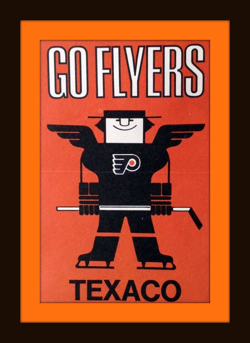
Check out this 1970s Philadelphia Flyers “Freddy Flyer” sticker from Texaco. It kind of anticipates the Flyers’ black jersey, which wouldn’t make its on-ice debut until 1997!
Now for the rest of this week’s picks:
• This Texas Rangers logo shown on these patches were a uni-landmark for me. When I moved to Dallas in the early 1970s, the Rangers were just coming to town. I loved this logo, and as soon as the merch started arriving, I snagged myself a cap and shirt. Why was this so big? Look at the bottom of the “R” in Rangers. There’s a little sheriff’s badge there. I was fascinated by that one little attention to detail. Even at 11 years of age, I Got It™ .
• And even though I Got It™ , I have to admit it took me years to notice that the B on this NBA Buffalo Braves WBEN Radio 930 bumper sticker was a feather, just like the ones on the Atlanta Braves softball tops of the mid-1970s. Of course, I didn’t know that was a horn on the Vikings’ helmets, either (I thought it was just some random swirly thing). Not proud of either of those things, but there you are.
• Terrific artwork on this 1970s Atlanta Flames poster, with one of the greatest (IMO) logos in history prominently displayed.
• Can’t say that I have ever seen an NFL fedora — in this case, from the Bengals — before.
• This 1970s Minnesota North Stars embroidered patch is still sealed in the bag.
• The 1970s Milwaukee Bucks thought their fans were “fan-tastic,” as it says on this button.
• Big-sized team logos to be found on these 1960s-70s NFL bed sheets.
• How about these officially licensed 1970s Green Bay Packers “N.F.L. Wide Receiver’s Gloves.”
• Nice-looking 1970s NFL helmet stickers. The seller thinks these may have been from a mail-in premium thing.
• See this 1960s Chargers gumball helmet? This one always drove me nuts. Why was the bolt so far off the mark? Don’t hold me to this, but I thought I read once that the team didn’t want to give them the license or something, so the helmet makers went with this look. Might’ve been the same story with the Bengals, too — their font was way off. Does anyone know the for-sure story on this?
• Snap this 1970s Atlanta Falcons bicycle reflector onto your spokes for safer nighttime biking.
T-shirt launch: Last Friday I showed you three color options for a new Uni Watch T-shirt designed by Todd Radom. Blue/orange was the overwhelming winner, so the shirt is now ready to order in that color scheme. We’re making it available in a variety of shirt and hoodie colors, including but not limited to the ones shown here (click to enlarge):
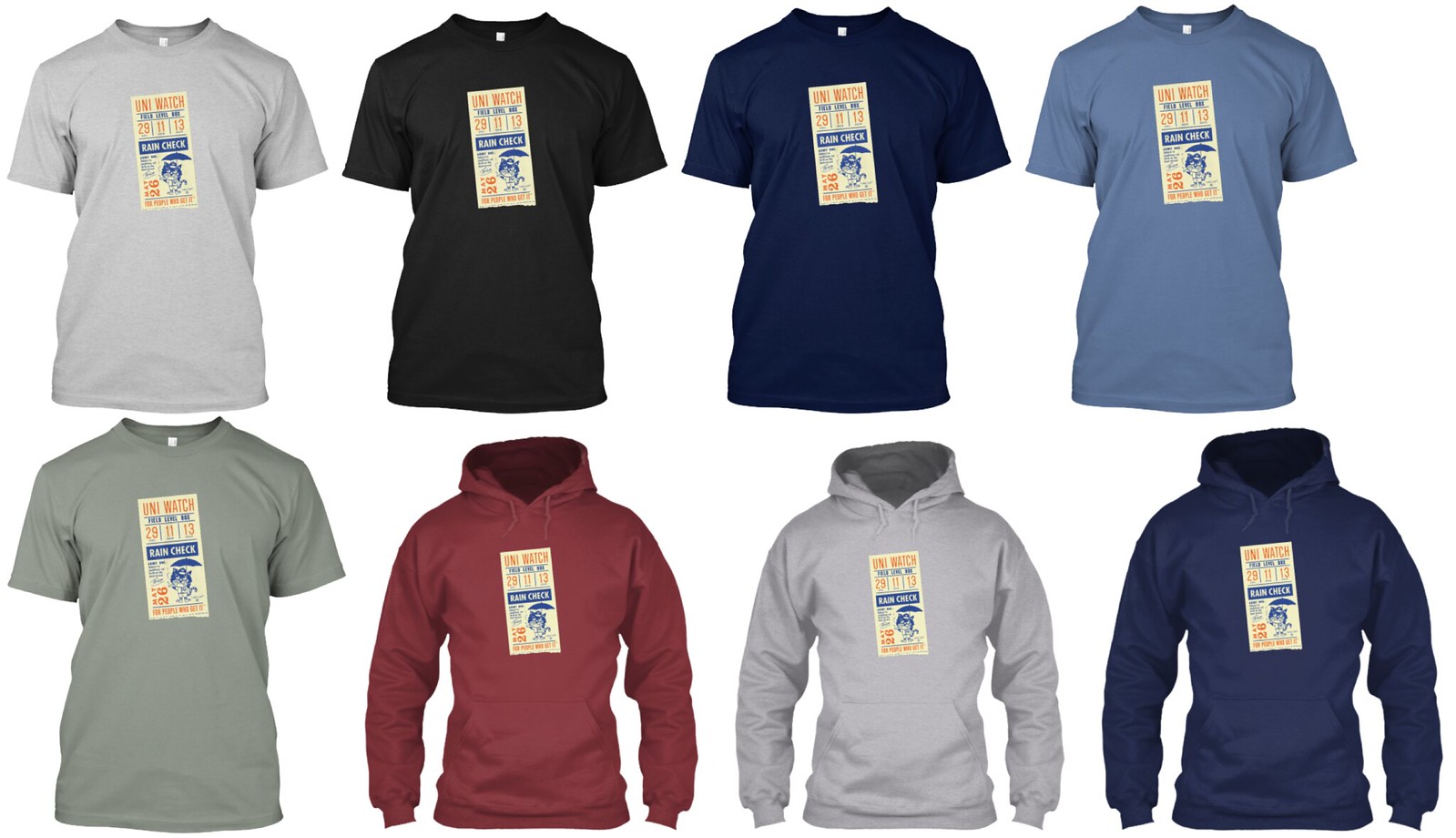
You can see the full range of options on the ordering page. If there’s a shirt color you want that isn’t shown there, let me know and I can set up a separate listing for you. Also, if you want one of the two other colorways that didn’t fare as well in the reader voting, I can help you out with that too.
This limited-edition shirt will be available through next Thursday, March 15.
Meanwhile: When I showed the three color options last week, some of you asked if this design might be made available as a print. We’re considering that, and we might set it up so that each print would be signed by Todd and myself. Stay tuned.
My thanks to Todd for the fun of collaborating with him once again, and my thanks to all of you, as always, for your consideration.
The Ticker
By Alex Hider

Baseball News: Former Giant pitchers Matt Moore and Tim Lincecum are both on the Rangers now. Moore is currently wearing No. 55 — Lincecum’s old number. Some are speculating he may give the number up (from Brinke). … The Tigers have two players at spring training named Norris — Daniel and Derek. Though their first names both start with D, Derek Norris goes FIOB. I’m assuming this is because Derek is a non-roster invitee, while Daniel is listed as being on the 40-man. Could be something to keep an eye on if they both make the team (from Jean Lefebvre). … Did you know that the Blue Jays have their own pattern of plaid registered with the Scottish Register of tartans? (From JD.) … The Aberdeen IronBirds will change their name to the Star-Spangled Banners and wear stars-and-stripes unis for Sunday home games. … The Hillsboro Hops, a Class A affiliate of the D-Backs based in Oregon, will wear Portland Mavericks throwbacks for five games this season (from Max G.). … LaSalle has some pretty bold socks — stripes galore! (From Al Cummings.)

NFL News: NFL prospect Mike McGlinchy had some number issues with his jacket at the NFL combine (from @_TheBooRadley). … The Teyran War Eagles, an amateur American football team based in France, uses a modified Atlanta Falcon as part of its logo (from Pierre-Louis Baudry).

Hockey News: The Flyers will reportedly have black alternate jerseys next season (from Phil). … Also from Phil: The Saskatoon Blades will wear Don Cherry-themed uniforms on Saturday. … From Saturday: The Capitals used these skate guards during their Stadium Series game against the Maple Leafs (from Marc Elo). … With Seattle rumored to be the NHL’s newest franchise, this designer took a stab at coming up with a brand concept — the Seattle Metros (from Cedric P.). … The Oilers and Devils will open the 2018-19 regular season by playing a game in Gothenburg, Sweden, while the Panthers and Jets will face off in Helsinki, Finland. Here are the logos for those games, which will presumably be worn as jersey patches, as has been the case for similar games in past seasons. In addition, the Devils and Oilers will play exhibition games against European teams. Here are the logos for those games. Additional info here.

NBA News: SportsLogos.net is reporting that the Nuggets will have a new logo and color scheme next season, with the Grizzlies also making some minor tweaks. … Speaking of the Grizzlies, they signed Xavier Rathan-Mayes to a 10-day contract yesterday. During last night’s game, he appeared in a No. 26 NNOB jersey. He’ll wear No. 22 when the team returns from their road trip Friday (from Allen Willis). … More Clover Watch from Bryan Martin Firvida: A number of NBA merch items are also using a four-leaf clover instead of a shamrock. … Here’s a first look at the WNBA’s Atlanta Dream’s new practice uniforms, as modeled by coach Nicki Collen (from @TheSkyShowCHI).

College and High School Hoops News: Northern Illinois wore Chicago Bulls-inspired uniforms last night in the MAC Tournament against Kent State, who went GFGS (from Hustle Belt). … Piggybacking off yesterday’s post, Ed Kalas attended Georgetown Prep, which is affiliated with Georgetown University. The prep team always wore the college’s jerseys from the year before and replaced the NOB with the team’s logo. … Arlington High School in Indiana sports a unique sleeved look, and also wears pinstriped shorts (from Derek Linn).

Soccer News: Sporting Kansas City wore their road kits at home on Sunday against NYCFC, who wore light blue — the color of SKC’s home kits. Very confusing (from @powerandfinesse). … Kyle Buckholder has the MLS uni tracker up and running for 2018. Here’s the 2017 tracker for reference.

Grab Bag: Over the weekend, the United States and Uruguay played a navy-on-light blue match in the Americas Rugby Championships. Even stranger is that the United States usually wears white as its primary kit (from Ed Kalas). … Also this weekend, the US sevens rugby team wore unbranded kits while winning the Las Vegas Sevens tournament. USA Rugby usually wears Adidas uniforms, and the fifteens team wore Adidas in the Americas Rugby Championships. … Speaking of rugby, here’s the logo for the Seattle Seawolves of Major League Rugby. The league is scheduled to launch next month (from Dean E. S. Richard). … Keiser University in Florida has added a memorial decal for Stoneman Douglas High School to its lacrosse helmets in the wake of February’s school shooting (from @ItsPaoloni). … Alabama won the seventh annual Darius Rucker Intercollegiate golf tournament, and were awarded a guitar with a South Carolina golf ball painted on it. Rucker is a noted Gamecocks fan (from Griffin Smith). … Green Airport in Providence has a Tennis Hall of Fame display featuring some great vintage ball cans (from Paul Bastia). … A French artist claims Disney plagiarized his work with their movie posters for Solo: A Star Wars Story (from Kary Klismet). … The Trump family’s business organization may have violated the law by ordering golf tee markers with the presidential seal.
Wow. I grew up in Liverpool and had NO IDEA. Should start a petition for the High School to change its mascot to The Devices.
Thats two of us from Liverpool and I had NO IDEA
Before the Brannock device. There was the Ritz stick
A weird uni-coincidence, but during my freshman year at North Texas, I dated the daughter of the man who (allegedly) designed that initial Rangers logo.
Does anyone definitively know who the original designer was? I’d like to see after all these years, if what she told told me was actually true (!).
Nice commentary on the Rangers logo in today’s edition but I was surprised to see no puzzling as to why the “S” is also capitalized…
-Jet
Wasn’t the capitalization a ‘shout-out’ to owner Robert Short?
Yes!
Not a fedora.
Barely even a Trilby.
One of the many things I learned on Uni Watch was the difference between a fedora and a trilby. I’m amazed at how many people basically call any hat that’s not a cowboy hat and not a baseball hat a “fedora.” I suppose it’s an easy enough mistake to make, but the distinctions are important.
More of a Homburg, really, what with the lack of the pinched front and the curled-up brim.
… I probably should’ve included a comma after the “front”.
Maybe everyone gets a free foot measuring on Brannock Night.
They might be amazed (as I recently was) to learn they are wearing the wrong size shoes!
My dream is that the home team breaks out “Brannocks” unis, with a device on the cap.
10 / 10 would buy a Brannocks hat.
In regard to the jags uni design the spotted helmets or jerseys don’t work for me in the same way I though the gators looked ugly in the gator print uni this last fall
RE Jags: I refuse to support any uniform that makes a political statement. Any player can feel how they want about any one issue, but that should be done pregame or off-field. We don’t need any more NFL controversies.
So I assume this means you’re opposed to stars/stripes uniforms and camouflage uniforms, right?
Yessir. Camo jerseys are distasteful and the flag gear violates flag code.
Fair enough. I salute your intellectual consistency!
In a democratic polity, all statements are political statements. Only in a dictatorship is everyday life sheltered from politics – as long as one obeys the rules, that is.
Agree 100% with this.
Respectfully, that’s just not true. We all have the right to say and do as we please whenever we please to do so, as long as no one is slandered, threatened, or subjected to libel. But there is a distinct difference between a player saying he doesn’t like guns and a team who represents the whole league codifying into it’s image opposition to a specific group. It smacks of impartiality and would do more to polarize than foment meaningful dialogue.
So if it were the players’ option to wear it or not, you’d be okay with that?
Can you clarify what you are talking about? I’ve re-read your comments multiple times and tried to find info about the Jags incorporating a political statement into their uniforms but I’m still unsure what you’re referring to.
One of the redesigns has an anti-NRA patch on the chest.
Thank you for explaining. I had not scrolled far enough through the submissions to come across the design that included that patch.
Brannock Device Night?!?!? That promotion is glorious for its absurditiy. It is way better than the generic Star Wars or super hero themed promotions.
The Brannock Device may become a releck soon. Between internet shopping and the sort of self service you find at many large sporting good stores (with all the sizes sitting out on the shelf). I can’t remember the last time I had my foot in one of those.
Most of us don’t use Brannock Devices (or any other foot-measuring methods) as adults, because our feet have stopped growing. But I assure you that Brannocks are still very much in use for younger people.
I have/had worn size 10 1/2 shoes for many, many years. When I started “running” a few years ago I went to get some good running shoes. When I was measured by the shoe guy it turns out I am a 12!!
It changed my life. Thanks Mr. Brannock!
Next up, proper bra sizing!
I have two young daughters, and used one on both of them this past weekend. Paul’s right, parents certainly still use them.
When I worked at an REI store, we used Brannock Devices when fitting people for hiking boots, and most hadn’t been measured since they were kids!
I haven’t been measured since I was a kid because I “know” I’m a roughly ten but the actual sizing can vary between 9 (Chucks) and 11 (Saucony). The Brannock device doesn’t tell me more than “start at 10, go from there”.
(I don’t know how people buy shoes online, there’s so much variability in the fit between brands and models)
RE: Jags uniforms, I see more than one concept using three different colors between helmet, jersey and pants (usually black, teal, and gold respectively). I guess they didn’t see the abomination that was the Ravens gold pants. I think the only way a different color helmet and colored jersey works in football is if the helmet and pants are the same (Packers, Lions) or if the pants are white (Falcons).
I concur with that Greg. That is a general principle of uni-law regarding a good football uniform if the helmet and dark jersey are different colours.
That Seattle Metros proposal is beautiful.
It is, except the green sweater needs more blue, the white jersey looks like a Dallas Stars knockoff (again, more blue) and there is an apostrophe catastrophe in the narrative and I fixated on that. Otherwise, beautiful and comprehensive.
I love the concept and execution, just not pleased with the green and blue because it’s too close to their Vancouver rivals up north. Propose the blue be dropped for gold. It would be a nice homage to the Sonics, and the green/gold scheme is not currently represented by another NHL team…which is baffling.
Enough green and blue in Seattle…
It’s the Hartford of the Pacific North West
The more teams that are added to a league, the harder it becomes to come up with a color scheme that isn’t duplicating another team. Up to 32 now in the NHL…
-Jet
IF Vancouver is Blue and Green (Truly the Hartford of the NW) I don’t think Seattle would want to be Blue and Green as well.
How about Green and Gold? (Sonics)
Re: Seattle in green and yellow Sonics colours – see near the bottom of this article.
Tim Leiweke says they will “keep the traditional Sonics colors if an NBA team returns but are not yet set on any color scheme for the NHL franchise.
Leiweke said the group will “protect” the Sonics colors and not use them for hockey.”
link
-Speaking to your thought Jet, would be nice to see some variety of colour that is not a duplicate of another team. Like if the Los Angeles Kings went back to purple! Oh – that would be sweet:
link
If the Nuggets are truly switching their colors next year, it’s a sad day. Do we really need another team wearing some form of navy? They used to own that powder blue, and while it was sad to see it relegated to secondary shade status this season, it was still there. I guess all good things must end.
They used to own rainbow stripes. I don’t know that they ever “owned” light blue. The Minneapolis/LA Lakers did it first, and the KC/Sacramento Kings did it longer. The Nuggets have never had a definitive identity – from red/white/blue in the ABA to the rainbow stripes to the navy/maroon/gold of the Mutumbo years to the light blue – and that’s the problem.
Agree. I’ve never identified them as a light blue team. If you asked me what their color is I’d probably say navy, and associate them with the rainbow and skyline look on the jersey. I’d say they are navy, gold, with red accents. Sadly the Pelicans have that color set now (and really they should be green, purple, and yellow).
I love light blue uniforms, which is an odd thing for a USC Trojan. What’s strange is that they are basically going away from a color palette that they shared with Memphis, to now going with colors of Cleveland. I know it’s hard to not have some duplication with a league of 30 teams, but It seems like they could have a selected different shade of red at least from the Cavs wine-burgundy.
I think they switched to light blue when Kiki VanDeWeghe (UCLA alum) was GM and George Karl (North Carolina) was head coach. Now that both are long gone, I figured it was a matter of time until the powder blue was too.
It wasn’t a bad look, but honestly I prefer the darker blue they wear now. And since the unis have changed the logo should match it.
Good point about Kiki and Karl. I remember when Larry Brown coached ucla and changed their light blue to the even lighter baby blue of UNC. The fans and alumni didn’t appreciate this.
Totally agree on the greatness of the old Atlanta Flames logo. It’s always been one of my favourites. I have always loved the red and gold/yellow uni combo. I liked the Atlanta sweater so much so that I had a cheap home white (as God intended) replica back in the 70s. Calgary’s flaming C is such a downgrade.
My favorite part was that the alternate captain’s “A” was a smaller version of the logo, which link.
link
See if that link works.
The “animal print” used above is not jaguar print. It is a leopard print.
Give it a google.
The Seattle Metros work is impressive. Very professional looking to this non-design professional.
The presentation is very slick, but I can’t say I’m a fan of that shoulder design on his uniform. Woof! I’m also just not a fan of the particular choices of colors – the “emerald green” and “coastal blue” just feel a bit weak.
Blue/green is already in use in the NHL in Vancouver.
But for how long? Granted I’ve only been into hockey for 20 years or so, but they were black, red yellow and orange. Then navy, maroon and silver, and now they are blue and green. They suffer the same problem as the Denver Nuggets. What are their colors and what will they be next?
Brent – the present Canucks ownership (Aquilini family) are pretty committed to the original blue and green colours. Feeling is supported in a quote from Canucks management in this article from a couple years back. Fans here in Vancouver seem to feel the same way. I think the Canucks have flushed all their colour changes out of their system. I expect to see blue and green for a long time.
link
Yeah, look at the colors of the NHL some time and try to convince me that a single team should have the exclusive right to certain groups of colors.
Though I do feel that two similarly colored teams in relatively close proximity isn’t such a good idea. In any case, I think I’d rather see a revival of the classic Supersonics colors of green and yellow, a combination we haven’t seen in the NHL since the North Stars went to metallic gold back in 1991.
That War Eagles logo looks like a mashup of the Falcons logo and the E from the old Eagles script.
“If we round off the beak, make it curvy, and change the color it will be completely original!”
I love that Jags concept! Unfortunately after a quick poll around work, others don’t seem to share my enthusiasm.
I usually love these redisign contests and and have a hard time deciding which uni I like best. This time I can honestly say that I hate most of them. I’m thinking it might be the color combo rather than the design.
Paul, do you have any intel on the actual new Jags uniform? There’s been a leak floating around that shows a pretty plain and boring redesign. Is it legit?
This is the leak: link
I tend not to comment on leaks of questionable legitimacy. If I have anything solid to report, I’ll report it.
Yes, I like that stance!
The Jags new-ish primary logo is still a problem. It’s far too detailed for a helmet logo.
The Blue Jays pattern is a tartan, not a plaid. The fact that it is registered makes it a tartan. Also, I think Toronto fans should start showing up in kilts – especially if they are from Nova Scotia.
It is also worth noting that in Scotland a plaid (pl-AYEd)is a piece of (usually)tartan fabric worn draped across the shoulder (often called a Fly Plaid). Obviously the term is pronounced differently and has a different meaning in the US.
Finally, Tartan Day is only a month away, so make sure you wear your Tartan on April 6.
Yeah, it would be more correct to say “the Blue Jays have their own tartan.”
For American purposes, all tartan is plaid, though not all plaid is tartan.
“Plaid” simply refers to a pattern in which a sequence of colored stripes is repeated at right angles to cross itself. “Tartan” is a plaid pattern that has been registered with the proper civil authorities in Scotland.
Here on Uni Watch, we frequently see non-plaid patterns described as “plaid.” Checks, tattersalls, windowpanes, and similar patterns can be plaids, but often are not, and are more common on sports unis than actual plaids of the sort that might be awarded recognition as a tartan.
MLS needs to treat more games like the Sporting Kansas City/NYCFC game. This home and away designation is simply a continuation of other American sports (minus current NBA). They should simply have a primary set and an alternate when it doesn’t work with the home team. The game clock changed, now it’s time for the uniforms to catch up.
Calling them home/road kits is just one way some people choose to distinguish them. The league itself uses primary/secondary.
Regardless of what the kits are called, don’t MLS teams usually only wear their primary/home kits when they are at home? How often do they actually wear their primary kits on the road?
Does Kyle Buckholde have any notes for home/away teams from his MLS uni tracker?
I think it is funny you note the soccer clock and catching up in the same sentence, as the clock in soccer is incredibly antiquated compared to other sports which easily calculate time and stoppages without have the “extra time” which is vague and nebulous. It may be tradition and part of the rules, but there is no reason for it today when you can simply stop the clock and/or precisely count how much time is needed down to the second.
To be more specific, I was comparing MLS to international soccer soccer where time starts at 0:00 and counts up. In the early years
of MLS, the clock counted down.
But yes, the extra time becomes flexible and annoying, especially when the winning team is ready to end it. On the other hand, it keeps total game play within a reasonably controlled amount of time.
Please ignore my “soccer soccer” typo. Proper editing was obviously not implemented.
Will the Astros be wearing a World Series champion hat with the gold logo?
Yes: link
Cagliari and Fiorentina to retire #13 shirt in honor of Davide Astori, who passed away Sunday before Fiorentina’s match.
Clippers have finally added their ad patch… except that’s not the term they’re using. If you’re eating, you may want to stop before clicking the following link:
link
This was nauseating. Especially since the company itself doesn’t “empower” woman in any real sense. A dating app for women who are trying to avoid unwanted solicitations from men… not sure I’d call that empowering. Now if this company worked to help women feel more comfortable reporting assault charges, aided in connecting female mentors to women looking to get into historically masculine fields, or provided various forms of support to women in third world countries who lack legal protection… yeah THAT is empowerment.
I’m so done with the NBA. From jersey advertisements to having only three or four teams with any chance of winning the title to a third of the league tanking it’s just so awful. The worst part is, they did it all to themselves.
Couldn’t agree more. This is a league that really should contract the number of teams to make the league more competitive. Go down to like 26 or so, that would go a long way. Of course this says nothing of the style of play, which is almost unwatchable now. Guys constantly playing to draw the foul rather than work for the open shot.
To me the most interesting part of the ChapStick ad is that ChapStick was 49 cents in 1965. It’s only around a dollar now. Googling an inflation calculator tells me that 49 cents in 1965 is $3.89 now.
Looking through all those Jags concepts, while I see a lot of interesting work on the cloth parts of the unis that I really like, I find that I just don’t like a single one with a black helmet. I find that I prefer the skeuomorphic approaches – either the general jaguar spots or the ones that use eyes to create a jaguar-head look. Some of this is surely rooted in my own preferences for helmets that look like the thing they represent – Vikings, Rams, Barnstormers, feather-stripe Redskins – but I think a lot of it is how much better a gold helmet looks to me than a black for this team.
I really am not sure why the uniforms have so much black. The logo is mostly gold, teal was (is?) the primary color… black should really just be there for accents. I love the idea of the Jags going with gold helmet, ideally chrome gold to stand out from the 49ers and Saints.
I agree
The uniforms all look great but black helmet sucks.
Gimme some contrast on that dome!
For my money, the best Jags unis were done by (in my personal order) Bryan Phillips, Chris Ramirez, Jacob Jordan, Jim Pericotti, and Paul Sullivan.
Great work guys! Those are all better than what they currently have, by far.
Wow! Thanks Rich! Love participating in these redesigns but never expected a shout-out. Loving so many of these designs. Some interesting concepts that make me jealous that I didn’t think of it.
I think these concepts prove that the Jags have a great color set and logo design, but all they’re missing is the right designer for the uniforms.
Ya I really like that it seems you kept some elements that are OK with the current, but took away a lot of the shitty parts..and I like the Jaguar fur pattern usage. Really sharp.
Thank you!
Good luck with that first pitch, uh, pitch Paul.
Any update on the Jags contest winners link Paul?????
Unfortunately, I’m not in control of when it will be published. I was told it would be today, and I’ve asked for an update on that. It’s possible that it will be bumped to tomorrow (that’s certainly happened with some of my other ESPN pieces over the years). Sorry for the hassle, and thanks for your patience.
Bummer. I was really hoping your editor(s) would push this through today.
The Jordan Grimes ones get my vote, the flat teal helmet and Jersey set look sharp.
I’ve noticed the anti-subscription trolls crawled back under their respective rocks today, so please permit the following rant so as to balance out their absurdity:
OMG TOO MUCH CONTENT TODAY WE WILL BE GETTING MORE THAN OUR MONEYS’ WORTH WHEN THE TIME COMES!!1!
I’m a couple of days behind, so this may be dealt with in a later ticker, but Lincecum decided to switch numbers to honor his late brother. link
Nick Triangl’s Jags Unis – LOVE THEM, but would be perfect paired with the original all black helmet.
I feel like the Nuggets make incremental changes to their uniforms on an almost annual basis, whether it’s new fonts, emphasis on a different color, etc. Despite being a Nuggets fan, this doesn’t make me inclined to spend money on big ticket items like jerseys. Especially now in the Nike era, where it feels like every jersey is an “alternate.”