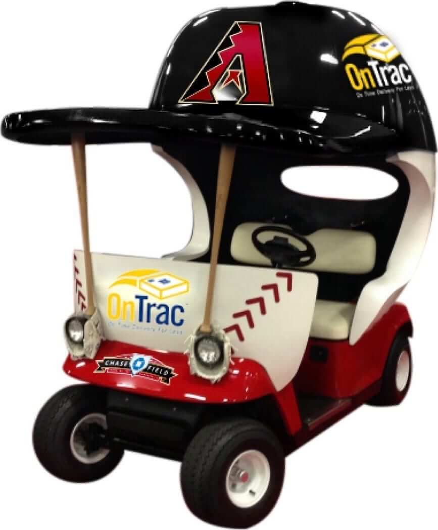
There have been rumors and rumblings for a while now about the bullpen buggy possibly making a return to MLB ballparks, and yesterday the Diamondbacks made it official: They’ve purchased two carts and will use them for the upcoming season.
A few notes and thoughts:
• According to reporting by my ESPN colleague Darren Rovell, who broke this story, D-backs pitchers will not be required to use the cart. The team’s bullpen coach, Mike Fetters, said, “Whatever makes them comfortable. We’re not going to force it.”
• Per MLB rules, the carts will be made available to the visiting teams, as well as to the D-backs.
• The design is similar to the old style from the 1970s, but with some modifications. Here’s a side-by-side comparison (click to enlarge):
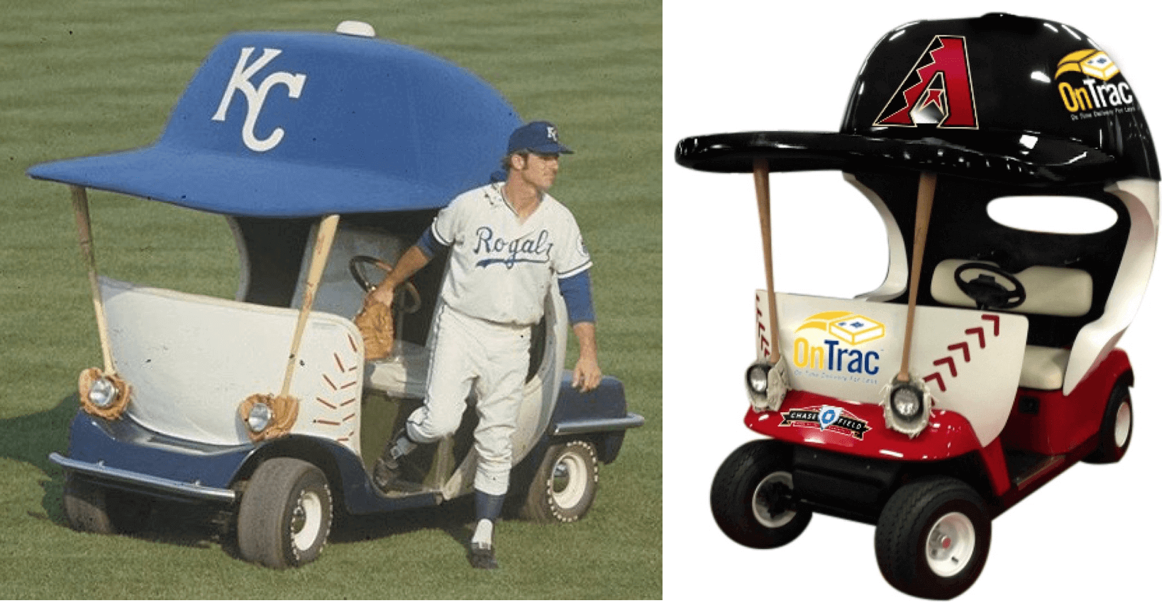
The design definitely pushes some nostalgic buttons, but I’m surprised they’ve made so few changes to the original style. Why stick so slavishly to the original template, complete with the gloves in the headlights and all of that? Why not go with something snake-themed, or Arizona-themed, or maybe one of the more modern-looking carts that they’ve used in Japan?
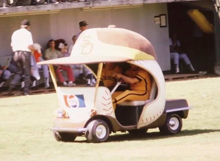
• As you can see, the D-backs have sold ad space on the cart. That’s disappointing but not unprecedented, as you can see on this old Padres cart from the 1970s:
• D-backs team prexy Derrick Hall has said that the bullpen carts could speed up the game, although I’m not so sure about that. The cart’s route will reportedly be from the bullpen to the warning track to the area in front of the dugout (i.e., the cart will not drive directly across the outfield), which is the same way most teams handled it during the original bullpen buggy era. I grew up watching those games, and I recall the carts taking a lot longer than today’s pitchers jogging in from the bullpen. But we’ll see.
• Hall also said he expects other teams to follow the D-backs’ lead. I’m trying to decide how I feel about that. Would you want your team to have a bullpen buggy this season? If so, would you want it to follow the ball/cap format, or would you rather see something new?
If you want to learn more about the history of bullpen carts, I wrote a fairly thorough history of them back in 2007, and then MLB.com expanded upon that with an even more thorough piece last year. Good stuff.
NBA ad update: After a nearly four-month dormancy, the NBA’s uniform advertising program rumbled back to life yesterday, as the Clippers and Mavericks announced that they’ve become the latest teams to sell space on their jerseys (and the first to do so since the Hornets in mid-November). Both ad patches made their on-court debuts last night.
In keeping with the policy I outlined last October, I will not show the ad patches or name the advertisers (if you need that info, it’s extremely easy to find). Instead, I will show how an ad patch makes a team’s uniforms look like crap. Here (for all of these, you can click to enlarge):
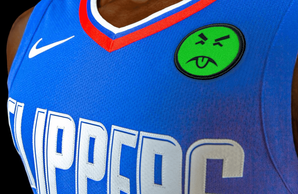
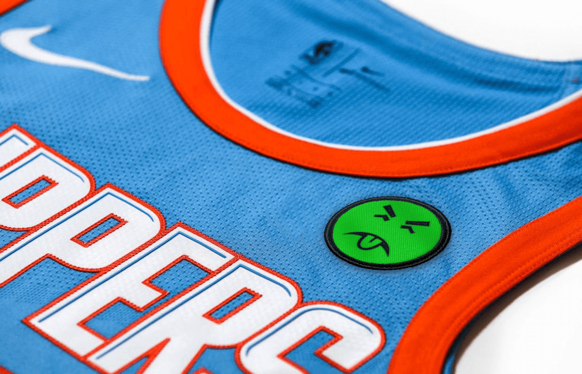
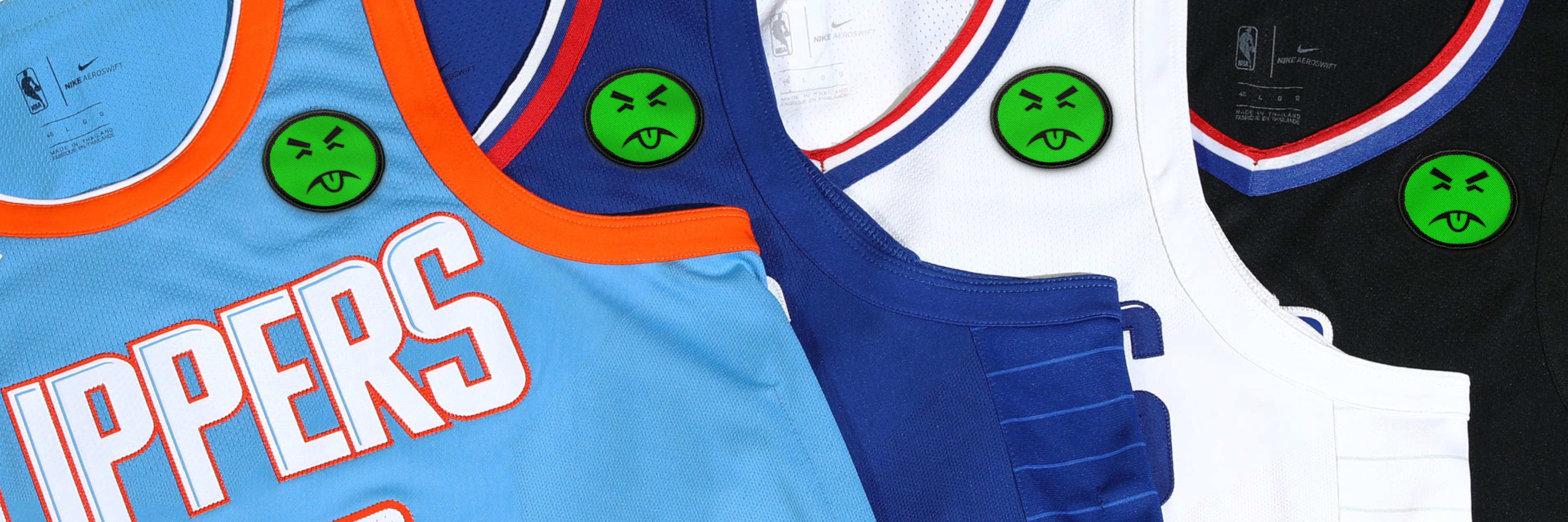
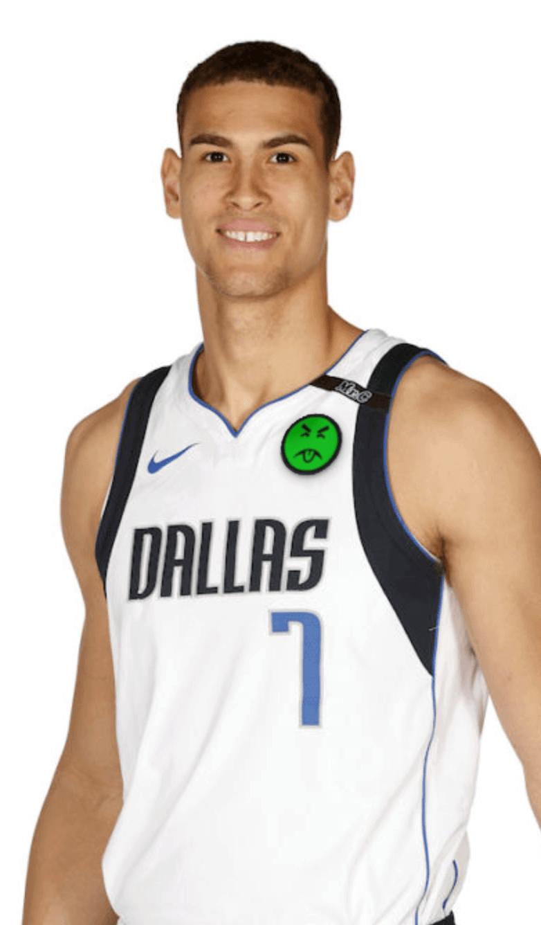
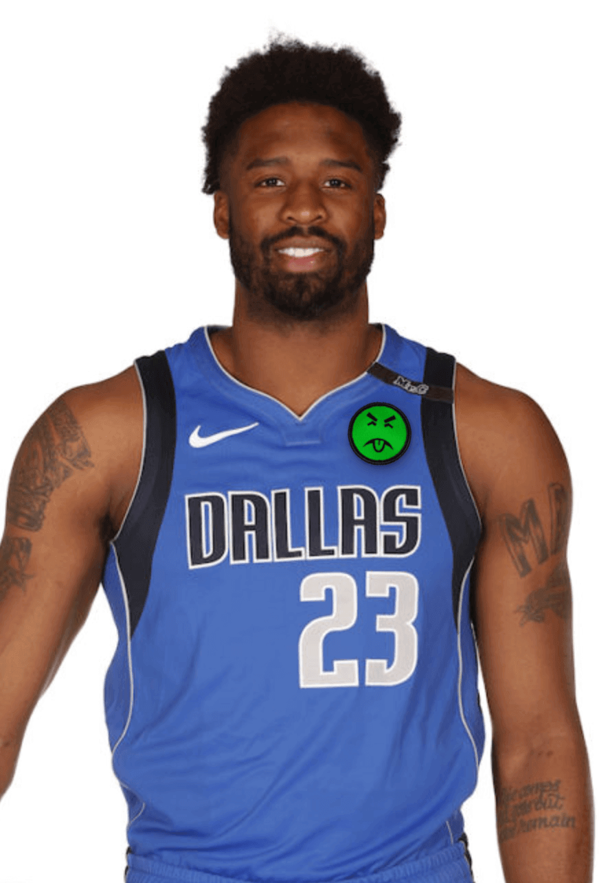
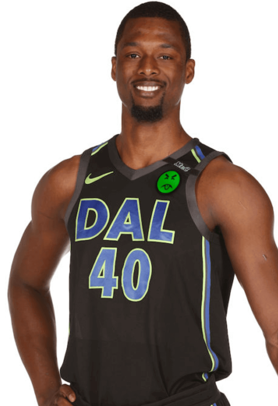
There are now 21 ad-clad NBA teams and nine ad-free teams, so we’ve passed the two-thirds mark. Sigh. #NoUniAds
(My continued thanks to Nic Schultz for his superb Photoshoppery.)
Brannock update: I called the Syracuse Chiefs yesterday to learn more about the details of their upcoming Brannock Device Night promotion. Unfortunately, the woman who answered the phone said that the team’s entire executive staff was stuck in a meeting, although she took down my information (including the fact that I have a Brannock tattoo, which she was a bit puzzled by) and promised that someone would call me back. As it turned out, that didn’t happen, so I’ll call them again today. Stay tuned.
ESPN update: Really sorry that yesterday’s “link coming soon” on the Jags redesign results turned out to be a tease. My ESPN editors decided to hold the piece until at least today. I know it’s frustrating, but the editors often have their own reasons for scheduling (or rescheduling) stories to run at particular times. Unfortunately, I can’t do anything about it. I’m hoping the piece will run today — we’ll see. Update: The piece is now available for your enjoyment.
Meanwhile, I expect to have another ESPN piece today, about notable uniforms in Big East basketball history. This piece is pegged to the start of this year’s Big East tournament, which tips off tonight, so I’m pretty sure this one really will run today. Link coming soon, I hope.
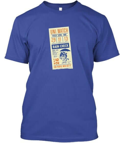
T-shirt reminder: In case you missed it yesterday, our latest limited-edition Uni Watch T-shirt, designed by the great Todd Radom, is now available. It comes in a wide range of colors (including deep royal, as shown at right; click to enlarge) and is available from now through next Thursday, March 15. You can order it here. If you want a color that isn’t shown, get in touch and I can take care of you. My thanks, as always, for your consideration.
The Ticker
By Alex Hider

Baseball News: Mets INF Wilmer Flores is the latest MLBer to adopt the faceguard attachment. … Tim Lincecum will wear No. 44 for the Rangers, in honor of his late brother, and teammate Matt Moore will continue to wear No. 55. … Good piece on how the Cubs break in their new gloves (from Mike Chamernik). … Whoops — MLB’s online store listed a Yankees hat for sale under the Mets section (from Tyler). … New logo and caps for the Daytona Tortugas, the Class-A affiliate of the Reds. … The Class-A Salem Red Sox will wear Autism Awareness jerseys on April 27 (from @peskys_pole). … The Canadian mint has unveiled a new coin design to mark the 150th anniversary of the first baseball game in Canada (from Jorge Cruz). … Rick Rutherford notes that the Mariners, who wore matte batting helmets last season, have been going with glossies in spring training. [I’ll try to find out if this is just a spring thing or an official change. — PL]

NFL News: There will be one less referee in a tiny shirt next season, as Ed Hochuli and his giant arms have decided to retire…. Brad Eenhuis was scrolling through Facebook and found that a friend of a friend has a pair of Bears jeans that include team numbers, striping, and the George Halas perma-memorial. … Alex Bennett has updated his “Gridiron Mismash” piece, which attempts to show the history of football in one image. He’s still taking suggestions to fill in the gaps.

Hockey News: Some McNOB inconsistencies for the Panthers: Derek MacKenzie and Jared McCann each wears a base-aligned “c,’ while Jamie McGinn’s “c” is raised (from Brian C. Johnson). … The Predators have painted “1320” behind each net at Bridgestone Arena, which commemorates GM David Poile becoming the winningest general manager in NHL history with more than 1,320 wins. … More Clover Watch from Bryan Martin Firvida: The NHL has its problems with four–leaf clovers, but also gets it right in more than a few instances. … Speaking of Clover Watch, the Chicago Wolves of the AHL are using a four-leaf clover, rather than the proper three-leaf shamrock on their St. Patrick’s Day sweaters (from Jonathon Cain). … The Reading Royals of the ECHL will wear autism awareness sweaters on March 24 (from Jackie Tyler). … Attendees of Mario Lemieux’s fantasy camp get to wear Penguins sweaters — only the maker’s mark has been moved to the front collar, and the back includes the camp’s logo (from Zack Tanner and Noah Kastroll). … The women on the McGill University hockey team took a pretty sharp team photo in 1927 — you can’t beat that chest protector with a skull and crossbones! (From Nick Maibroda).

Basketball News: The Bucks are holding “Noche Latina” on Friday and giving away this T-shirt (from Garrett). … The Washington Post has a great piece about how James Madison clinched a spot in the 2013 NCAA Tournament while wearing sweaty, unwashed uniforms (from John Gagosian and Paul Friedmann). … Lots of St. Mary’s players are doing the Under Armour roll. More on that phenomenon here (from Jared). … Mike Knapp found a pair of Ohio State game programs from 1948, both of which list home games as being played “here” on the Buckeyes’ schedule.

Soccer News: New home kits for Cruzeiro of Brazil’s Serie A (from Ed Zelaski). … ACF Fiorentina and Cagliari FC of Italy’s Serie A will both retire No. 13 in honor of Davide Astori, who tragically died this weekend at age 31 (from Anthony Emerson). … It appears that Liverpool is covering some seats at Anfield in red in order to obscure advertisements spelled out in empty seats for Champions League games (from Matthew). … FC Cincinnati has sold ad space on team shorts in addition to the ad it has already sold on jerseys (also from Ed Zelaski). … MLS used an old Philadelphia Union crest as the thumbnail on one of its videos recently (form Noah Fischer). … Deer Park Rangers FC, a rec league team based in Louisville, has some pretty slick home kits (from Kevin Smith).

Grab Bag: Recently, Bunbury Senior High School in the southwest of Australia celebrated its 100th anniversary. Allan Jennings sent along some old uni-related photos from the celebration, including a shot of the 1923 field hockey team, a 1958 Aussie rules football match between the basketball and hockey teams, and 1950s shot of the football team. … Sonja Bata, who opened the Bata Shoe Museum in Toronto (NYT link), died Feb. 20. Her museum has more than 13,000 shoes (from Tommy Turner).
Shamrock, not schmarock.
Links are broken to the bullpen buggy historical pieces.
here is one of the proper ones
link
Weird. Should be fixed now.
Love the bullpen buggies! I get why they’re sticking to the old school design. They’re a nostalgic thing for older fans — like me — who remember the days of Tug McGraw bounding out of the cart.
Ed Hochuli….
You gotta give him some credit. He *could* have pushed up those sleeve to REALLY release the pythons! Or maybe cut them SHORT to welcome us to the gun show!
And Ed is being replaced as a referee by his son Shaun.
Love me a bullpen buggy!
or a helmet cart, or personalized/modified golf cart,
Link for “Gridiron Mismash” accidentally reads “Gridiron Mismatch”. Love your work!
Got it.
“Gridiron Mishmash”, not “Mismatch”. Although it might be a Freudian slip, so I get it…
Of the few bullpens carts that exist today, here is a better look at the Vancouver Canadians’ cart in action compared to the photo in the mlb.com story linked in today’s lede.
link
That “Gridiron Mismatch” piece is frickin’ awesome. Couple of suggestions for what’s missing (or that I somehow missed):
– Joe Namath running off the field with “#1” finger in the air (instead of the muddy sideline poncho pose).
– Alan Ameche winning the 1958 championship game.
– Tom Dempsey’s 63-yard FG (instead of in a Rams uniform).
– Herschel Walker in a Generals uniform (instead of Georgia).
– Dave Casper’s “holy roller”.
– Doug Flutie, Boston College v. Miami, 1984.
– LT breaking Theismann’s leg.
– Mike Jones tackling Kevin Dyson to end Super Bowl XXXIV.
I’m sure I’ve just missed some of these; there were about 5 more on the list that I found while typing this!
-Riggins 4th and one v. Dolphins
-Snow plow
-Marshall’s wrong way run
-Jim O’Brien unbuckled chinstrap filed goal
-Marshawn Lynch stiff arms Tracy Porter
-Bum Phillips
-Butkus
a zillion more
Jim Marshall #70, lower left, with his back to us of course.
Do a ctrl-F for “balll/cap.” You’ll find a typo.
Got it.
I love the bullpen cart, and I’d love to see the Astros have one with an Astros cap. No need to reinvent the wheel (or the cart that has wheels).
No idea how reliable spring training box scores are, but in yesterday’s game, link. That should in fact be “at least” two and three, because some players’ numbers aren’t listed.
The Jaguars redesign piece is now available:
link
A typo and a context thing in the ESPN piece. In the first entry from Trevor Tierney you have this sentence as written:
“In both cases, the gold stripe in the center pops just enough just enough to provide some warmth throughout the design.”
You have “just enough” written twice. I don’t know if you accidentally did it, the editor copy/pasted it wrong or if it’s missing a comma, but something weird is up.
Thanks. I’ll alert my editor.
Very enjoyable piece, Paul! Pretty much all of the contestants’ submissions are better than what the Jags have been wearing the past few seasons.
Several of the designs make it clear what a sharp color combination teal and gold can be. It would be a real shame if the Jags de-emphasize the gold in their new uniform designs, as the rumors have suggested they might.
I want to like Kennedy’s leaping jaguar, but tapering it off to a point doesn’t work for me.
I agree that the sock stripes should be higher and the alt uni comes a little too close to looking like UCLA for me – although I’m sure that the jersey is actually a much different shade of blue. But as a whole, take away the metallic flake helmet and O’Keefe crushes the Jaguar redesign.
Even if you object to the Clippers’ ad patch from an aesthetic basis, at least it’s for a good cause. link
For a good cause? Don’t fall for the “empowerment badge” nonsense. Their corporate advertiser is simply a business that allows women to online date on a platform where men cannot make the first move. If said company had their jersey ad feature some charity that works to aid women that would be one thing. They are simply a company like any other. Would you consider it a good cause if a feminine hygiene product advertised? That’s basically the same thing.
Would Paul reject any of the sponsors for uni-watch if they were generating ad revenue for this site?
Paul *has* rejected advertisers, and does so on a regular basis.
If you’re trying to suggest that uniform ads are OK because “Hey, it’s just business,” that argument has never worked here at Uni Watch. Here’s why:
link
I hate that NBA teams are having advertising on uniforms, but I still want to see what they look like and who the advertisers are. I want to see if they are team colors or stand out with separate company colors. I get your protest, but it is newsworthy about uniforms, and this is a site that reports about uniforms.
it is newsworthy about uniforms, and this is a site that reports about uniforms.
We’ve already been thru this multiple times, Rick. The main newsworthy thing, as far as I’m concerned, is that the teams have ruined their uniforms by selling space on their jerseys.
This is a site that reports news, but it is also a site that provides commentary. I feel that the Mr. Yuk treatment provides the right balance of both. It identifies the teams and shows that a uniform ad ruins a uniform. If you want additional info, it is extremely easy to find, but I prefer not to give more exposure or “brand value” to the advertisers.
I totally understand and appreciate your take on this. I on the other hand would like to see these, and see how badly they make the uniforms look. Some are subtle like Cleveland, while others are completely gross. I also find it interesting if there is a local tie-in with the city, or if it’s a big national comglomerate. I also thought it was interesting that on the Clippers the colors were different for the different uniforms, with yellow on the blue and black unis, white on the light blue, and black on the white. But I get it that any exposure is benefiting these advertisers.
Thanks, Rick. I appreciate and respect your position as well. This really underscores how uniform advertising is just a miserable phenomenon, creating no-win situations.
There are other ways, you know, to find out this information, Rick.
Just sayin’
Milwaukee used to have a Harley with a sidecar as their bullpen delivery vehicle. Not sure if they still do. I like the baseball and hat golf cart, but the motorcycle was a good fit for the Brewers. Harley is a local business.
Mishmash suggestions
The holy roller
The sea of hands
Drew Pearson pushing off Nate Wright on the Hail Mary
I understand your thought on being against uniform advertisements.
But I find it absurd you post 7 big pictures of the uniforms with that stupid yucky face, WE GET IT PAUL you’re anti-ads on nba uniforms, I don’t see the point in not only posting the 7 pictures if you’re not going to show the ad, but asking some poor guy to photoshop all those pics (Worse yet is he probably volunteers)
I don’t see the point in not only posting the 7 pictures if you’re not going to show the ad…
The point is (a) showing how ad ad patch ruins all of the team’s jerseys, not just one, and (b) the cumulative oomph that accrues through repetition.
If you don’t care for it, just scroll past it. Simple.
I’m really impressed at how seamlessly Mr. Yuk fits on the Mavericks jerseys, especially the alternate with the lime green. I haven’t seen that patch fit any other jersey as well.
It is ideal for their “DAL” jersey, since using a random abbreviation for the sake of it make the jersey awful to begin with. I’m not from the Dallas area, but I have never heard that nickname. I mean Philly, Nola, A.T.L., I could see those, but does anyone call the city/region “DAL”?
No, but DFW would work.
Nope. Never. I’m from Fort Worth and would have loved to see DFW. They do call it Big D though.
“team prexy?”
Holy vernacularism, Batman!
Mr. Yuk is so endearing I want to get some of his patches and put them on actual jerseys. Well, not jerseys, but maybe on a hoodie or jacket.
I’m not sure how I feel about your use of Mr. Yuck instead of showing the ad, but I just wanted to say that I definitely appreciate the effort that you’re putting into the photos.
The texture on Mr. Yuck and the way its angled to look like its really on the jersey. The effort is not going unnoticed.
The Daytona Tortugas have been wearing those caps for at least two seasons now.
Even the BP one with the D on the turtle?
I don’t know about the BP hat and don’t really keep track of BP “gear” but I am looking at photos on my computer right now that I took in May 2015 when they wore the exact same light blue hat with white panel, same logo, and I purchased the very same green cap that day too.
Yeah, the game caps are unchanged. The green one with the D and the turtle is my go-to vacation hat. But I’d never seen either the BP logo or the BP cap’s color (not sure if it’s more of a neon or a pastel). But I only know the Tortugas from liking their logo and following them on the MiLB app, so they could have been wearing the BP logo for years and I might never have seen it.
“The cart’s route will reportedly be from the bullpen to the warning track to the area in front of the dugout (i.e., the cart will not drive directly across the outfield), which is the same way most teams handled it during the original bullpen buggy era”
Is this correct? I seem to recall the carts coming directly across the outfield and infield to the mound in stadiums with astroturf.
Obviously they wouldn’t do this today (two stadiums with turf and none with cutouts), I’m just questioning my memory of the 1970s.
I guess it depended on the team. Obviously, most of my memories are from Shea, but I saw plenty of buggies at other stadiums (on TV, I mean, not in person), and I mostly remember the buggies coming down the dirt warning track area. But maybe there were some that went onto the field.
Back to the Class-A Vancouver Canadians who have the bullpen cart today. They do drive it onto their grass field. What I remember from seeing recent games is that the cart drives across the outfield but stops at the dirt infield. Found this photo which seems to corroborate that memory:
link
If I were in charge of the baseball buggy program, then I would have the relief pitcher drive himself out to the mound, and the pitcher he was replacing would have to drive the buggy back!
And manual transmissions, just to spice it up.
Lee
Oooh, that’s good. You are a promotional genius!
I’d just make sure to instruct them to drive slowly so the pitcher’s bump music has a chance to play all the way through. ;-)
I’ll bet a lot of them don’t know how to drive a stick in this day and age.
That’s the spicy part!
Lee
What would guys like “Wild Thing” Vaughn, who can’t see well enough to be licensed to drive a car, do? (Wait, the ballpark is private property, so I suppose you don’t need a license to drive there.)
I dont have a stance on the YUK logo on the jersey vs showing the ad but I just read the following on ESPN:
The Clippers have partnered with the dating app Bumble to create the latest advertisement to grace NBA jerseys. But lest you think this ad for the dating app known for requiring women to make the first move is, uh, just an ad for the dating app known for requiring women to make the first move—don’t worry, it’s more. It’s so much more. What looks like an ad is actually an “empowerment badge,” designed to promote gender equality. Here’s an illuminating quote from team owner Steve Ballmer about how meaningful it is, albeit without any indication of what it actually means:
“We wanted to do something where we could really stand out and do something meaningful. The way it is positioned it becomes part of the game, so it’s an opportunity to have more meaning for everybody.”
Wow, Steve Ballmer….The Susan B Anthony of the NBA.
Wow, who wrote that nonsense for espn? All sorts nonsense and intellectual dishonesty going here. Surprised the Cavs didn’t claim their ad was an empowerment badge for all american workers in the auto industry…
But what if one of the teams decides to go with Mr. Yuk as their jersey advertiser?
COTD!!!!
So Uni-Watch’s lede today is about rolling billboards making a comeback in MLB, complete with photographs showing the corporate sponsor. Hockey pictures on the site never censor dasher board advertising, basketball pictures always include floor and arena ads, and last week you had TWO comprehensive reviews of MLS kits, which probably have more advertising per square inch than uniforms in any other sport besides NASCAR and Olympic skiing. You point out just about every time a New Era logo is visible, or not, on MLB hats. But you continue to sit on a high horse and cover up NBA ad patches with that stupid Mr. Yuk icon because that specific kind of uniform advertising offends your sense of the purity of sport and journalistic integrity? PUHLEEEEEEEEEEEZE. Gimme a break!
Some of us think that an ad on a player’s uniform is different than an ad anywhere else, because the uniform already stands for a brand — the brand of the team.
But if you’d like me to Yuk-ify all the ads that appear in other photos on the site, I’ll consider it. Perhaps you’d like to help?
Like you, I’d rather not see any advertising on any uniform. For a long time, that was a big difference between professional team sports in the US and other countries. And now, even the most traditional sports – golf and tennis – have become unbearable logo fests. Frankly, of all the major team sports, basketball is my least favorite. But for the life of me, I just don’t see how – if this site is meant to be a comprehensive review of sports uniform aesthetics and news – that censoring NBA jersey ads and refusing to address the sponsorships (which more often than not do seem to have some kind of local connection) makes sense if you continue to prominently show advertising that appears on uniforms in other sports.
I’m sorry if it doesn’t make sense to you, Bill. But it makes perfect sense to me, for reasons I’ve already explained many, many times.
You may find it useful to go back and read this:
link
And we’ve all read your rationale many times. It’s disingenuous and hypocritical, especially fromantic someone who’s just announced how vital it is for him to implement a fee to monetize his site. What’s critical for you apparently doesn’t cut it for other for-profit enterprises. Good kuck.
If you truly think there’s an apples-to-apples correlation between a professional sports team that has literally dozens of highly lucrative revenue streams and a website that gives away its content for free, well, enjoy those apples.
Back here on planet Earth, however, your comparison is laughable and you are just a troll.
Phil, we’ve exchanged messages several timesin the past, and I have contributed itemp to the site. This is the first time we’ve ever disagreed on an issue. If you can’t accept comments from long – time readers, and for that matter, people you might want to patronize your site in the future, don’t solicit them. I said that I think your position is disengenous and hypocritical, but I never called you a name. Characterizing me as a “troll” is unfair and completely uncalled for. But don’t worry, you won’t have to worry about hearing from me again.
You’ve “never called [me] a name”? I respectfully direct your attention to your previous comment in this thread, where you called me a hypocrite (without specifying how or why, incidentally).
Honestly, some people.
BYE, BILLECIA!
link
Like you, I’d rather not see any advertising on any uniform. For a long time, that was a big difference between professional team sports in the US and other countries. And now, even the most traditional sports – golf and tennis – have become unbearable logo fests. Frankly, of all the major team sports, basketball is my least favorite. But for the life of me, I just don’t see how – if this site is meant to be a comprehensive review of sports uniform aesthetics and news – that censoring NBA jersey ads and refusing to address the sponsorships (which more often than not do seem to have some kind of local connection) makes sense if you continue to prominently show advertising that appears on uniforms in other sports.
In the age where they are trying to speed up the ball games, it would seem counterproductive to add bullpen carts which (per the lede) would slow things down.
Yeah, given the commish’s stated priority to speed things up, I find this move a bit puzzling. But hey, maybe today’s carts are a lot faster!
Since the bullpens in Arizona are located at the foul pole, I am not sure it will S-L-O-W down the pitcher getting to the mound, although I am not sure it will significantly speed it up either.
Based on bullpen location, there would be no need for the carts to cut across the outfield, but I don’t know why they can’t make a turn where the infield cut out begins, and then be dropped off directly behind the mound.
That seems to me would make it as quick as possible.
They still haven’t put me in charge though, I’m waiting.
Lee
I refuse to take any of their pace of play initiatives seriously until they do more about commercial breaks. I know they lopped off a bit for this season, but it’s still going to be (I think) 2 minutes during the regular season & 2:55 during the postseason. It strikes me as disingenuous, as I’ve read that most of this really has to do with TV partners wanting to get games in under a nice, tidy 3 hour mark, when knocking a minute off every half-inning break would net 15+ minutes every game. Serious fans probably don’t care, and I suspect there’s not an overabundance of casual or non-fans out there saying, ‘we’ll talk when you can shave another 2 minutes off by making pitchers run in from the ‘pen.’
Relievers walking out isn’t a problem. Heck, usually that’s a commercial break anyway, so no way does MLB actually permit that process to take less time. I’ll take the “speed the game” pleading seriously when they use a buggy for managers’s visits to the mound.
Well, that or empower umpires to actually enforce the many time limits already written into the rules of the game.
Pace of play problems really begin and end with not enforcing the pace of play during at bats. Stop allowing the batters to step out of the box all the time, and have a loose clock on the pitcher as well. Once you do that it solves itself. Give it one or two seasons as it becomes habit, and it will enforce itself.
Yes yes yes! The rules, as written, require the batter to stand in the box throughout the at-bat or face the award of an automatic strike. For reasons that I assume have mostly to do with the wealth and therefore implicit power asymmetry between modern players and modern umps, batters tell the ump when it’s time out, rather than asking for a time out. If league officials simply reminded umps that time out is their discretion to award, and should be awarded only when the physical safety of the batter might reasonably be at stake, games would speed significantly. And not over two seasons; the change would be instantaneous, or anyway instantaneous after the first time a big-name player was awarded a strike in a game-critical at bat.
The only rule I’d change or add to speed the game, beyond enforcing the dead-letter rules on the books already, would be awarding the batter a ball, but never ball four, any time the pitcher throws to a base other than home during an at bat. Batters stand in the box, pitchers throw to home plate, and there’s the supposed games-take-too-long problem solved.
Since the gridiron mismash has TO on the star, they ought to put George Teague off to the side.
Anyone else remember when the Yankees used a Pinstriped Toyota Celica for the bullpen car?
And then it showed up for sale in the classifieds!:
link
I’ll give you $25,000/yr if you agree to add my corporate logo to all of your UniWatch shirts. Maybe then you would reconsider the subscription model for the site? I hope? ;)
Gridiron Mishmash:
“The Band is on the Field!”
Oregon Duck on Motorcycle
Kenny Wheaton INT vs UDub
Touchdown Jesus
T.O. on the Star as a 49er, and with Emmitt Smith
Paul, I’m genuinely curious…why are you okay with showing corporate logos on MLS uniforms but not on NBA uniforms? Thanks.
I’m not OK with ads on any uniform. But I don’t much care about MLS; I care a lot about the Big Four (which are called the Big Four for a reason).
Yea, I didn’t say you were okay with ads on MLS uniforms, just that you have been okay with showing them on your site…even as recently as this past Saturday’s lead. I certainly agree with you in not preferring ads on uniforms, but there seems to be an inconsistency in how you apply your policy. So, its simply the prominence of and/or your interest in the league that is the difference for you?
Uniform ads have been standard in soccer for decades. They are new to the Big Four. I don’t want them spreading to the other Big Four leagues, and a big part of that is refusing to let them be normalized.
Similarly, uniform ads have been standard in minor league hockey for many years. Again, I’m not a fan of that, but I’m also not prepared to make a big stink over it. But the Big Four is different.
PLs drowning if you can’t tell
It has always been my understanding that the bullpen cap buggies debuted in 1971 and were highlighted quite a bit in the 1971 World Series for their novelty.
link
As a big Met fan from the early 1970s, I remember the carts well. I don’t think the Mets had them in 1971. I don’t know about 1972. I know they had them in 1973, as my little league team went on the field and I remember noticing the glove headlights, which I had not noticed on TV. This article has a pic from January 1973 and they had one that looks very new.
link
I will try to do more research, but as of now I believe the Mets were not the first team to use the carts and they first used them in 1973.
The first bullpen car introduced in Major League Baseball (MLB) was “a little red auto” used by the Cleveland Indians in 1950 at the large Cleveland Municipal Stadium. The Chicago White Sox followed suit in 1951, becoming the first team to transport the pitcher from the bullpen all the way to the pitcher’s mound.[1] The White Sox discontinued the practice in 1955 after fans continued throwing garbage at the car.[2] In 1959, the Milwaukee Braves began to use a Harley-Davidson Topper with a sidecar as a bullpen car.[3]
In 1963, the Los Angeles Angels became the first team to use a golf cart as their bullpen car. The New York Mets introduced a bullpen car based on a golf cart with an oversized team hat in 1967.[4] The New York Yankees began using a Datsun 1200 painted with pinstripes in 1972. Rats chewed through the Datsun’s cables,[5] and the team switched to a Toyota Celica in 1982.[2][4] The White Sox introduced a bullpen car built off of a Chrysler LeBaron in 1981,[4] but it was also unpopular with pitchers, who refused to ride in it, and fans, who threw garbage at it.[2]
The Mets did not have those carts in 1967. They did not have them in 1969. Look at this from the 1969 World Series. Turn to the 1:42.31 mark.
link
UEFA are very strict about advertising during Champions League broadcasts. Non UEFA partners are not allowed unless on the teams uniform (and that was banned until 1996), so advertising in empty seats before the crowd arrive has to be blocked, stadium names like Emirates Stadium or Allianz Arena are not used.
Here is Nike and Qatar Airways being blocked out at the Camp Nou for instance
link