Click to enlarge
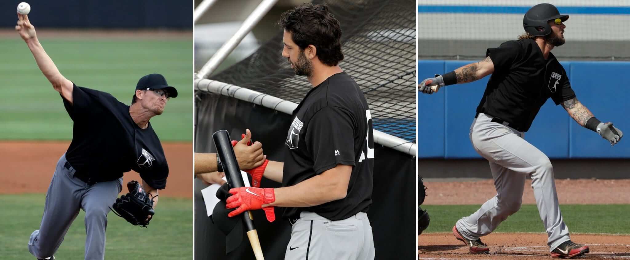
There were several articles yesterday about “Camp Jobless,” the spring training camp for unsigned free agents that’s been set up by the Major League Baseball Players Association. I was surprised to see that they have uniforms. Let’s take a look, from head to toe:
Caps: Plain black with no logo on the crown. They appear to have some sort of maker’s mark on the side (presumably New Era’s, although I haven’t seen a clear enough photo to confirm that).
Batting helmets: Plain black, matte finish.
Jerseys: Black, with the MLB Players Association logo on the upper-left chest. Numbers on the back. NNOB (which is a shame, because Jarrod Saltalamacchia is working out at this camp). Majestic maker’s mark on the left sleeve.
Pants: A hodgepodge. The one constant is that everyone is wearing grey. But if you look at the three photos shown above, you’ll see that one player has black piping and a Nike logo while the others are piping-free. And here’s a player with blue piping and a Majestic logo (click to enlarge):
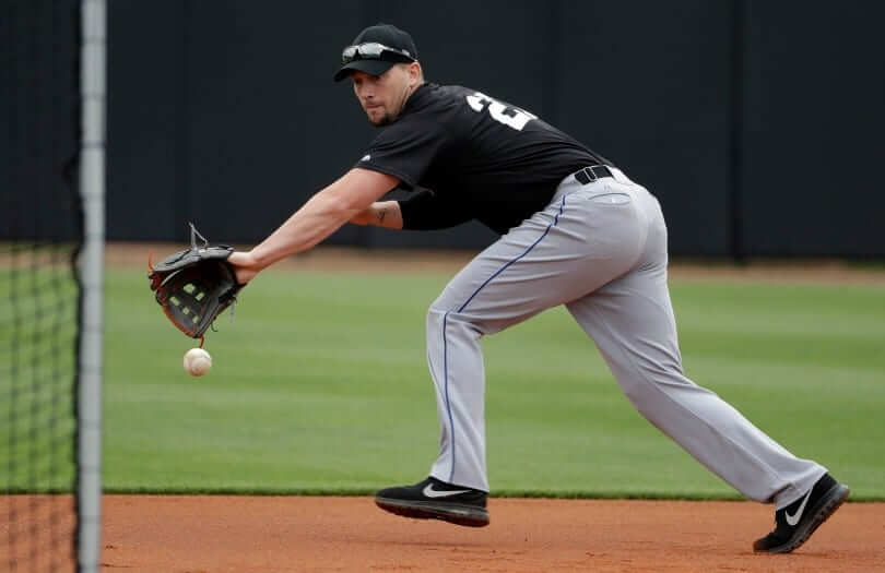
Everyone appears to be going low-cuffed, at least based on the dozen or so photos I’ve seen so far.
Shoes: A mishmash of colors, as you’d expect.
The most interesting thing about all of this, at least to me, is the MLBPA logo. Here’s another shot of how it looks on the jersey, followed by a closer look at the logo itself (click to enlarge):
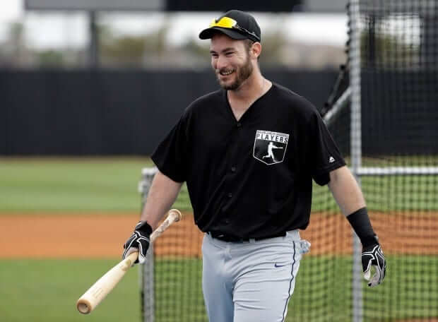
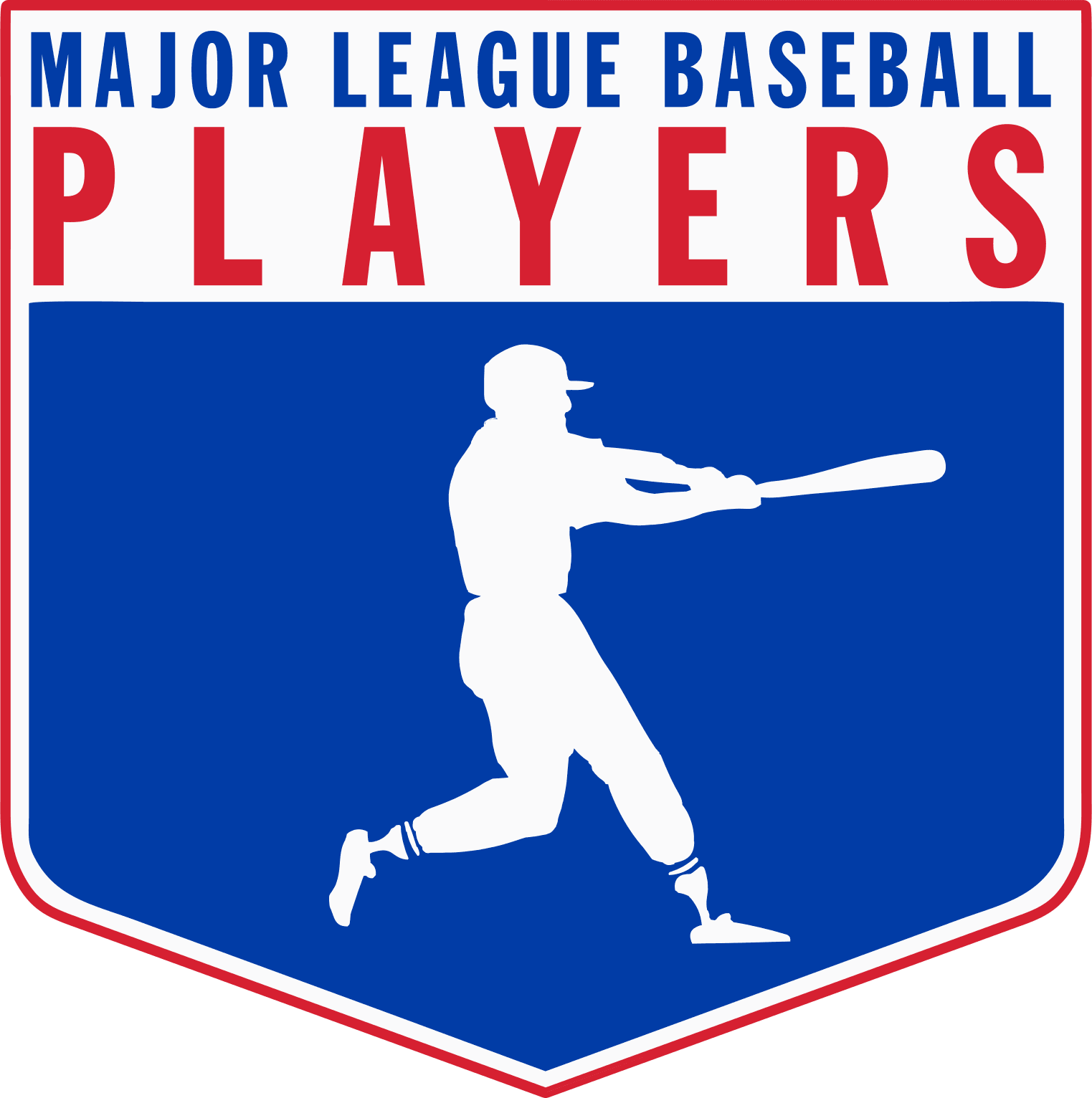
That logo has been around at least since the early 1970s (I remember seeing it when I was growing up), and maybe since the union’s founding in 1966. As you can see, the silhouetted player is clearly wearing striped stirrups — a detail I approve of (duh), although it’s obviously way out of step with contemporary uniform styles. It’s sort of like the NBA’s Jerry West logo, which shows the player wearing short shorts. You can understand why the NBA has been reluctant to update that mark, because it has so much brand equity and generations’ worth of familiarity, but I’m surprised the MLBPA hasn’t updated their logo. I like it, but it seems like it’s overdue for an overhaul.
Your input is hereby requested: It’s been a while since we had a new Uni Watch T-shirt, but Todd Radom — this week’s birthday boy — has been working on something very cool for us. Check it out (click to enlarge):
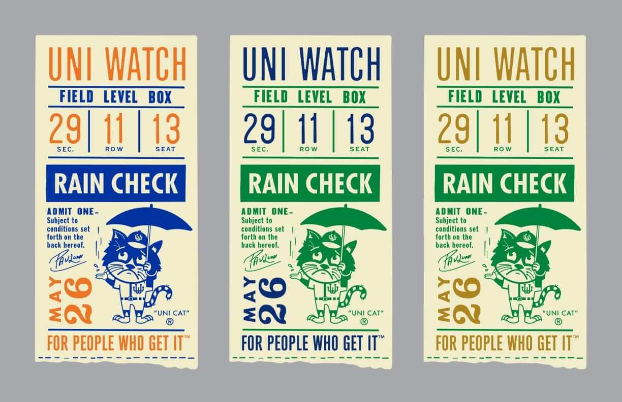
Pretty cool, right? The design concept is based on, of course, the Mets’ old rain check format, but with a new “Uni Cat” mascot substituted for Mr. Met. The section, row, and box numbers are all prime numbers (Todd did that at my request), and the May 26 date is the anniversary of when the first Uni Watch column appeared in The Village Voice (using that date was Todd’s idea).
As you can see, we’ve considering three different color combos. Whichever one we end up using, we’ll make it available on a wide variety of shirt colors — black, grey, navy, olive, maroon, etc. Here’s how each of them might look on a grey shirt (the ticket stub size and angle are not final; click to enlarge):
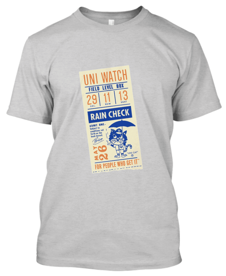
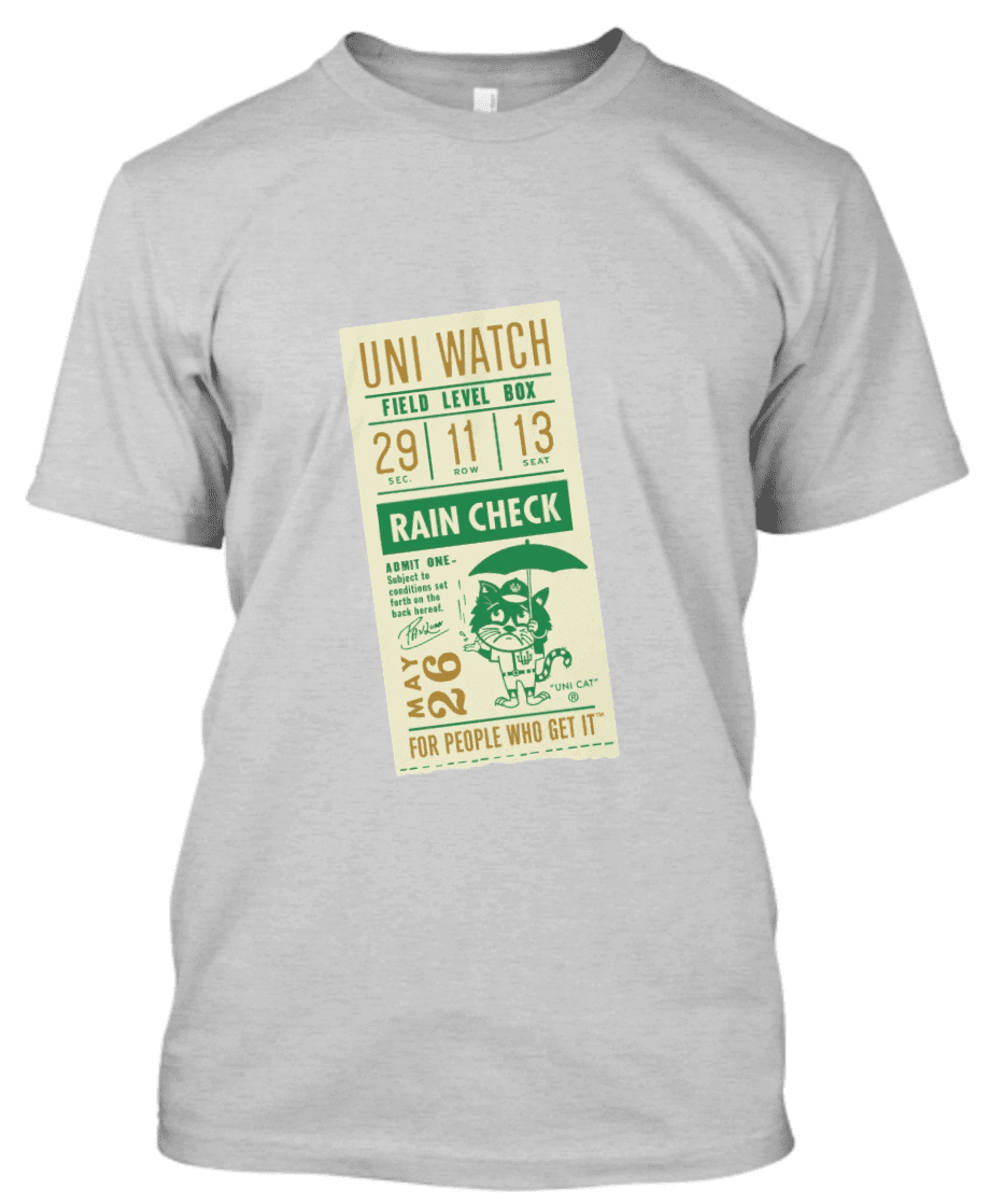
Again, this will be available in other shirt colors besides grey. Frankly, I like all three color combos — it’s a tough choice! If you have a favorite, please indicate it here:
[totalpoll id=”94151″]
Thanks for your input and consideration — much appreciated.
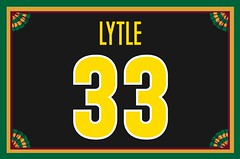
Membership update: Four new designs have been added to the membership card gallery (including Trevor Lytle’s, shown at right, which is based on Wichita State’s 2013 Final Four uniforms). I still have four open slots in the current batch.
Remember, a Uni Watch membership card entitles you to a 15% discount on any of the merchandise in our Teespring shop. (If you’re an existing member and would like to have the discount code, email me.) As always, you can sign up for your own custom-designed card here, you can see all the cards we’ve designed so far here, and you can see how we produce the cards here.
Big news: In case you missed it yesterday, big changes are afoot here at Uni Watch. Details here. My thanks to everyone who provided feedback yesterday — I really enjoyed the robust discussion.
The Ticker
By Paul

Baseball News: The Braves are making minor tweaks to their color scheme this season. Here’s a good rundown. … New uniforms for the Augusta GreenJackets. Additional info here (from Kevin Monahan). … Logan Morrison, who has worn Nos. 5, 7, and 20 throughout his MLB career, will wear No. 99 with the Twins. He’ll be the 18th MLB player to wear that number. Here are the other 17 (from Peter F). … Here’s a 1940 shot of Babe Ruth, after his playing days, wearing a Yankees uni with the interlocking “NY” chest logo. The Babe never wore the “NY” when he was an active player (from @BSmile). … A reporter who covers the Mariners thinks the team should abandon its trident-based spring training caps because they’re bad luck (from Jimmy Wong). … New Marlins owner Derek Jeter wants to get rid of the team’s home run sculpture, but he might be stuck with it (thanks, Brinke). … New alternate jersey for the Asheville Tourists (from Blake Pass). … The Red Sox have asked the city of Boston to rename Yawkey Way. It will go back to its original name, which is — get this — Jersey Street (thanks, Phil). … New Padres signee Eric Hosmer originally wanted to wear No. 35 in San Diego, but that number has been retired for Randy Jones, so his next choice was No. 30, as a shout-out to his former Royals teammate Yordano Ventura. Coach Glenn Hoffman was wearing No. 30 but changed numbers to accommodate Hosmer, who has now paid him back with a Rolex watch (thanks, Phil). … Mets OF Yoenis Céspedes wore his “La Potencia” warm-up top from last August’s Players Weekend yesterday (from Gregory Zitelli).

Football News: Well, that didn’t take long: With Papa John’s no longer serving as the NFL’s official pizza, Pizza Hut has stepped in to take that title. … Remember that new development league that was announced a while back? Adidas has now partnered with them. The league will supposedly launch in 2019 (from Lee Wilds). … While looking for something else, I noticed that Amherst High School in Wisconsin uses a recolored version of the Falcons’ logo. … Florida coach Dan Mullen says the team will have a BFBS uniform “at some point” (thanks, Phil).

Hockey News: Don Cherry-themed jerseys upcoming for the Edmonton Oil Kings (thanks, Phil). … The Grand Rapids Griffins will wear purple cancer-awareness jerseys tomorrow night. … The Canadiens are having a poor season, which has been bad for local merch sales. … Here’s an aerial shot of that shows how Navy Stadium is getting an aircraft carrier-themed makeover for this weekend’s Caps/Leafs Stadium Series game (from Eric Griffin). … The Canadiens are the latest NHL team to wear rainbow-patterned pregame warm-up jerseys to promote the “Hockey Is for Everyone” program (from Alan Kreit).

Basketball News: A building on UCF’s campus was briefly evacuated yesterday after a man wearing a LeBron James jersey interrupted a class by throwing a white powder into the air. It turned out to be harmless (from Mike Chamernik). … When the Celtics recently posed for a team portrait, Gordon Hayward didn’t have the black memorial band that everyone else was wearing. “I’m interested to see if they Photoshop it in once the photo is finalized,” says David Sperino. … Caleb Patrick suggests that if Raptors G CJ Miles wanted to wear a nickNOB, he could go with “Kilometers,” since he plays in Canada. … High school basketball shorts are getting short again (from @GBuchJr).

Soccer News: New keeper kits for Orange County SC (from Ed Zelaski). … Sprinter Usain Bolt will be playing in Soccer Aid, a celebrity soccer game that aims to raise money for UNICEF. He’ll be wearing No. 9.58, a reference to his world record time in the 100 meters (from Matt Pontoriero). … New logo for the Ghana Premier League. … Yesterday’s Tottenham Hotspur/Rochdale FA Cup fifth-round replay was played in the snow, so all the field lines were painted light blue (from our own Jamie Rathjen).

Grab Bag: A new line of LaCoste polo shirts will feature chest logos depicting endangered species, instead of the brand’s familiar crocodile logo. … New cricket jersey for Somerset (from @SullyEqual). … This is pretty great: The Illinois marching band sousaphone section has caps with a sousaphone logo (from @mrmichael21).
I’ll be spending most of today out on Long Island with my mom. Play nice while I’m away, yes? Thanks. See you back here tomorrow. — Paul

I voted blue and orange, because the cat mascot (mascat?) looks the best in blue. I’d like to see it with green as the second color (basically flip the blue and green on the middle option).
Not sure if this is just going to be a t-shirt, but it looks like it would be a good poster.
I love, love, love the ticket stub shirts, especially the blue/orange. But I just can’t get past how it’s angled on the shirt, and the graphic appears to be too low. But that’s just me.
Like I said, the size and position are not final. It will definitely be angled at least a bit, though.
I thought the same thing and agree with 100% of everything you just mentioned. Blue cat, green Uni Watch. Good poster.
I don’t know much about art, but I know what I hate. And I don’t hate the Marlins’ Homer sculpture.
I can’t decide if that statue is the best thing Jeff Loria did for the Marlins, or the only good thing he did for the Marlins. Either way, the fact that Jeter wants to demolish it pretty much confirms my low esteem for the man.
I think it is the most obnoxious, ridiculous, childish, ill-conceived, poorly-designed, overly-neon, plasticy, themepark-rejected thing I have ever seen.
The more I type, the more I like it!
Isn’t Miami one of the most obnoxious, ridiculous, childish, ill-conceived, poorly-designed, overly-neon, plasticy, themepark-rejected cities in America (kind of kidding)? And I love it! Miami and the sculpture go perfect together. MIA should go full heel and just embrace the absurdness of the city and it’s culture (like the Heat and the Miami Vice unis)
The big issue with moving it (apart from the fact that it IS unique for the stadium) is that there is a contract between the county and the artist to keep it right there. I’m sure the county has no plans to go breaking that contract (or enact other bizarre provisions of the contract that you never thought existed).
link
link
Go to the movies every day for only $10 per month?
i would rather read UniWatch, thank you!
The MLBPA uniforms remind me of the 1994-95 NHL lockout, when the NHLPA had link for their North American exhibition games.
We had some unique uniforms due to the lockout situation. Remember Wayne Gretzky’s Ninety Nine All Stars Tour uniforms in the old Detroit Cougars’ template?
link
I was actually disappointed that they didn’t wear those when they played the Detroit Vipers right before heading over to Europe.
I think it’s pretty ballsy to announce that the site is going to be hidden behind a paywall one day and then announce new merch for sale the next. Ya know, the merch that you said would help keep the site free?
Site is still free for at least the next two months. And T-shirts are fun to create anytime. Even after the site is paid, there will still be fun T-shirts, because fun T-shirts are fun. Simple.
Cash grab. Simple.
You want them to give them to you out of the goodness of their hearts?
If I really want a shirt, I’ll pay for it. I expect that.
And if I really want to read something, I’ll pay for that, too. I’m not owed anything for free.
No I don’t expect him to give them out for free. I think he SHOULD sell merchandise and I think he should sell more! Along with more ads on his site. I just think his stance is hypocritical. When the NBA does it, shame on them…but when I do it, it’s because it’s fun, simple! As if that makes it any different… I bet MJ thinks selling hornets gear is fun. Heck, I sure bet he thought selling the LendingTree ad on his jersey is fun when he cashed that check!
Great comparison — except the NBA has about eleventeen other revenue streams, and sports leagues have existed very profitably for generations without selling uniform advertising.
Who took the jam out of your donut?
Sean,
Surely, you don’t work for free.
-C.
Sean, if you leave now you won’t be embarrassed when you can’t afford it.
COTD!
“leave now you won’t be embarrassed when you can’t afford it.”
Weeding the poor from the rich – soon it will all be middle aged white people, perfect
“Camp Jobless”: Are these the Bradenton Bachelors?
link
I actually like the look of all three tickets side-by-side. Gives it a more artsy feel. Plus, for me, as a kid, when I went to Baltimore’s Memorial Stadium to see the Orioles play, the tickets were different colors to match the seating area you sat in. Blue was box seats. Gold was bleachers. Reds and pinks were in the upper-deck. Etc.
Likewise the Vet in Philadelphia.
Voted green/navy. Can’t vote blue/orange because I don’t like the Mets. (Sorry, Paul.) Green/yellow is probably most UniWatch-appropriate but the green/navy shows up better IMO.
I don’t dislike the Mets per se, but the orange and blue shouts “Mets!” at me, not “Uni Watch!” And as much as I think I would prefer green and gold in the abstract, the particular gold here is just too weak an element. So it was blue and green for me by default. I think I’d prefer green and maroon.
Complete concurrence.
This post was worth maybe 3 cents. Good luck charging $10/month, rube.
When do the redesigns come out?
Redesigns of what?
Jaguars?
Ah, that. The piece is done, but my editor is holding it until next week.
Not sure if it’s intentional, but the overhead shot of Navy Stadium looks remarkably like the deck of an aircraft carrier. Granted, the decks all differ by which class carrier.
link.jpeg
It is intentional, with the blue ocean and white wake marks produced by the moving carrier.
I’ll add this to the Ticker item.
I found this item:
Lance Hornby
@sunhornby
What should be cool about Saturday’s outdoor game at Navy Marine Corps Stadium is the background level of the rink will be a 35,760 sq. foot footage depiction of an aircraft carrier, with an honour guard of 500 midshipmen in whites watching from the ‘ship’s’ railing.
I didn’t even notice the blue ocean and wake marks. I guess at first glance I thought it was tarps.
I was just automatically drawn to the gray outline.
Ticket design is outstanding. Blue and orange for sure. Are you going to do hoodies etc. As well?
Yes, I expect there will be hoodies in various colors.
The cat logo would also be great on its own. Embroidered on the front of a ball cap, or big on a shirt or hoodie.
Agreed! I think it would also be a nice touch for the site, if there’s any kind of visual redesign accompanying the change in business model.
The comments on the Yawkey Way article are painful to read
This isn’t a Red Sox problem, it’s a Boston problem. The Red Sox were the last to integrate. The Celtics were the last to integrate. The Patriots were one of the last to integrate (The WASHINGTON FOOTBALL CLUB was actually the last to integrate). Surprisingly the Bruins were the FIRST to integrate in the NHL with Willie O’Ree.
I’m proud to say the Bruins is the only Boston team this New Englander roots for.
You might want to check your facts there – the Celtics were practically pioneers compared to the other Boston teams. They were the first NBA team to draft a black player and first to have a black coach in Bill Russell.
Actually the Knicks were the first NBA team to integrate when they had Nat “Sweetwater” Clifton from the Globetrotters.
I really like that overlapping “UW” on the cat’s jersey on the ticket stub. A tiny detail that really makes it look good. (And I voted for blue and green, because blue-and-orange are too Mets and green-and-gold are too A’s.)
Tokyo has announced its 2020 Olympic mascots
link
They’re actually kind of perfect for Tokyo
I called it, back on 12/7/17. “I’m thinking that Candidate A will be selected, as they incorporate their respective logos in their designs. But it’ll be up to the kids voting.”
And the kids let us down. The voting results reminded me of the outfits the U.S. athletes wore for the opening ceremony of the Los Angeles games in 1984.
From link: “[I]n the spirit of American democracy, Levi Strauss put the designs for the 1984 summer Olympics in L.A. to a public vote. Out of “active,” “classic,” or “Western,” Levi shoppers picked the “active” style option, leading to red, white and blue zip-front jackets with diagonal striping, elastic-waist sport pants, and baseball caps. It was extremely casual, and exemplifies what we remember as the fitness craze of the 1980s.”
After PyeongChang, I just know mascots will have a presence at the medal ceremonies in future Olympics. But I don’t see that these particular designs will be any better than Soohorang and Bandabi.
How are these “Camp Jobless” guys deciding which numbers to wear? Did someone print up a bunch of jerseys in numerical order with the players taking whatever? Or does each player get the number of his choosing?
Really good question!
Further to Mr. Patrick’s suggestion about if the Raptors’ C.J. Miles wore the nickNOB, shouldn’t it be “Kilometres”? The International and Canadian way of spelling it. Would need to used that, as the proposed “KM” does play in T.O.
The Mariner upside down Trident isn’t unlucky. They just have unlucky pitchers, Batters. Fielders.
Seriously, I am over the Brent Steckers of the world. Enough with the supposed trident Mariners curse. If anything, the navy, teal & silver compass rose motif is cursed. It’s synonymous with the longest playoff drought in team sports & wasted HOF careers. Keep the trident repeal the teal.
Do the cat’s feet look like their turned the wrong direction to anyone else?
*they’re
No. The claws are facing forward.
But it *sorta* looks like he is wearing striped shoes that *might* be facing backwards.
Totally see it now…for some reason, it was throwing me for a loop!
Not sure what this says about me but it is the honest truth. I had so much fun reading both sides of the PAY vs FREE arguments yesterday and even the nastiness pleased me so much that I never got around to reading the uniwatch content.
Want to make an easy buck, Paul. Get those comments printed and bound in a nice book form and make a coffee table book. I would read and re-read them every couple months and I would be glad to pay $50 bucks for such a book!
There were 418 comments on yesterday’s post. Anyone know if that is a Uni-Watch record?
“Homestead Hobos” was the unofficial name of the free agent camp that the union set up when the 1994-95 strike ended – that’s much better than “Camp Jobless!”
It was “Homestead Homies”.
Correct me if i’m wrong but isn’t Blue/Green also part of a colorblind hue? Just putting the thought out there in case someone is seeing blue/green as gray/gray (or whichever shade they see). Correct me if i’m wrong.
I put my vote down for Green/Gold cuz that is glorious. and matches your UniWatch persona.
cheers!
We need a line of merch featuring Uni Cat
Uni Cat, Uni Cat
What are they feeding you?
Is UniCat BFBS?
Failed the Blue/Green colorblind test that disqualified me from Army jump school in ’68. To this day I don’t think the Marines know how lucky they are for the Army’s loss.
I would gladly pay for Uni Watch. Problem is I’m 17 and work as a youth league umpire, and I just can’t afford.
UniCat needs to be a new line of merch. I could see it on baseball caps, t-shirts, even jerseys (if you wanted to make them, of course). That line might be successful enough to stop Uni Watch from becoming a paid site. (Sorry, just trying to suggest anything to stop the paywall)
I feel the design on the shirt should maybe a tad larger, as for the angle I think it should be angled the other way making so the “U” in “Uni” is highest letter so my OCD will calm down. Beyond that I love the look because it reminds of old concert tees.
longtime reader here, not a common poster anymore –
question re paywall:
will we still be subjected to your meat indulgences?
i’m understanding if it’s free. but if i’m paying a minimum of $60 per year, i’m not keen on seeing your meat habit.
question re t-shirt designs:
have you ever thought about instead of a t-shirt maybe doing one of the designs (the ticket one got me thinking of it, really) as a silkscreen style poster?
there’s a few of the shirt logos that i think would be pretty cool as an 11×14 poster or something.
just an idea.
thanks,
skott
It’s an extra $.50 per month for the meat reports.
but all the grommet pics are free for the taking
I wonder if we’ll see an MLBPA Camp Jobless team store for black merch.
Great shirt idea Todd and Paul. A vote for blue/orange.
I voted green & gold. I thought it looked great and, as mentioned above, they’re the official colours of Uni-Watch nation.
Regarding paywall; I’ve been reading UW every day for roughly 10 years. If I fall behind I make a point of catching up. It’s a part of my daily routine. Having said that; being a retiree and also a Canadian with a crappy U.S. dollar exchange I don’t know if I’m willing and/or able to justify paying for info that very much appeals to the sports/uniform geek in me but in the overall scheme of things isn’t very important. It’s a tough call that I’m not looking forward to making in a couple of months.
Whatever happens, I have enjoyed the blog very much and, Paul, I think that you are a terrific writer whose opinions on most, if not all, topics mirror mine. In fact, you have brought to my attention several uni-related subjects that may not have ever occurred to me even though I have been interested in and opinionated about sports unis for as long as I can remember. I find myself siding with you in my newly formed opinions. I particularly enjoy your point-counterpoint discussions in the comments section. Your replies are always rational and superbly stated. Enough sucking up. Have a great evening.
I think the MLBPA logo probably had its most exposure in the 80s til like the mid 90s in videogames that didn’t have the MLB license but still did have the mlbpa logo.
Speaking of which it did look slightly different, using blue and red in the background, with big MLB letters above.
link
link
The first time I saw the MLBPA logo was on the Mets 1969 LP. It is on the cover photo, in the scoreboard in place of the Mets logo. I own an original LP which belonged to my mother. II always thought it was odd how they used the players formal names…Bud Harrelson was “Darrell”…Tug McGraw was “Frank”…Tom Seaver was “G. Thomas Seaver”.
link: