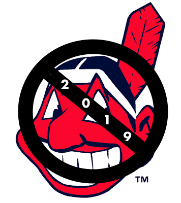
As you’ve probably heard by now, Chief Wahoo’s days are numbered. The Indians will stop wearing the cartoon logo in 2019. The news was first reported yesterday afternoon by The New York Times, and MLB issued its own statement shortly thereafter.
Here’s a quick FAQ-style rundown of the situation:
When will the Indians stop using or wearing Chief Wahoo?
In 2019 — the season after the upcoming one.
So they’ll keep wearing Wahoo this coming season?
Yes.
Will they wear Wahoo less in 2018 than they have in the past?
That’s up to the team. To my knowledge, the Indians have no uniform changes planned for 2018, and the Wahoo cap is still listed in the MLB Style Guide as the design to be worn with the team’s home whites and navy road alternate jersey. All of the team’s jerseys continue to have a Wahoo sleeve patch.
2019 is also when Under Armour takes over the MLB uniform contract. Is that why they’re waiting until then?
I think that’s just a coincidence. I don’t think this has anything to do with the Under Armour changeover.
What about the 2019 MLB All-Star Game, which is being played in Cleveland — does it have anything to do with that?
I think that’s a far more plausible explanation. MLB commish Rob Manfred has been on record as opposing Wahoo pretty consistently since taking office in 2015. So when the 2019 All-Star Game was awarded to Cleveland, many observers figured that there was no way Manfred would have allowed the Indians to host the game unless they had agreed to scrap Wahoo.
Are you saying there was a quid pro quo?
Neither the team nor the commissioner’s office would ever admit that. And I certainly can’t prove it. But I think it’s a plausible scenario.
Why wait a year? Why not just scrap Wahoo now?
Probably the same reason the Rams and Chargers couldn’t get new uniforms pronto when they changed cities: Too much retail merch in the pipeline. Also, I suspect the team wanted to give fans some advance warning.
What about the team’s name?
It’s staying the same.
Do you think scrapping Wahoo is the first step in what will eventually be a name change?
Honestly, I don’t have a good sense of that. Wait and see.
Will they come up with a new logo, or will they just use the block-C for pretty much everything?
The word is that for now they’ll stick with the block-C, although a new “complementary logo” may be added in the future.
What about Wahoo merch?
As of 2019, it will still be available at the team’s stadium and spring training facility, and also at retail outlets in northeastern Ohio, but it will not be available on the MLB website or other internet outlets.
What do you think of all this?
I’ve long been anti-Wahoo, so I’m glad they’re finally mothballing him. I wish it had happened sooner (and also wish they would change the team name), but you take progress where you find it.
I should also point out that I’m no fan of the block-C, which has always struck me as too plain. Cleveland fans deserve a logo with more pizzazz — either the 1970s caveman-C or something new.
As for the merch, they’re reportedly maintaining the retail presence for trademark-protection purposes (if they abandoned the mark commercially, it could be claimed by someone else, who could then produce their own Wahoo merch). Okay, but if you have to keep selling the stuff, why not donate the proceeds to Native American charities or something like that? Why keep profiting, even if only a little bit, on something you’ve just proclaimed to be unfit for on-field use?
Finally, a word to Cleveland fans: I realize many of you have grown up rooting for Wahoo and feel an emotional connection to the logo. I get it — that kind of connection between fan and logo is part of why I created Uni Watch. So while I’m pleased to see that Wahoo is finally on the way out, I’m not gloating about it and I’m certainly not taking any pleasure in the loss that some of you may be feeling. In time, I hope you can come to feel, as I do, that this was the right move to make.
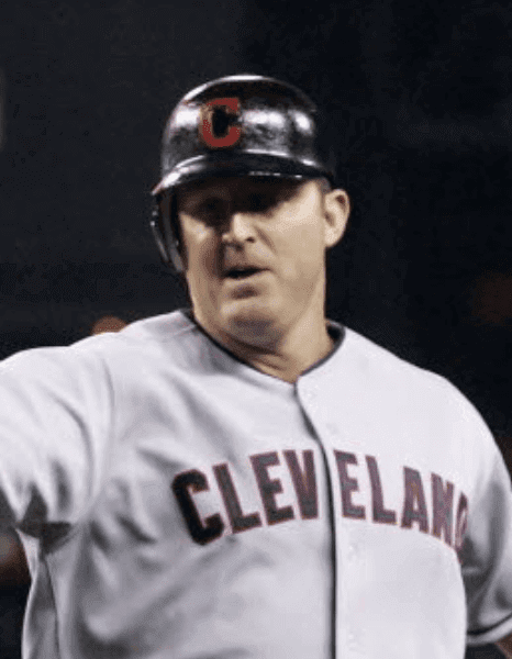
And speaking of Wahoo…: Reader Kary Klismet thinks yesterday’s Wahoo news makes it more likely that new Hall of Fame inductee Jim Thome will not have the Chief on his plaque. Thome, of course, did wear the block-C during his brief second stint in Cleveland in 2011 (as shown at right), so using that logo on his plaque wouldn’t be completely ahistorical, but he wore Wahoo-clad headwear for the vast majority of his time playing for the Indians, so that would seem to be the more obvious choice.
Kary, however, notes that Thome is reportedly undecided about whether he’ll wear Wahoo or the block-C on his Hall of Fame cap. “Obviously, that’s not definitive,” he says, “but it sounds like a the first step in a process of letting Wahoo enthusiasts down gently, especially when his cap choice would be a no-brainer if based solely on the number of games he played in each cap.”
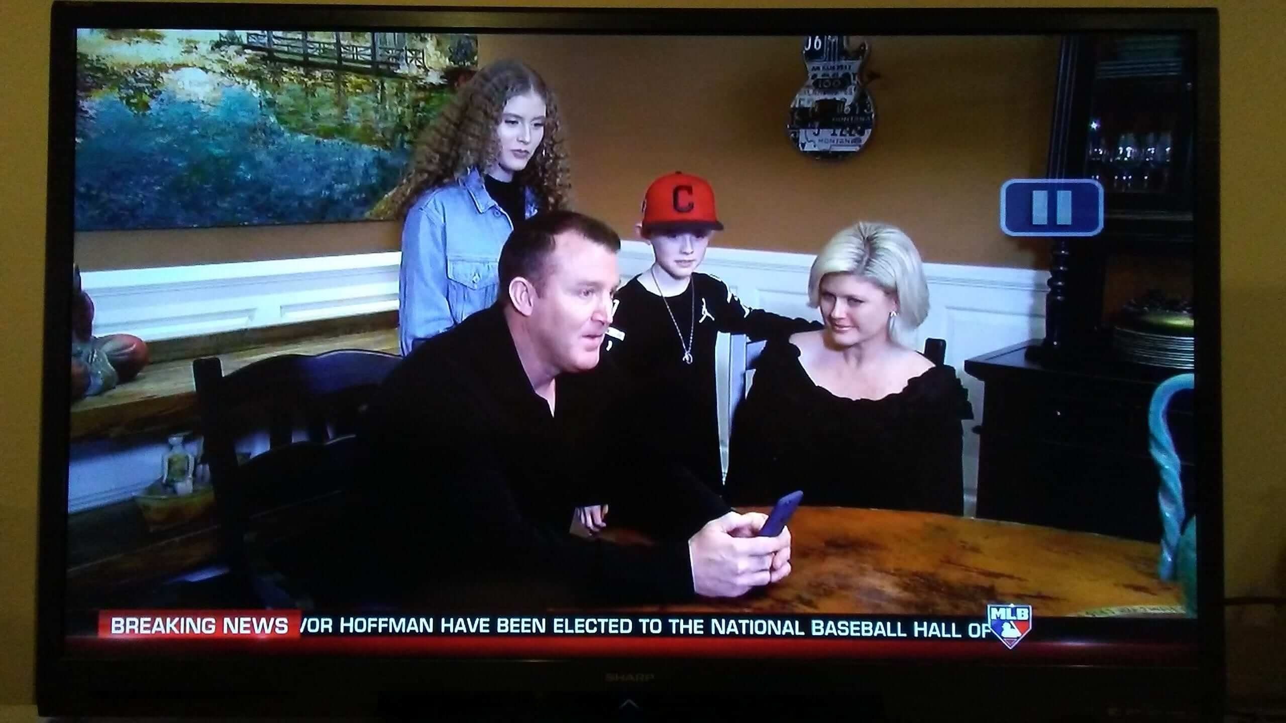
Kary also notes that Thome’s son Landon wore a block-C cap for the phone call announcing Thome’s Hall of Fame induction:
Kary also cites several examples of Hall inductees whose plaques feature non-obvious cap logos. Bert Blyleven, for example, spent the vast majority of his Twins career wearing the team’s “TC” logo, but his Hall plaque shows the team’s “M” logo, which he wore for two seasons during his second stint with the team — a situation very similar to Thome’s.
Personally, I wish the Hall would omit team logos from the plaques. I’m so tired of hearing people debate whether a given player will “go in as a Dodger” or “go in as a Yankee” or whatever. The reality is that a player is inducted into the Hall as himself, for the totality of his career, not as the representative of a given team. Omitting the team branding would reinforce that point, and would also spare us the petty turf wars that inevitably erupt among fans regarding the inductees’ cap choices.
Click to enlarge
Collector’s Corner
By Brinke Guthrie
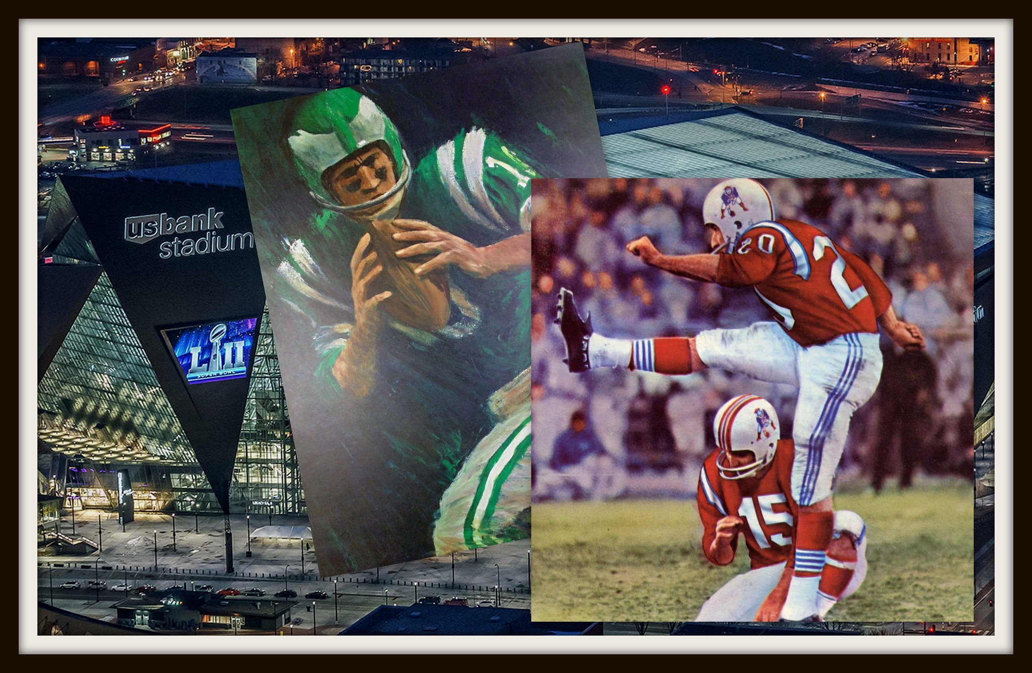
Per longstanding tradition, the Collector’s Corner installment leading up to The Big Game™ features the two competing teams, generally the Patriots and someone from the NFC. This time around, it happens to be the Eagles. So: This 1965 Dave Boss print of the Eagles would look fine on any Eagles fan’s wall, and here’s an 8×10 version of it that shows better detail.
Now for the rest of this week’s Super Bowl-themed picks:
• This 1965 Boston Patriots yearbook features about as classic a football pose and uni as you’re likely to find. (Yes, they were originally called “Boston,” and yes, they used to kick this way before the soccer kicking style took over.)
• This Patriots press guide from the prior season was drawn by an artist named Phil Bissell. In case you don’t know that name, he was the creator of Pat Patriot. More on Mr. Bissell here.
• This 1960s Eagles Technigraph helmet plaque would also look nice in any Eagles fan’s collection.
• Did I say wall plaque? This Boston Patriots version will set you back a pretty penny.
• The Eagles’ wings appear on the sides as opposed to the front of this 1970s kids’ helmet.
• Take a look at this 1972 Patriots sticker. If you enlarge the detail, you’ll notice it isn’t the usual crazed Pat..
• This 1960s Eagles water transfer decal sure has a classic look to it.
• Great cover art on this 1966 Patriots/Chargers game program.
• Unusual font on this 1971 Eagles/Veterans Stadium pin.
• This 1960s team travel bag belonged to Eagles defensive back Nate Ramsey.
Have you spotted an item on eBay that would make a good addition to Collector’s Corner? Send any submissions to uniwatchcollectorscorner@gmail.com.
“What’s It Worth?” reminder: In case you missed it last week, I announced a new partnership with Grey Flannel Auctions. If you have a potentially valuable collectible, GFA will appraise it at no charge, and with no obligation. Think of it as an online version of Antiques Roadshow. Full details here.
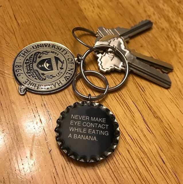
KRC update: The latest installment of Key Ring Chronicles is about a bottle cap with an unusual message. Check it out here.
The Ticker
By Alex Hider

Baseball News: MLB has released the 2018 spring training caps and jerseys, which (like last year) include a sublimated word cloud in the NOB and numbers. … The Detroit Free Press published a gallery tracking the changes in the Tigers’ unis throughout the year. … Rays P Austin Pruitt had his jersey retired at his alma mater, College Park High School in Texas, on Sunday (from Ignacio). … If old baseball sweaters are good, plaid baseball sweaters are better. That’s the Senators’ Clark Griffith in the early 1910s (from Phil). … Houston Rockets G Gerald Green was spotted wearing a Houston Colt .45s jersey. … New uniforms for the Chunichi Dragons. … Check out this old shot of Andres Galarraga wearing a Leones del Caracas uni from the Venezuelan leagues (from @GoatJerseys).

NFL News: Yahoo Sports caught up with the guy who used to play Ragnar, the Vikings’ human mascot (from Kary Klismet). … Henry Kelly was at the “Super Bowl Experience” event at the Minneapolis Convention Center and spotted an outdated Lions helmet on display. … Pats coach Bill Belichick arrived in Minnesota for the Super Bowl wearing his late father’s fedora. … Hmmm, is it the Super Bowl or a Superb Owl? Steve Vibert’s boss spotted those airport shuttles yesterday while in Minneapolis on a business trip. … Nike has built a “custom jersey suite” at its store in the Mall of America in Minnesota (from @HitTheGlass).
College Football News: I’m still calling it the L.A. Coliseum [We’ll have a Naming Wrongs shirt for this shortly — PL]. … A couple of Iowa players have said they will auction off the alternate black jerseys the Hawkeyes wore in their win over Ohio State last season. The funds will be donated to the University of Iowa Children’s Hospital (from Brinke).

Hockey News: Reprinted from yesterday’s comments: During Sunday’s NHL All-Star Game, Flames F Johnny Gaudreau scored a goal while dealing with a stray strand of string that was wrapped around his legs (from Steve Prudente and Mike Styczen). … Those who are red/green colorblind probably had a tough time watching last night’s AHL All-Star Game (from Steven Schapansky). … Lots of pink in the rink last Saturday in a NWHL game between the Metropolitan Riveters (pink) and Connecticut Whale (white with pink accents) (from Mike Engle). … Wow, check out the helmets the Ohio State hockey team wore in 1980 (from Tyler Johnson). … Batman-themed uniforms this Friday for the Wichita Thunder (from Mike Iles).

Pro Basketball News: The Celtics will wear their GFGS alternates for the first time on Feb. 11 (from Phil). … The Jazz will unveil their new red rock-inspired uniforms and court next Tuesday (from Phil). … Cross-listed from the baseball section: Rockets G Gerald Green was spotted wearing a Houston Colt .45s jersey. … The Wizards will debut their new “The District” alternates tonight (from Phil). … A player in a Spanish league got stuck wearing a backwards 6 on the back of his jersey (from Thomas Clouse).

College and High School Hoops News: Stony Brook will be wearing 1978 throwbacks on Saturday. Can’t wait to see those pinstripes on the court! … The Little Rock men’s and women’s teams will be wearing throwbacks on Feb. 1 (from Matt Snyder). … Northwestern wore their BFBS “Gothic” alternates last night at Michigan, who wore maize (from Kyle Good). … This blogger thinks Iowa should wear their gold alternates more (from Kary Klismet). … Georgetown is giving away a Starter jacket-inspired tank top on Feb. 26 (from @VictoryCB). … Speaking of Georgetown, they gave away jersey-themed drawstring bags before their game last night. … Goose Creek High School in South Carolina honors the nine victims of the Charleston church shooting with a modified Palmetto and moon logo that includes nine doves. One of the victims in the shooting was the school’s track coach (from Daren Stoltzfus).

Soccer News: FC Columbus is joining the National Premier Soccer League as an expansion team, and they’re asking fans to help design a logo (from John Flory). … Indy Eleven of the USL will be playing at Lucas Oil Stadium this season, and the seating chart includes one of the Colts end zones. Could they be keeping it around? (From Jeff LeFave.) … Aberdeen FC of the Scottish Premiership are planning on building a new stadium. In the renderings, Ed Zelaski noticed a fan is wearing a Jonny Hayes jersey. Hayes left Aberdeen over the summer.

Grab Bag: Tickets to tonight’s State of the Union speech had to be reprinted at the last minute because of a typo (from Kary Klismet). … Michael Van Gerwen, one of the world’s top dart players, will wear a new shirt during competition this year. He wore a solid shirt last year (from Greg Franklin). … Pennsylvania has new signs welcoming visitors to the state (from Michael). … North Carolina women’s lacrosse goalie Olivia Ferrucci has new custom-painted shoes (from James Gilbert). … Couple of racing items from David Firestone: NHRA driver Steve Torrence uses Marilyn Monroe imagery on his helmet. Also, former racer Dan Gurney was memorialized at the Rolex 24 this last weekend with helmet decals. Gurney died earlier this month.
Proofreading:
Kary also notes that Thome’s son Landon wore a clock-C cap
– block-C
Typo: Chunichi is misspelled.
GFGS – Celtics, I’ve made this point before, but no historic team has butchered their look more than the Celtics – what a joke. (Historic teams being Yankees, Dodgers, Original Six, Packers, etc)
Only distantly related to the Cleveland news, but if either the Washington football team or the Indians changed their name to “The Tribe”, would that still be viewed negatively?
I like “Tribe” because it can signify any group of people. It’s used around the world.
I’m admittedly not a Native American, but I would guess that “the Tribe” could be rebranded not to have an offensive context. Similar to what the Peoria Chiefs MiLB team did.
Typical modern day. The one or two people tell us what’s right or wrong. If one is offended then the masses have to listen. If your offended, don’t watch, don’t root. I personally get offended when Hollywood or Music people tell me how to think.
At the end of the day if I called an employee at work either what the Cleveland baseball team or Washington Football teams are called, I would get either a stiff warning (former) or outright dismissed (the later), society evolves, team names have to reflect that change. It’s not one or two people’s opinion.
Saying that – I don’t bother listening to Hollywood – so we’re aligned there.
That’s funny, because I have a brain and can separate the art/film/music from the person that produced it and their own political viewpoints. Guess I’m just not offended that easily… and I’m a Polack!
I get the point…. way to much of the “media’ forces their believes. The weak minded people take their words as law.
way to much of the “media’ forces their believes. The weak minded people take their words as law.
As a card-carrying member of “the media,” I’d like to know who these “weak-minded” people are, so I can impose my will on them. Could you please point them out to me?
Typical modern day. One or two bigots/racists think they can let us know what they think and we should agree with them or we are all the ones that are bad.
“Quick to judge
Quick to anger
Slow to understand
Ignorance and prejudice
And fear walk hand in hand…”
Emphasis on “Slow to understand”
Typo: “New uniforms for the CHUNICHI Dragons.”
Just a note that “Wahoo” became “Yahoo” under the “What do I think of this?” header.
Paul, typo alert: it’s the Chunichi Dragons, not *Chuichi.
Disappointed with the continuation of these silly gimmicky word-sublimated spring training jerseys. Also disappointed that so many of them have NOBs. And that they cost $135 with a name and number on the back.
As for Chief Wahoo, I’ll miss him but the logo is a product of a time when cartoony logos were more standard than they are now. (Look at the Cubs’ bear, or the Orioles’ bird, going from cartoon to realistic in recent decades, though the O’s have come full circle.)
I’d like to see the Indians create something that would still look good in any era, like the great-looking Chicago Blackhawks logo, or the Braves’ tomahawk.
The road uniforms are also far too plain (and not in a nice timeless way like the cream NNOB home alternates that they didn’t wear this year). Back in the 1970s, with those famous red uniforms, they had a Greek-looking font that somehow looked great and distinctive despite having no connection to Native American culture. Maybe they could bring that back.
I love the Indians’ uniforms from the 1970s, but the Tribe didn’t distinguish themselves with their quality of play during that decade. They’ve done better by their recent iterations. But the Caveman “C” would make a great addition to the current uniform set.
I had no idea how the team played; I just like that crazy red uniform!
BTW, why is the C on that uniform called the “Caveman” C? Is there some cultural reference that is flying past me? With its diagonal lines I always thought the font was meant to look like
link
or perhaps link.
I was always of the impression the designer liked the straight lines of the font (known as “Neuland”) and found it evocative of carved wooden National Forestry signage, and perhaps by extension, Indian writing. But feel free to disagree.
This reminds me… was that wordmark made from a full font, or was it made by itself? I just looked up the Neuland font, and that’s close but not quite the same (the S is very different), and then I looked up Lithos, the Greek-inspired font that I thought it might be, and Lithos is also close but not identical.
If they got it from woodcut forestry signage, that’s wonderful, and a great homage to American Indian culture, since very few tribes developed writing (with the notable exception of Sequoyah and the Cherokee; years ago I mocked up an Indians alternate in Cherokee script). Now I’m even more in favor of bringing it back.
But I still wonder where the word “Caveman” came from…
Meanwhile, there’s a good timeline of Wahoo’s history here
Link goes to a story about the Ohio Lottery Commission.
New naming wrongs shirt: I miss Chief Wahoo.
Clark Griffith’s sweater is indeed beautiful. But it’s checked, not plaid.
Proofreading:
“the Indians have no uniform changes planned for the 2018”
“had a tough time watch last night’s”
“at the seating chart includes”
Fixed.
I agree the block C is incredibly plain and boring. Perhaps go with the C they wore from 1921-1936
link
Likewise they could possibly make a logo based around the shield found on the city flag
link
I’d picture something like this:
link
I like that Cleveland is dropping Chief Wahoo. I would be in favour of going with a C but something new.
I know there is a lot of love for the Caveman C among many readers, but I am quite definitely not of fan of the Caveman C or that font on the jersey. Feels kind of minor league looking today for a major league team now. Keep it back in the 1970s.
Are they supposed to be “exciting”?
I just need them to be functional.
IMO mascot/cartoons have no place on teams caps.
Goodbye Mr. Red and Mr. Met…
THE Ohio State University hockey helmets were Northlands, infamously worn by Mike Foligno back in the day.
Yes, nothing really special about them considering the time when the photo was taken. Northlands commonly had the stripes going around the back of the helmet.
link
link
More specifically, they are Northland Stan Mikita helmets. I believe he helped design and popularize them in the late ’60’s, early ’70’s. We just called them fishbowl helmets.
No mascots in caps, that includes the Baltimore Orioles current cap
The Orioles’ cartoon bird cap logo came about in 1966. That predates the mascot, who didn’t appear until 1979. There’s s lot if history, including championships, associated with the cartoon bird cap.
Leeds kills its new badge.
link
Yay!
Add it to the pile that contains the 49ers ‘one day’ helmet.
Lee
Glad they are finally ditching Wahoo. Long overdue.
As for Hall caps, I like the players plaques having team logos. Just hoping Trevor Hoffman pulls a total wildcard (not that the Hall would ever allow it) and goes in with a Florida Marlins “F” on his hat (maybe the last chance for the very slim chances of that ever happening).
Agreed on logos on the plaques. Sure, the Hall could have blank caps, and they’d look generic enough that we’d see the player, not the team. But there’s enough variety in jersey styles that it’s not possible to depict a truly generic jersey. On Mickey Mantle’s plaque, if his jersey were plain, it would stand out, and all we’d see is that he’s wearing the wrong jersey. Whereas if he’s depicted in pinstripes, that’s as bold a declaration of his team’s identity as the cap logo. This is true of many teams across the years, not just the Yankees. Whether or not Paul’s preference for downlplaying teams on Hall of Fame plaques is a good idea, it is an impossible idea. Can’t be done. So, rather than trying and failing to not depict a player’s team, better to depict the player’s team as thoughtfully as possible. And the current de facto practice of “ask the player what he wants” is pretty much the least thoughtful way to approach the matter.
“Neither the team nor the commissioner’s office would ever admit that.”
I’m not sure why Manfred wouldn’t just admit it. Bud Selig admitted the sale of the Astros to Jim Crane in 2011 was tied to the Astros agreeing to move to the American League in 2013. That move went over like a fart in an elevator, and it was far more tangible to on-field play than any Chief Wahoo news.
To anyone regretting the retirement of Wahoo: I’ve been an Atlanta Braves fan for as long as I remember (and I’m 52), and wore period appropriate Braves merch for much of my life. I have NO desire to see the team revert to the “hollering brave” logo or Chief Nok-a-Homa. I’m also fine with a nickname change if the team sees fit, or a rebranding away from the tomahawk, etc. (and I HATE the chant!). Like Sienfeld said, we’re all just rooting for laundry.
I’m only two years younger, but would love to see the “hollering” Brave make a comeback; its associations with the Aaron era are indelible for me. (I’m sure it won’t return, but behold my two cents.) Regardless, one doubts the team will ever change its name, nor does it need to. In the spirit of the Seinfeld quote, I trust no one will disapprove of that prospect too intensely.
Recently just moved out of ATL after living there for four years… every time I saw that “hollering brave” logo around town I was horrified. It is an absolutely vile logo and should never be used. I’m also in the camp of stopping ‘the chop’ during the game. There’s something about 20,000 white folks imitating a native american chant that just doesn’t sit right with me.
I can’t begin to imagine what could possibly have “horrified” you or struck you as “vile” about the logo. It’s a non-caricatured drawing that, to my eye, could only upset someone who found the sight of an Indian upsetting in itself (for reasons best known to that person). But my congratulations on your having moved away from the home of such a profoundly upsetting stimulus, I suppose.
As for “the chop,” I’m not sure how any number of ushers could dissuade a crowd from launching into it. In fact, I can think of no better way to make it a thing than by trying to shut it down.
Le Cracquere walking around town looking at white people proudly wearing a racist logo? Pretty horrifying to me.
The team can stop performing the chop, beating the drum and playing the music that encourages the crowd to mock native american chants. In my experience at Braves games the crowd never did the chop unless prompted by the team. Team being the staff hired to beat the drum and the guy playing the chant music over the loudspeakers.
I’m afraid you’ll have to explain what’s “racist” about that particular logo. If you find it unfortunate or ill-considered for some reason, I’m all ears and might even be persuaded to agree. But this is not a promising path.
I suspect that if the team stopped prompting the chant, particularly if they seemed to do so under duress, you’d then see the crowd break into it of their own accord. No one likes a killjoy, even if it’s the front office.
How is a team supposed to go about discouraging a chant?
I am one to point out when I think people are easily offended and in this case, I think its good wahoo is finally being removed. I can see why wahoo is finally being replaced. At best its a bad caricature logo from the 1940s that lasted much longer than it should’ve as a logo, and when you look at it, yea it is pretty bad.
The idea that Wahoo causes anyone to feel mental anguish or be offended to the point that it ruins their day seems a bit much. But as you say, this is simply a tasteless logo that has long outlived its life. At best it is in poor taste. That alone is reason enough. Considering there have been plenty of beloved logos that were changed simply because the owners wanted to modernize
or make money on new merchandise, I’m not sure why changing this logo is such an awful thing.
#KeepWhahoo
I want to keep Cheif Wahoo, not to be racist or anything
Sorry to anyone I offend.
Disclaimer: I fully understand the reason behind the decision. Hey, at least the logo stays for a while!
As Trojan, I’m looking forward to getting the “I’M STILL CALLING IT THE L.A. Coliseum “ in cardinal and gold (yellow). I thought it might be a little long to say “I’M STILL CALLING IT THE LOS ANGELES MEMORIAL COLISEUM”. Most just call it the Coliseum. I promoted Uni Watch on a few USC sites, letting them know that I expected this to be coming.
The new corporate name sounds like it’s a memorial to people who died in United plane disasters.
Especially worse when you consider a certain put-down nickname for the place, or any venue called “Coliseum” when the home team is doing poorly.
A bit surprised to see Indy Eleven moving into Lucas Oil Stadium. I read their average attendance last year was about 9,000 (pretty good for NASL or USL team). Lucas Oil Stadium full capacity is 70,000. It will be way too cavernous. Hope they have invested some funds to figure out a way to drape off many of the unused seats to give it a more intimate feeling.
Have you seen what they do in BC Place in Vancouver for Whitecap games? I feel thats a pretty good solution for soccer teams playing in pro football stadiums.
No idea if they plan to do the same in Indianapolis.
Lee
For sure Lee – I live in Vancouver and can no longer count the number of times I have seen the Whitecaps play live at BC Place.
It works for them in their situation. BC Place full capacity is about 54,000. Whitecaps average about 21,000. Can be about 28,000 when Seattle or Portland are in town. The set up they have investing in is perfect, with the tarps acting like a roof over fans. One barely notices the upper deck is there. They do the same thing for the CFL BC Lions now as well.
link
But Lucas Oil Stadium is a lot bigger and the Indy Eleven attendance is smaller. If it was larger MLS sized crowds, would be a better fit. The amenities will be nice and I am not knocking it. They need to do what is best for them, but seems like a large facility for what they need.
Blame a little on IUPUI in making it miserable hosts.
Also didn’t help that IUPUI’s facility is dumpy and terrible for fans (track around the field, off-centered stands, etc.).
Chief Wahoo is an iconic logo, the team name goes back to the early 1900’s. this is just another example of bowing down to the PC police. Im not from Cleveland, but as a kid growing up in the 60’s, i will never forget all the classic logos from my old baseball cards and caps I wore. If they want to do it right, get rid of the “block-c” and go back to the wishbone c they wore with the vest uni from the late 60’s. red cap, white “wishbone-c” outlined in blue.
I mean whats next? animal rights activists protesting the Tigers, Cubs, Eagles, Falcons because they deem it exploitation of wildlife? Everybody is way too sensitive these days.
Sorry but thats the way it is, folks
Seems unlikely that they’d go with the wishbone-C when that’s now so heavily associated with the Reds.
I’ve got fond memories of Wahoo, but I feel remorse with the knowledge that the emblem brings pain to certain fans. Maybe from this point onward it serves us better to treat other groups of people with the respect we would like to have ourselves. Ultimately it isn’t a great sacrifice.
I think Wahoo is a bit much, but anyone in whom it inspires “pain” is far too silly to concern oneself on behalf of. I’m fine with the Indians’ retiring him … even as I worry a bit over the effects of letting fatuous people think their opinions can have such real-world sway.
Yes, that is a concern, and I would push back at those who seek to retire the “Indians” moniker. But Wahoo doesn’t pass the current-events test, and neither does the word “Redskins”. I have a mental threshold, as I would suppose others do.
Agreed – we now live a WAY too sensitive society. Anything & everything offends somebody. As a long-time sports fan, decisions like this really turn me off from sports. Everything has to be PC today or you will receive backlash from a very vocal minority. I do remember studies being done and the majority of native American Indians did not find this offensive. Let’s hope Snyder doesn’t back down from his defense of the Redskins nickname.
One of the hazards of running a sports franchises is separating the legitimate grievances of wronged people from the ginned-up ones of folks who like to hear themselves talk. One must choose wisely.
Except Snyder doesn’t have a ‘defense’, other than he “doesn’t wanna”.
Lee
Those of us in favor of removing denigrating nicknames and imagery could just as easily say we’ve lived in a far too obtuse, white-feelings-matter-most culture for far too long, and those playing the “PC police” and “snowflakes” card(s) are just upset because they can’t handle a little change every century or two. Because, reading between the lines, all you’re really saying is, “dammit, I wanna be racist because it’s always been this way!”
“Agreed – we now live a WAY too sensitive society. Anything & everything offends somebody.”
I love it when white people say this. No clue how anyone else lives or how they feel when they see racist iconography. Just mad that they can’t have fun with their racist stereotypes any longer.
Sad little snowflake can’t make fun of people behind their backs any longer. Oh wait, yeah you can. Because you’d never do it to their face.
Tigers/Cubs/Eagles/Falcons are animals. American Indians are actual human people. I would think this isn’t a hard distinction to understand.
With that approach, any mascot that is a person will have to be removed, lest we offend them (Celtics=Irish; Padres=priests; Vikings=Scandinavians etc etc…).
Soon, we will just have color for nicknames (but, not black, brown, red or yellow….)
False equivalence. As we’ve discussed here countless times, the Vikings, Celtics, etc. are examples of a culture CELEBRATING ITSELF. Nothing wrong with that.
Indians, Braves, and other Native American team names are examples of cultural misappropriation — taking someone *else’s* culture.
Maybe you’re OK with cultural appropriation, and maybe you’re not. Either way, please don’t confuse it with the Vikings or Celtics (or Hawks, Eagles, etc.). Thanks.
Its the appropriation and caricature that’s wrong. It’s not a hard line to draw.
Compare Wahoo with Florida State (which has approval of the Seminole Nation) or the Spokane Indians which has the active support of the Spokane Nation and a jersey in the Salish language.
link
False equivalence on Paul. The Indians/Redskins/(insert non PC name here) didn’t pick those names to belittle anyone. “lets choose Indians, that will make people think we’re weak and easily dominated!” No, in the sports arena its picked as a nod to the strong spirit of the group named. No difference at all between that and Vikings/Celtics. People choose those because its a strong and aggressive mental image.
The Indians/Redskins/(insert non PC name here) didn’t pick those names to belittle anyone.
Never said there was any belittling intent. That’s not relevant to the argument. The relevance is, and has always been, cultural misappropriation vs. a culture celebrating itself. In other words, you can find a strong, aggressive image that isn’t stealing from someone else’s culture. That’s all.
It’s just the typical double-standard of false compassion for minorities. Take the Pirates and the Buccaneers for instance. If they changed their logo/mascot to even remotely resemble a Somalian, there would be riots. But since they chose scruffy white guys with black hair (a stereotype btw!) it’s totally fine.
Vikings/Celtics/Fighting Irish is just as much of a cultural appropriation. It’s just one that you happen to find non-bothersome.
Vikings/Celtics/Fighting Irish is just as much of a cultural appropriation.
Well, actually, no — that’s not accurate.
When an area largely settled by Scandinavians chooses “Vikings” as the name for its local team, that’s not appropriation. That’s a culture celebrating itself.
When a city with a high percentage of Irish immigrants (and descendants thereof) chooses “Celtics” as the name for its local team, that’s not appropriation. That’s a culture celebrating itself.
When region that has nothing to do with Native Americans (well, except land theft and genocide) chooses “Braves” or “Indians” as the name for its local team, that is cultural appropriation.
We are talking about the logo, not the name. Look at the Fighting Irish logo. Depicts that Irish people are Leprechauns and always wanting to punch people, usually with drunk connotations. But we all know it is a logo and that it is not an accurate depiction of the Irish. Why is this fine, but Chief Wahoo is not? It is s logo. Logos aren’t meant to represent all people in that demographic. They are caricatures.
As a person with Native American and Irish ancestry, I am not offended by something that is basically a cartoon. But if one is more offensive, the Notre Dame is way more offensive. To put Cleveland’s on par with Notre Dame would be if Chief Wahoo was holding a booze bottle.
Don’t even get me started on North Dakota Fighting Sioux, who’s logo was respectful and even created by a Native American. Nothing disrespectul about it at all. But NCAA made them change it and are now Fighting Hawks. Lame. You will see 90% of fans still wear Sioux gear.
Society has gotten too far sensitive over everything. If people are really going to get upset over a cartoon logo, then boycott them, or root for another team. Next we will see religous people boycotting New Jersey, Duke, or Arizona State because they are the Devils, or the Dodgers because they are too old and slow to get out of the way of a train and offended by those who can dodge trollies. ENOUGH.
For the gazillionth time: Apples and oranges, because Notre Dame’s team name is an example of a culture celebrating itself, not cultural appropriation.
(Also, “Fighting” is a standard descriptor for college teams — Fighting Blue Hens, Fighting Ducks, Fighting Illini [which has its own problems, but still], etc. Notre Dame’s use of “Fighting” has nothing to do with the Irish per se; it’s just a standard college team name trope.)
For my part, I’m okay with cultural appropriation, and even celebrate it. I’ve no quarrel with someone who opposes it … but opposition to it isn’t, and shouldn’t be, treated as the default position (or as a self-evident position in discussions of this kind).
When an area largely settled by “indians” chooses “indians” as the name for its local team, that’s not appropriation. That’s a culture celebrating itself.
The name was suggested by Bert Rose the original GM (not an Indian).
From the Vikings own website:
TEAM NICKNAMED — In one of his first moves with the team, Bert Rose recommended the nickname “Vikings” to the Board of Directors. The name was selected because it represented both an aggressive person with the will to win and the Nordic tradition in the northern Midwest.
So the people who named U of I the illini, the fighting souix, etc were doing the same thing. They used a name, or similar name, of someone that was in the region.
I’m squeamish about discussions of cultural misappropriation because some intemperate speakers have tried to impugn white singers of reggae music. It ignores the fact that works of quality will find an audience, and those very works choose who to influence, not the other way around.
Whining about other people purportedly “bowing down to the PC police” is just another way of demanding a license to be rude, insensitive and hurtful to those in whose shoes one will never have to walk.
Agreed… any time anyone says “PC etc”, I dismiss them out of hand, because I understand there will not be a critical analysis of the topic forthcoming.
Lee
It’s honestly the market.
There isn’t some PC police running around. Consumers just don’t want to walk around with racist caricature on their forehead.
Wahoo’s popularity really plummeted in the last decade plus, especially once the block “C” came out. A lot of folks consider the “C” boring but I see a lot of those caps out and about.
The fact that Wahoo is ridiculous just turned off the public. You may like it but as far as the club is concerned its just the right path for the future.
it’s more supply and demand than it is “the market”. The Block C is more readily available/sold then Wahoo is. Ask most Indians fans and the Wahoo hat / logo is resoundingly more popular. If we Clevelanders weren’t told daily that we’re racists for wearing it, we’d be wearing it more and more and more.
So Clevelanders aren’t wearing it that often because they don’t want to be looked down as racists and your ability to walk around without feeling ashamed is more important.
Isn’t that a market effect? Like not being able to drape oneself in velvet because its not socially acceptable.
I’m with Paul on how he ended his post today. I understand the emotional attachment. I even understand frustration with PC police.
I hope that you agree that, there are lines that shouldn’t be crossed when it comes to stereotypes. Maybe you disagree where those lines are.
I hope people understand that this was a careful process, a judgment made not just because of “PC protesters”, but a judgment call that the lines of what is acceptable has changed, and Wahoo is on the wrong side of it.
There’s a different Block C that’s associated with the Cleveland Naps and Cleveland Blues which might be a good option.
link
link
That being said, I’m sort of a fan of the Caveman logo. Was first introduced when I lived in Cleveland in the 70s.
Personally I believe if Cleveland is going away from Wahoo, they should rip the band-aid completely off and change names as well. This doesn’t seem well thought out, IMHO.
I am kind of glad to see Wahoo go, people don’t mention something that I always found obvious; it’s a butt-ugly, poorly designed logo anyway. I just hope that they come up with a better hat logo than that bland and font mismatched “Block C”, maybe go back to the “Caveman C” from the 1970’s.
I agree with this so much, its a bad caricature logo from the 1940s, it should have been replaced in general long ago, I liked the I logo they had in the 2000s.
I would add that they need to come up with a great sleeve logo for the jersey to replace Wahoo. I understand moving away from the logo, but the block C as a primary replacement is a really, really weak choice.
Sleeve logos are overdone. Leave them blank.
Aside from the dumb corporate sponsor tag on the LA Coliseum, it also makes it sound like it’s a memorial to victims of United Airlines
Did you think the previous name (“Los Angeles Memorial Coliseum”) was a memorial to the dead citizens of Los Angeles?
Also: Advertiser, not sponsor.
Since I shared a similar sentiment as JessMan, I can say that no, I never thought of it that way with the municipality as part of the name. The fact that the advertiser’s name is getting thrown in there changes its perception, though.
I guess I’m coming at it from the angle of perceiving the new name from the perspective of someone who, while having above-average intelligence, has never heard of the Coliseum before. If given the two names and not being told that they are one and the same, what conclusions would you draw?
That’s not to say I haven’t heard of the Coliseum, I’m assuming the role of a hypothetical person who hasn’t heard of it.
I just asked a co-worker what he thought of the name “United Airlines Memorial Coliseum”, without any context, and he too thought of the name memorializing a plane tragedy. Then I told him it was the new name for the LA Memorial Coliseum, and he just shook his head.
Typo: in the Item about Thome’s son, it says “clock-c” instead of block-c.
Thanks. Fixed.
Head’s up – The Cleveland.com piece on Wahoo’s history links out to the wrong article
To the extent to which one can judge by retail sales photos – that is, not very far – the 2018 Spring Training/Hitting Rehearsal cap appears to be the first time the Nats will wear their actual, official, updated-in-2011 Curly W logo on their caps. (When the team switched to 3-D logos on their batting helmets, they switched to the 2011 logo, previously the only time they’ve worn their actual official logo on their uniforms.) Has any other team ever persisted so long in continuing to wear an officially outdated logo as the Nationals? Counting regular game home, road, and alternate caps, as well as regular and alternate home uniforms, the Nats are entering their 8th season of wearing a logo they officially abandoned after the 2010 season.
I need picture links to illustrate your point, because from what I can find so far, I’m not seeing what you’re talking about.
The differences between the 2005-2010 curly W and the revised 2011 curly W logo are small, but they’re significant enough that the team bothered to make the change. And they’re easy to spot when you look closely. The two most visible changes are
1) The point on the upper left where the “arm” meets the first loop. In the 2005 logo, there’s a “flat” spot there, so that there are actually two angles in the transition. In the 2011 logo, the two curves meet with a single sharp angle.
2) The point in the bottom center where the two loops of the W cross. In the 2005 logo, the curves are discontinuous across the “x” where the loops cross, such that the upper-right line looks pinched at the crossing point. In the 2011 logo, the curves are continuous and even across the “x” where the loops cross.
Take a look at the 2018 Spring Training/Hitting Rehearsal cap logo. Note the sharp angle where the arm meets the first loop on the left, and note the even curves where the two loops of the W cross:
link
Then take a look at the current standard home cap. Note the “flat” edge where the arm meets the first loop on the left, and note how the upward loop on the right of the “x” where the loops cross looks thinner than the lower loop on the left, which is supposed to be a single line. If the thickness of the white stitching makes it hard for you to see, pay attention to the flat blue outline stitching, which repeats both of these flaws in the older logo:
link
Still waiting on a Naming Wrongs Shirt to memorialize the Georgia Dome…
I like when Native American Tribes have been brought in at places like Florida State to get their buy in. Using Notre Dame and the Minnesota Vikings as comparisons is weak IMHO. Notre Dame is Catholic, and quite a few Irish Americans are Catholic. And Minnesota has a large population of people from Scandinavia. I also don’t know what ethnicity considers themselves “Pirates” and could be offended by this. I get it that teams don’t name themselves after something they don’t like. You don’t see any teams called the Sh*theads. However, why not bring the Native American community in and get their input. I can see how the indigenous people of America don’t want to be called Redskins and Indians. But honoring their culture with names like Braves, Warriors, and Tribe, could be a positive thing if the teams don’t use disparaging imagines and chants. But again, buy in from them would be a positive move.
The Florida State situation is more complicated than people think too, in my opinion. They have the support of the Seminole Tribe of Florida but the Seminole Nation of Oklahoma has expressed disapproval. The Oklahoma group is far larger. Because of the Trail of Tears.
For the life of me, I don’t understand why they went with the current block C when this is what they wore previous to the Wahoo caps. The tiny addition of a white outline does wonders for the cap. (full disclosure: this is the cap I identify with my youth, and the first Indians hat I owned)
link
Oddly, this cap design seems to have slipped from the public consciousness, despite being the first flowering of what seems to be accepted as the archetypal Cleveland “C”. I identify it with Joe Charbonneau and Len Barker.
Agreed. I never liked the caveman/ crooked C, the 80s block C had relatively clean unis, even if they were pull overs, and those “good” Indians players of the time. Super Joe, Julio, Len Barker, Bert B, Thunder Thornton, etc, etc, etc.
If Cleveland created a new logo, along the lines of the late-great Kansas City Scouts imagery, would that be acceptable to the brass at MLB? If not — and I suspect that would be the case — then it proves that it is not just the logo that is the end game here. Rather, this issue will end only with the changing of the team’s name itself.
Personally, I have no problem with the name or Wahoo. But if changes are to be made, then Manfred and Co. should be transparent about it and tell fans of the Indians their true intentions. I’d respect them more if they did, just as I’d respect anyone more by simply being honest, even if I disagreed with their viewpoint.
-C.
Per longstanding tradition, the Collector’s Corner installment leading up to The Big Game™
Is “The Big Game” trademarked for the Super Bowl? I would presume that it belonged to Stanford vs. Cal.
I have long disagreed with Paul on the Wahoo issue but thought he handled the news sensitively & professionally. However, to be clear, Indians owner Paul Dolan stated yesterday the team name isn’t changing & that MLB is on board so hopefully that will end the chorus to change the nickname.
Now where did I leave my caveman C cap?
Something occurred to me yesterday after the Wahoo news, as I was discussing it with someone vis-à-vis the Washington football team.
I have always maintained that the question of whether caricatures like Chief Wahoo and epithets like “Redskins” are appropriate for sports branding is a separate question from whether or not American Indian names and visual motifs are appropriate more generally, without opining as to whether the answer to the latter is the same as the former.
It occurs to me also that there’s a difference between changing a team’s logo and changing its name. The present issue with Cleveland is the logo, not the name; the issue with Washington is the name, not the logo.
Changing a team’s logo is comparatively easy next to changing its name, at least from a PR/marketing/perception standpoint. The former happens all the time, whereas the latter almost never happens, unless the team changes cities and either the old name doesn’t suit the new city or the franchise wants to establish a new identity.
The only two examples I can think of off the top of my head of major pro teams since WWII changing their names without changing cities are the Bullets/Wizards and Devil Rays/Rays.
It seems to me that under any circumstances, it’s a lot harder to change a name than a logo.
A few name changes off the top of my head.
These do not include teams that changed city names (Florida / Miami) or different variations of the same name ( Anaheim-Mighty Ducks-of Anaheim)
NFL
NY link / link
Boston Braves / R*dsk*ns
Pittsburg Pirates / Steelers
MLB
Houston link / Astros
NY Highlanders / Yankees
Cleveland Spiders / Indians
NBA
Charlotte Bobcats / Hornets
Charlotte Hornets / Pelicans
NHL
Detroit Cougars / Red Wings
Toronto Pats / Maple Leafs
Geez – NBA should be
NBA
Charlotte Bobcats / Hornets
New Orleans Hornets / Pelicans
I figured there were plenty that I’d forgotten, but a lot of these were in the early years of MLB and the NFL when teams changed their names willy-nilly (and well before modern sports branding), which is why I specified post-WWII. That said, Titans/Jets and Colt .45s/Astros I definitely should have remembered.
I missed your quantification, but still new some of them were from another time. It was just an example that it can and has been done then and recently.
And while a name change in this age of marketing/branding/over exposure isn’t easy, it could actually lead to more revenue than if they left the name alone. People who otherwise would not have upgraded their jersey/cap/shirt/car magnet…. would essentially be forced to.
There’s not good reason not to make a name change if that name is akin to a racial slur.
Sure, it could, but so could changing the logo and colors while leaving the name alone. If it was such a sure thing, we’d see a lot more name changes than we actually do. Think about it: Titans/Jets happened in 1963 as a result of a change in ownership; Colt .45s/Astros in 1965 when a new stadium opened. Hornets/Pelicans was a delayed post-relocation name change, like Oilers/Titans (albeit a much longer delay), and Bobcats/Hornets was tied to that.
The only name changes I can think of that were in no way connected to any other major change in the franchise, were the two that I first mentioned: Bullets/Wizards and Devil Rays/Rays. Of course it “has been done”; no one is suggesting otherwise. But that’s not the point. If changing a team’s name was such a guaranteed revenue-raiser, and that were a good enough reason to do it, I think we’d see it happen a lot more often than we do.
I’m not suggesting any “reason”, let alone a “good” one, “not to make a name change”. Again, that’s not the point. An organization doesn’t need a reason to not do something unless there is some objective basis on which to expect that it will be done. Whether a “name is akin to a racial slur” appears to be, rightly or wrongly, a matter of subjective opinion and perception. That some, or many, people are of the opinion or perceive that “Redskins” “is akin to a racial slur” is apparently not a good enough reason, in the eyes of those who are in any position to do anything about it, to do anything about it. That also presumes that there are, and can be, no other factors or considerations that matter besides the foregoing opinions and perceptions.
Check Wikipedia on Cleveland going direct from Spiders to Indians. link
The lineage of Cleveland baseball, prior to being in the AL is:
Forest Citys
Blues
Spiders (nickname Blues)
Infants (nickname Babes)
Lake Shores
Bluebirds (shortened to Blues)
Napoleons (shortened to Naps, for Nap Lajoie; sometimes called Napkins because the folded up so often)
And finally:
With Lajoie gone (1916), the club needed a new name. Owner Charles Somers asked the local baseball writers to come up with a new name, and based on their input, the team was renamed the Cleveland Indians. The name referenced the nickname “Indians” that was applied to the Cleveland Spiders baseball club during the time when Louis Sockalexis, a Native American, played in Cleveland (1897–99).
So the ORIGIN of Indians was due to a Native American ballplayer.
Meant to say due to a racial slap at a Native American ballplayer
The idea that the Indians were actually named to honor Louis Sockalexis has been examined thoroughly and is dubious at very best: link
I guess I hadn’t realized there was a push to change the name as well. I think it was time for Wahoo to go, and think Washington football should and could easily rebrand to “Warriors,” but can someone explain what’s wrong with “Indians” as a name? (Would fully support a shift back to “Spiders” for what it’s worth)
I was on a vacation in Sedona, Arizona this past fall and was shopping at a local craft show. I started talking to this one gentleman, a Native American, who was selling pottery. He was wearing a Blackhawks hat, as a fan of the team I was curious and struck up a conversation with him about the hat and racist team names and logos. Now granted, this is one guy and his opinion, but he said he didn’t have a problem with the Blackhawks but said the team named the Indians was racist and bothered him the most.
In my view, nothing is wrong with “Indians” as a name. Neither is there anything wrong with “Braves,” “Chiefs” or “Blackhawks.” Then again, I’m not an Indian. And a lot of people disagree.
Paul’s point about cultural appropriation (viz., non-Indians appropriating Indian motifs or “celebrating” Indian culture) is well-taken. I’m not sure I completely agree that doing so is necessarily wrong or bad, but it is definitely distinguishable from Irish or Scandinavian populations in Boston or Minnesota, for example, or cattle herders in north Texas, celebrating their own cultural heritage. In any event it should be done with caution, care and respect.
One thing that is not wrong with the name “Indians” is that it’s supposedly not an appropriate term for native peoples because it refers to people from India, allegedly the result of Columbus mistakenly believing he’d landed there in 1492. Whether, how, to what degree and extent Columbus’ adventures have anything to do with the modern English word “indian” meaning “native (or indigenous) person” is debatable, but the direct 1:1 relationship we were all taught in elementary school is apocryphal, and doesn’t really make a lot of sense given how southern European languages worked in the 15th century. In modern English, “American Indian” quite literally means “Native American.”
Unfortunately, the person who chose the sobriquet “Indians” way back when could not foresee the intentions of future users and curators of the term. Had Cleveland Baseball shown a light touch and better taste, they might have been given the deference that, say, the Chicago Blackhawks are shown.
NFL:
Tennessee Oilers/Tennessee Titans
Well, OK, but that was just a delayed post-relocation name change, which is not what I had in mind.
PBS Sports is all over SuperB Owl just like the airport train.
link
Minor correction, the crescent in the South Carolina flag is not a moon though it’s often mistaken for one. It’s a depiction of a crescent emblem on the caps of revolutionary war soldiers.
link
It’s a gorget, which is worn around the neck or over the chest, not on a cap. Find several early American examples (including young George Washington) in the Wikipedia entry:
link
A few modern-day armies still use metal gorgets as part of their dress uniforms.
That’s what I thought as well, but I couldn’t find a reference. Could it be that the crescent on the cap symbolized a gorget?
Why keep profiting, even if only a little bit, on something you’ve just proclaimed to be unfit for on-field use?
Because they’re not proclaiming it unfit for on field use. They’re capitulating to the vocal minority (another argument for hopefully never).
Further, if the Native American’s are as anti-Wahoo as we’re led to believe, why would they want to accept money coming from that? I mean, their principals would demand they don’t accept a penny from it.
Anyways, hope the Indians get a new logo over the block C. I think it makes for a nice hat, but as a logo it’s boring. I bet though, if they decided to use a feather a group of people would proclaim that feathers are now infringing on Native American culture, too.
PS…there’s a big push to label Pro wahoo fans as bigots or racists since they support something “racist”. The Indians never made the logo with that in mind. There was no ill will. Insensitive? OK, I’ll agree with that, but this push to call it a racist logo is just the “I’m offended crowd” over compensating and an example of someone loving to sniff their own farts.
Because they’re not proclaiming it unfit for on field use. They’re capitulating to the vocal minority (another argument for hopefully never).
Uh, quote from Rob Manfred: “[T]he club ultimately agreed with my position that the logo is no longer appropriate for on-field use in Major League Baseball.”
Source: link
uh, that’s just saving face when you were bribed into doing it (ALL STAR GAME). If Manfred didn’t dangle the ASG into the equation, Wahoo would most likely still be on the uniform. I mean, cmon, we pretending that when issues like this are resolved the side “losing” something doesn’t spin it to appear to be a part of it vs. being TOLD to do something?
The best was Manfred’s quote, by the way. Taking ownership of being “Anti-Wahoo” like it was some novel concept he came up with just a few years ago, when really there’s been a movement on this for a while. And, he’s conveniently leaving out the “Cmon, Dolan, do this and I’ll give you the All Star game” aspect.
I won’t lie. This saddens me a bit. I have always associated this logo with the team I loved. I never looked at Wahoo and thought of disparaging Native Americans. I think your part at the end was a nice and a way to show that you understand us Wahoo guys aren’t racists because we liked it. So I do appreciate it.
Further, I just like logos on baseball caps more than I like initials on baseball caps. Give me a cool new logo and I’ll be able to move forward with (hardly) no complaints.
edit^
Nowhere does Dolan call it unfit for on field use. Manfred says “they agree with me” and Dolan says he agrees with Manfred’s position, but if we’re going to be accurate, Dolan didn’t say he deemed it un-fit for on field use.
Let’s recap what this thread was supposedly about:
1) In today’s lede, I asked why they’d want to profit off of something that they’ve declared unfit for on-field use.
2) You asserted that they *hadn’t* declared it unfit for on-field use.
3) I pointed out that in fact they HAVE declared it unfit for on-field use.
4) Faced with this inconvenient fact, you’ve now resorted to asserting that the declaration is insincere and was done “to save face.”
OK. So, cutting thru all the other noise, we’re back where we started: Why would you want to profit off of something if you’ve declared it, even insincerely, to be unfit for on-field use?
Personally, I wish the Hall would omit team logos from the plaques. I’m so tired of hearing people debate whether a given player will “go in as a Dodger” or “go in as a Yankee” or whatever.
It’s fun to contemplate what headwear will be featured on a player’s Hall of Fame plaque – such as the discussions about which Astros logos Craig Biggio and Jeff Bagwell would wear. But I agree that fans’ notion of a player “going in as” a member of a particular team has obscured the celebration of his entire career.
In fact, the cap logos on Baseball Hall of Fame plaques seem to have created a fundamental misunderstanding among fans about how hall of famers are honored in other sports. I’ve frequently heard fans talk about football or basketball players going into their respective halls of fame “as” a member of one team or another. But if you link hall of famers link in those sports, it’s team-agnostic.
Let’s recap what this thread was supposedly about:
1) In today’s lede, I asked why they’d want to profit off of something that they’ve declared unfit for on-field use.
2) You asserted that they *hadn’t* declared it unfit for on-field use.
3) I pointed out that in fact they HAVE declared it unfit for on-field use.
4) Faced with that reality, you’ve now resorted to asserting that the declaration is insincere and was done “to save face.”
OK. So, cutting thru all the other noise, we’re back where we started: Why would you want to profit off of something if you’ve declared it, even insincerely, to be unfit for on-field use?
Paul…. Please, pull the quote directly from Paul Dolan declaring it unfit for on-field use. You can’t. He never said it.
“”We have consistently maintained that we are cognizant and sensitive to both sides of the discussion,” Dolan said in a statement. “While we recognize many of our fans have a long-standing attachment to Chief Wahoo, I’m ultimately in agreement with Commissioner Manfred’s desire to remove the logo from our uniforms in 2019.”
Keywords: “Commission Manfred’s desire” not “my desire” or “the team’s desire”.
So to summarize, Dolan didn’t want to remove it,but did it because he was given the ASG, Manfred doesn’t want to appear that he “paid off the team” so he gets to have liberty with how it’s presented. But the fact that Dolan said “we agree with his desire” and Manfred said “he agrees with my position” is pretty plain to see how it came to be.
So again, the Dolans never were quoted saying it’s unfit for on-field use, so why wouldn’t they want to profit off a logo that Clevelanders will still buy, that he clearly didn’t want to get rid of?
Please, pull the quote directly from Paul Dolan declaring it unfit for on-field use. You can’t. He never said it.
I never said he said it. I said “they.” MLB and the team (both of which profit from the merch). Although it’s worth noting that you’re conveniently omitting “in agreement” from your carefully chosen Dolan keywords.
You’re splitting the barest of rhetorical hairs here, Rich. If you’d like to ascribe the whole thing to Manfred, then fine — why would Manfred want to profit from it? Same issue, same point.
Let’s please move on. Thanks.
My inclusion or omission of “in agreement” is moot (and unintentional,not trying to pull a “fast one”) because you can read the rest of the line where he calls it Mr. Manfred’s Desire. So that right there exposes that it’s not a unilateral decision.
Manfred probably wouldn’t want them to profit, only in that he wouldn’t want to be exposed as not being against them profiting from it. But that’s beyond the scope of his job. He’s merely a hired gun for the owners. Pretty sure the team’s shop and retail locally isn’t shared revenue, so how can Manfred tell a member club how to / not to make money.
I’m fine with moving on. Just felt the need to point things out that were being missed.
Cheers
Chunichi is still spelled wrong
Fixed.
Regarding: Lucas Oil Stadium for Indy Eleven…I don’t know the layout of space on the field, but I find it hard to imagine that “Indianapolis” endzone will be visible like on the seating chart. A soccer field can be maximum 120 yards, which is exactly what a football field is from back-of-endzone to same.
If “Indianapolis” were to exist, that would mean there’s an additional 10 yards (or so) to move the field one direction. This would also mean the field is off-center in the stadium. I find that hard to believe they’ll do that too.
Soccer fields are 120 yard maximum, 110 is the preferred minimum.. Currently in MLS Portland and Yankee Stadium are 110 yards long there are many at 115 and 117 also along with the “standard” 120y fields. The width also vary 70 to 77 yards. No reason for them to go longer than 110 and leave the endzone alone as branding.
The end zone logo would be covered by the net. Would look strange and they do not have a lot of room. This intrigue will have me looking in on an Indy Eleven game this year in the media when I might not have otherwise been inclined to be.
link
Perhaps it’s merely there (on a seating chart) to distinguish which end will be where the main supporters section will be.
Like the AHL All Star North Division green uniforms. After seeing those, really hoping the Vancouver Canucks start wearing a green alternate uniform when the NHL brings back the 3rd unis.
Just realized Blake Griffin will probably wear #23 with Pistons. They retired 32 for Rip.
Yeah, Griffin wore #23 at Oklahoma University previously. His #32 was assigned by the Clippers because when he was drafted, Marcus Camby was #23, so flip the digits. If Griffin takes #23 in Detroit, you might say it’s a return to his number.
I was born and raised and still live in Cleveland. I only think of Chief Wahoo as a symbol of a sports team and nothing sinister or demeaning. However, I know that my opinion is not the only one that matters. I am very sad to see Chief Wahoo go but I realize that it is time for him to go. It will take a long time for me to get used to not seeing that logo in my teams uniforms but it is a small price to pay.
As an aside to Paul, thank you for your approach to this story, your paragraph at the end to Cleveland fans really meant a lot to me. I have always struggled with feeling like a bad person for rooting for my team with that logo after I first heard of the want to remove it on this very site a number of years ago. I know you have addressed that in the past and your words today echo what you have said before in terms of the fans of the team, if my memory serves me. Anwyas, thanks. I love the site and hope, on a lighter note, that the removal of Chief Wahoo will help our ranking in your uniform ranking list.
Your opinion is just as valid as any other.
The de-funification of professional sports continues. Perhaps they’ll be able to create a new cartoon character to represent the team like the Reds were able to reintroduce, but I won’t hold my breath. It will be hard with the name Indians.
Of all the Indian-themed logos, I liked this one the best. It was friendly and youthful, rather than some false sense of “fierce” paraded as a form of respect.
It’s unfortunate that so many pro teams shy away from fun, whimsical and clever to go with aggressive, sterile and bland.
Aesthetically Chief Wahoo is one of the worst logos in American sports – good riddance!
I agree that Fighting Irish is an example of cultural celebration but more than a few of my fellow Hibernians see it as a reinforcement of a negative stereotype. I have no problem with it and rather enjoy tweaking so called *woke* people every time they use the term paddy wagon without knowing its origin.
BTW, are there any descendants of the early Dutch settlers out there who take offense at being associated with a James Dolan-owned team ; )
Referring to it as the caveman c is super offensive
Paul is going to kill me for bringing this up again, but I still hold to the theory that the real motive behind the whole “remove Indian imagery” movement is to alleviate white guilt.
Sure, some NA people are offended by the use of their culture in sports, but others like the fact that sports teams remain pretty much the only reference that the NA population gets in mainstream America anymore. Why are their views less important?
I’m a white guy myself, and I think my fellow white guys simply do not like to be reminded that the land they enjoy now came at the price of a lot of Indian blood.
My offering: Call the team the Cleveland Americans and have the branding, logo, and uniform celebrate the Native American culture through collaboration with Native American groups to help preserve culture rather than misappropriate it.