For all photos, click to enlarge
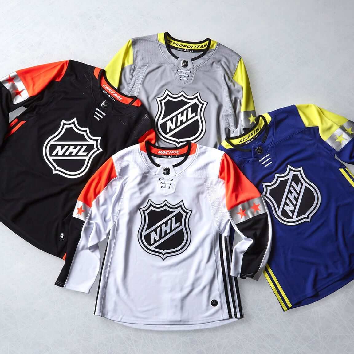
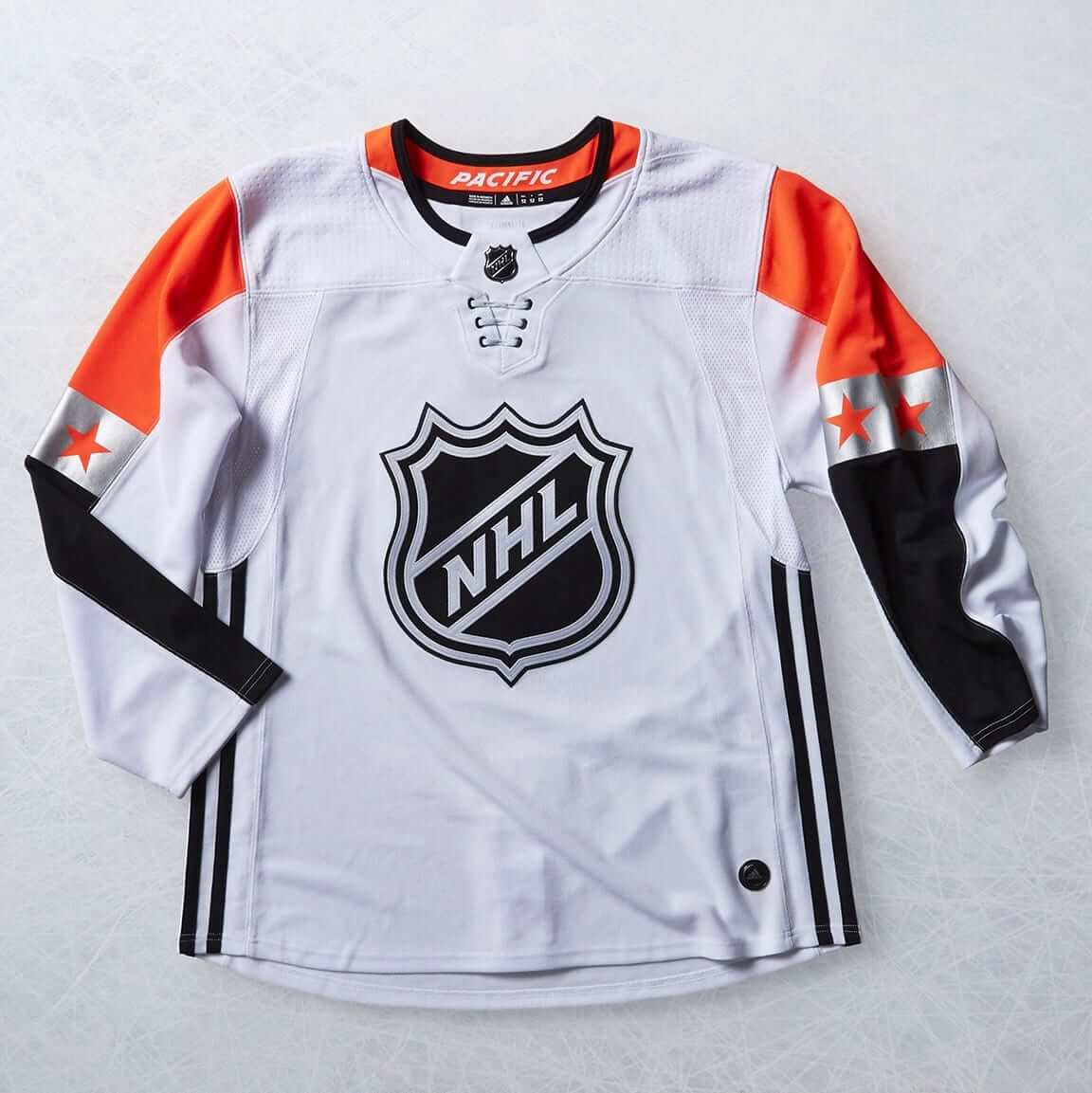
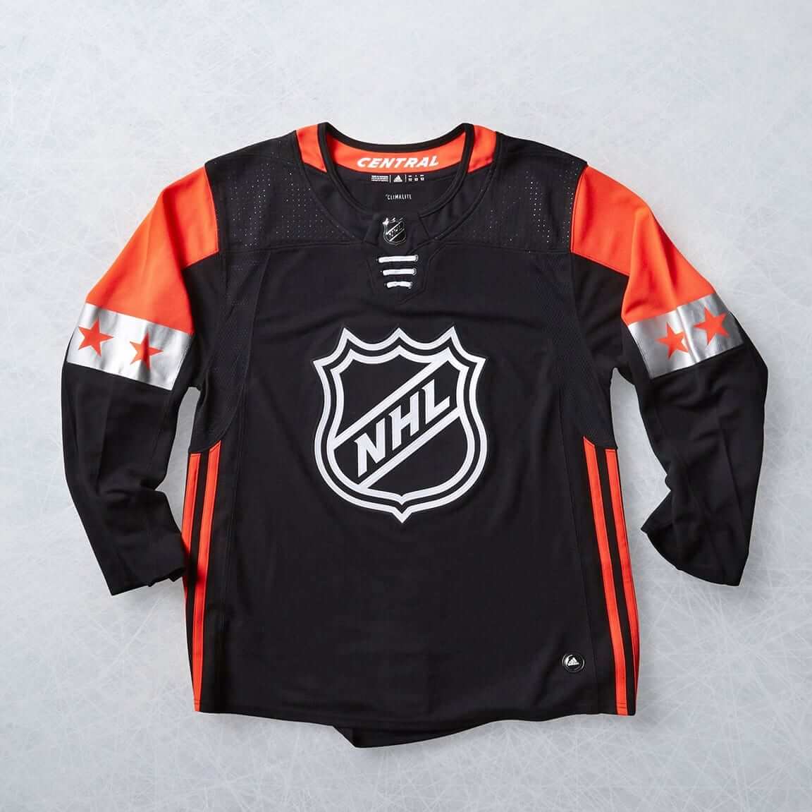
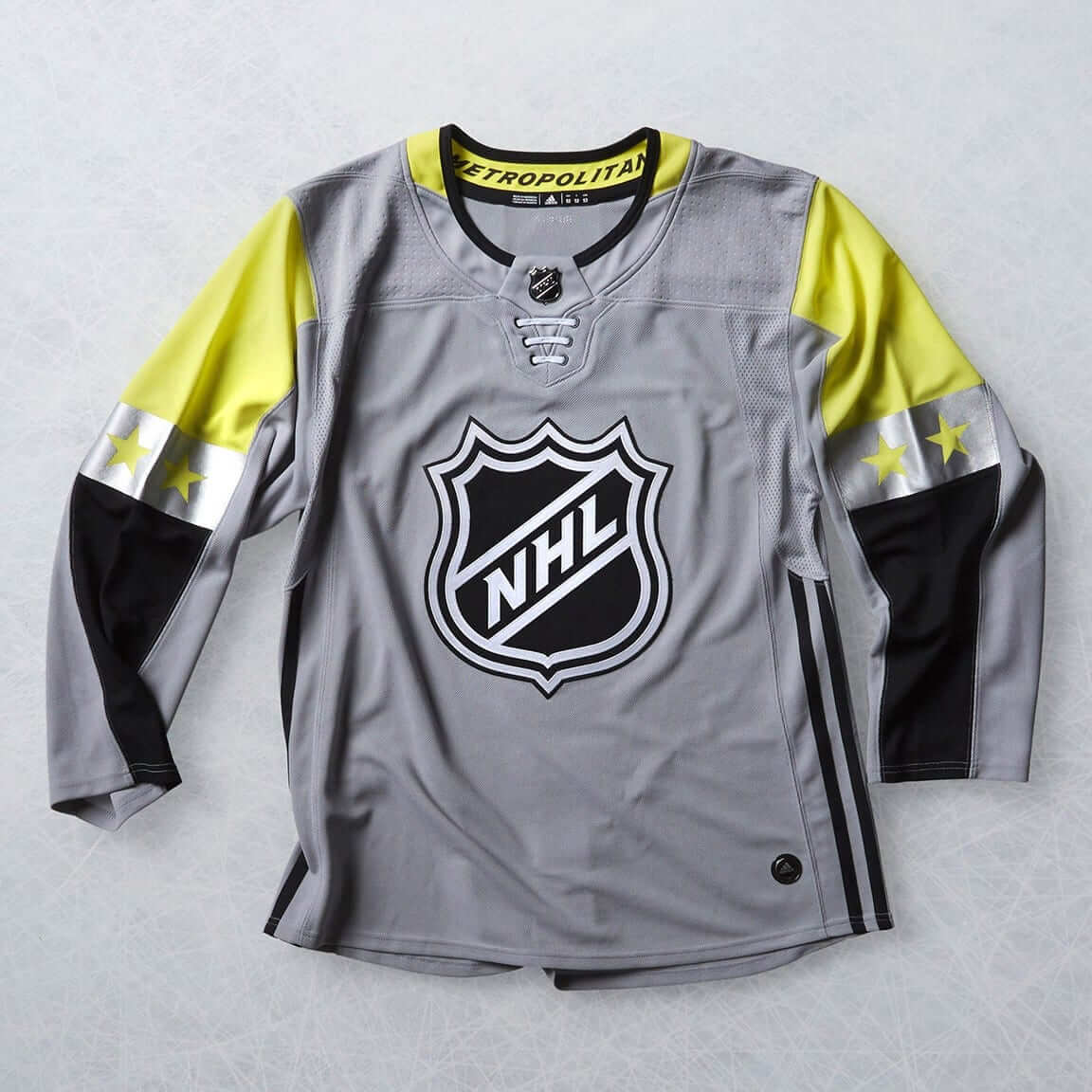
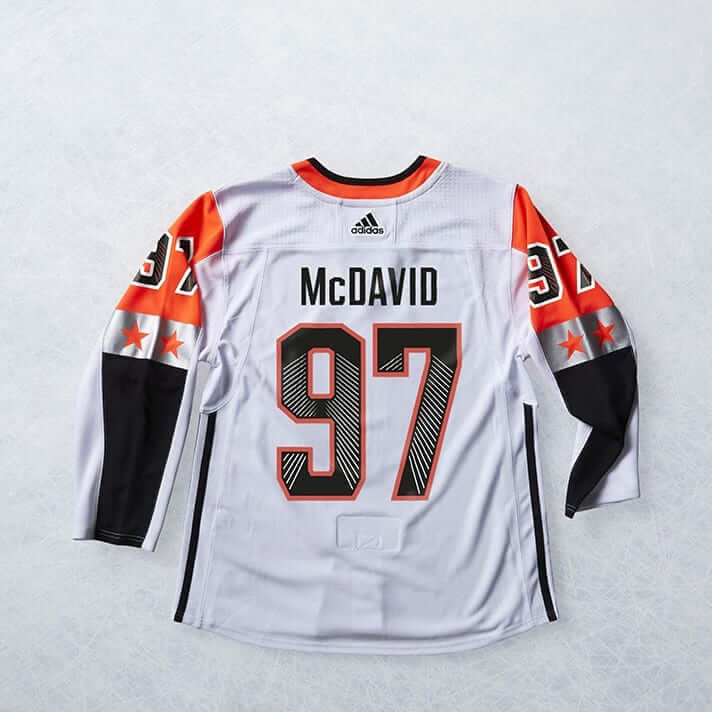
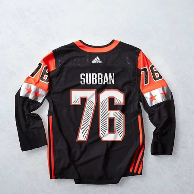
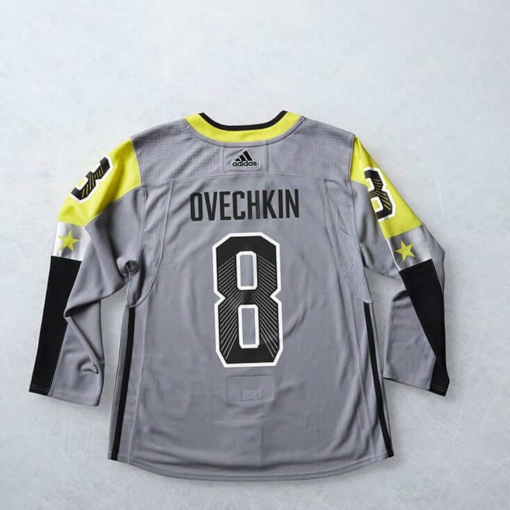
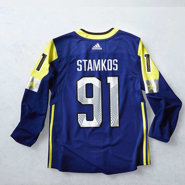
The NHL unveiled this season’s All-Star jerseys last night. They’re once again going with the four-team format, so there are four separate designs — one for each division. Here’s a closer look at the front and back of each one:
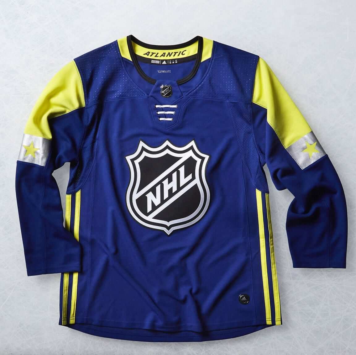
Some quick thoughts:
• The white and black ones aren’t terrible. But the other two, with the neon accents, are brutal. And man, neon and grey? What a disaster.
• I kinda like the linear treatment on the uni numbers.
• The three-stripe treatment up the sides isn’t really a surprise, since Adidas did something similar for NBA All-Star uniforms in recent years, but it’s still disappointing and unacceptable. This is supposed to be the NHL All-Star Game, not the Adidas All-Star Game.
• As is becoming increasingly common, they only revealed the jerseys, not the full uniforms. I asked an Adidas rep if images of the pants, socks, and accessories were available, and he said no. This not only makes it impossible to fully assess the design but just reinforces the notion that the only point of this exercise is to sell merch. Again, disappointing.
• In a related item, I note with a raised eyebrow that the jerseys in the promo photos all have that annoying little Adidas logo thingie down toward the front-left hemline. That thingie only appears on retail jerseys, not game jerseys. So they are promoting the All-Star Game uniforms by showing merchandise, not uniforms.
The game will be played on Jan. 28.
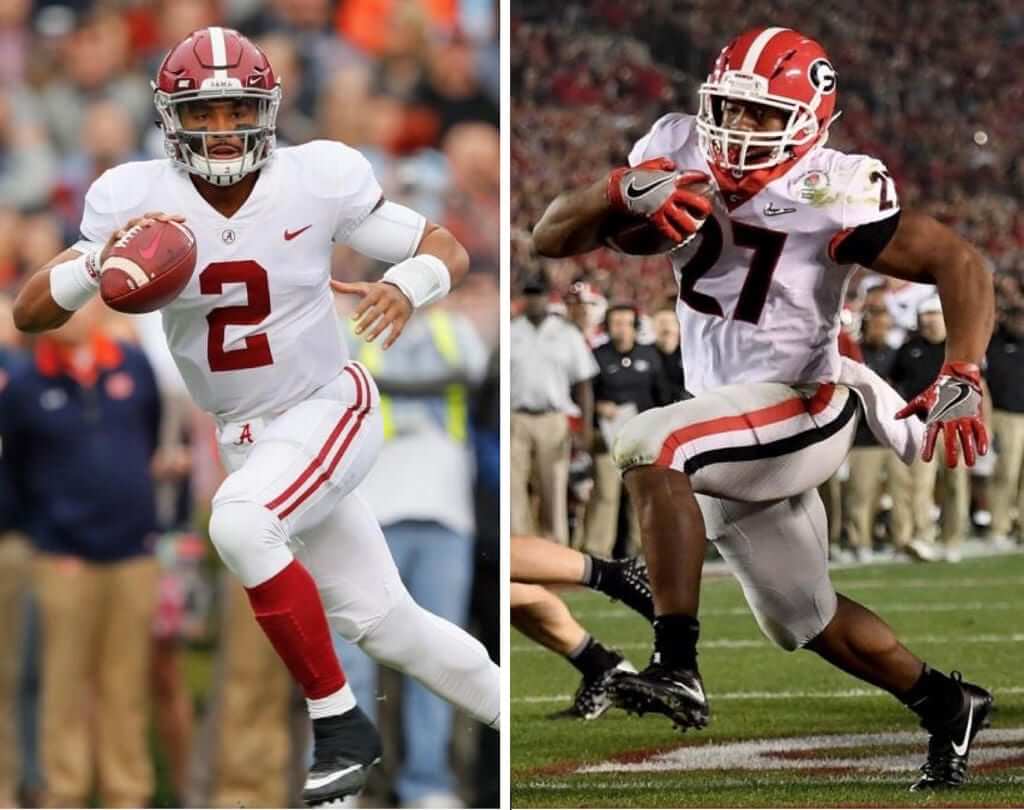
CFP preview: Today I have a new ESPN column that explores a simple question: We’re always hearing that teams need flashy, over-the-top uniforms to appeal to top recruits, so how come most of the College Football Playoff teams over the past four years (including Alabama and Georgia, shown above, who’ll meet in Monday night’s national championship game) have had fairly traditional uniforms? Check it out here.
Click to enlarge
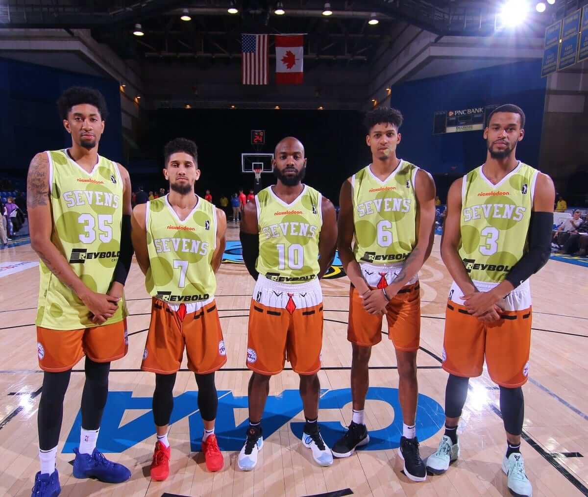
I’m ugly and I’m not so proud: These very thrilled-looking gents were the starting five last night for the Delaware 87ers, who wore Spongebob-themed uniforms. Their faces and body language appear to be saying, “Man, I knew I should’ve signed with that Italian team instead of going with this D-League shit, or G-League, or whatever the fuck they’re calling it this week.”
Here’s a closer view at the jersey and shorts. And how did they look on the court? Thanks to the miracles of modern technology, you can see the entire game (which the 87ers lost by a single Spongebob-themed point) in the viewer below:
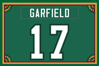
Membership update: If your New Year’s resolution was to finally sign up for a custom-designed Uni Watch membership card (like Johnny Garfield’s, shown at right, which is based on the late-1980s Saskatchewan Roughriders), there’s no time like the present.
Remember, a Uni Watch membership card entitles you to a 15% discount on any of the merchandise in our Teespring shop. (If you’re an existing member and would like to have the discount code, email me.) As always, you can sign up for your own custom-designed card here, you can see all the cards we’ve designed so far here, and you can see how we produce the cards here.
Buttery suede for sale: For reasons not worth explaining, I find myself with a beautiful vintage Western-style suede jacket that I’d like to sell. I could list it on eBay or Etsy, but I’d rather see a Uni Watch reader end up with it (for all the photos that follow, you can click to enlarge).
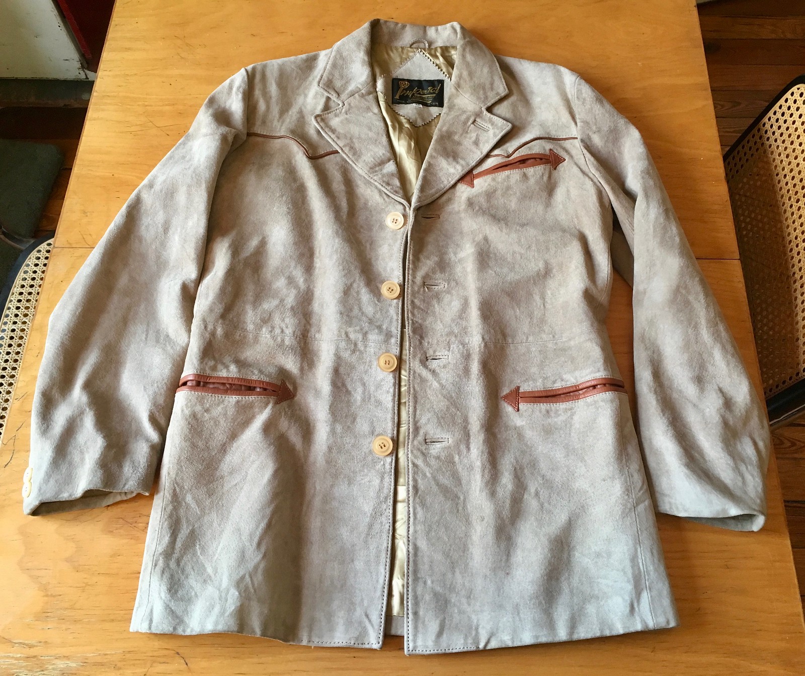
The specifics: It’s a light-tan suede jacket with brown leather trim. Four-button front with reinforced buttons and high lapels. Western-style pockets and yoke. Two buttons on each sleeve cuff. Fully lined with gold rayon or acetate.
The back has a Western-style yoke and a center vent:
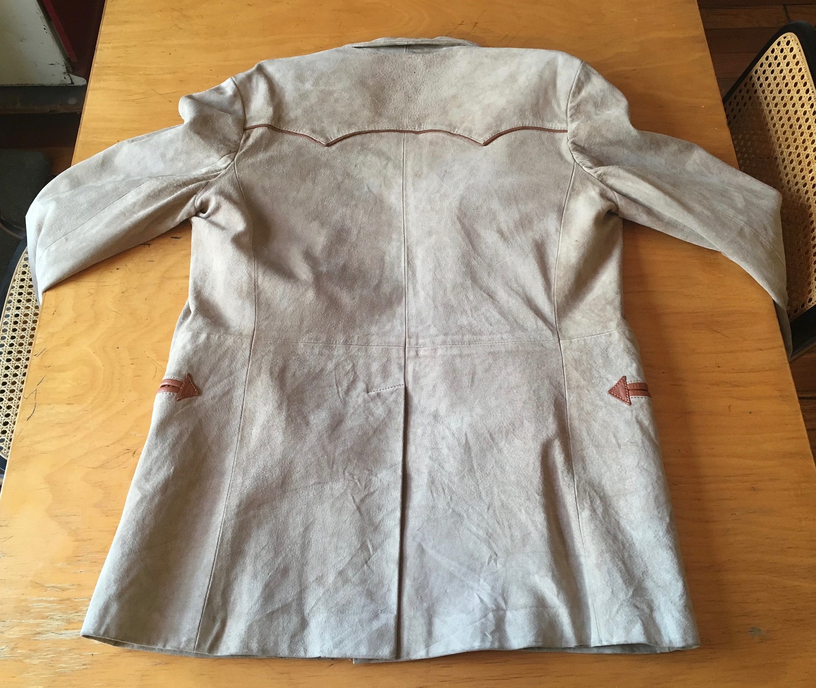
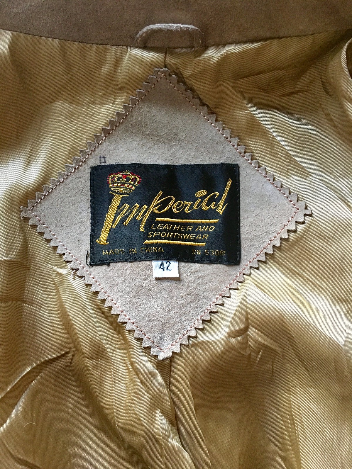
Although tagged as a size 42, it measures 20.5″ across the chest, so it’s really a 41. Measures 32″ from the back collar to the hemline, which is the main reason I’m selling it — it’s too long for me.
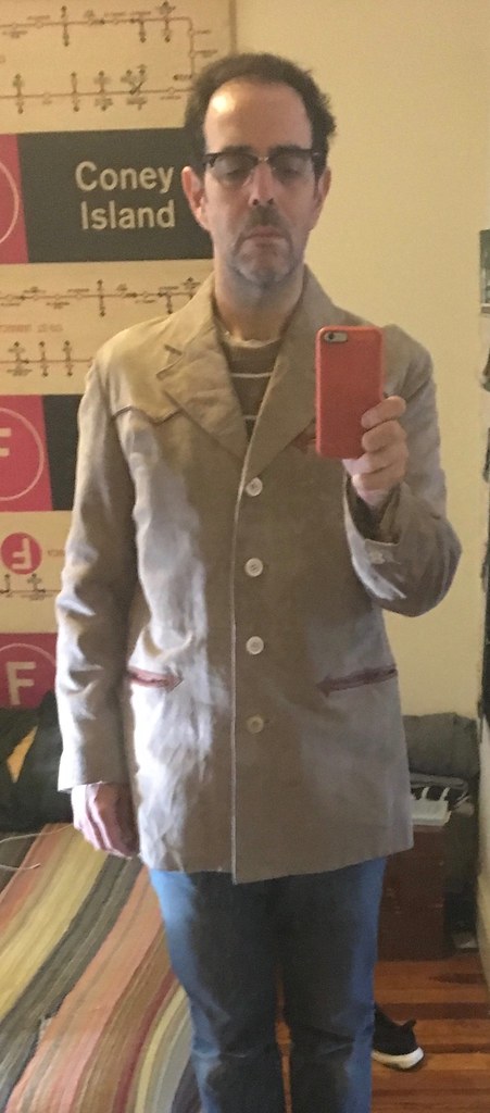
Just so you can get a sense of how it drapes, here are two really awful photos of me wearing it — one buttoned and one unbuttoned:
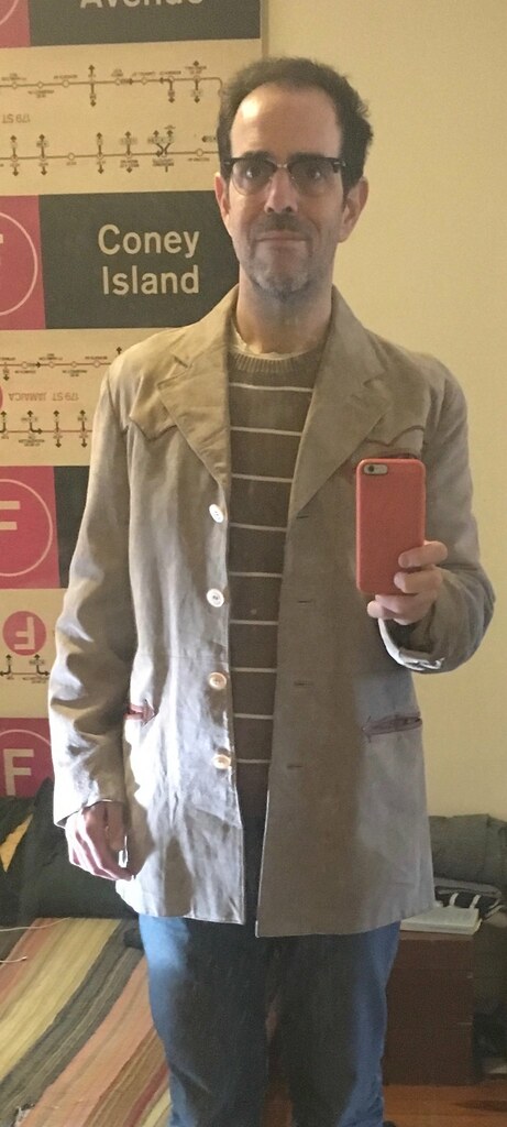
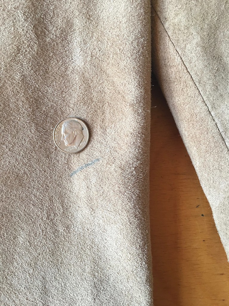
It’s in excellent condition — almost like new. All the stitches and buttons are in great shape. The only defect I can see is a small mark on the right sleeve that looks like ballpoint pen. I haven’t tried to clean it. Dime provided for scale:
It’s substantial, supple, and very warm. You want? Yours for $50 plus shipping. Get in touch if you’re interested, or if you have any questions. Thanks.
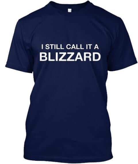
Bomb this: As you are probably aware, Uni Watch HQ and the rest of the eastern seaboard are currently being pelted by a winter storm, which has been dubbed a “bomb cyclone” — a term that, as reader John Vivino pointed out to me yesterday, is “in essence a way to market a blizzard.” John suggested a Naming Wrongs response, and I readily obliged with the mockup shown at right.
I don’t really expect anyone to buy this shirt. But if someone out there wants to, it’s available here. I’ll donate any proceeds to disaster relief.
The Ticker
By Paul

Baseball News: Most of this year’s new MLB sleeve patches have already been unveiled, but a little birdie provided me with some video game screen shots showing how the patches will look for the Dodgers (60th anniversary in L.A.), Giants (60th anniversary in S.F.), A’s (50th anniversary in Oakland), D-backs (20th anniversary), Rockies (25th anniversary), Rays (20th anniversary), Royals (50th season), and Nats (All-Star Game). … Following up on yesterday’s entry about certain uni numbers making a player seem faster or taller or whatever, here’s former Phillies SS Jimmy Rollins talking about how he wore No. 11 because it made him look taller (from @wBlinty). … A Houston artist has made a portrait of Astros 2B Jose Altuve out of Lego (from @igTXSalazar).

NFL News: Dolphins C Mike Pouncey likes the team’s throwback uniforms because they look “meaner” (from Tony DiRubbo). … Looks like the Bills will wear white over blue for Sunday’s playoff game in Jacksonville (from Sujan Vyas). … When the Browns beat the Jets in a double-overtime playoff game 31 years ago yesterday, Browns K Mark Moseley and holder Jeff Gossett had grey facemasks while the rest of the Cleveland players had white (good spot by Robert Hayes and Mike Styczen). … Chargers owners Dean and John Spanos were spotted wearing Chargers-style hard hats at the site of the team’s future stadium (from Moe Khan and Andy Garms). … Not exactly a news flash, but the Panthers will wear white for Saturday’s playoff game in New Orleans. The bigger question is whether the Saints will go mono-black. Hope not. … The Vikings use their weird jersey font for the yard markers on their field, which brings up an interesting question from Joseph Adams: “Will they keep that font for the Super Bowl [which is being played in Minnesota this year], or do they change to the typical stencil font?” Hmmmm.
College Football News: UCF, which went undefeated in 2017 but wasn’t invited to the CFP because the school isn’t in a Power 5 conference, will raise a national championship banner — so there! … Looks like the national championship game will once again have black end zones this year (from @BassinDawg).

Hockey News: The Rangers and Bruins went on a European exhibition tour at the conclusion of the 1958-59 season. Here’s a souvenir program and poster from that tour (from Kevin Vautour). … Reprinted from yesterday’s comments: The term “color rush” is spreading to the AHL. … “Not many pro hockey players were wearing helmets in 1973-74,” says Wade Heidt. “But Jim Cardiff of the WHA’s Vancouver Blazers had a pretty cool CCM helmet with flames on it. Had not seen that before.” … Red Wings C Andreas Athanasiou was still wearing the NHL centennial patch last night. It was supposed to have been removed in mid-December. … Here’s some pretty hilarious video of Jeremy Roenick talking about how he didn’t have an NOB when he scored his first NHL goal (from @@just___james405).

NBA News: After a month of voting from Chinese fans, the Mavs have chosen their Chinese nickname, which roughly translates to “Lone Ranger Heroes.” More about the process by which the name was chosen here (from our own Kris Gross). … A few years ago the Lakers added the years of their championships to their floor design, but they used backwards apostrophes. Happily, they’ve now fixed them (great spot by Cork Gaines).

College Hoops News: Color-vs.-color games are now fairly common in the NBA, but they’re still a relative rarity in college ball. UNC and FSU went that route last night, however, and so did Rutgers and Purdue (from James Gilbert and Robert Baker, respectively).

Grab Bag: New logo for Sly Fox Brewing. … Pro golfer Rickie Fowler will have “Aloha”-themed apparel for the Tournament of Champions, which tees off today in Hawaii (from Zach Loesl).
I looked up the previous two Red Wings games last night, and Andreas Athanasiou was wearing the patch in those games as well.
With the SpongeBob ugliness up top, it doesn’t also need to be in the ticker.
Right. Forgot to de-Tickerize it after I wrote that sub-lede.
“De-tickerize.” Something about this term is immensely satisfying. I have to find a way to work this into my everyday vocabulary.
The Spongebob shorts for the Delaware 87ers look like the players are wearing little red ties on their dongs that are hanging down because they forgot to zip up.
Man, that is an awful placement of the Tie on the Spongebob uniforms.
And rather uncomplementary, no wonder 60% of the team is covering up their dimunutive red tie.
It’s almost as bad as the South American female cycling team with the flesh colored fabric in the groin area…. Somewhat suggestive and embarassing at the same time.
CFP preview column: To Paul’s point, Ohio State — which won the first CFP — has seemingly used more alternate unis since then, and did not even make the CFP this year.
Hmmm.
Paul, you look as happy as a 87er in that jacket.
UCF is also having parade on Sunday at Disney World for their “accomplishment”. sheesh.
link
That naming wrongs shirt could easily be changed to “just call it a blizzard” for those of us that refuse to say “McFlurry” at McDonalds.
Thou shalt use the appropriate McSuffix when ordering foodstuffs at the Golden Arches.
So let it be written.
ack! PREfix
The numbers on the Vikings’ field are sewn in as opposed to being merely painted on. That neither guarantees the use of the peculiar font in question or its replacement with something more conventional, but it might make a change more difficult. My take is the NFL will want conventional looking numbers if at all possible.
The NFL already has conventional-looking logos for the Super Bowl for the foreseeable future.
About the stadium/field from the Vikings site:
“Interchangeable parts: The areas that distinguish the turf as the home of the Vikings — particularly the Norseman and purple end zones — are in a “removable active panel (RAP) system that can be replaced by green segments when U.S. Bank Stadium hosts other events.
The numbers that mark the yard lines are not part of the removable system but can be painted green.”
Since they can’t be swapped I will imagine them being repainted.
sewn in doesn’t matter, i coach high school football in Dallas area. We’ve played at Jerry’s World and they have at least 3 different turf systems. NCAA, NFL, and soccer. Texas HS plays with NCAA rules/field. The NFL is not as bad as the NCAA Bball when it comes to uniformity in its playing surface but with them liking to keep some things standard, the mid field logo etc… it beckoned the question if they would make them change the numbers. I do like the Vikings number font on the field. I also like the UNLV filed too :)
If they’re sewn in then I vote just keep them. Sure those numbers are weird looking but it’ll look much worse to paint them green and then paint plain numbers over them. It’ll just be a quirk when highlights are shown in the future.
In Madden, the field markings don’t change style or color.
I worked as a volunteer at the 2004 Super Bowl in Houston, soon after Reliant Stadium (as it was known then) opened. The morning of my training, we sat in seats behind an end zone, and were told the plain grass field below had just been installed. It was brought in by the NFL specifically – and only – for the Super Bowl.
That being said, I am guessing the Minnesota turf will be taken up and completely replaced for the Super Bowl. Just a hunch.
I notice the 87ers jerseys say “SEVENS” not SEVENERS”.
seem odd.
I’m having a hard time comparalbly saying “Nines” instead of “Niners” or “Sixes” instead of “Sixers”.
Short pants and long faces: doesn’t anybody see those ridiculous uniforms as incentive to do well and get to the NBA??
I get UCF’s outrage at going undefeated and uninvited to the College Football Playoff, but are they serious about claiming a NATIONAL championship?!
Not the same thing, but it reminds me of when the Cincinnati Reds had MLB’s best record but did not qualify for the playoffs in the strike season of 1981.
link
That was just a screwed-up season. First-half division leaders had zero incentive to continue playing well in the second half, and it showed. The Oakland Athletics were the only first-half leader to finish with the best overall record in their division, finishing the second half behind a resurgent Kansas City Royals team that still had a losing record for the entire year.
To be fair to UCF, plenty of college football teams claim national titles in past years that weren’t won as the result of a playoff…
UCF: I think we know why we have football championship playoffs.
Seinfeld: I don’t think you do. You see, you know how to *claim* the championship, you just don’t know how to *earn* the championship. And that’s really the most important part of the championship: the earning. Anybody can just claim them.
link
I do like the black and white NHL ALL-Star jerseys. Reason being is the return to the black and orange colour scheme. It is a nod to the regular NHL All-Star colour scheme used for decades and then they stopped using it in 1994.
I was wondering about that. Weird that they aren’t using the color scheme of the hosting team (Lightning) but I like the history lesson there.
I think it’s annoying that the All-Star logo has a nice golden yellow and decent-looking orange, yet the uniforms are giving us bright-ass highlighter yellow and safety orange.
The old orange was more a burnt orange, not as bright as this. My first thought on these was Cincinnati Bengals. These jerseys look like football jerseys, or practice jerseys.
Seeing the four NHL All-Star jerseys for the Atlantic, Central, Pacific, and Metropolitan divisions got me thinking about a Naming Wrongs shirt.
– I Still Call Them The Adams, Patrick, Norris, & Smythe
Probably more appropriate:
I Miss The Adams, Patrick, Norris, & Smythe
In that order would be Adams, Smythe, Norris and Patrick.
Actually: Adams (Atlantic), Norris (Central), Smythe (Pacific), and Patrick (Metropolitan).
I love that a reader pointed out the absurdity of the term “bomb cyclone”. I’m almost 50. I don’t ever recall hearing that term before yesterday. I guess it has probably existed for something time but it sounds silly. It’s as if some meteorologists got together with a few marketing guys and said “blizzard is too dull, we need to really get their attention” “Hey how about a cyclone” “Yeah but let’s add bomb, it’s an attention grabber”. And so as the snow piles up here in the NYC metro area and the wind blows it appears I’m somehow surviving the bomb cyclone……I mean blizzard.
It sounds like the result of a Nike marketing meeting.
I thought the same thing, “bomb cyclone” is even more obnoxious than most nonsense weather terminology. Definitely sounds like a sneaker they would make.
That said, I’m enjoying my day home from work, perfect reason to put some beef stew in the slow cooker, get the fire place going, and dig into some books.
Also, when did “they” start NAMING every storm (winter or summer) like it’s a catastrophe waiting to happen?
link
No sir. I don’t like it.
Even good old fashioned cold fronts for some reason got rebranded a few years ago as polar vortexes. On today’s weather event, if given the choice – I would go with “I’m calling it a Nor-Easter”
Weather Channel branded winter storms. Legitimate news outlets should not be using names for winter storms.
Today’s ESPN column is up:
link
Just curious…was this column inspired at all by a comment I made here a few weeks back, observing that all four playoff teams had traditional uniforms?
Your comment reminded me that I had thought something similar last year. Now that we’re four years in, it seemed like a good time to look at the ongoing phenomenon.
Great minds think alike, right?
I think a lot of older people tend to assume that younger guys are ignorant or unaware of tradition and history, but I suspect that traditional uniforms (for successful programs) might actually be much more of a draw than trendy ones.
Certainly a lot of young kids dream about being able to wear the same uniform that their heroes did, not to mention that the traditional uniform gives players a chance to feel like they’re part of something bigger than themselves.
Nicely stated, Dan. I heartily concur!
The Bruin in the hockey poster from ’58-’59, looks incredibly like the great Phil Esposito, and also has his number 7. Phil was only 16 that year and didn’t become a Bruin until ’67. Did Nostradamus create this?
Nope, it’s just Vic Stasiuk.
I thought the same thing!
Fine ESPN article, but I’m pretty sure southern nomenclature calls Georgia’s pants “dem silver britches.” Not gray.
“Will they keep that font for the Super Bowl [which is being played in Minnesota this year], or do they change to the typical stencil font?” Hmmmm.“
I was reading an article yesterday about how if the Vikings made the Super Bowl, the NFL wouldn’t allow them to use team specific touches in the stadium (the ship, the horns, in stadium sound effects, etc) to try and uphold neutrality of the site. I would imagine The number font would be changed as well.
College Hoops color-on-color: Missed another one last night with LSU hosting Kentucky:
link
with a cameo by Will Wade’s purple blazer:
link
Good ESPN article, Paul. I find myself venturing into old man hot take mode whenever I think about such things, as I find it sad that anyone would actually let what the uniforms look like determine where you would go to school.
I normally dislike the Alabama program, but I do appreciate the adherence to tradition and will recognize their 84% graduation rate as higher than I expected it to be.
Today’s membership card is from my fave era of CFL jerseys, when Champion made them with the floating outline.
When reading about the Vikings field number fonts in the ticker I was reminded about the font used in Las Vegas for whatever bowl they hosted. They chose Comic Sans as the yard line numbers and the greater than less than symbols as the arrows. It was awful.
Anyone else notice that on the Spongebob shorts there is an 87ers logo and a 76ers one?
The 87ers are the Sixers’ affiliate.
Right, I knew that. Is that commonplace and just something I didn’t know about?
I dug those 1985-87 Saskatchewan Roughriders uniforms and their number style. It’s nice to see it represented here on a membership card! Sure the sleeves were busy, but it worked in that stripey 80’s way.