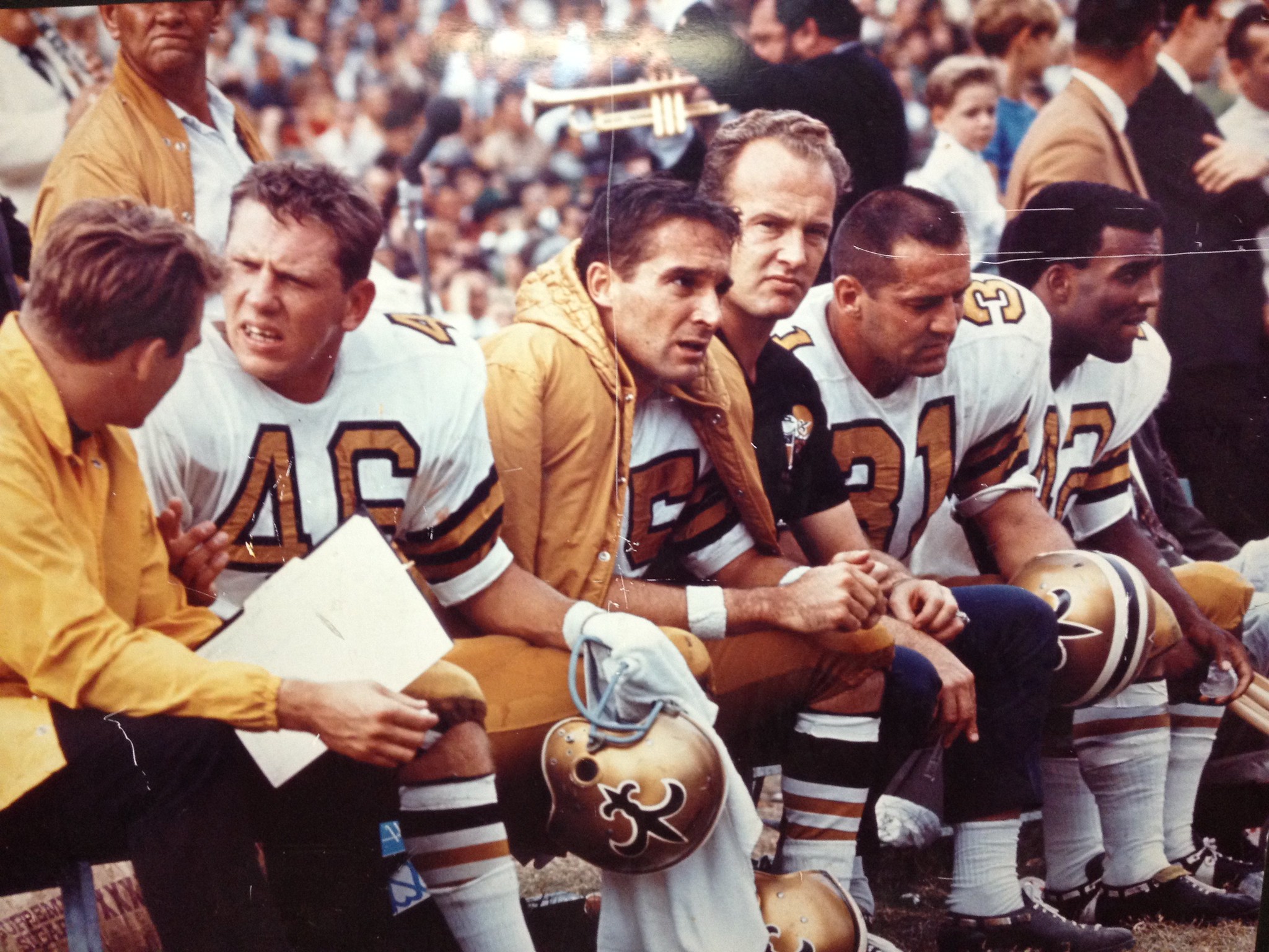
Click to enlarge
The photo shown above was taken during the Saints’ inaugural season, 1967. Take a look at the two players in the center — quarterback Gary Cuozzo and running back Jim Taylor. As you can see, their jersey numbers are much thicker than the ones being worn by the two other players (and yes, Taylor’s helmet striping is inverted, but we’ve discussed that issue before so let’s not worry about it today).
According to reader Russell Goutierez, Cuozzo and Taylor were the only two Saints to wear the thicker numbers that year. By coincidence, those two players also appeared on this famous Sports Illustrated cover (which is famous in part because of the plain white helmet stripes):
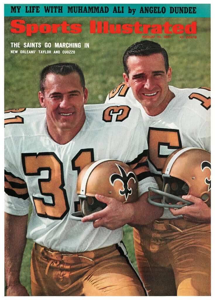
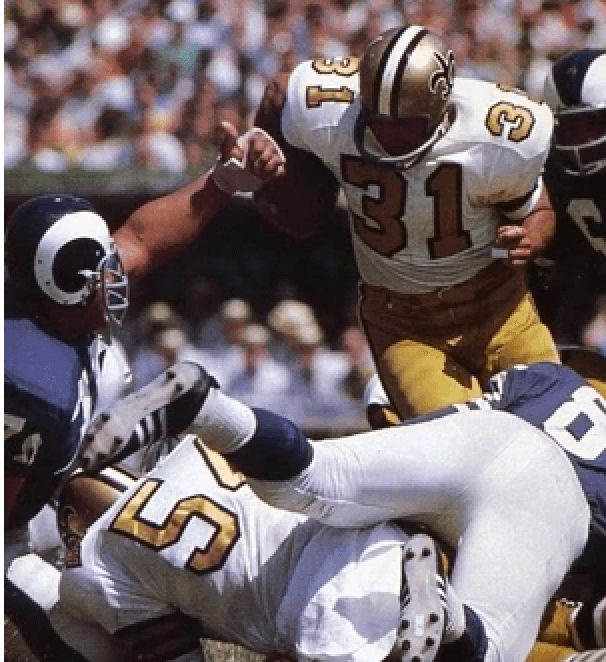
“Every other Saint I’ve ever seen in pics or video from 1967 (and I’ve looked at a lot of them) wears the ‘thin’ number font,” says Goutierez. I did some photo research, and he appears to be right. Here’s a 1967 shot that shows a bunch of Saints wearing the thin number, and here’s shot showing Taylor with the thick font and a defensive lineman with the thin font:
This would all be just a fun historical footnote except for one thing: The Saints will be wearing their mono-white Thursday-night uniforms for tonight’s game against the Falcons, and those uniforms use the thicker font (click to enlarge):
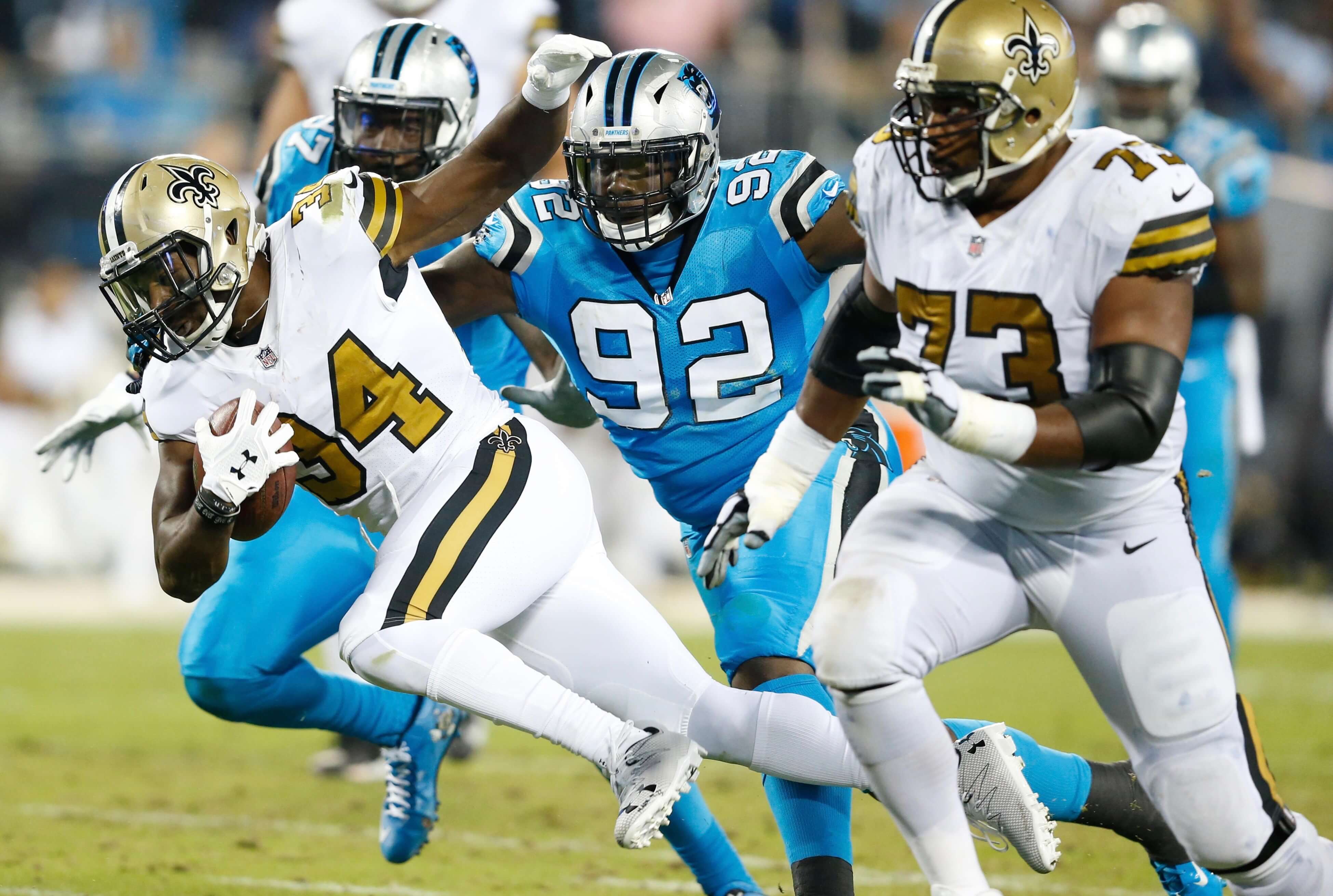
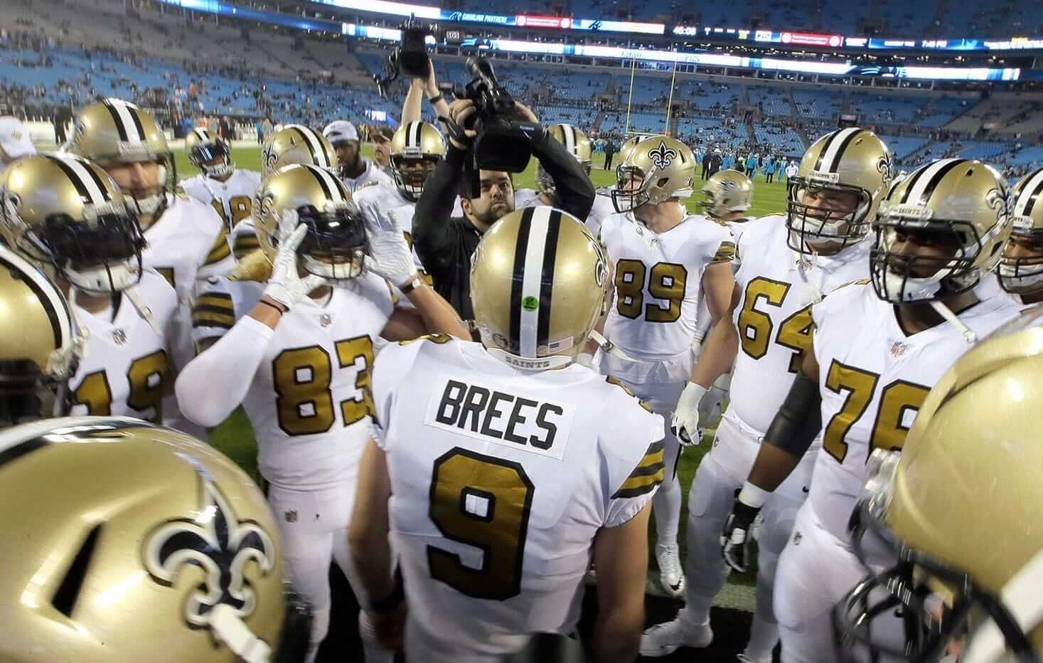
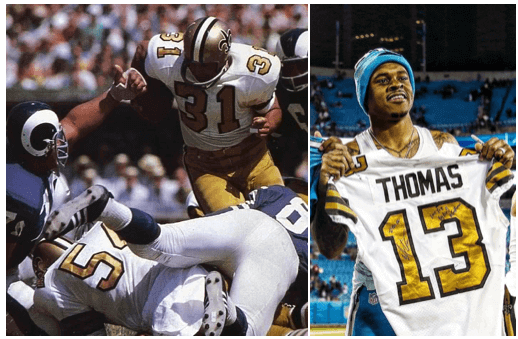
So the Saints are basing their Thursday-night uniforms, which are supposedly a nod to their early history, on a number font that was worn by only two players. Seems odd, no?
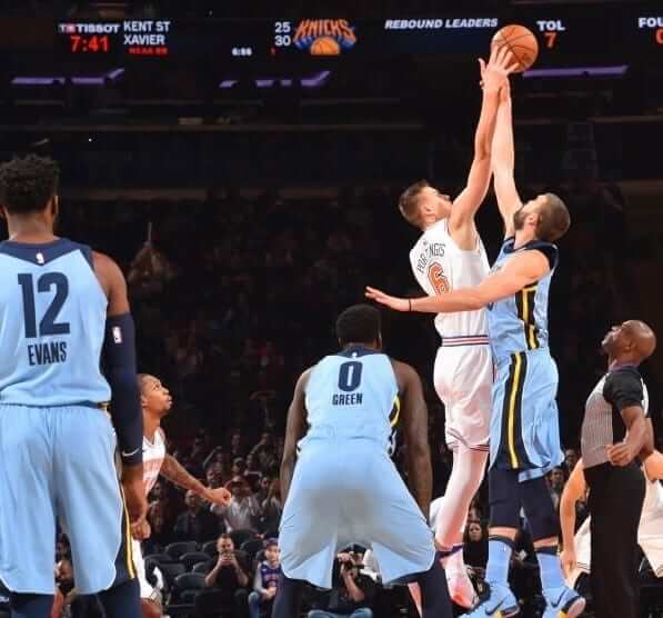
Heading south: Notice anything unusual about this shot from last night’s Grizzlies/Knicks game? As you can see, the Memphis players had drop-down NOBs on their light-blue alternate uniforms. But when this uni design was revealed a few months ago, it showed a conventional radially arched NOB.
The Grizzlies had worn this uniform one previous time, on Nov. 26 against the Nets, and sure enough, they had the drop-down NOBs in that game as well. That was during the Thanksgiving weekend and I must have missed it. Interesting development!
(My thanks to Collin Wright for bringing this one to my attention.)
Cats are so fucking weird: I recently found an old blanket in the back of my closet. I think I bought it at a thrift shop more than 10 years ago, and then it got buried under a bunch of other stuff and I forgot about it.
I initially put it at the end of my bed, where Uni Watch mascot Caitlin immediately curled up on it. Turns out she loves it — no matter where I put it, she ends up on it (for all photos, you can click to enlarge):
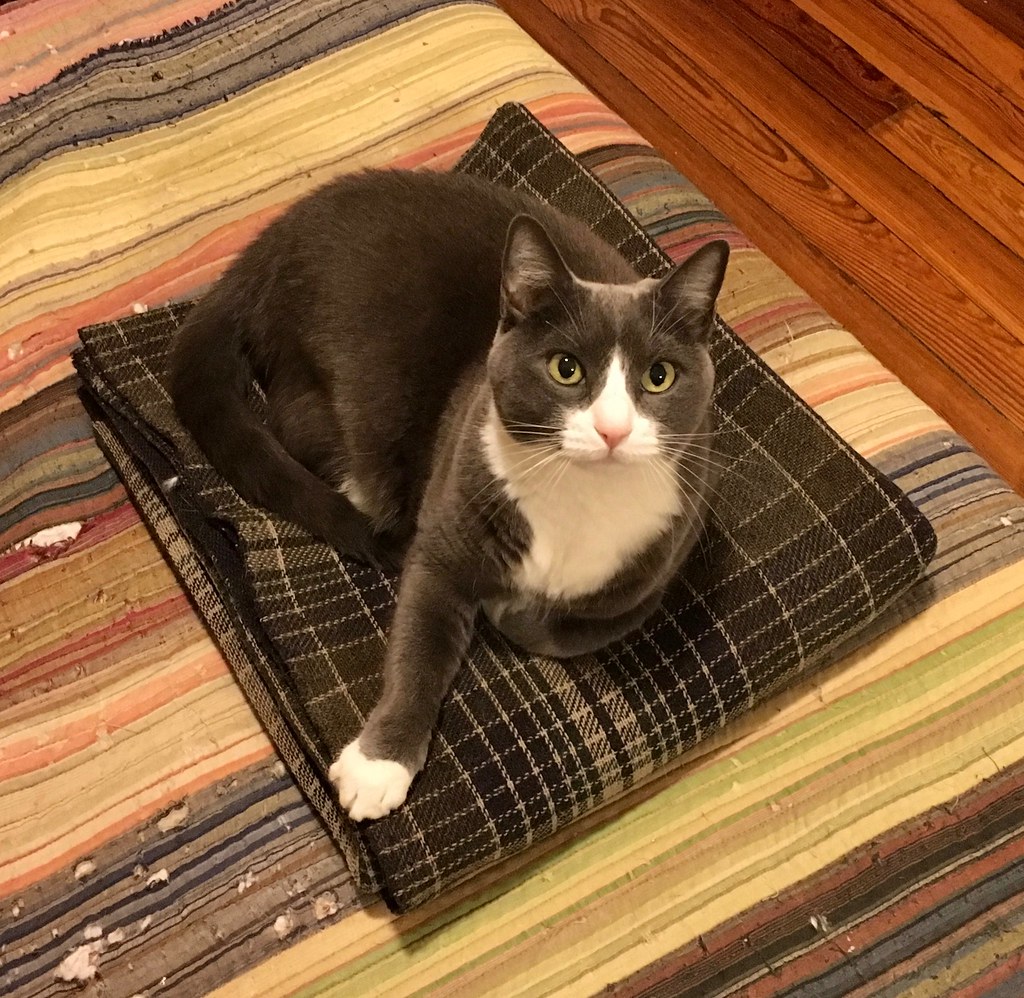
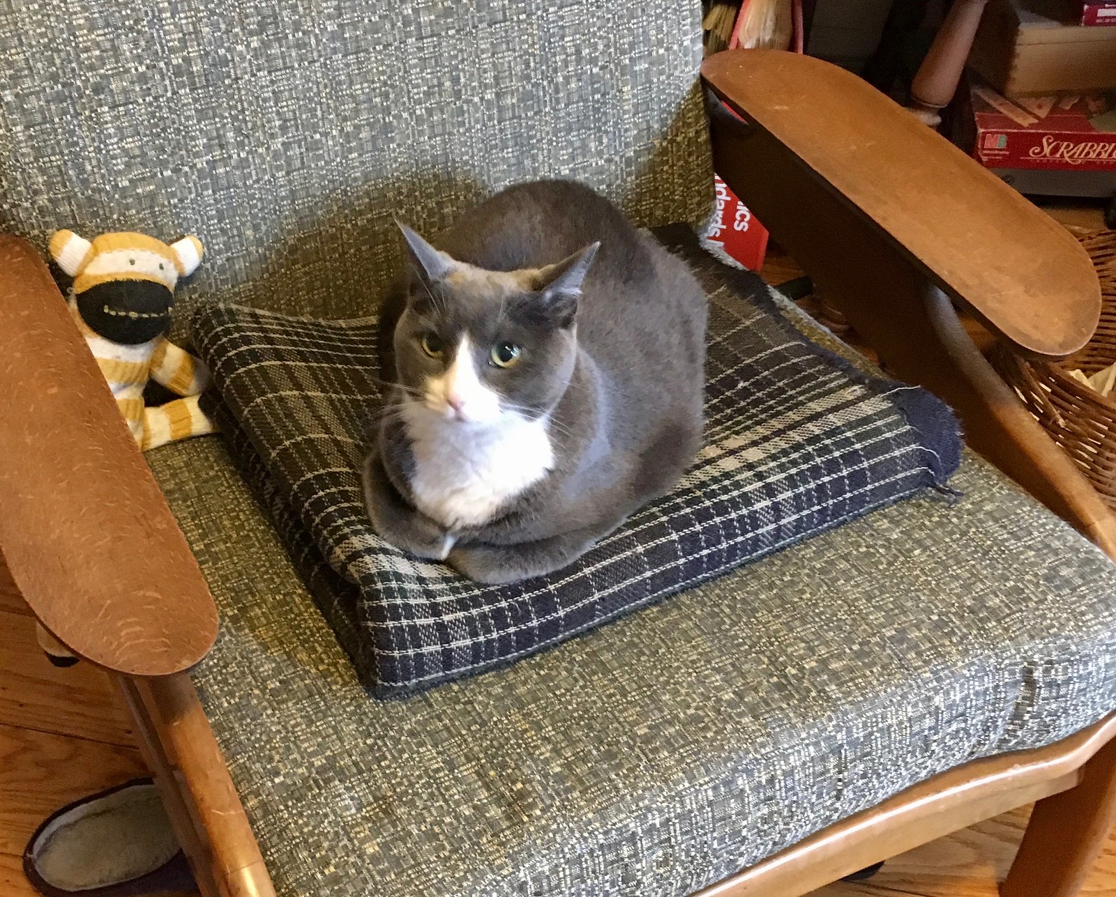
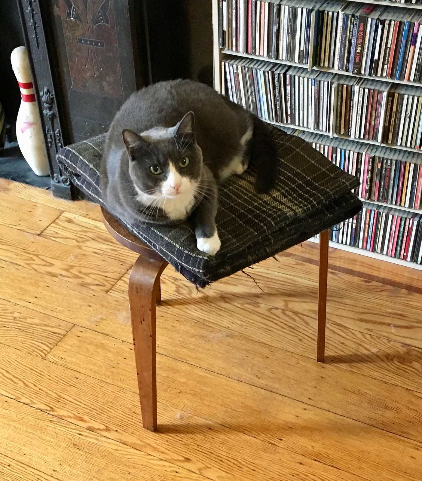
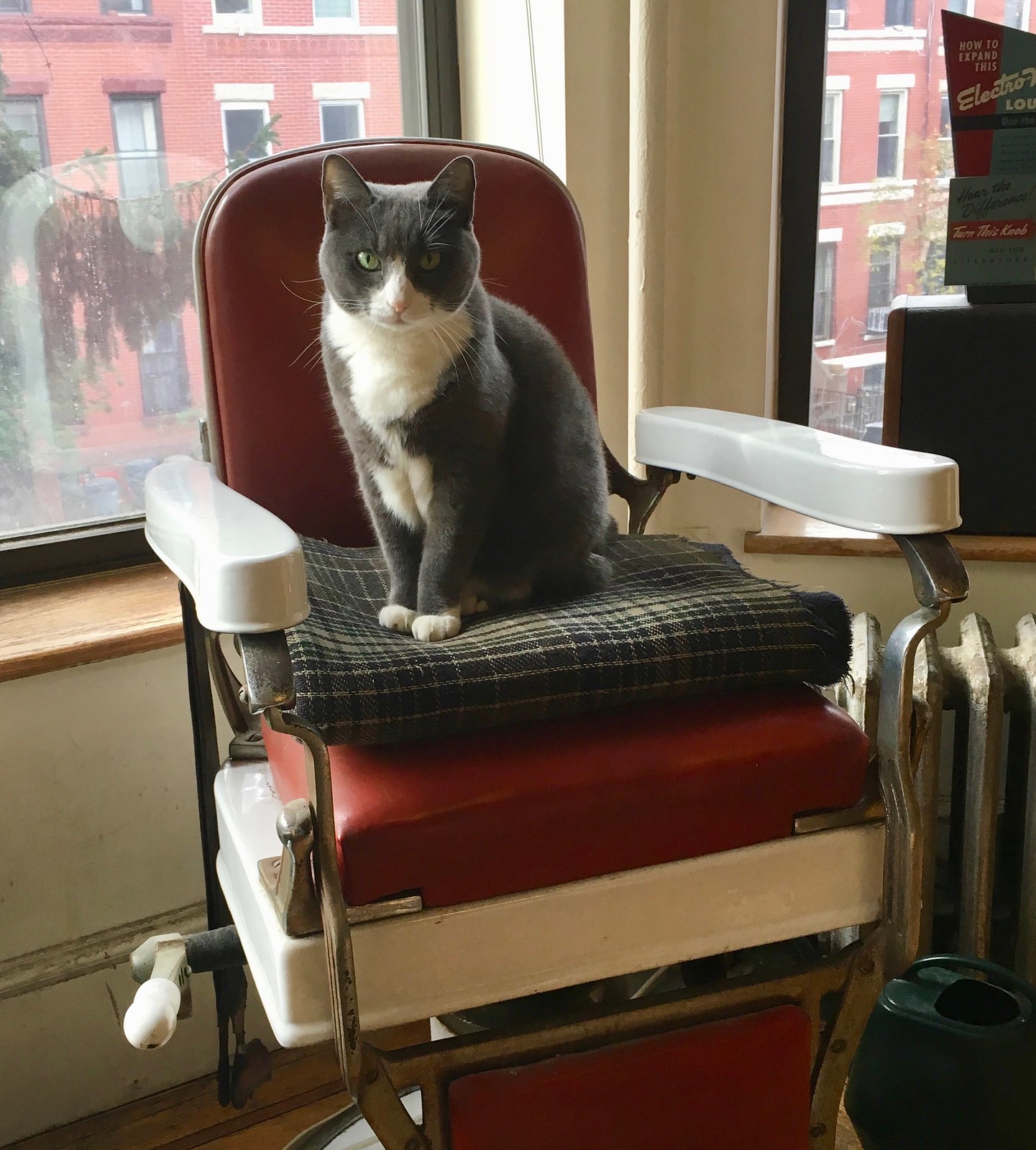
So territorial! What a cutie.
The Ticker
By Paul

Baseball News: New logos for the Single-A Augusta GreenJackets. … Check out this great old aerial photo of City Island Ball Park in Daytona, Florida (now known as Jackie Robinson Ballpark). Ya think any foul balls made it into the water?

NFL News: It wasn’t uncommon back in the day for football coaches to wear football pants during practices. But here’s an old shot of former Giants head coach Steve Owen wearing what appears to be baseball pants. Ditto in this shot. While we’re at it, here’s a shot of Owen wearing a cap and jacket with a Yankees-style “NY” insignia (all this from Jamie Burditt). … The Chargers will go mono-navy this Sunday (thanks, Phil). … Colts DB Malik Hooker bought a new set of basketball uniforms for his hometown high school in New Castle, Pennsylvania. Additional pics here and also gave out five autographed footballs (from Michael Conn). … The NFL has a new line of team merch designed by students at the Fashion Institute of Technology in NYC. Additional info here (from Tommy Turner). … Giants WR Sterling Shepard wishes the team’s Color Rash uniforms were red instead of white.
College Football News: Good work by James Gilbert, who is charting all the field designs for UNC’s stadium. … The National Bobblehead Hall of Fame has released a line of limited-edition college football bobbles. Additional info here (from Jason Hillyer). … Also from Jason: Newly named Arizona State coach Herm Edwards, who’d been away from the coaching ranks for a decade couldn’t believe how small modern jerseys have become. … This photo, apparently from 1908, shows Pitt players wearing uni numbers that appear to be pinned to their jerseys (from Robert Hayes). … I don’t much care about corporate theater, but this piece about whether Under Armour hates Auburn is pretty funny (from David Wilson). … Here’s how a UAB jersey looks with a Bahamas Bowl patch. … Anyone know what’s written on Holy Cross QB Peter Pujals’s undershirt? It looks like he had “Holy Cross” there in previous games (from Matt Simpson).

Basketball News: Cross-listed from the NFL section: Indianapolis Colts DB Malik Hooker bought a new set of basketball uniforms for his hometown high school in New Castle, Pennsylvania. Additional pics here and also gave out five autographed footballs (from Michael Conn). … A current State Farm commercial features an ice sculpture of Rockets G Chris Paul, including the maker’s mark on his sneakers. “Gross,” says Chris Perrenot).

Soccer News: Keaton Parks re-upped with Portuguese side Benfica B through 2022 and was presented wtih a No. 2022 jersey for the occasion (from Mike D).

Grab Bag: The University of North Dakota has extended its apparel deal with Adidas through 2025. … The French cycling team FDJ will be called Groupama-FDJ next season, thanks to a new corporate partnership. … Here are some great manhole cover designs from Japan (from @gondokc). … A New Jersey ice cream shop has been getting complaints about its logo, which features a sexualized dairy cow. … USF’s athletics dept., which has been outfitted by Under Armour in recent years, is switching to Adidas (thanks, Alex). … A food contractor’s sign at McCarron Airport in Las Vegas uses the old Star Trek font (from Ed Hughes). … Here are the six candidates for the 2020 Olympics and Paralympics mascots (from Jeremy Brahm). … I’d better enjoy 2017 while I still can: Pantone picked a shade of purple as its color of the year for 2018. Ugh.

What Paul did last night: Last night I saw the new movie The Shape of Water, which is about a romance between a mute woman and a sea monster. It’s a sweet story, and gorgeously shot, although almost completely predictable and unchallenging. What really interested me was the movie’s fixation on my favorite color, green. In addition to the green sea creature who lives in brackish green water, there are green custodial uniforms, green wall tiles, green hand soap, green buses with green seats, green pie, green Jell-o, green candy, a green car (a car salesman describes it as “the color of the future”), and even a character who apparently develops gangrene.
I imagine this was all meant to be a subliminal (or maybe liminal) environmental message, but for me it was just a visual treat — a movie saturated with various shades of my favorite hue. Mmmmm, green.
Cat pictures are always the best!!! FYI My cat likes heating pads, but likes any blanket…
Cats are Weird, Part 312:
A couple weeks ago I was wrapping a birthday present. In my haste to leave after wrapping the present, I left a couple sheets of tissue paper, one squared on top of the other, on the living room floor. Later that evening I noticed my girlfriend’s cat Wallace was sleeping on the paper. I thought it was just a cute one time oddity. However, since then, Wallace has used that as his napping area every day. He never laid in that spot before but apparently the tissue paper made it just right!
Seconded. I used a cloth-feeling wrapping paper for my girlfriend’s gift back in August, and literally every day since it’s been opened, my cat has sat on it, chewed at it, played with it—just sitting on the floor.
Make a square of painters tape about a foot by a foot. Hard floor or carpet, don’t matter, your cat will likely sit there. They are bizarre.
Early December is Cat Christmas, when numerous cardboard Amazon boxes are scattered across the floor, all there for Birdie to sit in, flop around in, jump between, and hide beneath. I’d like to straighten the place up and take some out to recycle, but I’m not made of stone.
I wonder if the Saints had those two jerseys made just for the SI cover pics? Then when they went in production for the team either changed their minds or it was an oversight?
I was thinking the same thing. Like maybe the full run of jerseys weren’t done in time for the photo shoot and they just made those two in a small special batch.
Or maybe the thin numbered jerseys were a botched batch. The team was embarrassed to have them on the cover, yet didn’t have the time/money to redo everyone’s jersey.
Either way, I doubt it’s merely a coincidence.
(Side note: ledes like these are one of the main reasons I love this blog and feel a need to read it every day. Hats off!)
Regardless of how thick or thin the numerals were, those are damn fine unis. Maybe the best in league history.
Definitely among the best. The Saints are still by and large a fine looking team, but boy howdy they looked even better when they first took the field.
I agree. Hard to believe that the two players in that cover just happen to be the two with different unis. More likely that their unis were made early for photo purposes, and then the design was tweaked.
“and here’s shot showing Taylor with the thick font and a defensive lineman with the thin font:” – I think you mean offensive lineman.
According to Pro Football reference, #54 on the 1967 Saints was Joe Wendryhoski, who is listed as a Center.
Lee
That’s my point. Why would a picture of Taylor running the ball include a Saints defensive lineman?
…Paul must disagree.
USF starts an 8-year deal with adidas this summer.
link
Oops…someone beat me to it. I hope adidas doesn’t mess with the football and basketball uniforms too much. That’s the part of the redesign that I’m dreading the most.
Seems odd – yes, and a missed opportunity to do something esoterically cool, which would be to replicate the oddity, have a couple of players wear the thicker numbers.
Proofreading:
“Giants WR Sterling Shepard wishes the teams Color Rash uniforms” team’s
For the Saints, is it possible that the thick numbers read better for television?
Fixed.
Thick is better than thin.
To me, the thin numbers are more legible, and thus actually bolder and more impactful. On such a pleasingly simple uniform, the numbers need to be strong elements, and so the thinner digits are better.
That’s what she said.
As they said on the old Chunky candy bar commercials, “Thickerer tastes better than thinner.”
The Saints went with thicker numbers more uniformly in 1969, though. So the rash-backs are more a pastiche of the Saints’ first three seasons than representative of any one season.
Here’s link of the thick numbers from 1969. (Note the stripes being cut off due to the shortened sleeves!)
Interesting post on the font thickness, but it doesn’t seem odd to me. The Saints are honoring the general look of the old unis, while tweaking (and in my opinion, improving) the number font. Not a true throwback anyway since they are wearing white pants not gold.
My question: When did the Saints switch from the gold in the older uniform to the lighter, less glorious gold of today?
Here, you can look that up yourself on the Gridiron Uniform Database:
link
Thanks. According to the Gridiron uniform Database, 1975 was the last year the Saints wore the darker gold. In searching for Saints images, I came across another one of those XL jaw-protecting facemasks.
link
However I have always preferred the original, simpler fleur de lis and shade of gold to the modern ones.
Likewise. The older gold is gorgeous. The new shade looks like unwashed laundry that’s been sitting around too long.
The new colour is more like metallic beige than gold.
Other than the necessities (food, litter box, grooming and health tools, ID and collar if it’s an outdoor cat), it’s such a waste to buy anything specifically for a cat. If you have a spare box, they’ll adopt it. Old ratty blanket? They claim it. They like that stuff more than any toy or gadget.
Maybe there’s something we can learn from the simplicity.
Whoa! Not ALL the UNC football field designs, yet. Working on it. Thanks for the shout-out.
Gotcha. Have changed “has charted” to “is charting”.
James – Great work on those Kenan Stadium field designs…I”m a UNC grad/fan and wasn’t aware of many of them.
I was about to say that you left out at least one (I am thinking of the recent “blackout” games), but it appears you’re on top of things.
Be sure to let us know when you’re finished.
Jackie Robinson Stadium is still there in Daytona, and still close to the river.
Home of the Daytona Tortugas (class A Reds affiliate)
link
The Jack is a fabulous little ballpark to watch a game from (at least from behind home plate or on the first base side – the original stand with the wooden floor, roof supports, oscillating fans etc.). It’s like taking a trip back in time. Highly recommended if you ever find yourself in the area during the FSL season.
Pretty crazy to see how much land the created around the park since that original shot in the ticker.
I came to comment on the same thing. As a midwesterner who has never lived on a coast, I find the whole concept of “reclaiming” land surreal. Seeing how and island has doubled in size over 40-50 years.
And it appears the field is a candidate for a naming wrongs shirt – “Radiology Associates Field at Jackie Robinson Ballpark”??? Gee, just rolls of the tongue and pays a great honor to Robinson.
The island’s also been expanded just a bit over the years, with a library and courthouse being built on reclaimed land. Also, the bridge shown on the left side of the 1946 photo was replaced in the 1950s, and that bridge is in the process of being replaced again.
I don’t think the Saints using the thicker font is all that odd. Standardizing it for the team is hat makes a uniform, well, uniform. And the thicker numbers are more standard for today’s NFL.
I wish they’d use that thinner font, though. It would be spectacular to see that on a modern NFL field.
*is what makes a uniform…
Didn’t proofread…
I believe that’s trumpeter, and minority owner of the Saints, Al Hirt in the background of the first Saints pic.
It absolutely is…lots to see in this cool picture; Paul Hornung in street clothes (never played a down for the Saints due to a previous neck injury) and Danny Abramowicz (#46), a damn good receiver.
The new logos for the Augusta GreenJackets are a step up, but the black caps are a step backward. The team already mostly wore black hats, but had at least one green alternate. I’m generally bummed that it’s not a rule more widely observed: If your team has a color in its name or is named after a color, then you wear that color.
Disagree. The new musclebound logo is just a mirror image of the Jacksonville Jumbo Shrimp. And what happened to the Masters green jacket that the bug has always worn?
Holy Cross QB sleeves….
the best I can find is that sometimes it looks like something written in Latin or with Greek lettering.
link
#13 in the background of this shot has it/something too.
link
Thanks for the detective work here, sir!
The Holy Cross QB’s sleeves appear to read “H TAN H EΠI TAΣ” Greek for “Either this or on this.” In the writings of Plutarch, it is the phrase said by Spartan mothers when handing their sons shields and sending them into battle, meaning, “Come home with this (shield), or come home on it.” Basically, it is Sparta’s version of “Victory or Death.”
Very interesting, sir. Appreciate you tracking down an answer. Happy holidays!
Great color choice by Pantone! It looks somewhat similar to the shade that the Rockies started using this past MLB season.
I like the hue. But the color of the year in 2018? Pantone isn’t just making this stuff up – the “color of the year” thing reflects both serious research on market inputs and a conscious choice to influence the marketplace – but this one feels like a misfire to me.
Not that Pantone’s choices have actually performed all that well lately. Pink and lavender in 2016? Yellowy green in 2017? At least in the US, who looks back on those years and sees those colors?
Actually, they do just make it up. It’s supposed to be a self-fulfilling prophecy, but it’s still prophecy. The Color Mafia.
I think you’ll all appreciate this. Memphis’ daily newspaper (The Commercial Appeal) was sold a year or two ago. They moved printing, editorial team, and a lot of staff to Nashville or Jackson, TN. There have been a fair number of gaffes just because the new editorial team doesn’t know Memphis. This one takes the cake though. They made these award plaques for best places to work in Memphis – but the plaque is a picture of Nashville’s skyline. link
My family recently decided to bring one of our dog beds into the living room for no frickin reason and one of my cats decided she liked it. Now my 85lb Amstaff is scared to go near her bed if the 8lb cat is sleeping on it. It’s hillarious
It is amazing how big dogs can be so scared of cats. My only guess is that while the dogs mean no harm, the cats get scared, become hostile, which in turn frightens the dog.
Or at least, that’s why I think happened to my 60 lb dog who is now scared to visit my parents house ever since they got a cat, and said cat promptly smacked him on the nose the first time he tried to sniff her.
Regarding The Shape of Water, it’s nice to see Del Toro finally got to make that Hellboy spin-off with Abe Sapien.
What I’d like to see most from the Saints is to go back to the deeper coppery looking gold instead of that pale color they use now. Looks much sharper.
Those are the candidates for the 2020 mascots (Tokyo) not for 2018.
Thanks. Fixed.
I say we all chip in and buy Paul a new bed spread.
Lee
Ha! Caitlin will shred that one just like she shredded this one. Comes with the feline territory.
Dogs have masters, cats have staff.
Dogs have masters, cats have staff.
Of course I cannot speak for Guillermo del Toro, but in film making, when wanting to convey a sense of queasiness or sickly-ness (physical or mental), green is the color that often is used to represent that.
Lee
North Dakota didn’t have a full deal with Adidas before. Some sports were Nike and some were Adidas. Believe this is a new deal across all sports.
Grizzlies NOBs: Maybe somebody decided the arched letters clashed with Nike’s more angular design? Based on that picture, I’d say the drop-down is an upgrade regardless of intent.
Saints fauxbacks: If the Saints went with period-accurate jerseys, they’d probably have two problems: One, The NFL uniform police would throw a fit at two different font weights. Two, which running back gets the heavy numbers: Ingram or Kamara?
I think those jersey look much better with the number above the NOB. MUch more balanced; the black area and NBA logo on the top, with the name on the bottom, frame the number just right.
Uniform inconsistencies in pro football always interesting. Probably more common in older days. Did not know this about the Saints.
This type of thing reminds me of a 1970s photo of the BC Lions. 2 players with white TV numbers and 2 with black TV numbers. Don’t know why:
link
Or the more recent screw up of the Winnipeg Blue Bombers and their throwback alternates in 2013 with the stripes:
link
Here’s an English-language link from the 2020 Olympics website regarding the mascot candidates for the 2020 Olympic and Paralympic games in Tokyo:
link
Japanese sports teams in NPB and the J-League, in general, have great-looking animal and human mascots. But I have a hard time seeing that any of these candidates are in the same level as those mascots.
Candidate C features the most animal-like figures; the Paralympic mascot appears to be a red panda. I’d like to see the figures in Candidate B turned into actual mascots that greet visitors during the games.
In 2016, Olympic medalists received small statues of the Rio logo along with their medals; Paralympic medalists received stuffed mascots along with their medals, in keeping with recent practice in international sporting events. I’m thinking that Candidate A will be selected, as they incorporate their respective logos in their designs. But it’ll be up to the kids voting.
I just wonder if the designs that are not chosen will be relegated to oblivion, of if they’ll be brought back to take part in the games in some capacity anyway.
Regarding the Saints numbers, does that “Taylor” font have a name? When we were kids, my friends and I called that style “Cowboy numbers” for obvious reasons. Later we learned that the Colts, Eagles and Jets used something very similar for at least a season or two. Once Dallas gave up that number font, they did not seem to be the Cowboys anymore.
That is a great font for a football team. Surprised nobody uses it anymore.
I guess the old Lakers and Heat jerseys also featured that font, with a drop-shadow.
Present-day CFL BC Lions do use a similar type of font on their numbers:
link
Local leather store had this cow and deer logo for years at 2 different locations in Thunder Bay and I never heard of any complaints from local people or in the local media. He eventually had a large foam sign made up at this shopfront with the cow/deer logo.
Logo was around years before and store front shut down in September 2016.
link
link
Sam at 10:23 am.
I also like that coppery color in those two Saints’ photographs as well but I think it’s just a distortion produced by the film lab when the photograph was produced.
I always wondered whether the leagues (MLB, NFL, NBA, NHL, etc.)kept a sample of each team’s uniforms, by year, saved somewhere. Wouldn’t that be neat if they did? What a treasure trove!
Paul, given your knowledge and expertise, do you know whether leagues – or even individual teams – keep an archive of their uniforms?
Paul, given your knowledge and expertise, do you know whether leagues – or even individual teams – keep an archive of their uniforms?
If only.
Most of the Color Rash uniforms are crap, but the Saints ones are very sharp! They should go with the gold numbers on their white jerseys full-time (I feel the same about the Raiders and their silver numbers).
The Saints white uniform tonight is everything their usual black home uniform isn’t. It’s sharp and crisp, they look great.
It would be interesting to see the pants the Falcons are wearing tonight against a white uniform, although admittedly not the Falcons regular white uniform.
Thick or thin, the Saints ’67-68 home whites with the gold numbers are the coolest unis of all time, and while I personally like the thinner numbers, I totally understand the need for the TV cameras to pick up the thicker ones. (Maybe I’m a little prejudiced here, with my loyalties divided between the Saints and Giants …) The color rash unis go one better, with using the white pants. It warms my heart to see it. If it were up to me, they would wear these unis at home – and ditch the old gold helmets for the original bright gold.
BTW: That lede foto (which I’d never seen before) was the best array of talent the Saints could muster that first year: Danny Abramowicz, Gary Cuozzo, Paul Hornung (yeah, I know, he was retired by then), Jim Taylor and John Gilliam. Okay, it could’ve used Billy Kilmer getting into the shot, too …
What does Drew Brees have on his jersey? I don’t know how to post screenshots, sorry. A caped person??? If anyone watching game, clearly visible with 7:34 left in game.
link
Ahh that’s right!! Thanks Paul. Still up? Late out east.
The Pitt football photo couldn’t be from 1908. It looks like it was taken in Forbes Field which wasn’t built until 1909. The Panthers played there until Pitt Stadium opened in 1925.
I hate to do this, but technically… hues and shades are two different ways of modifying colors. That is, hues occur when you add white to a color, and shades occur when you add black. At least I think I remember that from high school Art class. So, I suppose you could’ve said “a move saturated with various hues and shades of my favorite color!” Anyway, perhaps pedantic, but for some reason, I felt compelled to comment today.