Am I the only one who thinks @cj_wentz's mic sticker is off-center? @UniWatch @PhilHecken #SundayNightFootball pic.twitter.com/SrhJfmegUZ
— Tyler (@TylerRGoldberg) December 4, 2017
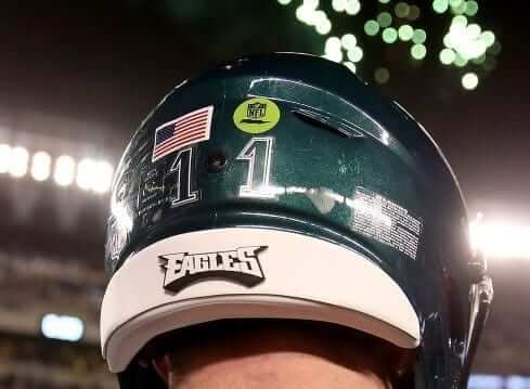
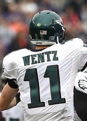
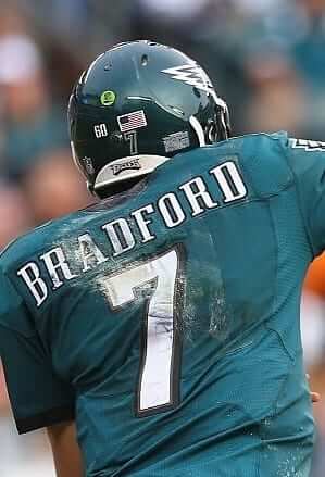
During last Sunday night’s Eagles/Seahawks game, a reader named Tyler Goldberg sent me the tweet shown above. Although the image is somewhat distorted, he’s right: The green dot sticker on Eagles quarterback Carson Wentz’s helmet, which indicates that his helmet is wired for radio reception, was off-center. It was positioned above the second “1,” while the American flag was above the first “1.” That’s unusual — the green dot is usually centered on the back of the shell.
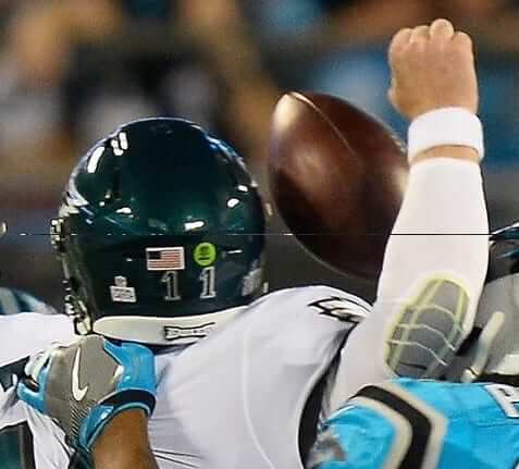
This raises a bunch of questions, so let’s take them one at a time. First question: Is this a new thing for Wentz? Answer: No — his green dot has been off-center for a while now, as you can see in these photos from earlier in the 2017 season:
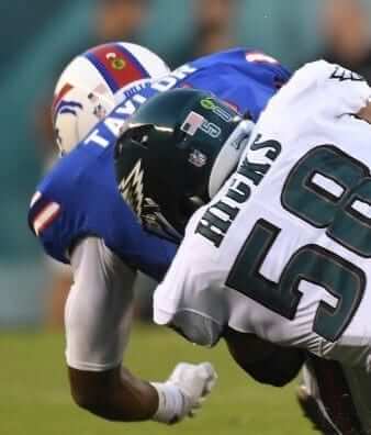
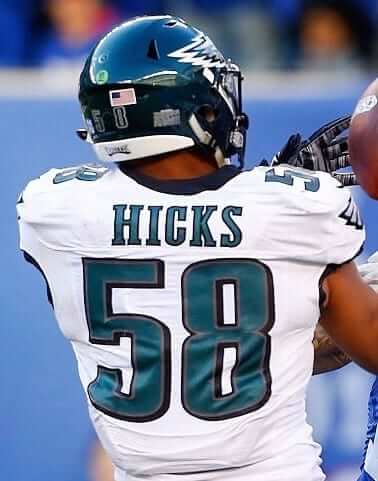
Second question: What about the radio helmets worn by the Eagles’ defensive captains? Did they also have the off-center green dot? Answer: Yes, at least for this season.
Third question: What about prior to 2017? That’s a particularly good question because most NFL teams were wearing the American flag on the right side up until this year, when they moved it to the left. How did the Eagles handle that? Answer: They had the flag on the right, but the green dot was centered, as you can see in these photos from 2016 and 2015:
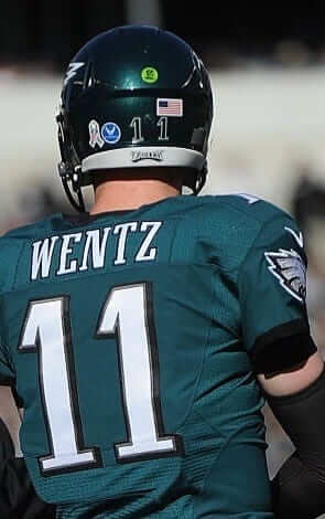
So there you have it: The Eagles changed their green dots from centered to off-center this season and none of us even noticed!
Do any other teams go off-center with their green dots?
(Big thanks to Tyler Goldberg for getting this ball rolling.)
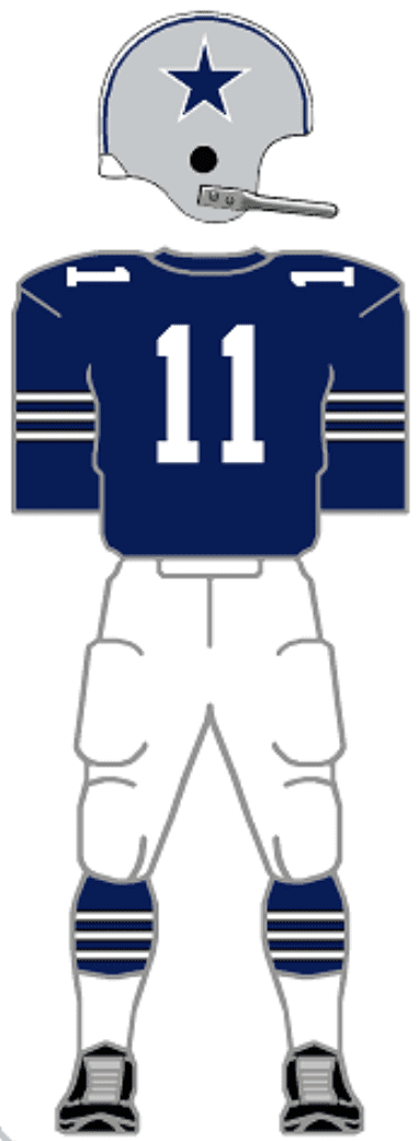
A Cowboys first … sort of: The Giants are wearing their mono-white Thursday-night uniforms at home this Sunday against the Cowboys (yet another spread of the Rash, although a fairly benign one). That means the ’Boys will have to wear their navy jerseys — but with a twist. As was first reported last week, they’ve decided to pair the navy jerseys with their white Thursday-night pants.
Key passage from that last link:
The decision to wear white pants is based on a couple of different factors. Several veteran players, like Dez Bryant, have lobbied over the years for the navy/white combination because they think it will look good. Dallas Cowboys Merchandising agrees with the sentiment and knew this Game 14 scenario with the Giants wearing all-white Color Rush uniforms provided a unique opportunity to try the new color combination.
The article also states that this will be the “first time in team history” that Dallas has worn navy over white, but there’s a big asterisk to that claim. Gridiron Uniforms Database researcher Bill Schaefer provided these photos from a Cowboys/Rams preseason game that took place on Aug. 17, 1965, and it sure looks like Dallas was wearing navy over white (click to enlarge):
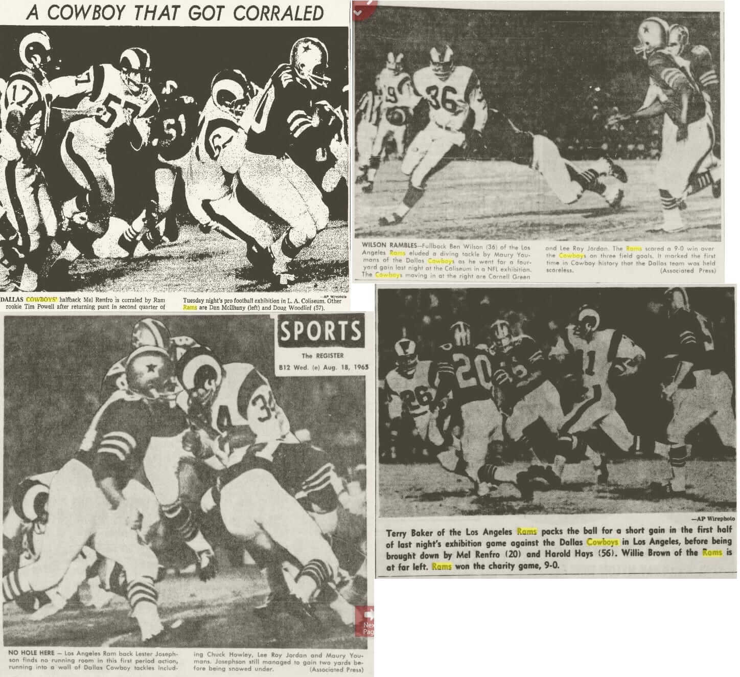
Granted, preseason isn’t the same thing as a game that counts in the standings. But it’s still very interesting to see that the Cowboys experimented with this uniform combo more than 50 years ago.
Gift Guide reminder: In case you missed it yesterday, my annual Uni Watch Holiday Gift Guide is now available for your enjoyment.
Membership update: If you want to order a Uni Watch membership card and have it arrive in time for Christmas, I strongly urge you to order it this week.
You can also order a membership gift voucher, which your lucky recipient can redeem at any time.
Remember, a Uni Watch membership card entitles you to a 15% discount on any of the merchandise in our Teespring shop. (If you’re an existing member and would like to have the discount code, email me.) As always, you can sign up for your own custom-designed card here, you can see all the cards we’ve designed so far here, and you can see how we produce the cards here.
While we’re at it: If you want a Uni Watch mini-helmet to arrive by Christmas, you should order it by the end of next week. And if you want me and/or Phil to sign your mini-helmet and get it back to you in time for Christmas, you should probably order it now. Details on how to get your helmet autographed can be found here.
The Ticker
By Alex Hider

Baseball News: New logos and uniforms for the Class A Hudson Valley Renegades (from Eric C. Leach). … Angel Stadium in Anaheim is hosting football for the first time in decades, as the Eagles will use the field to practice before taking on the Rams this weekend. Note the uncovered warning track in the back of the end zone (from Blake Fox).

NFL News: Cross-listed from the baseball section: The Eagles are in LA this weekend to play the Rams and chose to practice at Angel Stadium in Anaheim. Note the uncovered warning track in the back of the end zone (from Blake Fox). … The Saints and Falcons will both be participating in Color Rash this Thursday (from Phil). … Eli Manning’s jersey sales have surged since he was benched last week (from Phil). … Here’s a great video that follows the Chargers’ equipment staff to a road game (from Mike Chamernik). … Former FB Reggie Brown played for the Seahawks from 1996-2000. For at least his final two seasons in Seattle, Brown used three initials on his NOB, despite being the only Brown on the team with a first name that started with an R (from David Hein). …

Other Football News: The Heart of Dallas Bowl recently used an outdated Utah logo in a promo graphic (from @QuinneyUte). … The Carolina Cobras will begin play as a National Arena League expansion in Greensboro, North Carolina team beginning in 2018. A team with the same name previously played in Raleigh and Charlotte from 2000-2004 (from Scott M. Trembly).

Hockey News: Devils D Josh Moore took a puck to the head last night and lost his helmet decal in the process. Don’t worry, he got a new one (from Jay Mazzone). … Couple of vintage items sent along by Ray Hund: this awesome Gerry Cheevers bobblehead (complete with mask) and this table hockey puck (not often you see those up close). … Looks like Tim Hortons locations across Canada had trouble sorting their doughnuts between CFL logos and NHL logos yesterday (from Jim Wooley and Scott Elder). … The Des Moines Buccaneers of the USHL will wear ugly sweater jerseys on Saturday (from Derek).

College Hoops News: West Virginia went GFGS last night (from @cDubya212 and A.D. Hale). … Texas and Florida A&M played a BFBS-on-dark green matchup the other day (from Gavin Lane). … Phoenix’s Talking Stick Resort Arena hosted a couple of college basketball games last night. Instead of installing a new court, arena employees just put painter’s tape on top of the Suns’ court (from Chris Pastore).

Soccer News: The MLS put together a timeline of all the jerseys worn during the MLS Cup since 1996. … A designer and soccer enthusiast designed a USMNT jersey “for the people” in the wake of the team’s failure to qualify for the 2018 World Cup (from Graeme Bice). … Juventus has asked Juventus Bucharest, a team in Romania’s top league, to change its team name and crest (the two teams are not affiliated). Juventus Bucharest will change its name to FC Colentina (from Josh Hinton). … Crystal Palace has announced plans to renovate its stadium (also from Josh Hinton). … New home and away jerseys for Keene FC (from our own Kris Gross).

Grab Bag: Yesterday, the IOC announced that Russia was essentially banned from the 2018 Winter Olympics. However, individual athletes can still compete under the Olympic flag and wear “Olympic Athlete from Russia” uniforms. Here’s what previous neutral Olympic uniforms have looked like. … This column argues that the Army — the military branch, not the football team — needs a throwback uniform (from Tim Dunn). … This piece helps break down which jersey you should buy for the Canadian sports fan in your life (from Phil). … New York Uni Watchers will certainly appreciate this video detailing the awning typography on Upper East Side apartment buildings (from Fred Nicolaus). … Nike is building a new flagship store in New York (from Tommy the CPA). … Houston Baptist University has signed a new agreement with Under Armour (from Chris Mycoskie). … Sad day in Cincinnati, as the old Cincinnati Gardens’ iconic lettering has been removed. The building, which was once home to the NBA’s Cincinnati Royals, is slated for demolition later this month. The good news is that the letters will be moved to the nearby American Sign Museum (a must-visit if you’re ever in town).
Proofreading:
“Gary Cheevers bobblehead” Gerry
“DeMoines Buccaneers” Des Moines
Fixed.
As a Cowboys fan I’m conflicted. I look forward to the 2 or 3 games a year without green pants and I love the Cowboys navy set. I think it’s the best uniform in sports and absolutely relish the games the silver pants (almost) actually match the helmet. That said, the Cowboys NEVER do anything like this uni wise so it should be cool. I just wish if they are experimenting they would wear the color rush set more but with navy socks.
Not a Cowboys fan, but I agree. The mismatched colors drive me nuts, switch the royal blue on the white jerseys to navy. And whether they want to have the blue-green silver or regular silver, just pick one and use it on the helmets AND pants.
As a NYG fan and a Cowboy hater those Cowboy uniforms look good.
I do not like the mismatching of colours either.
I do have a solution which may not be popular. I know many people prefer the navy blue and more metallic silver, but I would like them to go somewhat retro with the dark uniform and have them wear the dark royal blue and blue-silver. Means the colours would need to be slightly adjusted on the helmets.
Basically present-day versions of the same uniforms they wore in the 1970s, with the silvers and blues matching on the helmets and pants.
link
Yeah, as long as it the same silver, and the same blue, that’s good enough for me! I would say I prefer the navy because a lighter shade of blue makes them too similar to the Lions.
Wentz’s green dot placement adds balance to the look of the helmet. Flag over one numeral, dot over the other.
The link to the gallery of all the rear-card designs isn’t working. Going to purchase one, but can’t decide which team design to get. Thanks!
Link seems to be working. Maybe your workplace blocks Flickr..?
Here, try again:
link
Did you notice on the mls cup jersey chart that only the adidas logo is shown on the shirts. The shirts that out date the leagues deal with adidas, like the early LA Galaxy Nike ones, do not have any brand marks.
The flag on the back of the helmet seems really out of place there. Perhaps because the number are at the back base, the higher placed flag above the numbers looks haphazard there, like they didn’t have good place for it so they just put it there.
Not an NHL related item quite yet, but Seattle approved redevelopment of the Key Arena, a 32nd NHL team seems a perfect fit there. Perhaps a design contest soon?
Possibly an NBA contest as well. While most would probably prefer to revive the Sonics identity, it’d be interesting to see how creative people could be coming up with a new identity.
Much better look at the Renegades new look:
link
(It’s an upgrade and I love it incorporates the Hudson Valley)
What? No bared human teeth??
This is a good look for them. So were the inaugural year uniforms, when crossed bats made the “V” in “Valley”.
Definitely an upgrade, though with the current color scheme their most recent look was pretty good. It’s like a B to B-plus move.
I’m pretty sure the throwbacks the Cowboys wore for a while were a navy jersey-over-white pants combo. Did everyone forget about that, or…?
This sure looks like navy-over-white to me. There must be some wrinkle that we’re missing.
link
Should have clarified. I (and others) meant the basic navy jerseys, not the original or throwback double-star jerseys.
Also they used the white helmet in the throwbacks.
Yeah, this part: “The article also states that this will be the “first time in team history” that Dallas has worn navy over white” is just puzzling without the many caveats mentioned.
Lee
No Vancouver Canucks love in the ultimate Canadian sports jersey power rankings? I guess this could be expected from a writer in Toronto who may be getting ready for bed when Canucks home games start. Looks like one flew under the radar.
Some insider info. Story missed out on one that will be big. 20 year old Brock Boeser is leading the team in scoring at a point per game. He’s got the skill and not a flash in the pan. Envision him to be a long time leading scorer with the team. Get those jerseys now.
Nobody loves the Canucks. Even their fans hate them.
So they’re the Phillies of the NHL?
Not me. Canucks 4 Life!
In the second question about the helmet dots there’s a missing ‘r’ in worn: radio helmets won by the
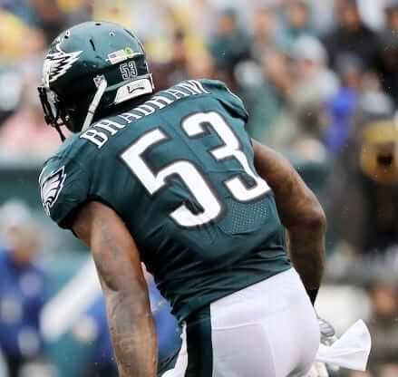
Also is it me or is it weird how Bradham’s helmet numbers have almost no spacing between them but Wentz and Hicks do.
Fixed.
Let’s all remember that the Cowboys wore ROYAL BLUE prior to 1981, so 1965 would have been Royal Blue over White.
In case anyone hasn’t noticed, I still track all of these color changes on my site…here’s the NFL franchise listing – link
(I’m using a new format for the color display as well…no more crappy image files.)
You call both HEX: #003087 and HEX: #00205B “Royal Blue” ?
They look different to me, and I’d say that #00205B isn’t what would be called royal in the first place.
Just curious.
Lee
I don’t make this stuff up out of thin air – the Hex and RGB values I use correspond with current Pantone specifications. All of the colors on my site are reflective of decades of research as to the official colors combined with the nebulous color descriptions that the marketing depts. want to call the colors. That being said, there also aren’t any definitive measures for what defines “Royal” Blue vs. “Navy” either. In fact, I can show you literally hundreds of examples of where one color is called by one descriptive name, and 5 other teams call it something else. PANTONE 1235 being one example. The Packers, Steelers, Chiefs, Chargers, et al call it “Gold”, while the Cardinals (and many other franchises and institutions) call it “Yellow”. The Peoria Chiefs of the Midwest League call it “Orange”.
I should also point out that my defense of all of this stuff actually somewhat negates my original argument – the whole Royal Blue vs. Navy thing really doesn’t matter in the end.
Thank you for your reply. I hope you didn’t feel attacked, I was just curious.
While I have been to your site before (thank you!), I had no idea how it was compiled.
I am quite aware that what teams call colors isn’t ‘official’, wasn’t sure how official your site is.
Thanks
Lee
I was going to say the same thing, that the 1965 pic would have been royal blue over white. That being said, they have worn navy blue over white – the faux back uniforms worn from about 2005 to 2012. link
Devils D John Moore not Josh
That table hockey puck is from the Munro Bobby Hull Hockey game of the late 60’s/early 70’s. That yellow puck didn’t come with the game, it was in the accessories catalog.
The game came with a black version of that puck, with the metal ball in the metal. The ball did get rusted after many years, like the one in the picture. The accessories catalog had the yellow puck, as well as a wooden puck and a magnetic puck. I had all of them. The wooden one was best because it was light and you could line up a shot against this little “flipper” protruding from the left wing boards at the blue line (it was only on the left side as Bobby Hull was a LW) and rip a shot so fast you couldn’t even see it, into the far upper corner of the net!
The roller pucks were heavier with the metal ball, and the magnetic puck was bizarre, gave you great stickhandling (the players were metal) but difficult to shoot.
-Jet
Angels Stadium is frequently used for HS football games, typically those involving the local Catholic High Schools in Orange County.
Nice to see my local team The Renegades… but I can’t stand that blue. They were plum and forest when I was growing up, very 90’s, but a vast improvement over the neon color crap.
Proofreading:
“That’s a particularly good question because the most NFL teams were wearing the American flag on the right
– Drop “the” before most
“and it sure looks like Dallas wear wearing navy over white”
– will wear or will be wearing
Fixed.
Not green sticker related but flag on the helmet related
Cal changed the flags on the back of their helmets earlier this year. Note the US flag on the left of the California flag in the first link from earlier in the year and then the US Flag to the left of the California flag later in the year.
From Cal’s uniform announcement and as seen in earlier games this season:
link
From the Stanford/CAL game (same was seen in the Washington/Cal game).
link
“…and then the US Flag to the left of the California flag later in the year.” should read “and then the US Flag to the RIGHT of the California flag later in the year.”
Man, I spent a lot of time at the Gardens as I had Cyclones season tickets for years. Great place to watch a hockey game. It was modeled after the Maple Leaf Gardens in Toronto and, if you ever went there, you could definitely tell it was.
I’ll ditto the American Sign Museum visit. A MUST-DO if you’re ever in Cincinnati.
OK, now back to talking about silly green dots and letting Paul know he made mistakes (gasp!) typing something or whatever.
The article about the Army’s “pinks and greens” ran in the Ticker shortly after it was first published in October. Here are slightly more recent updates to the underlying story:
link
link
What are the pink parts of the pink and greens?
The tan/brown pants. WWII Army humor, apparently.
There’s police agencies today that call their uniforms “Pinks and Blues, Pinks and greens” depending. Simply because the tan pants can sometimes have a pink hue.
Forgive me, but Angel Stadium hosts high school football playoff games every December: link
USF inks a deal with adidas that starts this summer.
link
On that Eagles helmet, I’m more interested in the number stickers, which are in the Eagles’ custom font. Are they five layers thick? It looks like (from the inside outward) green, silver, black, white, and clear.
Have any uniform numbers ever had this many layers? The Marlins had four layers for a while, and I think the Miami Heat did too. Any teams with five?