Disappointing news yesterday out of Charlotte, as the Hornets became the latest NBA team to sell space on their jersey to an advertiser, and the second to do so since the start of the season. The patch will make its on-court debut for tomorrow night’s game against the Cavs, which will also be the season debut for the team’s much-ballyhooed throwbacks — a lose-lose.
It’s interesting that the Hornets have chosen to go this route. They had previously said that they weren’t sure they’d have a uniform advertiser because they might not want to have anything compete with the Jordan logo (and, conversely, potential advertisers might feel overwhelmed by the Jordan logo). But the price was apparently right.
In keeping with our new policy, I will neither show the ad patch nor name the advertiser, but I will definitely show how the patch makes the team’s uniforms look like crap. Here (for all of these, you can click to enlarge):
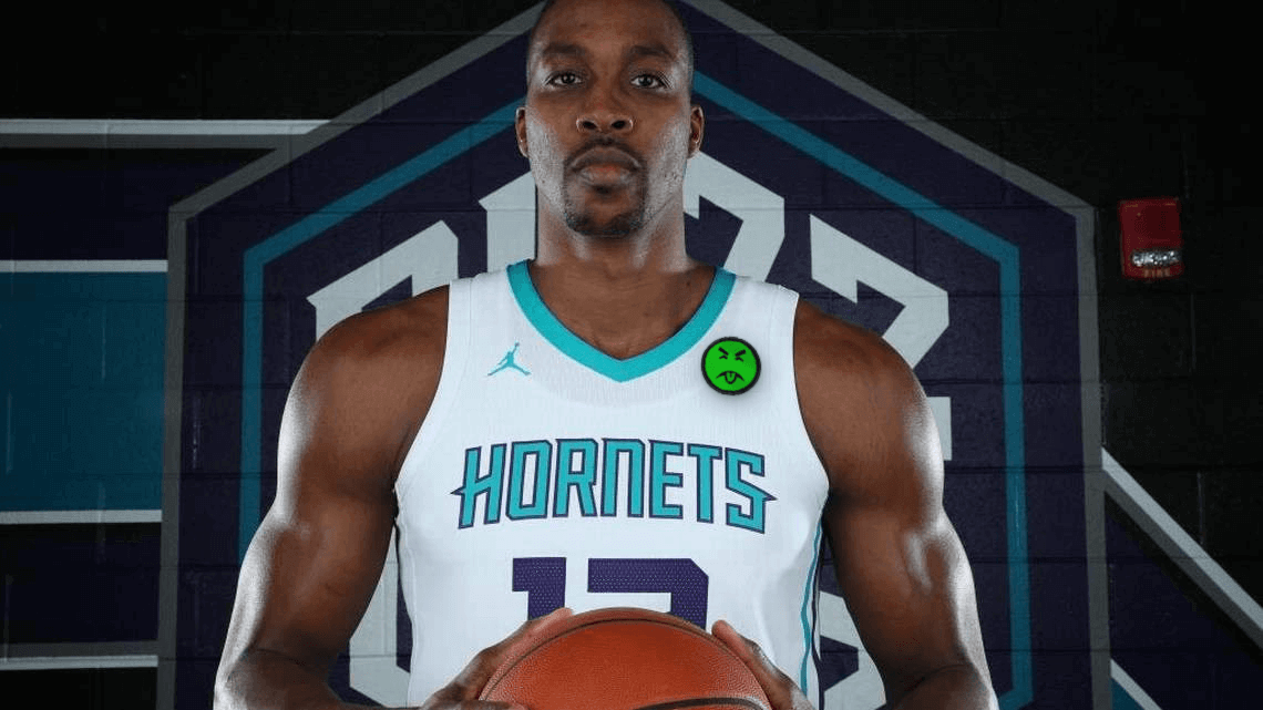
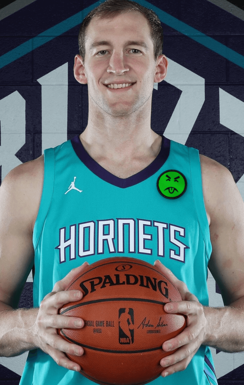
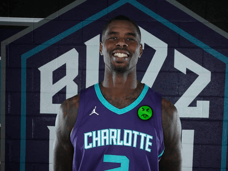
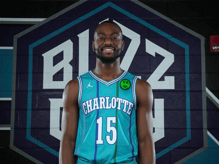
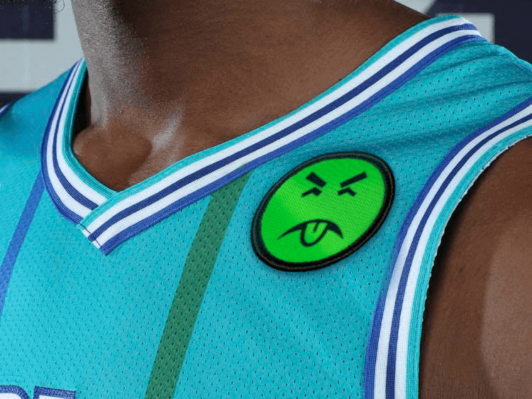
That about covers it. There are now 19 ad-clad teams and 11 ad-free teams. #NoUniAds
(My continued thanks to Nic Schultz for his Photoshoppery.)
Click to enlarge
Collector’s Corner
By Brinke Guthrie
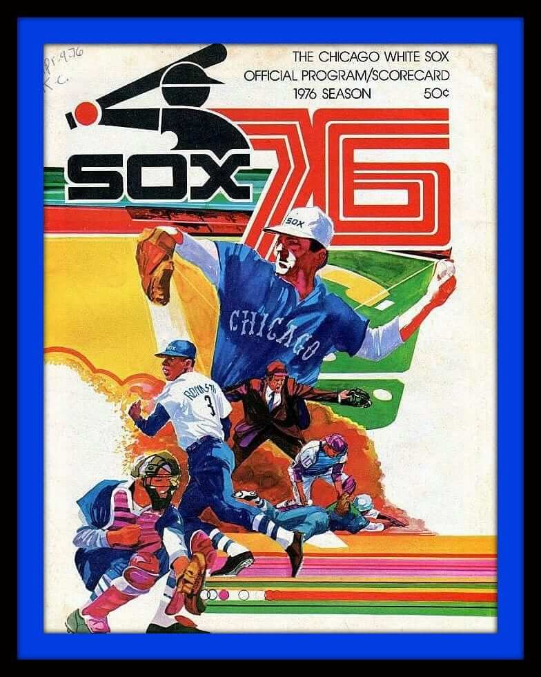
If you love retro baseball art, you can’t beat this White Sox scorecard cover from the bicentennial year, 1976. It’s got all the artistic tricks from that period — the multi-colored stripes, the baseball in motion, the works. The cover has “Apr 9 ’76 KC” scrawled in the corner — that was Opening Day, with the Sox beating the Royals, 4-0.
Now for the rest of this week’s picks:
• Before we go any further, since it’s my birthday the day after tomorrow, I can dream about getting this Kruk & Kuip double-bobble. If you’d like to buy it for me, I’ll happily provide shipping details!
• Here’s a 1970s Dallas Cowboys zip-front sweater from Sears. 100% virgin acrylic!
• I’ve seen NFL helmet plaques like this before, but not from the NBA. This 1970s Knicks plaque comes to you from Kentucky Art Plaques of Morehead, Ky.
• Speaking of helmet plaques, does the facemask on this 1970s Seahawks helmet look a bit off to you?
• Boy howdy, check out the artwork on these 1970s Sears MLB curtains. Why did I not have these?
• Got a little extra black outline trim on the arrowhead logo of this K.C. Chiefs parka, made by Logo 7 (predecessor of Logo Athletic). The listing says 1970s but it looks to be more contemporary than that, no?
• This eBay seller says he has a bunch of locker room locker plates from the San Diego Chargers — that one’s an example from Torrence Allen’s locker. He wears No. 83 now but did wear No. 3 at one point that season, maybe just for training camp.
• Here’s a 1970s Baltimore Colts gear bag that looks like it’s in great shape.
• Nice-looking 1970s NFL Alumni jacket in New York Giants colors.
• The face of Packers all-time great lineman Jerry Kramer was on the face of this 1970s Pizza Hut promo glass.
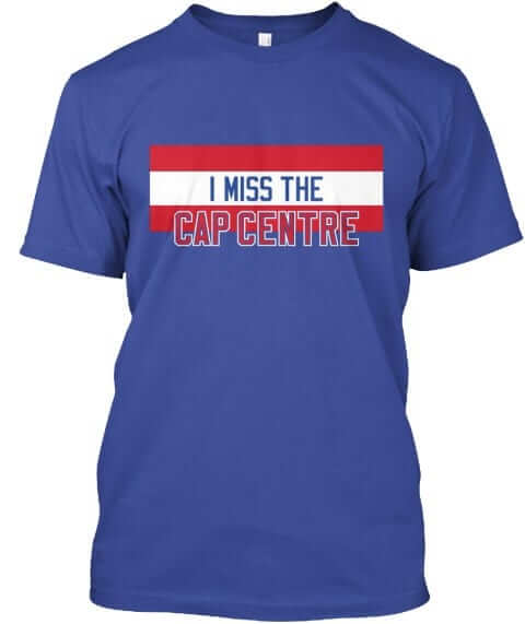
Assorted reminders: In case you missed it yesterday, we have a bunch of new Naming Wrongs shirts (including the very cool Cap Centre design shown at right). Check them out here.
We also have a new Uni Watch T-shirt, designed by Rob Ullman. Full details here, or go straight to the ordering page. The design is also available in a modified version, as a coffee mug.
In addition, the Uni Watch mini-helmet is now available for ordering. Full info here, or just go straight to the ordering page.
Speaking of the mini-helmet, reader Brad Darby, who was the first person to order one of the minis last Thursday evening, has already received his mini in the mail:
@minihelmetguy @UniWatch – came home to my mini helmet – #uniwatch – made my day! pic.twitter.com/OJO8YrniCR
— Brad Darby (@MylesH1gh) November 14, 2017
Looks sharp, no?

Baseball News: New 60th-anniversary logo for the Giants’ move to San Francisco. I can confirm that it’ll be worn as a sleeve patch. To my knowledge, it will not appear on the cap. … Reader Brett Baker’s grandfather, Harold Baker, was best friends with longtime American League ump Larry Barnett, who gave the elder Baker this very cool game pass. Here’s the flip side. … Here’s a 1980 video of Styx keyboardist/singer Dennis DeYoung wearing a Cubs jersey — notable that it’s from pre-merch era (from Rich Paloma). … Here’s a good piece on the history of football games at Fenway Park (from Dan Tarrant).

NFL News: Dolphins WR Jarvis Landry appeared to be wearing a gold bracelet for last night’s game against the Panthers. … Speaking of the Panthers, they wore the initials of fallen service members on their helmets last night. Additional info here (thanks, Phil). … The Raiders broke ground on their new Vegas stadium yesterday (thanks, Brinke). … Cool shot of the Lions playing the college all-stars in 1953. Such games were common back in the day (from Ray Hund).
College Football News: Here’s our first full look at the white alternates that Ohio State will be wearing against Michigan. … Speaking of Michigan, LB Patrick Kugler engaged in a bit of corporate theater by wearing an Adidas sweatshirt with a cover-up Nike logo. Guess he can’t draw the jumpman. … Did you know that the winner of the Florida/Florida State game wins something called the Makala Trophy? It’s true (from Andrew Cosentino). … Penn State is doing a stripe-out for this weekend’s game against Nebraska. … Cross-listed from the baseball section: Here’s a good piece on the history of college football games at Fenway Park (from Dan Tarrant).

Hockey News: The NHL 100 Classic uniforms are expected to be unveiled today, and the Canadiens have released some teaser photos of theirs. … Star Wars jerseys upcoming next month for the Toledo Walleye.

Basketball News: If a player’s number is 22, you’d think it would be easy enough to ensure that both numerals were properly oriented — but you’d be wrong. That’s a player on the AC Clippers sporting the mismatched 2s (good spot by Ross Yoshida). … Purdue players are wearing “Togetherness” shooting shirts this season (from Jeff Dem). … Grey-out last night for Providence (from Ryan McNeely). … Very unusual new home whites for San Francisco.

Soccer News: New home jersey for Switzerland (from Ed Żelaski). … New uniforms for the Delhi Dynamos. … Liverpool is apparently wooing LinkedIn to be the team’s next shirt advertiser. … Japan’s new kit is, uh, really something.

Grab Bag: Love this soap box derby photo and accompanying button (both from Ray Hund). … State troopers in North Dakota will soon be switching from white patrol cars to black. … Scammers were showing up at San Diego residents’ homes, falsely claiming to be from the local electric utility, so now the utility has changed its uniforms. … New uniforms for the U.S. ski team (thanks, Phil). … Here’s a really interesting piece about the color-coded uniforms on aircraft carriers. … Holy moly, look what you can do with the label on this Christmas-themed bottle of Coke.

What Paul did last night: Last night I saw the new movie The Florida Project, which is about childhood and poverty and Disney and welfare hotels and single parenthood and adventure and friendship and pathology and burping and prostitution, not necessarily in that order.
How good was it? So good that I didn’t even mind how much of it is purple (as you can see in the trailer above). So good that I didn’t mind that one of the kids was played by a six-year-old actress named Brooklyn. So good that I didn’t mind Willem Dafoe doing a fairly boilerplate heart-of-gold routine.
It’s really good. See it.
Uniform in the final link in the Grab Bag section is the new Japanese national team soccer kit.
Thanks. I’ll move it to the soccer section.
It’s now in both.
Weird. Could’ve sworn I deleted the second one. Now fixed for real!
It also still has the heat-press applique protector on top of the Honda logo and the 44, it looks like. I would imagine the real look would just be white letters/numbers without the tan squares around them. Not that it makes the design a TON better…but incrementally at least haha
It looks to me like they haven’t even been applied to the shirt yet, and are just laid out on top of it just to show it off. And it’s probably a player name, not an advertiser (since the font looks nothing like the car company’s wordmark, and “Honda” is a common enough family name).
Oh wow I didn’t even think of that as a last name…but it is Japan, so that would make sense.
I wonder if that means that this kit is actually not that weird…if Honda is #4 and the smaller # is going on the front or a sleeve, with the last name/bigger # going on the back.
Yea that’s apparently exactly what it is…they played a friendly vs Brazil this past weekend
link
Yeah, the finished product looks much better.
It’s poetic that the most common NBA uni ad is a sickened, disgusted face.
No, it’s dumb that they aren’t shown. For a site devoted to the study of uniforms to be so petty bugs the hell out of me. Everyone can hate the logos all they want, that’s fair, but an true depiction of the uniform is a must.
Typo: “State troopers in North Dakota will soon be switching FROM white patrol cars to black.”
Fixed.
Left out the word ‘know’ in the CFB section: Did you that the winner of the Florida/Florida State
Fixed.
So I work in a sports shop, soccer to be specific. I
We order number templates from a rather big supplier when we do local uniform orders. Last week we had a problem with an number from the 20’s where the 2 was two inches bigger that the second digit even the other two. I wonder if that basketball shirt was a template they ordered. You do it so long you just assume the stuff you get it correct and put it on.
Penguins’ camo warmups:
link
Care is sometimes taken.
News on the “I still call it the Tappan Zee” front:
Apparently, so do a lot of people and they want it changed back (no one, and no one…not even on the local news calls it by its new “name”):
link
I still can’t get used to the Dolphins’ uniforms. I even kind of like the logo, but it just doesn’t feel like they’re the Miami Dolphins.
And thank you for the minimal amount of auto-play ads. I was on ESPN on someone else’s computer the other day and three separate videos started to play at once.
Re: Dolphins. An issue is that there needs to be more orange trim compared to the amount of navy blue trim. Needs a bit more orange. Right now the proportion of orange and navy blue used as trim colours are the same. A higher proportion of orange trim compared to navy would help them look more like the Dolphins.
Of course, I do not even need to say it, but we all know what uniforms the Dolphins need to change to for them to look better.
I agree about the navy/orange proportions. Even in the previous set, while navy was the color of the block shadow on the numbers, it was otherwise sparingly used as a tertiary accent, allowing the aqua and orange parts of the trim to stand out.
Also need to change the aqua color, it is far too blue now.
Regarding the orange, it used to be their stripes were a big orange stripe, surrounded by smaller aqua stripes, and more recently smaller navy stripes. Now white is the primary stripe feature. They basically look like a light blue and white team now, not an aqua and orange team.
Agreed, it look really weird under the lights last night, a total mess that should be rectified.
Even simply changing the main helmet stripe to orange would help.
@ Brinke: happy early birthday from a fellow sixteenth of Novemberist!
That very cool umpire’s league pass can be dated specifically to 1969, which is the only year that both Seattle and Washington were in the American League.
I like how it was AL only. I miss the leagues being separate entities under the MLB unbrella.
It says 1970 on the front.
Probably was issued for the 1970 season, before the Pilots move to Milwaukee became official. In any case, it had to be either 1969 or issued early 1970 before the move happened.
I might be in the minority here, but I’m not a fan of the censoring the NBA ad patches in this context. I come here to get my uni-related news every morning, and omitting the sponsors is a bit of a nuisance, actually. I get that it’s about preventing normalization, but all this is doing is making me Google “hornets jersey sponsor” in a separate browser tab in order to find out what the company actually is and what the patch will look like.
omitting the sponsors is a bit of a nuisance, actually
Oh, boo-fucking-hoo.
For the jillionth time: Any argument that begins with “I come here to…” is a non-starter, because my reason for coming here will always trump your reason for coming here. And today my reason for coming here was to offer commentary on the NBA’s uniform ads.
all this is doing is making me Google “hornets jersey sponsor” in a separate browser tab in order to find out what the company actually is and what the patch will look like.
That’s fine. I’m not trying to hide the info from you (nor could I do so even if I wanted to). But I’m not going to help this team or this advertiser spread their message.
Also: You’re playing fast and loose with the term “censoring,” which should be reserved for government suppression of speech. I’m simply replacing the team’s message with my own.
For what it’s worth Paul, I agree with your position on this.
I won’t be googling Charlotte’s shirt advertiser. Don’t care.
Lee
Ditto this. Beyond knowing that the Hornets have an ad patch now, I have no great thirst to know who paid the cash. I’ll see it eventually, I’ll ignore it until then. The sun will rise tomorrow.
I’m with you too Paul. The first time you did it, (Was it the Knicks?) I googled it because I wanted to see. But now I don’t care. Keep it up with Mr.Yuck. I think the only time I will go out of my way to see it is when and if my team does it.
I think if someone decides to rank NBA unis that no team with an ad can out rank one without. So my the rationale, the Mavericks have a better looking uniform than the Celtics. No?
I think if someone decides to rank NBA unis that no team with an ad can out rank one without. So my the rationale, the Mavericks have a better looking uniform than the Celtics. No?
Agreed. In fact, the Jaguars and Bengals now have better-looking uniforms than the Celtics.
Perfect and much needed take-down of the inane “I come here to” device.
I have to agree with zenmasterchen on this one. The Jordan logo on the jersey remains, as does the NBA logo made up of corporate logos. I end up Googling the ad, too, because I want to know how it impacts the aesthetics of the uniform.
I agree.
I’m not trying to prevent you (or anyone) from googling it. I’ve simply declined to spread the team’s or advertiser’s message on my website, and I have replaced it with a message of my own.
In short, I created my own ad-blocker.
So I’d say we have a win-win. You found the information you were looking for, and I presented the message I was looking to present.
While I understand their arguments, in the sense that they come to uni-watch to read about uniform news and see what they look like, and thus the ad blocker prevents them from seeing it. Your point remains incredibly valid; the ads look bad, and worse yet they are part of an awful trend to ruin uniform design (which we all love, or else we wouldn’t be here). So throwing the ad blocker on is no different, it makes it ugly, just like the real ad.
I end up searching to see it, mainly to see just how bad it looks, since I think some of the ads look worse than others. But to your point, if we talk of which ads look better or worse, we’ve normalized it as part of uniform design, and NOBODY wants that.
Then don’t show pictures at all, Paul lately you’ve have been pretty immature and angry about stuff. (Especially your use of cursing, where it’s not needed, you can express your views just the same without it) I get it, it’s your blog, but it is still off putting. No reason to even cover the hornets getting [redacted] as a sponser, if you don’t want to, you could just link it in the ticker.
You’re basically saying I should simply ignore it. But I don’t want to ignore it — I want to call attention to how awful it is, but without spreading the advertiser’s message. So that’s what I’m doing. For some reason this bothers you. That’s how life goes sometimes.
As for cursing: I wouldn’t want to use words like “fuck” or “shit” in every sentence, or even every day. And that’s why I *don’t* use them every day. But they’re perfectly useful words for expressing outrage, mockery, despair, and so on, and I plan to continue to use them judiciously. Many of the greatest writers in history have used these types of words. I’m not saying I’m in their league, but I see no reason I shouldn’t have access to the same toolkit. If you find that off-putting, well, I can’t help that. As always, I do what makes sense to me, and everyone else, yourself included, is free to follow along or not. Completely up to you.
I don’t give a [fuck] about ad patches on uniforms, or the debate about them being bad, good or otherwise. I do find it entertaining to see all this passion spent on this debate though. Cry all you want but this snowball has already started downhill. It’s human nature to fight change, especially if it conflicts with our predisposed set of beliefs or personal preferences.
I do believe that any good writer will use any available word in their toolbox, including a swear word. It’s the bad writer that has to rely on them over and over again.
Proofreading:
“It’s interesting that the Hornets have chosen to go this route. They had previously said that they’d weren’t sure”
– they, not “they’d”
“LB Patrick Kugler engaged in a bit corporate theater”
– bit of
Fixed.
That’s probably Keisuke Honda’s #4 jersey with the numbers and nameplate resting on the jersey before they get applied to the front and back.
Hey Paul, perhaps the Cap Centre t-shirt in Gray & Blue for the Hoyas???
Good idea. Thanks!
The White Sox logo on the 1976 program cover is the only one I’ve ever found (in sports) that uses a circle to represent a hand. And I think it works.
I love the green sourpuss photoshopped over the advertiser’s logo- why give the advertiser more exposure- they will get plenty on tv, internet and print (and i am in the ad business!) Just keep it off my team’s uni’s!
Paul, you’ve peaked my interest in the movie you saw.
Any news on a broader release date for The Florida Project movie?
(from someone in the hinterlands ‘North of 49’)
I think they’re doing a limited release now with a broader release planned soon. Here’s the movie’s official site:
link
Dang, it played here in San Francisco recently… it was on my radar, but I never made it out to see it. I’ll be sure to catch it when/if it comes back.
Going to see “The Killing of a Sacred Deer” tonight. Oh boy.
Lee
Paul was too polite to point this out, but just for future reference, he “piqued” your interest, not “peaked.”
It could be something other than polite.
Take a closer look at the 1976 Sox program. Both the batter (2nd from left) and the sliding player (bottom right) are shown with their jersey tucked in.
We know that White Sox debuted the full untucked look to the public on March 9, 1976. Even then one player appeared at the fashion show with his jersey tucked. The program must have gone to the printer before it came out that all jerseys would be untucked for 1976.
link
link
Great finds. (And they never wore an all-white hat.)
the one thing I would mention on the new Hornets partnership and patch, it covers up the top of the stripe on their “Uniform formerly known as Alternate”, which makes it one of the longer ones in the NBA. Weren’t there guidelines on these, and wouldn’t someone check to make sure it didn’t cover up part of the aesthetic before an unveiling?
The Hornets’ ad patch is doubly bad because it interrupts the pinstripes on their throwback uniforms: link
Paul, any news on NFL’s 100th anniversary coming up in the 2019 season? The last big anniversary, 75th season in 1994, they did that widespread throwback program. Obviously the one helmet rule would really limit that this time around.
I haven’t heard anything about it so far.
In ’94 most teams, but not all, used their current shell with throwback decals and unis. The result was sometimes a half-assed look. Below is an example..
link
Some teams however, went all out. The Broncos and Falcons come to mind.
Two teams (49ers, Cowboys) didn’t even bother with throwback decals, using their current helmets and decals/striping with the retro jerseys & pants.
The Jets and Bills were the only teams (2) that used throwback decals on current shells that were a different color from the years thrown-back-to, the former adding a white outline to the logo and inverting the stripes, the latter inverting the logo.
Most of the really old-school NFL teams, viz., Packers, Bears, Cardinals, Washington, Lions and Steelers (6), merely removed the decals and striping from their current shells, throwing-back to the leather-helmet era.
The Giants, Eagles, Raiders and Bengals (4) used throwback decals and/or striping on their current shells, which were the same color as the years thrown-back-to.
The Saints, Browns, Colts, Rams, Dolphins, Chiefs, Vikings, Buccaneers and Seahawks (8) used their current helmets, decals and striping which were the same or basically the same as the years thrown-back-to.
The Broncos, Chargers, Falcons, Patriots and Oilers (5) went all-out with different-colored throwback helmets and retro decals/striping.
Thanks for the more in depth look at it. Odd how I was so sure that I remembered seeing the Bills go to the white helmets with standing buffalo back then, but they really never did.
After digging a little more, by my count there are 14 teams that would have alternate colored helmets to throw back to: Cowboys, Eagles, Falcons, Bucs, 49ers, Seahawks, Bills, Pats, Jets, Steelers, Jags, Titans/Oilers, Broncos, and Chargers.
Of them the 49ers have 2 different colored helmets to throw back to (I knew silver, but was shocked to see a red one too).
The Eagles and Broncos each have 3 different colors to throw back to.
Any others I am missing?
It would certainly be odd seeing the Bills throwback to the red helmets, since I still equate them with their modern design, and see the white helmet as a sort of perma-throwback that is out of place today.
Technically, the Giants could throw back to a navy-blue non-metallic helmet shell from their current dark blue metallic helmet shell. Same for teams like the Vikings and Washington, the latter of which could also throw back to a yellow helmet as well as different shades of burgundy.
The Colts have a blue helmet in their history; the Bills have a silver helmet in theirs as well as the red, and the Rams have a red helmet in theirs, yellow too if you go back further, before the ram horns. The Browns wore white helmets in their AAFC years (late ’40s). The Cardinals had red helmets in the ’50s. The Packers had gold helmets in the early ’50s and white helmets in the late ’50s. The Lions had blue, gold and red helmets at various times in the ’50s and late ’40s.
For some reason I remember them all be pretty authentic (aside from if they were throwing back to leather helmet days). I could have sworn the Bills went white helmets, Jets too, but apparently not. Chalk it up to me being a kid at the time. In know we saw the Chargers powder blues set return with white helmets.
Though looking back, at the time there were only 8 teams who would have needed to wear different color helmets, and even now only 11 teams (though some teams with multiple throwback helmet colors).
I am guessing the Packers will do something next season, if prior performance indicates future results.
In 1993, Green Bay marked the team’s 75th season, in events (IIRC) leading up to the 75th anniversary. That was a year before the NFL marked its 75 years.
The team started in 1919, predating the league by a year, even though GB didn’t join until 1921.
Paul is right n “The Florida ProjecT”…a fine and memorable movie…
Ohio State is doomed this weekend.
Those silly camo leggings are the same ones that Oregon lost the Natty to tOSU in.
Refuses to show ad patches on uniforms, has ad-clad site on uniforms. Nice.
We’ve been through this countless time, Brandon. This should be helpful:
link
A broad statement against advertising is quite different from a specific objection to ads on uniforms that have never had them. I don’t agree with Paul that the NBA ads are without exception hideous, and I find the substitution of a “Mr. Yuk,” whatever that is, for the actual ad kind of silly, not least because it prevents an assessment of what damage, if any, the ad patch does to the NBA uniform aesthetic. But it’s not inconsistent with accepting ads on this site.
I dislike your approach to the patches. They are part of the uniform and their aesthetic. It’s ridiculous to show the uniforms without the patches (or with the stupid tongue face).
It’s also disappointing because it means you will never expand to cover uniforms from any non-American sports league, and they can be very interesting
I’ve never said that I wouldn’t show the ad on a non-American uniform. Non-American sports leagues have their own culture, and I have no axe to grind (or at least a much, much smaller axe) with them.
But I live in America and follow American sports, and I have a strong interest in preventing or at least slowing the spread of ad patches on our uniforms. I’ll continue to do that in the way that makes the most sense to me, which for now means employing the Mr. Yuk graphics.
You’re right about one thing, though: The patches are “part of the uniform and their aesthetic.” Very true — from an aesthetic standpoint, the patches make the uniforms look like shit. So I’ve found a way of showing that without playing into the advertisers’ agenda or amplifying their message. There’s no substantive difference between the real ad patches and the images that I’m showing. A win-win! (Well, a bigger win would be no ad patches at all, but you get the idea.)
Dennis DeYoung wearing a Cubs jersey — notable that it’s from pre-merch era
That’s not entirely accurate. It was the pre-*explosion*-of-merch era, yes.
Readers of the Century Sports Network (Baseball/Basketball/Football/Hockey/Soccer Digest magazines) could order all kinds of items including jerseys. They had ads all throughout the magazines with an order form on the back.
Plus you could find jerseys and caps at an old fashioned sporting goods store. Unlike Sears and Penney’s they had adult sizes too, although you had nowhere near the variety of the current day.
“I will neither show the ad patch nor name the advertiser”.
But, by showing the Hornets wearing the ad patch, aren’t you kind of showing the ad patch anyway?
Um, I didn’t show the Hornets wearing the ad patch. I showed a Photoshopped “Mr. Yuk” patch.
The NBA ad patches look fine, for the most part — certainly less obtrusive than the hideous, symmetry-killing New Era insignia on MLB hats.
Just wait for the big honking under armour logo on the chest of the jerseys once their contract takes place. That’s going to be ridiculously obtrusive.
Yes, I’m dreading that. I’m all-in with Paul on “logo creep.” Even so, I find the NBA ads to be different for some reason. Not always, perhaps, but in at least some instances they complement the uniform, as with the Bucks’ Harley Davidson ad. Likewise, I’m kind of surprised that I don’t mind the Celtics’ GE ad, which also represents a business with deep roots in the team’s geographic region. It seems entirely intuitive;I can’t explain why the NBA ads are OK, even harmonious, while every MLB adornment (except perhaps the MLB logo itself) is so dissonant.
Charlotte native and Hornets fan here.
Needless to say, I am disappointed that the team is adding the ad to their uniforms. I was really hoping they’d be a holdout, especially with the Jordan logo already serving as an ad of sorts.
I won’t try to circumvent what Paul’s doing by naming the company, but at least it is a business started and headquartered in Charlotte. Also, at least on the “modern” jerseys, the ad remains in team colors and is really pretty unobtrusive as far as these things go. So it could be worse, I guess.
I hate to say it, but I think it’s time to wave the white flag on this issue – it is almost a certainty that all NBA teams will eventually have an ad.
Is it me? It might very well be… but, am I the only one expecting BIGGER names for the advertising patches? Coke, Pepsi, fed ex., visa, MasterCard, Amex, ?? Seems like a lot of tier 2 companies… makes sense, but I was anticipating everyone to have some huge named sponsor…
Home Depot, kfc, Taco Bell, McDonald’s… I dunno…
I am honestly just asking this question, not trying to stir anything up. While I understand your issue with ads on unis (and agree in particular with the aesthetic arguments against it), do you similarly object to maker’s marks (Jumpman, Majestic logo, New Era logo, etc.)? Although it’s not totally an apples to apples comparison, the maker’s mark is really an ad in an of itself, isn’t it? I get the manufacturer has the right to put their logo on their clothing, but it’s also similar: a company paying to get their logo on sport unis for exposure purposes. There’s more to it in the case of the uni providers, just wondering your thoughts (can’t recall if you ever touched on this specifically before). Thanks.
Love Mr. Yuk, BTW.
do you similarly object to maker’s marks (Jumpman, Majestic logo, New Era logo, etc.)?
I’ve written for nearly 20 years about my opposition to makers’ marks. I coined the term “logo creep” to describe their proliferation.
Gotcha. Not suggesting you put a Mr. Yuk on all of them (that would be a lot of Mr. Yuks!)
Glad I read this before I asked much the same question…
What happens when Mr. Yuk buys an ad patch from a team?
Okay, I finally gave up and looked up the Hornets’ patch, and I have to say, that’s the least obtrusive one I’ve seen. I still despise the whole idea, but if there are degrees of abomination, that’s at the low end.
I hate to say one ad is “better” because it indicates it isn’t awful. So perhaps the least awful one in my opinion is ad on the Cavs jerseys. If only because it is the logo with no words, and their logo looks like it could be the logo for a sports team. If you didn’t know it was corporate logo, you’d think it was some random uni-oddity.
But the problem is not just how the ad patches look, but what they *represent,* and what they probably mean for the future of the uni-verse.
That’s why, to me, they all look like shit. There are no shades or hierarchies of unacceptability.
We’re probably never going to see a Red Man Tobacco ad patch, I suppose.
I’m anxious to see what type of scenario could drive the accursed uniform ads back into Pandora’s box, never to re-emerge. My money’s on the team’s star having a personal services contract with a rival of the suppliers of the patch, resulting in a trade.
There was talk of a curse once for companies that named stadiums. It is grounded in the theory that excessive hubris causes companies to make bad stadium deals and is a sign of recklessness. Coincidentally, GE is now in the worst shape they have been in in years. Curse II?
link
My thoughts on the Mr. Yuk…when the deal is announced, that is news and the ad should be shown. Thereafter, the ad should be censored. This is probably not practical and would be a lot of work, unless removing it from pics it could be automated. This is what makes the ad so infuriating…they are going to get tons of inadvertent advertising.
I watch Timberwolves v. Pelicans, and one needs 20/10 vision to even be able to read the ad – which means ad space will become larger in three years if not sooner.
Meanwhile WNBA will now allow a SECOND ad sponsor on uniforms, and article concluded that Euro’s laugh at the U.S. being fussy about Uni ads.
I did go to the Charlotte Business website to see the sponsor unveil. Of course when I tried to close I am greeted with a subscription offer – which I refer to as being foxtrot-unicorn-charlie-kilo’d out the door – 100 times more annoying than the NBA ad patches at this point.
The linked article says that North Dakota State Troopers are switching from white patrol cars to black patrol cars in the name of safety because of all of the snow events which make the white cars invisible.
Without looking it up, isn’t it safe to say that North Dakota experiences far more night events than snow events? Wouldn’t those black cars become invisible more often than the white ones?
Wouldn’t, say, neon yellow be a safer option?
Sounds to me like North Dakota State Troopers just want to drive around in black cars and don’t want to admit it.
Most Police cars have reflective decals which identify the car.
Google “advertising on swedish hockey jerseys”. Mr Yuk would have to cover the whole effing jersey!
This article on Bleacher Report talks about how Kyrie Irving was frustrated by wearing a clear mask vs. a black one, but fails to mention that black masks are no longer allowed in the NBA.
link
I take that back. While the article didn’t mention the rule against wearing black masks, it was only the headline (presumably not written by the person who wrote the article) that claimed the color of the mask was the problem.
Irving said the clear was better than the black.
What I’ve been appalled with in regards to the ad patches (aside from the fact that they exist) is how rinky-dink and shitty they look.
Again, I would rather them not do this nonsense, but if the NBA is going to allow it, there should be standards for look and aesthetics. I keep thinking about the Warriors ad patch, and how it’s just a screen printed logo on a generic, flimsy white patch that they slap on there. It looks like a fucking rec league design job, rather than something that should be on a professional uniform.