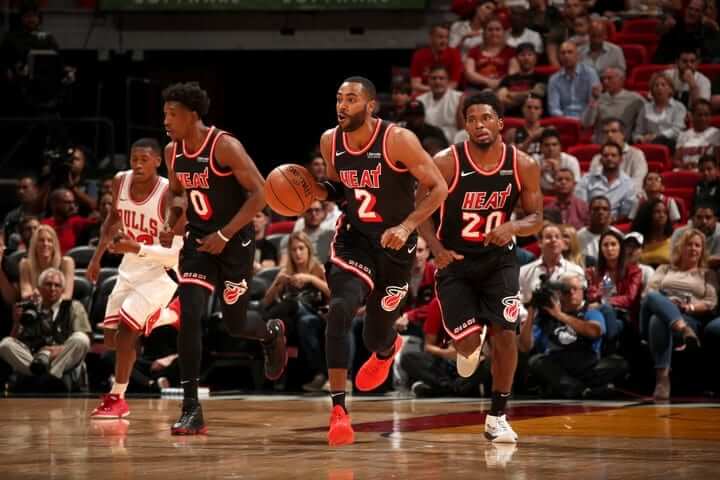
The Heat didn’t waste any time getting their new black throwbacks onto the court. After announcing them on Tuesday, they wore them on Wednesday night against the Bulls (lots of additional photos here).
When the throwbacks were revealed on Tuesday afternoon, I thought something about the chest insignia looked a bit off, but I couldn’t put my finger on it and didn’t have enough time that day to pursue it. But now I’ve done some photo research and discovered, to my surprise, that there was a lot of variation in the Heat’s chest wordmark during the franchise’s early days. Here are some shots from the team’s first four years of existence (click to enlarge):
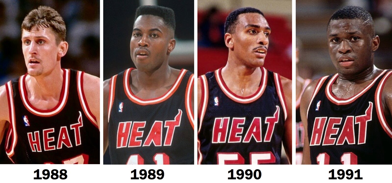
Man, that’s a lot of variation! I see three different versions of the “A” and at least two different versions of the other letters. This might be common knowledge to some of you, but I had no idea. (Update: I’ve now been informed by reader/commenter Jack O’Connor that the 1988 photo is of Brent Barry, who played for the Heat in 1997-98. Ugh — Getty Images’ notoriously bad photo dating strikes again. Or maybe I just messed up. But while the year may be off, the basic point of the wordmark’s inconsistency remains.)
So which version ended up on the throwbacks? Let’s take a look:

I don’t think that “A” matches any of the original versions.
I haven’t yet had time to conduct similar comparisons of the white jerseys from those early years. I’ll get around to it, but feel free to pursue that on your own if you like.
In any case, it’s interesting to see a team whose uniforms were so non-uniform. A good reminder that things aren’t always as standardized as we like to think they are.
Click to enlarge
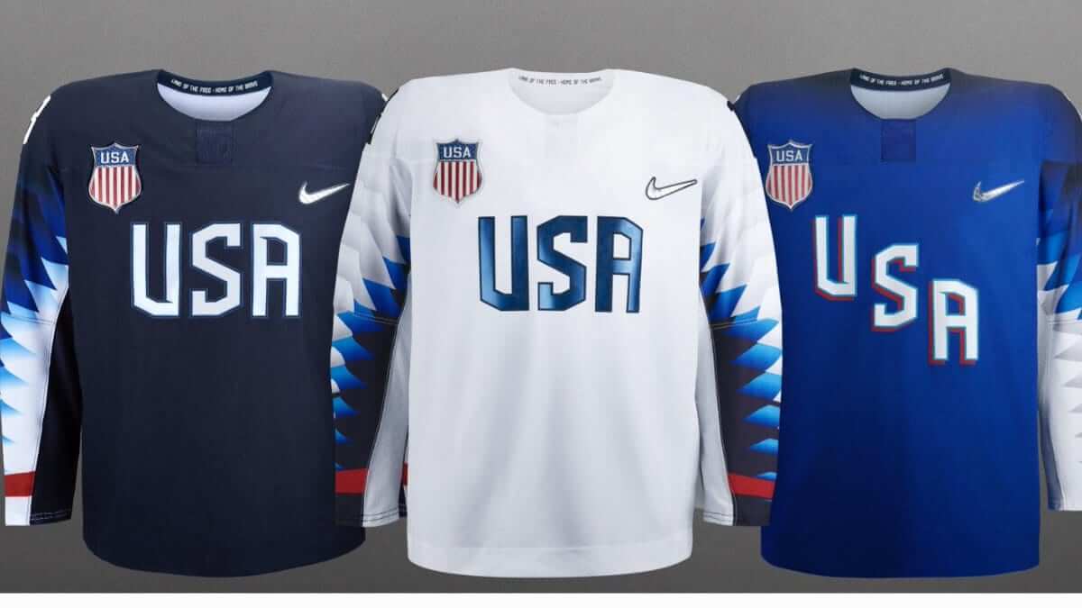
So that’s why the NHL players won’t be participating: Don’t look now — no, seriously, don’t look now — but the Olympix are only about three months away, whee! As usual, they’ve started the uniform rollout with the hockey jerseys, so everyone can remember 1980 and say, “Do you believe in miracles?”
I’m guessing you probably do believe in miracles. But what about total fucking shit — do you believe in total fucking shit?
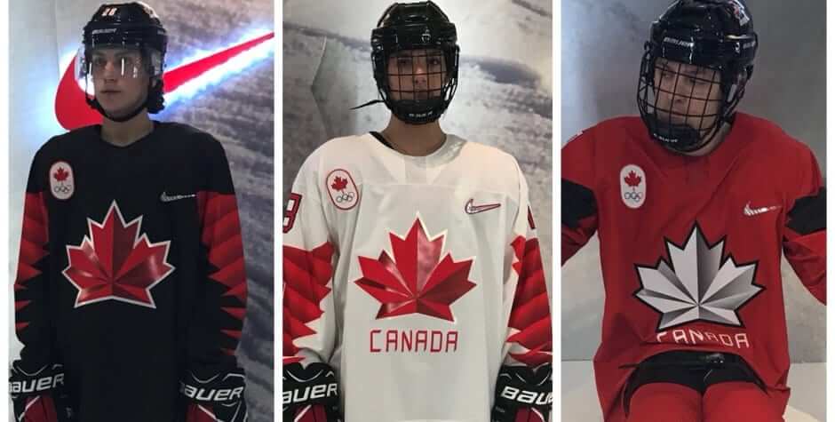
If you didn’t before, you sure will now, thanks to these new Team USA hockey jerseys, which are a bad joke (see above). Canada’s aren’t much better:
Meanwhile, everyone loves the closing ceremonies, because they’re all about selling oodles of clothing that has nothing to do with sports bringing nations together, so those outfits were unveiled yesterday as well.
Soon we’ll be able to have our quadrennial debate about whether figure skating is actually a sport. (It’s not.) Can’t wait!
Naming Wrongs update: Last week we launched three Naming Wrongs shirts for Reunion Arena, in NHL colors. Now we have shirts for Reunion’s old NBA tenant as well. They’re available in blue, green, grey, and white:
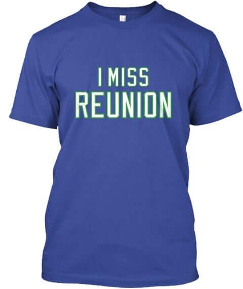
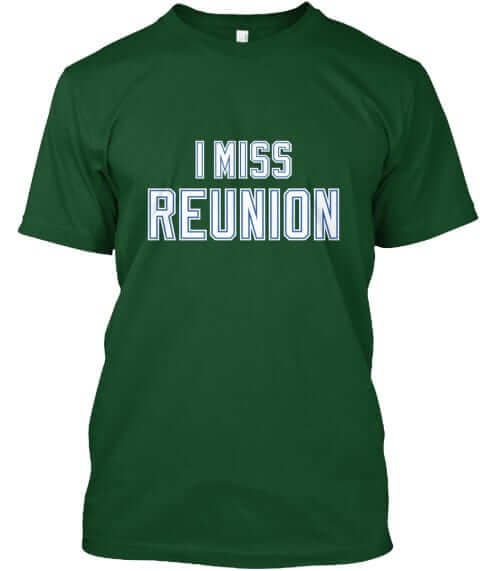
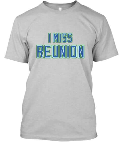
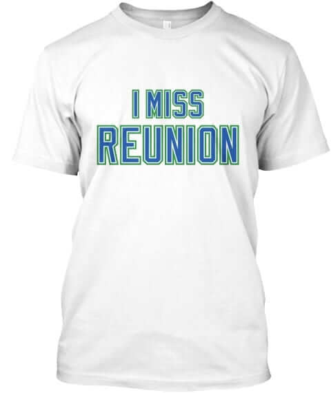
All of these designs are now available in the Naming Wrongs shop. They’re also cross-listed in the Uni Watch shop, where card-carrying members can get 15% off. (If you’re a member and need the discount code, send me a note and I’ll hook you up.) My thanks, as always, for your consideration.

KRC update: The latest installment of Key Ring Chronicles is about a nut — like, the kind that goes with a bolt. Check it out here.
The Ticker
By Paul

’Skins Watch: An L.A. Times beat writer who’s been covering the World Series says commish Rob Manfred described Wahoo as “problematic” and that Manfred plans to continue discussions with the Indians this winter (from @bryanwdc). … Washington QB Kirk Cousins appeared at a press conference yesterday wearing a T-shirt that showed an Indian-head nickel in place of the ’Skins logo (WaPo link). He’s also selling the shirts on his personal website (from William Yurasko).

Baseball News: The Astros wore their orange alternate jerseys for last night’s World Series finale — the only time either team wore anything other than white or grey. … Bidding on a game-used Jackie Robinson jersey has topped $1 million. … Reprinted from yesterday’s comments: Looks like The Atlanta Journal-Constitution may have leaked the news that the Gwinnett Braves’ new name will be the Gwinnett Buttons, which is a reference to Button Gwinnett. … Love this jack-o-lantern sewn up with baseball-style laces (from Kary Klismet). … Whoa, check out this awesome old map of organized baseball in 1940. Highly recommended (from Mark Gatti). … Here’s some great 1960s home movie footage shot at a Senators game at RFK Stadium. There’s additional background info in this WaPo piece (thanks, Phil). … Astros pitching coach Brent Strom wore good-luck socks adorned with the images of Boston Celtics stars Bill Russell and Bob Cousy last night (thanks, Brinke).

NFL News: Looks like the Jets will wear their kelly shade of green tonight. … The CEO of the Papa John’s “pizza” chain says the NFL’s anthem protests are to blame for his company’s poor earnings performance, which seems like as good a reason as any to keep the protests going. … The Eagles wore G.I. Joke practice jerseys yesterday (from Blake Fox). … The Broncos wore white belts with their orange pants for one season — 1971. Here’s a really good view of that (from Ray Hund). … Newly signed Pats backup QB Brian Hoyer will wear No. 2 (from Tim Medeiros). … With the Jaguars slated to wear their teal alts this weekend, a Twitter account devoted to poking fun at Jags QB Blake Bortles notes that he is undefeated in teal (from @Hail21RIP).
College Football News: James Harbaugh Jr., the son of Michigan coach Jim Harbaugh, says some trick/treaters showed up at his door dressed up as his dad (from Jim Vilk). … FAU going with a stars/stripes end zone design this week. … Saturday’s VaTech/Miami game will be mono-white against mono-black (from Andrew Cosentino). … Central Michigan and Western Michigan went color vs. color last night (from John Chapman).

Hockey News: Here’s a good look at the Red Wings’ old diamond-C captain’s designation (from Shawn Bolton). … NHL teams are adding “hockey Fights Cancer” helmet decals for the month of November (from Jerry Wolper). … ” Golden Knights goalie Maxime Lagace, whose mask is otherwise Spartan-themed, has the small logo of the Canadian band Silverstein on the backplate,” says our own Jamie Rathjen. “I’ve had a hard time finding a good photo, but you can see part of it here.” … Grand Rapids Griffins G Tom McCollum has a new cold-activated mask (from Dennis Homminga).

NBA News: Cross-listed from the baseball section: Houston Astros pitching coach Brent Strom wore good-luck socks adorned with the images of Celtics stars Bill Russell and Bob Cousy last night (thanks, Brinke). … Some of the Lakers’ NOBs are riding ridiculously low (from Jordan Teller).

College Hoops News: New uniforms for the Minnesota women’s team (from Jeremy Formo). … New uniforms for La Salle, Richmond, and Texas Tech. … For those who are wondering, my annual College Hoops Season Preview column will run on ESPN.com next Tuesday.

Soccer News: Here’s an article about the 1994 opening-round World Cup game when Ireland and Italy both showed up wearing white (from Denis Hurley). … New throwback for Juventus (from Charlie Kranz).

Grab Bag: New logo in the works for the Aussie rules football club West Coast Eagles (from Will Pike). … Here’s a piece on the role of customized typography in event branding (thanks, Phil). … Home Depot sells a bunch of magnetic signs and standings boards for a variety of pro and college teams and leagues (from Jon Solomonson). … … New uniforms for the Aussie rule football team Collingwood FC (from Nick Hulett).
What Paul did last night: Duh, I watched Game Seven of the World Series! Kind of a stinker of a game, but that’s how it goes sometimes. Congrats to the Astros and their fans.
Now there’s that empty feeling that comes with the end of the baseball season. How many more days until pitchers and catchers?
The picture used for 1988 is Brent Barry, who played for Miami during the 1997-98 season.
Ugh. Really? Getty Images’ notoriously unreliable dating strikes again.
I’ll update the text. But still, there’s a lot of inconsistency there, regardless of the years.
Some of the inconsistencies can be attributed to the change from Sand Knit to Champion as uni supplier in 1990 – there were lots of minor uniform changes and errors around that time.
I always liked the HEAT’s original uniform design (I admit that despite being a Magic fan), but I didn’t know about the insignia’s inconsistencies until now. Good catch!
I agree. That uniform was a real gem. I loved the white version in particular.
That version was my favorite from that set. The red really popped on it.
Also a cool feature, they were an asymmetrical. The side stripes only ran down the right side of the body. The left had the big flaming basketball on the shorts but nothing else.
103 days until pitchers and catchers!
103 long days
103
Damn. Din’t refresh. Still…that’s our number
That 1940 baseball map is pure gold.
But also a disaster. Several state lines bear no resemblance to reality, and numerous cities are drawn far from their actual location. There’s hand-drawn, which is charming, and there’s badly drawn, which is bad.
The Fall Classic ending on Nov 1st, still 6-7 weeks away from baseball’s polar opposite season (winter), a lot better than Ice Hockey (I hate using “Ice” but it’s appropriate here), that generally ends 1-2 week from it’s polar opposite season (summer). If baseball was to adopt the NHL approach, we would be watching the World Series just before Christmas.
NFL is number 1 for a lot of reasons – one of them is it’s short season – and doesn’t drift too far out from it’s natural season (Fall)
I don’t know about that, Oakville. The Super Bowl is the first week of February, about a month and a half after the official first day of winter.
Fair point, but it’s better on the front end – starting just 2 weeks before it’s natural season, where baseball starts more or less at the start of Spring.
The biggest benefit the NFL has (IMO), is it’s only 16 games – could you imagine watching 162 games a year of your favorite NFL team (or even 82)
NFL offseason (ignoring exhibition) – is essentially 7 months, baseball 5 months, hockey – a dismal 3.5 months
I thought the shortened season back during the strike (or was it a lockout) was optimal. They could do 50 games. And since more than half the teams make the playoffs anyway, a 50 game season gives everyone a fair enough shot to be respectable enough to at least get into the postseason. NBA should be the same.
CFL has summer/fall.
Regular starts latter part of June – Grey Cup near end of November.
NHL season is too long and I say that with hockey being my #1 sport. 70 games would do for regular season. Wouldn’t be against less teams making the playoffs either. Neither is going to happen.
Being only a casual MLB fan you don’t want to know how many games I think there should be for that.
120! And I enjoy baseball.
Disappointed about Olympic hockey jerseys today. You screwed up Nike. These are not tasteful hockey jerseys.
Since there is no NHL participation in the Olympics again, I would have loved to see Team Canada commemorate this by throwing back to the uniforms the barnstorming national team wore. Those were beauties.
link
That sure beats what the Americans and Canadians will be wearing next year by a country mile.
And doable, considering it’s not a federation logo; as you may recall, federation logos are not allowed on Olympic team sport uniforms.
I don’t get the vitriol for the USA jerseys. The typography is fine, and the feather pattern on the sleeves is thematically appropriate and visually interesting. Color treatment is off; the set has too much blue, all of it too light, and not enough red. But all that amounts to a C-plus or B-minus set, not a “looks like fucking shit” set.
Canada, though, good lord. They make the mediocre barnstorming unis linked above look like a masterpiece.
The typography is “fine”?
I think you misspelled “brutal.”
Olympic hockey jerseys so far. Oh good lord. Yuck-o.
Canada kind of sort of works in a barely passable way…it’s red and black with maple leaf jags on the sleeves.
USA? Entirely too many shades of blue and not enough red. As for the template, maybe because I saw Canada first, I don’t see feathers the way RS Rogers does. But if I did, then my first thought isn’t our majestic bald eagle like it should be. It’s movie Mighty Ducks and the Flying V. Lame. And not a good look at all.
My first thought wasn’t feathers, I thought it looked like the link.
I don’t like those jerseys either.
Design of the jerseys of both teams is bad. The Leaf crest for Canada on its own, however, is fucking sweet. Shame it has to go on such an overdone jersey.
Proofreading:
“basebal style laces”
Fixed.
I was about to lambaste Kirk Cousins for not using a 1932 nickle on his shirt (you know the year the Redskins were established!).
Turns out, there are no 1932 Indian/Buffalo nickels. Noe were minted in 1932 or 1933. Go figure.
It only took me a minute and a half to decipher WTF FAU had written in their endzone!
Not as long as it took me, Dumb Guy; I saw that on the Twitter page yesterday, and I couldn’t make it out until this morning! But what do the five stars in Florida mean?
Not sure. Apparently there aren’t normally stars on the Florida.
link
Maybe for the 5 branches of the military?
“Soon we’ll be able to have our quadrennial debate about whether figure skating is actually a sport.” How about the debate about whether we should still call it figure skating? (Naming Wrongs T-shirt request?) So many changes, from men’s skating outfits to the end of compulsory figures, and the use of vocal music in all disciplines.
Collingwood FC entry in the soccer section is for the Australian rules football team.
Fixed.
The French name for the sport is “Patinage Artistique” (artistic skating). It at least dies not suggest an element of the sport (School figures) that is no longer part of the sport.
I commented on this a while back, and while Paul responded I don’t recall him actually offering his opinion on it. Do people consider the Astros a navy team with orange, or an orange team with navy? I mean the navy caps have the unoriginal feeling of a typical navy MLB team. But since they use orange for their alternate jersey, does that make orange their primary color? What does everyone think?
Ideally they’d have orange caps and orange lettering/numbers. But as is, I think I’d say they are a navy team.
They *should* be considered an orange team. After all, “Astro” means “star” and there aren’t any navy blue stars of which I’m aware.
Was really pulling for the Dodgers…one reason: I didn’t want Houston to win until they went back to orange caps. Oh well, at least they weren’t wearing black and brick red with pinstripes and script lettering (I love script, but not on the Astros).
Although…on the orange caps they have a blue star…
Again, they could’ve looked a lot worse. I’ll leave it at that.
Trick question! The Astros are an orange, yellow, red, and navy team!
Seriously though, I always think of them as a navy team with orange, but they sure do play up the orange angle now.
Plus, the night sky is navy so the navy cap with the orange star is more accurate anyway.
Yeah, I guess I’d just like them to go orange so their identity is more distinct. There are what, 12 clubs that wear a navy cap either full or part time? At the very least go with the orange brim and have orange lettering and numbers on the uniform (and of course bring back the shooting star over the lettering).
Although I know this not to be the case, I like to imagine “Astros” is short for “Astronauts” and as such should embrace the orange.
Navy team for sure. I think they could pull off a balance by wearing the orange caps.
There are certain teams whose “signature” color doesn’t really correlate with how MUCH of it they wear. Team name has something to do with it: the Red Sox, Reds, and Cardinals went through long stretches where their unis featured much less red than navy, but they always seemed like “red teams” regardless. Even when the Phillies, Braves, and Indians sported much the same ratio of blue:red, the first always seemed like more of a “red” team, and the latter two “blue” (even when the Indians went through primarily-red periods). More study is called for, maybe.
Collingwood FC is not a soccer team. They play Aussie Rules.
Yup, already moved to Grab Bag.
TBH I actually really like the black and the white Canada jerseys. The red would be good as well, but the black stuff on the sleeves would have to be white. But no jersey will every beat the 2010 canada whites in my opinion
My favourite Team Canada uniforms were the late 1980s and early 1990s Canada Cup. Simple, classic, iconic. Probably because I got so into the tournaments as a young fan:
link
Team USA had pretty good uniforms in those tournaments as well:
link
Makes sense. The 2010 ones are my favorite because it was the first tournament I really was old enough to remember. I also do tend to like the modern designs of some of the newer uniforms though.
Prefer the 1976 Canada Cup for USA jerseys:
link
For Canada some inspiration from 1928 (or 1936) for the white.
link
link
Could use the 2002 Olympic ‘heritage’ jersey or something like it for the dark
link
Canada Cup ones for Canada wouldn’t be a bad choice.
Papa Johns doesn’t like NFL players taking a knee… Funny since his horrible excuse for a pizza puts consumers on their knees in front of toilets.
That sounds like a quip out of MAD magazine.
I love MAD Magazine.
Considering I’m long tired of those commercials for that crappy pizza chain, nothing would make me happier than to see them back out of their deal altogether and just go away. There are just so many better places to get a pie.
They should be the official pizza of the NBA instead. I’ve noticed the only thing that rivals the average Uni Watch commenter’s disdain for the NBA is the disdain for Papa John’s. Sure, both can be improved, but neither is as bad as they’re made out to be in the comments.
But think about poor Peyton!
Thanks to his little stunt while at UT he has other issues to deal with…
Hey! The West Coast Eagles are the team I’ve supported from the youngest age in the sport dearest to my heart! We’re uniwatch relevant!
I spent about half an hour prosing a comment on the team’s facebook page for the redesign process video linked above in Grab Bag. In the 12-hours since release, the club social media has been hit by a lot of loud opinions – typical, knee jerk dislikings – which got the amateur designer in me angry! Short of opening “…as a card-carrying member of Uni-Watch”, I felt compelled to share my opinions on their FB:
As a West Coast fan I am pleased with this redesign. Although I do not support constant rebranding, i think that this was a good time to refresh our visual identity, and the outcome was positive. I also appreciate the video taking us through the design process.
The “Ready For Attack” concept was, in my opinion, a standout design. A logo that can communicate with such unique, minimal detail, and it echoed our classic, original look…
I think that the caption “needs to be more authentic and realistic” needs to be prefaced with “according to the client” because it undermines the clear talent of the designer. I read somewhere that the “realism” was a response to feedback from fans, and I am totally supportive of that level of consultation, but from a design perspective – i think “ready for attack” was the winner.
But hey, they could still turn the compromise into something good.
Interesting pic of the Red Wings captain’s patch – a nod to the state of Michigan, where the state road designation is a diamond?
I agree with the empty felling with no Baseball, but now there is Hockey!
“I watched Game Seven of the World Series! Kind of a stinker of a game, but that’s how it goes sometimes.”
It was not a stinker for those of us who are Astros fans. I say that tongue in cheek. It was an anti-climatic game to an otherwise exciting series that featured plenty of lead changes and twists.
It occurred to me today, while reading this analysis of the new Miami Heat throwbacks, that the Uni-Watch blog more-or-less exists to point out the imperfections of human-made & hand-sewn things. And that bums me out.
In 1988, a hardworking tailor worked long hours sewing awesome-looking uniforms for an upstart basketball franchise. For all intents and purposes, those were great uni’s. But here we are, 30 years later, staring into an LED-lit device, critiquing how the “A” in “HEAT” on a hand-sewn piece of cloth is slightly inconsistent from year-1 through year-4. What kind of sad, useless bastards are we?
Oh, I agree that inconsistencies and imperfections are part of the charm of hand-made things. And the person doing the sewing didn’t do anything wrong — he/she just sewed whatever cloth was given to him/her.
The person cutting the cloth didn’t necessarily do anything wrong either. He/she presumably used whatever pattern was given to him/her.
Now, why did the pattern change, and who was responsible for that? That’s the question.
I didn’t view your feature on the old Heat design to be “look at those nitwits, they can’t do anything right”. But just pointing out how subtle, barely noticeable changes happened with the Heat’s early uniforms. Was it intentional, or was it an accident? If it was intentional, why? If it was an accident, where in the process did it happen? I think it is an interesting topic, as uniforms 30+ years ago rarely got much publicity or attention to detail from the media or most fans.
Right. I wasn’t playing “gotcha”; I was just noticing something that might otherwise go overlooked, which is pretty much the essence of Uni Watch.
I’d wager that if somebody really took the time, a good number of other teams in the NBA (as well as other major league sports) probably also had minor inconsistencies from year-to-year on jerseys that were supposed to be the same.
That would be a tough research project though, since you’d be basically taking shots in the dark unless you had already noticed something.
Lettering on the Heat’s black jersey is two-color, but on their 1988 white jersey it was three-color. AFAICT, the team was inconsistent with determining which layers would create the templates for the road jersey, resulting in ample counters in some circumstances, filled-in counters on others.
Thanks for your thoughts! I really am a big fan of the blog; I just landed in a moment of existential questioning this morning. Like, is such analysis trivializing the beauty in human imperfection, or appreciating it? What does obsessing over such minutiae say about us as humans? Are our expectations growing increasingly unreasonable and driving us apart? Etc. Etc.
The home movie footage shot at a Senators game at RFK Stadium had to have been in 1969. Ted Williams can be seen wearing a Senators uniform (he was the manager) and you can also see the 100th Anniversary patch on the left sleeves of the Senators’ uniforms in the close-ups at the beginning of the video. That patch was worn during the 1969 season. Looks like they were playing the California Angels who were wearing their halo caps.
Did anybody else find themselves slightly distracted by the fact that in that Red Wings photo there is no logo on Ted Lindsay’s sweater?
The CEO of Yum Brands, Pizza Hut’s parent, is calling bullshit on “Papa” John Schnatter’s claims.
link
I enjoyed the footage of the Washington Senators at RFK, but unfortunately the first thing I noticed were all the blank walls at the stadium.
I’ve gotten so used to ads being plastered all over any available space at stadiums that it almost looks like somebody went into the footage and edited them out.
BTW, does anybody else find RFK to be a good argument for why we should re-consider the much-derided circular “cookie-cutter” stadiums of the 1950s through 1970s? Especially for football, those seats were right on top of the action. I never saw a game there, but it seems that even the nosebleed seats weren’t too far away.
Even for baseball, it seemed very intimate.
Although it was not too uncommon in 1969 the first thing I noticed were all of the empty seats. Looks like it was a nice summer afternoon.
A quick internet search reveals a few things there:
– This could have been shot in 1970, as Ted Williams was still the manager
– If so, by 1970 the team owner was already threatening to move the team
– The 1970 Senators were a last-place team while the nearby Balitmore Orioles were easily the best team in baseball, eventually winning 108 games and the WS
So these factors might have contributed to the near-empty stadium…
As I previously stated, the home movie dates from 1969 because the Baseball 100th Anniversary patch can be seen on the left sleeves of the Senators’ jerseys at the beginning of the video. That patch was worn by all MLB teams throughout the 1969 season.
Sorry Will, I missed that part of your post.
Interestingly, 1969 was the Senators (ver 2.0) best team, unfortunately that still meant 4th place.
So I’m guessing the team was simply never not that popular, in part due to not being any good, and probably mostly due to the Orioles being very good during that era.
On other item from 1969, the All Star Game was played at RFK that year. Attendance was 45,259. The date was July 23, 1969, it was a day game because of rain the previous night. This was the last non-prime time All Star Game.
The cookie cutter stadiums were anything but intimate. Their roundness pushed the lower level seats far from the action.
Next time you’re in the Bay Area, go to a game in Oakland. It’s a very different experience than going to a game on the other side of the bay.
One interesting thing about the current Astros look was that when it was announced, a regimented schedule was set for which uniform was to be worn on which days. Fridays for the orange jersey, Saturday for the orange cap, and Sunday for the BP.
Having a set pattern for the alts always seemed like a good idea to me.
Another interesting thing about that Red Wings photo is Gordie Howe wearing different socks than the other two players.
Olympix??? You mean Olympics with a “cs” not “x.”
You take the Olympix much more seriously than I do.
With the ongoing X-Games-ification of the Summer and Winter Games, I figure my spelling will become the official version soon enough.
I would add, the Olympics are on the other side of the hill, and will follow Boxing, Bowling and Thoroughbred horses as a fading sport, as some writer pointed out, it’s really just an elaborate reality TV show, that can leave huge messes behind (i.e. for anyone interested, read what has happened to the Brazilian facilities from the 2016 debacle)
as some writer pointed out, it’s really just an elaborate reality TV show
See, that’s why I think the Games will endure. Reality TV sells. That’s why the Olympix have a much higher female viewership than traditional sports.
Haha. No, I teach English in Mainland China and Hong Kong. I am always looking for words with alternate spellings. (Spelling over here is never consistent because the teachers come from all over the world.) When I looked up your spelling it came up as fitness center. I was just double checking your meaning.
At first I didn’t understand why you changed the spelling, but now that I do I love it. Growing up, I enjoyed the olympics, but now find myself bored with them. The xgamification being a large factor. Not enough of the traditional sports. Also, too many commercials(I know, shocker in sports today), too much studio and not actually showing competition, and finally not showing medal rounds until late, which due to my schedule I just can’t stay up for.
Do we know how many teams in history have worn alternates (read: not white or gray) in the World Series? More importantly, is there a count of how many teams clinched in their softball tops?
In terms of alternates worn by the recent WS winning teams we have 2017 Astros (orange softball), 2016 Cubs (blue softball), 2003 Marlins (black softball), 2001 Diamondbacks (sleeveless), and 1997 Marlins (sleeveless).
Last night someone on Twitter said this was the third time a team had clinched while wearing a softball top. Previous two were the 2003 Marlins and the 2016 Cubs. I haven’t fact-checked that.
The Pirates were in yellow over black pants in Game 7 in 1979. I’m sure the A’s wore green tops for one or more of their clinchers in the 1970s.
Nike went from a “Not too bad” uni set used in the IIHF tournaments to something generated from a bad LSD Trip.
I can’t wait to spend $2,000 on that Ralph Lauren Olympic Parka…
Anyone else sick of Manfred’s stance on Chief Wahoo? Is he going to form a committee on the logo next? You’re the Commissioner of MLB. If you want it gone, say so.
Maybe his ploy is long term? With UA becoming the uniform provider in 2019, is there something which could be/has been done to not have UA create Uni’s with Chief Wahoo?
These jets units are hard to watch. Lots of Halo effect with the reflective green.
Do the Bills’ helmet stripes and decals look goofy on anyone else’s TV?
Astros became the first AL team in 45 years to win gm7 of the WS on the road. Like the A’s before, the Astros also went to the color unis in gm7, unlike the ’68 Tigers and every other team before, who wore traditional matching unis/pants