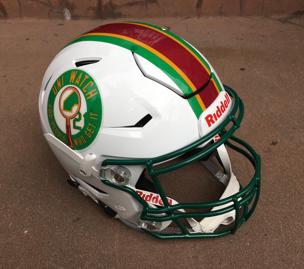
Last week I wrote about the very cool Uni Watch helmet that Riddell sent me (shown at right; click to enlarge). The virtual ink on that entry had barely dried when a bunch of people started asking, “Where can I get a mini-helmet version of that?”
Full disclosure: Up until this week, I didn’t know jack shit about mini-helmets. I can see how they’d be a fun thing to collect (less expensive and cumbersome than real helmets, and miniature items tend to be inherently pleasing), but they’ve never really been on my radar. So it would never even have occurred to me that someone might be interested in a Uni Watch mini-helmet. And I certainly wouldn’t know how to get them made.
Fortunately, there’s a Twitter-er called MiniHelmetGuy, who specializes in creating all sorts of custom mini-helmets. I knew about him because he often tags me in his posts. So I went to his Twitter profile, which includes a link to his website, which includes a contact link, and got in touch with him.
It turns out that MiniHelmetGuy’s real name is Casey Tierney. Nice guy, smart guy. We talked for a bit and agreed that it would be fun to offer Uni Watch mini-helmets, assuming there’s enough demand. I said I’d need to see a prototype or sample, so I sent him the artwork for the striping and side decals (the same artwork I had provided to Riddell). Casey then sent the artwork to his decal provider, a guy named Shane Maddox, who runs a mini-helmet site of his own called T-Mac Sports. Shane made me a prototype and shipped it to me. It arrived yesterday. Check it out (for all photos, you can click to enlarge):
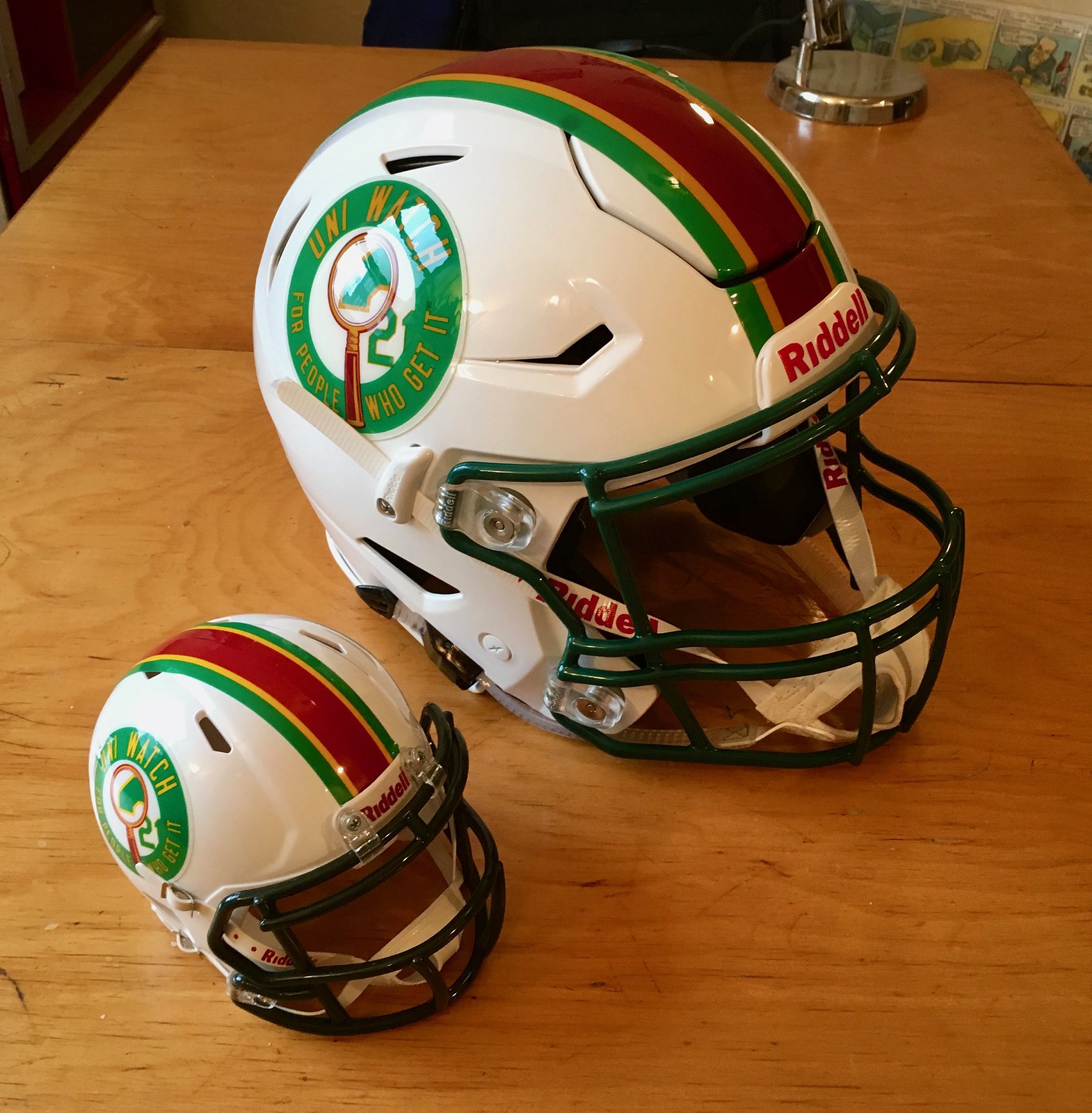
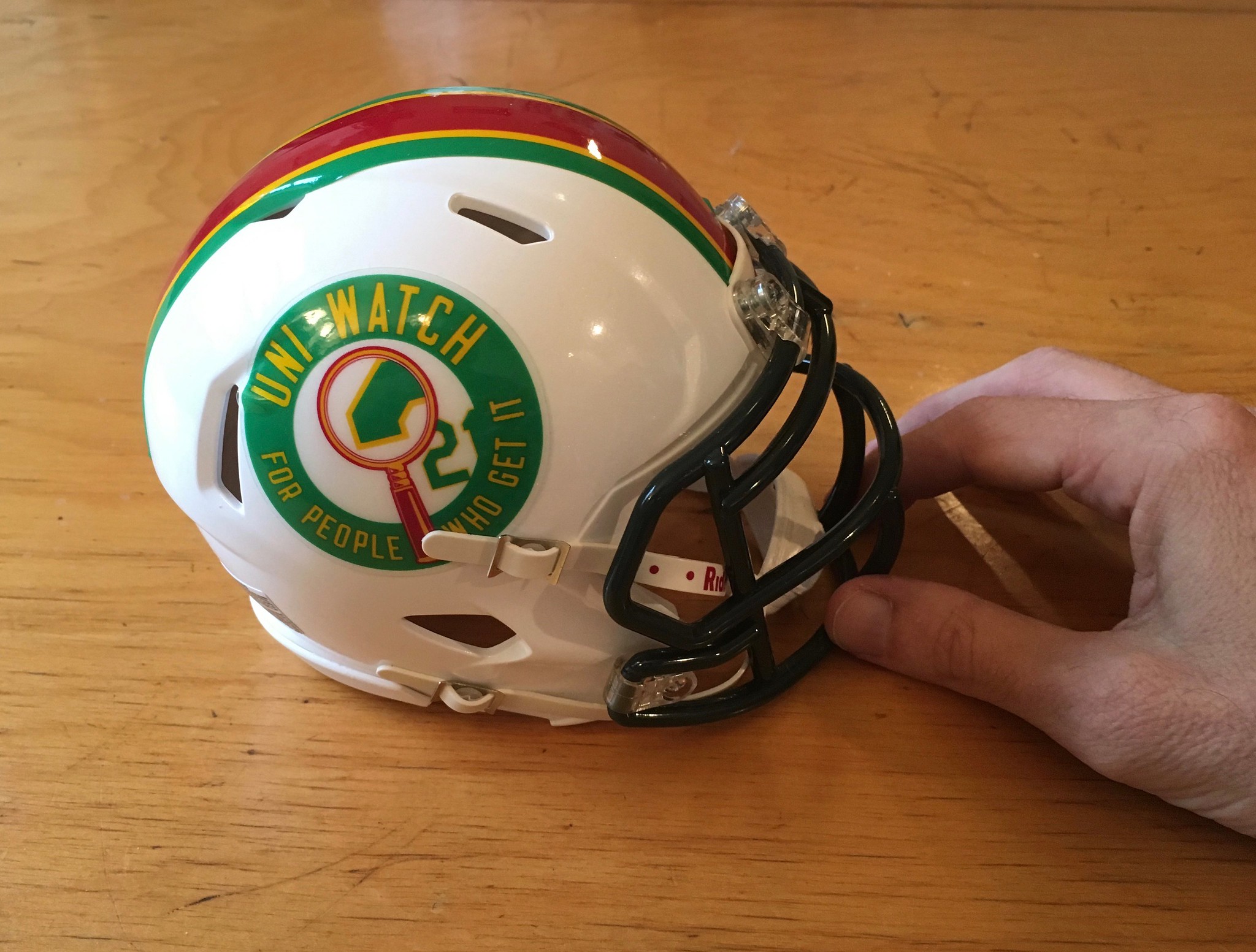
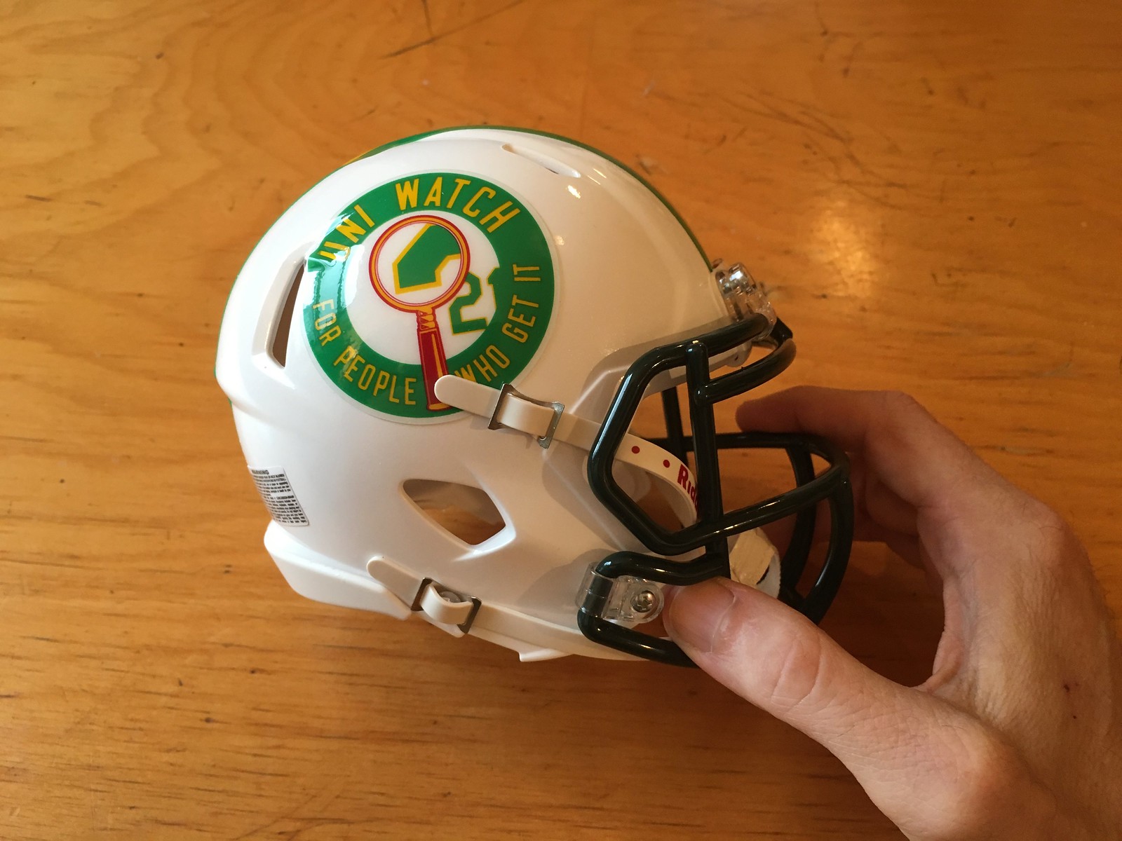

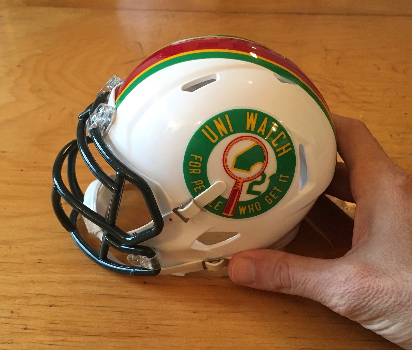
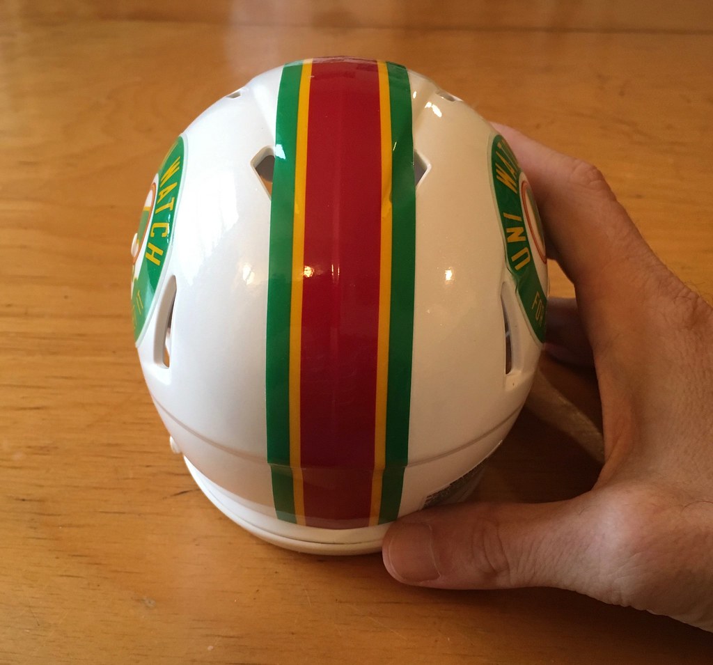
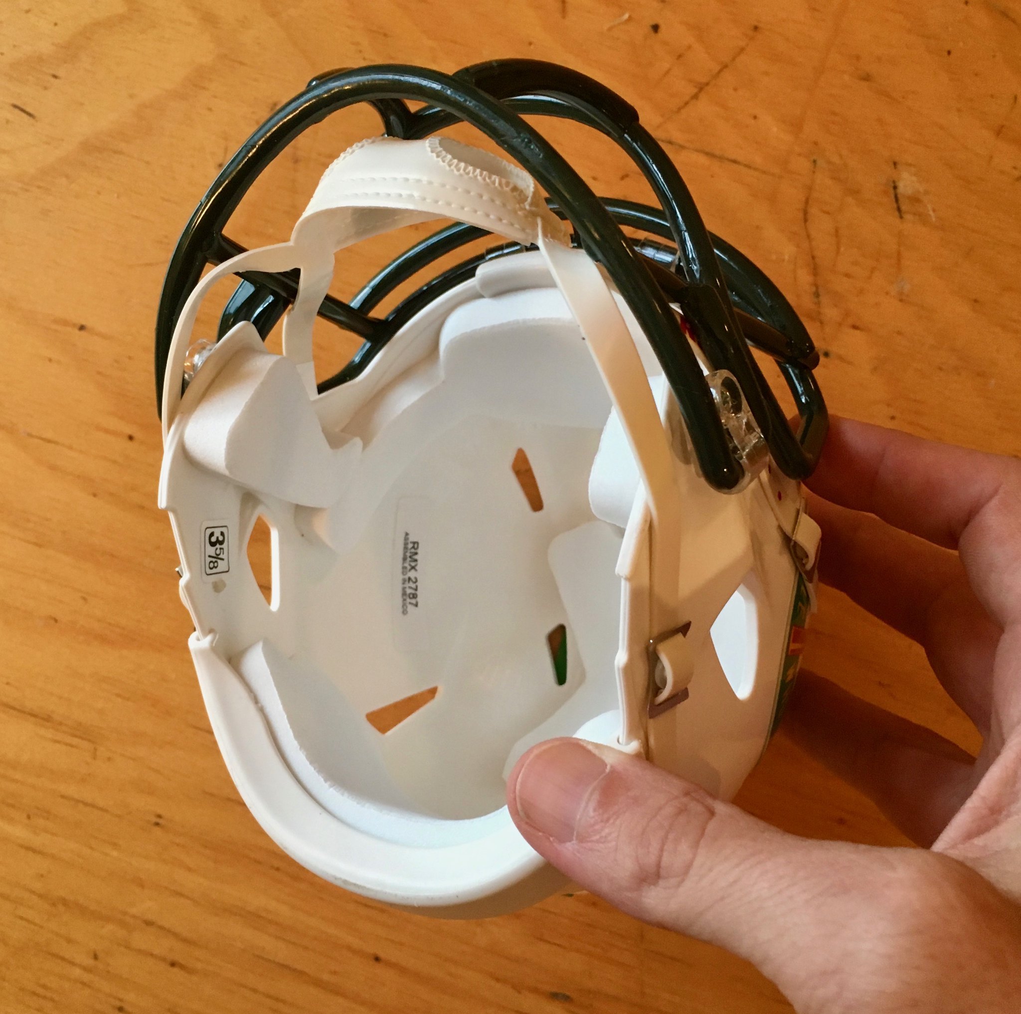
Pretty cool, right? I included my hand for scale. Also tried to put the helmet on Uni Watch girl mascot Caitlin, but she wouldn’t sit still for it.
Here are a few notes:
• My full-size helmet is a Riddell SpeedFlex, but Riddell doesn’t offer a mini version of that model, so we went with a mini-Speed. Unlike the full-size helmet, it doesn’t have the flex panel, so the striping tape runs across the crown without being cut.
• Casey says that the striping tape on the Uni Watch helmet is better than what’s typically used on mass-produced mini-helmets. “For multi-colored striping, Riddell uses individual stripes for each color,” he says. “For example, they use three different pieces of tape to make the striping on a Dallas Cowboys mini-helmet. For the Uni Watch helmet, we used a one-piece stripe, which just looks smoother and more realistic, like what’s on the full-size helmet.”
• If there’s enough interest, we’ll offer these for sale through Casey’s website. If that happens, we might create a logo decal — a magnifying glass, say — to place over the Riddell logo on the nose bumper. I’m open to other suggestions.
• As you can see, the green facemask on the mini-helmet is darker than the one on the real helmet. We might end up swapping out the dark mini-mask for a lighter, kelly-ish green mask, which would be a closer match to the stripes and decals.
• Looks like the price will be $40 (which I’m told is pricier than a mass-produced NFL mini-helmet but not out of line for a custom job like this one). If you want a clear plastic display case, that’ll be another $11. You’ll likely be able to add a visor to the helmet for an additional $20ish.
So: With all of that in mind, would you be interested in such a product? If so, shoot me a note. This isn’t an iron-clad commitment — we’re just trying to gauge how much demand there is. Not interested? No problemo. Either way, thanks for letting me play show-and-tell today.
However this plays out, I want to thank Casey and Shane for preparing the sample mini so quickly, and for giving me a crash course in mini-helmets. Good stuff.
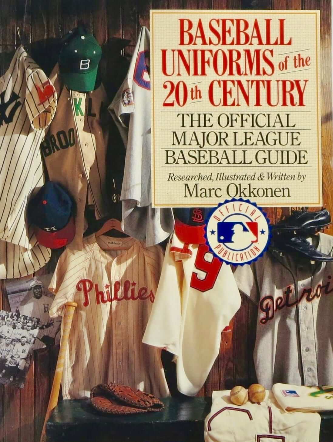
Uni Watch Personal Shopper: Longtime reader Jason Hillyer was shopping for used books yesterday and came across a hardcover copy of Marc Okkonen’s seminal Baseball Uniforms of the 20th Century. It’s no exaggeration to say that Uni Watch probably wouldn’t exist if not for this book, which was the first major uni-historical effort of its kind.
Jason already has a copy of the book in his library, but the used copy he found was only $10 and in very good shape (here’s the front, back, and spine), so he bought it and will gladly sell it the first Uni Watch reader who’s willing to pay the 10 bucks plus shipping. (If you live in or near Columbus, Ohio, he’ll even meet up with you personally somewhere in the suburban Westerville area.)
Incidentally, the book has a lot more than just the little uniform diagrams that also form the basis of the Dressed to the Nines database. There’s also lots of text for every MLB team, vintage photos, and so on. A great book, and a very nice gesture on Jason’s part. If you’re interested, contact him here. Update: The book has now been claimed. Thanks again to Jason for doing this.
Naming Wrongs update: Busy week for Naming Wrongs, as we have still more designs available today. One at a time:
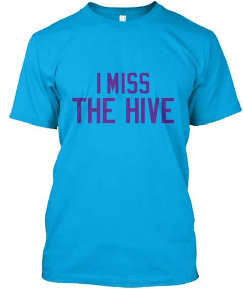
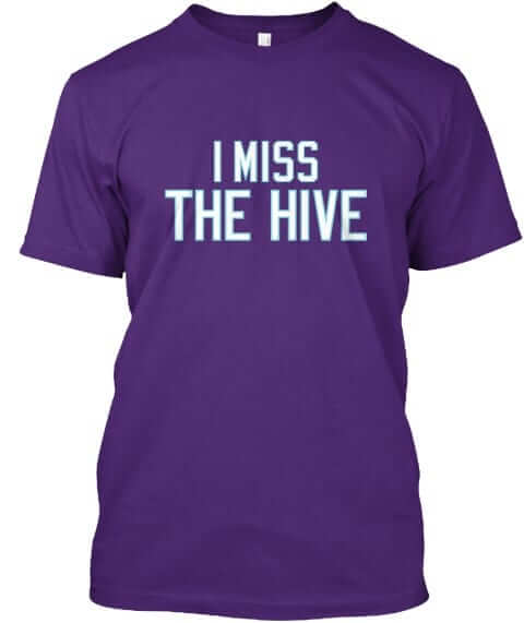
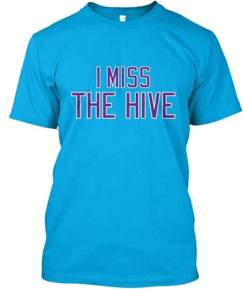
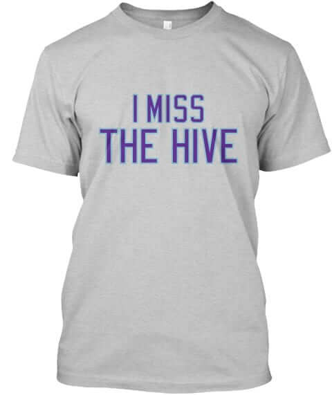
The Hive: This one is available in teal with purple lettering, teal with outlined lettering, purple, and grey (for all photos, you can click to enlarge):
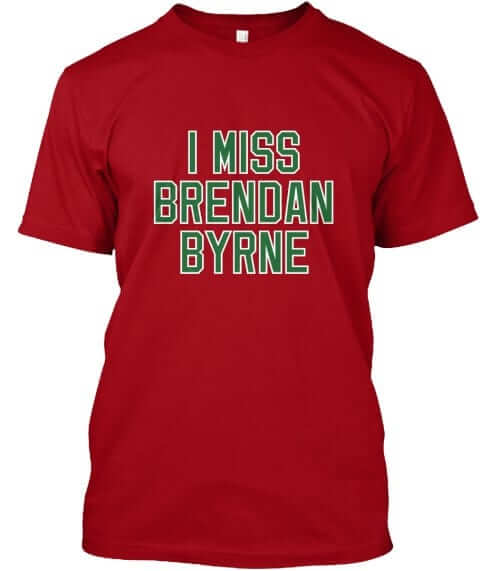
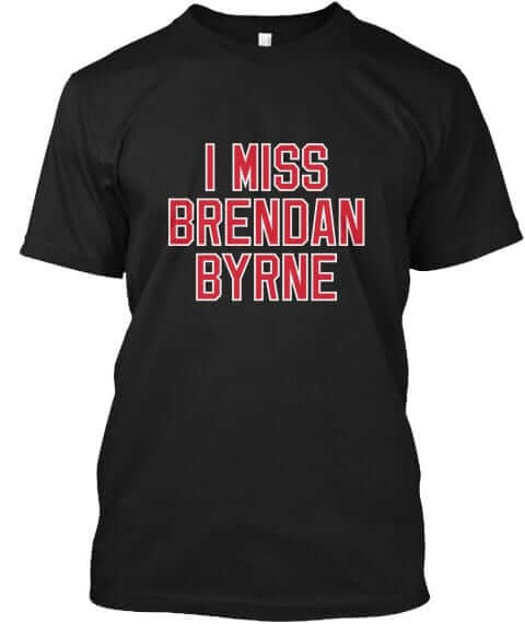
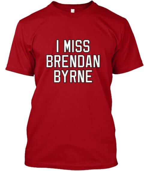
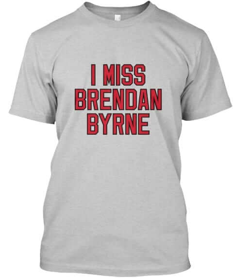
Brendan Byrne Arena: Devils fans have been asking for this one. It’s available in red with green lettering, red with white lettering, black, and grey:
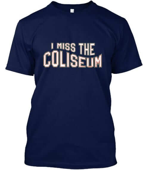
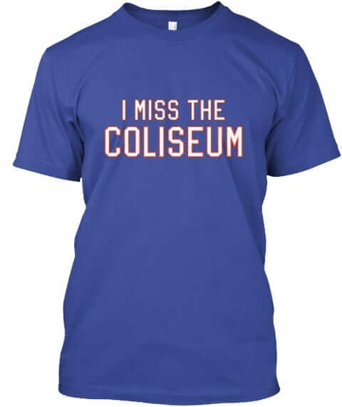
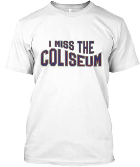
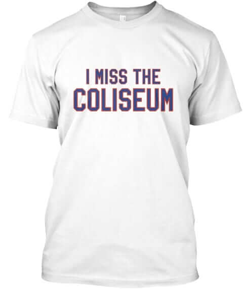
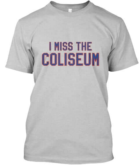
Nassau Coliseum: I know, I know — nobody misses the Nassau Coliseum. Except some people do (maybe because the Islanders’ current arena, which is just a few blocks from Uni Watch HQ, wasn’t designed for hockey and has terrible sightlines). And check out the great designs that Scott Turner came up with — wavy navy, wavy white, royal, white, and grey:
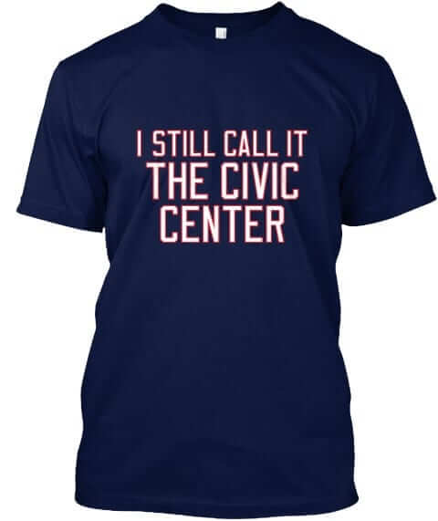
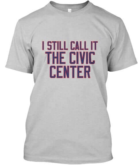
Hartford Civic Center: We had already done this one in Whalers colors, but now we’ve added UConn colors — navy and grey:
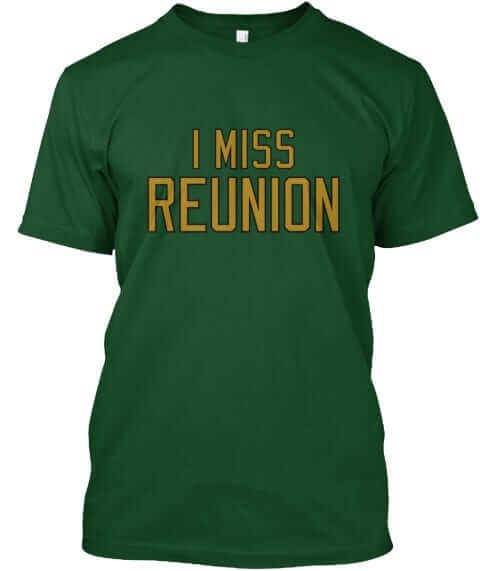
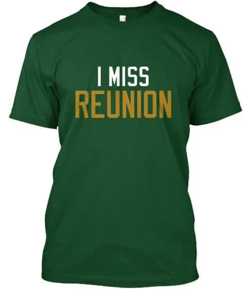
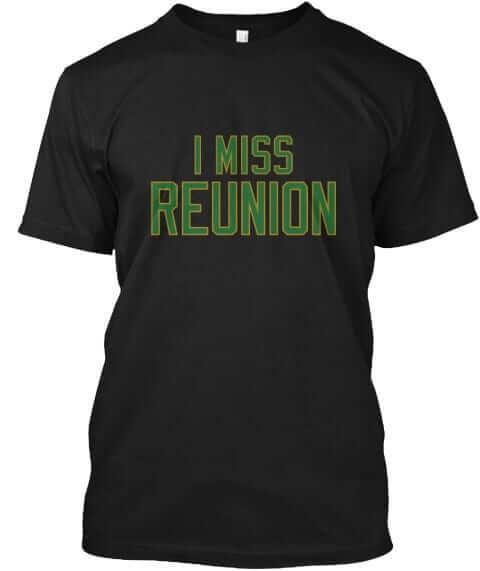
Reunion Arena: Reunion was home to the Stars and the Mavericks. For now, we only have the Stars designs available, in green with gold lettering, green with white/gold lettering, and black (the Mavs versions will follow next week):
All of these designs are now available in the Naming Wrongs shop. They’re also cross-listed in the Uni Watch shop, where card-carrying members can get 15% off. (If you’re a member and need the discount code, send me a note and I’ll hook you up.)
In case you missed it earlier this week, we also have new Naming Wrongs shirts for the Hoosier Dome, the L.A. Forum, the Salt Palace, and RFK Stadium (which we’d previously done in ’Skins colors but is now available in DC United colors). Full info and images here.
We also recently launched four new shirts devoted to college basketball arenas. You can see those here.
My thanks, as always, for your consideration.

’Skins Watch: The artist who created the logo of a “brave” for an Ontario high school back in the 1970s is sad that the school has decided to stop using the design. … An Edmonton hockey fan has amassed a collection of rookie cards for every Indigenous player ever to appear in an NHL game (from Mike Styczen).

NFL News: Last night’s Ravens/Dolphins game was mono-purple vs. mono-white. Additional photos here. … Washington will be wearing throwbacks this Sunday against the Cowboys. … Speaking of Washington, TE Niles Paul says he was fined $6,000 for wearing non-regulation socks (from Andrew DeFrank). … The folks at the Unforgettable Buzz, who’ve spent the past few years documenting the history and culture of electric football, have published another book. This one is called The Electric Football Wishbook, and it consists of dozens of pages from old Sears catalogs from the 1950s through the ’80s. Really nice stuff. You can buy it, and also see some of the interior pages, here. … The fastest-growing sport in New York is flag football, with many of the kids wearing NFL-themed uniforms (from Tommy Turner). … An off-duty New Jersey state trooper was wearing a Jets jersey when he saved a choking man by administering the Heimlich maneuver (from Alan Kreit). … Remember when Toronto mayor Rob Ford confessed to smoking crack while wearing an NFL team logo necktie? That tie — or what someone claims to be that tie — is currently up for auction on eBay (from David Firestone).
College Football News: Recruits are reacting to Ohio State’s grey uniform. … UNC will wear its navy alternates this weekend (from James Gilbert). … Homecoming uniforms this weekend for Maryland (thanks, Phil). … Black-white-black this weekend for Dartmouth (from Cameron Mellor). The annual Georgia/Florida game has been color-vs.-color for the past three seasons, but not this year, as Georgia will be wearing white (from Chris Thorpe). … The latest Virginia Tech player to wear No. 25 will be defensive tackle Ricky Walker (from Andrew Cosentino).

NBA News: The Bucks wore their 1970s throwbacks (complete with ad patch, ugh) last night. The game was played at UW-Milwaukee Panther Arena — i.e., the old MECCA Center — on a new version of the old MECCA court design, which led to much hilarity when Celtics G Kyrie Irving mistakenly thought it was the original MECCA court (although he later reversed course on that). Additional game photos here. … Also of note: The Bucks wore throwback shooting shirts. “That buck’s head logo was on the team’s shorts from 1968 through 1976, and was also on the throwback shorts,” says Alan Filipczak. … Also-also: The Bucks’ throwbacks didn’t have the little championship tab on the back. … Looks like the adhesive or something was showing through the letters and numbers on Nuggets G Gary Harris’s jersey the other night (from Chris Weber). … The Hawks will retire a No. 59 jersey for outgoing Atlanta mayor Kasim Reed. They chose No. 59 because Reed is the city’s 59th mayor. … Here’s a weird one: Newly acquired Pelicans G Jameer Nelson wore No. 1 for last Sunday’s game against the Lakers — his first game with the Pelicans — but is now wearing No. 14. Turns out that the No. 1 jersey was just a placeholder (from Tyler Adams and Joel Lutz).

College Hoops News: The most embarrassingly named arena in all of college basketball is keeping its embarrassing name (from James Gilbert).

Soccer News: New presenting partner jersey advertiser for the San Diego Sockers. It’s amazing the lengths these teams and companies will go to just to avoid saying, “advertiser” (from Jim Vilk).

Grab Bag: Reader Joe Burke and his bride had a Philadelphia sports-themed wedding cake.
Happy Birthday to our own Scott M.X. Turner, who designs all of our membership cards and Naming Wrongs shirts. He also designed the logo and striping that appear on the Uni Watch helmets (although I don’t think he ever imagined that they’d be used in that context). Have a good one, buddy!
I don’t suppose there’s anyone out there who dabbles in baseball mini helmets (the size that various dairy dessert shops use, not the itty-bitty ones)?
Riddell used to make MLB minis (meybe they still do?).
Rawlings makes them.
link
As a ravens fan, they are one of those (modern) but classic teams that haven’t introduced many uniform options (i.e. Throwbacks, Fauxbacks, new uniforms). This changed with the color rash and while I agree they are purple, and the jerseys weren’t that great I loved a changed to the look and the gold numbers. Only other time I can think of that I felt that way was years ago when they introduced black pants and the black alternate top.
I thought the Ravens color rash was an upgrade from their regular uniforms. Just need to change the purple socks to white or gold to lose the leotard look.
The gold numbers are a great upgrade. It’s simple but shockingly effective at adding a little life to a good though broadly drab uniform set.
Oddly enough while the Ravens have limited themselves to a handful of pants (white and black) and jerseys (white, black, and purple), they’ve made up for that by wearing every conceivable combination.
In 2015, with no Color Rash, they still wore 7 different combinations. In recent years 6 combinations have been the norm.
Oddly enough while the Ravens have limited themselves to a handful of pants (white and black)…
Aren’t you forgetting these?:
link
Or maybe you’ve just blotted them out of your memory…
Not at all since I loved those pants. I was trying to speak towards the general trend. I debated whether or not to include the gold pants but left them out as they were a one off.
Since the Ravens have worn black trousers with stripes before, I wonder what’s keeping them from doing it now.
Agree, the black pants they wore in their first year, with white and purple stripes, were far superior to the solid black. If they went back to those I would say wear them every week, with the white or purple jersey.
First year black pants in 1996 were just the white stripe:
link
Purple added to the stripes in 1997:
link
——————
I think the purple pants from last night would make a good road option with the white jersey.
As a longtime Magic fan, seeing Jameer Nelson wear a number other than 14 seems odd to me. Now that he’s wearing that number again, all is right with the world! LOL
Was Nelson a fan favorite in Orlando? I’m an SJU grad and always thought he was incredibly underrated in the pros, a true point guard that we don’t see as much in the modern game.
He was as much of a crowd favorite in O-Town as he was at St. Joe’s. He’s one Magic player I was sad to see let go and I still miss seeing him in Magic colors. I hope the club retires his number one day.
He wore #28 his first year in Denver, then #1 the last 2 years.
Copy: Jason’s email address contains a typo; @gmail.com is repeated in the link code.
Jameer Nelson with a placeholder jersey reminds me of Jason Collins with Brooklyn…he took #46 for his first game because it was available but quickly moved to #98, and was always #98 in the scorecard.
The seasick Coliseum shirt is hilarious! I went to Hofstra for law and grad school so I walked over plenty of times for cheap student day-of-game tickets. Great memories.
I was going to make the same comment about Collins’ number switch. I would think “placeholder” jerseys are somewhat common, especially when a player is acquired while a team is on the road (as Collins was). I wouldn’t call it “weird.”
…it’s a neat coincidence, however, that both Collins and Nelson debuted on the road against the Lakers!
Okkonen’s book helped fuel my interest in uniforms too, I remember going on a bus trip to Camden Yards back when it was still new and unique as a retro park. On the way home they raffled off some prizes. I ended up with the book, I believe choosing it over a VHS copy of Field of Dreams. To this day I still dig into it from time to time.
Re: Nose bumper, are you typically against the makers mark there as opposed to a team logo? I actually find the team logos that have been popping up there a bit overdoing it on the helmets. The makers mark at that spot never bothered me.
Maker’s marks on equipment don’t bother me as much as they do on team-issued uniforms.
Football helmets are sort of halfway between equipment and uniforms. They fall into that in-between category that I call link.
While a maker’s mark on the nose bumper isn’t the worst thing in the world, I think replacing it with a team logo is better.
I’m not a Devils fan, so I don’t necessarily know what I’m talking about, but I do recall watching a few Pens-Devils games in the ’80s, and I feel like the announcers usually referred to the arena as “The Meadowlands”, not as “Brendan Byrne”. In fact, it was some years before I even realized that Brendan Byrne Arena was the place’s actual name. Any Devils fans care to weigh in on this?
As is the case with most of our shirts, we’re doing this one because people specifically asked for it. We’re not just making things up as we go!
I am very surprised that was asked for, I do not recall it be referred to as that ever. Perhaps it was requested by his family members ;)
Perhaps people that miss the actual Brendan Byrne, RIP, will purchase one.
UPDATE: Brendan Byrne is still alive!
They can still miss him if they haven’t seen him in a while.
I was thinking we might want to change it to “I MISS BYRNE ARENA,” because “I MISS BRENDAN BYRNE” could be interpreted as a political statement.
Given the poll numbers for the current governor, most NJers would probably be happy to make that statement.
I recall reading that Mr. Byrne was devastated when the arena was renamed for its corporate advertiser) I’ll stick with Paul’s protocol about not naming them).
At the time it was named after him, however, he was still the sitting governor and some of his opponents likened the naming to a form of political advertising. Interesting read: link
The only time I remember it that arena actually being called the Brendan Byrne is when the Grateful Dead played there or deadheads were/are talking about it.
Already sold two. Someone must have called it that.
The great thing about Teespring is that it’s fine by me if those are the only two Byrne shirts we ever sell. I mean, I’d *prefer* to sell more, but it’s no problem if we don’t — no inventory, no overhead. So sometimes we do designs that we know will have a very small audience, because why not? If only six people want a particular shirt, and if the shirt fits with our program, we can do it and make six people happy.
I am tempted to buy one, as much for the political comment as the arena one, but those 15 t-shirts that I bought as part of the 2015 program are taking up quite a bit of my t-shirt space!
That Gorton’s Fisherman wavy-style Coliseum naming wrongs shirt might be the best one yet!
It’s great, right? All credit to Scott Turner for that one — totally his idea.
I like it too. And I was at every game during the Gorton’s era. And I haven’t been an Islanders fan since 2001.
Charlotte native here again, and it was a pleasant surprise to see I “Miss The Hive” shirts. Am tempted to get one although I don’t really miss the old Charlotte Coliseum.
I have wondered why their current arena, with a corporate name, is never referred to as the Hive now, but nobody really says that.
Maybe we should call it “The Nest” since Hornets don’t build hives?
Interestingly, Wikipedia says the current arena’s nicknames are “The Cable Box” *and* “The Hive”:
link
But yeah, I feel like “The Hive” is always understood to be the old arena, which is why we went with the “I Miss” shirt.
Right. I think the Hornets do still use “The Hive” in some of their marketing/promotion/social media stuff, but the name doesn’t seem to have caught on with the locals.
Kind of like how they took it upon themselves to dub Charlotte “Buzz City”, which nobody ever called it. If anything, until recently our drinking laws made it difficult to catch a buzz at all.
Clearly that Redskins throwback uniform is garbage.
I sure wish that the shades of burgundy on the helmets and jerseys matched. I think that the Redskins would be better off going with a blank helmet instead of having a decal on them that is clearly different from the one on the sleeves.
Yeah, it’s just too big a mish-mash for me.
Most jarring will be the forward-facing Indian on the left side of the helmet with a rearward one on the sleeve, if past be prologue.
So, the Bucks defaced their throwbacks with the maker’s mark and the ad patch, but didn’t have the championship tab that represents the title they won back when they originally wore that particular design?
Fuck the NBA, man. #NoUniAds
As Todd Radom pointed out in Tweets last night, that was a poor execution of a throwback to begin with.
It is a shame that the Bucks don’t just use that MECCA court full time. It is beautiful and a classic.
There are likely a couple of issues.
The original floor was sold, and it is privately held. As noted, it’s not in playable shape. link
The building that was the Arena/MECCA (and is now the UWM Panther Arena) is operated by an entity called the Wisconsin Center District. (Hence the ‘WCD’ on the bottom of some of the folding chairs you could see on the broadcast). The Bradley Center is operated by a separate state board – and the two don’t necessarily get along. There’s no way the BC would allow the Bucks to use something with the “other” guy’s name on it.
The original floor would clearly not be up to current standards. But this new one is just as beautiful. To use it only once is such a waste.
What about the guy that bought the original MECCA floor? If the Bucks are going to recreate it, does his still have value?
I want to see him bring it on Antiques Roadshow.
I’m sure the original will still hold value. The Bucks are sending this floor to get re-painted (again) and sent to their G-League affiliate in Appleton, WI.
Oshkosh, not Appleton.
The original floor is a work of art by a world famous artist. Even so, if was almost sold for scrap wood a few years ago.
This is just a beautiful copy.
The most embarrassingly named arena in all of college basketball is keeping its embarrassing name (from James Gilbert).
I’ve always had particular bile for the Tweeter Center, Dunkin’ Donuts Arena, and the National Car Rental Center. Do you ever contemplate the most inappropriate-possible marriage of corporate name and sporting venue? I’ll bet you’ve come up with some whoppers. Can you top the “Drinker & Shaw Iron Lung Arena”?
Viagra Place.
I always wanted a bowl game called the “American Standard Toilet Bowl”
I found TOSU’s Value City Arena to be pretty embarrassing, largely because their retail stores with which I was familiar were pretty low-end; their furniture stores at least seem a touch classier, but I can’t imagine it’s exactly top-notch quality.
Seeing the I Miss Reunion shirts makes me wonder if anyone’s asked for one for the Met Center. It’d be a bit odd, considering that none of the current Minnesota teams ever called it home, and the one team that still exists that did play at the Met has been in Dallas for the past quarter century.
Still, the T-Wolves’ corporate-named arena did basically supplant the Met in its importance as a sports and entertainment venue.
It’s just a thought.
“I Miss The Met Center” in North Stars green and gold seems like a Uni Watch natural.
It’s neighbor, Metropolitan Stadium, deserves a “I Miss The Met” tee in my opinion.
Is that an accurate helmet size label inside the mini-helmet? 3-5/8?
As fun as this mini-helmet is, I’d much prefer to see a gumball-sized UW mini-helmet. Which I bet somebody has already done!
Why dont the Redskins wear the same logo on the helmet that is on the sleeve? How hard could that be?
That sleeve logo never made it to a helmet. When it was on the sleeve there was NO logo on the helmets yet.
That’s only part of the reason this “throwback” uni is such a disaster.
No love for the Sixers on that wedding cake.
Recent “process trusting” enthusiasts aside, the Sixers, and the NBA as a whole, are pretty low on the sports radar in Philly. There is more love for Big 5 college hoops in the city than the Sixers.
Now if that were a Big-Five-layered cake, I’d eat that! But the one they actually made…there isn’t enough milk in the world to wash that down…
They seemed to be front runners, too. Wouldn’t use the current Phillies logo, so it seems teams with poor results didn’t make it to the cake.
What’s the deal with all these Color Rash games in which one of the teams wears white? I think most of the Rash uniforms are ugly as much as the next guy, but doesn’t it defeat the whole purpose of the gimmick when you can count on one team trotting out mono-white? C’mon, it’s a Thursday game between two bad teams — if we’re doing Color Rash, I want to see some color!
I prefer to see both teams wear dark for Color Rush games as long as there’s some contrast just to break up the white-on-dark monotony. Too bad the Dolphins abandoned their coral jerseys and pants.
I wonder if owners or important people at the league didn’t care for how garish some of the match-ups looked early on, so they pressed Nike to tone things down a bit.
About the NFL flag football uniforms in New York, my younger brothers play in a similar league. The Lions uniforms still have the black trim.
Happy birthday Scott and thank you for all you do
The non-wavy Coliseum shirts could also double as late 80s/early 90s Cavs tributes. Just add some wine & gold (and some Cleveland Force blue & gold or Barons red & black) and you’re good to go!
Is there any reason why Riddell doesn’t cut the striping tape on the back part of the Speeedflex panel? There’s a tiny bit of tape that goes over the gaps in the back part of the panel. I’m guessing it’s just too much of a hassle to cut that minuscule of tape?
Riddell doesn’t apply the tape. The teams do.
I see. Thanks for clarifying! So I’m guessing no teams cut that little gap on the back part then?
Curious, did you pay Riddell for the original helmet? (I asked in the previous article, but it was apparently a couple days too late to receive an answer.)
No, it was complimentary. As I wrote in last Friday’s post, the point of giving me the helmet was so I could see the results of the custom-fit process. They originally scanned my head (“And found nothing!” — Dizzy Dean) but said they couldn’t make a helmet for me because they had limited capacity. Then it turned out they could make the helmet after all. As we were talking about it, they said, “We could put Uni Watch graphics on it if you like,” so that’s what we did.
The mini-helmet sample was complimentary as well.
Understood. And now you will potentially profit off the complimentary helmets. Which you have every right to decide to do.
Yet, you critique similar sports organizations for ad patches, unusual sponsorships, questionable designs, and so forth. And won’t even list the name of sponsors on NBA ad patches (though, will on soccer sponsors, NASCAR teams, etc.)
As I mentioned in my original post, every newspaper journalist I’ve known won’t even allow someone to buy them lunch to avoid any semblance of conflict of interest.
I suppose it sounds like I’m judging you by bringing it up. Trying not to be overly judgmental, though I don’t believe if I were in the position that I’d accept them free.
As I mentioned in my original post, every newspaper journalist I’ve known won’t even allow someone to buy them lunch to avoid any semblance of conflict of interest.
Then I suppose you don’t know any of the literally thousands of journalists who:
– Accept free review copies of books
– Accept free review copies of CDs
– Accept free screeners of TV shows
– Attend free press screenings of movies
– Are put on the guest list for various live events
– Attend promotional events with lots of free food and drink
– Accept free samples of newly launched products
I could go on. Scott, it appears you’re not a journalist yourself, so maybe — just maybe — I know more about journalistic ethics than you do.
If you’re a longtime reader, then you know that companies send me free stuff all the time, and that most of it ends up in the year-end raffle that I conduct each December (maybe you’ve even won some of those items..?). Most of that stuff has nothing to do with anything I’m working on, but this helmet *did* have to do with a story I’m working on. It is essentially a review copy of the precision-fit helmet, so I could see how the process turned out. (And if it didn’t fit well, I would certainly say so. But it fits quite well.)
I also turn down free stuff all the time. For the recent NHL/Adidas unveiling event in Las Vegas, Adidas offered me a hotel room (and, I think, a plane ticket, although I’m not positive about that part). That would be totally unacceptable, so I declined. ESPN paid for my airfare/hotel instead. But once I was there, Adidas invited a bunch of writers to a lunch with a few of their executives, and you bet I attended that. And it’s a good thing that I did, because I got lots of good info there.
It’s fine if you want to judge me, because your judgment is the judgment of someone who doesn’t know what he’s talking about. Judge away.
I am fairly certain they gifted it to him
I love how the mini-helmet has an accurate hat sizing label, like a baby is ready to strap it on and enter the game.
I have a new idea for a t-shirt “I miss uniwatch when they didn’t sell I miss T-shirt’s!”
Touché.
So, I’m looking through the awesome Naming Wrongs site, and I’m trying to help come up with other places.
Can we do Olympic Stadium? Or does that not count because there wasn’t a replacement? Or something for Jarry Park?
Or perhaps Memorial Stadium in Baltimore? In O’s and Colts colors?
Sorry if I’m overreaching but this concept was always awesome and I’d like to see more.
I miss the Big Sombrero?
I miss The Launching Pad for Atlanta-Fulton County.
Yeah is it me or do I feel like there can’t possibly be any ballpark/stadium/arena that still has not been covered by Naming Wrongs….
I mean Milwaukee County Stadium made the list…
To save everyone the trouble I’m pretty sure I found the remaining places that await their shirt. (Forgive me if one of these has actually been designed)
I miss the Cow Palace
I still call it the Palladium
The pyramid
I miss Greensboro Coliseum
ARCO #1 (sorry, arena had a sponsor name from the very beginning)
Same goes with the BB&T center never getting the chance to go by the Broward County Civic Arena
I miss the Los Angeles Memorial sports Arena? (As a clippers fan I do miss them having their own barn lol)
Nothing against the shirts- I think they are all designed very well, I just feel like we’re getting close to every former spot having a rememberance shirt by now don’t you think?
The Greensboro Coliseum is still in use and is still called that.
I Still Call It Kemper Arena (soon to be renamed).
Pitt fans might say I Miss Pitt Stadium. Or I Miss The Fitzgerald Field House.
Cavs fans might Still Call It Gund Arena.
I Miss The Capital Centre.
Some Akron fans may Miss The Rubber Bowl, but I think everyone can agree it’s time to put it out of its misery.
link
“I Miss The Iceplant”
(the pre-Mt. Davis “renovation” at the Oakland Coliseum that used to have an ice plant berm with true bleachers and a view of the Oakland Hills.)
Great job on the mini-helmet.
You need about six different versions though. Need one with a white facemask, gray for GFGS, Black for BFBS, camo for Military Appreciation Day, a throwback model and of course purple for May 17:)
In between innings of the World Series I just checked the score between Infor vs Squarespace