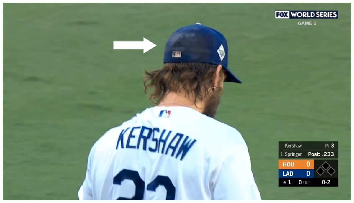
Screen shot by BSmile; click to enlarge
Dodgers pitcher Clayton Kershaw is apparently a superstitious fella. As you can see above, he was wearing an old, sweat- and rosin-stained cap for last night’s World Series opener. They presumably just slapped the Series logo patch on his preferred piece of headwear.
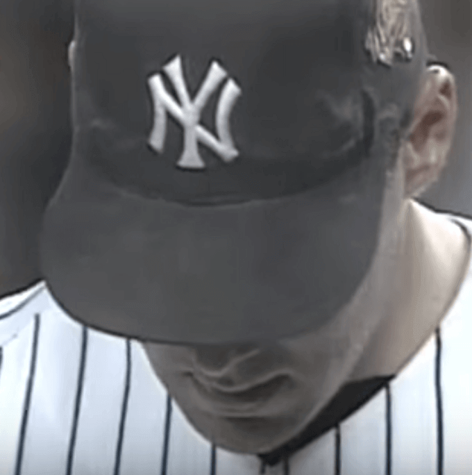
The same thing happened in 1996, which was the first year that a Series logo was added to the players’ caps. The Yankees’ closer that year was John Wetteland (Mariano Rivera was the setup man and didn’t ascend to the closer’s role until the following season), who had superstitiously worn the same cap all season long. So while everyone else got a new cap, Wetteland just wore the same one he’d been wearing, complete with sweat stains:
Incidentally, while I was looking for a good shot of Wetteland’s cap, I came across this shot of the Yankees celebrating after winning Game Five of the ’96 Series. Check out the pants and stirrups:
Man, that was a sad period, eh? The full-blown pajama era would soon follow.
Anyway, getting back to this year’s Fall Classic, last night’s opener was pretty uni-uneventful, but here are a few tidbits:
• The big, honking World Series sleeve patches looked brutal:
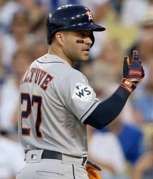
Also, as Alex noted in yesterday’s Ticker, it’s odd that the large sleeve patch has just “WS,” while the smaller cap patch has “World Series.” Seems like it should be the other way around. (By coincidence, the last time the Astros were in the World Series was in 2005, when the sleeve patches also featured the “WS” abbreviation.)
• As you can see in that last photo, a Getty photographer caught Dodgers third baseman Justin Turner with his tongue sticking out. Other Dodgers with their tongues on display last night included Kershaw and outfielder Yasiel Puig. Puig, of course, leads the league in tongue exposure. He even had an extended tongue shaved into his head and wore “Tongues Out” cleats.
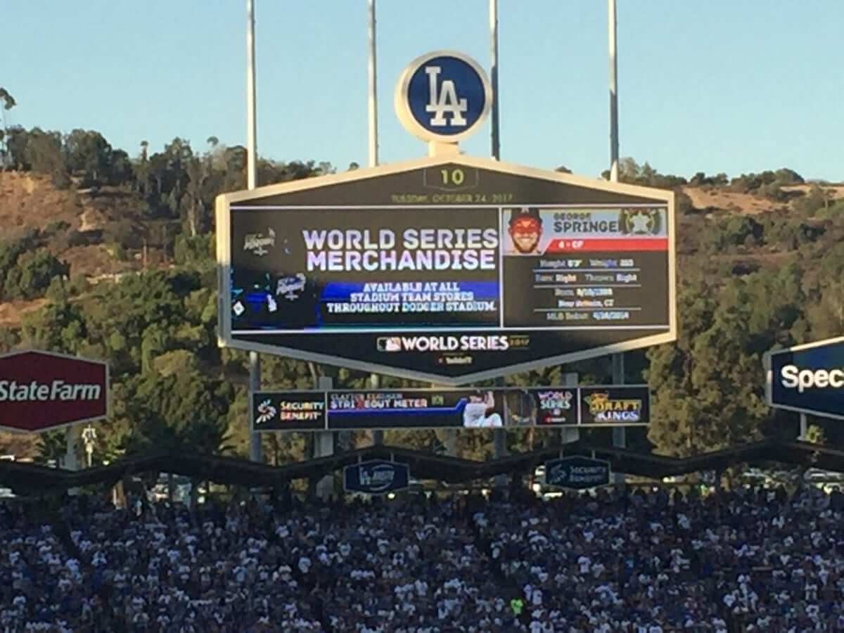
• As you might have heard, it was a wee bit balmy at the ballpark — officially 103º at gametime. The Dodger Stadium scoreboard, which usually shows the temperature, wasn’t equipped to show the third digit, so it just had “10” (click to enlarge):
• The Dodger Stadium grounds crew was wearing advertising patches:
Dodgers grounds crew has ad patches on caps & shirts @UniWatch @PhilHecken pic.twitter.com/Z8lklGujqM
— Tom Denne (@tomteavee) October 25, 2017
• Somewhat incredibly, the game was played in only two hours and 28 minutes, making it the fastest Series game since Game Four in 1992. (Here’s a log of all the Series games that took 2:30 or less, from the most recent to the most distant.)
Meanwhile, in case you missed it yesterday, here’s my annual Uni Watch World Series Preview, with 10 uni-related storylines to watch for as the Series unfolds.
(Big thanks to the always-awesome BSmile for the Kershaw screen shot, and thanks also to Steve Richards, @ptakers, @theTeej_13, and @BillShaikin for their contributions.)
Naming Wrongs update: I’m happy to announce that we have a bunch of new Naming Wrongs designs, for the following buildings:
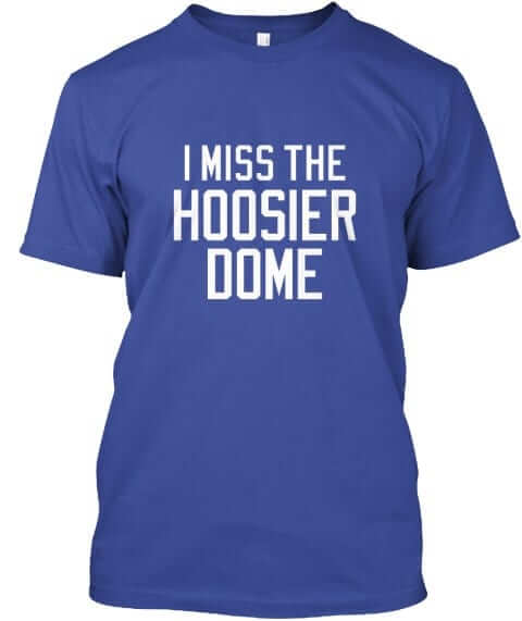
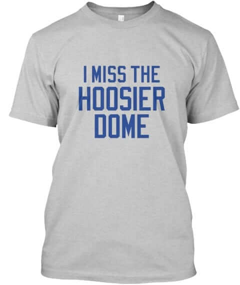
Hoosier Dome: Colts fans were asking for this one. It’s available in blue and grey (for all photos, you can click to enlarge):
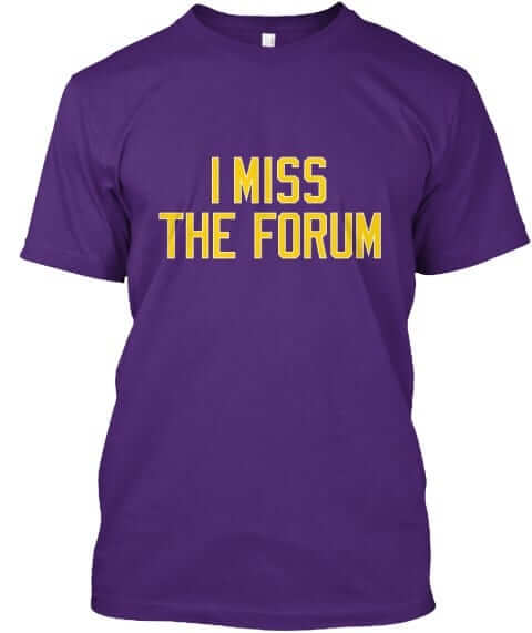
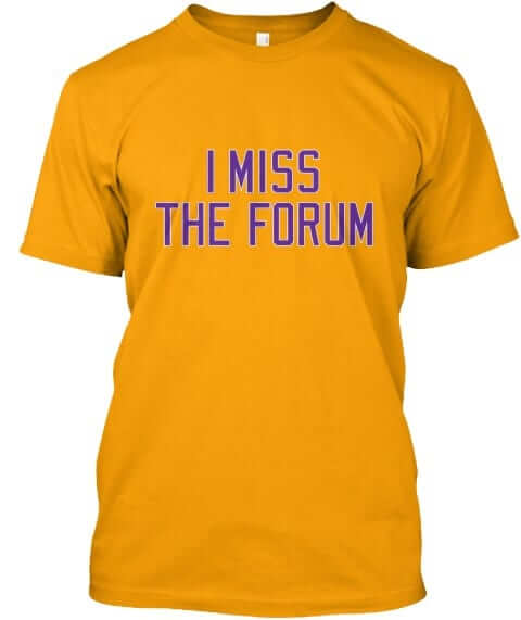
L.A. Forum: Now that the NBA season has started, we were getting lots of requests for this one. Works for the Kings as well as the Lakers. It’s available in purple and gold:
Salt Palace: Another one for NBA fans. This one’s available in green and purple:
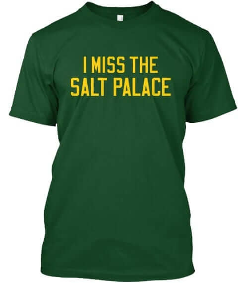
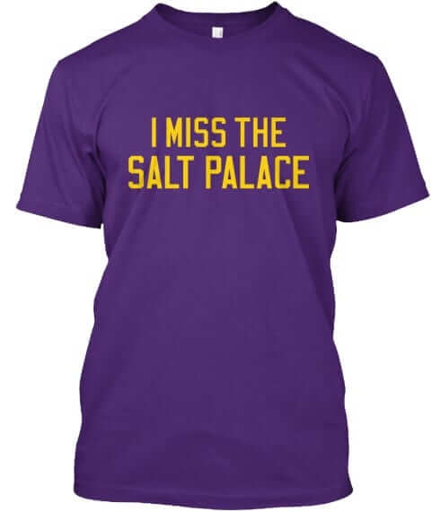
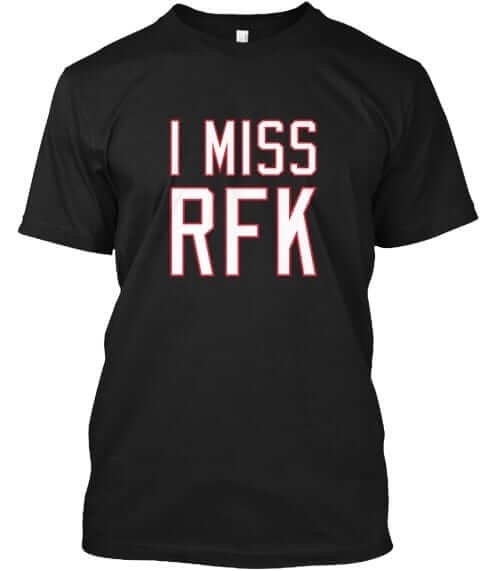
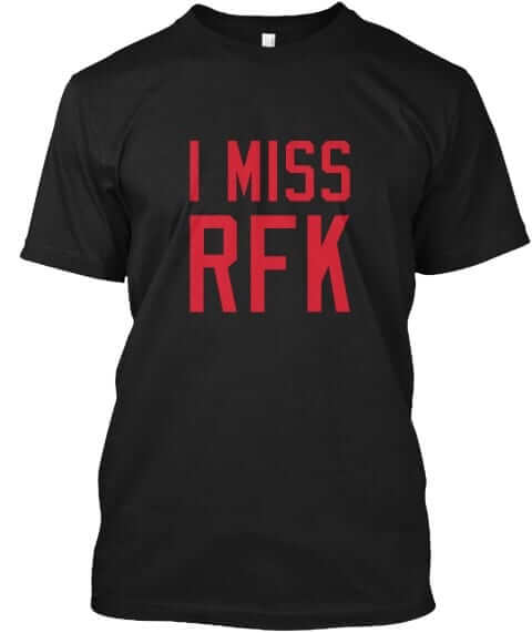
RFK redux: We had previously done RFK shirts in ’Skins colors. But now that the MLS season is over and DC United is moving from RFK to a new corporate-named stadium, lots of DCU fans were asking for their own RFK shirts. We’re doing them in red, black with white lettering, and black with red lettering:
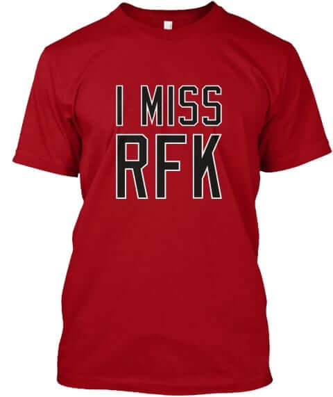
All of these designs are now available in the Naming Wrongs shop. They’re also cross-listed in the Uni Watch shop, where card-carrying members can get 15% off. (If you’re a member and need the discount code, send me a note and I’ll hook you up.) My thanks, as always, for your consideration.
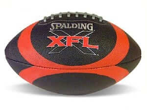
XFL contest reminder: In case you missed it on Saturday, Phil announced our latest jersey design contest, this time to reimagine a team from the XFL if the league were still operational today.
The deadline is Oct. 31. Full details here.
The Ticker
By Alex Hider

Baseball News: The Triple-A Charlotte Knights will honor the 20th anniversary of their affiliation with the White Sox next season by wearing unis inspired by the ’80s-era Sox (from Ty Ferrin). … Braves utility man Micah Johnson made a really cool Jackie Robinson mural out of colored baseballs (from Michael Rich).

NFL News: The Ravens will be going mono-purple on Thursday night (from Andrew Cosentino). … The NFL’s Instagram account apparently still thinks the Chargers play in San Diego (from Joey Rogers). … The Wall Street Journal has published a piece on the evolving off-field fashion of NFL players. … Saints OL Ryan Ramczyk is from Wisconsin and grew up a Packers fan. When the Saints played in Green Bay last weekend, Ramczyk’s father wore a Saints/Packers frankenjersey to the game (from Daron Jones). … This ESPN piece speculating about where Kirk Cousins will play next year features Photoshopped pics of Cousins in other teams’ uniforms (from Brian Spiess). … Here’s a treasure trove of 1970s NFL apparel (from David Cline). … Found at a flea market: these Jaguars wristbands with the old “phantom logo” (from @MEbelMath).
College Football News: Southern Mississippi will be wearing “blackout” helmets with a black eagle’s head decal this weekend. … Marshall will wear military appreciation helmets this Saturday (from Phil). … Boston College will once again wear bandana-pattern stripes in honor of Welles Crowther, a 9/11 victim who saved dozens of lives. More on that in this story from last season (from ACC Tracker). … Here are even more photos of the mono-gray uni Ohio State will wear on Saturday (from Phil). … Speaking of which, OSU players say they like the new grey design, although several of them say they prefer the 2015 BFBS set (from Jason Hillyer). … It’s easy to forget how much advertising we’re bombarded with at any given moment during a college football report (from Chris).

Hockey News: The Golden Knights will wear white at home on Friday (from @SJankowski11). … A Maple Leafs blog held a discussion about the best and worst unis in the NHL (from Phil). … A Predators fan painted his pumpkin like G Pekka Rinne — but painted him in the team’s old road jersey. … The Vintage Sports Images feed on Twitter is celebrating Halloween by running a daily series of creepy goalie mask photos, beginning with this early-’60s shot of Terry Sawchuk. … Sean Huffman’s niece had to decorate a pumpkin for school and put a Capitals goalie mask over the pumpkin.

Basketball News: The Magic will wear a memorial band this season for the team owner’s wife, Helen DeVos, who died last week. … The Celtics have been wearing a patch on their warmup tops honoring the 10th anniversary of their last NBA title (from Mike Sullivan). … Bulls rookie Lauri Markkanen asked former Bulls player Brian Scalabrine if it would be okay to wear Scalabrine’s No. 24 (from Mike Chamernik). … College of Charleston teased their new uniforms on Twitter yesterday (from Will Chitty). … New uniforms for Youngstown State (from Robert Hayes).

Soccer News: Lazio FC, a team in the top Italian soccer league, Serie A, will wear shirts bearing Anne Frank’s face before their match tomorrow in an attempt to fight anti-Semitism among supporters. … Michael Rich checks in with the following story: “I recently attended a Colorado Rapids (MLS) game. I noticed when the road team, FC Dallas, got a yellow card, it was up on the video boards as a ‘Toyota Yellow Card,’ of course adorned with Toyota logos. When the home team got a yellow card, it was simply a ‘Yellow Card.’ I’ve never seen an advertiser for something specific to only one team, but I guess Toyota don’t want their ‘good name’ associated with something going poorly for the home team.”

Grab Bag: The National Lacrosse League’s newest team will be the San Diego Seals … Speaking of lacrosse, new gloves for Penn State (from María Canales). … Police in Hamden, Connecticut are celebrating Pinkotber by painting their cruisers (from Josh Gleason). … The Sports Turf Managers Association is conducting a mowing patterns contest (from James Gilbert).
WS on the sleeve patch? Really? They couldn’t be bothered to use the proper logo spelling out WORLD SERIES? That is brutal.
Somebody really blew it. That “WS” looked hideous.
Agreed…but imagine the ideas that got rejected?
I think the pants look naked without a huge WS logo to remind me what I’m watching.
All of the post season logos are terrible. Light gold on white on white, impossible to read. Maybe they overcompensated with the WS logos, you know, in case you didn’t know what game you were watching.
Really, I haven’t been a fan of any of the World Series logos since they moved away from the script-over-diamond format of the 90s. And the current state of having new logos each year just isn’t the same as when the Super Bowl had all-new logos annually. None of them have really felt right.
One other tidbit: The Astros continued to wear their solid navy caps on the road with the gray jerseys. Houston ditched the navy/orange caps on the road after the ALDS Game 3 loss in Boston. And I wish the Astros would go back to them because their record with the solid navys on the road in the playoffs is now a less-than-sparkling 1-4 with four losses in a row.
I guess I hadn’t been able to watch any of the ALCS with the ‘Stros on the road because I only noticed this for the first time last night and wondered why it wasn’t mentioned on here. I’m a big, big fan of the solid-navy look in comparison. In fact, I think they should just switch the designation up: orange brim with home whites (wait until next season if you absolutely have to), solid navy with the road grays. You could even keep those home/road designations whenever wearing the orange jersey in either location.
I hadn’t thought of that, but I think you’re right. Still, I wish there was a place for the all-orange cap. The logo works better with the orange star on navy, but nothing says “Astros” to me more than an orange cap. Well, except for rainbow guts, obviously.
For this team, I actually like the idea of an orange cap with a navy brim at home.
Not uni-related part of the World Series – the between AB commercials were ridiculous. Apparently MLB’s efforts to speed up games means that the advertisers do not get enough commercials in, so now we need to see them between AB’s too.
Yeah, that was totally fucked. I was trying to remember if they’d done that last year or if it was new for 2017. Anyone..?
I want to say that they are new, but I do not remember for sure.
Some background on the 15 second ad.
link
There was a New York Times article back in August about Fox using 6 second commercials for the 2017 No Fans League season.
link
The concept is totally, totally horrible.
…but if that’s honestly what’s going to make the games end at a reasonable bedtime for us east-coasters, it’s an easy thing to ignore in my eyes. Obviously not a perfect scenario, but I really really did appreciate being in bed before 11.
The more I watch non sports programming via live streaming (no commercials), and watch more and more futbol (solid halves without commercial breaks), the more it seems like American televised sports are just an elaborate vehicle for televised ads. NFL games have reached the level of basically unwatchable.
Forgive me, Paul, but I would gladly submit to giant uniform ads if they were in lieu of, instead of in addition to, the endless mindless dumb television ads.
That Kirk Cousins’ feature leads me to wonder if the 49ers have issued #8 since Steve Young retired. Seeing Cousins in it just looked wrong to me.
And please excuse the apostrophe catastrophe.
Maybe it’s just because I’m a Washington sports fan, but … the Kirk Cousins picture that looked the MOST like a photoshop… was the one of him in his current uniform
is ESPN trying to tell me something?
This seems hard to believe, but according to pro-football-reference.com, Steve Young is the only 49ers player *ever* to wear No. 8:
link
It most certainly would not be given to Cousins as it’s retired:
link
FYI: The 70’s NFL garb item was included in Brinke’s Collector’s Corner on 10/17/17.
Cool link showing the 1970s football apparel.
The NFL Sport shoes look like bowling shoes.
Not the soles!!
That photo of Wetteland and Pettitte (that’s a lot of Ts) was likely after Game 5. The Yanks won the 1996 Series at home in pinstripes.
Ah, good call. Will adjust text.
Would it be more complicated to sew or heatpress a patch on a worn cap that’s full of sweat and grime and God knows what else? I honestly don’t know.
The San Diego Seals are really the NLL’s co-newest team. Another expansion team in Philadelphia starts play at the same time in 2018-19.
Philadelphia has not picked a name yet. They have whittled it down to 3 names and are holding a name the team contest. Fans can still vote for Fire, Founders or Wings.
I am hopeful it will be the rebirth of the Philadelphia Wings. There is history with that name.
link
Oh, it’ll be the Wings. Waaaaay too much history with the name — Doug Favell, John Tucker, Scott Gabrielsen, Hollywood Marachek, Jake Bergey, Gary Gait, and the immortal Dallas Eliuk.
Dallas Eliuk spent a lot of time in goal for the Wings in the winter NLL (1991-2005).
He is appreciated in lacrosse circles around here in Metro Vancouver for his summer lacrosse job during that time. Starting in 1986, he played 20 seasons in the Western Lacrosse Association (WLA) for the Richmond Outlaws, Burnaby Lakers and Coquitlam Adanacs.
A Canadian Lacrosse Hall of Famer based on the merits alone of his junior career and summer Senior A career in WLA.
link
Doug Favell was a friend of my family growing up in St. Catharines and until this very moment I had no idea he also played lacrosse.
Did the Jaguars ever actually consider using the full-body “phantom logo” on their helmets? I thought they would use a close-up profile (head and forelegs) until they were forced to change the design. But I liked the original design they introduced, teal tongue and all.
Are there any rules in the NHL that prohibit the use of older goalie mask models? Those old masks are creepy indeed; it would be great to see them again as throwbacks once in a while.
Sponsored yellow cards are stupid, especially when the visiting team yellow cards get branded, but not the home team. Road team derision is better left with the home team fans, if it’s necessary at all.
Sponsored yellow cards are stupid, especially when the visiting team yellow cards get branded, but not the home team.
Advertised, not sponsored. link
Re: older goalies masks. Love the old photos of them, especially in the late 1970s when there were some great paint jobs.
Nothing really specific that I can see in the rule book other than “protective masks of a design approved by the League must be worn by goalkeepers”.
The old masks are face-hugging so that a goalie can see through the eyeholes. Likely not “approved by the league” anymore for safety reasons if a goalie tried to get that passed. I suggest a goalie wears one in today’s NHL if the have a death wish.
At least we can see them still in alumni games:
link
Proofreading:
“while I was looking for good shot of Wetteland’s cap”
You thank @theTeej_13 twice. Maybe it’s deserved.
“team owner Helen DeVos” The Magic describe her as the “wife of owner Rich DeVos.”
Fixed.
The kicker to the yellow card advertisement story is that FC Dallas’s stadium is called Toyota Stadium.
More proofreading:
-“Pinktober” in the Grab Bag has two letters flipped.
-“Lazio FC” is really called S.S. Lazio, but that’s the Deadspin writer’s fault (seriously, they had “SS Lazio” in one of the article’s block quotes and used “Lazio FC” in the sentence right before it)
Kind of odd to see shirts that read, “I Miss The Hoosier Dome”…that place was the poster child for character-less, sterile astroturf-ed inflatable domes. Haven’t been to their current place but can’t help but think its a huge improvement.
Here, read this: link
I understand why you are offering them. I guess nostalgia is powerful enough that fans might miss a stadium that they probably didn’t really like when it was in use.
It still would be funny to see somebody wearing a shirt like that.
I’m not sure why you think it’s “funny” for someone to have a powerful emotional connection to a stadium, even a crummy one. You’re basically ridiculing someone’s fond memories. I sure hope every place *you’re* nostalgic about is a picture-perfect palace.
Again, I understand the power of nostalgia. I find it amusing because the Hoosier/RCA Dome is seldom if ever mentioned as a classic stadium or even a lovable “dump” like the Vet.
One can’t help what one finds funny, and certainly if I saw somebody wearing such a shirt I wouldn’t come up and ridicule them.
Like I said, if people have requested it, I don’t blame you for offering it.
One can’t help what one finds funny…
No, but one can avoid expressing every thought that comes into one’s head, such as thoughts that ridicule other people’s fond memories.
Having basically grown up with Shea Stadium as my second home, I fully understand how people can grow attached to certain stadiums/arenas, even if their replacements are objectively “better.” Maybe you don’t have that kind of personal experience, but you could at least try to have some empathy.
I think you’re blowing this a little out of proportion.
I doubt anybody was traumatized by my remark. If so, I apologize.
I never said anyone was “traumatized.” One difficulty I’ve found when debating with you, Dan, is that you put words in my mouth and move the goalposts. Please don’t do that. Thanks.
It would be interesting to know if there are any Colts fans here who really wish they were still playing in the Hoosier/RCA Dome.
I do myself have some experience with this – I have fond memories of watching the Hornets play in the Charlotte Coliseum, which was demolished after the new arena, originally called the Bobcats Arena (now Spectrum Center), was built. Doesn’t mean I really miss the place, however.
And even you would have to admit that a shirt that read, “I Still Call It the Bobcats Arena” would be kind of funny. I might actually buy that one.
Update: Already sold two of the Hoosier Dome shirts.
Glad to hear it. I’ve long thought “Naming Wrongs” was a cool idea and I hope you’re successful with it.
I get the feeling you thought I was making fun of you for offering the shirt, which was not the case.
Thanks, Dan.
Thanks also for weighing in on the CLT thing — good to have a local voice on that.
I’ll try this again since my last comment didn’t go thru or was deleted. Dan, you’re not crazy for thinking that. I can see how “I miss” could imply that one is saying the old stadium is better then the new one. “RIP” or something to that effect would better demonstrate nostalgia while also not sending the wrong message about the current stadium/arena.
Right, that’s all I was going for. To say “I miss” a stadium does imply that the individual wishes their team was still playing there.
This might be outside the scope of UniWatch, but it would be interesting to know how many longtime fans of teams really wish their teams were still playing in older arenas/stadiums versus the current ones.
Another example from my personal POV would be when the UNC Tar Heels moved from the intimate Carmichael Auditorium to the huge Dean E. Smith Center. Plenty of fans “missed” the experience of the old place but understood that a 10,018 seat arena was not sufficient given the popularity of UNC basketball.
So one could say that games were probably more fun at Carmichael but also understand the reality of the team needing to move on…
To say “I miss” a stadium does imply that the individual wishes their team was still playing there.
Not trying to be argumentative, but I disagree with this statement. You can be very happy with a current situation but still miss things about the earlier situation. I don’t think “I Miss” implies a hierarchy or a preference; it just means you’re wistful or nostalgic about something that’s no longer part of your life.
I bet you dont love shea as much as she loves the eiffel tower, Paul!
link
Neeko – Paul and I have corresponded offline about my comments in the past, so I do try to keep them in line with what he wants for his site.
I probably could have worded my initial comment a little better. I don’t blame him for being sensitive with regards to a business endeavor he’s involved it, I would be as well.
And, perhaps I should eat a little bit of humble pie and acknowledge that Paul is right that sports fans certainly can form attachments to stadiums that the public at large doesn’t consider “classic”. That was really all I was getting at – that the Hoosier Dome doesn’t come to mind as a place that is often missed. But obviously at least a few people do.
Gotchya – just saying, as a Brewer fan, if I wore a “I miss County Stadium ” shirt – I could see how people could come up & ask what’s wrong with Miller Park etc.. Definitely pros & cons to both places
The Triple-A Charlotte Knights will honor the 20th anniversary of their affiliation with the White Sox next season by wearing unis inspired by the ’80s-era Sox (from Ty Ferrin).
That Charlotte hat better not say “CLT”; suffice it to say, nobody’s going to pronounce it “cult”. That’s a five-alarm fuck up. Isn’t “CHA” the accepted abbreviation for the Queen City?
Mulva?
I live in Charlotte and “CLT” is the generally accepted abbreviation for the city.
I think it stems from CLT being the official code for Charlotte-Douglas International Airport.
Have never seen “CHA” being used.
I’ve seen CHA is in the score bug when the Hornets are playing. This is the first time I’ve seen CLT used in a sports context.
In the USL, America’s 2nd tier soccer league, the score bug/standings abbreviation has Charleston Battery as CHS and CLT for the Charlotte Independence.
That seems remarkable. I’ve never seen any abbreviation for Charlotte outside of Charlotte other than CHA.
Yeah, now that you mention it, I guess they do sometimes use CHA in the scoring bug.
I guess unlike for states, their exists no “offical” abbreviation for cities, beyond the airport code.
FWIW, CHA is the official code for Chattanooga’s airport.
IATA codes are often not indicative of the more common abbreviations, though, as in many cases the codes will have little to do with the name of the primary city/region served, or will incorporate more than just the city name.
I’m just saying as a lifelong resident of the city that CLT strikes me as the more common abbreviation.
Look at it this way, for example…the official twitter handle for the Hornets is @clt_hornets.
True, some people might think “clit” when they see it, but that’s no reason not to use it.
I pretty much giggled uncontrollably when I saw that Charlotte Knights hat.
On the bright side, at least Stan from South Park will know where to find it…
The *real* problem is that those are apparently not pull-over jerseys. :(
What are the odds they ignore the purpose of Color Rush yet again and put the Dolphins in mono-white rather than mono-orange. To be fair, that wouldn’t necessarily be a bad thing at all.
To be precise, the club’s official name is S.S. Lazio, not “Lazio FC.” And for those who find the “SS” part appropriate due to Lazio’s history, it stands for “Società Sportiva” (Sporting Society).
Maybe Clayton Kershaw just likes the feel of a broken-in hat better than a brand new one? Unless he specifically indicated he wears the hat because he thinks it is lucky, then why would you assume he’s superstitious? Am I missing something?
He has specifically indicated as such, Hal.
KERSHAW WILL REACH the makeshift dugout, the same spot in the middle of the bench where he will sit when the Dodgers are at bat. Then he will pull on a cap and the glove he has used for all his previous starts and step out onto the field.
link
Ahem….Forum NOT Great Western Forum. Great Western was a LA based savings and loan, best known back in the late 1970’s for having John Wayne as its spokesman.
See: link
For a John Wayne commercial: link
Brain cramp on my part (and a bad one). Fixed.
When new, I recall Chick Hearn calling it “The Fabulous Forum.”
Listening to Lakers Games growing up, Chick Hearn did call it the “Fabulous Forum” but that was something the folks in LA called it. Everyone else just called it “The Forum”.
The ticket stubs actually said Faubulous Forum.
Indeed they do!
link
As I was watching the WS last night I kept noticing that the Houston batting helmets would look even better if they had a 3-D logo. I feel like the sticker undersells the design of the logo.
Proofreading:
“while the smaller cap patch has ‘World Series.'”
Link goes to a Mets jersey
“Michael Rich checks in with following story:”
Missing a ‘the’ (and proofreading my own ticker submission!)
Fixed.
Hmmm, cap patch link still goes to a Mets jersey. Tried Firefox and Chrome.
link
Bizarre. I used a different fix this time — should be good. Here’s the new link:
link
Thank you Paul! Now there’s officially three sets of Naming Wrongs t-shirts based on MY team’s old buildings (Shea, Forum, Boston Garden). Awesome job.
If Notre Dame Stadium is EVER re-named..Jesus will climb off the library…
Oh wait, and Texas Stadium too! FOUR NAMING WRONGS!
Well then, I hope we’ll have you as a customer!
Do I have this right then? You are a fan of the Mets, Lakers, Bruins, and Cowboys?? Interesting combination, all over the map.
That is an interesting combo…I’ve got a pretty weird one as well – I’m Seahawks, Flames, SF Giants, Celtics
SF Giants, LA Rams!, NY Rangers, Knicks and Texas Longhorns. Well, at least two are from my hometown.
I need to get one of the ‘I Miss RFK’ shirts because I miss RFK…and I’m not talking about the stadium.
Yeah, that design cuts both ways, for sure.
“Has anybody here seen my old friend Bobby? Can you tell me where he’s gone?”
I’m thinking about getting that shirt for the same reason, possibly also for an uncle who was active in Bobby’s ’68 campaign.
As for the stadium, I enjoyed plenty of games in multiple sports at RFK. But I don’t miss the place one bit. Getting to watch soccer, baseball, concerts, festivals, and the like was a joy. Having to watch them at RFK was a pain.
What, no silver and black for the Kings? Sure, they wore purple and gold at the Forum for over 20 seasons, but still…
… maybe one in white in the style of the link?
Purple/gold does double duty for Lakers and Kings, at least for now. Hard to get proper silver ink to evoke the later era.
Out of curiosity, what’s the most popular Naming Wrong?
Just interested in seeing which fanbase has the most palpable nostalgia for the pre-corporate era.
Not sure (for reasons not worth explaining here, Teespring’s analytics system makes it annoying difficult to track lifetime sales). If I had to guess, I’d say Mile High.
Seems about right. Mile High had that combination of being a great atmosphere that also witnessed great sports moments.
I want to once more submit my request for an “I’m Calling it the Dome” shirt for the Georgia Dome.
I have a question regarding the Qalo rings on Kirk Cousins hand in the ESPN article you posted in the football section. Do you think the rings were left untouched by the photo shoppers or do you think the colors were changed as well? It looks like they all match the uniform so I wonder if they actually tinkered with them. Have a great day everybody
“Micah Johnson made a really cool Jackie Robinson mural out of colored baseballs ”
Not to be a noodge (sp?), but he really made a wall of baseballs then painted a mural ON the balls.
I was expecting to see something more along these lines (these are not baseballs, however and it is TS)
link
Still a good looking art piece, Micah.
Paul is right that those “WS” patches are terrible.
But they remind me a little of the font used for those oval stickers that you see on cars that were originally in other countries.
Example:
link
I also want to pitch a uni watch t-shirt idea~ in the same style as the unintended thread artwork PL purchased… a shirt that displays/diagrams different uni names w/ pictures (Northwestern stripes, UCLA stripes etc…) I’m still brainstorming
Ooh, that would be good. Basically a visual glossary. It could include:
– Northwestern stripes
– UCLA stripes
– Vertical arching
– Radial arching
– Breathing Ethier
– Nose bumper
– Pupello Pocket
– Squatchee
And a lot more.
Not UW glossary specific, but I’d want to see such a thing illustrate the correct stripe proportions and sequence for Tequila Sunrise.
As for the idea in general, I’d find a place on my office wall for it if it were available as a poster.
Two Naming Wrongs I doubt we will be seeing any time soon:
I still call it Livestrong Sporting Park
I still call it Paige Sports Arena
Enron Field, anyone?
Enron + Minute Maid = Two Wrongs Don’t Make a Right
Maybe we could try this:
I Still Call It Union Station
I had a couple thoughts regarding game time last night while they’re were blowing through game 1:
– It’s just a teensy bit annoying that very few people seem to want to acknowledge the elephant in the room with regard to game duration: commercial breaks. I know I’ve heard it brought up within the past few months, but it’s almost as though someone at MLB’s corporate office just had this epiphany: ‘if we cut a minute off every commercial break, that’s close to 20 minutes right there!’ I know everyone involved makes more $$$ by having more commercials, but I refused to take any of their other pace-of-play initiatives seriously until they considered commercial length.
So, of course, they want to now cram more in between ABs. I’d almost prefer they took a sort of “this next inning brought to you by _______” approach, maybe put the advertiser’s logo next to the scoreboard graphic. I’m pretty sure that’s one method used in soccer matches, and having that logo incorporated on the periphery isn’t all that distracting.
– Speaking of soccer, I wonder whether they’ve taken a look at limiting # of substitutions per game? It wasn’t really much of an issue last night, but there’s always games (particularly in the postseason when the stakes are much higher) where each team uses 4, 5, or even 6 pitchers. So maybe limit the # of pitching changes per 9 inning game to 2. Starter’s getting shelled in the 2nd inning? As a manager, it’s your prerogative whether you use a change then and hope your 2 relievers can last the rest of the game, or tell your starter to suck it up.
I don’t like the idea of limiting substitutions, but were something like that to be adopted, I expect we’d see teams doing things like sticking a reliever in left field to get around it, since players swapping positions on the diamond is not a substitution.
Football is where I want to see limited substitutions.
I just realized another idea – for the Detroit Tigers:
I Miss The Corner
That’s actually on our list. Saving it until next spring.
As a Colts fan who saw many games in “the Dome” (as we really called it in Indy) I can say I like the shirt aesthetically, but I in no way “miss” the Hoosier/RCA Dome. I don’t miss ears popping and being sucked in when you entered, or the stiff wind blowing you on your way out. Nor do I miss the upper deck BLEACHER SEATS!!! Plus, hey, let’s design a dome that (for all intensive purposes) is a twin to the Metro-dome **BUT** Let’s design it with a fixed interior seating arrangement so you CAN’T play baseball in it. Yeah, no baseball in Lucas Oil either, but it was built after Victory Field, so no harm there. Lucas Oil is light years better than “the Dome”… and I don’t miss it.
No problem. Then this shirt isn’t for you.
But other people asked for it, so we made it for them. And they’re already buying it.
Now I DO miss Market Square Arena. So many cool memories in that place, which by today’s standards was a dump, but between the Pacers, (all the different Hockey teams) all the Concerts, Pro Wrestling and even Monster Truck stuff I saw there as a kid I’ve romanticized it even more. I mean, Gretzky scored his first ever professional goal in that building, Elvis had his last concert there. Motley Crue recorded a music video there, Andre the Giant defeated Hulk Hogan for the WWF title there on National TV (I was there for that) Jordan made his NBA return there, they held the Fianl Four there in 1980, the Pan Am Games, all kinds of stuff went on there. It dominated the east side of downtown for decades. Yeah, I miss Market Square Arena. If you ever do that one Paul, make it the older, brighter blue and yellow from the Pacers era there.
It’s on our list.
Serious question: Would you want it to say “I Miss Market Square” or “I Miss Market Square Arena”?
Personally, I say with “arena”… but either would be cool. Which ever flows better aesthetically on a t-shirt would probably be the winner. But as a native of Indy, I always said “arena” when referring to it.
Thanks for the input, Randy — appreciated.
Speaking of MSA, how gorgeous is this?
link
WAY COOL!
“I Miss Met Center” is the Naming Wrong I would buy. It would have to be in kelly green with yellow/gold lettering. I think you would sell a few in Minnesota.
Paul the NFL has the same logo pretty much every year with the SB dating back to SB 45. The NBA does the same with The Finals logo. The NHL does the same with The Stanley Cup Final. Why can’t MLB create one logo for The World Series and stick with it! I say have Phil run a contest for a permanent WS logo!
Unrelated to today’s lede and ticker, but I just came across it in my marketing textbook:
Other organizations and structures, such as buildings and bridges, may seek sponsorships as a means of generating revenue. Imagine how many people drive across the Brooklyn Bridge in New York or the Golden Gate Bridge in San Francisco and how much awareness an organization would get if they were allowed to pay to have their name on either of the bridges.
Imagine, indeed. *shudder*