Every Sunday, Brinke Guthrie sends me his weekly “Collector’s Corner” column, and each Monday morning I edit it. I enjoy seeing all of the vintage items he turns up, but every now and then he includes something that merits further investigation.
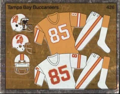
That was the case last week, when his column included an eBay listing for a 1980s collectible sticker showing mock-ups of the Tampa Bay Bucs’ creamsicle uniforms (shown at right). Not only that, but I recognized the style of the mock-ups — they were taken directly from the NFL Style Guide. (Here’s an old Uni Watch entry showing a 1980s NFL Style Guide for comparison.)
Trading cards — okay, trading stickers — based on uniforms? That seemed like major news! How had I not known about this? I wanted to learn more, so I removed that item from Brinke’s column and began a trip down a very interesting rabbit hole.
I should begin by saying I purchased that Bucs creamsicle uni sticker on eBay, along with similar stickers for the Bears and 49ers. I also found similar stickers for MLB (I purchased an Expos sticker) and the NHL (I purchased a North Stars sticker). Here are the five stickers I acquired, with a coin included to show scale (click to enlarge):
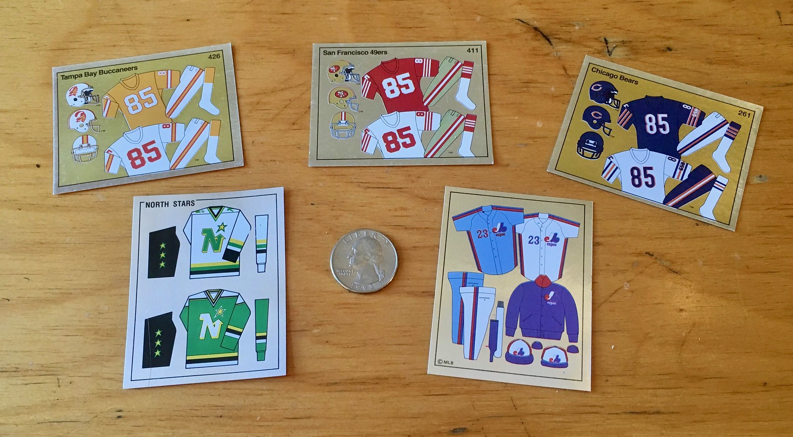
As you can see, the stickers are small — 2-1/8″ by 3-3/4″ — but they show a decent level of detail for each team’s uniform set. What’s the story behind these things? After a bit of research and reporting, here’s what I’ve learned:
1. The stickers were manufactured by an Italian company called Panini. I’d never heard of Panini before, but Wikipedia says they’ve been around since 1961, and they’re apparently a big deal in the sticker biz (which I know nothing about). They continue to make sports stickers today.
2. The NFL uniform stickers were part of Panini’s 1988 NFL set, which primarily featured player photos but also included one sticker for each team’s uniform set, another for each team’s helmet, and yet another for each team’s wordmark. These three stickers — and only these three — had a foil background. (Here’s a blog post that shows all three of those stickers for the Browns.) The full NFL set, which numbered 433 stickers, could be assembled in an album — which, like the stickers, is available on eBay.
Additional info on the 1988 Panini NFL stickers comes from the Beckett Price Guide, the most authoritative source in the trading card world:
This set of 433 different stickers (457 different subjects including half stickers) was issued in 1988 by Panini. Panini had been producing stickers under Topps license but, beginning with this set, Panini established its own trade name in this country separate from Topps.
The stickers measure approximately 2 1/8″ by 2 3/4″, are numbered on both the front and the back, and are in alphabetical order by team. The album for the set is easily obtainable. It is organized in team order like the sticker numbering. On the inside back cover of the sticker album the company offered (via direct mail-order) up to 30 different stickers of your choice for either ten cents each (only in Canada) or in trade one-for-one for your unwanted extra stickers (only in the United States) plus $1.00 for postage and handling; this is one reason why the values of the most popular players in these sticker sets are somewhat depressed compared to traditional card set prices.
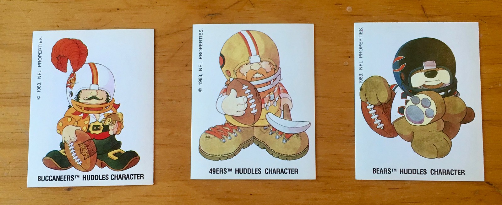
Each sticker pack included one foil sticker. Team name foils were produced in pairs; the other member of the pair is listed parenthetically. The team name foils contain a referee signal on the sticker back, the helmet foils have the team’s stadium on the back, and the uniform foils include a team “Huddles” cartoon card on the back [click to enlarge].
3. That same year, Panini also produced an MLB sticker set that included uniform mock-ups for each team, like the Expos sticker that I purchased. The artwork came straight from the MLB Style Guide. (Here’s a Uni Watch entry that shows an early-1980s MLB Style Guide for comparison.) The MLB stickers had a sales pitch for World Series and All-Star Game baseball on the back. Once again, the stickers were meant to be put in an album, and the album is readily available. Unsurprisingly, the mighty Fleer Sticker project has written about this.
4. Panini also produced a 1988-89 NHL sticker set, and that too included a uniform sticker for each team, like the North Stars sticker that I purchased. I’ve never seen an NHL Style Guide from that period, so I can’t say for certain if that’s where the graphics came from, but I’d say it’s a pretty strong bet. The back of the NHL stickers had instructions on how to get more stickers — in English and French! Once again, these stickers were meant to be placed in an album.
5. Panini also did a 1988-89 NBA sticker set, which of course included uniform stickers. I did not find any individual NBA uniform stickers available for purchase, but here’s the entire set (click to enlarge):
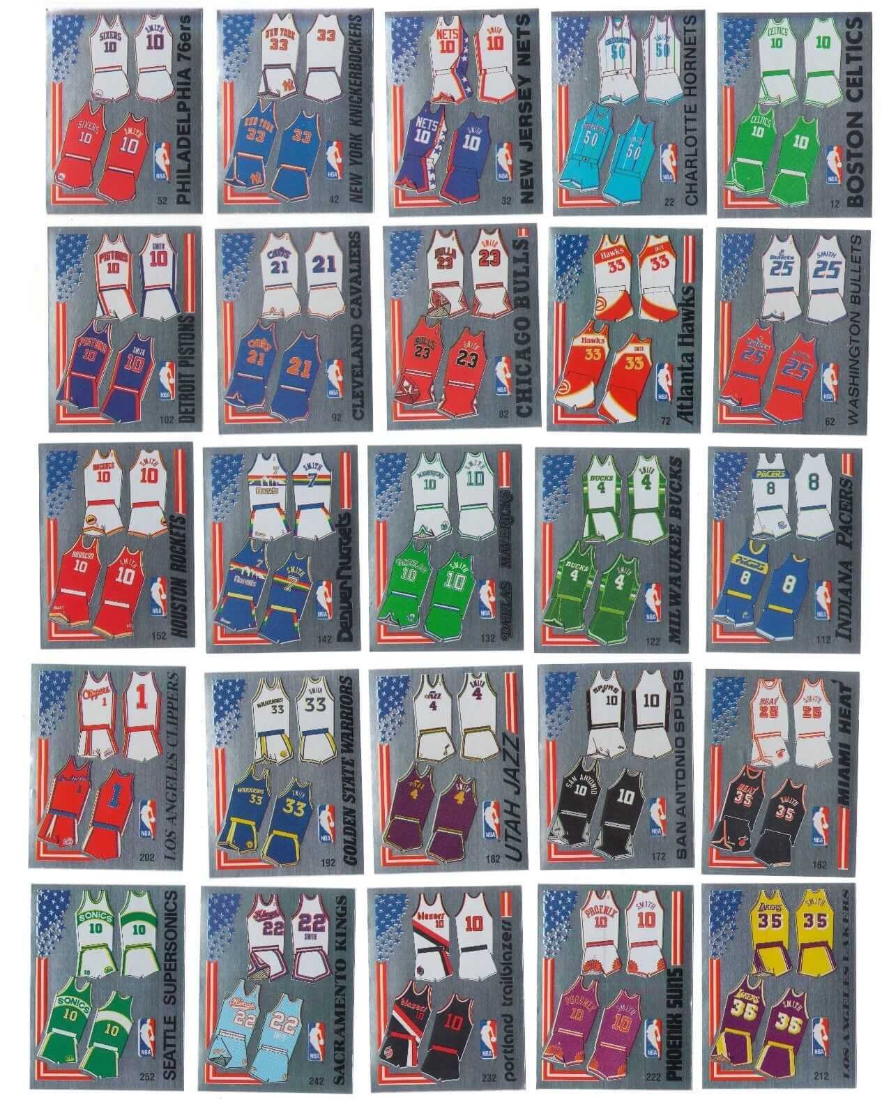
I’ve never seen an NBA Style Guide from that period, so, again, I can’t be sure if the guide was the source of the graphics, but I strongly suspect that it was.
6. Based on my admittedly preliminary research, it appears that 1988 was the only year that Panini included uniform designs in its sticker sets.
7. You can see more of the stickers by simple Googling.
8. If you want to purchase some of the NFL, MLB, and NHL uniform stickers, they’re inexpensive, typically ranging between $1 and $3 apiece. You can find a bunch of them by going to eBay and searching on “Panini uniform sticker.”
9. Burbank Sportscards, one of the big retailers in the card biz, has mistakenly eBay-listed a bunch of the NFL uniform stickers as “1983 Huddles stickers.” This is because the back of the NFL uni stickers shows each team’s Huddles character with a 1983 copyright date. So if you go to eBay and search on “Huddles sticker uniform,” you’ll see all of Burbank Sportscards’ listings for the NFL uni stickers. Free shipping, too. (I spoke with Burbank Sportscards owner Rob Veres as part of my research for this piece. Very nice guy. Said he had no idea when or how they acquired the uni stickers and knew nothing about them. “We’ve got over 40 million cards here, and frankly I’ve never ever seen these before,” he said.)
10. I have not seen any eBay listings for individual NBA uniform stickers, but the entire set of team logo and uniform stickers is available here.
That’s about it. I love the idea that someone was making uniform trading cards (or stickers, whatever). Why didn’t Topps ever do this? If they did, I might still be collecting baseball cards today, just to get the uni cards!
If anyone knows more, feel free to enlighten us in the comments.
(Big thanks to Brinke Guthrie for discovering the tip of this iceberg, and also to Rob Veres of Burbank Sportscards, Brian Fleischer of Beckett, and Jon Helfenstein of the Fleer Sticker Project for their research assistance.)
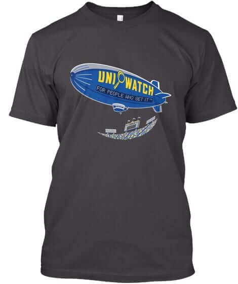
T-shirt reminders: In case you missed it last week, our latest limited-edition shirt from the Uni Watch Artist’s Series is by the great Sean Kane (shown at right; click to enlarge). It’s available here through next Monday, Oct. 9. Additional info here.
We also have a bunch of new Naming Wrongs designs. Check those out here.
The Ticker
By Alex Hider

Baseball News: One Twins player had his jersey almost completely unbuttoned during last night’s American League Wild Card game (from Jack Gioffre). … In that same game, Yankees P David Robertson’s Postseason cap patch was peeling off. … Speaking of the Postseason cap patch, here’s what it looks like on a Cubs cap (from @Lincolning). … Eight teams had three players wear the same jersey number throughout the 2017 season, but none could top the Yankees, who had seven different players wear No. 30 this season. Also, 11 individual players wore three different numbers this season (from MLB Jersey Numbers). … Cool project by Trevor Milless, who recorded the Mariners cap he wore for every game of the 2017 season and then turned it into a video. … These are the top-selling player jerseys in the MLB this season (from Andrew Cosentino). … Good piece on a sports merchandising company that makes the rally towels that teams provide to fans in the playoffs (from Mike Chamernik). … As if we needed another excuse to imagine the Padres in brown, here’s a mockup of a potential Padres road uni (from Jeff Walton). … An increasing number of MLB players are wearing NBA socks (from Phil).

NFL News: The Patriots will wear all-white, including a new set of white pants, for Color Rash this Thursday. … The Rams will be wearing their gorgeous throwback unis this weekend (from Phil). … The Bengals will wear their orange alts on Sunday (from Phil). … RB Randall Cobb and WR Davante Adams forgot to wear white-bottom socks for the Packers’ team photo yesterday (from Duncan Platts and Brett). … Speaking of the Packers, this is a good oral history about how the team ultimately ended up in Lambeau Field (from Mike Chamernik). … Here’s another example of an ad featuring team uniforms that don’t include the NFL logo, this time with the Packers in an ad for a local bank (from Brian Anderson). … Erving spotted this awesome Bears bicycle in the suburbs of Chicago.
College Football News: UNLV will add a red ribbon decal to its helmets honor the victims of Sunday night’s concert shooting. The opposing team, San Diego State, will also wear the ribbon decal (from Phil and @CouvillierMax). … Nebraska will wear their 1997 throwbacks (featuring faux-mesh numbers) this weekend against Wisconsin (from Phil). … NC State will go BFBS against Louisville on Saturday (from ACC Tracker). … If this mannequin is any indication, Iowa State will be going white/white/red this weekend (from Zach Sills). … Coastal Carolina will be going mono-teal this Saturday (from @Westside Firefly). … Louisville’s practice uniforms have some drop shadow inconsistencies (from Eric Wright). … Whoever is counterfeiting tickets to Saturday’s Michigan/Michigan State game isn’t doing a very good job. … The ACC Tracker has been updated for week five. … Following up on yesterday’s lede on the use of merit decals prior to 1968: Notre Dame used stenciled stars (not quite the same as decals but the same basic concept) in 1964 (from Dan Cichalski).

Hockey News: The Senators will wear a memorial decal on their helmets in honor of former GM and coach Bryan Murray, who recently passed away (from Josh Ghouls). … The Preds retired No. 7 for “The Seventh Man” years ago, but they’ve just replaced the banner with a new one that includes the names of season ticket holders. In addition, here’s a first look at the team’s 2017 Western Conference Championship banner, which will be raised on Thursday (from Lee Wilds). … The Vancouver Giants will wear jerseys inspired by Don Cherry’s suits on Saturday night (from Phil). … Here’s a video on the making of the Penguins’ Stanley Cup rings. The ring design features a “5” in place of the penguin’s eye, to mark the team’s five championships (from Jerry Wolper).

NBA News: The league announced Tuesday that it was changing up the All-Star Game format and going to a playground-style draft. That means we probably won’t see “East” and “West” on the jerseys this year. No indication yet on what the uniforms will be. … Taj Gibson of the Timberwolves will become the first player in NBA history to wear No. 67 when he takes the court this season (from Mike Chamernik). … According to this thread, the Bucks are having a hell of a time differentiating between 2s and 5s (from Nicholas). … We got a sneak peak of the T-Wolves’s new court yesterday (from @JunkWaxTwins). … SB Nation is celebrating jersey week, and yesterday they broke down the sublimated, teal-shaded, ornately-trimmed jerseys of the ’90s (also from Mike Chamernik). … Someone mocked up some NBA concept jerseys for Italian soccer teams (from Kyle K.). … ICYMI from the baseball section: More and more MLB players are wearing NBA socks (from Phil). … A Fox Sports ad poking fun at the Knicks lasted one day before fan outrage prompted its removal.

College Hoops News: Xavier’s “new” throwback jerseys look an awful lot like last year’s throwback jerseys. … Louisville’s student paper got creative with the Adidas logo in one of their recent stories about Rick Pitino.

Soccer News: ICYMI from the NBA section: Someone mocked up a bunch of Serie A basketball jersey concepts (from Kyle K.). … New uniforms for the Baltimore Blast of the Major Arena Soccer League (from Jim Vilk). … This is wild: One of the Russian stadiums slated to host games during the 2018 World Cup wasn’t large enough, so a giant section of stands was added outside the stadium. It appears they also removed one of the walls from the stadium so fans will have a full view of the pitch. … Ed Zelaski sends along this history of the modern soccer boot.

Grab Bag: Here’s what Team Canada will be wearing during the Opening Ceremonies of the 2018 Winter Olympics (from Ted Arnold). … Georgia Tech is close to choosing a consistent shade of gold that it will use across all its teams (from Michael Rich). … Jimmie Johnson and Dale Earnhardt, Jr. had an autograph mishap yesterday (from David Firestone). … The iWireless Center in Moline, Illinois will now be known as the TaxSlayer Center (from Mike Chamernik). … A trucking company is using a version of Wisconsin’s Bucky the Badger logo on the mudflaps of its trucks (from Ted Chastain). … Here’s an interesting piece that looks at the uniforms and other attire worn by workers at New York City’s Fulton Fish Market (from Tommy). … Here’s an in-depth piece about a killer whale hat made by the Tlingit tribe of the Pacific Northwest, and the controversy surrounding a replica of the same hat (from Adam Herbst).
Click to enlarge

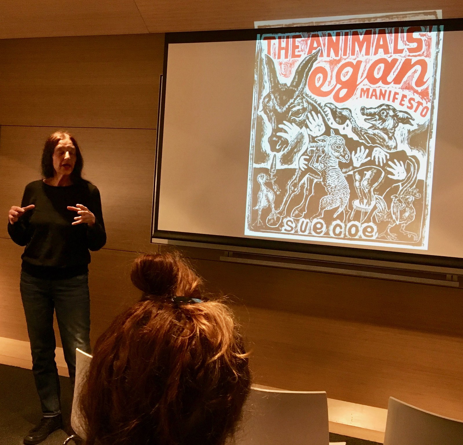
What Paul did last night: I’ve been a huge fan of the radical British illustrator Sue Coe for about 25 years now. The funny thing about that is that Coe, who grew up next to a slaughterhouse, has devoted much of her career to promoting vegan revolution, while I’m a major carnivore. Despite the seeming contradiction, I love her stuff, which is full of dark, shadowy, nightmare indictments of the meat industry and capitalism in general. It’s super-powerful and super-disturbing, and I mean that in the best way. (If you’re not familiar with her stuff, you can see some of it here, here, and here.)
I’d never seen Coe in person until last night, when she gave a presentation at the Parsons School of Design to promote her latest book, The Animals’ Vegan Manifesto, which is basically a retelling of George Orwell’s Animal Farm but with a happy ending. She was smart, poignant, angry, sad, hilarious. At the end, I bought a copy of the book and got her to sign it. Afterward, I went with the Tugboat Captain and our friend Nate to a nearby Spanish bar, where the complimentary meatballs were a guiltier-than-usual pleasure.
These ‘Huddles’ characters – did they only exist on these cards, or were they a thing? As a baby, there’s a photo of me with a Bengals stuffed animal that looks a lot like these.
I also had the most racist stuffed animal ever, because the Redskins one I had was the damn logo come to life.
They were a thing!
link
They were a thing. If I’m reading Dumb Guy’s URL right, there were plush toys, and there were also costumed mascots at the stadiums.
Yep. Sticker, notebooks, ornaments, mascots, plush, coloring books, shirts…. the works.
I assembled the entire plush Huddles collection over the years. Have them in my basement.
Still have my Bears plush one… Never knew what they were called or where it came from.
Huddles! I haven’t thought about those in ages! I actually had at least two of them when I was younger… The Dolphins and the Broncos. They were pretty neat.
Looks like the artist who created them was a student who did so on a very crappy contract.
link
So color rush can’t be blue vs red either? I get the color blind cases but Navy and “Buccaneer Red” don’t seem to fall into that category, unless I’m missing something.
This is the thing that I can’t figure out, either. The only justification for Color Rush for me was the color v. color aspect of it. There are plenty of all white v. monochrome color games in the NFL every week, so at best, the money grab to sell additional jersey becomes transparent, at worst, the league doesn’t even get to grab money because some teams are just switching out pants and wearing already existing jerseys.
Regarding the NC State going BFBS picture. It actually looks like that is a Louisville uniform (wings on shoulders and the chest says Louisville) but the player has on NC State wrist bands.
It’s NC State’s uniform, the Louisville name is just part of the graphic. Here’s a better view
link
Also, the game is on Thursday, not Saturday.
“Twins player had his jersey almost completely unbuttoned.”
Sexy!
Yankee Stadium 1984, last game of regular season vs. the Detroit Tigers. Juan Berenguer, wearing warm-up jacket, was talking Spanish to a guy standing next to me along 3rd base line. All of a sudden, Berenguer unsnaps his jacket to reveal a completely bare chest, smiles, rubs his fat hairy belly, then buttons it back up. Cameras what they were, I couldn’t focus and advance film fast enough. Moment gone, but never forgotten.
Great story! An old Happy Days episode had a scene where the boys were playing for the High School basketball team. At one point Ralph mouth is on the bench wearing his warmups. Something happens in the game and coach yells “Mouth, off the bench get in the game” Ralph leaps off the bench, unzips his warmup to reveal him fully clothed in his street clothes. He obviously just put his warmups over his regular clothes. Ralph looks at coach and sadly says “I never play”…. not sure why but 40 years later the absurdity of that scene still make me laugh.
It’s actually Ralph Malph.
Proofreading:
“the first player in NBA history wear No. 67”
“the Knicks last one day before fan outrage” lasted
“I’ve been a huge fan of a radical British illustrator Sue Coe for about 25 years now.”
“is that a Coe”
Fixed.
Interesting item about the Ekaterinburg Arena in Russia with the temporary stadium expansion.
When I saw this, reminded me of the most massive stadium expansion done for a Grey Cup, the 1995 CFL championship game in Regina, SK.
Regular seating capacity of Taylor Field at that time was just over 27,000. He is a photo with the stands how they would have been regularly configured in 1995 (though photo is from a bit later):
link
The stadium capacity was almost doubled to over 55,000. With temporary scaffold seats also set up outside the walls of the stadium:
link
FYI, the Twins player with the unbuttoned jersey is Chris Giminez. It’s become kind of his calling card this year (as seen in this pic, for example: link), although I don’t think I’ve ever seen him take it to the level he did last night.
Good looking NBA uniforms back in 88-89. Back in the good old days when the stripes went all the way around the edges of the armholes.
Not my all-time favorite year but pretty close. Not a bad uni in the bunch!
Man, I wish the Clippers’ numbers were actually that big then…
Panini stickers were HUGE here in the UK! Throughout the late 70’s and 80’s collecting football (soccer) stickers was a rite of passage. Albums/collections were issued for every season and special collections issued for major tournaments such as World Cups and European Championships. Schoolkids regularly collected them and school playgrounds became trading floors for the numerous swaps/doubles you ended up with. Foils/Glossies/Shinies were highly sought after and not guaranteed in every pack. These panini stickers still hold a place in many 40 somethings heart…
More info can be found here: link
and in this book:
link
The author of the above book has mentioned recently that a TV documentary will soon be released on the culture of sticker collecting
Good stuff. Thanks for passing it along.
I have the FIFA ’02 game for Playstation 1, and you can earn virtual Panini stickers by winning different tournaments. Back when I got the game I had no idea Panini was a thing (other than a sandwich).
Thinking about it now nearly all the sticker albums I collected had a kit sticker which was one of the two “shinys” prized-beyond all else I remember having the 94 premier league album and sealing the Arsenal Kit and the Leeds United Crest for the premier league logo which was sticker 1
Yeah, huge in that time.
Every year I ended up with a half complete book and a pile of the same player – that no-one else needed.
When they released the NBA one I went into the local newsagent and bought the book and enough stickers to complete it in one afternoon. Adult buying power!
The rest of the world can just stop competing for best-dressed honors in the Winter Olympics opening ceremony. Canada always wins.
I notice the Packers are seated for the team photo in numerical order–something they have been doing for many years (since the 80’s?). How many other teams do it that way, and for how long have they been doing so?
Sounds like a research project to me!
Here is the 1970 SF 49ers, in numerical order.
link
Without giving it too much thought, I had always assumed it was (usually) done this way.
Lee
’68 Packers mishmash.
link
When I was a boy, McDonald’s would partner with the Cowboys and issue team posters. I don’t know if they were free or came with Happy Meals or what. But they were always in numerical order. I had a 1979,1981 and an ’83. I can still tell you the order, names and numbers of the’81 poster.
I collected Panini hockey stickers as a kid. I remember getting the 92-93 set, but it didn’t have any uniform stickers.
They also make cards now, pretty sure they have the exclusive license for the NFL.
Does anyone else find it interesting that both the NFL and NBA moved away from their traditional conference vs conference format for the All Star / Pro Bowl game only a short time after Nike took over each league’s uniform manufacturing contract?
The NHL also did for a while and Nike was not involved.
True but the NHL also has a history of tinkering with it’s All Star game format over the years whereas the Pro Bowl and NBA All Star games were exclusively conference vs conference for decades. To be clear, I’m not saying Nike had anything to do with the change, it’s just a weird coincidence.
Those San Diego Padres uniforms are fabulous! Holee Cow!
Just the right touch of brown (it really can’t be a base color for baseball uniforms, just doesn’t look good). Paired with a heather pattern like UnderArmour has developed, you’ve got a winner.
…. which is precisely why the Padres’ ownership won’t do it.
Yes, I’d take that Padres uniform in a second. I still rank their original 1969 design as one of my all-time favorites.
Collectable stickers and the accompanying albums have always been popular in the UK – I probably had 2 dozen during my childhood. Panini started putting out NBA albums around 1990, and I collected them until 1996.
I loved them, they appealed to my obsessive nature and they were a lot cheaper than Fleer or Upper Deck cards. In fact, I still have a stack of foil Hornets logo stickers somewhere at my parents’ house.
I still have my Panini MLB book circa-late 80s; need to dig it out of moving box museum in my garage.
In that Packers group photo, #18 Randall Cobb is wearing a very different jersey cut as well – check out the collar!
Been like that for years. Packers still use old Reebok fabric and tailoring, which includes different collar patterns for various cuts.
Adidas actually has a running shoe called the Adios. So hey, free advertising in the Louisville paper.
I was big into the Panini baseball albums in the early 90’s. While it didn’t have full uniform stickers, I remember the 1990 album featured a foil sticker of each team’s batting helmet.
Panini baseball albums in the late 80’s, early 90’s were sold in convenience stores almost everywhere. The pages even had stadium foils which would be amazing to get onto the naming wrongs shirts. Those stickers made me want to be an architect until I found out I hated math.
I collected Panini soccer cards/stickers whenever I visited my relatives in Italy in the 1970’s. Their packets had player cards on thin cardboard stock, and included stickers for the team emblems. It was until much later they dumped the thin carboard stock for the player cards and went to stickers.
RE: Creamsicle…
I especially like the last paragraph.
link
Panini has the exclusive trading card license for the NFL, NBA, NCAA and FIFA, along with a license with the MLB Players Assoc. They also have a license for NASCAR, so that Ticker item about Dale Jr. and Johnson? Those are Panini relic cards the drivers are signing.
I went through a sticker phase in late 80’s. I know for certain I had two or three NHL sticker books, probably from 88-90 or so. I definitely remember that North Star uniform sticker! The foils with the team logos and the uniform stickers were my favorite. I also remember at least one year, there were stickers for the team’s arena.
My folks were cleaning out their attic recently and I believe my old sticker books got thrown out. Would’ve been cool to send in some pictures.
Love that the ’88-’89 NBA stickers went with “SMITH” as the NOB across the board — though it’s a little jarring to see that on a Bulls #23.
LOL, except for the teams who are depicted NNOB, which I don’t think is accurate! Wonder if there is a pattern there.
SB Nation is celebrating jersey week, and yesterday they broke down the sublimated, teal-shaded, ornately-trimmed jerseys of the ’90s (also from Mike Chamernik).
Two things: A) The only thing I liked about the Vancouver Griz was the Haida trim around the waist and armholes, and it would be inappropriate for a team from the south to recycle it. B) The staff at SB Nation appears to miss the use of artistic license of the “mismatched” pinstripes of the Hornets jersey. Alexander Julian was influenced by cricket sweaters, and employed accent colors which were related to, but didn’t match, the team’s palette. For my buck, maybe the best (at least, cleverest) use of color in a sports context.
So, has this site ever tackled the reason why the old Hornets jerseys had stripes, but not the shorts? It always bugged me that the striping was inconsistently spaced and strange colors.
Nope. Good questions, though.
I’m not an expert, but I play one on TV:) I think Alexander Julian was influenced by cricket sweaters. Use of cyan, maroon, lime green in the stripes was to employ colors which accent, but don’t repeat, the team palette. Clever in my eyes, but these uniforms do have their detractors. Use of pleats in the shorts suggests sweater vests worn with tennis shorts.
They were consistently spaced. Four equidistant stripes on the front and back.
Alexander Julian was using accent colors outside the teams palette. I want to say complementary colors, but that may not fit the strict definition.
I’m of the opinion Alexander Julian was influenced by cricket sweaters and khaki shorts when the Hornets’ inaugural uniforms were penned. Use of maroon, lime and cyan pinstripes was clever, since these are close relatives of turquoise and purple. Charlotte’s uniforms had their detractors, but I’m a fan. Advanced color theory ought to have more of a place in the sports world.
In addition to the all-white against TB, the Pats are apparently wearing the navy color rush uniforms on October 22 against Atlanta according to several best writers and usually reputable Twitter accounts.
link
All blue on 10/22 confirmed on the Patriots Twitter account as well. Should hve checked there first, my bad.
link
The rash is spreading.
I’m not sure why the Magic went away from the pinstripes in the late ’90s. They’ve always looked their very best in pinstripes IMO.
Boy those players look THRILLED to be wearing ridiculous Don Cherry jerseys
The iWireless Center in Moline, Illinois will now be known as the TaxSlayer Center
Guessing Moline doesn’t have multiple sporting venues, so I’m Calling It The Moline Arena. Kinda flows, no?
I wonder if some people still call it the MARK of the Quad Cities, the venue’s original name.
I wish I knew of a decent place near me that served complimentary meatballs!
I collected Pannini’s NHL stickers in the mid to late 1980s. I’m not sure of the exact prices, but I want to say the album was 75 cents or a dollar.
A package of six(?) stickers was a quarter and I do remember the adverts in English and French to order stickers to complete your collection.
For some reason, every other pack had Pokey Reddick in it!
I also remember Topps doing the same with baseball stickers/albums.
I believe my brother still has a few complete from the early to mid 1980s.
Nice find and article. Brought back a lot of great memories.
My very first year I started getting into sports was 1988 and I remember those Panini albums and the uniform stickers. Probably what got me into my sports uniform obsession.
Currently, you can buy Panini’s “road to the world cup” sticker album in the USA at places like Target.
The Last few international tournaments, Panini and fifa had a virtual sticker album on fifa’s website.
I have fun memories of those stickers as a kid; we used to bend the packs while still in the store, measuring the thickness to see if we could find one that had heavy foil cards in it.
Also, I was about to call this something in need of proofreading:
These are the top-selling player jerseys in the MLB this season
…because it’s not “The Major League Baseball”. I don’t think I had ever seen the phrase “the MLB” until just a few years ago, and now I see it from time to time. Was there some kind of advertising campaign calling it that, in the style of people calling Atlanta “the ATL” and that kind of thing?
Animal Farm with a happy ending defeats the purpose of the book: a withering analysis & prediction of Soviet communism in 1948.
Orwell nailed it.
FFS, nobody said she was trying to improve on Orwell. It’s a different interpretation with a completely different message, and you haven’t even seen the book.
Jeez.