
Click to enlarge
The latest design-related arms race involves NBA courts. Several teams have had two court designs (the Bucks, for example, have a green one and a black one, depending on which uniform they’re wearing, and Golden State has used standard and throwback designs), but the Kings are now poised to become the first team with three distinct floor patterns.
First they’ll have their basic purple-themed design — a carryover from last season — which they’ll use when wearing either their white or purple uniforms (remember, the home team can now wear whichever uniform it wants). They’ll have a new black-themed design, shown above, when wearing their black alternate uniforms (the Nike-updated version of which is expected to be unveiled very soon), and they’ll have a third court design to go with their final alternate uniform. That court/uni combo will be revealed later this year. The idea is to create a unified design presentation for each game, literally from the ground up.
Regarding the new black design: If you look in the top-right and lower-left corners, you’ll see the team’s crown logo rendered with Chinese characters. There’s also a version with the logo rendered in Hindi. Those logos will be used for the team’s Lunar New Year and Bollywood theme nights. More info on all of this can be found here.
Personally, I like the idea of matching the court to the uniform. If the team can handle the logistics of it, why not?
Click to enlarge
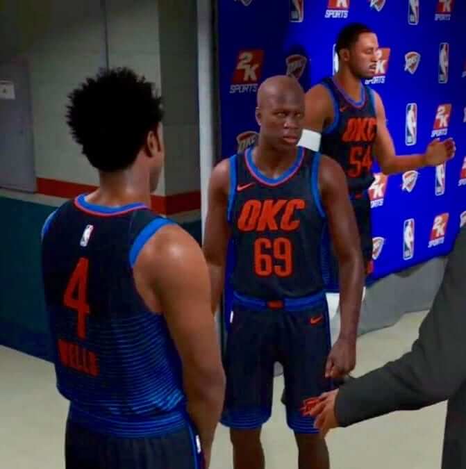
Meanwhile, here are the latest NBA leaks: The photo you see above, showing what appears to be a Thunder alternate uniform, began circulating yesterday. It matches the design shown in the video screen shots that were posted two days ago on SportsLogos.net. So this photo not only confirms the Thunder screen shot but also lends added credibility to the remaining screen shots.
Late last night, this video began circulating as well:
First Look at the OKC Thunder Alternate in #NBA2K18 these jerseys are insane #ThunderUp @okcthunder pic.twitter.com/UJgWnwruJC
— Travis Singleton (@SneakerReporter) September 15, 2017
Personally, I don’t care for this design at all. Don’t like the color scheme, don’t like the big honking “OKC” on the chest. That said, there are some noteworthy elements:
• I kinda like the gradation, which appears to be only on the back.
• Subscript NOBs are always interesting, although I don’t know that there’s a real point to it here.
• See how the “OKC” lettering looks jaggy? You can get a better sense of it in this video game shot. I assume this was intended to evoke, you know, thunder and lightning. But given that Oklahoma has been experiencing an unprecedented rise in earthquakes due to fracking (more info here), maybe fractured lettering wasn’t the brightest approach.
And while we’re at it, yesterday Suns point guard Tyler Ulis posted a photo of what appears to be the team’s upcoming throwback uniform on Instagram. Here’s a look at that one:
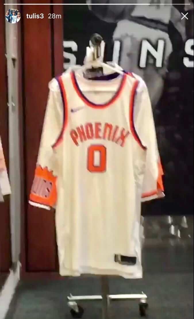
That design is apparently based on this one. Not bad, although we’ll need to see more in order to assess it properly.
(My thanks to Colin Butler, who was the first to alert me to the Thunder photo, and Conrad Burry, who first tweeted about the Suns photo.)
Click to enlarge
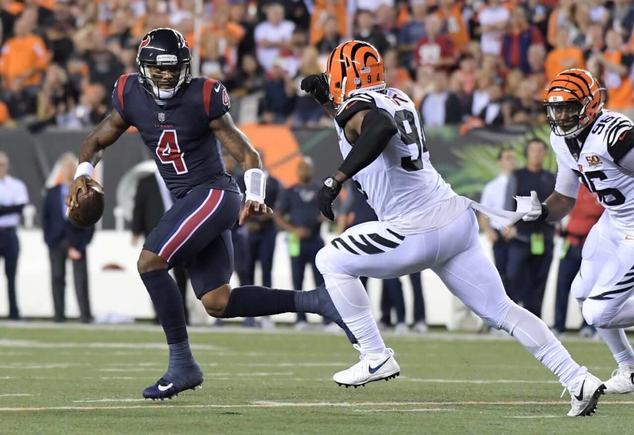
Rash is fading: Last night was the first Thursday Night Football game of the NFL season. Well, not counting the season opener between the Pats and Chiefs, which took place on a Thursday but for some reason doesn’t count as Thursday Night Football. And neither do the games on Thanksgiving, which will happen on a Thursday but also don’t count as Thursday Night Football. And for some reason the Thursday Night Football schedule includes three Saturday games and a Monday game, which I guess means the NFL has created a time warp or something, which is pretty rad when you think about it.
But I digress.
As I was saying, last night was the first Thursday Night Football game of the season, which means it was also our first matchup of solid-colored uniforms. Which in turn means that the mono-uni season has started without any hype. No big announcements, no press releases showing all the week-by-week color pairings, no hype photos showing the mono-blue team playing on blue turf.
Maybe they think it’s sufficiently well-established that they don’t need to hype it anymore. Or maybe they realize it’s been a bust, what with so many of the games featuring a team in mono-white, and are soft-pedaling it. Either way, I’m grateful for the more restrained marketing approach.
Meanwhile: Can you spot the uni-notable detail in this screen shot of Bengals defensive back Adam Jones?
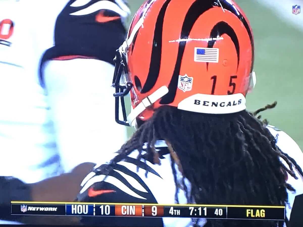
If you said, “Hey, his jersey number is 24 but his helmet number is 15,” that would be what my 11th grade math teacher liked to call “the right wrong answer.” Jones has been wearing 15 on his helmet as a tribute to Chris Henry since at least 2015, so that’s old news (although that didn’t prevent approximately eleventeen jillion people from asking me about it during last night’s game).
No, the more interesting detail in that photo is that the Bengals wear the American flag and NFL logo decals on the same side of the helmet (and it’s not just Jones — it’s a team-wide thing). The typical format is to have them on opposite sides. That’s the right right answer.
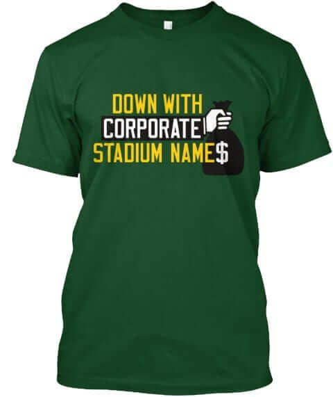
Naming Wrongs reminder: In case you missed it yesterday, we have some new Naming Wrongs shirts. They’re all based on the design shown at right (which you can click to enlarge), with lots of different color combos. Get the full scoop here.
September call-ups reminder: Also from yesterday, we have three new additions to the Uni Watch team. Meet them here.
Raffle reminder: I’m currently raffling off some cool Hartford Whalers memorabilia. Full details here.
The Ticker
By Kris Gross

Baseball News: Last night Twins wore red caps with their regular home whites for the first time this season (from Jordan Oster, @TwinsPics). … Here’s a look at this year’s ”Postseason” cap patch compared to last year’s (from Josh). … The Brewers will wear their home uniforms as the “road team” this weekend after their series with Marlins got moved to Milwaukee due to Hurricane Irma (from Johnny O). … Angels DH Albert Pujols will wear “Strike Out Slavery” cleats this weekend, part of an anti-human trafficking endeavor. Additional info here. … Here’s a great comic from the Big Book of the 70s on “baseball’s most out-of-control decade,” the 1970s (from Ray Hund). … The St. Pius X High School (Kansas City) Quiz Bowl team uses a modified throwback White Sox logo (from Brick Barrientos).

NFL News: Texans DE JJ Watt wore Texas flag-themed shoes last night. … Bengals CB William Jackson III, who’s a Houston Native, wore “Houston Strong” cleats last night. … The city of Atlanta has unveiled their Super Bowl LIII host city logo (from Douglas Ford). … Enjoy the covers of Pro! magazine’s 1972 NFC and AFC previews (from Ray Hund).
College Football News: Boise State went full orange last night, and we had a shoulder stripe malfunction — note how the stripe angles don’t match (from Tim Cross and Tyler Novak). … Iowa State will wear mono-white on Saturday (from Tyler Gross). … Here are this week’s uniform combos for North Carolina, West Virginia, Northwestern, and Texas State for the weekend (from James Gilbert, Broc, Craig R, and @stallionjockey). … TCU will wear white jerseys and pants and have white end zones for their “white out” against SMU. … Each week Virginia Tech head coach Justin Fuente picks a special teams player to wear No. 25 to honor Frank Beamer. This week, it’s Greg Stroman Jr. (from Andrew Cosentino). … Wayne State is celebrateing their 100th anniversary with new uniforms. The NOB will honor Medal of Honor recipients (from Ryan Keberly). … Arkansas State will go all red (from Tice Singleton). … Columbia helmets this season feature the New York City skyline (from Joe Sibley). … Here is an archive of North Carolina media guide covers from the past half-century (from James Gilbert). … 47 years ago this weekend, we had the first college football double-header, with Xavier vs. Miami and Cincinnati vs. Dayton (from Kevin). … ESPN’s Gamecast uses blue turf for Boise State home games (from Tom Whitfield).

Hockey News: Some number changes for Bruins this season (from Shane Bua). … The Rockford IceHogs, a Blackhawks affliliate, have new grey alternates (from Jason). … The Saskatoon Blades of the WHL unveiled their new jerseys (from Wade Heidt). … Also from Wade: The Lethbridge Hurricanes’ mascot announced his retirement.

Basketball News: A new look for Baylor’s practice court (from @BearDroppingsBU). … Check out former Bulls player Norm Van Lier sporting old warm-ups from “1973-ish” (from Ray Hund). … The California Bearcats, a San Diego club team, are about to become the only team outside of LaVar Ball’s club to sport the Big Baller Brand logo. There’s a manufacturing partnership between the team owner and LaVar Ball.

Soccer News: Tottenham Hotspur added a third kit (thanks, Jamie). … A great story here about the 1990-91 Chelsea team that wore five different shirts and eight jersey combos when three different kits was the norm (from Dennis Hurley).

Grab Bag: Tennessee announced the return of the Lady Vols name and logo for all of the school’s women’s teams (from Lee Wilds). … Baltimore City College High School unveiled four redesigned logos (from Darryl Carver).
Pink turns to blue: Last week I wrote about the death of Walter Becker, co-founder of Steely Dan, which was my favorite band for most of my time in high school. Yesterday, in an eerie coincidence, word came down about the death of Grant Hart, co-founder of the Minneapolis hardcore trio Hüsker Dü, which was my favorite band through most of my time in college.
I saw Hüsker Dü twice during those years — once in some basement shithole in Syracuse in the fall of 1984 (they were very, very good) and once in an auditorium on the campus of my college, SUNY-Binghamton, in February of 1986 (honestly, I thought they were only so-so that night). I also played their records incessantly, wrote about them a lot for our college newspaper, talked about them a lot with my friends and girlfriend, encouraged people to buy their records at the campus record store that I managed, and generally obsessed over them. It’s not going too far to say they changed my life, or at least had a major impact on one chapter of it.
A few hours prior to that Binghamton show, I had the chance to hang out with Hüsker Dü in their dressing room. I was more interested in talking to their other songwriter, Bob Mould, who was one of my heroes at the time, but I was embarrassed to face him because I had done a fairly awful phone interview with him two weeks earlier for an article I was writing (it was my first time interviewing someone I admired, and I was all nervous and flustered). So I figured I’d talk to Grant Hart instead. I can still see him there, sitting on a table, barefoot, his big mop of hair all mussed up, a smile on his face. He looked like a friendly teddy bear.
I approached him, and he immediately asked if I had any drugs or knew where to get some. I was this record-collector dweeb who at that point had never dabbled in anything stronger than alcohol, so I mumbled, “No, sorry,” and then kinda slunk over to the corner of the room, where I stayed for a bit until I excused myself to go watch the opening band.
Hüsker Dü broke up the year after that. I soon learned that Grant Hart asked a lot of people for drugs over the years. I also learned that he was gay, which was a surprise, because he’d written a lot of songs about female romantic partners. (He’s hardly the only gay songwriter to have done that, of course.) He continued to make music in other bands and under his own name, although none of it was as special as his work with the Hüskers, and stories began circulating about how he was a bit of a mess. I never met him again, but I have several friends in the music biz who dealt with him in various capacities, and they all agree that he was a gentle soul, a friendly soul, a troubled soul. I think I got all of that in that brief encounter 30 years ago. I wish I’d found a way to talk with him for a bit.
As songwriters, Mould and Hart were a punk version of Lennon and McCartney. Mould usually (but not always) wrote the darker, more introspective songs, and Hart usually (but not always) wrote the poppier, catchier tunes. The push-pull between those two sensibilities was part of what made Hüsker Dü such a special band. On balance, I always preferred Mould’s stuff — like I said, he was my hero (I’ve always preferred Lennon over McCartney, too) — but Hart’s best tunes were every bit as good as Mould’s. I’m embedding a few of them below. Here’s hoping that troubled soul is now at peace. RIP.
Second item in NFL graf has a wonky link
Fixed. And for the record, that was my fault, not Kris’s.
So the City of Sacramento paid 272.9 million toward this arena, yet the owners (cry poor) waste money on additional courts. Marvelous.
I suspect many fans will be happy about the additional courts.
I suspect those fans would have been happier had that $273 million been put towards things that they don’t have to buy a ticket to enjoy.
Actually, you can enjoy the new court while watching it on TV.
I’m certainly not defending publicly funded arena deals, which are almost always boondoggles. But once the arena has been built, I don’t quite see the rationale for objecting to something like multiple court designs, which most fans are probably in favor of.
Sue me but I think the NFL game looked great last night. 2 of the better CR uniforms that both look better than either team’s regular sets. I wish they would just do alternate uniforms instead of having to be monochromatic. Had the Texans had red socks and the Bengals black they would have looked extra fantastic.
The only good thing about color rash Thursday’s is occasionally a team will wear a better uniform then their regular duds, as is the case for the Bengals.
-Bengals duds are nice, but would look better if the helmet could match the uniform. NFL uni rules creates a situation for them with their Color Rash which mirrors the Rams with gold in just their jerseys. It looks like a mix of parts of different uniforms because the colour schemes do not match. Helmet orange while rest of uniform has a mainly black and white colour scheme.
-Texans having red letters in the nameplate hard to make out.
I think the Bengals all-white may actually be the best of the color rush unis, coming from someone who is generally in favor of that program. To me, the orange helmet goes great with that uni since there is subtle orange trim. An inverse of the black/white on that uni would make for an amazing second set to replace their current uniform set. It is a shame that their current atrocity of a uniform is so overdone because the Bengals, particularly with that helmet, have a very unique uniform theme that when played out correctly (as with the current color rush uni) is one of the best in all of football.
Problem with the court shenanigans is that somebody has to pay for them. Expect ticket prices to rise…and/or local taxes, depending on who operates the arena.
Sad mismanagement when you see struggling college athletic programs have 4-6 helmets, plus a handful of uniforms. Yet, can’t balance the books.
It’s just greedy when it comes to pro sports. Have the Kings donated any new courts to the local parks system?
A few thoughts here:
1) Can you please give an example of a “struggling college athletic program” that has “4-6 helmets” but “can’t balance the books”?
2) You may not realize this, but programs with multiple helmets usually purchase the helmets with funds specifically donated for helmet purchase by boosters and/or auction the helmets afterward. I’m not defending the crazy use of a gazillion helmet designs — I think it’s absurd from an aesthetic standpoint — but they are rarely if ever a financial liability.
3) Similarly, while I’m not defending the use of multiple NBA uniforms, I think many fans will view the use of matching courts as the sign of a first-rate organization that strives for a higher level of visual presentation. In other words, they will view this as getting exactly what they hoped for when they underwrote the new arena.
Indiana U has six helmets and their AD has had financial difficulties for a decade.
And the myriad of smaller colleges and even high schools doing it now. Doesn’t matter if boosters are willing to absorb the cost. It simply reiterates my ‘somebody will pay for it’ point.
In pros it will manifest with the consumer at some point. You think if they put it to a democratic vote that Sacramentoans would overwhelmingly say, yes, spend X extra dollars on 3 courts? Doubtful.
I bet they are using the revenue from those trashy patches on the uniforms
Thank you for the Grant Hart mention. That news yesterday really hit me. Many a night in my youth spent with Zen Arcade, New Day Rising, Candy Apple Grey, and Warehouse. “Don’t Want to Know If You Are Lonely” is definitely in my top five songs.
Between them and the Replacements…now I’m really missing that SST Label
I hear ya. But the Replacements were on Twin/Tone, not SST.
Lord, you’re right. Those days must be hazier than I thought they were.
I too had the pleasure of hanging out with Husker Du one winter night in Detroit, I must be one of the few people Grant Hart didn’t ask for drugs. Still the music meant a lot, thanks so much for the tribute.
I was at the Twins game last night (noticed the red caps right away). Mid game between innings the stadium PA played a bit of “I Don’t Want to Know if You are Lonely”. Can’t say that many in the ballpark knew why the song was being played and its significance but for this fan of the Minneapolis/St. Paul music scene it was a nice moment. A really small thing but something a big major league team can do to connect with fans. Well done Twins.
Wow. That’s impressive.
Thanks Paul for the notice on Grant Hart, I was off line yesterday and missed the sad news. I know I bought a bunch of albums in 84-85 but only remember playing Zen Arcade, the Minutemen’s Double Nickles on the Dime and the ‘Mats Let It Be. Masterpieces all. RIP Grant.
Agreed. I got into Hüsker Dü after they had already broken up when I discovered Bob Mould’s follow-up band, Sugar. Sugar was one of the best concerts I ever saw when I was in college. Thanks for the mention – it’s funny that for a band that never achieved much commerical success, the breadth of our world posting tributes to Grant Hart has been impressive.
While they were never commercially successful, they were enormously influential among writers and other musicians. Like I always say (usually when referring to sports mech sales, but the same thing applies here), retail popularity is not necessarily a gauge of quality.
I would’ve italicized the first right.
Ha ha, I thought that too when I saw it! Although after re-reading it with the emphasis on the second right, I think that also works.
“The right wrong answer” just doesn’t sound right to me. It comes off as “The answer is incorrect, but we’ll accept it anyway”, rather than “the answer is correct, but it’s not the answer we’re looking for”, which is the meaning I would get if it were phrased “the wrong right answer” instead.
What he meant was that it was the predictable wrong answer — the wrong answer he expected people to give (and they always did).
I actually dig the OKC type treatment no those Thunder alts. It’s significantly better than either of their white/blue uniforms which look generic and uninspired (especially the stacked ‘Oklahoma City’ one – and I can’t believe those original unis that looked like rushed placeholders have lasted nearly a decade). The slight lightning bolt angle on the “OKC” for the first time actually gives the Thunder something in their identity the actually even remotely evokes *Thunder*.
I like them much better too, and if the NBA is going to make every team put that stupid logo below the collar, it’s better to have the NOB below the number so that the number is framed by the other elements. It looks so balanced compared to what is today the default.
“But given that Oklahoma has been experiencing an unprecedented rise in earthquakes due to fracking”
Just to clarify, the earthquakes are not from fracking, they are from injection of wastewater into natural underground storage. This is done for things other than fracking as well, but the fracking boom has led to a significant increase in the activity.
This is frequently misrepresented, and it hurts the credibility of environmental concerns. Fracking itself, getting the gas out, is not that problematic, it is the disposal of the wastewater that is causing all of these problems, and where we need to step up our regulation on the industry to hold them accountable.
Fair point. Well stated.
Re: WHL Saskatoon Blades. The recent unveiling is the new 3rd jersey. Those who follow major junior hockey might remember that the Blades are switching back to vintage style primary uniforms starting this season.
link
The yellow 3rd jersey was described as having a modern take on the classic primary logo. Not much different. The toe of the skate blade is positioned a bit differently in the circle and the type at the top of the logo is different. The trim is royal blue though it does look darker in the photos probably due to the lighting.
Enjoyed the Grant Hart tribute Paul. I didn’t discover Husker Du until the early 2000s, but they, and several other early indie bands, served as the soundtrack to what was probably the best days of my life.
Thanks for the tribute Paul. RIP Grant.
While glorious, that Bulls warm-up isn’t quite as old as “73-ish.” Artis Gilmore who’s pictured behind VanLier didn’t join the Bulls until the 1976-77 season.
Gamecocks are planning a blackout this weekend in their home opener against Kentucky. Spurrier was against “Blackouts”, but the Muschamp era has brought many new uni-combos, including the all-black and all-garnet looks.
Speaking on the new OKC unis, it is interesting to see more teams using varying shades of the same color in their schemes of late. When the US Soccer team put out dark red on red this past year i thought, hmm, this looks like shit. Since then there have been numerous teams tinkering with the concept. The Minnesota timberwolves already released their updated set which plays off the seahawks colors. The hawks were a pioneer to this trend. In MLB in recent years, the Brewers have paired their navy and royal and the Dbacks introduced teal to pop on their dark gray on black. MiLB teams like Eugene Emeralds and Durham Bulls have hopped on the wagon as well. Im curious to see as gradiants become more stylized if this trend will go to new heights.
I got to see Husker Du once, and it was a powerful set. As for Grant’s songs, I will recommend another two: “The Girl Who Lives on Heaven Hill” from New Day Rising will strip the paint off your walls, while his early solo single “2541” is a great pop tune…especially love the wordplay “It won’t be the last time I have to be out by the first”.
I realize you’re trying to be careful, but it’s just Chinese characters. While Chinese characters do transcend throughout a lot of East Asia, (Japan and Kanji for example) simply calling those “asian characters” kind of disregards the vastness of Asian languages and writing systems.
I wasn’t trying to be careful. In fact, I was careless — should have said Chinese. Will fix.
Paul, if it helps to have a Western analogy, the characters are still Chinese even if they’re used in other Asian countries just like our alphabet is Latin even though many non-Latin languages use it.
(I feel like the Cyrillic alphabet should be called that, though, not “Russian”.)
Lovely tribute to Grant Hart. And what a shock to learn we were at the same show in Syracuse!
As an Orangeman, I always had a fondness for (I’m still calling them) the Colonials. I somehow never knew you went to Binghamton.
The Syracuse show that I’m remembering was in Oct. or Nov. of 1984, as I recall. Do you recall the name of the club?
The next day I picked up the phone to make a call and couldn’t hear the dial tone. That’s how much my ears were ringing.
I’m pretty sure it was at The Jabberwocky
and you suffered a symptom that was pretty common after shows there
News of the Lethbridge Hurricanes’ mascot announcing his retirement leads me to wonder if the club is planning to change its nickname, in light of recent events. Then again, the club website contains an item mentioning the search for a new mascot performer; this item appeared some time before the retirement announcement.
link
I hope the club isn’t just looking for another person to inherit 30 years of stink and sweat from the previous performer, who should just get his (or her) costume as a retirement gift.
After seeing this, my thought is that they may be creating a whole new mascot entirely – a new character and new suit. It is the character itself (Twister) that is retiring per Twister’s letter. I do not think that the team is planning on changing their name.
I want to really like Husker Du, especially since all my favorite bands cite them as a huge influence (especially the Hold Steady), but I have one big problem with them: their albums SOUND terrible.
No, not the music, which is by all means excellent, I mean the recording of the music. It has all the hallmarks of terrible 80’s recordings that I can’t stand: tinny drums and weak bass. Imagine if they had recorded in 1975 or 1995… it’s a shame.
An earlier doubleheader occurred on September 29, 1917. Georgia Tech played 2 games that day, the first against Furman and the second Wake Forest. Tech went on to an undefeated season and a national championship.
Shawn,
Why did Georgia Tech play two games on the same day?
The Suns throwback is based on the 1968-69 home uniform. That Silas picture is from between 1970-71 and 1972-73 (they had block numerals in 1968-69 and 1969-70 and west to the Western lettering in 1973-74.
Upon closer inspection, the player in Milwaukee player in the background is McCoy McLemore, so the photo would have to be from 1970-71.
Isn’t that OKC photo a screen capture from a video game?
or did I miss the joke?
Is it?
I honestly thought it was an actual photo.
I think it is. Look at Patrick Patterson’s hand. There’s no definition between the fingers. There’s not a #69 on the roster and his pose looks too symmetrical. Then again I could be totally wrong.
Yep, certainly looks like a 2K screen cap to me.
Never mind the fact I’d have a tremendously hard time believing any human basketball player would request #69 AND that any human equipment manager would issue #69. That was my first tip-off.
I just noticed the 2K Sports logo on the backdrop too.
The Suns throwback looks like their second uniform, introduced in 1973, instead of their first one you reference. The one Tyler Ulis shows appears to have the western font that the second generation had.