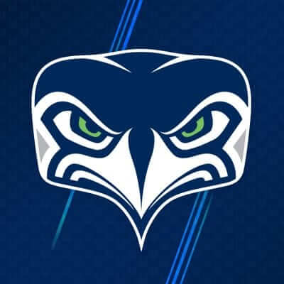
In yesterday’s Ticker, I linked to a photo of a Seahawks cap with a logo I’d never seen before. That photo, which was originally posted on the team’s Instagram page, was apparently the “soft launch” for a new secondary logo that was officially announced last night on the Seahawks’ Facebook page. It’s already being used as the team’s social media avatar on Facebook, Twitter, and Instagram, although it’s not yet clear whether it’ll ever be used on the field. Like, are they going to try to put it on the front of the helmet somehow?
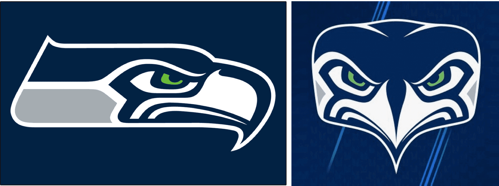
I hope not. Seriously, it’s hideous. Compare it to the side-view logo on which it’s based (click to enlarge):

The bird on the left looks like a serious bird of prey — steadfast, resolute, determined. The one on the right looks more like prey — square-faced, thin-beaked, scrawny. It looks like an ostrich! And I’m not the only one who thinks so:
Seahawks new alternate logo was inspired by… pic.twitter.com/tYASXD4IEZ
— Ronnie Wellington (@ronn_wellington) September 6, 2017
That was one of many amusing comparisons people made regarding the new logo. Twitter pretty much had a field day with this one. Here are some of the reactions:
I… I just don’t know what to think about this new #Seahawks logo. pic.twitter.com/2jVVsPaIUk
— Stephen Cohen (@scohenPI) September 6, 2017
New Seahawks logo looking like a librarian who is disappointed in you because you turned your books in past their due date pic.twitter.com/OVrfw0YdgH
— Natalieeeee (@MsNatalieHughes) September 6, 2017
If you flip the alternate Seahawks logo, it looks like a pug with a mohawk. pic.twitter.com/qqvUKI4zQ8
— Ryan Nanni (@celebrityhottub) September 6, 2017
Moral of the story: The Seahawks should stick to what they do best (i.e., wearing lots of ugly neon green, wearing greys that look like poorly laundered whites, etc.) and leave the new logos to someone like the Chargers.
NFL preview reminder: In case you missed it yesterday, my annual NFL season preview, with all of the uniform news for the coming season, is now available over at ESPN.com.
Raffle reminder: Also from yesterday, I’m currently raffling off a bunch of cool Hartford Whalers items. Full details here.

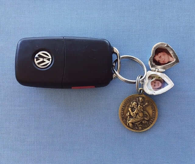
KRC update: The latest installment of Key Ring Chronicles is about a woman who has two items on her key ring — one from each of her grandmothers. Check it out here.

Membership update: As is usually the case, membership enrollments slowed down during my annual August break from the site, but we did add one more batch of cards to the membership card gallery (including Anthony Scandiffio Jr.’s card, shown at right, which is an NNOB version of a Team USA jersey from the 1996 World Cup of Hockey).
I have a bunch of open slots on the current sheet of cards and plan to send it to the printer this Friday. So if you sign up today, you should get your card without much of a wait.
Remember, a Uni Watch membership card now entitles you to a 15% discount on any of the merchandise in our Teespring shop. (If you’re an existing member and would like to have the discount code, email me.) As always, you can sign up for your own custom-designed card here, you can see all the cards we’ve designed so far here, and you can see how we produce the cards here.
The Ticker
By Alex Hider

Baseball News: The Mariners will be wearing “Los Marineros” jerseys on Saturday, and the team will also give away a Robinson Cano bobblehead that features him wearing the jersey (from Tim Dunn). … Orioles prospect Austin Hays will wear No. 18 when he makes his debut (from Andrew Cosentino). … Gordon Blau took this shot at an old-time base ball game at the Mountain Athletic Club in Fleischmanns, New York. Check out the knob on that bat! … The Braves have Clemson-themed merch for tonight’s game.

NFL News: Reports indicate that the Cowboys will only wear blue jerseys three times this year (same as last year), despite the team’s equipment manager saying he would campaign them to wear blue at home more often (from Jason Eudaley Brown). … Based on the Bills’ promotional schedule, it looks like they’ll wear throwbacks on Oct. 29, and it appears that the league will be reprising the “My Cause, My Cleats” program on Dec. 3 (from F Free and Spencer Seaner).
College Football News: Virginia Tech will wear white “Hokie stone” helmets this weekend against Delaware (from Andrew Cosentino). … North Texas is going black-white-black this weekend (from Garrett Gough). … Air Force has already unveiled their new alternate helmet, and is leaking the various new decals throughout the week. … Georgia Southern teased the special helmets they’ll wear this weekend for Military Appreciation Day yesterday. … We may have mentioned this before, but Stony Brook has white lids this year (from Eric Wright). … Tennessee made a floating “Power T” with helium-injected foam before Monday’s game against Georgia Tech (from Aaron Roggensack). … New band uniforms for Alabama (from College Marching Bands). … Looks like North Carolina is going to re-up with Nike (from James Gilbert).

Hockey News: The Rangers have a new red line design that incorporates a silhouette of the team’s shield logo (from Patrick Thomas). … Ryan Seacrest and Kelly Ripa donned Rangers sweaters during an interview with Henrik Lundqvist yesterday (from Chris Flinn). … According to a video tweeted by the Stars, the anniversary patch the team will wear this season will be a chromaflex patch (from Patrick Thomas). … Like many other NHL teams, the Capitals are still wearing Reebok practice jerseys (from Evan Knode). … The Kalamazoo Wings of the ECHL will wear Mighty Ducks (the movie) jerseys on Dec. 22. … New Star Wars jerseys for the Cincinnati Cyclones (from Everett Fitzhugh). … Here’s a new Vegas Golden Knights goalie mask.

Basketball News: Video game leaks point to the Thunder wearing a navy and orange alternate this season (from Travis Singleton). … More video game leaks: Terry Rozier of the Celtics will be going with RNOB (from Cole Pessolano). … Awesome move by UCLA: They’re going old school with their new court design (from Dalton). … ICYMI from the College Football section: Looks like North Carolina is going to re-up with Nike (from James Gilbert).

Soccer News: Alex Hunter is the fictional footballer featured in FIFA 18’s Career Mode. In this year’s game, players can have Hunter sign with the LA Galaxy, so the team has started selling Hunter’s jersey at their team shop (from Jose Palacios). … There was a yellow-on-yellow match in the first qualifying round of the FA Cup between Horsham and Ashford United on Saturday (from Doc Serph). … The Australian Mens National Team, usually referred to as the Socceroos, appears to have added a corporate advertiser to its nickname (from Shane Bua).

Grab Bag: Venus Williams lost an earring during the US Open last night, and Petra Kvitová took off her headband halfway through the match (from John Furstenthal). … The Brazil women’s volleyball team must have run out of zs, because they used a 2 on one player’s NOB (from Timmy). … The demand for Adidas Yeezys, the coveted and rare signature shoe for rapper Kanye West, has spawned a massive footwear black market.
“Check out the knob on that bat! ”
If the photo was bigger than a postage stamp I might be able to check it out.
Fixed. Here’s a better view:
link
That’s like a full-on doorknob!
That new Seahawks logo looks like it would have been from a totem pole or something?
I could see that.
I do not think it is as ugly as some others. I think its actually quite decent and complementary as an alternate/secondary logo
I think that was definitely the goal.
link
But that looks sooooooo much better than the logo.
“….or something.”
link
The NFL/Seahawks could stick their heads in the sand :) and deny the Ostrich is a bad logo.
Proofreading:
“Kelly Rippa” one P
Fixed.
I sense a very short life for the Ostrich. (1 and done?). When a logo can be quickly ridiculed, it’s never good.
Pittsburgh Contrarian is correct. As with the primary logo, this logo is influenced by Native American art, and specifically the top of a totem pole (thus the squarish shape).
As a 45 year Hawks fanatic, I can say it is dreadful, in spite of the good intention.
Imagine The Thrill of It All, seeing that “floating Power T”; that must have been how they made those soap suds structures float into the sky! The aftermath of James Garner kicking all those detergent boxes into the swimming pool traumatized me as a kid.
Crazy seeing North Texas State wearing so much black when their nickname is Mean Green
As hideous as it is, I am now curious as how would other logos look fron the front. Broncos, Eagles, Cardinals, etc.
Seems like a nicer project than all those helmet redesigns or “this sport jerseys as another sport”
+1
The Ravens have had an alternate front view of their logo since the beginning of the franchise (1996).
link
Not exactly, as one has an open beak, the other closed.
Yeah, the head-on version was originally link which was just the head of link logo.
They had a link as well, with the birds mouth open, but that version was rarely used.
When they re-branded (or whatever I’m supposed to call it) to the link, they revamped the side version (added a B and closed his mouth) but didn’t close the mouth on the head-on version.
Redskins, Dolphins.
That’s Georgia Southern with the military appreciation helmets, not Georgia State.
Fixed.
I have no problem with the Seahawks’ new secondary mark. I like it. I’m not a Seahawks fan, but they have used some of my favorite sports logos.
Typo: “first QUALIFYING round of the FA Cup between Horsham and Ashford United”. This is the first of four qualifying rounds before League One and League Two clubs join the competition in November.
Australia’s national soccer team has borne the name of Caltex, a petroleum brand of Chevron, since March 2016.
link
Fixed.
I would hope we do not see this Seahawks logo on a uniform. The only positive aspect about the logo – it does look like the top of a totem pole as I am sure it was intended.
The introduction of a secondary logo that is a front facing bird’s head is not newly creative in pro football. Their idea is borrowed. Has been done before by the Baltimore Ravens:
link
Also been done (quite hideously) as an alternate for a brief period by the Montreal Alouettes. Unfortunately, that logo was worn on their 3rd jersey from a decade ago. They made the poor decision of wearing that logo in the 2005 Grey Cup, back when teams had an option to wear a 3rd uniform in the championship game:
link
link
Animals seen head on by and large make for lousy logos. See the Panthers, Timberwolves, Tigers, Flames, Columbia U., etc.
No, the crappy new Seahawks logo doesn’t look anything like an ostrich, or any prey avian. Among birds, as among most vertebrates, predators have forward-facing eyes for binocular vision. Prey birds have eyes on the sides of their heads for expanded range of vision. Like the ostrich in that side-by-side tweet embedded in the lede, whose side-of-head eyes make it look nothing at all like the crappy new Seahawks logo. In fact, the crappy new logo looks more like an actual hawk than the great old logo, whose stylized, slightly abstracted eyes are clearly on the side of its head like a chicken’s. Of course, that stylized abstraction is part of the visual language of Northwest Native American art, so it works. The more literal accuracy of the crappy new logo is a large part of what makes it look so crappy. It takes the forms of the original logo and strips them of everything that anchors them in the culture and style of the Northwest. It’s no longer a totem-pole carving; it’s just a bad drawing of a bird.
The original Seahawk (and for that matter, the orca on the Canucks’ sweater and the UA Anchorage Seawolf) were rendered in the very-consciously 2-dimensional realm of Haida artwork. Of course, Haida also has the 3-D realm of totem poles, but this is not practical for the same reason actual horns do not protrude from Minnesota’s helmet. A more successful bird would be done paying more faithful attention to the way the Haida would have done it.
Exactly. You see the same style in ancient Egyptian and modern Cubist art. The head is in profile to show prominent shapes, such as a nose or a beak, but the eye is shown from the front to show its most prominent features as well. Each element is representational, but in a way that renders the whole abstract. That’s why the original logo is so evocative, and the more literally representational new logo is not.
+1 on the prey vs predator distinction when it comes to the eyes. You beat me to the comment. This new logo looks far more like a bird of prey than a predator.
link
And a real bird of prey. link
so it’s really crappy……………
Just out of curiosity, how many RNOB athletes have a personal services contract with Adidas?
The Seahawks’ new logo looks like they cropped the primary logo, squished it a bit, and then mirrored it.
There are only two or three lines/curves in the whole thing that cannot be exactly duplicated by doing precisely this with the scale tool in Photoshop.
Day late and a dollar short, but I am way crushing on that Louisville hockey uniform. The academic crest front and center is spectacular!
The shape of the new Seahawks logo is weird, but it is definitely inspired by the ovoid, one of the building block shapes used in art from this region. Given that the main logo has roots in this type of artwork, I think it’s appropriate that the new mark take the same approach, but it just doesn’t translate as well as the profile mark does, or maybe it’s just not executed as well as it could be.
I’m not wild about the Seahawk front face, but it is clear how it was derived.
I’m not sure if this has been shared yet or not, but Madden 18 gives uniwatch a shout out in the create a player section. link pause at 13 seconds
Not the first Madden edition to do that. Some sports writers have tweets in the game, in the style of what they might talk about in real life. Paul remarked “this is the first and probably the last time I’ll be on Skip Bayless’s pay scale.”
Not a damn thing wrong with the Seahawks logo as a secondary. Sorry, I just disagree with this most recent logo bashing. Can’t we focus more on the Bengals awful, 1970’s pimp uniforms or the Browns cluster fuss of bad branding? Really, the only gripe I have with the Seahawks is their “uni-tard” all blue home uniform. Where the white or gray pants to break it up a bit, please, but this “secondary” logo is nothing to raise a stink about.
**WEAR! Jeez, lol
I agree. It’s a well-designed logo that would look great on a baseball cap. It fits in well with the team’s main logo.
And I also agree that the Bengals and Browns look ridiculous. The Bengals haven’t looked good since link.
Good pants and jersey, crappy hat.
Concur. That logo isn’t great, but with
all the uniform nonsense going on with that team, it’s pretty minor. Remember when they first came into the league and were darn near the best looking team in the NFL?
Just FYI…the floating foam T was a Chick-fil-A marketing thing, not done by Tennessee. They also had templates for the Chick-fil-A “Chicken C” and “GT”. CFA had these at the Peach Bowl this year, as well.
They had ESPN ones as well, though the ‘E’ seemed to deflate before the rest of the letters on a lot of them.
Apparently this is a bit of a thing now, and there are a bunch of youtube videos of this technology:
link
But yea, it was a glorified commercial for the company that was making them. They showed an ad in the stadium shortly before kickoff.
New Seahawks logo. I actually like it on the baseball cap. But I wouldn’t like it on the helmet. Football helmets are designed to be looked at from the side, but ball caps are head on. There’s a reason why you don’t see the Vikings horn or the Rams horn or the Eagles wing as a cap logo, but I’ll admit the Seahawks side logo didn’t look bad on caps.
The Caps are still wearing Reebok practice jerseys buuuuuut: link
While we’re at it, the Seahawks primary logo is pretty awful as well.
The original 1976 Seahawks logo had a certain dignity to it. Then they had to cartoon it up because it wasn’t “mean” enough.
Add them to the pile of teams who got it right the first time. I won’t bore you with the list of franchises who should have left well enough alone; it goes on for days.
Agreed.
In the event some of you have not seen this, the original Seahawks logo was the inspiration for a logo of interest in the BCJHL in the 1980s (Junior A hockey).
Here is the logo of the Vancouver Bluehawks (and later the Burnaby Bluehawks):
link
As a Seahawks fan, I’m going to have to go ahead and disagree with you there. While I do like it,(especially the color scheme)the original logo looks like it’s sad or half asleep. And though a minor tweak to 99.9% of people, the gray stripe is such a huge improvement on the blue stripe on the 2002-2011 version of the current logo.
Guess I’m in the minority here, but I like the new Seahawks logo. Not as a primary logo, but in the secondary slot I think it’s just different enough to be a good addition to their visual program.
Okay, I admit I really really like that Thunder uniform.
Seahawks need to change their logo & stop using Native American imagery
It’ll be a little hard to avoid all reference to Native Americans for Seattle given the city is named after one.
Just saying.
Really?? In that neck of the woods about all there is, is Native American Imagery. It’s disingenuous to preach the sacredness and solemnity of Haida artwork when it hangs in galleries on every street corner with a price tag hanging from it. Anyway, it adds conspicuous regional flavor to teams based in the Pacific Northwest. I have a hard time imagining any indigenous American taking this particular position.
It’s Terry Rozier, not Teddy, withyhe RNOB
Fixed.
The Rangers red line is’t new. They had it last year.
Several folks noting the Ravens front view logo.
Not the same as what Seattle has done.
The ‘Hawks have clearly taken the current side view and created a front view from it.
The Ravens’ front view is completely different. Beak open. Crazy feathers. etc.
So the Cowboys article says they are wearing navy at home on Thanksgiving and you recently posted the Charges uniform schedule stating that they would be wearing powder blues on Thanksgiving at the Cowboys. Wearing navy on Thanksgiving would be in keeping with previous years for the Cowboys. Do you think one of the articles is wrong or could we potentially see color vs. color on Thanksgiving?
Let’s not forget this ostrich face is still better than these:
link
(When the Seahawks played the 1976 season without logos on their helmet.)
link
Joking, yes? A lot of football cards just never included the logos for licensing reasons.
“…bizarre ostrich logo.”
I LOL’ed at my desk when I read that.
Love the headline calling the Seahawks’ new alternate logo “bizarre.” Great choice of words. Truly hard to look at … it’s an odd move on Seattle’s part. How’d that get approved?!!
Brilliant review of the hawks logo. And I’m not trying to kiss up.
Maybe some “head on” NFL logos will give us a side view. The Colts could give us the side view of a horseshoe… basically a thick blue line
The new Seahawks logo looks like two depressed seagulls touching beaks. This is the superturd of turd logos.
Ncaa week 1 recap with graphics?