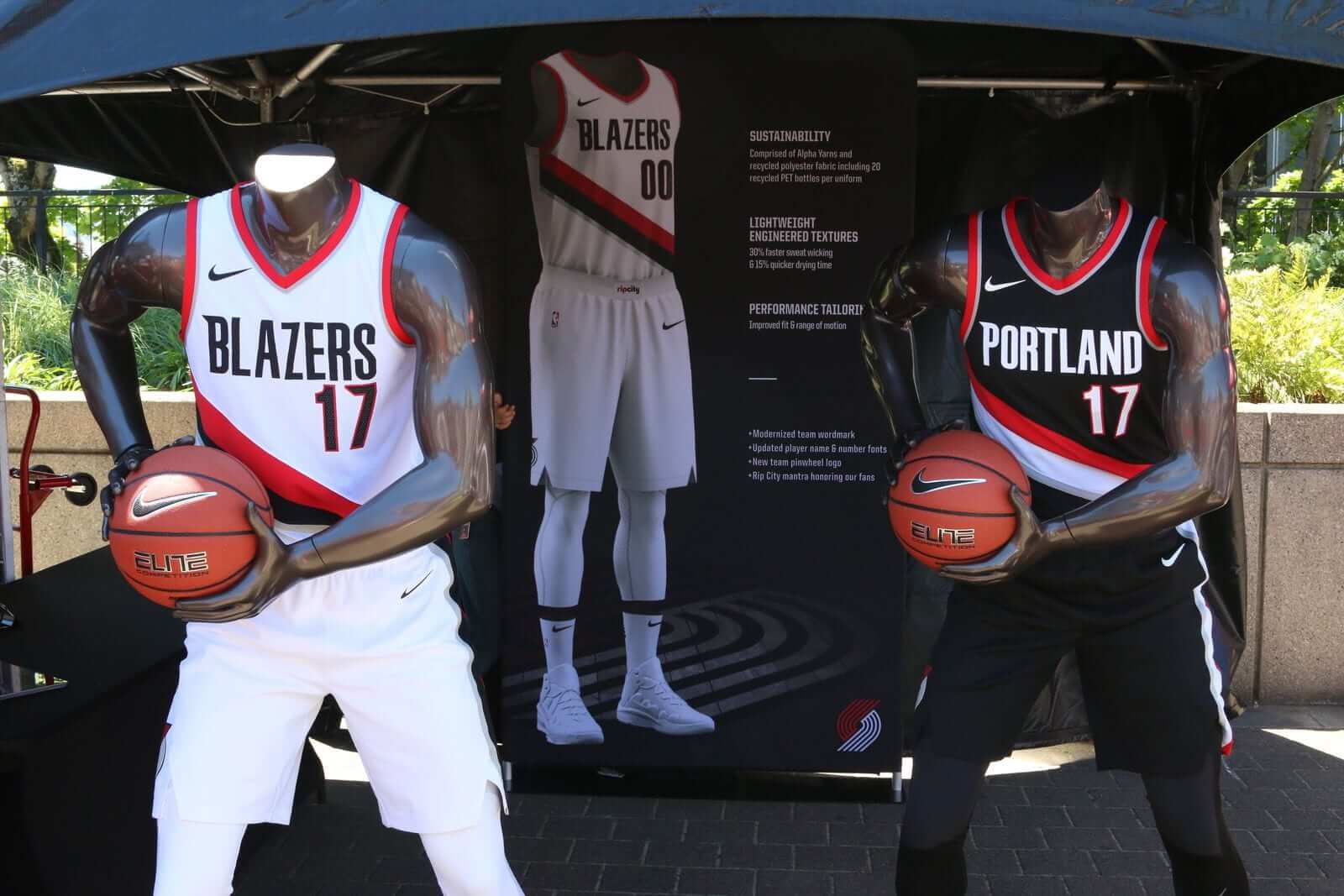
Photo by David MacKay, blazersedge.com; click to enlarge
By Paul, pinch-hitting again for Phil
Who the hell unveils a new uniform set on a Saturday afternoon? The Trail Blazers, that’s who. While I was off doing, you know, Saturday stuff (more on that in a minute), they became the latest NBA team to unveil their new home and road white and colored uniforms.
If you’re looking at the photo above and are thinking, “That looks a lot like their old uniforms,” you’re right! The changes are subtle, as you can see in these two before/after comparisons (click to enlarge):
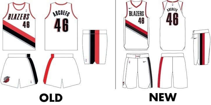
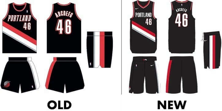
Here’s a summary of the changes:
• The chest lettering is no longer italic and is now one-color.
• The NOB lettering is now one-color.
• The drop-shadow has been removed from the numbers.
• The “Rip City” logo has been added to the waistband (thereby maintaining Nike’s unbroken streak of having a waistband mark for every team).
• The pinwheel logo has been moved from the front of the shorts to the side, and the logo itself is the updated version that was released back in May.
Here’s a better look at the backs of the jerseys, which I’d say is an upgrade — less busy, less choppy-looking (click to enlarge):
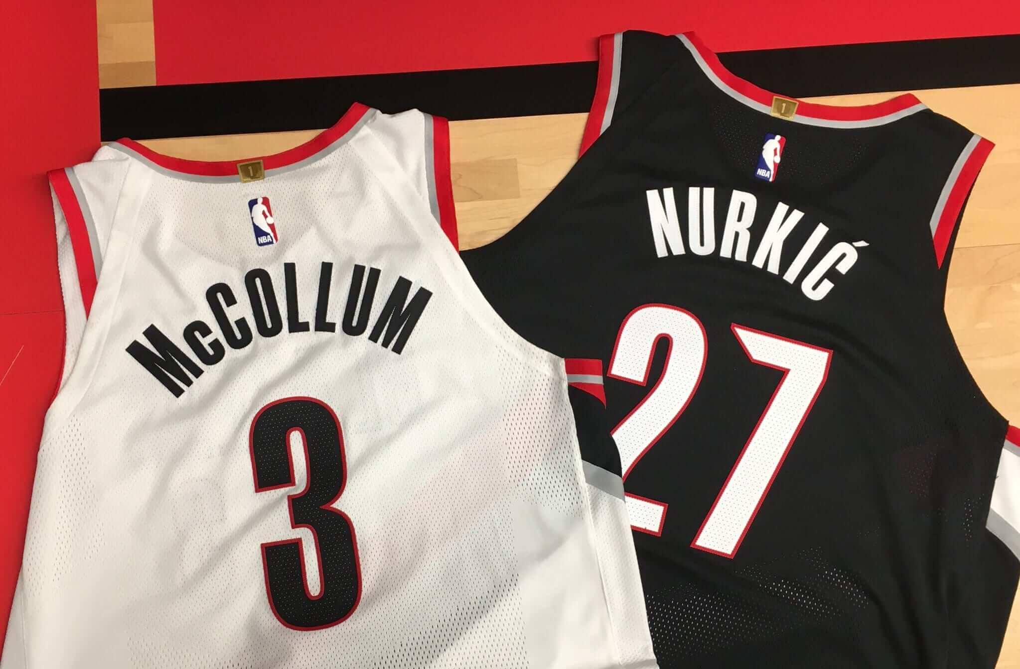
Also (and this is obviously a small thing, but what is Uni Watch about if not small things?): That accent on Jusuf Nurkić’s NOB looks much better than the old version.
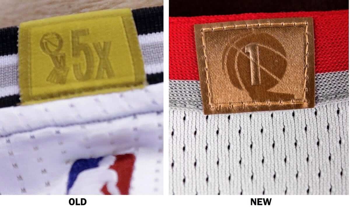
Also-also: The Blazers have provided our first close-up view of the NBA’s updated design for the gold championship tab on the rear collar. Here’s a comparison (click to enlarge):
You can see additional info and photos here and here. That second link includes some interesting info about how fans wanted to keep the diagonal sash (good for them — it’s a distinctive element that the Blazers totally own) and also has this:
[The uniforms] do not feature do not feature the logo of a[n advertiser]. The team remains in conversations with numerous companies and is “very optimistic” of the prospect of adding a[n advertiser] logo to their jerseys this season, as teams such as the Cavaliers and Kings have already done. The goal is to have a jersey [advertiser] in place before the start of the 2017-18 season, though it is also possible a logo will be added mid-season, or not at all in the event that a suitable partner takes longer to find.
Interesting. The big news there is that teams can add an ad patch during the season even if they begin the season ad-free. Here’s hoping they never find that suitable partner. #NoUniAds
One final thought: If you go back and look at the photo at the top of the page, you’ll see that the mannequins are both holding basketballs emblazoned with the Nike logo. Those basketballs will never be used in an NBA game, because the official NBA ball is made by Spalding. Just another way that Nike tries to make everything about Nike — even things that really have nothing to do with Nike.
Sock salute: Ivan Rodriguez will be inducted into the Baseball Hall of Fame today, and the Rangers have been saluting him for the past two games with a sleeve patch. Nothing new there — it had been announced in advance.
But here’s something that hadn’t been announced: For last night’s game, the Rangers who chose to go high-cuffed were wearing Rodriguez-themed socks. Check it out (click to enlarge):
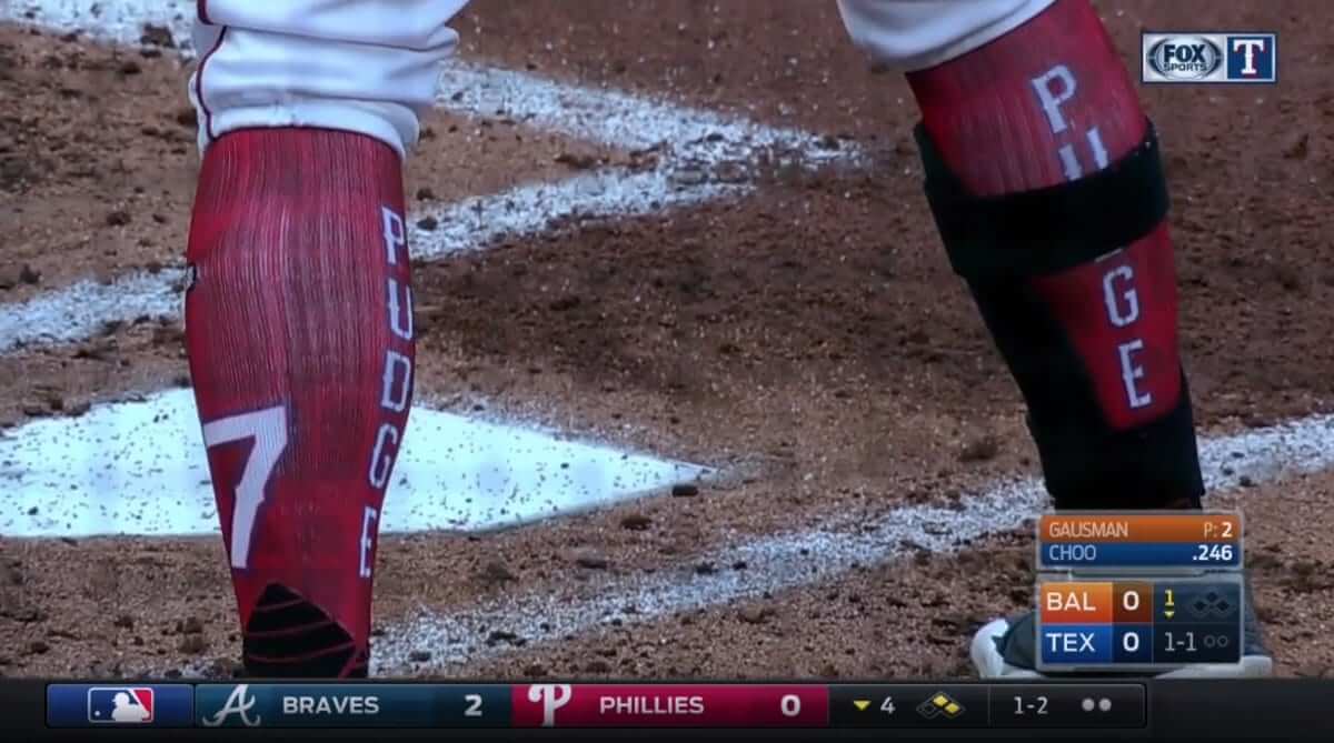
There have been hosiery-based commemorations before, like when Cardinals pitcher Jason Simontacchi wore a black “57” memorial ankle band for Darryl Kile in 2002. But to my knowledge, this is the first time MLB socks have honored a specific player in a non-memorial context. In fact, it may be a Big Four first. If anyone knows of other examples, please post them in today’s comments. Thanks.
Update: Stance representative Tzvi Twersky has reminded me that quite a few NBA teams have worn player-commemorative socks in recent years. Examples include the Lakers honoring Kobe Bryant, the Pistons honoring Ben Wallace, the Suns honoring Steve Nash, and the Spurs honoring Tim Duncan.
Blast from the 100-year-old past: The White Sox and Cleveland wore 1917 throwbacks yesterday. The highlight, as you can see above, was that the Sox all went high-cuffed, showcasing some excellent striped hosiery. Mildly disappointing that the Sox didn’t spring for throwback batting helmets, but whaddaya gonna do. Lots of additional photos here and here.
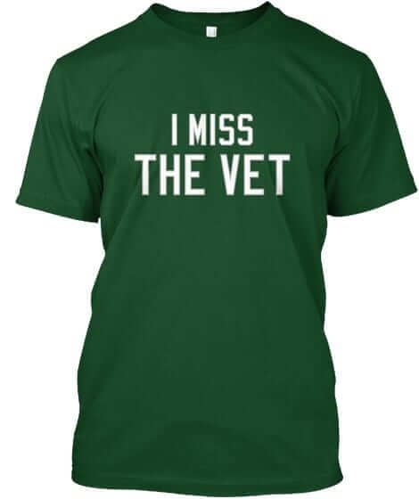
Naming Wrongs update: In case you missed it earlier this week, we have a new batch of Naming Wrongs designs (including new color options for the Vet, shown at right). Full details here, or just go straight to the Naming Wrongs shop.
The Ticker
By Paul

Baseball News: More minor league teams doing solar eclipse promotions on Aug. 21: the Salem-Keizer Volcanoes and Nashville Sounds (from Andrew Kling and Lee Wilds, respectively). … G.I. Joke jerseys next Wednesday for the West Virginia Black Bears (from Zach Loesl). … I didn’t know that the ball used for a ceremonial first pitch actually says “ceremonial first pitch” (and neither did Chris Flinn). .. “The Cubs are currently on a three game set up in Milwaukee,” says Brendan Hickey. “The Brewers have worn their retro alternates for two games in a row now. The conspiracy theorist in me has me thinking they’re wearing them to help make it seem like all the Cubbie blue in the crowd is just royal blue for them. When the Cubs are in Milwaukee, there’s typically a majority Cubs fans, dubbed ‘Wrigley north.'” … Christmas in July jerseys last night for the Omaha Storm Chasers (from PrincessWahoo).

Football News: Edmonton Eskimos equipment manager Dwayne Mandrusiak has been with the team a whopping 47 years and worked his 1,000th game on Friday night. They gave him this jersey to mark the milestone (from BQG).
College Football News: Iowa State coach Matt Campbell’s use of a seemingly innocuous hashtag in a recent tweet has rekindled a long-simmering feud between Iowa State and Iowa fans over the Hawkeyes’ “ANF” helmet decal (from Kary Klismet). … A piece on the 73 worst college football uniforms ever? Yeah, okay (thanks, Alex). … A UCF spokesman tells me the school will have dozens of potential uniform combinations this season and plans to wear a different combo each week. He adds: “We’ll have numerous different nose bumper decals. The default will be the player’s area code (we did this in the USF game last year). We’ll also have bumpers for military appreciation day. We’ll also have bumpers that read UCFast (for offense) and UCFierce (defense).”

Hockey News: The AHL’s Albany Devils have moved to Binghamton and become the Binghamton Devils. Yesterday they unveiled their new jerseys and logo set. The town’s previous team, the Binghamton Senators, have moved to Belleville, Ontario.

Grab Bag: As a longtime neon sign enthusiast, I’m happy to see that the neon glow is having a restaurant revival here in NYC. … New uniforms for Ohio State women’s volleyball. … So here’s something completely unexpected and fascinating: Professional cooks and chefs are super-duper-picky about how they label things with painter’s tape. That may not sound like an interesting topic, but trust me — it’s the best link you’ll click on today (from my longtime pal Liz Clayton). … Here’s a new one: The logo mascot for the old Maryland Arrows lacrosse team was depicted wearing a knee brace. “Never seen that before,” says Dave Holland). … New cricket uniforms for the St. Kitts & Nevis Patriots. … New wrestling singlets for UVA (from Dan Hillery).

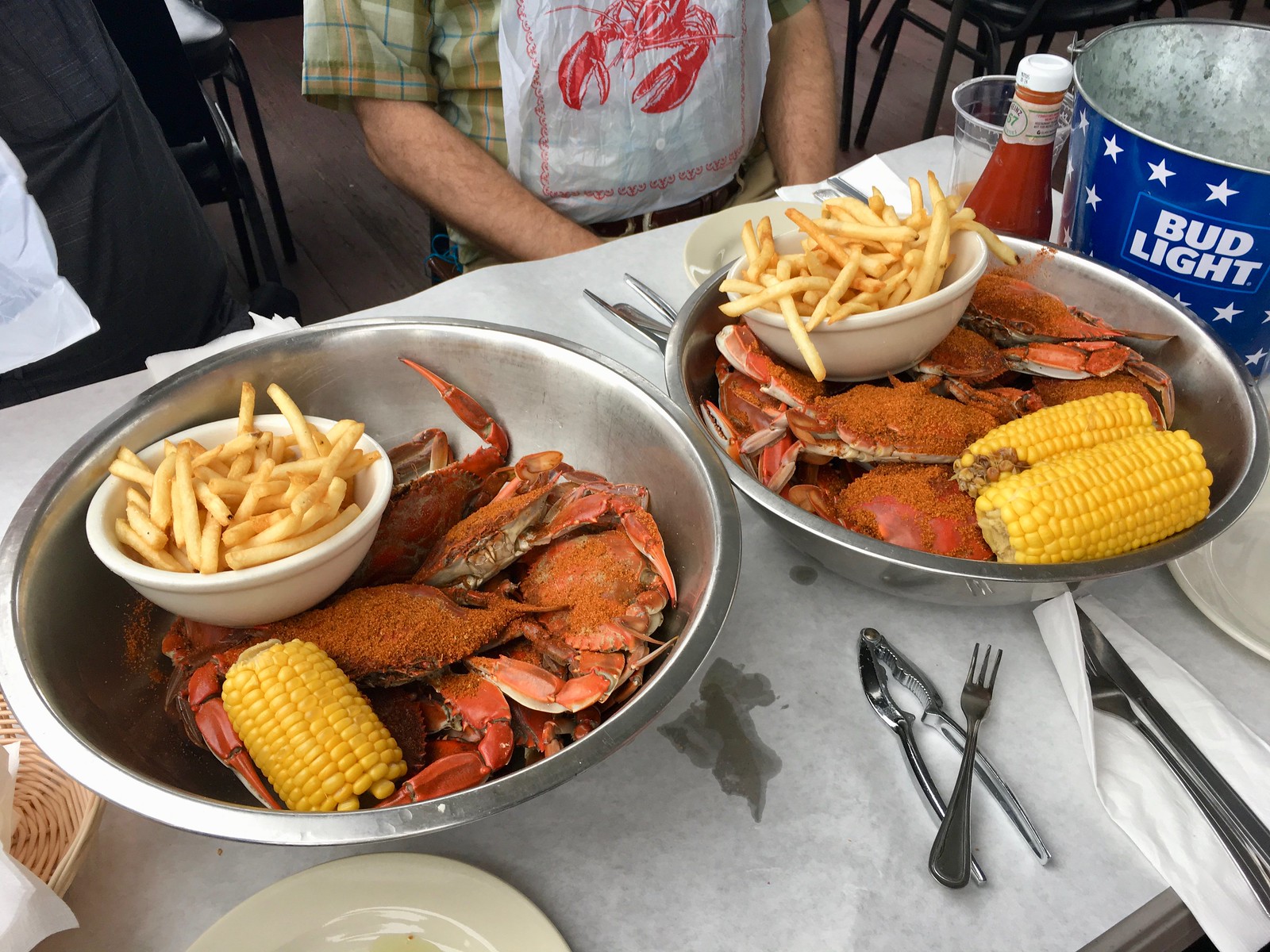
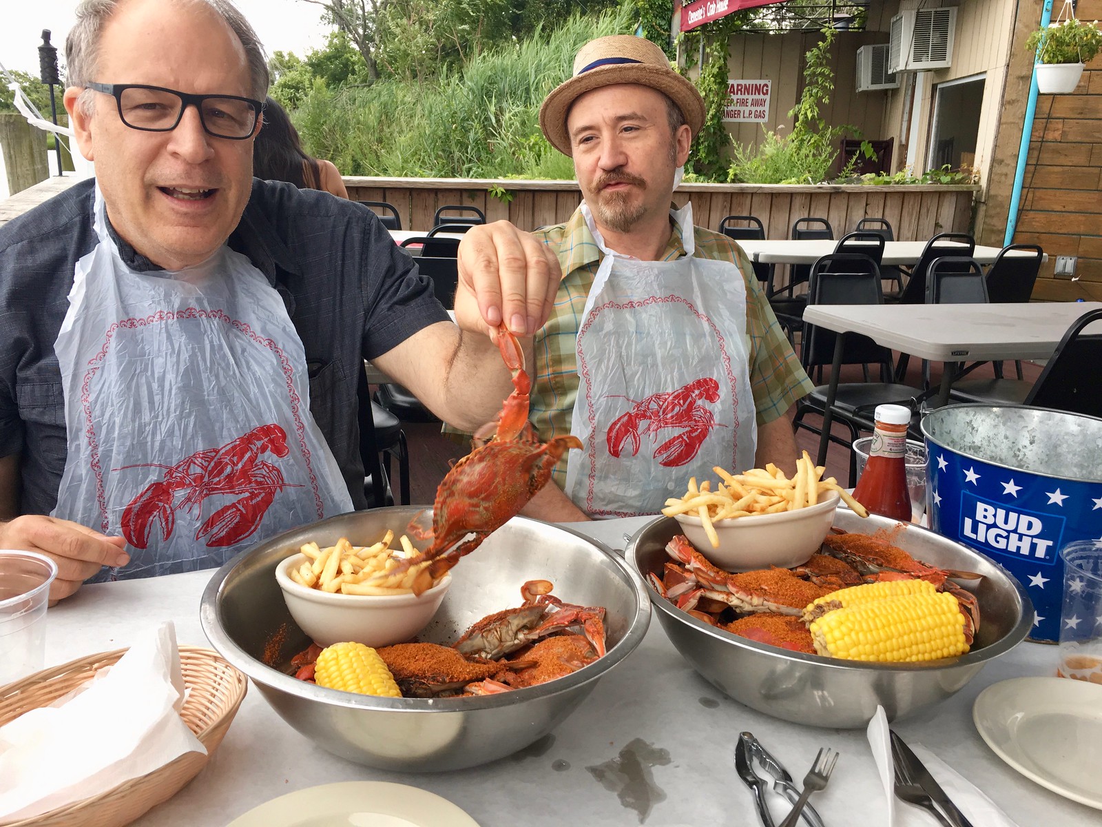
What Paul did yesterday: While the Trail Blazers were unveiling their new uniforms, I was driving to the outer-Brooklyn neighborhood of Sheepshead Bay with my friends Chris, Garth, and Greg. Our destination was Clemente’s Maryland Crab house, a waterside crab shack that feels like it’s a million miles away from NYC, even though it’s part of the city.
Good crabs, good beer, good friends — now that’s the proper way to spend a summer Saturday (click to enlarge):
After reaching our shellfish threshold, we went off for a nightcap in the adjacent neighborhood of Gerritsen Beach, home to one of my favorite NYC bars: Tamaqua (which I anointed “Best Bar You Can’t Get To” in last year’s Village Voice “Best of New York” issue). Among its many charms, Tamaqua has a cat named Captain Jack who often patrols the parking lot. I was hoping to see him, and he did not disappoint:
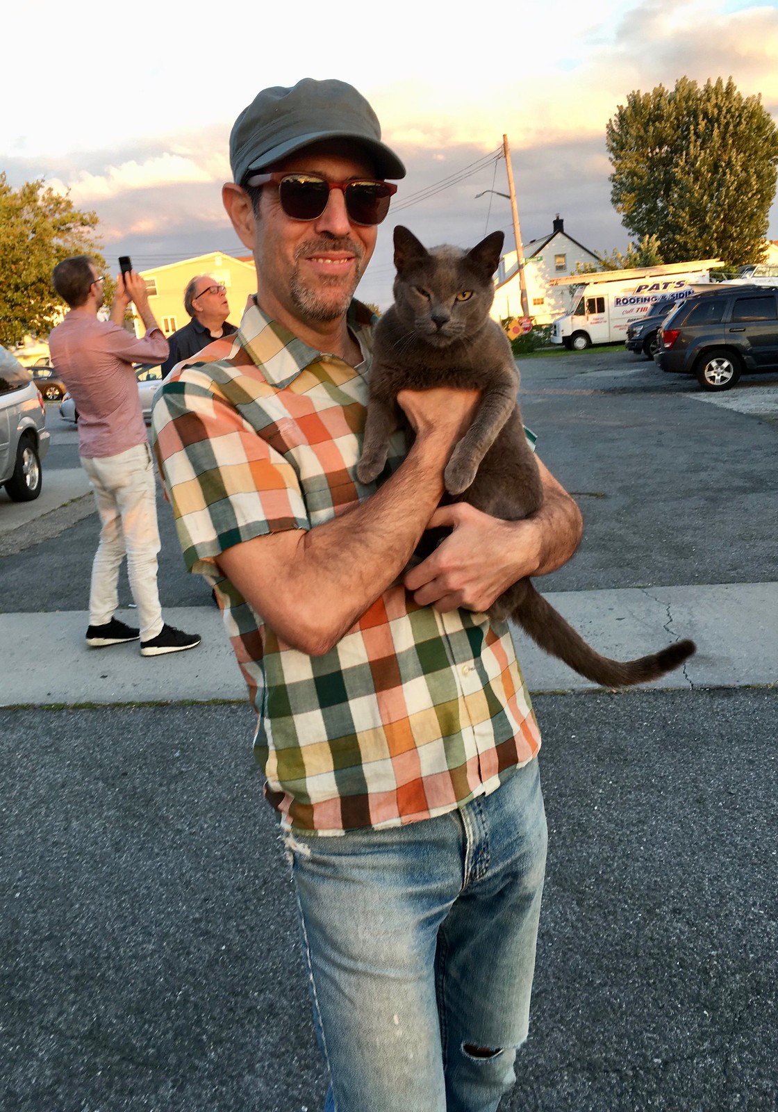
And no, Captain Jack is not a one-eyed Jack. He was just squinting.
I wanted to stay longer, but I had to scurry home to cover a breaking story. (Have I mentioned that it’s nuts to unveil a new uniform set on a Saturday afternoon?) Finally finished at about 11:20pm. The things I do for you people! See you back here tomorrow.
Wonky tagging in the fifth Blazers item (“The pinwheel logo…”)
I’d be happy to see them ditch the silver, but that’s obviously not going to happen.
Fixed.
I’m with you on that, BurghFan. I was hopeful that the silver trim would be eliminated. Thought it was very possible when we saw the updated pinwheel logo. Would have been an improvement.
So, let’s see which NBA team decides to roll out their new uniforms today while everybody’s out doing Sunday stuff!
Ugh.
Only twenty-something more roll outs to go. Like the summer league and LaVar Ball antics, just another way to try to keep the NBA in the news year-round. I guess there really is no such thing as bad publicity.
Maybe just my computer, but the links to the white sox throwbacks photos don’t seem to be working.
Also, I’m curious what a throwback batting helmet for that particular uniform would have looked like. A replica of the hat? The chest insignia on a colored helmet? How do you throwback to something that has never existed? I know this has been discussed before in relation to the Packers and stuff, but I always find it interesting.
Links should be fixed now.
As for the throwback helmet: You could just match the cap, no?
When they wore this same uniform design as a Sunday throwback in 2001, they used a different cap design, with a matching helmet:
link
Yeah, you could just match the cap, but because batting helmets didn’t exist back then it’s no less historically accurate to wear their current helmets or, as they did yesterday, wear throwbacks to a time when helmets were used. As long as you’ve got a helmet on it’s wrong, historically speaking…
And, it seems like a lot of work/money to get a white batting helmet with pinstripes for one game, when the team would have no other reason to use them in the foreseeable future. I’d love the Sox to introduce a regular season 1917 alt into their rotation (think the original TBTC in 1990), which would make a helmet like that handy to have around, but they don’t seem to be heading that direction any time soon.
it’s no less historically accurate to wear their current helmets or, as they did yesterday, wear throwbacks to a time when helmets were used.
I agree that there’s no such thing as a historically accurate 1917 helmet. But there’s definitely such a thing as a helmet that feels more era-appropriate and doesn’t clash with the rest of the uniform design.
Would it be a big expense for a one-day promotion? Yes. But lots of teams have done it in the past.
Did Stance make those awesome sox (socks)? Nince job of everyone on the Sox going high sox style!
All the criticism about the White Sox not wearing some sort of matching helmets misses another element that was historically inaccurate — they wore red shoes last night (the ones they wear with their usual alternate 83 fauxbacks).
They could have been more accurate by wearing their normal black shoes, at no added expense.
Watching throwback games is like going to Halloween dress-up day at work. Still work, just weird. A little fun maybe (depending) but definitely a once-a-year kinda fun.
Perfectly said. Lots of talk about the Sox unis (and they looked solid) but what about the Indians? I liked the look a lot (the pinstripes especially) and found it an improvement over the current road set. Best part for me of both teams was the American flag patch on the sleeve.
I feel that whether I like or dislike anything about a particular uniform is irrelevant these days. Most teams don’t wear anything consistently enough for it to take — for me to be willing to identify it as part of the landscape. Uni’s today are more like the weather…always changing.
Obviously the big question is, did Tucker and Caitlin judge you for getting so cuddly with Captain Jack?
Shhhh, don’t tell them!
In other words, you changed your clothes as soon as you got home. ;)
I’m still gonna call them home and away.
Blazers also slightly modified the number font; compare the 7s worn by Nurkić.
Quite amazing resume for Dwayne Mandrusiak to be part of the Edmonton Eskimos’ equipment staff for so long. He started as an staff assistant with the Eskimos in 1971 when he was just 14 years old.
During that time, he has developed quite a jewellery collection of Grey Cup rings. Dwayne has 11 Grey Cup championships, as he was fortunate enough to be there during the Eskimos dynasty of 5 consecutive Grey Cups from 1978 to 1982.
Very strange. The video of the new Blazers uniforms on Bleacher Report shows the black jersey having “BLAZERS” and not “PORTLAND”.
Someone’s prob already pointed it out but I do love how u chose to open the same way you did yesterday.
As much as some Chicago fans may think that they total domination over Milwaukee and the Brewers, the Brew Crew wearing their throwbacks again on Saturday is not some blue-panic conspiracy theory.
My guess? The Brewers won on Friday night (their usual throwback night on homestands) so they wanted to continue the magic on Saturday in typical baseball superstition fashion. Brewers lost in extras last night, so my guess today is that they are back to either their normal home whites or blue softball tops. Losing last night is part of it, but also the clubhouse staff would only have about 12 hours to clean each throwback uniform to have it ready for the afternoon game today.
Thanks for the tape article!
Hey, is there anyway to get info on when baseball teams will be wearing throwbacks before they wear them? That way people could tune in and watch.
Yes, there’s a very simple way: Read Uni Watch. Most throwback games, including yesterday’s Sox/Clevo game, are announced and reported well in advance on this website.
Really? I guess I missed it, where was it?
In the Ticker.
The Brewers actually wore their retro Friday jerseys two days in a row because they won the night before in them. From time to time they do this. Unfortunately it didnt work so well in game 2.
Miller Park in Milwaukee IS Wrigley North. The day after the Blackhawks womb the Cup in 2010 i was in Milwaukee for a Cubs/Brewers game. My best guess is that 80-90% of the crowd was wearing RED for the Hawks. It was a strange sight, watching two blue teams with a red-clad backdrop.
Big fan of the new championship tab. Much cleaner. I never liked the “[n]x” designation on the back; just having the number is far better.
I gotta admit, I kind of envy Paul for being able to eat as much great food as he does and remain thin.
What’s your secret?
No secret. I exercise almost every day and I weigh myself every day, for starters.
Also, keep in mind that the version of my life that you see here on the site is rather selective. I tend not to write about the days when I have salad for dinner, but those days do exist.
And now, as if on cue, it’s time for my daily bike. After that I’m meeting friends in Manhattan, and then I have other plans for the evening. See you tomorrow. Here’s hoping no NBA teams unveil anything between now and then.
Damn, I was hoping there was a secret and you were eating like this daily!
Well I sure hope UCF goes 0-12 with that BS
Portland added the diagonal striping to their uniforms the season following their NBA championship. I have always wondered if the sash George C. Scott wore in the opening scene of “Patton” was the inspiration for this.
link
The things I do for you people!
And it’s greatly appreciated!
BTW, Paul, since you’re in Brooklyn, stay safe. It’s dangerous out there:
link
Also, Portland’s new look is an upgrade all the way.
So far, so good for Nike, I’d say.
Although I see the greater point about Nike using their version of a basketball, it would be strange if they used another brand’s ball, no? What if they had used an all black ball (or some other “fashion” ball) for instance?
This was not a Nike event. It was a Trail Blazers event. The Trail Blazers play in the NBA. The NBA uses an official NBA basketball. That ball happens to be made by Spalding. The end.
Even if you accept that notion the it would be “strange” to show the Spalding logo (a notion I completely reject, since this was not a Nike corporate event), it would be simple enough to simply rotate the ball in a way that does not expose the logo.
Using Nike balls, with the logo strategically positioned outward, is just more bullshit stealth marketing in a place where it doesn’t belong. Fuck that.
Yeah, I agree that at a Trail Blazers event it doesn’t make sense. I guess that stealth marketing has brainwashed me into incorrectly assuming it was a Nike unveiling.
I wonder if it has to do with the Oregon connection/close proximity to Nike? I checked the Pacers and Kings unveilings and they both used the official NBA ball. I agree with you it’s stupid.
I guess that stealth marketing has brainwashed me into incorrectly assuming it was a Nike unveiling.
And that is precisely the problem. People have begun to think of these uniforms as being more about Nike than they are about the teams. Of course, that is (a) precisely what Nike wants you to think, and (b) seriously messed up.