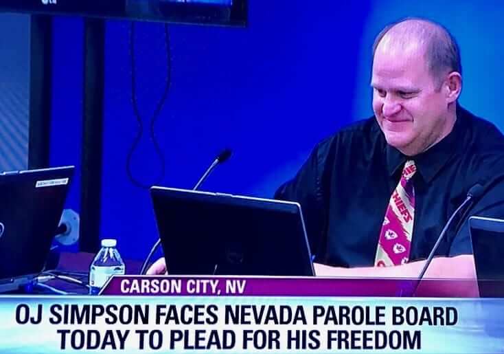
Screen shot by @MarlaTellez; click to slightly enlarge
Bizarre scene at yesterday’s Nevada Parole Board hearing for O.J. Simpson, as one of the commissioners was wearing a Kansas City Chiefs necktie. Here’s a closer look:
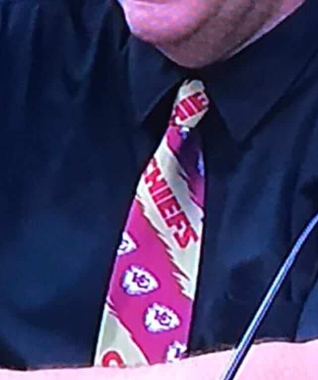
The commissioner in question is named Adam Endel. According to this article, he went to college in the 1980s at Central Missouri State, which may explain his Chiefs fandom. The tie may be an oldie that he’s had for a while, because I couldn’t find it listed for sale anywhere online. This means you will not be able to dress up like a Nevada Parole Board commissioner. I’ll let you decide whether that’s a good thing or a bad thing.
It’s hard to know what message Endel was trying to send with his neckwear, though. Was he saying, “Don’t worry, O.J., I’m an NFL fan”? Was he saying, “Screw you, O.J., I hate the Bills and I’m not granting you parole”? (Apparently not, given the way things turned out.) Was he trying to remind Simpson of his old pal and former Chief Marcus Allen, who allegedly had an affair with Nicole Brown Simpson?
Or maybe he just woke up yesterday morning and thought, “I’m going to be on national TV today, so I can finally wear my Chiefs tie!”
Whatever the answer might be, when it comes to Chiefs-branded attire, I’ll still go with Hank Stram.
(My thanks to Zach Loesl for bringing this one to my attention.)
NBA update: I spent a very enjoyable 40 minutes or so yesterday as a guest on the Thunder Buddies podcast, which is conducted by Thunder beat writers Erik Horne and Brett Dawson. We talked about a lot of stuff — some of it about the Thunder, but also about the NBA and Nike, and about uniforms in general. It was a really good conversation, and I think you’ll enjoy listening to it. Check it out here.
Along the way, Erik and Brett said a few things that I believe qualify as news:
1. Erik had previously reported on Twitter a few days earlier that the Thunder are scrapping their orange alternate uniform. (We had this in the Ticker earlier this week.) But during the podcast, he and Brett said the team is also scrapping its white sleeved alternate.
2. They also said it was their understanding that no NBA teams will be wearing sleeves this season. Most people have assumed that to be the case, but this is the closest I’ve heard to a confirmation of it.
3. Most intriguingly, Erik said that Nike plans to introduce a new alternate uniform for every team every year, right around the holiday (or, rather, holiday-shopping) season. I asked if it would be the alternate “inspired by the community” or the one “inspired by the athlete’s mindset,” and he said he wasn’t sure. But he seemed pretty certain that each team would get a new design each year. He also suggested that these new designs would be used instead of the Christmas uniforms we’ve gotten used to seeing.
Never a dull moment!
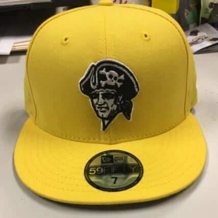
Blinding Buccos: The Pirates and Cardinals will be playing a game in Williamsport, Pa., home of the Little League World Series, on Aug. 20, and multiple sources are indicating that the Pirates will be wearing the bright yellow cap shown at right (click to enlarge) for that game.
The Cardinals will presumably have a special cap as well. There’s also talk that every MLB team will have a similarly bright-colored cap that weekend, as a way of supporting the LLWS, although it’s not yet clear whether these caps will be worn on the field or if they’ll just be for retail.
The following weekend, Aug. 25-27, is the so-called Players Weekend, when players can wear nickNOBs and wackadoodle-colored accessories. Thankfully, I’ll be on my annual August break from the blog when all of this happens.

Membership update: Six new designs have been added to the membership card gallery (including Lloyd Alaban’s, shown at right, which is based on Tommie Smith’s jersey from the 1968 Olympics). The printed/laminated versions of these cards should mail out early next week.
Nicholas Allen and Aaron Pinto: Your cards will mail out with this batch as well, but they aren’t fully designed yet. Soon!
Remember, a Uni Watch membership card now entitles you to 15% off of any of the merchandise in our Teespring shop (if you’re an existing member and would like to have the discount code, email me). As always, you can sign up for your own custom-designed card here, you can see all the cards we’ve designed so far here, and you can see how we produce the cards here.
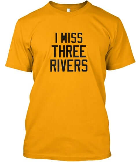
Naming Wrongs reminder: In case you missed it earlier this week, we released a slew of new Naming Wrongs shirts (including the Three Rivers design shown at right). Get the full scoop here, or just go straight to the Naming Wrongs online shop.
The Ticker
By Paul

Baseball News: It’s not often that you’ll see a baseball uniform for a bleachery. … Newly acquired Yankee Todd Frazier will stick with No. 29 and will not wear Paul O’Neill’s No. 21 (thanks, Brinke). … Here’s a piece about what’s being called “irony jerseys,” but it’s really about players in an unfamiliar team’s uniform, like Jim Thome as a Dodger or Ivan Rodriguez as a National (from Chris Flinn). … Ferdinand Cesarano was in Philadelphia recently and spotted a taxi with a Phillies throwback motif — maroon and powder blue. … Texas Flag-themed uniforms this weekend for the Midland RockHounds. … Yankees OF Jacoby Ellsbury appears to keep some scouting reports on opposing players in his cap (from Daniel Carroll).”¨

Football News: Pitt is asking fans which team colors they prefer (from Larry Soles). … Ranking the XFL’s helmets? Sure, why not. … Here’s a pretty good set of designs showing NHL teams reimagined as football teams (from Austin Glover). … New gloves for LSU (from Daniel Bowen). … Subtle changes possibly in the works for Ohio State. … New white uniform possibly in the works for Missouri.

Hockey News: Here’s the logo for the NHL’s games in China (from Benjamin Kassel). … A “name the team” contest is now underway for a new ECHL team in Portland, Me. (rare non-UNC-related submission from James Gilbert). … Repeated from the football section: Here’s a pretty good set of designs showing NHL teams reimagined as football teams (from Austin Glover).

Basketball News: New floor design for Vassar (from Mark Peczuh). … Good story about Georgia Tech’s uni numbers (from Michael Rich). … Nike has made a shoe to honor former college player Saieed Ivey, who was killed last summer (thanks, Mike). … Also from Mike: Here’s a ranking of NBA throwback jerseys.

Soccer News: New uniforms for Penn State (from Pat Rouleau). … New third kit for Stoke City (thanks, Phil). … Good article on the history of TruSox (from Jeremy Brahm).

Grab Bag: Interesting article about a Nike sneaker engineer. … Pro golfer Jason Day teed off at the British Open wearing high-top sneakers (thanks, Phil). … Whoa, check out this rainbow patterned volleyball court (from J. Williams). … New rugby uniforms for Saracens Rugby Club and Harlequins (from @Stumpy7780).

Photos by Mary Bakija; click to enlarge

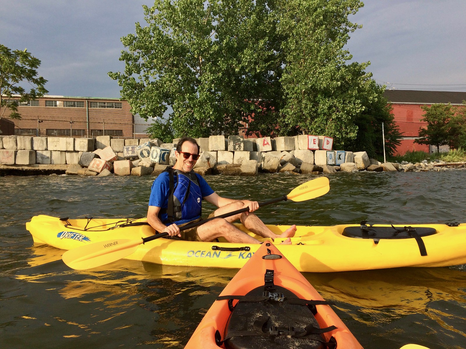
What Paul did last night: One of the nice things about summer in NYC is that there are several programs that offer free kayaking. The Tugboat Captain and I participated in one of them last evening, as we went down to Valentino Pier in Red Hook and spent about half an hour paddling hither and thither. It was all courtesy of Red Hook Boaters, a volunteer organization that makes its kayaks available for free. How great is that?
It was a nice little workout, and we got just wet enough to cool us off after a blisteringly hot day. Then we went to our favorite nearby bar and had a few drinks in their backyard while eating peanuts, cherries, and olives. A very nice night.
Proofreading:
“This means you will not be able to dress up like Nevada Parole Board commissioner.” Whether ‘a’ or the name is missing, it’s another dream dashed.
“Was he trying to remind Simpson of his old pal and former Chief Marcus Allen, allegedly had an affair with Nicole Brown Simpson?” who allegedly
Fixed.
NHL logos work amazingly well on NFL helmets. Good work, Jimmy.
I would be very OK if they took that Dallas Stars design for if/when the Eagles go back to kelly green, but add silver.
I wish they used the Stars Kelly green… the green looks too dark. Was super excited to see the Stars and was a tad disappointed – looked too much like the jets.
The Jets green is the biggest reason I can’t see the Eagles ever going back to kelly.
Jets hunter green is still darker than kelly green. I hope this would not stop the Eagles from going back to kelly green, it would then be unique to them in the NFL world.
Like many, I want both Jets and Eagles to go back to kelly right away please.
I thought the Flyers’ Flying-P looked a little weird facing the back of the helmet. They could reverse it on the left side of the helmet, but then it wouldn’t be a “P”.
A lot of the uniform designs were pretty good, but the worst of the Edge designs made for the worst of the football concepts. Especially Colorado.
Noticed the same thing. The Avs and Predators uniforms are kind of a mess and translated to a bad football uni, but the rest of them looked really good!
I usually hate — HATE — league/sport mashup designs.
But I absolutely LOVE these. I wish there were more detail including back of uniforms and side views of helmets. I can’t get enough of these. I find myself thinking that they’re better than 80% of current NFL uniforms.
Is it just me, or are those NHL football renditions better than 99% of the NFL current uniforms?
Forgive me if this has been discussed to death already, but… have we talked about how link? The rest of the players have a typical Met color scheme of orange numerals with white borders (albeit with a quirky font), and Tim has orange numbers with a blue layer in the middle and a white layer on the outside.
Good catch. The number font looks slightly different to me, as well. (The “1” up top doesn’t curve as much on Tebow’s jersey)
Urban kayaking is great, how extensive is it in New York? It’s really grown in DC in the last few years.
The alphabet blocks on the shore are a nice touch. What’s the story behind them?
At least four places to do it in NYC that I’m aware of (and probably more that I’m not aware of).
Tommie Smith should be spelled like Tommie Agee, not Tommy John. Grateful to see a shout-out to a wrongly vilified athlete; he and John Carlos are favorites.
Fixed, and shame on me for getting that one wrong. Thanks, Walter.
As I recall, the uniforms were better than the helmets in the XFL.
Me Hate Them
Proofread:
“The commissioner in quesiton is Adam…”
Fixed.
Throwback by LPGA star Lexi Thompson:
link
Pirates vs. Cardinals game at Williamsport: “I Still Call It Bowman Field”
That Lexi pic today was awesome with the ridiculousness of the new LPGA rules.
The NBA Throwback page you linked to states that the Celtics uniforms still have the “same font and lettering,” which, of course, is not true. Early Celtic jerseys (before the late 60s) had radial arching and serif lettering, like the Bill Russell picture on the page. After 1968 or so they changed to sans-serif lettering and vertical arching. I tried to contact the post’s author but there does not seem to be a way to do that on the site. Maybe he is reading comments here.
GT Numbers article finally helped answer a longstanding question for me! The article talked about how 1 and 2 were once illegal numbers in college hoops – I did some research and found a new york times article (with a Paul Lukas quote!) that said a player number of 1 or 2 would complicate the referees’ signals for free throws after foul calls.
link to the article: link
Just wanted to say, I appreciate you including personal things in this blog, like events you go to, places you like to eat, etc. It’s fun getting to “know” you.
Cheers
Brendan
Thanks, Brendan — appreciated!
I don’t think the shoes that Jason Day wore on the first day are “sneakers” or “trainers.” I think that they are simply high top golf shoes. Not that that is an excuse for wearing them at Royal Birkdale, particularly when its hosting the Open.
They are golf specific Air Jordan 1s, and they are glorious.
I’m still calling it the British Open
The NHL football unis are, for the most part, fantastic! I don’t think there’s a dog in the whole set. The Penguins especially jumped out at me as a beauty.
Colorado, Calgary, Ottawa… I can think of a few dogs.
The Penguins concept is definitely one of the best, though.
About halfway through the NHL as football uniforms article, I realized the numbers were different on each one. They referenced a star player in that team’s history.
Nice touch. I probably knew about two thirds of them.
Wow. The NHL-to-NFL crossover is spectacular! Not a bad uni in the lot. I’m an old guy with conservative/traditional taste, but even the modern unis look great in this set. I tip my helmet to you, Jimmy Nutini!
Not going to lie, I find something likeabke about that Pirates cap
I don’t hate it.
It’s a shame about OKC’s orange uniforms. I thought they were pretty good. Good use of the “OKC” initials and orange is an underutilized color in the NBA.
However the Thunder white sleeved ones were probably the worse jersey in basketball and definitely should have been eliminated. They looked like free fan giveaway t-shirts.
“However the Thunder white sleeved ones were probably the worse jersey in basketball…”
The Clippers jerseys called and would like to chat.
The orange uniforms were the only good ones they ever had!
Ehh, the best uniforms they ever had were left behind in Seattle.
:P
1. Jack Sikma/Fred Brown-era unis
2. OKC orange unis
3. Original Sonics unis
4. Every other era in Sonics/Thunder history
What I liked about the OKC orange jerseys – the nameplates below the numbers on the back.
Forgot about that. That puts them in a tie for first.
Hockey/Football Crossover
1. Could the Seahawks please adopt the Canucks motif, please?
2. I think the Blackhawks helmet would put them in the same boat as the Redskins and Indians in using caricatures.
If the 12″ version on their chest doesn’t, why would a 6″ version on a football helmet?
We need a Naming Wrongs “I’m Still Calling It the D-League”
The NHL to NFL uniforms were great.
Whatever illustrator software the designer used, can we make that mandatory for concepts and unveilings? I’ve spent too much time looking at dark uniforms against black backgrounds in the dark. With fog. Trying to figure out what I’m looking at.
Some of those NHL crossover uniforms are better than many current NFL uniforms.
Bad Penn State MSOC top. B1G logo on the chest and Penn State logo on right sleeve.
Crest over the heart. Always.
I apologize if this comes across as condescending or ignorant, but I’m curious why Pittsburghers would admit to missing Three Rivers. Everything I’ve read/seen ranks PNC near the top of the list of current MLB stadiums, and Three Rivers was, of course, a notorious cookie-cutter. Maybe it’s the championships (or lack thereof in the current home)?
For me, this raises the question: just because we can (call out an instance of corporate advertising), does it mean we should?
Three Rivers was a nice cookie cutter and there are times I miss it. Doesn’t mean I don’t thoroughly enjoy the new park.
I realize Paul has addressed this in previous comment sections, but my $.02 is that people miss stadiums for many reasons, including (but by no means limited to) the quality of the structure.
As a personal example, I’m a Pirates fan, I love every chance I get to attend a game at PNC, & I think the park is absolutely magnificent. But when I was a young’un growing up in Nor’eastern Ohio, one of our family traditions was a trip to Cleveland for a Sunday game (often a doubleheader, back when those were regular features in the schedule).
Few folks would argue the Cleveland Municipal Stadium was remotely “good” for baseball games. And fewer still would argue that 70s-era Cleveland baseball was remotely “good” either. But do I miss the stadium & those lousy teams? Damn right I do.
Why do we miss the things we miss? For no other reason than, once upon a time, they meant something to us.
I got to sit in a suite at The Jake the last few years. Every time I did, my first thought was, I’d much rather be on the right field railing at Municipal Stadium. Never really been a Tribe fan but I loved that place.
Nostalgia.
I grew up in Exhibition Stadium for the Jays. Place was a dump. A total dump. I can’t believe they played there 12 years.
But as said above – we formed a lot of good memories there. It meant something to us.
Can they send that Sharks mockup to Jacksonville, slap a Jaguar on the helmet, and call it a day?
I hope the NBA gets rid of the sleeved jerseys. They’re almost bearable if they have the same lettering as the sleeveless.
But the ones with the big honking logos on the front are simply horrible.