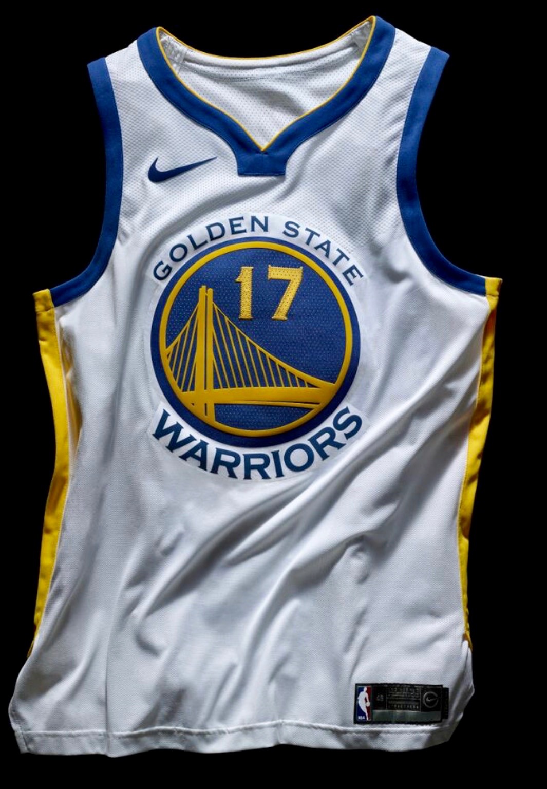
Click to enlarge
Lots of NBA developments yesterday, as we finally got a look at some bona fide Nike uniforms. First, the company released a photo of a new Warriors jersey, shown above. Let’s see how it compares to the old one (click to enlarge):

The most obvious change, aside from the maker’s mark, is the collar. In addition, the numerals are clearly lighter/thinner, which seems like a downgrade.
Shortly after Nike posted that photo, the Kings unexpectedly revealed their new home and road white and purple uniforms, providing us with our first photos of how a jersey will look with the Nike maker’s mark and a corporate advertising patch. Here are some old/new comparisons (click to enlarge):
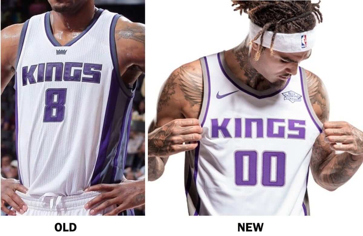
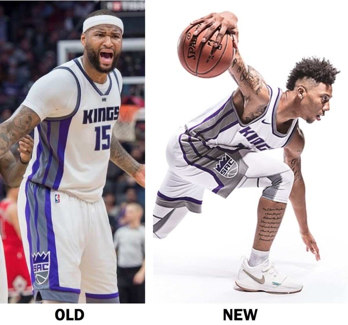
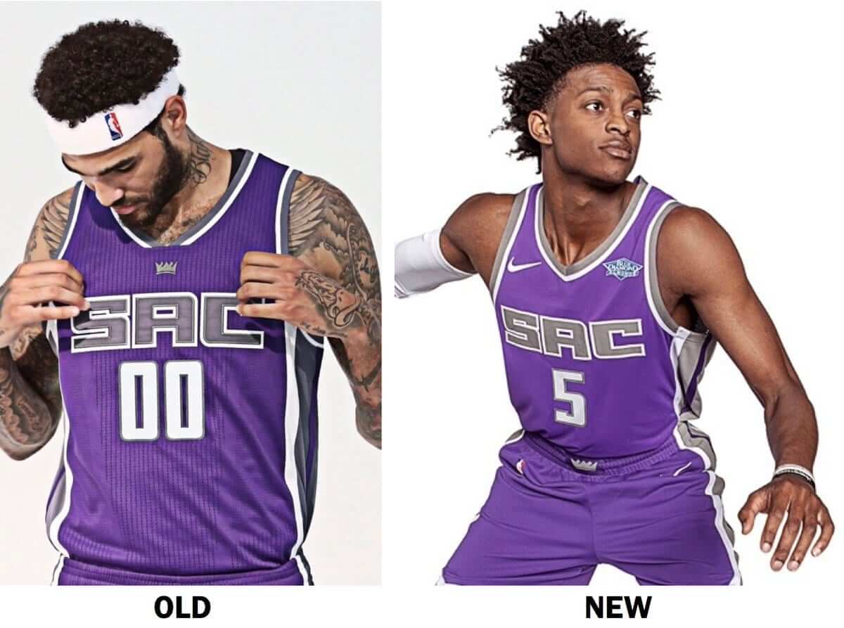
Quick notes:
• For both uniforms, the main difference appears to be the collar.
• Also, as we saw in those Snapchat screen grabs last Friday, the crown icon has been removed from the chest. What we didn’t know then, but can now see, is that it’s been moved to the waistband.
• It looks like the piping now wraps all the way around on the inner-leg portion of the shorts, instead of being truncated.
• Although the shades of silver and, to some extent, purple look a bit different in the old and new photos, a Kings spokesman confirmed to me yesterday that the official team colors have not changed, so it must just be the lighting.
• In addition, the Kings hinted very strongly that they’ll be keeping their black alternate and powder blue throwback.
The Warriors and Kings photos were part of a larger info dump by Nike yesterday afternoon. To get the full scoop, I strongly recommend that you start with Nike’s press release and then continue with this explainer/Q&A piece that I did for ESPN. That should get you up to speed.
Go ahead and read those two pieces — I’ll wait.
Okay, now that you’ve read them, a few quick thoughts:
1. I’m fine with eliminating the home and road uni designations. I’ve always been in favor of color-vs.-color games, and the league was already moving in that direction. I’m sure there’ll be a few games where someone doesn’t get the memo and we end up with red vs. orange or some other insufficiently contrasting matchup, which will be good for a laugh. Overall, though, I see no problem with this move. Remember, the NFL doesn’t have home or road uniforms either — it’s home team’s choice, which is basically what the NBA is now doing.
2. That said: The whole thing about every team having four uniform “editions,” each with a cringe-worthy name and an embarrassing explanation, is already unbearable. Can you imagine a whole season (or lots and lots of seasons) of fans actually using these marketingspeak terms? It’s beyond depressing. Hmmm, maybe we should do some new Naming Wrongs shirts: “I Still Call It the Home Uni,” or whatever.
3. Several people have noted that the photo of the new Warriors jersey doesn’t show the stitching on the back collar where the gold championship tab would normally be. That photo notwithstanding, my understanding is that the gold tabs will still be used this season.
4. In addition to all the info in my ESPN piece, there’s a new development. A reputable news outlet in Utah is reporting that the Jazz will have a gold alternate uniform at some point this season, although it may not debut until December. (Following up on something I mentioned a few days ago: Note that the headline and lede graf don’t even mention the word “uniform”; they just say “jersey,” as if that’s the only thing that matters.)
5. This morning, as I was putting the finishing touches on today’s entry, an image began circulating that appears to show James Harden in a Nike-made Rockets uniform. There’s an additional shot here.
And that’s all. For now.
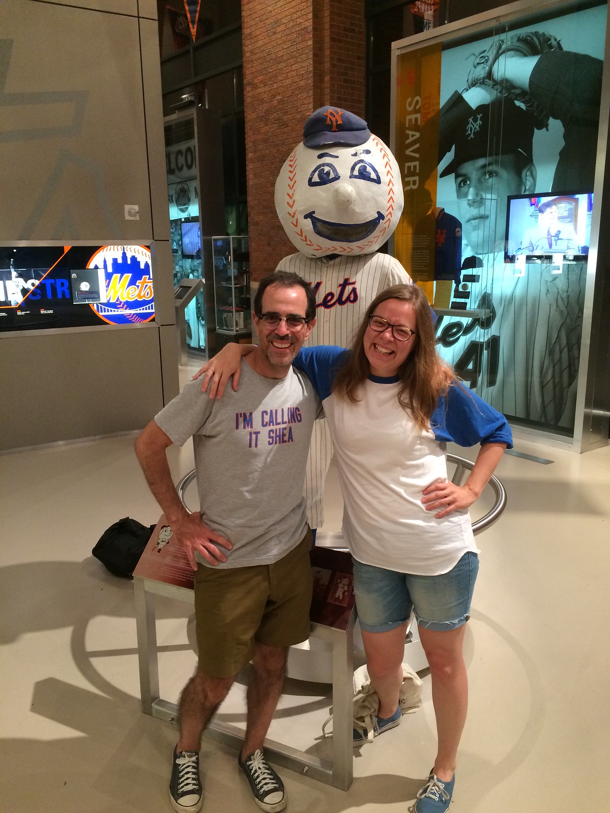
For all photos in this section, click to enlarge
Mr. Met meet-up: The Tugboat Captain and I attended last night’s Cards/Mets game. Incredibly enough, it was our first Mets game together, so we had to do all the obvious stuff, like posing with the original Mr. Met head at the Mets Hall of Fame (above), seeing how our feet are way smaller than Jackie Robinson’s, and so on. And in a fun coincidence, it turned out that we were sitting one section over from Mets by the Numbers honcho Jon Springer.
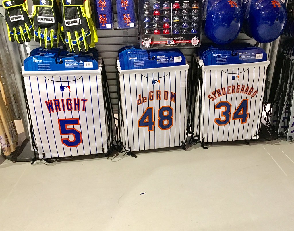
Naturally, I made some uni-related observations. The gift shop was selling some sort of bags that where designed to look like the back of a jersey. The for some reason the one with Jacob deGrom’s name and number had vertically arched NOB lettering — something the Mets have never worn at any point in their 56-season history:
Also: The first time through the batting order, the scoreboard puts up a graphic for each player that includes his signature, and I was struck by how many of the signatures included the players’ uniform number. I only managed to get photos of the ones for catcher René Rivera and pitcher Rafael Montero, but there were several others:
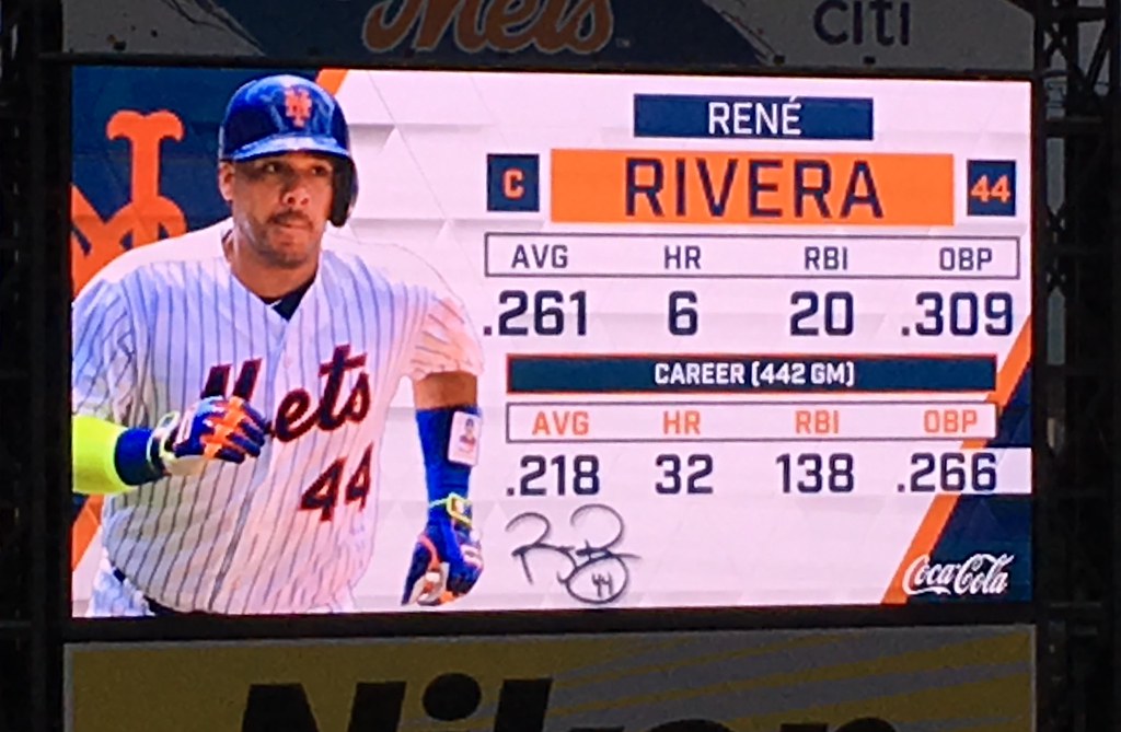
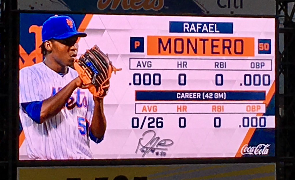
I realize that a number-inclusive autograph isn’t a new thing, but has it become a standard thing? Do most players now do it?
Thinking about this type of stuff was a good distraction from the game, which the Mets lost badly. Still, it was a gorgeous night to be out at the ballpark, especially after a frantic day of NBA coverage.
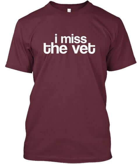
Naming Wrongs reminder: In case you missed it earlier this week, we released a slew of new Naming Wrongs shirts (including the Vet design shown at right). Get the full scoop here, or just go straight to the Naming Wrongs online shop.
The Ticker
By Alex Hider

Baseball News: Astros P Dallas Keuchel recently made a rehab start with the Corpus Christi Hooks and wore his own Astros pants (from Josh). … Astros OF Josh Reddick was wearing quite the outfit during a recent TV interview (from Scott Whit). … The Mets wore their blue alts at home for the first time in over a month last night against the Cardinals. They must not have known that Paul was in attendance (from James Beattie). … The Orioles are giving away a set of bottle stoppers that include figurines of their four starting infielders ”” who are shown wearing four different uniforms (from Andrew Cosentino). … For the second year in a row, the Bowie Baysox are holding a David Bowie Tribute night. They’ll wear these jerseys on July 29 (from Russell Finn). … The Hartford Yard Goats have a hockey-themed cap for sale in their team shop, which presumably went with their recent Whalers-themed jerseys (from Okie). … The Johnson City Cardinals will wear Volunteer orange on July 22 for Pat Summitt night (from Daniel Patrick Owens). … Fans of old Pacific Coast League baseball will love these old photos taken in the late 1920s and early ’30s (from Mathieu Deschaine). … A Stockton Ports pitcher wore some classic-looking stirrups last night. … Bartolo Colón made his Twins debut last night and wore No. 40. That makes 10 teams that he’s played for, and he’s worn No. 40 for at least part of his tenure with every one of them (from Dave Feigenbaum).

NFL News: The Texans have released their promo schedule, which indicates that they’ll wear mono-blue on Oct. 15 against the Browns and red on Dec. 10 against the 49ers. They also have a “white out” scheduled for Sept. 10 against the Jaguars, so they could be wearing mono-white on that date (from Al Gruwell). … NM Sports took a stab at redesigning the Eagles’ identity.
College Football News: It looks like Florida is slightly altering its white pants and putting the Gator logo on the left thigh (from Ryan King). … We now have a shot of the back of the new Navy football uniform (from Seamus McNally). … Clemson is the latest team to be using the Schutt F7 helmet, which Paul wrote about earlier this year (from Kevin Shaw). … Some behind-the-scenes action at North Carolina yesterday, as the grounds crew tweeted a photo of workers cleaning up their yard-marking stencils (from James Gilbert). … Here’s an awesome graphic that breaks down the size and shape of the video boards at Big Ten schools (from Jason Collins). … Speaking of the Big Ten, here’s a ranking of the conference’s football uniforms (from Mark Kunz). … Purdue’s ticketing website is currently using an old Michigan logo (from Teddy Tran). … Maryland repurposed Cole Field House, its old basketball arena, into an indoor practice facility for the football team (from Matt Shevin). … One newlywed couple had their cake made into an Alabama marching band drum (from James Gilbert).

Hockey News: SB Nation thinks the NHL should follow the NBA’s lead and do away with designated home and away jerseys. They fail to mention what a nightmare it would be if teams were forced to travel on long road trips with two or three sets of different colored equipment. … A fan’s Canadian flag-inspired Leafs jersey concept was actually made into a physical sweater (from Josh Tremblay). … There’s some good stuff in this blog post about vintage hockey games and toys (from Chris Mizzoni”). … ICYMI from the baseball section: The Hartford Yard Goats have a hockey-themed cap for sale in their team shop, which presumably went with their recent Whalers-themed jerseys (from Okie).

NBA News: Reader Benji went ahead and fixed the Paul Pierce jersey that was the subject of yesterday’s lede. Thank you! … On the other end of the spectrum, the Raptors signed C.J. Miles yesterday and welcomed him by photoshopping him into his new jersey ”” and they didn’t forget the ad. Sigh. (From Patrick Lahaie”).

Soccer News: New kits for UCLA women’s soccer (from Prop). … Polish III Liga club Stal Rzeszów has new uniforms (from Ed Zelaski). … New kits for Club America of Liga MX in Mexico (from Ryan Huguenel”). … Stoke City covered up its kit advertiser during a recent training match. Not sure why, but perhaps it had something to do with Bet 365 being the team’s advertiser (from Josh Coles). … The addition of new players to the U.S. Men’s National Team roster has forced a reshuffling of uniform numbers for the Gold Cup (from Michael Kanady).

Grab Bag: This is pretty great: Chicagoans famously refuse to eat ketchup on their hot dogs, so Heinz will rename ketchup “Chicago Dog Sauce” for National Hot Dog Day. The “Chicago Dog Sauce” containers also have a Chicago city flag motif (from James Gilbert). … Titleist is suing a website that is ripping of its logo to sell shirts that read “Titties.” … Dale Earnhardt Jr.’s car will have a retro paint scheme for a race later this year at Darlington Raceway (from Brad Darby). … The Youngstown (Ohio) City School District has a new logo (from Robert Hayes). … Adidas is now the official partner of USA Volleyball.
I like when players include the number in their signature – it helps me identify them later. The actual signature tends to be illegible.
I’m not a huge autograph collector, but when I have a chance to meet a Met or former Met in a setting where they are already signing, I have them sign my Mets history book. Having the numbers does help!
But a signature should be permanent. What if a player changes teams and has to get a new number? What if he changes his number on a whim?
Why does a signature — or, more specifically, an autograph, which is not the same as a signature used for legal documents, etc — have to be permanent and unchanging?
True, I have met players who have admitted that their autograph is different than their signature. I am sure this is not uncommon, especially considering how illegible modern autographs have become. The need to sign many, sometimes dozens, of autographs quickly for eager fans necessitates an abbreviated version which is often much different tan what they would use to sign, say, a legal document.
This reminds me of the “controversy” over Jack Lew’s signature when he became Treasury secretary in 2013:
link
I’ve had a bit of signature-related controversy myself. For many years I used a standard cursive signature (pretty much the way I learned to do it in grade school) for official documents, signing checks, and “grown-up stuff,” if you know what I mean, and used a completely different, somewhat more informal treatment when signing letters, memos, etc.
At some point I decided I liked the letters/memos version better, and I started using it for everything (including when I sign each Uni Watch membership card, as you can see link).
For the most part, the change in signatures hasn’t caused any issues. But my old cursive signature is still on my driver’s license (it was digitized ages ago and they keep re-using it), which occasionally causes problems when I’m signing some paperwork and then they ask for my i.d., and the signature on the license doesn’t match the one I just put on the paperwork. I’ve always been able to explain the situation, though.
Also: When I started voting, I was using the old cursive signature, and that’s still the one that the Board of Elections has on file. So when I show up to vote and have to sign in, I use the old cursive style, so my sigs will match. Don’t want to be accused of voter fraud! It’s the only time I still sign my name the old way.
Those Mets bags should be on the “You Had One Job” feed. Three bags, each with its own font type/size, or color scheme. The MLB logo and pin stripes appear consistent, so someone goofed during the approval process.
Wright’s looks different than the other two for sure.
But to me, it looks like deGrom’s is radially arched – not vertically arched as Paul indicated. The lines on each of the letters are not parallel to the pinstripes, indicating they are tilted at an angle. It’s the most obvious on the d, e, and o.
Paul seems like he didn’t know what those bags were. He said ” Some type of bags” They are called string bags. Very popular these days with kids and teenagers. They are generally worn like a backpack but can be held like a hand bag or thrown over one shoulder. They’re less bulky than traditional backpacks but lack the space and hard shell form that keeps things safer and compartmentalized.
They can also be folded up and stuffed into a pocket until they’re needed.
Proofreading:
“(from Kevin Shaw )” extra space
From what I’ve seen, like the annual Steelers Christmas card, numbers are part of most players’ autographs. To be fair, without the context of the other info on the scoreboard, it would be hard to discern whose signature a given squiggle is; the number is very helpful there.
And those names for different colors of NBA unis are embarrassing.
Fixed.
Somebody forgot that the Yard Goats had a link that was worn this past weekend, hence the corresponding hat.
Good call. Will add to text.
I love that the “Chicago Dog Sauce” is in a blue container (not red).
Folks can put whatever toppings they want on a hot dog. That’s a given.
But…
If someone puts ketchup on a Chicago style hot dog, it ceases to be a Chicago style hot dog.
Well, it wouldn’t matter to me, because I wouldn’t touch a Chicago-style dog with a ten foot pole. Or any hot dog with mustard on it for that matter, because mustard makes me throw up.
I don’t feel that it makes me any less of a Detroiter, though, because I won’t eat a “proper” Coney dog.
I’m still calling it ketchup.
As Paul mentioned, the container is blue because it’s designed after the Chicago city flag.
To give credit where it’s due: I didn’t mention anything. Today’s Ticker, as noted in the byline, was prepared by Alex Hider, not me.
Eep…sorry about that.
“… first Mets game together, so we had to do all the obvious stuff, like posing with the original Mr. Met head …, seeing how our feet are way smaller than Jackie Robinson’s, and so on. ”
Sometimes locals just have to do “touristy” stuff in a “touristy” way. It helps you not forget why people come to your town and do things. Nothin’ wrong with a little fun.
Love the NBA letting the home team decide what to wear no matter the color. For hockey that would be great too, they’d just have to schedule it out in advance so the traveling teams could plan on the best sweater(s) to bring on road trips so there were no clashes.
I actually prefer the international standard for pro soccer – primary/secondary/third uniforms. If you have a really distinctive look, you almost always wear that, no matter if you are at home or away, unless the home team clashes with it. Then if your 2nd kit clashes too, you have a 3rd that is generally really off the wall with color and design so it’s unlikely to clash with anything.
A lot easier for equipment managers in the NBA: smaller rosters, fewer yards of cloth, socks are the same. They could do the soccer route.
I would like hockey going the basketball route. Teams would have 1 light jersey 1 dark jersey a Alternate and a Throwback! Would like to see the St Louis Blues go this route, so they can keep our old alt and Winter Classic jersey
Typo: “The Johnson City Cardinals will wear Volunteer orange on July 22 for Pat SUMMITT”.
Fixed.
“They also have a “white out” scheduled for Sept. 10 against the Jaguars, so they could be wearing mono-white on that date”
That’s the date of the Texans’ (home) opener, and they have been wearing mono-white for the opener for years. No reason to think this year would be different.
RE: Stoke City jerseys
link
MY 31 year old daughter has a NY Rangers jersey with signatures back to the ’94 cup and almost all of the players sign with their uni number.
I’ve seen this since the early 90s as well with Red Wings autographs including the players’ numbers.
The I’m still calling it ketchup shirts would be a nice touch.
LOL!
Hahaha You win the prize for comment of the day.
Great seeing you Paul. My seatmate pointed you out to me saying “Check out that guy’s shirt.” It turned out I was sitting with a cranky Bernie Sanders: link
Ha! So Chris Christie *and* Bernie Sanders were at the ballpark last night!!
Lol
That is tremendous. Just played the clip and my wife was totally fooled until I showed her the face….
Proofreading:
There’s a double “from Okie” on the Yard Goats item in the Baseball section.
Fixed.
Gator pants logo is on right thigh, not left.
I know when I was a kid in the late 80’s – early 90’s and we practiced our autograph, we would always include our number. You’d take your signature, make it more illegible and add your uniform number to it.
As someone else mentioned earlier, having the number helps identify who it is, especially when you’re getting autographs of minor league players or NFL camp invitees.
I collected autographs on team pennants in the 80s-90s at spring training games for many different Cactus League clubs. Looking at them now, I wish more players had used their uniform numbers, as there are many autographs that are difficult to identify!
Could Benji please swap “Boston” with “Celtics” and move the Logoman to the front?
Not looking forward to the NBA’s new era of not requiring white jerseys at home. This will bring us nonstop eyesore games I’m afraid. With very few exceptions, sports works better when it’s white vs. color.
I really like the slit at the bottom of the shorts in the Kings uniform. Will all the teams have that?
I have less concern about white or color at home, that’s no big deal to me (outside of baseball that is). The problem with this in the NBA (unlike NFL and NHL) is that teams tend to wear (or traditionally wore) their nickname and/or city on the front the jerseys. I’ve always been proponent of city (or state) on the road and nickname at home. With the “wear whatever you want” policy this goes out the window.
Then of course, as Paul noted, Nike came up with their garbage corporate marketing speak, when really you could just say white, primary color, alternate color, and throwback.
I’m not sure if you’ve had a request for the St. Louis Blues’ old stadium for naming wrongs. You have your choice of missing “the arena” or still calling it “Kiel” (or Savvis for the weirdos).
Yes, that’s on our list. When we get closer to hockey season.
“I’m calling it the Checkerdome”
“I’m calling it The Arena.”
For the purposes of Naming Wrongs, Kiel counts, but Savvis doesn’t. The Kiel name also has history behind it, because the arena formerly known as the Kiel Center was built on the site of the original Kiel Auditorium.
What is “Savvis”? I haven’t heard of that.
Lee
It’s an IT company that’s currently a subsidiary of CenturyLink.
YES! I would buy that!
Stoke covered up the Bet365 logo as they were playing in Switzerland. I’m 99% certain sports teams can’t advertise betting/gambling companies in Switzerland.
Most of the baseball autographs I’ve seen include player numbers.
Except – if you get an autograph from a hall of famer, it often includes “HOF” and their year of induction, instead of a number.
link
Is there a reason the NBA has not made available for purchase jerseys with the gold championship tabs? Unless there’s a good explanation, seems like an egregious oversight. Methinks fans would love to lap those up.
Because you have to win an NBA championship (or rather, play for the defending champions) for the privilege of wearing those jerseys. Makes it actually mean something.
One could just as easily say that they shouldn’t sell jerseys at all because you have to play for a team in order to have the privilege of wearing its jersey. Makes the uniform actually mean something.
But once you’re letting fans play fantasy dress-up, why not let them go all the way, complete with the gold tab?
And then the “real” fans would “have to” buy a new jersey when their team wins another title. You’d hate to get caught wearing an outdated jersey!!!
*barf*
Hard to tell, but the Nike NBA template looks a little like the one NCAA teams wore this year, with the racer-back look. That was not a good look, so I hope they don’t wind up with that.
That issue, along with many others, was addressed in my ESPN piece:
link
“Maryland repurposed Cole Field House, its old basketball arena, into an indoor practice facility for the football team.”
Awaiting a graphic that that breaks down the size and shape of indoor practice facilities at Big Ten schools.
It is great to see the new Maryland Football facility come to fruition. For many who dont know, it was the original basketball arena on campus which at one time hosted the infamous nat’l championship game with Texas Western winning their historic title. When I go to the new Xfinity Basketball arena on campus, two thoughts come to mind…
1. I STILL CALL IT COMCAST. It was originally opened as the Comcast Center. Hiwever, when “The Comcastle” opened everyone would say
2. I’M CALLING IT COLE
Hopefully one day they will make it onto a shirt in your super cool series. Cheers!
I miss the Spectrum more than I miss the Vet.
^This
So glad the Palestra has outlived them both, though.
I do hold a certain remembrance of the smell of stale beer (and other smells) that washed over the Vet. That will never ever go away.
I remember Mike Schmidt complaining that it smelled like cat pee.
The Nets will never wear their white uniforms at home. I don’t know if thats a bad thing.
The first autograph I ever got was from Charlie Waters and he put a 41 in his signature. 5 year old Brent just thought that was the coolest thing.
Some jersey ads look worse than others. The Kings’ ad isn’t bad, as far as ads go. The ad photoshopped onto CJ Miles looks horrible – hopefully will be less intrusive In real life.
I don’t really mind the small ads. I don’t love them, but I can tolerate. But I cringe thinking about soccer style ads.
I don’t know that much about baseball autographs but in terms of hockey there are always numbers in the autographs
Wouldn’t mind a Naming Wrongs shirt similar to the “I Miss the Vet” 70’s font one for Metropolitan Stadium, “I Miss the Met”
An underrated old ballpark for the Twins, also home to Vikings and Kicks soccer.
I’d actually buy one for sure in Kicks orange and blue colors.
Ive collected autographs for over thirty years. The quality of the professional athletes signatures has dropped considerably over time. Most modern autographs are illegible. It’s actually really hurt the industry if you ask me. I feel that modern players add their numbers to help identity the signature.
The quality of the professional athletes signatures has dropped considerably over time. … It’s actually really hurt the industry if you ask me.
“The industry”?
Maybe the quality would be better if “the industry” didn’t have them cranking out so many autographs.
It also looks like the Gators have added a serif to their 9 from the photo provided in the ticker
Interesting piece from the Press Release:
“Complementing the new uniform editions, Nike will also unveil a new on-court collection, including tights and socks, that provide a seamless look for the greatest athletes in the world when they play on the game’s biggest stages.”
Does this mean Stance’s deal to provide on-court socks will be going away?
Yes, that was reported more than a month ago.
Hi, I’ve posted in the past but have been away for a few years. I’m back and returning to hopefully more regularly being here. I was wondering if anyone had any solid, go-to articles, tutorials, or youtube videos on designing uniforms. I’ve worked in Illustrator and done basic ones before but I’m looking for some more realistic ones, in Photoshop. Any help is appreciated. I’ll post tomorrow as well in case anyone didn’t see this and knows, but I appreciate the time! Thanks.
Any thoughts on what color the Lakers “Association” unis will be?
I was wondering the same thing. Their white uniform has traditionally been an alternate. I’m guessing that the yellow, white and purple jerseys will remain as options, regardless of the “edition”.
Can you do a report on the now defunct Hawaii Winter League?
What would a “I Miss The” shirt say for the old Yankee Stadium?
Perhaps “I Miss The Old Stadium” or “I Miss The Original Stadium”?
It should say “I miss the house that Ruth built”