Click to enlarge
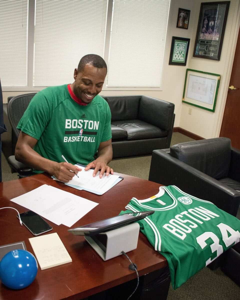
Longtime NBA star Paul Pierce signed a contract with Boston yesterday, allowing him to retire as a Celtic — a very nice sentimental gesture. And look, they staged a photo of him signing the paperwork alongside a Celtics jersey with a big, honking GE ad on it. Because when you think of Paul Pierce, you think of the Celtics and GE, not necessarily in that order. Awww, isn’t that sweet?
GE paid for precisely this type of exposure, of course. And that’s the problem with uniform ads: They pollute everything they touch — not just the games themselves (although that’s bad enough), but also lots of ancillary events like Pierce signing his retirement contract. Disappointing.
That brings up another point: The Celtics announced that they’d be retiring Pierce’s No. 34. That should be okay, because the Celtics just hang banners with their retired numbers. But some teams hang jerseys. Are there any teams that show the front of the retired jersey? Probably not — and just as well, or else they might start putting ads on those too.
Also, here’s something that hadn’t occurred to me until now (although it should have): Will the jersey ads appear on throwbacks? They presumably will — that’s part of what the advertiser is paying for, right? If so, that’s going to look sooooo awful, especially in instances when the advertiser didn’t even exist during the period when the throwback was originally worn. Imagine, for example, the Nets’ Infor ad patch on a Dr. J-era throwback — ugh.
Meanwhile, you may have noticed that Pierce inked his deal while wearing an Adidas-made Celtics T-shirt. That’s because Adidas is still, as of today, the NBA’s official outfitter. I’ll be summarizing the latest info about the Nike changeover in an ESPN piece this afternoon — stay tuned.
Click to enlarge
Collector’s Corner
By Brinke Guthrie
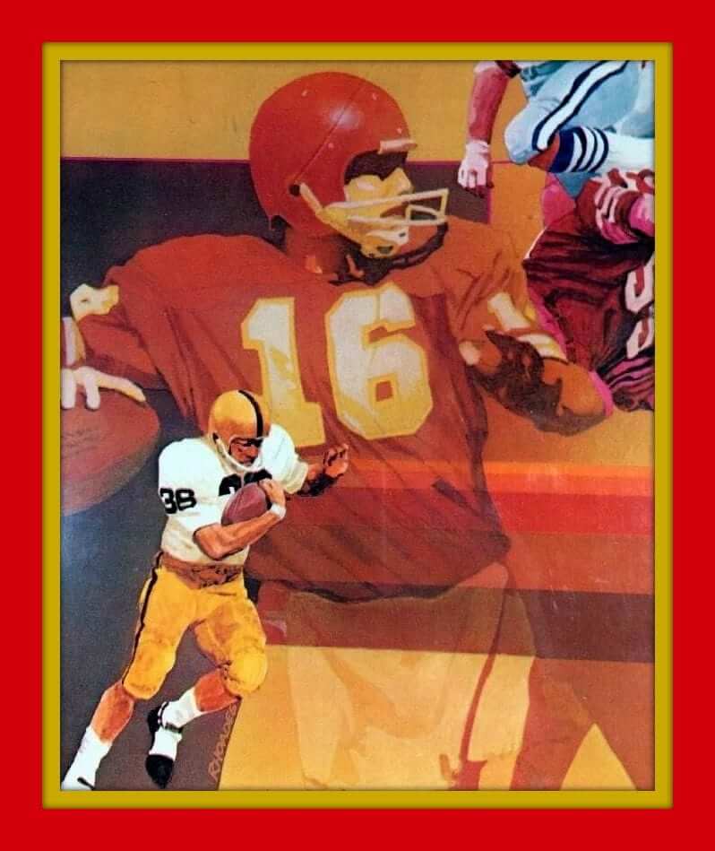
Ya gotta check this one out. Behold this 1970s Mead NFL binder. The artwork is stunning. Ed Podolak, Griese, Butkus, Reeves, Dawson, Namath, and others. I had this one and always wondered why there were no helmet logos on ’em. A classic.
Now for the rest of this week picks:
• Here’s a nice-looking Eagles sweatshirt for kids, straight from the NFL Shop at Sears. But you knew that.
• One more from the City of Brotherly Love: this nifty Eagles Technigraph plaque.
• This 1970s vending machine header card from “Folz Vending Co.” touts “All-Time Hockey Champs” like the Rangers and Bruins.
• Another vintage 1970s NBA light switch plate for you, this time for the Golden State Warriors.
• Another Warriors item, this time a pair of 1980s practice shorts from Champion.
• Ah, will ya look at that old logo on this California Angels beer stein!
• Very cool 1968 Atlanta Falcons poster by Don Weller right here.
• Check out the logos on this 1970s NFL belt!
• Here’s an interesting item: The seller says this is the original packaging artwork for a 1960s/1970s team necklace.
• This Bengals helmet plaque font is not even close. Not by 100 miles. So how did this one make it to production?
• If Nick Schultz wonders where his 1970s MLB card carrying case is, he should check on eBay. (His name is on the “Property of” sticker on the front.)
Click to enlarge
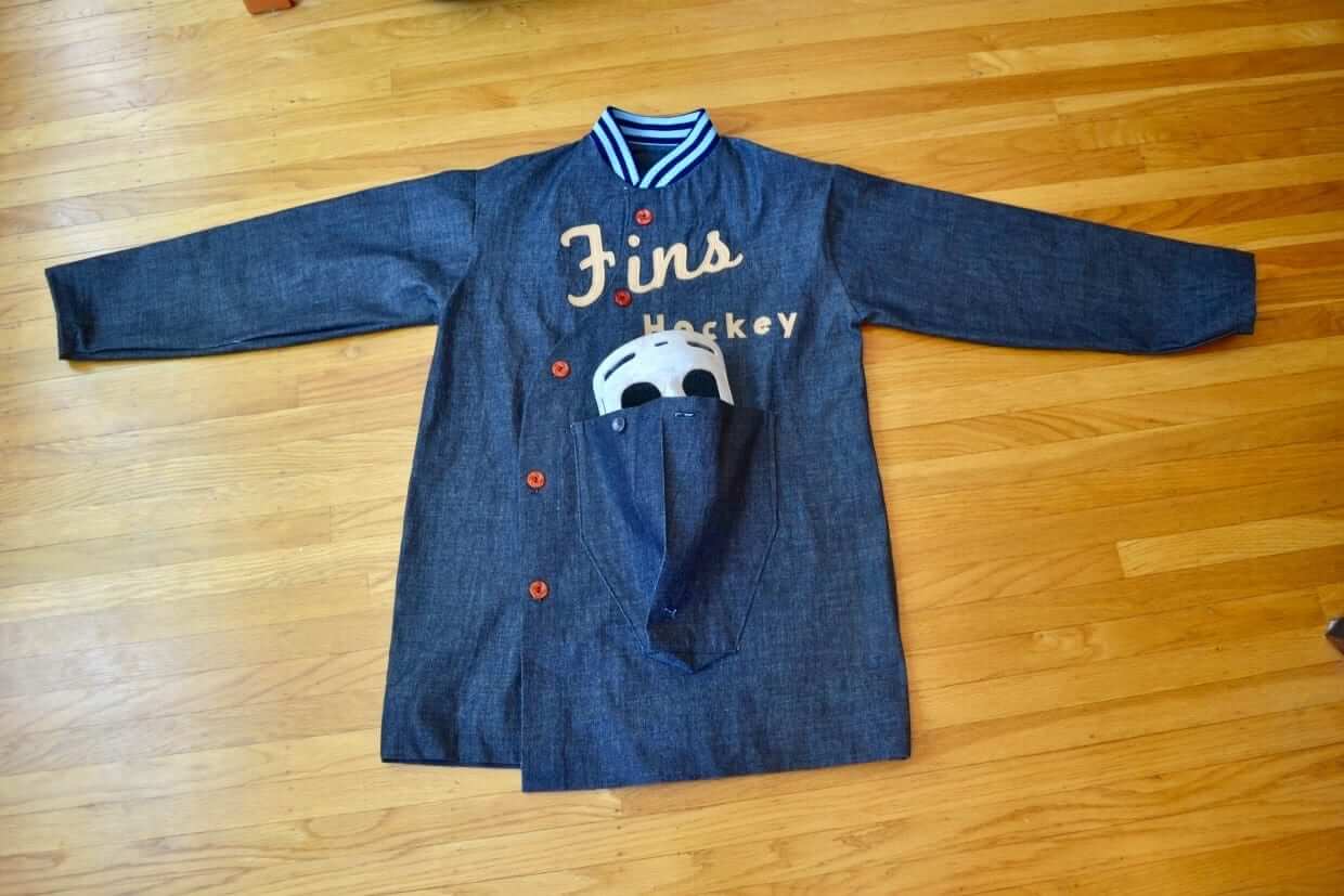
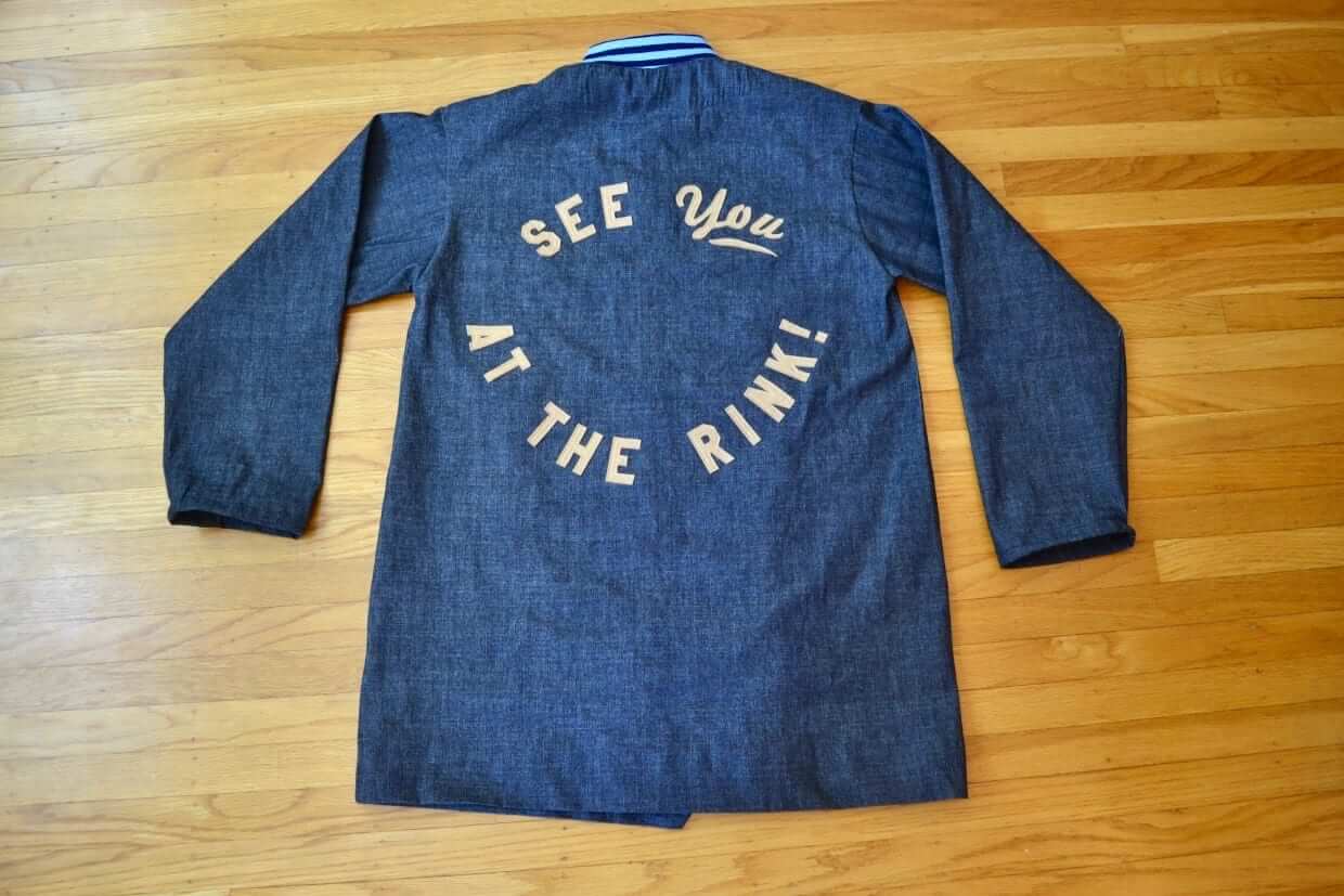
Too good for the Ticker: The pseudonymous DIY genius known as Wafflebored has done it again, this time created a hockey jacket with its own goalie mask pocket. Get the full story on this one here.
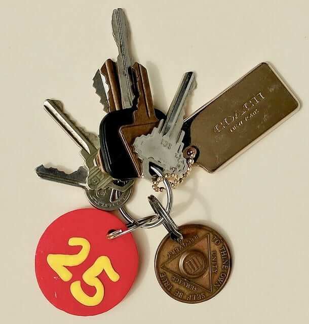
KRC update: The latest installment of Key Ring Chronicles is about a pair of sobriety tokens — a metal one with the Roman numeral III and a DIY plastic one with the number 25. Check it out here.
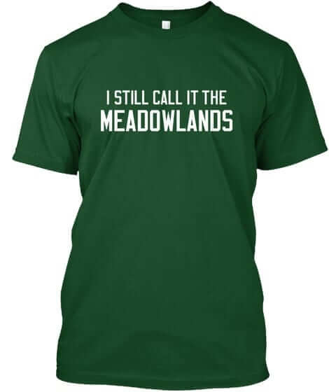
Naming Wrongs reminder: In case you missed it yesterday, we released a slew of new Naming Wrongs shirts (including the Meadowlands design shown at right). Get the full scoop here, or just go straight to the Naming Wrongs online shop.
The Ticker
By Mike Chamernik

Baseball News: The Dodgers have been quietly attempting to sell the naming rights to their field, although not to the stadium itself, so the resulting naming would be “[Advertiser] Field at Dodger Stadium” (from David Raglin). … Astros DH Carlos Beltran hasn’t played the outfield since May, so his teammates wore black and held a funeral for his glove out in center field before last night’s game. … Cardinals P Carlos Martinez is missing his top two buttons. Jonathan Karberg surmises that Velcro or hidden buttons are keeping the jersey together. … “Oven mitt” sliding gloves have become increasingly common among the game’s top baserunners. The one worn by the Royals’ Whit Merrifield has small metal rods to protect his left hand and prevent jammed or broken fingers (from Brad Reissig). … MLB is taking legal action against Overwatch League, an eSports league, because its logo is very similar to the MLB logo. Of course, lots of leagues have copied the MLB logo format, so it’s a bit odd that this is the one time MLB decided to litigate. … MLB switched to Majestic Flex Base jerseys in 2016, but Cardinals catcher Yadier Molina still wears the full weight knit (from Bill Henderson). … The Round Rock Express will be having a Fauxback Weekend on Aug. 4-5. They’ll wear this cap and the powder blue jersey shown at top-right here (from Joey Friedman). … MLB ump Dan Bellino, who was working last night’s Mariners/Astros game, appeared to have a Batman T-shirt under his jersey last night (from Ian Hill). … Here’s a Japanese high school catcher who wears a padded face guard in addition to his regular catcher’s mask (from Jeremy Brahm).

NFL News: Outside of the Pro Football Hall of Fame in Canton, Ohio, the electric company uses a set of goal posts as a transmission tower (from James Gilbert). … The Lions will wear throwbacks on Thanksgiving, and will have grey Color Rush unis for a Saturday game — not a Thursday-night game — in December (from Mike Thompson). … Alan Sankey found a few old NFL pennants with “The” before the city name.
College & High School Football News: Not the best photo, but it looks like Navy has new uniforms. The Midshipmen ditched the gold collar, and moved the stripes from the chest to the shoulder and the TV numbers from the shoulder to the sleeve. Here’s what they wore last year (from Seamus McNally). … For the Lobster Bowl, an annual high school all-star game in Maine, players wear their own helmets with additional decals of other schools participating in the game as well. Here are a few more photos (from Jacob Paulette). … USC has updated its jersey template, although their basic design is staying the same. … New uniforms for Marshall. … Here’s how the new Schutt F7 helmet looks with Michigan and Miami decals.

Hockey News: The Red Wings’ new arena will have a 5,100-square-foot center-hung scoreboard, the largest in the league (from Eric Romain). … A few former Gophers are not thrilled that Minnesota sold the naming rights to Mariucci Arena (from Ebin Sandler).

NBA News: A Sixers fan is selling a full-size Joel Embiid balloon figurine. … Repeated from the hockey section: The new arena for the Pistons and Red Wings will have a 5,100-square-foot center-hung scoreboard (from Eric Romain). … A Thunder beat writer said during an online chat session that the team is scrapping its orange “sunset” uni and adding two alternates.

Grab Bag: Here’s the logo evolution for Johnnie Walker, the Scotch brand. … LSU’s new lazy river at the school’s campus pool is shaped like the school’s initials. … Both the LPGA and the U.S. House of Representatives have been criticized recently for their strict dress code policies regarding women golfers and reporters, respectively (from Tom Turner).

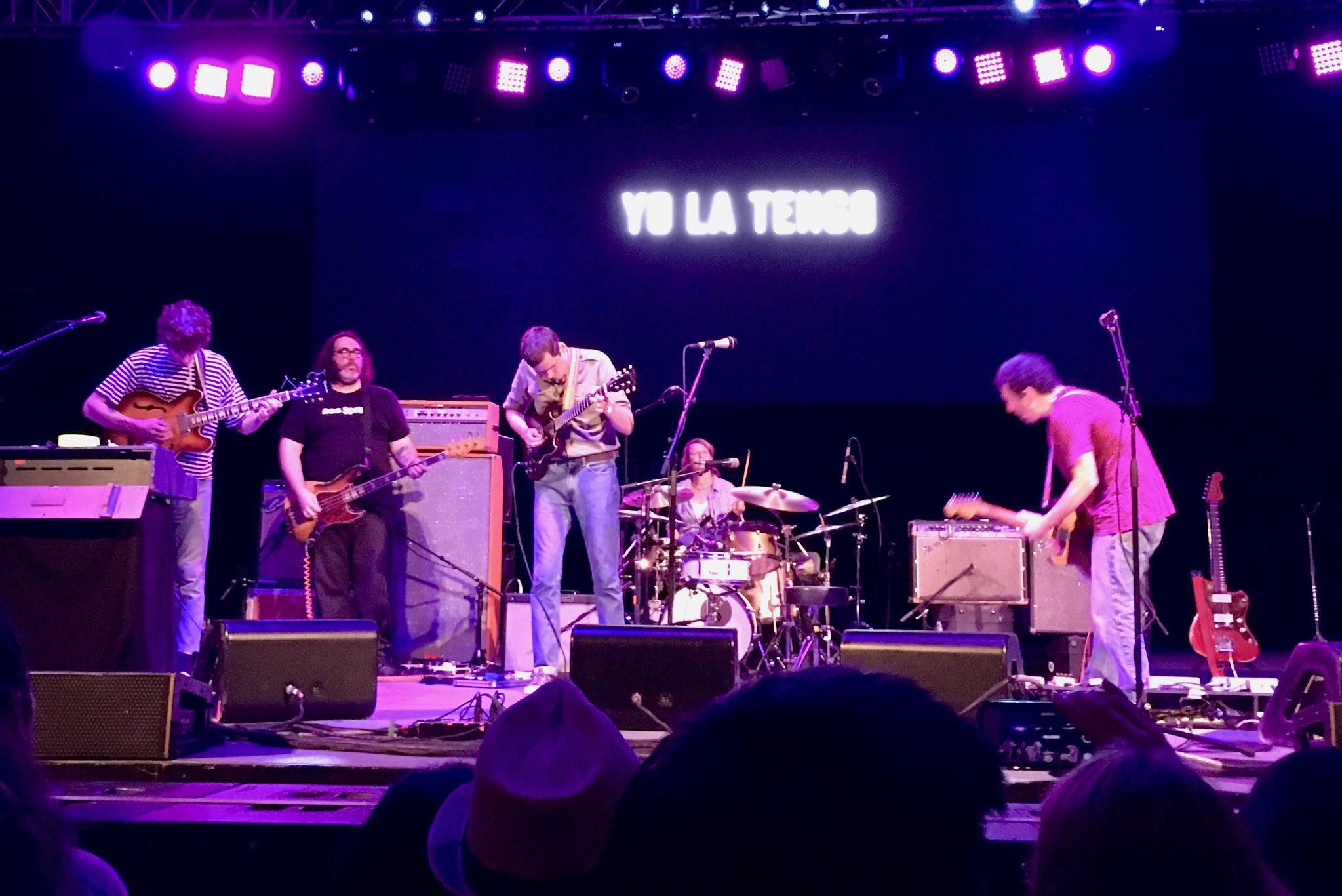
What Paul did last night: I’m a big fan of the British indie band Ultimate Painting, so my friend Shane and I went to see them last night in Central Park, where they were opening for Yo La Tengo.
They were great (I’m a sucker for that whole Velvets/Luna/Feelies thing). But from an aesthetic standpoint, take a look at the video clip I shot, shown above. As you can see, guitarists James Hoare, on the left, and Jack Cooper both wear their guitars a bit high — especially Cooper. For some reason I’ve always found this style to look a bit pinched and uncomfortable, and last night I found that it was making me uncomfortable. I don’t mean it as a criticism — obviously, they should wear their instruments however they want. But something about it felt a bit uptight, instead of free and easy.
This feeling was thrown into higher relief when Hoare and Cooper came onstage to join Yo La Tengo for the finale of YLT’s set. YLT guitarist Ira Kaplan and bassist James McNew both wear their instruments pretty low-slung, and the contrast between their look and Hoare and Cooper’s look was pretty funny (click to enlarge):
Anyway: Both bands were excellent (I’ve seen YLT dozens of times over the past 30 years and this was one of the better sets I’ve seen them play), the price was right (the show was part of the free Summerstage series), and there were these high school girls in front of me who were sharing what appeared to be the first joint of their lives, which was pretty hilarious. All in all, a very good night.
A similar thought occurred to me last night. Will MLB throwbacks have Under Armour logo on the front when UA begins supplying jerseys?
Well, most current MLB throwbacks have the Majestic maker’s mark, so….
Didn’t you already cover this? Didn’t UA pay something like TWICE the next-closest bid just so they could have their logo on the front of jerseys?
Yes, they paid a lot more.
So yes, we can assume that their maker’s mark will appear on throwbacks, as well as on regular uniforms — just as the Majestic mark does.
I was thinking watching the Phillies this past weekend wearing the light blue throwbacks, if there will be the big honkin UA on the front, right now there’s a majestic logo on the side of the stripe on the sleeve.
No! Please No!
My assumption from that picture of the Lobster Bowl (link) is that one of the players has the “OH” (or is it “HO”?) decal upside, right? Or are they really two different schools with identical – albeit rotate 180-degrees – logos?
The ads-on-throwbacks thing is something that’s been seen in soccer (here in the US anyway, the times I can recall seeing true throwbacks – not new designs inspired by classic ones – overseas they are true to the original jersey and don’t have them. I can recall a few instances where teams have done “throwbacks” but had modern ads on them. FC Edmonton / Edmonton Drillers from 2011: link. 2015 Jacksonville Armada / Jacksonville Tea Men (note the Adidas stripes despite the Armada being a Nike team today): link. And the Philadelphia Union / Bethlehem Steel FC: link. That last one is not a true throwback, but is of note I think because of the retro-styled sponsor Bimbo logo on the front. The Timbers did something similar with Alaska Airlines on a 3rd jersey a few years back. Will be interesting to see if NBA teams, where applicable, throwback the ad logo too.
CFL teams have had similar size advertising patches to those of the NBA for over a decade.
Each CFL team wore 1960s throwbacks during the 2009 season.
The uniforms were so throwback that they did not even have nameplates on the back, but they did have the modern-day ads on the jerseys.
link
Unfortunately, I could forecast something similar happening with the NBA ads and throwbacks. It would not surprise me.
I believe the Celtics changed their away jersey to read “Boston” instead of “Celtics” in 2014, so Pierce never wore that style of jersey.
Proofreading:
“That should be okay, because they Celtics”
– the Celtics
“The one worn the Royals’ Whit Merrifield”
– worn by
“MLB is taking legal action against Overwatch League, an esports league”
– eSports
“For the Lobster Bowl, an annual high school all-star game in Maine, players wear the own helmets”
– their own
“LSU’s new lazy river at the school’s campus pool is shaped like school’s initials”
– the school’s
“This feeling was thrown into higher relief was Hoare and Cooper came onstage”
– when Hoare
Ay yi yi. Fixed.
Tribute to Winston, er..Ono perhaps?
Funny you should mention that. If you watch the little video clip I shot, watch Jack Cooper (the guy on the right) when he starts singing. See how he bends slightly at both knees as he sings? That’s exactly what Lennon used to do in the Beatles’ early days. I actually thought about mentioning that in today’s post but decided not to go that route and just stick to the high-guitar thing.
Oh, absolutely. The whole thing (the way he strums with the pick, the progression of bar chords, the knees) is absolutely channeling Lennon (whether intentionally or not). First thing I thought of (played the vid w/o sound, so maybe that added to my cognizance).
link
Those guys don’t seem high at all
The highest guitar I’ve ever seen was on the dude from Don Caballero. I thought maybe it was so he could see his looping pedal.
And Waffleboard makes me feel like a real chump. Nice work. As always.
Yes. This was my first thought as well. Harrison played that way in early Beatles as well. From a guitar standpoint, this position does make working the fretboard hand easier, but the downside is that arm can get tired from being in a more bent position.
Paul, you have great tastes in music, food, etc. I have enjoyed your work from very early on. I know we’d get along if we could ever hang out. But man, the uni ad thing is happening. I don’t like it, but $ eventually gets to everything in sports. And of course, don’t let that stop you from fighting the good fight.
Given that they went to the trouble to announce the throwback uniform, it’s no surprise that the Lions would roll it out on Thanksgiving once again. Now, if only the Vikings would wear throwbacks – they’ve got two great options for white jerseys, too, with either Northwestern (1961-1968) or UCLA (1969-2005) stripes.
Being a die-hard Ohio State fan, I absolutely love how awful Michigan’s overrated and first-used-at-Princeton winged helmet design looks on the Schutt F7. :)
Well, that’s hardly an objective opinion now, is it?
Having seen the wing design adapted to hockey helmets (which are hardly optimal for the pattern) over the last three decades, this doesn’t bother me.
Well Ohio States Helmets have to many stickers! I’m a Michigan football fan
RE: Goalpost power line poles…
Here in MouseTown, just outside of Walt Disney World is a Mickey shape power pole:
link
I thought of that one as well, but didn’t submit it because there was no sports connection.
a connection to a connection.
Are there any teams that show the front of the retired jersey?
Yes. link Which I’ve always loved because you get a real sense of the uniform evolution, sometimes even link.
No retired numbers from the era of Paul’s least favorite uniform color, though.
New I Miss It shirts: I miss the Arena.
(St. Louis). I miss the Stadium. (Chicago)
Generic I miss for hockey: I Miss the Barn or I Miss the Arena
For hockey, I think Gardens has become more rare than Arena.
At the highest levels, sadly, Center is well on its way to most of the above terms.
D Bloomquist,
Whatever you do today, do NOT click on the Round Rock express jersey shit show in the baseball section!
Thank me later
Yes, that would suck. Oriole Park at Camden Yards is about as far as this can go.
If anything, it should be Vin Scully Field at Dodger Stadium.
Wouldn’t it be nice if some benevolent billionaire outbid everyone for the naming rights, and chose to call it either Vin Scully Field or even just Dodger Field at Dodger Stadium?
Bingo. Would it kill these moneygrabbers (to use the substitute term for m-f’ers used in the TV version of Trading Places) to leave just a little cash on the table for the sake of esthetics?
You may recall that when the Lakers retired Shaq’s jersey, they put his name/number on the front of the jersey instead of the back. link I wonder if the ad would have made it on there, too.
Seeing the goal post and Mickey Mouse shaped power poles made me think of another item that was modified solely due to its location. I used to live in Charlotte, NC and the crosswalks around the NASCAR HOF are checkered flag patterned. I loved the subtle change that is totally appropriate for the location.
link
Philly has some link in the neighborhood affectionately called the Gayborhood.
Atlanta just recently installed them as well at one intersection.
I don’t think the full awfulness of the NBA uniform ads hit me until I saw that Pierce Photo. My God what a disgrace. It gets worse. The Dodgers selling field naming rights? Ugh. These are dark days in the Uni-verse.
I saw the Royals on TV for the first time this season and noticed Whitfield’s sliding glove/oven mitt. While I understand the rationale, etc., how is it this can be legal? The glove obviously is longer than his fingers. What’s stopping him, for instance, from using a 3-foot-long glove? I don’t if this is covered in the rule book. Thoughts?
Naming Wrongs “I Miss It” idea: County Stadium
How much marketing corporate speak BS can one company make in a day?
link
Holy crap. You still have default homes (Lakers gold, everybody else white), default roads, some alternates, and some throwbacks. And you can still see other permutations on the court with prior arrangements as long as there are no clashes. Much ado about nothing.
I don’t know why this particular announcement grinds my gears so much though.
“Association Edition”? “Icon Edition”? You gotta be fuckin’ kidding me.
I’m assuming this will be tomorrow’s lede.
It’s essentially the continuation of the video game-ization of uniforms. Go play Madden or an NBA 2K game and you can pick any combination of uniform you want from the entirety of a team’s history, often even mixing and matching. Why not have real life be like that?
Well, that last question is what the marketers think. It’s unfortunate because, for some of us, tradition still means something, and sacrificing tradition for dollars is just kind of sad. There’s no reason to do this other than to sell more uniforms. That’s all.
I’m sure this will fall along the usual lines. Young folks will like it. Older folks won’t. Nike will make more money. Eventually, other sports will follow — hockey kind of has already, baseball has different color tops and football is heading in this direction. And, for us fans, there’s basically nothing we can do about it.
It is what it is, though the constant pursuit of more money is truly tiring to me. There are other things of value out there.
To play a bit of devil’s advocate, the video game has no vested interest in selling more merch but this option exists there. It probably means the people who are into the video game just think it looks cool. This is about attracting viewers as much or more than it is about selling tank tops.
But seriously the thing nobody realizes is that in 20 years there won’t be anything to throw back to because this era at least is moving away from any attempt at distinct or iconic looks.
Does anybody know what kind of chest protector that Japanese catcher is wearing? The helmet and nose protector is an interesting look, but that pad looks like an inflatable pool floatie.
That catcher takes so much care protecting his already protected face, but wears his chest protector incorrectly. His throat and collarbone are very vulnerable to foul tips and balls in the dirt.
link
link
After a freak accident in 1976, Yeager introduced the neck protector (aka. billygoat), the flap attached to the catcher’s mask. He was hit with the jagged end of a broken bat from teammate Bill Russell’s bat while in the on-deck circle which pierced his esophagus. He had nine splinters removed from his neck in surgery. Dodger trainer Bill Buhler invented and patented the throat protector that hangs from the catcher’s mask which was subsequently used by most catchers thereafter in the Majors and other leagues.
I loved the funeral for Carlos Beltran’s glove, and thought it was great that the attendees wore black.
A lazy river!? Damn, people at my school lost their minds when we finally got a Starbucks. Throw in a Chick-fil-A a year later and we thought we were royalty
So long as we don’t see the Quicken Loans Grand Canyon or the Carl’s Jr. Bad Caverns im okay with naming rights on certain facilities.