While we all wait for the NBA and Nike to unveil the 2017-18 uniforms, some leaks and hints have been accumulating. The latest one comes from Twitterer @DodgerGonerIV, who got in touch with me yesterday with an interesting tidbit: He was on Snapchat and saw an ad for the Kings’ new arena app (yes, the arena has its own app). The ad suggested that the app would provide a sneak peek at the team’s new uniforms, and @DodgerGonerIV was able to get two screen shots before the ad disappeared.
Could this guy be scamming me? Sure, it’s possible. But I had a lengthy back-and-forth with him and did a bit of other diligence, and I think these screen shots are legit (click to enlarge):
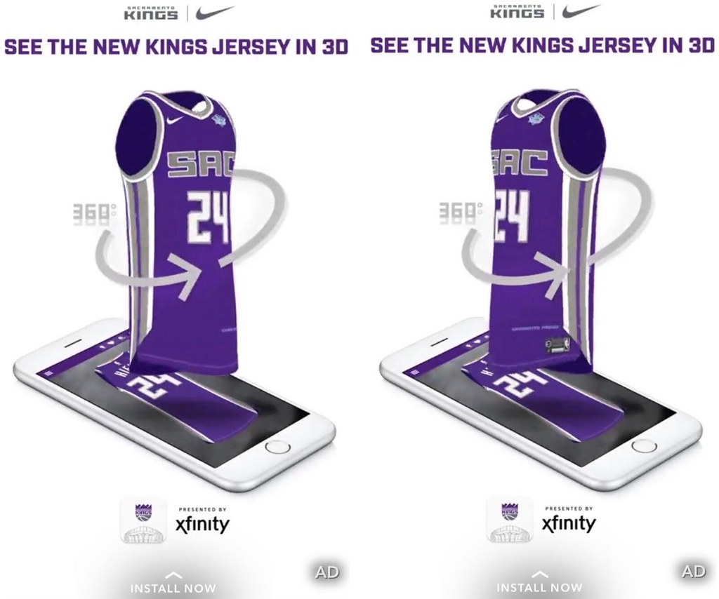
As you can see, these are fairly crude mock-ups, but they do give us a pretty clear view of the Kings’ purple jersey, including the Nike maker’s mark and the Blue Diamond Almonds ad patch. Aside from those elements, how does this jersey compare with the old version? Let’s take a look at the outgoing design (click to enlarge):
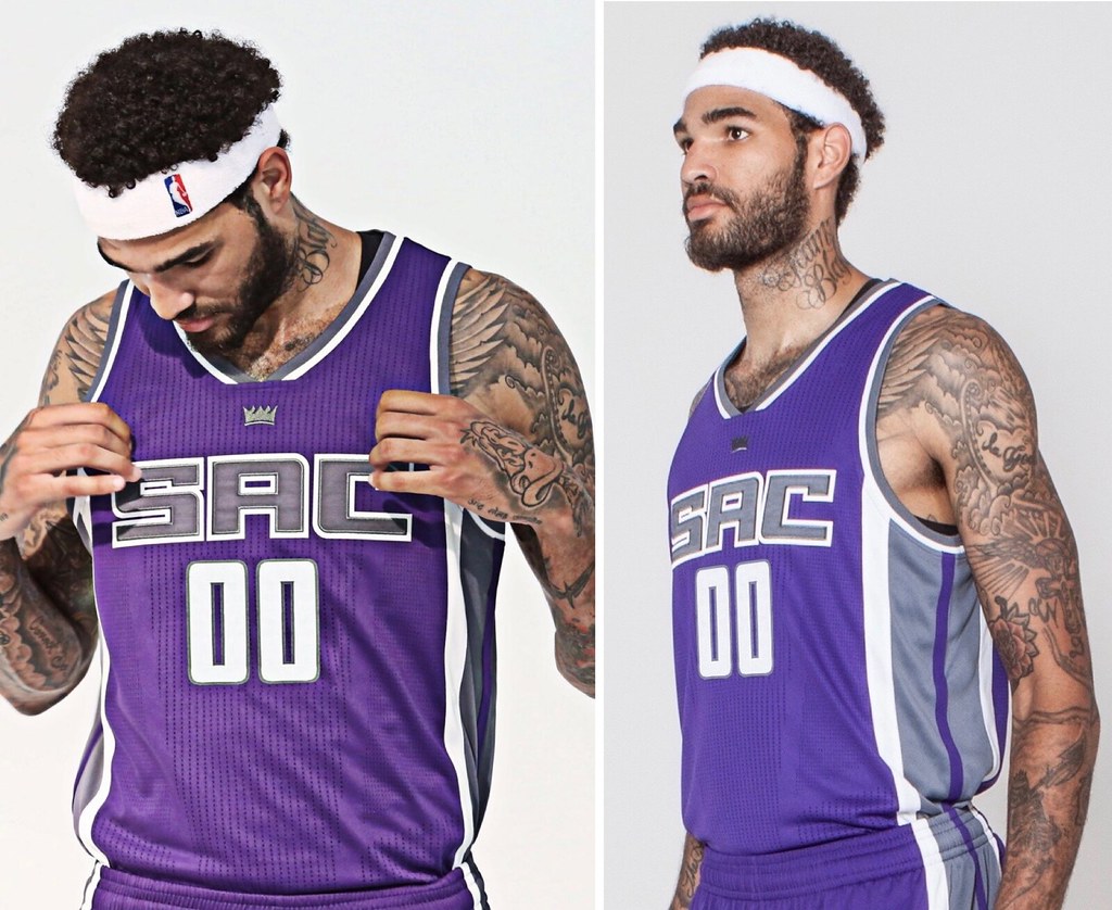
Based on this, it looks like the main difference is the collar, which is going from a truncated stripe to a full stripe (sort of the opposite of what’s happening to some NFL collars this year). Also, the crown logo isn’t shown on the chest, although that might just be something they didn’t bother to include on the mock-up because it’s a small detail. Also-also, it appears that the side striping is diagonally truncated at the base instead of going all the way down to the hemline (although that won’t have an visual effect during a game because the jerseys will be tucked in). And the numerals look larger in the new mock-up, but that might just be a mock-up thing.
In short: It appears that the Kings will only have teeny-tiny changes. Not surprising, given that they just unveiled their latest look just a year ago.
One final thought: It’s disappointing that the ad promises fans a sneak peek at the team’s new jersey, not the full uniform. We all know why they do that, of course — because the jerseys are what they’ll be selling — but it’s still a drag. It contributes to the growing tendency of people to think that the uniform simply consists of the jersey, with the other elements reduced to afterthoughts. Come on, Kings — don’t contribute to uni-illiteracy!
Meanwhile, for those who’d like to engage in some additional NBA tea leaf reading, the Nuggets raised some eyebrows yesterday by introducing free agent acquisition Paul Millsap with one of their classic skyline/rainbow jerseys:
#Nuggets there's a new star in town. Heard DeMarre Carroll say Jokic and Millsap will be really good together. pic.twitter.com/qRef7VwoDt
— Rafael Torres (@rafaeltorresNBA) July 14, 2017
Is that a hint that the Nuggets will be switching to that style in the fall? Shmaybe, but keep in mind that they wore that design as a throwback last October, so they certainly have plenty of those jerseys lying around. Still, it’s certainly interesting that they chose to use that design for the Millsap presser.
I’ll have more to say about the NBA/Nike situation next week on ESPN.
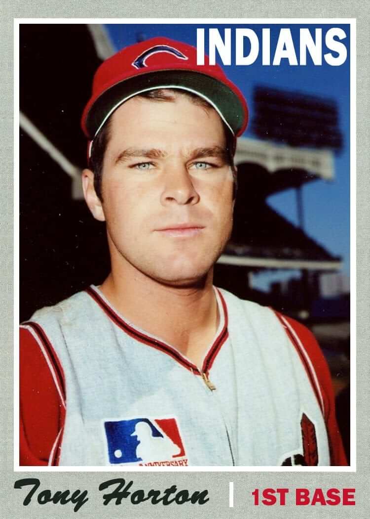
Click to enlarge
Zip-a-dee-doo-dah: My latest Friday Flashback piece on ESPN takes a look at MLB teams that have worn zippered jerseys (including Cleveland, shown above, whose 1969 zippered vests featured the MLB centennial patch on the chest, instead on the sleeve). Check it out here.
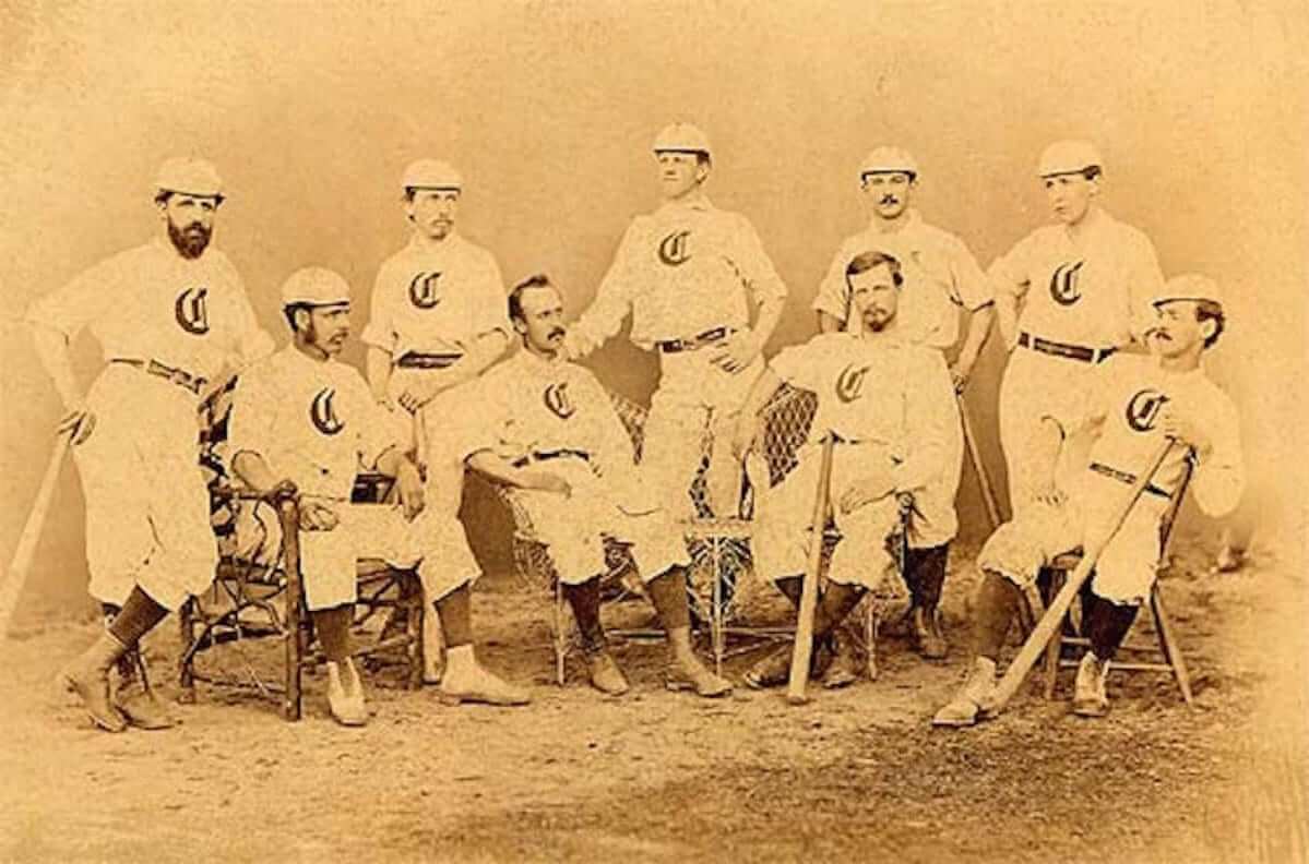
Red letter stocking day: Don’t look now, but a major baseball milestone is upon us. Based on the best available research by uniform historian Craig Brown, who runs the excellent Threads of Our Game website, tomorrow is the 150th anniversary of when the 1867 Cincinnati baseball club became the first team to wear knickers and expose their colored socks, thereby ushering in baseball’s high-cuffed era and paving the way for team names like Red Sox and White Sox.
“Nineteenth-century research is spotty and always open to question,” says Craig. “Some accounts imply that 1868 was actually the first year for the knickers, but there are several bits of data pointing to July 15, 1867.” Craig is the leading historian of 19th-century unis, so if he’s comfortable with the 1867 date, that’s good enough for me.
Some of you may be thinking to yourselves, “Wait a minute — I thought ballplayers always exposed their socks back in the day.” Nope. The earliest baseball uniforms, dating back to the late 1840s, featured long trousers, which sometimes included interesting accessories down at the cuff level. As the Baseball Hall of Fame’s website explains, “In order to keep pant legs from catching on shoes or otherwise interfering with a player’s actions, some clubs adopted pants with buttons on the sides of the leg openings, resulting in a tight-fitting, tapered fit at the shoe top. Other clubs belted the leg openings in order to keep them from interfering with play.” Sounds like some of the shenanigans that modern players have engaged in more recently to keep their cuffs anchored to their shoetops.
But of course there’s no need for any of that. The simple solution: Go high-cuffed, just like the Cincy squad did 150 years ago. I suggest we all celebrate the anniversary tomorrow by going high-cuffed ourselves, even if we’re not playing baseball.
Pop-up update: Some of you have been complaining lately about an infestation of annoying pop-up ads on the site, especially on mobile. It’s been surprisingly difficult to diagnose and fix, but we’ve made some changes that may have done the trick. For those of you who were experiencing the pop-ups, have you seen any improvement?
You can always help us troubleshoot this type of thing by sending me screen shots of any pop-ups you encounter. Thanks, both for your patience and your assistance.
Naming Wrongs update: Scott Turner and I have been working on a new batch of Naming Wrongs designs, which I should be ready to unveil for you on Monday.
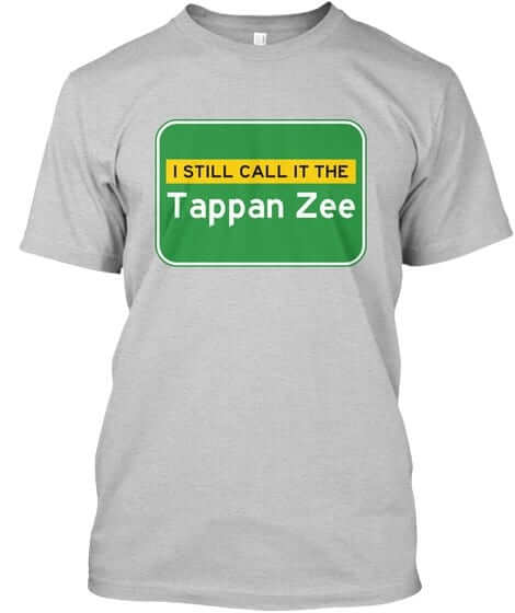
In the meantime, we decided to have some fun with the new Tappan Zee Bridge, which is being named the Mario M. Cuomo Bridge. Now, naming a bridge after a former governor isn’t necessarily an awful thing (although, given the identity of the current governor, it smacks of a certain nepotism), but “Tappan Zee” is such a good name — why change it? So we’ve created the design shown at right, which you can click to enlarge.
Since this isn’t an anti-corporate shirt, I haven’t put it in the Naming Wrongs shop. Instead, I’ve created a new shop, called Bridge and Tunnel. For now, it just has lot of versions of the Tappan Zee design (if you want a color or style that isn’t shown there, just ask), but we may add other products at some point down the road.
The Ticker
By Alex Hider

Baseball News: Reader Andrew Lehman points out that Cardinals mascot Fredbird has a strange variant of the team’s “STL” logo on his cap ”” and has worn the logo for close to 30 years. Does anyone know why Fredbird wears this logo, or if this logo has been used elsewhere? … It appears that the Rays’ Colby Rasmus wears a QALO wedding band on the field ”” with no batting gloves! (From Mike Engle.) … Six Roberto Clemente collectors’ items ”” including his 1967 Silver Slugger Award ”” went for more than $300,000 at auction this week (from Rich Mueller). … Anyone ever notice the White Sox caps and T-shirts featured in the movie The Breakfast Club? (From Jeff Scam Gundy.) … These are the finalists in the rename-the-team contest for the Gwinnett Braves. Some folks aren’t happy about the choices. … Rough black-on-dark blue matchup last night between the Jacksonville Jumbo Shrimp and the Chattanooga Lookouts (from Charles Eldridge). … The State College Spikes of the New York-Penn League will wear special jerseys for “Salute to Conspiracy Theories Night” (from WB Young). … Rockies P Chad Bettis, rehabbing with the Hartford Yard Goats, wore his pinstriped Rockies pants with Hartford’s non-pinstriped jersey (from Stephen Scheffel). … An Albuquerque Isotopes coach and player had mismatched number fonts. … The Burlington Royals used to be a Cleveland farm team, so their stadium salutes some old Cleveland stars from the 1990s — but does so in the bathroom (from Jeff Moulden).

Football News: Paul discussed the Panthers’ new training camp logo in yesterday’s post, but it was later revealed that the logo was inspired by HBO’s Game of Thrones (from Alex Gras). … One of the new overpriced concessions items at Washington’s FedEx Field this year includes an interesting piece of design (from Tommy Turner). … Auburn is dropping its academic logo in favor of its interlocking “AU” athletics logo (from Clint Richardson). … Lots of #BrandSynergy 🙄 on the cover of North Carolina’s 2017 media guide. … New helmets for Cedar Crest High School in Lebanon, Pennsylvania (from Joseph Matlock).

Hockey News: The Predators will wear a 20th-season patch next season. Look familiar to anyone else? Although the date range shown on the patch is “1998-2018,” they’ll apparently start wearing it in the fall of 2017. … This blog ranks the top 10 uniforms worn by teams in their inaugural seasons (from Phil).

Basketball News: The logo for the 2018 All Star Game in Los Angeles has leaked. … Yahoo Sports used the Lakers’ logo to troll Magic Johnson and Lavar Ball. … Marshall High School, a school featured prominently in the classic documentary Hoop Dreams, has a wild new floor ”” and backboard! (thanks Mike).

Soccer News: Chris Wondolowski of the San Jose Earthquakes changed his jersey number from 8 to 38 on Thursday to honor teammate Matheus Silva, who recently awoke from a coma following a swimming accident (from Noah Fischer). … Germany’s home kit for the 2018 World Cup has reportedly been leaked (from Trevor Williams). … Manchester United and Manchester City will face off in Houston later this month. Both teams’ jerseys will include a worker bee patch, a symbol commonly associated with the city of Manchester. The patch will serve as a memorial for those killed in the May terror attack in the city (from The Ghost of Tal’s Hill). … New home kits for Partick Thistle of the Scottish Premier League (from Ed Å»elaski”). … Borussia Dortmund has released their change kit for 2017/18 (from Andy). … Speaking of Dortmund, their change kit is part of a “blackout” campaign by Puma. Twenty-two other teams from around the world will go BFBS (from Mikey Traynor). … These are the kits that Mexican side Leon will wear in the upcoming Apertura tournament (also from Ed Zelaski). … New kits for Cruz Azul (from Alex Dusza”). … Croatian side GNK Dinamo Zagreb also has new kits (also also from Ed Zelaski).

Grab Bag: Do you call athletic shoes “sneakers” or “tennis shoes?” As a proud Cincinnatian, I’ve always said “gym shoes.” I didn’t know that was strange until today (from Brinke). … Here’s an interesting list of every county flag in the state of Ohio. I’m a little disappointed that more counties don’t take after the state flag’s pennant shape (from Jason and K.C.). … The World Chess Hall of Fame and the St. Louis Fashion Fund are trying to design the quintessential chess uniform (from Phil).
Kings Jerseys….Gross. The team is in Sacramento, not Sac.
It’s a misspelling. It should read SUX
In addition, there is a team in Phoenix, not PHX.
In the ticker: Cruz Azul, not Azul Cruz.
And, as an aside, John Hughes was a big Sox fan, hence the Sox stuff in his films.
Fixed.
Umm… while I see the similarities, that Wise logo is not familiar to me. A local company? A regional brand?
Regional:
link
The chip I grew up on. I didn’t realize they distributed as far west as Ohio, so I was surprised when Alex (who lives in Cincy) included it in today’s Ticker.
Makes sense I wouldn’t know them, being from Michigan, where Better Made is the dominant local brand going up against the nationals. Last time I was in a grocery store outside of Metro Detroit was in Pittsburgh in July 2014, and I was more taken with the fact that they had ice cream from Friendly’s (which pulled out of Michigan in the early 1990s and closed their last Ohio locations in November 2014; I had even stopped in the one in Maumee on my way back from the ‘Burgh that trip!).
Before I clicked the link, I was expecting to see a photo of the Cincinnati Stingers logo.
link
OK, maybe this link will work
link
I don’t believe Wise actually sells in my corner of the state, but you may be able to get them in Cleveland. Otherwise, it must have stuck in my brain from road trips or TV references.
Paul. Please, please, please add the Triborough Bridge to your Bridge and Tunnel store! Renaming bridges, tunnels and highways in NYC for famous folks when the original names explained exactly what they did drives me nuts! The Triborough (connecting three boroughs) is on the top of that list for me followed by the Brooklyn Battery Tunnel. I would so buy a Triborough or BBT t-shirt.
This! “Hugh L. Carey Tunnel,” my ass! And “Atlantic Avenue-Barclays Center” will always be Pacific Street.
Yes, yes, yes!
And the 59th Street Bridge.
We’ve had a lot of pointless renamings in the past several years.
If you really want to go old school, JFK was Idlewild Airport (though, I don’t think anyone’s “Still” calling it that
Wasn’t Idlewild the name of a local development used colloquially for the airport, with its official name New York International?
For Philadelphians who ride SEPTA, maybe a “I still call it link” and “I still call it link“.
Both stations renamed for corporate sponsors (or whatever they’re supposed to be called here). Jefferson is the hospital near the Jefferson stop, so that’s not as bad as AT&T Station, which it total horseshit.
Both stations renamed for corporate sponsors (or whatever they’re supposed to be called here).
Advertisers. Very simple term. Advertisers.
Glad you’re using the proper font family and not that less-appealing Clearview!
Sears Tower
Re. the name for athletic shoes: seems to me “running shoes” or “runners” is the most commonly used term in Toronto.
I grew up in the Chicago area saying gym shoes. My wife is from Massachusetts and says sneakers.
Chicago here, too. Gym shoes.
‘Ello Guvnuh! I calls ’em me trainuhs!
Chicago as well, gym shoes.
They were tennis shoes when I lived in Iowa until age 7; I don’t recall what they were in Philadelphia for the next couple of years; and then they were sneakers for the rest of my childhood in Minnesota. They were also tennies in Iowa at the time, but I don’t hear that anymore when visiting. That might have been a 1970s thing, not a regionalism.
Tennis shoes in the part of Illinois I live in.
My first 13 years were spent in Iowa as well, and I still call them tennis shoes. Or really more like “tennishoes”.
Lee
They’re sneakers in Philadelphia, too.
it took me a while to get the hang of “trainers” while reading Harry Potter
Wasn’t that one of the words they changed for the American edition of the early books?
Apparently I didn’t read that edition. That’s also where I was introduced to the term “pitch” instead of field.
Nah. Every edition of the HP books I’ve ever seen has used trainers.
Out of curiosity, I checked. According to this, “trainers” was indeed one of the words they changed.
link
If anyone is interested, the New York Times ran link back in 2013. Maps out where your regionalisms come from.
The quiz link. Which is funny, because although I spent much of my childhood in Milwaukee I haven’t lived there in twenty years. Guess old habits die hard. Of course, some words are link they may tend to skew the results.
I did mine out of interest. I’m British but it mapped me strongest in Washington State.
When I took mine earnestly, it gave Tucson, Phoenix and Mesa, Arizona. I took it a second time with a couple fudges and got Denver along with Omaha and Fort Wayne, Indiana. I haven’t been to Omaha since 1965 and I’ve never even been to Indiana.
Wow.
I took the test, and it nailed me. It specified Omaha (I grew up in Iowa until 13) and Fremont (California, SF bay area, where I have lived since moving from Iowa.)
Wow.
Cool
Lee
Always called them Sneakers (east PA/NW Jersey) my older relatives in east PA did say tennis shoes though so it might also be a generational thing too. My wife is from IN, she calls them tennis shoes and laughs at me calling them sneakers.
also it’s “Sneaker Heads” not “Tennis Shoe Heads”….lol
runners or running shoes I believe is also the most common here in Thunder Bay and likely Northwestern Ontario.
sneakers are not unheard of as a term but the terms tennis shoes or gym shoes would only pop up in that particular context (when in a gym and require non-marking soles or when playing tennis)
I would say that description is pretty spot on in Western Canada too.
Growing up in Atlanta, I invariably called them “tennis shoes.”
For that little shoe calling piece I fully suspect that if “kicks” was an option that it’d win with the younger folks. I grew up calling them sneakers and wonder if anybody else were like my brother and I when we got a new pair. By that I mean we’d test out how fast they were by running to the end of the hallway and back in our apartment building.
For that little shoe calling piece I fully suspect that if “kicks” was an option that it’d win with the younger folks.
Probably, but that’s also an example of modern mass communication erasing regionalisms.
It appears that the light bank over Tony Horton’s shoulder in the baseball card picture is airbrushed over. Strange.
Today’s ESPN column is up:
link
That’s not the new basketball floor at Marshall high school. Nike is hosting free summer basketball camps and they did it just for that. They often do this around Chicago.
Nike/Jordan often change the court in the Jordan store at 32 South State every 3-6 months. They even rolled out black Jordan branded turf there last year for an “NFL draft inspired” workout that I took part in.
I grew up in Michigan, and I called them gym shoes. I would occasionally hear them called tennis shoes or play shoes. Sneakers always seemed like an old-fashioned term, something you would hear on an old tv show.
When you get to airports, a “I still call it just National Airport” shirt would be great. As for the other local airfields, I don’t think anyone still uses “Friendship Airport”.
I was going to suggest National/Reagan airport in DC.
I was going to jokingly suggest Idewild/JFK, but then looked up Idewild’s naming history. :)
Just “I’m Still Calling It National” is the shirt I’d buy. Especially if “National” is link.
I Still Call It The 59th Street Bridge
and I’m feelin’ groovy about it
Me, too. But hell, you could sell two versions of that one – “I still call it 59th Street” and “I just call it Queensboro”.
I like that. Also:
“I Still Call It the Triboro”
“I Still Call It the Interboro”
“I Still Call It the Interboro”
~~~
While I appreciate the let’s not name shit after politicians (and agree 100%) … I gotta override this one.
There should be more things named for JRR, not less.
You’d think they’d make that parkway NY 42, and not leave that route number on some road through the Catskills!
Oh, I totally agree. I probably told you the story about the conversation I had with a friend-of-a-friend about naming the new rotunda after JRR.
I also don’t really have a problem with RFK, but there are enough things named after RFK.
Not a New Yorker, so when I saw JRR (which may be a common expression in New York City) I thought it was a Lord of the Rings reference…
I still call it the Blackwell’s Island Bridge.
Does anyone actualy use these names?? it’s like when, back in the 40’s, they officially changed the name of Sixth Ave to ‘Avenue of the Americas’, NObody used it in real life, except maybe some tourists. The same thing happened up here in the Hudson Valley – a few years ago, they ‘renamed’ the Mid-Hudson Bridge by Poughkeepsie, the “Franklin D Roosevelt Bridge”, which sort of made sense, as FDR lived in Hyde Park, which is right next to Po-town. Then to appease local Republicans, they also renamed the nearby Newburgh-Beacon Bridge after Hamilton Fish, who was a conservative Republican congressman who happened to represent FDR’s home district. (Fun Fact: FDR NEVER carried his home district, either as NY Governor or President!). To this day, I have never heard one person refer to either bridge by their ‘official’ names.
I’m absolutely loving that LA All Star Game primary logo. Simple elements with bits of color.
The World Chess Hall of Fame and the St. Louis Fashion Fund are trying to design the quintessential chess uniform (from Phil).
This bit of news evokes the SNL “Spartan Spirit!” skit when the cheerleaders were boosting the chess club: “K! I! N! G! You can’t take my king from me!”
In hockey, football, and basketball, it is remiss to show just the jersey; there are too many details to the shorts, breezers, helmets, stockings and other pieces of apparel. But in baseball, once you see the hat and jersey you pretty much know everything. The exception which proves the rule: When the Diamondbacks added unusual details to the pants, everybody howled in disapproval and Arizona dumbed the trousers down this year. Which strange detail of recent vintage on baseball pants has survived more than a year? I’d say the black & white stripe of the White Sox knickers, and the white, teal & black stripe for the expansion Marlins. Slim pickings.
link
Splendid example, but not really of recent vintage. I was trying to think of everything since the Rangers put Braves-style piping on the belt tunnels. I recall the Brewers briefly had Tigers-like belt loops, but I’m fuzzy on the dates.
Oddly, when the Astros rebooted their look in 1994, the stripe on the trousers was the only piping on the entire uniform, a feature they carried over to the Enron Field years. As I said, slim pickings, but it just goes to show baseball pants are an overlooked canvas.
That’s the same attitude that led the Brewers to drop their pants piping so the same white pants could be worn with either the navy-and-metallic-gold primaries or the navy-and-athletic-gold alts.
We should resist that at all costs.
What is this new overpriced concession item at FedEx Field this year? The paywall stopped my cheap ass from accessing the content.
Same here Rex…I will never be that interested.
It’s a new way to serve your food with your drink
link
Hint: Right-click the link and click on “Open in new private window” (Firefox) or “Open in incognito window” (Chrome).
If you’re on a mobile device in Chrome, hold down on the link until the context window pops up, and tap on “Open in incognito window”.
I have no idea for Mac or iOS users.
Agreed. It’s also a line in Carole King’s “Really Rosie,” so let’s keep calling it that.
As for annoying ads interrupting my Uni-Watch viewing experience, that problem seems to have tailed off. Sometimes audio for an ad will refuse to shut up, but I don’t find that a major hassle.
Right click the tab in your browser and select “Mute tab”
Are they seriously designing a “chess uniform”? Chess is one of the last bastions of the jacket and tie and is a “sport” that is entirely cerebral, no uniforms or ads needed.
Ugh. Agree 100%.
Not exactly the same, but the version of bowling shirts they have now are bad enough that I simply cannot watch anymore.
Lee
Growing up in central Ohio in the 60s, we called them “tennis shoes.” I don’t recall ever hearing/using “gym shoes,” but couldn’t swear to it either way. Never ever “sneakers” though.
I grew up in Iowa, where we called them tennis shoes. Moved to California, where it was a mixture of tennis shoes & sneakers.
Never heard of “gym shoes” until today.
Lee
Regarding the Cardinals’ mascot wearing a mutant version of the STL logo on his hat… Dinger, the Colorado Rockies mascot has done the same thing for as long as I can recall. His CR logo is not the same one as the players wear, which is odd, because he always wears a jersey that matches whatever the team is wearing that day. (Image containing purple here… link)
Wow – that’s a much better logo.
After further research, Dinger used to wear a more accurate logo… I wonder why he switched when the rest of the uni matches.
A quick EBay search of older or vintage Cardinals caps (especially the “trucker” kind) will reveal that the Cards had two kinds of red caps: the “sober” kind which was worn on the field, and various fan give-away and unofficial caps with a more pronounced interlocking STL. That unofficial STL logo was fairly common in the 70s and 80s. It is based on the late 50s / early 60s STL logo. You can even see that type of logo on some old mesh Spring Training caps, I believe. So Fredbird is basically wearing that logo, but a more animated style of it.
Correction: #8 to #38 on Monday the 10th
Re: Sox hat and shirt in The Breakfast Club
In the second photo, they’re both drinking Old Style, still a favorite at Wrigley among Cubs fans
I seem to recall reading that John Hughes was a White Sox fan.
I don’t know if he included Wrigley Field in Ferris Bueller’s Day Off because it was more appropriate for his tour-of-landmarks love letter to Chicago or because the White Sox wouldn’t let them film at Comiskey.
On the day the ballgame scene was blocked for filming, the Sox weren’t in town. The Cubs were.
Hughes eventually got Comiskey on celluloid in Only the Lonely, a film he produced that started John Candy, Ally Sheedy, and Maureen O’Hara.
Tennis Shoes. I grew up in Southern California, and was in high school in the mid 70s, so I don’t know if this was a regional or era thing.
“The State College Spikes Salute to Conspiracy Night uniforms do not exist.” – Alex Jones
no comment showed up…now THERE’S a conspiracy theory for you!
Those Grub Tub things they’re selling in Washington have been available at Yankee Stadium this season, as well as Nathan’s in Coney Island.
Those are some truly lousy choices for the renaming of the Gwinnett Braves, save one. However I think they are purposefully bad in order to funnel the voters toward the one name that has any legitimacy: Gwinnett Buttons.
Gwinnett Buttons would honor Georgia signer of the Declaration of Independence, and county namesake, Button Gwinnett.
And the name won’t seem so strange when Lin-Manuel Miranda & stephen Colbert bring their hit one-song musical “Button” to the Broadway stage: link
here is a picture of Fredbird in the bluecap with birds sitting on the bat and red bill
link
The best thing about yesterday’s “Synesthesia” article is that I’m not the only one who has it.
I think it may come from toys as a child. First thing I can think of is wooden blocks with numbers and letters. Another may be a Fisher-Price or Sesame Street piano/pop-up toy that has specific colors for letters. Heck, if Big Bird is 1, Elmo is 2 and Cookie Monster is 3, you may associate 1 as being tall and yellow and 3 as being wide, rounded and blue.
Another thing would be billiard balls, which may also be used in games.
link
Whatever billiard-type game you play, 1 is always yellow, 2 is blue and 3 is red (it’s funny that the first three are primary colors, next three are secondary and the seventh is a brown/maroon that’s a combo of all three).
Some may come from schooling. I had parochial school nuns and repetition was big. To this day, I have no trouble counting up by numbers (4, 8, 12, 16…) except for eights. I don’t know why but I think I may have been sick and missed a few of those days. Say what you want about nuns, but I remember school as being exciting and I was eager to go and learn.
Also, I remember a jigsaw puzzle about the states and their shapes.
Vermont is tall and skinny. The Hawaiian Islands are wide and slim.
To this day, I associate vertical with Vermont and horizontal with Hawaii.
Skittle Pool ROCKED!!
I had Skittle Poker…
link
So, it technically still is the Tappan Zee, but they just “officially” slapped the name of a politician in front of it.
And oooooh, he was governor for all of ONE YEAR! Wow.