As many of you probably know, the Phillies and Padres wore 1983 throwbacks on Friday. They got a lot of things wrong, which Phil covered in his excellent Saturday post. But Bill Henderson, author of the awesome Game Worn Guide to MLB Jerseys, noticed some additional issues, which he has helpfully spelled out for us. Take it away, Bill.
A Closer Look at the Padres and Phillies Throwbacks
By Bill Henderson
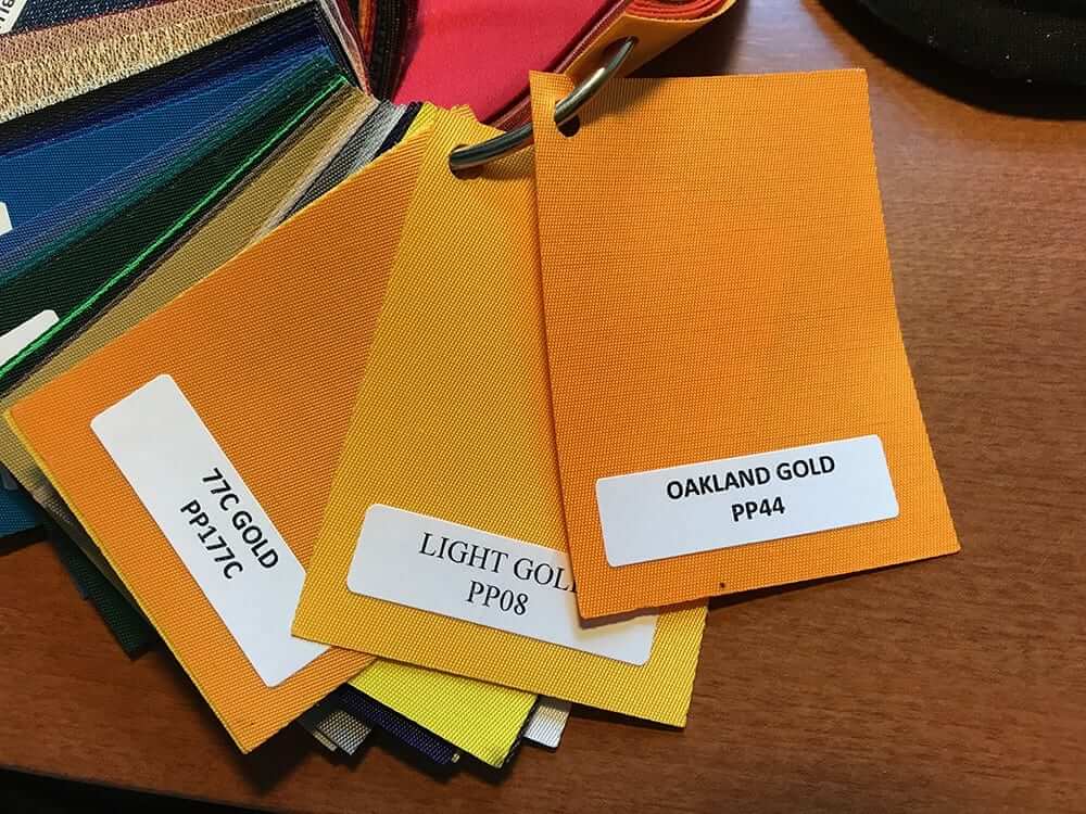
The Padres’ numbers and wordmarks didn’t match the color of the player names! That is a lazy and unacceptable oversight. The numbers are likely in Liebe’s “Oakland Gold” (the closest shade, PP44), while the player names (likely sewn someplace else?) were in some other color ”” possibly Light Gold (PP08). There are like seven shades of yellow and gold available on the color wheel, so it is easy to get it wrong ”” but it’s not that hard to get it right [for all of these, click to enlarge].
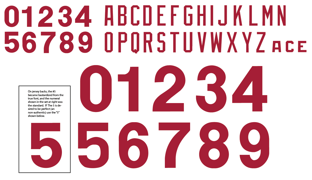
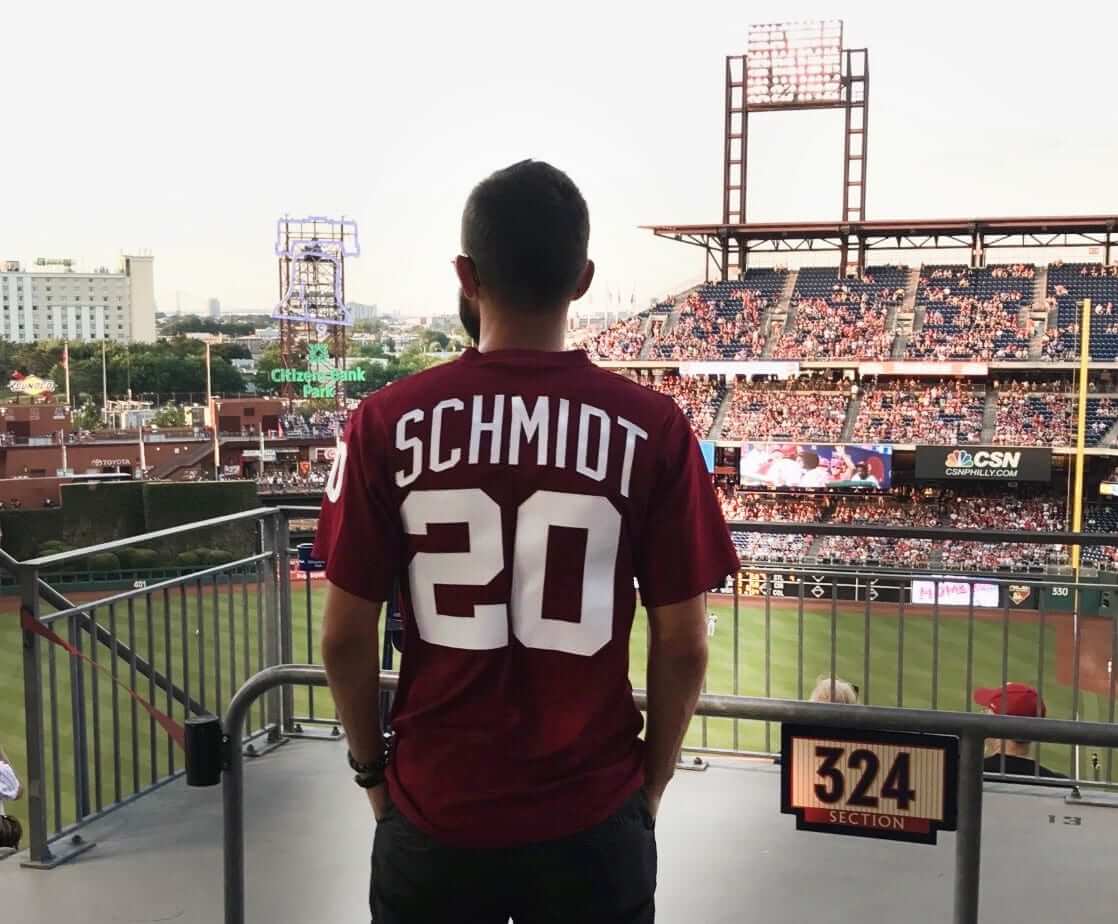
Also, the font used for the Phillies’ numbers was too light. Where the hell did they even get this font? I supplied the correct ones to Majestic some years ago, but they clearly don’t care to use them. And they never call for assistance anymore, either. Here is the correct font, followed by a game photo:
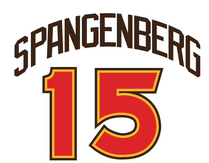
Finally, as Phil noted on Saturday, the players’ names should have been vertically arched, but they weren’t. It is so easy to create vertically arched names in this day and age. I do them in my basement workshop, for crying out loud. No excuse. Here’s one I made for the 1978 BP jersey that I sewed for my son last month, using my recreated patterns taken from real period game jerseys:
Just to show how easy it is, I went to my recreated font sets and laid out the jersey back of a player from Friday night’s game who has a particularly long name: Cory Spangenberg. It took me all of ten minutes.
The pattern I drew can then be sent to the cutter to cut the lettering out of twill. I have a cutter in my basement, so I even made this video showing how easy that process is.
Some years ago, I regularly was consulted by Majestic. They often asked me to send them fonts, which I gladly did. But when Majestic was sold to VF Corp. eight or so years ago, all communication ceased. I even called the new executives down in Florida to let them know I was still willing to help, but they seemed thoroughly disinterested. At one point I even re-created the Phillies 1960s flannel jersey player number font ”” those big chain-stitched numbers that would have looked more at home on a football jersey ”” and then the throwback game happened and they didn’t use them! They used a generic and incorrect font.
Was I annoyed? Sure, but mostly I was sad, because I really had believed I was helping MLB get the details right. But then I recalled an adage that I learned a long time ago: “You shouldn’t care more about your work than your boss does, or else you’ll end up frustrated and angry.” So if Majestic, the Phillies, and MLB choose not to care, I guess I shouldn’t care either.
———
Paul here. Great stuff, Bill — thanks so much for sharing your passion and expertise with us. And whoever your videographer was, please thank him/her for us as well.
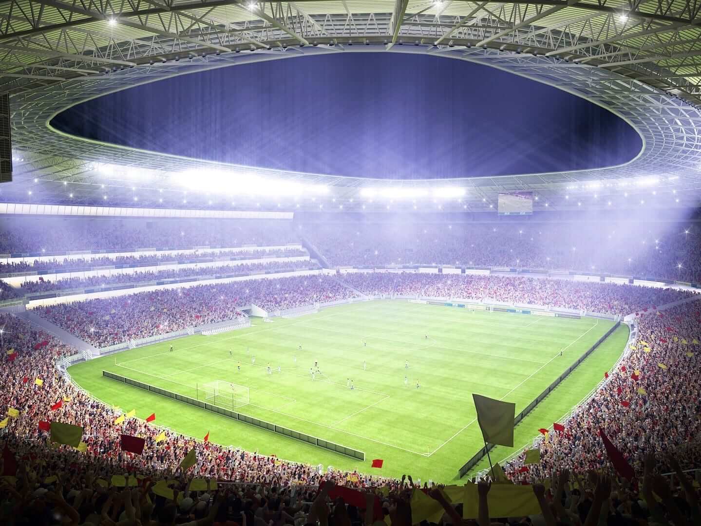
So here’s a question for you: As we continue to expand our line of Naming Wrongs T-shirts (we’ll have some new designs soon, possibly this week), UK reader Neil MacLeod has suggested that the project should include some English soccer stadiums.
I’m certainly willing to consider that if there’s a demand for it. But I’m not the least bit knowledgeable about English soccer, so I’d need some guidance regarding which stadiums to feature. Neil has provided a preliminary list of suggestions, as follows:
• I Still Call It The Abbey (for Cambs Glass Stadium, home of Cambridge United)
• I Still Call It Valley Parade (for Northern Commercials Stadium, home of Bradford City)
• I Still Call It Brisbane Road (for Matchroom Stadium, home of Leyton Orient)
• I Still Call It the Bescot (for Banks’s Stadium, home of Walsall)
• I Still Call It Dean Court (for Vitality Stadium, home of AFC Bournemouth)
• I Still Call It London Road (for ABAX Stadium, home of Peterborough United)
• I Still Call It Boundary Park (for SportsDirect.com Park, home of Oldham Athletic)
Neil also included some ideas for UK and Australian rugby stadiums, but let’s hold off on those until I can gauge how much interest there is for these soccer concepts.
It’s worth noting here that Teespring’s shipping charges to the UK are $12.50 for one shirt and $16.50 for two (as opposed to $4 and $6, respectively, for USA shipping). This means a UK customer’s price for one shirt, including shipping, would be in the $36-ish range.
So what say ye, UK soccer fans — would you be willing to pay that much for a Naming Wrongs shirt? For that matter, are there soccer fans here in the here in the States who might enjoy wearing the shirts to their favorite soccer bars? Are there other stadiums you’d like to see featured, in addition to (or instead of) the ones listed above? Feel free to answer any or all of these questions in today’s comments.
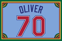
Membership update: Eight new designs have been added to the membership card gallery, including Todd Oliver’s Texas Rangers 1970s road treatment, shown at right. I like that we processed this order just as the Rangers were wearing that design as a throwback, and I also like that Todd’s NOB has a notable Rangers precedent.
The printed/laminated versions of these cards should mail out either today or tomorrow.
Remember, a Uni Watch membership card now entitles you to 15% off of any of the merchandise in our Teespring shop (if you’re an existing member and would like to have the discount code, email me). As always, you can sign up for your own custom-designed card here, you can see all the cards we’ve designed so far here, and you can see how we produce the cards here.
The Ticker
By Alex Hider

Baseball News: Looks like we could have some NOB/number font inconsistencies on the All-Star unis this week. … The Rockies repurposed their Memorial Day duds for Military Appreciation Day yesterday. So during their last nine games, they’ve worn stars/stripes four times and camouflage once (from Jake Yergs). … The Pirates’ Andrew McCutchen was wearing solid red batting gloves yesterday (from Derek Reynolds). … Michael Blake Raymer spotted a Blue Jays fan wearing a Joe Carter jersey with shoddy NOB work . … Think the West Michigan Whitecaps have enough sleeve patches? (From Robert Hayes.)

Pro Football News: Reader Billy Ferris found a Lions cap with the team’s new primary logo (note the lack of a black outline) that also included the team’s old wordmark. … Interesting NOB situation for the Saskatchewan Roughriders: The team has two receivers on the team with the last name Grant: Bakari (a seven-year veteran) and Antwane (a rookie). But instead of having the Grants wear first initials, as most teams would do, Bakari wears “Sr.” — not because he has a son with the same name as his, but because he’s the senior Grant on the team due to his veteran status. More on that here (from Wade Heidt).
College Football News: Reader Clint Richardson, who for many years has maintained a website devoted to Auburn’s uniforms, has now added a companion site: a UAB uniform tracker.

NBA News: A member of the Sixers’ marketing team tweeted a close-up of what appears to be a new jersey. Could this be a new home jersey? A new alternate? (From Jimmy Football). … Bulls rookie Lauri Markkanen played well in his first Summer League game despite a misspelled NOB (from Kelby Phillips).

Soccer News: Not sure if this detail has been pointed out, but the USMNT’s Gold Cup kits are marked with the opponent, location and date for each match on the front of the jersey above the number (from John Smith). … FC Cincinnati wore white at home against the Richmond Kickers yesterday (from Brian Henke).

Grab Bag: Found on Etsy: This Vancouver Canucks sweater that combines the team’s vintage “stick” logo and the black/yellow/orange color scheme (from Matthew Black). … Teams in the Major League Lacrosse All Star Game wore American flag-themed uniforms this weekend ”” a theme that extended to the cleats (from Jared Buccola and The Doctor). … Some people are just now noticing that there is a “1” in the negative space of the Formula 1 logo. … New rugby uniforms for Scotland.
I always enjoy checking out the various Membership Card designs, and occasionally still peruse the card gallery. Paul, your comment today re: the Rangers makes me wonder…
Have you ever considered including (perhaps below each card in the gallery) the reasoning behind why members chose the various card designs?
I suppose it may be too difficult to execute at this point; but given what I suspect is the general demographic of devoted Uni Watch readers (thoughtful attention to details), it sure would be a fascinating read.
Not every enrollee tells me the reason.
Back when the membership program started, people would often comment on the Flickr pages for each card — lots of discussions, sometimes the enrollees would join in and explain their card choices, etc. It would be nice to see that happen again.
Great suggestion, Paul. I went in and updated mine.
link
It’s probably overkill… but my reasoning is all there.
I would be fascinated to read others, if anyone is game.
Here you go flyergil:
link
Lee
flyergil — In my case, I became most interested in uniform design when I was in my early teens as the USFL started up. The Philadelphia Stars were my favorite team and so I went with Kelvin Bryant’s No. 44. Apparently, on Flickr, this was most deflating to a commenter on my specific card. Who knew I’d steal the fella’s thunder?!
-C.
Very cool, Lee and Chris. I checked out Lee’s yesterday, and will search for yours today, Chris. Like you, I was in my early teens when the USFL started up. I was fascinated by the league, and amazed at how many true star players signed on (Herschel Walker, Jim Kelly, Doug Flutie, Kelvin Bryant, Bobby Hebert, Mike Rozier, Steve Young, etc.) So cool that you memorialized the league with your membership card.
Hi Chris – that was me that commented on Flickr..i couldn’t believe it when I saw Bryant’s 44 on there! And your reason is the exact same reason I would have done it…big USFL fan, big Bryant fan as a teen. Surprised there aren’t more USFL designs out there…Breakers is an all time great uniform.
Matt & Flyergil,
Thanks guys. Yeah, the Breakers were so far ahead of their time, they’re timeless!
Onward, my USFL brothers!
Still waiting for the merger with the NFL … ;)
-C.
Majestic’s suits not consulting with Bill Henderson is a joke considering how badly they missed the mark with the throwback uniforms that the Padres and Phillies wore a few days ago. It’s as if Majestic’s suits think their shit doesn’t stink. The errors the company made were easily avoidable and are simply inexcusable.
Vertical arching is practically my favorite thing about sports! Paul, you can attest to this: I doodle it in the margins of my sketchbooks. The fallow period in sports of this vital detail is depressing.
I was disappointed when the Braves ditched the vertical arch. Love that detail!
Compared to the hatchet job they did on the 1964 uniforms a season or two ago, these are practically masterpieces. I don’t understand how they could take something so simple – somebody gave them the right stuff!! – and make it so unnecessarily difficult.
I can’t understand it, either. It’s not as if those uniforms are obscure. These are 2 of the best-known MLB throwbacks and Majestic STILL butchered them. That takes some doing!
Sadly I understand it,because they know 95% of the audience watching will not notice the inaccuracies, even the lack of zipper on the Phillies jerseys. It’s a shame, but at long as most people don’t notice and they keep on selling the amount of throwback merchandise that they do (hell I even have a light blue Phillies replica that is buttoned) they will continue to do the minimal effort to get the throwback look.
There’s plenty of photographic evidence along with Bill’s expertise to get the unis dead nuts accurate. I just think that Majestic just doesn’t care and if “close enough” is good enough for them, they don’t need to strive for 100% accuracy.
The addition of the info about the match in soccer jerseys is something that mainly Adidas and Nike do (not so sure about Puma) and it has been done for a couple of years now in the World Cup and Euro (would need to check when it started).
However, not many teams do it as not all outfitters are able to provide 1 brand new jersey per game. Last night Mexico had the flags of both teams while El Salvador had nothing about the match.
Mexico link
El Salvador
link
I’m guessing the new Tottenham stadium will have corporate naming rights when it opens, so you may want to plan on a I’m Still Calling it White Hart Lane shirt.
Would that fit in though? Because Spurs are changing stadiums. Not just renaming WHL.
They’re technically maintaining WHL, they’re just demolishing a good chunk of it and adding on, as seen in the attached picture. But I would imagine much like Arsenal and other bigger teams with new stadiums they’ll sell the naming rights.
link
I think that picture demonstrates just the opposite, that it’s a totally new stadium. Not adding on anything.
The pitches may link, but there will be nothing of the old building link. This isn’t like them overhauling Lambeau Field or the old Yankee Stadium. It’s knocking down the old one and building a new one right next to it.
It’s a new stadium, so I think “I’m Calling it White Hart Lane” would work best, a la Citi/Shea
… the heck is link from?
And this one — link
That’s the rear view of an F1 helmet (I forget the name of the driver):
link
It’s Jacques Villeneuve
It’s the back of Jacques Villeneuve’s helmet: link
Explanation coming soon, and it’s a doozy. Stay tuned.
Arsenal: I Still Call It Highbury
Man City: I Still Call It City of Manchester
Americans (or others) might buy shirts for Man City or Arsenal because these UK teams have international appeal. The teams listed in the entry probably won’t have buyers outside of their small but loyal fan bases.
I thought the unofficial name for Arsenal’s stadium was “Ashburton Grove.” While everyone would still get the Highbury reference, I wonder what Arsenal supporters would prefer.
I thought about the Arsenal one but that’d probably have to be:
I call it Ashburton Grove
rather than ‘I still call it…’
It was also nicknamed “CashBurden Grove” by some fans.
I would discourage City (since I hate them), but the Arsenal example is perfect. Might do better with bigger teams, I know people in the US who would probably like a Highbury shirt. The market for the list Neil provided is probably very small.
No no no no no no no. NO Arsenal fan calls Emirates Highbury, nor would they want to. It would be a disgrace to Highbury. We miss Highbury, we lament Highbury, we wish they could have stayed at Highbury, but we’d never sully the memory of Highbury by calling that new place Highbury.
I mean, I guess I shouldn’t speak for other Arsenal fans, especially since I’m American. But I think I’m pretty plugged into Arsenal fan culture as much as one can be without living in London, and I don’t sense this would fly at all.
NO Arsenal fan calls Emirates Highbury, nor would they want to. It would be a disgrace to Highbury. We miss Highbury, we lament Highbury, we wish they could have stayed at Highbury, but we’d never sully the memory of Highbury by calling that new place Highbury.
Agreed. Highbury is a place name, and the new stadium is not in Highbury. It’s in Ashburton Grove, which is the name used by the Arsenal fans I know who don’t want to mouth the corporate line.
Yes do Arsenal and City. The market for the list provided in the post is too small. Maybe not even Arsenal. But do Man City, “I Call it City of Manchester”
I agree with Perry. All the Arsenal fans I know consider Highbury and The Emirates to be two totally distinct places and no one refers to the new stadium by the old name. Also note that Highbury wasn’t destroyed but was converted into an apartment complex with the exterior walls still looking like they did in the Highbury days.
That said, I can’t think of any big European football clubs (Arsenal, Liverpool, ManU, Chelsea, Barca, Real Madrid, etc.) that have had a naming rights change while staying at the same physical space. There are some teams (Bayern, Juventus, etc.) that have moved into newly constructed stadia, but I don’t know that the sentiment behind the shirts would work or that there would be enough of an interest.
I think we can all agree that there are not enough Cambridge United or AFC Bournemouth supporters to make this work for Paul.
I agree about Arsenal and Highbury. How about “I still miss Highbury”? Or, for those who are not Arsenal fans, ‘The Library’ – which referred to Arsenal supporters being somewhat less vocal than those of other clubs.
Also, Newcastle United was once a big club so “I Still Call It St. James’ Park” works for me.
Nitpicky-thing from me (shocker): The Canucks’ color scheme from ’78-79 through ’91-92 was always called (in official team color lists) Black, Yellow and RED. The original “Red” color was Warm Red C – which is an orangey-red (see Marlins, OKC Thunder, original Charlotte Bobcats, etc.). in ’92-93 through ’96-97, the shade of Red used was modified to Red 032 C and called “Pacific Salmon Red”.
Bravo to Bill. I was at the game yesterday and immediately picked up on the mismatched yellows. I also knew the Phils jerseys were wrong for various reasons like the number font (which I believe was also outlined in white, incorrectly?) I knew I was missing something, it was the lack of vertical arch. Funny because I refused to by a player t-shirt from that era many years ago until I could find one properly lettered on the back.
Keep up the fight–the manufacturer laziness around getting things right must be called out!!!
The pinstripes were off too…they used a thicker red zig-zag pattern back then, not the thin pinstripes…
How can people not see the “1”???
I know, right? Of the several “negative space” designs out there, I always thought this one was the most obvious.
According to the article, apparently people thought the red pattern was the 1!
WHAT.
I googled “negative space logos”.
there are some good ones out there!
link
I never noticed the “C” in Carrefour until staring at it now. . .
I don’t believe anyone doesn’t see the 1. So to me, the mystery is why a writer (or his editor) thought he could get away with calling the 1 “hidden.” The 1 is no more hidden than the batter in MLB’s logo.
I thought it was a bird in the MLB logo.
Readers: Has anyone been to the All-Star Fan Fest in Miami this weekend?
When the Mets hosted the game four years ago, I saw a photo display of Hall of Fame plaques for all the blacks that were inducted to date. Jackie Robinson’s plaque was shown, but it was the original one.
Just want to know if the display has been changed to show the new plaque, which mentions him breaking the color line.
“For all the blacks?” That reads way worse than I hope you intended.
I meant, “Black players (including Negro League stars) and non-players so honored with induction”. MLB has been about honoring the contributions of black players and non-players in recent years, and preserving the legacy of Jackie Robinson in particular, from retiring “42” for all major leaguers, making them wear his number once or twice a season, and revising his plaque in Cooperstown.
See, that’s what I assumed you meant. And had you written “black players,” it’d be fine. Just writing “blacks” causes all sorts of trouble.
Having Bill Henderson today was akin to having Jordan, Montana, or Jeter on as a guest. This guy is good at his game.
It elates me to know sports fans across the pond are as upset about greedy advertisers besmirching their favorite stadiums as I am. The ads splashed all over the uniforms break my heart.
Some of us are concerned about traditional stadium names being ‘overwritten’ by the highest bidders corporate moniker others a little less so. Many of the bigger teams in the cash rich Premier League don’t need the extra funds that many of the lower league teams do and so many of their stadia remain untarnished.
As for sponsors/advertisers logos on shirts – we’ve come to get used to that now seeing as its been around 40 years that they’ve featured. Although the plethora of betting websites that are appearing on shirts is not a good look. Thankfully, kids shirts are not legally allowed to carry gambling or alcohol advertising and so they come without the logos. If you’re lucky enough to fit into an XL kids jersey then you can get one without – sadly I’m not that small…
Some clubs have also offered adult versions if people object to wearing betting or alcohol brands on religious grounds but they are few and far between.
And then there’s European hockey!
Archer’s all star jersey looks like it was made at the Trop (name and numbers are Rays fonts, though the name looks to be just the base layer that makes the white outline). Not sure if there was a logistics issue that prevented Archer’s actual jersey from being given but maybe he’ll have it for the All Star Game and its festivities.
Re: Soccer Naming Wrongs, I suggested a few weeks ago a Columbus Crew version: I Still Call It Crew Stadium.
I don’t know or care what a “MAPFRE” is, and I refuse to use that name.
Spot on!
Always will be Crew Stadium to me too.
I hear ya. But we’re not including team names on any of the shirts, so that one won’t be happening. Sorry — wish we could to it.
Here’s my take on recreating numbers like this:
1. They were clearly meant to be (mostly) Helvetica, and any inconsistencies seem to stem from the fact that they were cut by hand instead of by a machine (though there are some forms that stray from the base typeface, like the zero).
2. This presents an issue, because the numbers are obviously not going to be hand-cut for a throwback in 2017. They’re going to be machine-cut for efficiency’s sake, and if you build all those hand-cut errors into the artwork, you’re going end up with every digit having the same imperfections across multiple jerseys. That seems very odd and, to me, even more inauthentic. It feels like pre-ripped jeans or a pre-distressed t-shirt.
This is why I think the best solution is to, rather than just trace numbers directly from old jerseys, figure out the “genetics” of the numbers (so to speak) and build a clean, uniform set of numerals without the hand-cut errors seen in the older specimens.
That said, they still screwed this up and could have gotten the weight and some of the other details correct on that front.
Maybe Under Armour could connect with Mr. Henderson, start a new working relationship with him consulting them for when their MLB uniform contract kicks in.
No disrespect to Bill, but I don’t think he’s needed for that. Any design dept. worth its salt should be doing exactly what he does when tasked with these types of projects. If they don’t care enough to do the research themselves, they sure as heck won’t care enough to hire someone else to do it.
Hard to fault the Whitecaps for the patches. One is a memorial to Mike Illitch, and I believe it’s being worn on all the Tigers farm teams. The other is for the Midwest League president, and that’s being worn by all Midwest League teams. The other two are the team logo on one sleeve and the Tigers logo on the other. I guess removing the team logos or moving the memorials to the chest area might have been an option.
Cutch only wears the red gloves while he is running the bases. He has team colored Nike batting gloves, still. Once he reaches base he switches to the all red gloves. Started doing it during the Phillies series, or about a week ago.
1972 Oakland gold was a lighter shade than 1973 and into the 80s Oakland gold
Proofreading:
“spotted a Blue Jays fan wearing a Joe Carter with shoddy NOB work”
– Joe Carter jersey
Fixed.
The person behind the Blue Jays fan wearing a Joe Carter jersey with shoddy NOB work has a shoddy glove.
I think that’s Troy Tulowitzky
What about a “I Still Call It The Coliseum”, for the Oakland A’s? Has that been considered?
I don’t remember all of the different names that it’s had but after being the Oakland—Alameda County Coliseum for many years, it has since been known as Network Associates Coliseum, McAfee Coliseum, O.co Coliseum, among others.
Throughout, those of us in the bay area refer to it simply & consistently as “The Coliseum”.
Lee
Well, that’s basically its current name, so there doesn’t seem to be much need for that.
Certainly the current ‘official’ name – Oakland—Alameda County Coliseum – is merely a placeholder until someone steps up to buy naming rights.
But your point is valid, for now.
Incidentally, I asked a woman I work with whose family has A’s season tickets what the ‘official’ name of the stadium was, and she had no idea. Either had I until looking it up, I didn’t know it wasn’t a corporate name anymore.
Lee
As much as I hate suffixes on the backs of jerseys, that Grant, Sr. thing is really making me crazy.
Ridiculous.
Totally unnecessary. Bakari Grant is the Grant who wears 81, Antwane is the Grant who has 85. *That’s* how you tell them apart.
Agreed. Nonsensical.
B. Grant and A. Grant. Simple & easy.
Or just leave off the first initial if you must, and let them be differentiated by their number.
Lee
What really makes me crazy about the Bakari Grant jersey as a Riders fan is that he wears #81.
When I see a Roughriders jersey with #81, it should say Elgaard on the back. Ray Elgaard was a slotback with the team for 14 seasons, amassing over 13,000 receiving yards for them. Named the league’s Most Outstanding Canadian 3 times.
It was okay for Geroy Simon to wear #81 during his short time with the Green and White (a reasonable exception), but this number should be retired or taken out of circulation by the Riders.
link
Just thinking about the Rangers’ throwbacks over the weekend… by going with the powder blue road unis, they yet again avoided going out on the field with “RANGERS” on the front of their jersey.
Naming Wrongs Update
When you announced this project, I noted that MN didn’t have any candidates because our corporate named stadiums have all had their corporate names since being built and the names of the buildings they replaced wouldn’t make any sense for the new ones.
As predicted at the time, I spoke too soon. . . link
Yup, I saw that news today. Have added it to our list.
Meanwhile, we may soon have to add shirts for the DC Metro:
link
Adam N. – Should it be just “Mariucci”? Also, might as well prepare for “I’m still calling it Williams Arena.”
Here in Philly, Pattison Avenue Station on the Broad Street Line (subway) has been renamed AT&T Station for the last few years. And out in Denver, the year-old commuter rail line to Denver International Airport goes by the moniker of University of Colorado A Line!
Re: FC Cincinnati in white.
They get crazy attendance (I think they are outdrawing a considerable amount of MLS teams), last night was 21k +, so they ran a “white out”. I believe they ran a cross promotion with their team store and had “little bonuses”. I.e. Free name / number personalization with the purchase of the white jersey.
A big shout out to the fans in Cincinnati. Based on their attendance counts for a USL team, that alone is proof enough that the fans deserve one of the MLS expansion spots.
It’s been crazy! especially with the wins over Columbus and Chicago.
Proofreading Membership update: “…I also like the Todd’s NOB has a notable Rangers precedent.”
Thanks. Fixed.
I’m aware of the Darren Oliver connection, but were you hinting at Precedent George W. Bush?
He was pointing out that “the” should have been “that.”
I recalled an adage that I learned a long time ago: “You shouldn’t care more about your work than your boss does, or else you’ll end up frustrated and angry.” So if Majestic, the Phillies, and MLB choose not to care, I guess I shouldn’t care either.
I really try to keep this in mind with the Brewers, but their incorrect logo drives me crazy every time I see it.
Tom Meindel, the originator of the superb Brewers “glove” logo, offered the team an updated version of his design but (as I understand it) was totally rebuffed.
What bothers you about the current logo, Chance?
Proofreading: The Whitecaps’ location name is West Michigan, not Western
Fixed.
I love the quote about not caring more about your work than the boss does. I’d like to add, “Don’t care about things your boss doesn’t care about, and do care about things your boss cares about.”