For all of today’s photos, click to enlarge
We’re going to go off-uni today, because I want to talk about a highlight of my recent trip to Las Vegas: a visit to the Neon Museum, which I’d been wanting to check out for years.
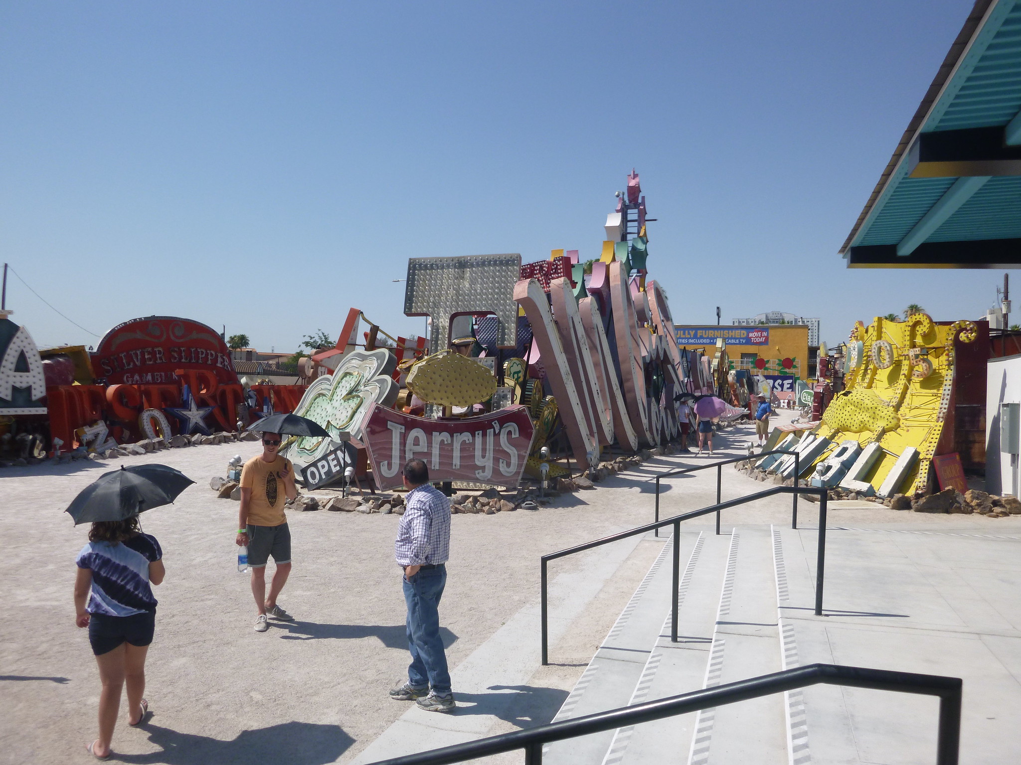
The museum’s collection of old signs is spread out across an outdoor site (commonly known as the “boneyard”), which is only accessible via one-hour guided tours. Because of Vegas’s summer heat, tours this time of year take place only during the morning and evening. Each option has its pros and cons: If you go during daylight, you get the best view of all the signs, most of which no longer light up. If you go at night, you can see the illumination of the handful of signs in the collection that have been restored and do light up, but you don’t get as good a view of all the inoperable signs. (The ideal option, I’ve been told, is to get the best of both worlds by going at dusk.)
My evenings on this trip were already spoken for, so I booked myself on a tour at 9:20am, when the temperature was “only” about 95 º. (It would hit a Vegas-record 117 º later that day.) Our tour guide pretty much insisted that we all bring along a bottle of water, and the museum offered umbrellas to anyone who wanted some additional shade. I declined the umbrella and was fine, although a few people peeled off and retreated to the air-conditioned visitor’s center about halfway through our tour.
The short version: The boneyard features scores of signs, almost all of them from Vegas, most of them rusting and fading in various states of disrepair. But there’s a grandeur to most of them, despite (or sometimes accentuated by) their slow decay. Some of the signs are fully intact; others are just pieces — a stray letter here, a random design detail there. I found most of it completely compelling.
You can get a sense of the scale of the place in this shot of our tour guide surrounded by assorted signage:
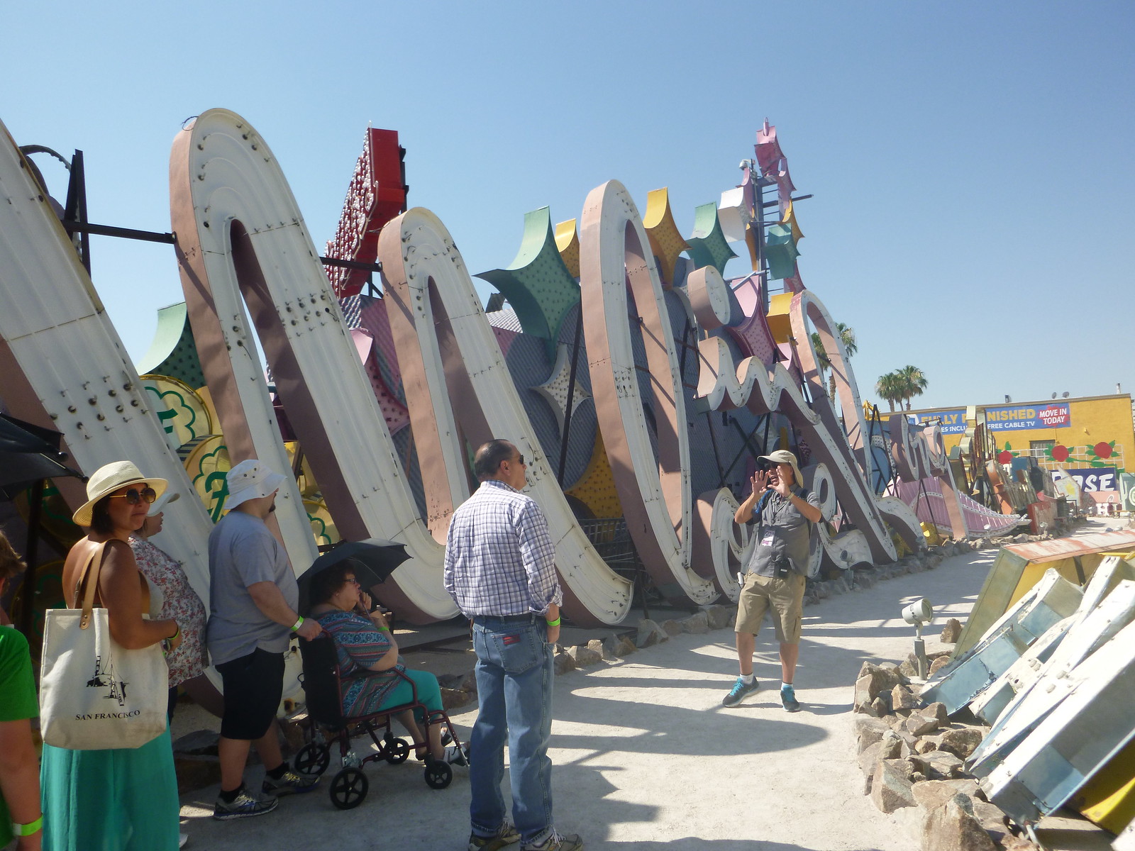
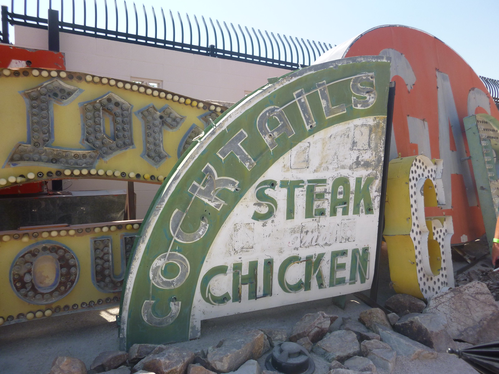
I took a lot of photos, and I don’t want to go overboard by saying, “I really liked this one. And this one. And this one…” So I’ll try to stick to just a few highlights, beginning with this sign, which was my favorite (and is also, according to our tour guide, the oldest sign in the museum’s collection, dating back to the mid-1930s) — what a beauty:
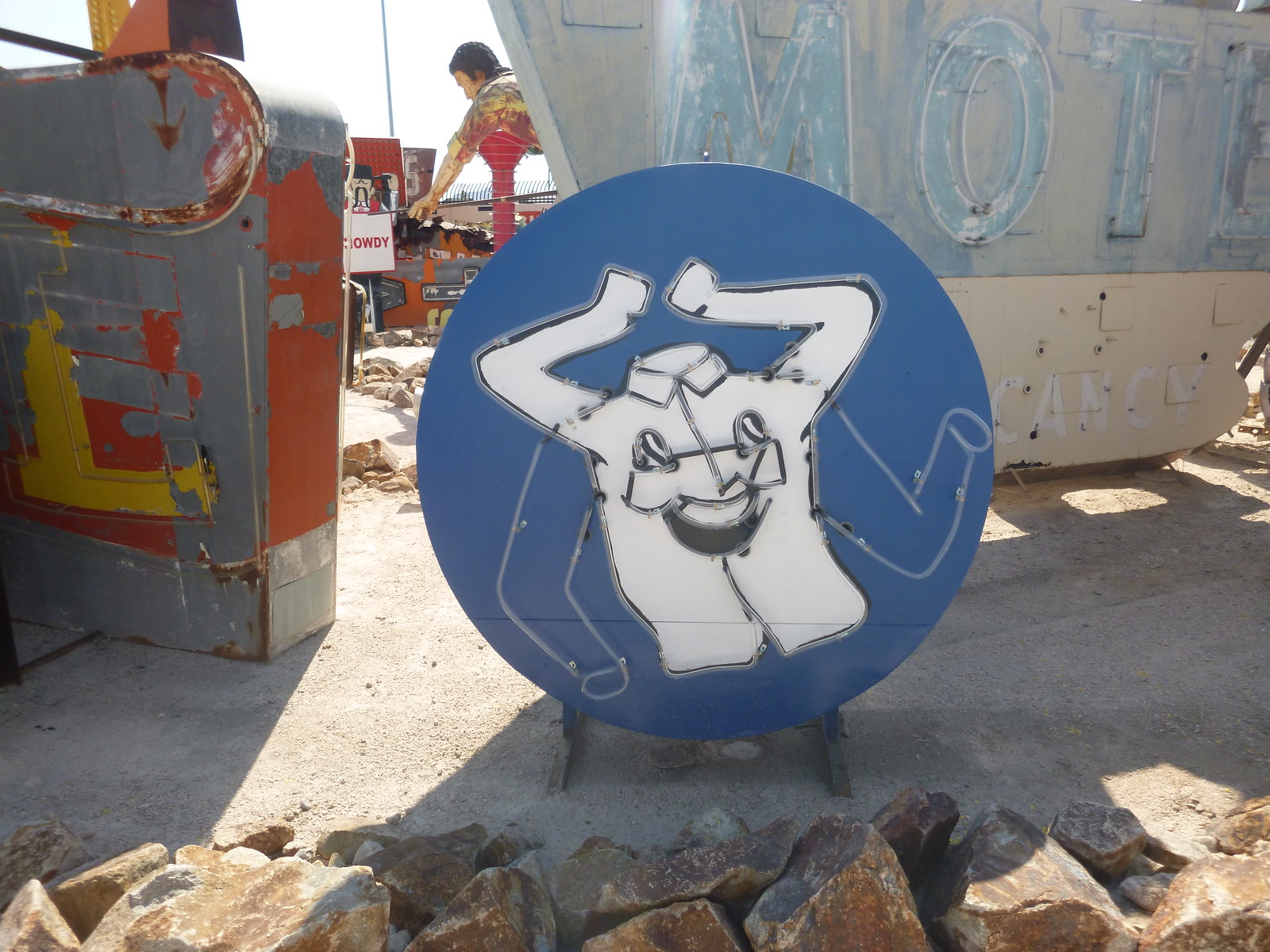
I really wish this sign, from a dry cleaner, had been operational, since it apparently showed a smiley-faced shirt moving its arms/sleeves up and down:
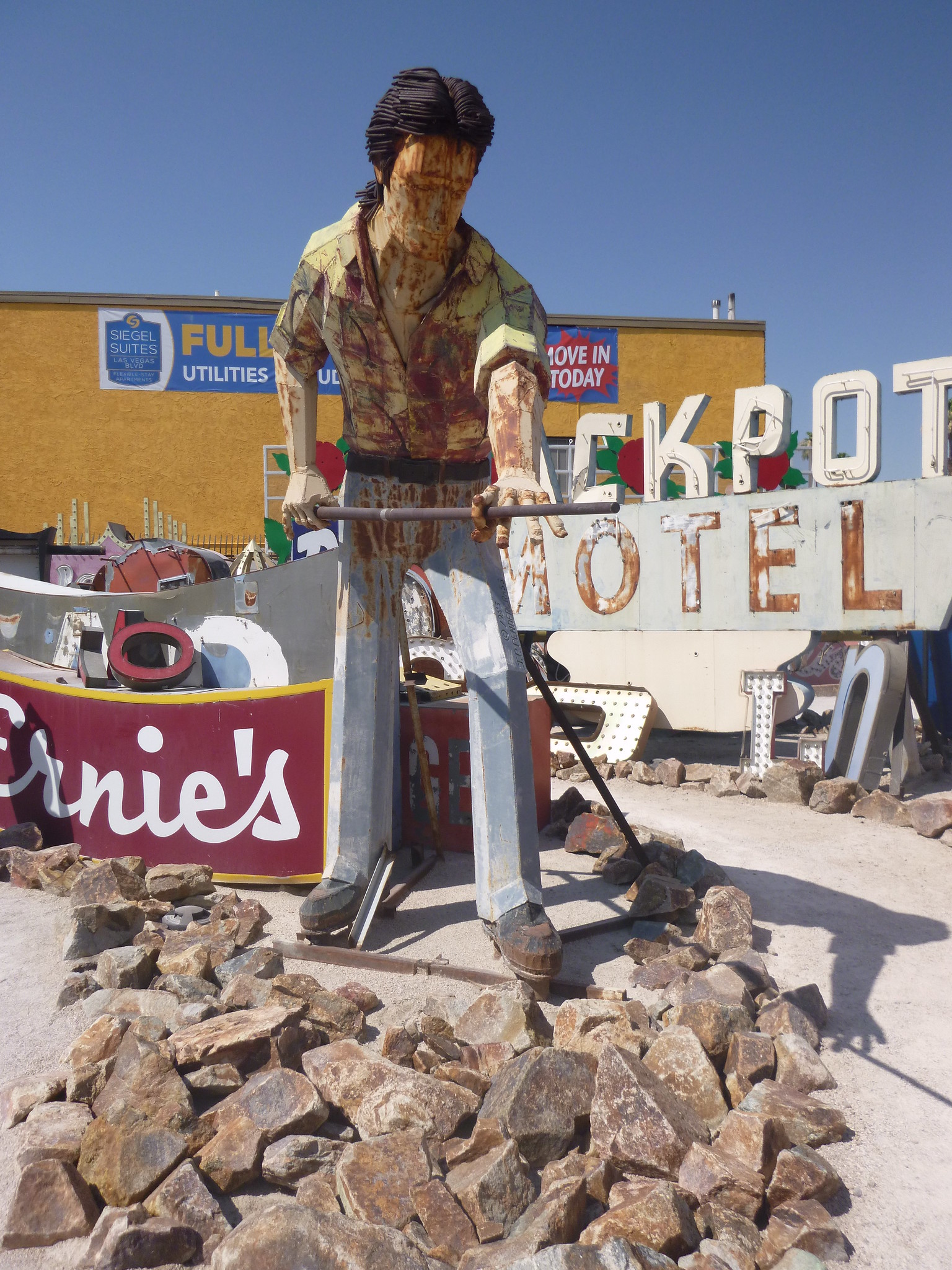
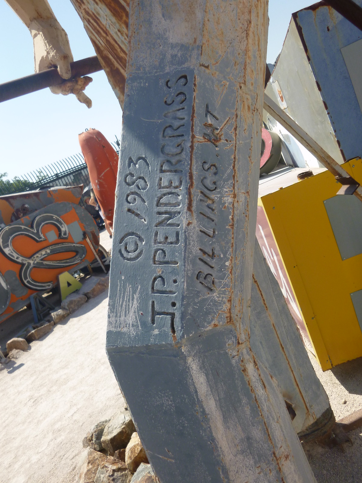
If you look in the background of that last shot, you can see a figure bending over. That’s a guy who was shooting pool as part of a big sign display. No neon on this one, so I suppose you could say it doesn’t really belong in the museum, but whatever — it’s so cool:

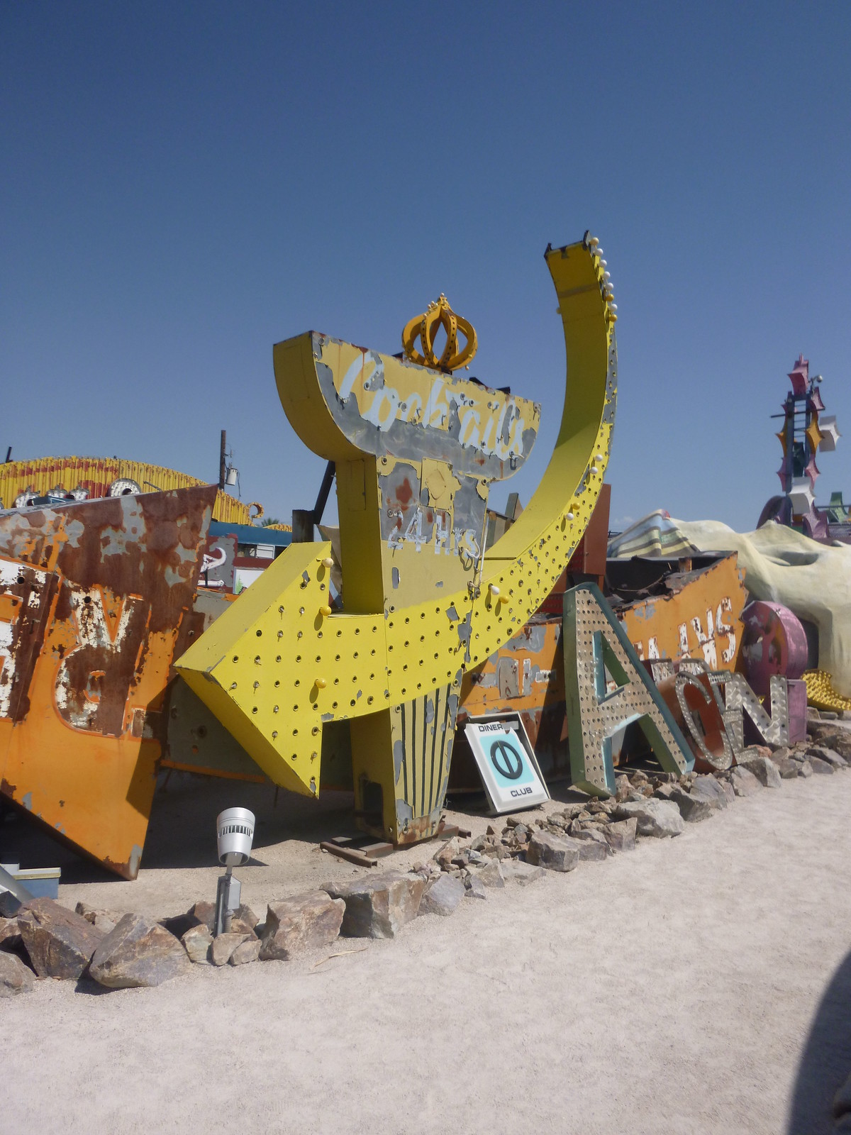
I love this scepter (or is it a torch?) intersected by a giant arrow — that points toward nothing:
Amidst all the rusty, broken-down signs, a few displays still retained an air of Vegas glitz:
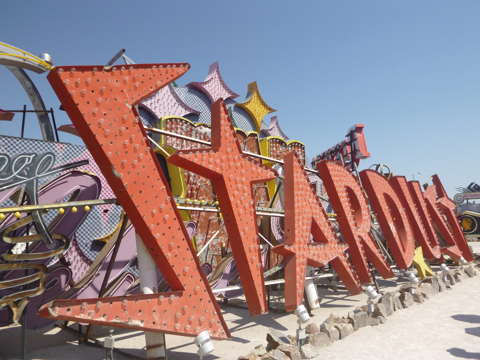
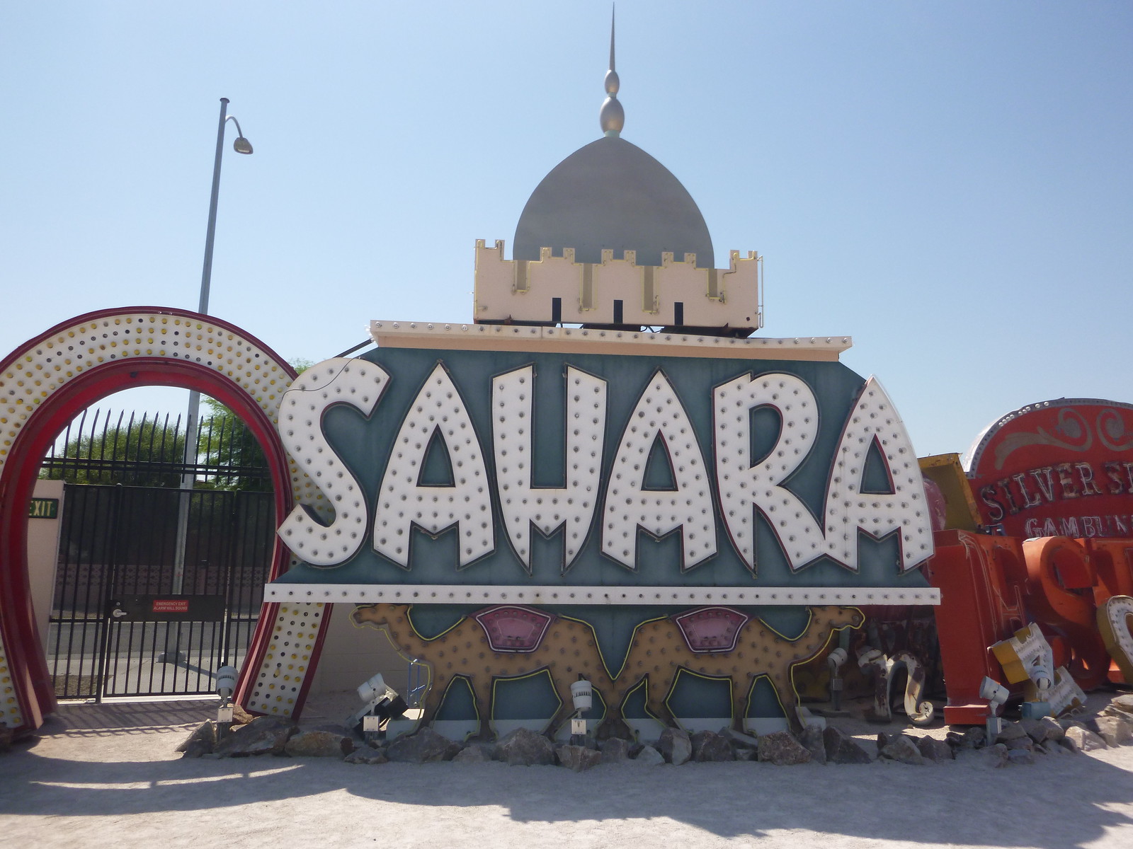
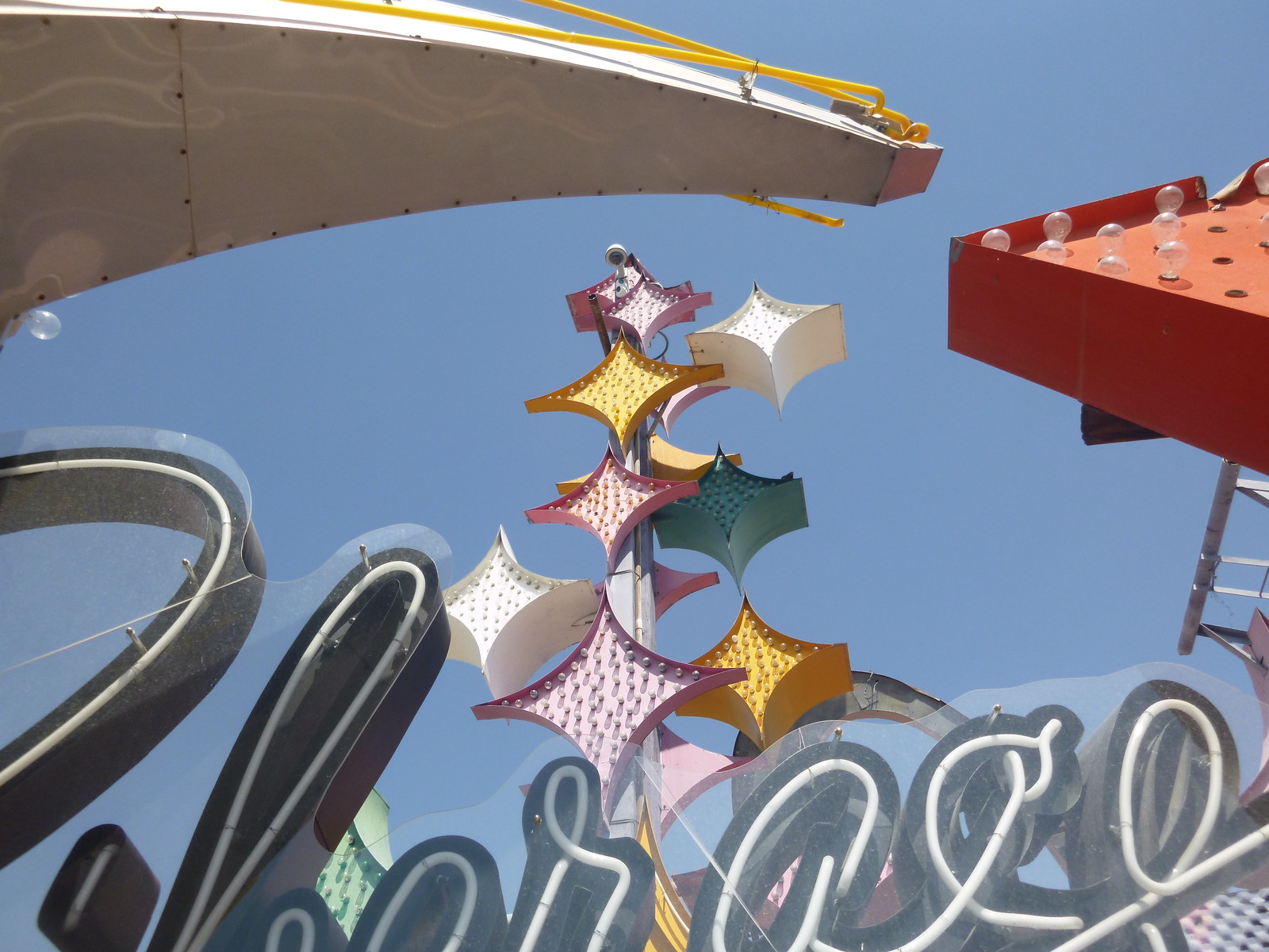
Because many of the signs were packed so close together, their various elements sometimes coalesced into interesting composite arrangments:
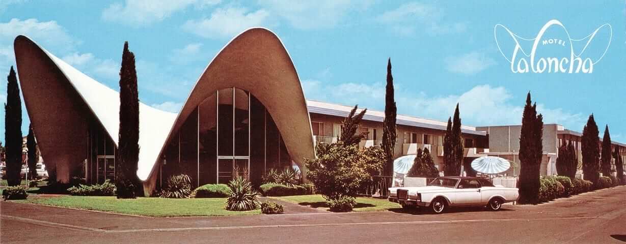
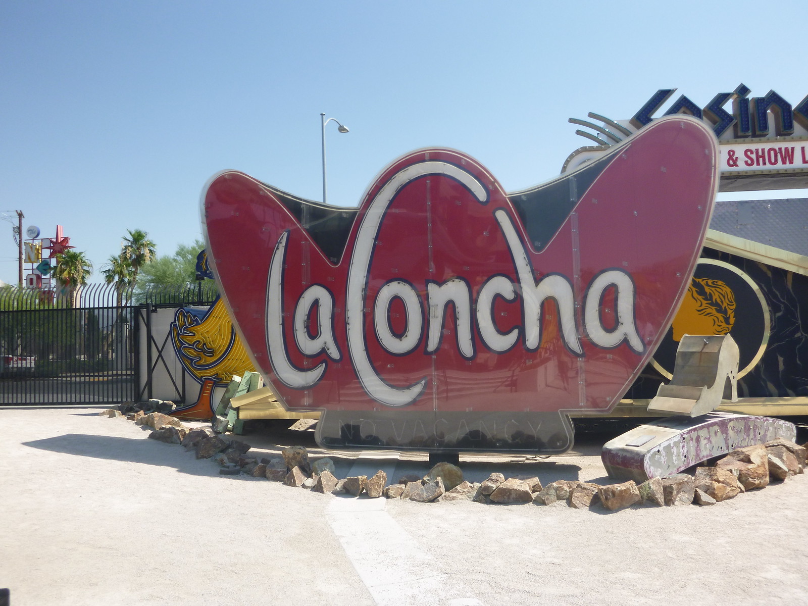
And here’s a bonus: The museum’s visitor’s center was originally the lobby of the La Concha Motel, which was in a different part of Vegas and was relocated to the museum site in 2012. Here’s how the La Concha looked in an old postcard:
And here’s how it looks as the museum’s visitor’s center (photo by Jennifer Huber, not by me):
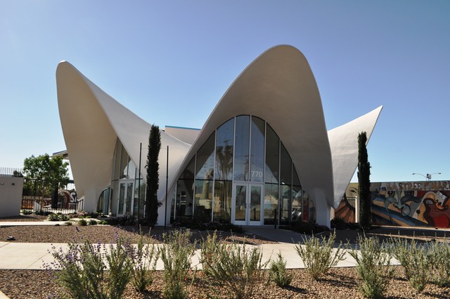
For those of you who remember my Candela Structures project from a few years back, it’s amazing how much the La Concha looks like the Candelas, right? There’s no connection, though. The La Concha is slightly older (it opened in 1961, while the Candelas were built for the 1964 World’s Fair) and is made of concrete (while the Candelas are fiberglass). Different architects, too: Paul Williams for the La Concha and Peter Schladermundt for the Candelas.
Still, the stylistic similarities are pretty remarkable. The visitor’s center even has a few photos of the La Concha being disassembled so it could be moved to the museum site, which are similar to the old photos of a Candela pavillion being disassembled so it could be moved upstate, where it became a family’s summer cabin.
Anyway: The La Concha’s original sign is part of the boneyard.
That seems like a good place to stop. If you want more, you can see all of the photos I took in this slideshow (or by clicking here):
All in all, a great time. Now I need to check out the American Sign Museum in Cincinnati.
Thanks for listening. We’ll get back to more conventional Uni Watch content tomorrow.
Collector’s Corner”¨
By Brinke Guthrie
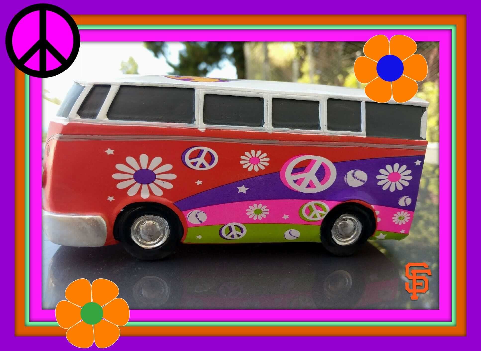
It’s the Summer of Love’s 50th Anniversary here in the Bay Area, so let’s start off with this nifty SoL VW Bus that the Giants gave away just two days ago at AT&T Park. (I wasn’t at the game, but I’ve already scarfed one on eBay.) The Giants have long had an association with the Bay Area’s Grateful Dead, and this fits right in. In fact, they’ve got a Grateful Dead Dancing Bear bobblehead coming up on Aug. 2, and that’s next on my hit list. Let’s face it, the Giants’ season has been, to phrase it in 1967 terms, a bad trip. So we gotta have freebies to keep our attention.
Now let’s keep on truckin’ — everything this week is from 1967!
• It’s the classic Miami Dolphins look on this 1967 Bob Griese jersey.
• Johnny U. on the cover of the Baltimore Colts edition of the This is NFL Football booklet.
• Penguins fans! Here’s a 1967 seat from the Civic Arena in Pittsburgh.
• Really nice-looking thermal mug for the 1967 World Series with the Red Sox and Cards.
• How about a “Class of 67” NHL banner?
• Here’s a 1967 Amoco ad telling you how to win a 1968 Mustang by collecting NFL player stamps.
• This is what you’d call groovy cover artwork on this 1967 pro basketball edition of Sports Illustrated featuring Walt Frazier and “the new Madison Square Garden.” It was so groovy you could barely read it, but that hardly mattered, man.
• Cool shot of The Danderoo on the cover of The Dallas Cowboys 1967 Outlook. Love the three striped sleeves. Now, of course, they barely even have sleeves.
• This San Antonio Spurs pennant says “established 1967.” And they were! (As the Dallas Chaparrals.)
• Here we have a 1967 magazine with some stellar cover art, The Professionals Look at Pro Football. [This is an excellent booklet. I devoted an entire entry to it three months ago. ”” PL]
• Check out the cover art on this 1967 preseason game program for the Colts and Patriots.
• Great googly-moogly, there’s some terrific cover art here. The SF Giants visiting the Braves, no matter what the listing says.
• Maple Leafs fans will love this Stanley Cup Champions mug set, from 1967, 1964, and 1963.
The Ticker
By Paul

Baseball News: When Stance took over as MLB’s hosiery outfitter last year, they supplied socks but not stirrups, so players who wanted to wear stirrups wore non-Stance product. But as you can see in this shot of Cleveland SS Francisco Lindor, Stance is now making stirrups. Lindor, as usual, is wearing them over Trusox, which he uses as sanitaries. He also appears to be wearing a Stance sock as a repurposed compression sleeve on his arm (from Jason Whitt). … Here’s a patch for Albert Pujols’s 600th home run. … Bob Andrews recently scored a copy of a 1965 Astrodome media guide. Of particular interest is the page that shows fabric swatches from the various color-coded seating levels. Leaving aside how cool the color guide is, I’m astonished to learn that they were using fabric-covered seats! … Game 1 of the College World Series last night between Florida and LSU featured a blue-vs.-purple matchup. … Cubs C Willson Contreras, who’s from Venezuela, wore a compression sleeve with a Venezuelan flag design last night. I’m told he’s been wearing it for a while. … A new minor league team is coming to Fayetteville, N.C., and the search for the team’s name is now down to five finalists, most of which seem very Brandiose-ready (from Matt McCormack). … Lids, perhaps unfamiliar with a certain chapter in American history, is selling a line of stars/stripes T-shirts under the name “Stars and Bars” (from an appalled Ed Casey). … Hall of Famer Craig Biggio wore No. 7 for most of his career — but not in his MLB debut, when he wore No. 4 (from Nick Lineback). … The Nationals will host the Mets at 11am on Independence Day. Looking back at old box scores, I see that they’ve been doing this for several years now. What’s up with that? I thought the only morning game on the MLB schedule was the annual Patriots Day game in Boston and hadn’t realized the Nats were doing something similar for Independence Day. Is there a specific holiday-based reason for the morning start time? (With thanks to Mets Police blogger Shannon Shark, who mentioned the unusual start time in his latest post.)

Pro Football News: Very odd size and placement for the Dolphins’ logo on the midfield helmet design in a 1982 game. “A similar situation happened during the 1981 season for a Monday-night game against the Eagles, but that time it was on the left side of the 50-yard line,” says Cris Routh. … The NFL Shop apparently thinks the ’Skins play in Washington State (from Tommy Turner, among others). … Broncos rookies have been wearing polo shirts with the team’s old “D” logo. “First time I’ve seen it at an official team event,” says Justin Pauls. … With Canada’s sesquicentennial taking place on Canada Day this Saturday, the CFL is planning lots of celebratory details for its Week 2 schedule, highlighted by this amazing ref’s jersey (from Wade Heidt).
College Football News: Reader Joe Bailey is in San Diego for a conference and took a tour of the USS Midway. “In one of the C/O’s offices was a desk that was covered in glass,” he says. “Underneath was a ticket stub for the 1941 Army/Navy game. I couldn’t tell if it was reproduced or not. Kind of cool.” Indeed.

Hockey News: Yesterday’s Ticker had a blurry screen shot of an early Oakland Seals uni. Here’s a clearer shot, which were originally used in the Seals’ WHL days and were briefly repurposed during the 1967 preseason (from Kevin Vautour).

NBA News: For the second consecutive year, the NBA had a float in NYC’s Gay Pride parade. It is the only major sports league to have entered a float.

Soccer News: Stuttgart has become the latest Bundesliga club to add a sleeve sponsor advertiser (from Ed Å»elaski”). … New away kit and new jersey advertiser for Crystal Palace. … Here’s the MLS All-Star jersey. “They’re a subtle throwback to the infamous 1994 World Cup 1994 ‘denim’ tops,” says Ivan KrstiÄević. … New jersey advertiser for Orange County Soccer Club (from Brian Henke).

Grab Bag: UFC combatant BJ Penn was wearing his trunks inside-out the other night. … Great story on the history of Confederate flag design. … This article about life on the lower rungs of the pro tennis circuit includes the following: “Before her first-round match in Charlottesville, [Aleksandra] Wozniak sat by the front desk of the club. She rummaged around and found a plastic stencil, placed it over the strings of her racket, then took a fat black marker and colored in the Yonex logo as she chatted amiably. ‘You can’t forget to do it or you could lose your sponsorship deal,’ she said.” … The Chicago-area grocery chain Jewel-Osco has a new cyclops-styled mascot (from Jordan Cutler).
Happy birthday to our own Mike Chamernik. Hope you get everything you wish for when you blow out the candles, buddy!
The Neon Museum looks amazing – that Stardust sign is so classic – Thanks Paul!
Of course, there’s the neon in the Las Vegas-based Killers’ “All These Things I Have Done” video: link
Well, I guess that’s not neon.
American sign museum in Cincinnati is awesome. In a pretty interesting part of town as well.
Less than half a mile away is a classic Cincinnati restaurant called “camp Washington chili”. As the chili capital of the world (that’s right), camp Washington is considered one of the best.
Going over to Terry’s Turf Club, with all of their neon signs, before or after the American Sign Museum would be more appropriate but I do love Camp Washington.
Good call. Forgot about Terry’s. Would be a terrible drive due to construction, but definitely worth it.
Speaking of neon collections, here’s one man’s pretty impressive ‘backyard neon sign garden’.
link
I believe we actually had that in the Ticker last month. Several readers brought it to my attention.
I’m not impressed by fancy houses, cars, or boats. But this guy is living the dream!
I don’t know if there’s another official explanation, but I assumed the Nationals’ early start was to ease crowding on the Metro, which is typically full of people going to see fireworks on The Mall.
That’s the explanation I recall. I can say from experience that Metro starts to get really crowded by 3pm on the Fourth, so an 11am start gets the ballpark masses back onto Metro before the absolute worst of the crunch.
These days, an 11:05 start being over before 3pm is far from a safe bet. Hey, at least the automatic walk will maybe get them out 40 seconds earlier.
The Brewers played the Nats last year on Independence Day, and had an 11:05 start, 10:05 in Milwaukee. The game was over before the Independence Day parade, that the local radio station ran, instead of the game.
The Nats presumably have the 11:05 a.m. start because of all the other events in the District on the 4th. I kind of like it. They also regularly have a 6:05 game on the 3rd.
Fayetteville MiLB team: Jumpers is a pretty good name. I guess by the standards of modern minor-league baseball, one out of five ain’t bad. Bat .200 for the Astros and eventually you’ll wind up playing in Fayetteville. A shame that the team opted for the cliche “Adjectve Dogs” format to refer to dogwood trees, rather than sticking with Dogwoods. Dogwoods would be a terrific minor-league team name. And because it still has the word “dog” embedded in it, there’s no reason the team couldn’t do the same generic snarling-canine branding for Dogwoods that it inevitably would for Wood Dogs.
I would pass on Wood Dogs, as there is already a team in the Carolina League called the Wood Ducks.
I would also pass on the Woodpeckers. The Greensboro team in the South Atlantic League is called the Grasshoppers but many refer to them simply as “the ‘Hoppers”. I really don’t think the Fayetteville management wants their team to be sometimes referred to as “the ‘Peckers”.
That’s pretty ubiquitous in baseball: Blue Jays = Jays, Devil Rays = Rays, every minor-league team named the Adjective Nouns = Nouns, and so forth. But given the proximity to the South Carolina Gamecocks, which exploit the “Cocks” abbreviation for commercial gain in their merchandise, I’m not sure that the team would see that as a bug, rather than a feature, of the Woodpeckers nickname.
Brandoise is spearheading the naming of my local team, the Gwinnett Braves. The reveal of the “five finalists” has been delayed past the July 4th weekend. Wouldn’t be surprised if Dogwoods isn’t one of our finalists (or Wood Dogs).
The Charleston RiverDogs are a Sally-League team, but are just a few hours’ drive away from Fayetteville. The new team might rather its nickname be a little more distinct from any regional neighbors.
Of the five, I like the Jumpers the best. But how about the ‘Chutes?
And then they could offer “Chuters” instead of beer during the 7th inning stretch…
Paul, any sense of the water situation for Las Vegas? I’ve read they are set for the next thirty years. I’ve also read there will be a water crisis within 5 years.
I didn’t hear anything about that, although I did wonder about it, being in the desert and all.
Lake Mead is still there, and very large, if that’s what you’re asking, but it’s probably not as large as it once was, which could be a sign of things to come.
Going outside in Las Vegas, during the day, in the summer, is strange. It honestly feels like it will never rain there. I don’t think I saw a cloud in three days. It’s kind of surreal and exhausting, and I could have never understood it as a midwesterner, experiencing rain every day for a month in the spring, and fairly often in other seasons. It puts into perspective why indigenous people from the southwest placed so much spiritual importance on the rain.
If you go to Hoover Dam you can clearly see where the water level in Lake Mead ONCE was.
If we continue on the path we’re on, within Teo years there will be massive restrictions on water usage in southern Nevada. There are several plans to bring in water from northern NV, buy it from Mexico, or buy from other, more rainy states. There has also been discussion about reworking the original water distribution agreement from when Hoover Dam was built. That 100 year old agreement has California getting more than half of the water in the lake, followed by Arizona, with NV receiving about 20%. But of course, CA is reluctant.
On the MLS All-Star jersey: nineteen stars represent the 19 American clubs, three Maple Leaf emblems represent the three Canadian clubs.
Nats fan here … The 11 AM start time is awesome because we get to have cheeseburgers and beer for breakfast.
I like the cut of your jib.
That’s always an option. No need for baseball.
Minor typo: “Cubs C Wilson Contreras, who’s from Venezuelan” should be “… from Venezuela”
There are no minor typos! There are just typos. And this one is now fixed. Thanks!
Another minor typo – ” the CFL is planing lots of celebratory details” – should be planning with two Ns.
Fixed.
They should either resurrect the logo of the centennial (1967) helmet for the Tiger-Cats or modify the centennial logo to the country’s 150th anniversary logo.
link
That is a marvelous idea. National 150th birthday logo reminds me of the 100th one. We will see if there are any uniform surprises for the week ahead.
My hope is that the Tiger-Cats would resurrect the yellow helmet forever (with the present day logo).
Furthermore, Willson Contreras has two L’s in his first name. Horribly confusing because of the baseball brand and the otherwise common name with just one.
Fixed.
Love love love the neon sign graveyard/boneyard. Summer of love ticker is a great idea. Long Island uniwatch/deadheads “Half Step” is playing a free concert at Overlook beach this Friday night.
The article about the proposed Confederate flags is very fascinating.
There’s an interesting history of the “Stars and Bars” that most people aren’t aware of. The term actually describes only the original flag of the Confederate States, not the one that most people associate with the term “Confederate flag.”
The original flag had a blue canton with a ring of stars, and three horizontal bars (white in the center flanked by red at the top and bottom). As you can imagine, this flag was very similar to the Union flag, and it didn’t last long as a result. In battle especially, something more unique was required, and in response, the familiar icon of stars in a blue saltire on a red field was born and utilized as a battle flag. The civil flag was eventually replaced by two different white flags with that same battle emblem as the canton. The first was all white and known as the “Stainless Banner,” while the second had a red stripe on the end and was called the “Blood Stained Banner.” The official flags eventually gave way to the battle flag as the enduring symbol of the Confederacy, even though the battle flag was never the official flag of the nation itself.
You can see the Confederate States flag pretty much everywhere throughout the Southeast. Oh, no, I’m not talking about the battle flag, you see that everywhere, too. No, I’m talking about Georgia’s State flag. See, to get from the Georgia flag to the CSA flag, remove the gold coat of arms. And that’s it.
Which is extremely interesting. Not too long ago, they came under fire publicly because of the use of the battle flag in their state flag, so their solution was to remove the reference to the battle flag, and just use the actual CSA flag itself. Seems far, far more racist than before.
It was a kind of compromise. The current state flag resembles Georgia’s early 20th-century flag. During the civil-rights era, though, some state politicians changed the design to the battle flag, as a jab against would-be desegregators.
Eventually, the state legislature changed that design … to a hideous, short-lived abortion that vexillologists still laugh at to this day. Within a few years, the state adopted a design that resembled all the Georgia flags up to the ’50s. It’s based on the Stars and Bars, of course, but that’s scarcely the flag someone with bigoted intentions is likely to reach for. (Should that not be good enough for any outsiders, I hate it for them.)
Its not based upon the stars and bars, it IS the stars and bars.
Slight difference there
Andrew – the background you provide on the Stars & Bars would have really helped the author of the NYT article. I may have missed something, but the article seems to suggest that the Confederacy had no official flag while they debated the various proposals before deciding in 1863 to use the battle flag.
-A.L.
A close-up view of the inside collar of those flag-desecration shirts offered by Lids shows that they’re made by ’47. And sure enough, Lids isn’t the only retailer that has them; link.
So, yeah, blame ’47 for the naming, though the retailers aren’t without fault either for failing to notice it.
I’ve been seeing various US flag themed merchandise advertised as “Stars & Bars” for 30 years. It’s nothing new.
Really? Companies are that facepalm-inducingly stupid?
Stupid, staggeringly ignorant of history, take your pick.
Quite staggering; confederate symbols are not only racist but treasonous. But this wouldn’t be the first time someone used questionable judgement to make money.
Embracing tainted symbols and slogans because they sound cool strikes me as an element of human nature; it happens so often.
That “Class of ’67” NHL banner on Ebay is a recent product, not a vintage from back in the day… easy to spot because it has the Seals as the CALIFORNIA GOLDEN SEALS in green/yellow colors and they didn’t adopt that name and the Charles O. Finley colors until 1970. The banner SHOULD have read OAKLAND SEALS with green/blue coloring.
DAMN I hate this kind of ignorance…
-Jet
Those “heritage banners”, which go back to around 2008 or so, are just poorly researched. The makers apparently scoured Sportslogos.net for their source material, but didn’t really put any effort into checking to make sure everything was actually correct, as there have been errors in some of the logos posted that have since been corrected over the years. The worst offender is probably the Maple Leafs banner, which has a version of the 1967 logo using the previous logo’s font instead of Futura Display – an error that existed on SL.net until circa 2010. (Though the current version on the site still has errors – the lower left corners of the Es and Ls are too rounded, and the S has a diagonal stroke instead of the correct horizontal stroke.)
Absolutely agree. I little extra work and one would have a historically accurate logo. Much like American Needle and the cap they produce for the 1969 Seattle Pilots…..wrong color (should be a darker blue) and the scrambled eggs should be palm leaves closer to the crown.
“The NFL Shop apparently thinks the ’Skins play in Washington State”
No, the maker of those license plates does (or is quite lazy, or uninformed).
The NFL shop has a lax review process for this item.
And yes, the Panthers represent both Carolinas. Charlotte is right along the border (Carowinds, the city’s amusement park, is in both states) and if memory serves, the Panthers end up doing parts of their training camp in each state.
21 years ago I visited the Carowinds amusement park, which literally straddles the state line. Part of it is in NC and part in SC, with a big line painted on the ground to indicate the border. Bizarre.
There are a few bars that straddle state lines as well.
link
How does this work in terms of taxes?
ScottyDanger: Charlotte native here.
The Panthers hold their training camp in Spartanburg, SC, about an hour south of Charlotte. The team’s regular season practice facilities are in Uptown Charlotte, right beside BoA Stadium.
I recall back when the Panthers were still just a concept, there was talk of putting the stadium near the NC/SC line to fully embrace the “Carolinas” concept. Fortunately, that idea was scrapped.
You couldn’t legally use the Cowboys or Texans either. We have to have a front plate. I guess you could in other states but to me that’s a good way to get pulled over.
Florida only give you ONE license plate.
My recently purchased new car doesn’t even have a front license plate bracket.
Thanks so much for the virtual Neon tour. My wife and I visited last August, we had a scheduled evening tour. Due to severe lightning in the area, they cut the tour ten minutes in. They don’t mess around – with all that metal, you’re a sitting duck. Was last tour of the night and we were flying out the next day… I was bummed! Hope to return!
If you really want to see everything, I would recommend this:
1. Take the tour once, then go back again to view everything as the guide talks (now that you’ve already heard the schpiel).
2. Brush up with a book or web research on the history of Las Vegas neon before the tour (they even sell books in the shop there). Again, you’ll be able to divert your attention from the guide to the signs without fear of missing out.
Happy Birthday, Mike!
Happy Birthday Mike!
Thanks guys!
So glad you enjoyed the boneyard, Paul. Something I tend to wonder about the museum is how/whether it’ll grow over time. Like the figure shooting pool, signs in use today aren’t neon, but are definitely “cool” and will be worth preserving, imho.
Anyway, again, it was truly great meeting you during your visit. (Readers: for those who haven’t had the pleasure, I can sincerely say PL is a gentleman of the highest order, as well as a great hang.) Come see us again sometime, when the temperature is back in the double-digits!
-Kaine in Las Vegas
Thanks, Kaine. And I can definitely return the compliment: Kaine too is a true gentleman! He even picked me up and dropped me off at my hotel before/after our dinner together. Thanks for a great time, Kaine!
Paul, have you heard any whispers or rumors, or perhaps something more definitive, about the Broncos possibly going back to their ‘D’ logo? The current set has been around for about 20 years … perhaps it’s time to make a change by going back … ?
I don’t report on whispers or rumors (not that I’ve heard any), and I haven’t heard anything more definitive.
I certainly can’t speak for all Broncos fans, but I think many (like myself) are conflicted about the Denver “D”. On the one hand, I much prefer the D design and uniforms, but the team was 0-4 in Super Bowls with them. Losing was humiliating, and the D is still a reminder of that.
On the other hand, I really don’t like the “new” logo and uniforms, but the team is 3-1 in Super Bowls with them. The best moments in team history are tied to these unis.
“Old Town” Saginaw Michigan has a public parking lot that displays a neon sign museum made up of signs from defunct businesses around the community. The Ippel building nextdoor also contains several in its hallways. Its my favorite recent development in the city.
From mlive: link
Happy birthday, Mike! Hope you have a fantastic day & a most excellent year.
Thanks Hugh!
Great to see these signs. Las Vegas is part of my territory, so I’ll plan to visit this in the fall when it cools down.
Funny story about Vegas and signs. I remember in college in the early 1980s when I was driving back to Southern California from skiing in Utah we came upon the north side of Vegas at night and the first sign we saw was a really large SHELL gas station sign. This sign was just the letters, and the “S” was the only letter not lit up. Seemed an appropriate greeting to “Sin City”.
Proofreading:
“because I want to talk about highlight of my recent trip to Las Vegas”
– “the” highlight
“a,” actually (not “the”). But now fixed.
I’ve been to the Mob Museum in Vegas. Next time I go to visit, I’ll put the Neon Museum on my list.
The Neon and Mob Museums are located fairly close to each other, so they sell a combo ticket that allows you to visit both places at a discounted price. I bought that ticket — but then I ran out of time and didn’t get to see the Mob Museum. Dang.
The Mob Museum was great, but it requires a lot of time. It’s filled with tons of info and lots of reading is required o get the most out of it.
Today’s NY Times review of the Big3 states: “[N]o one could deny the strong logo work, notably the snarling warthog of the Ball Hogs.”
Congrats to Todd.
link
I just saw something interesting. The White Sox just took the field at home, and a cameraman took a hand held camera behind the mound to show José Quintana begin his warmup. As you may know, the White Sox put their logo on the back of the mound. The logo slightly reflected the stadium lights, which indicates that the logo isn’t chalk but a thin plastic mat, shaped like the logo.
That Griese jersey looks like a knockoff to me. The number font doesn’t look correct.
Awesome entry on the Neon Sign Museum. Thanks for sharing your experience and photos!