Click photos to enlarge
Way back in the day, the NFL used to put out all sorts of cool promotional publications, many of them with beautiful illustrations. I was lucky enough to get several of these while I was growing up, including the American Express NFL Playbook from 1973 (taught me so much about football!) and the Sunoco NFL Action stamp album from 1972 (which I had, and then lost, and then a Uni Watch reader generously gifted me a vintage copy a few years back).
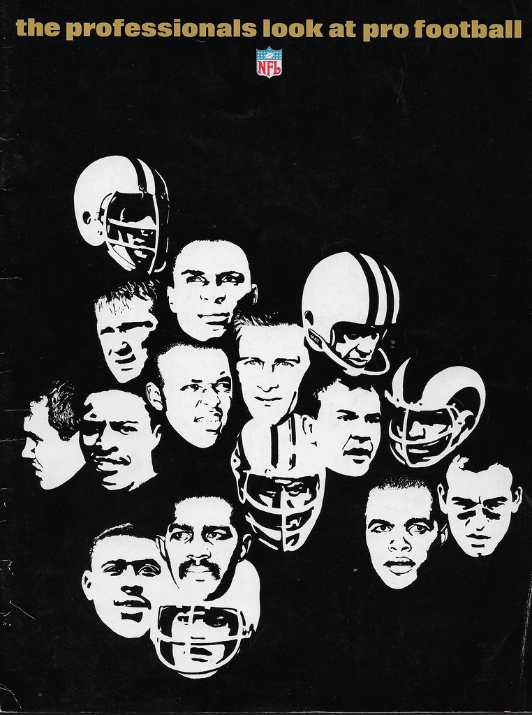
But I was too young to encounter another beautiful publication: The Professionals Look at Pro Football, a 40-page item that was produced by NFL Properties in 1967 in conjunction with the paper company Kimberly-Clark. Both organizations got something out of the deal: Kimberly-Clark used the publication to showcase some of its high-quality paper stock (paper manufacturers often partnered with other companies this way, so they’d have something flashy to show to new printing clients), and the NFL got a nice promotional piece to distribute.
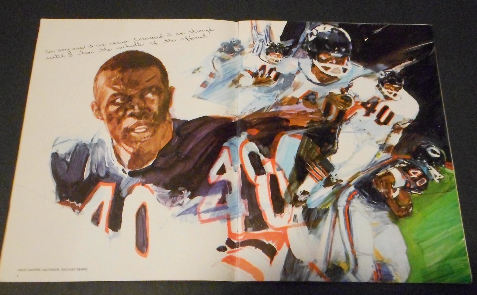
I’d never seen or even heard of The Professionals Look at Pro Football until reader Dennis Jones got in touch to let me know he’d recently found a copy of it while cleaning out his dad’s house. The premise of the publication is simple: 16 players — one from each NFL team at the time — were asked to provide their thoughts about playing football. Some, like Bears running back Gayle Sayers and Cowboys defensive tackle Bob Lilly, were established stars and went on to become Hall of Famers; others, like Steelers cornerback Brady Keys and Saints running back Don McCall, had lower profiles and are largely forgotten today. Meanwhile, various illustrators, artists, and photographers were hired to create the imagery that accompanied each player’s text.
The NFL was in full mythmaking mode here. Some of the pull quotes are embarrassing and cringe-inducing, especially given what we know about football and brain disease (“If a man doesn’t get hurt in the game, he hasn’t been playing hard enough” and “You’ve got to punish your opponent. You’ve got to make him think that to try you is a mistake,” that sort of thing), but that was par for the course 50 years ago. In any case, many of the photos and, especially, the illustrations are sensational.
Dennis has scanned the entire publication, one page at a time, and grouped the scans into this Flickr set. If you want to read the text, use those scans — the text is crisp and clear.
But many of the standout illustrations and photos were formatted as two-page spreads. Dennis couldn’t fit two pages at a time on his scanner, and the images don’t have the same impact when they’re broken up into two separate scans, so I asked him to take photos of the two-page art pieces. Those photos are shown below. The text isn’t as crisp, and there’s some glare on some of the photos, but at least you’ll get a better sense of the two-page images (if you can’t see the slideshow, click here):
Great stuff. I wish the NFL — or any sports organization — would commission this type of top-notch artwork nowadays. Kimberly-Clark even provided art and production notes here and here.
Incidentally, this booklet seems like it would be right up “Collector’s Corner” columnist Brinke Guthrie’s alley, right? So I checked with him and was surprised when he said he’d never seen it either. It appears to be a genuine collector’s item.
(Big thanks to Dennis Jones for sharing this item with me.)
MLB preview reminder and updates: In case you missed it yesterday, the 19th annual Uni Watch MLB Season Preview is now available. Enjoy.
There are also some late-breaking items that either didn’t make into the preview or were added fairly late in the day yesterday, so you may have missed them:
• The Reds, much like the Pirates, are changing the cap that’s worn with their camouflage alternate jersey, switching from a camo cap to an olive cap:
Reds replacing cap worn with camouflage alternate jersey this season. Old version on left, new on right. pic.twitter.com/Xo8RWWaW3e
— Paul Lukas (@UniWatch) March 29, 2017
• The Cardinals will mark the 50th anniversary of their 1967 championship by wearing ’67 throwbacks on May 16. The jerseys will include a patch that wasn’t part of the original ’67 uni:
Commemorative 1967 World Champions 50th Anniversary @cardinals patch released today @UniWatch pic.twitter.com/d2CXVsGsD8
— Jordan Hofeditz (@jhofeditz) March 29, 2017
That patch, incidentally, is based on the Cardinals’ press pin from the ’67 World Series.
• The Phillies will be adding a memorial patch for former skipper Dallas Green. It will make its on-field debut at the team’s home opener on April 7. No visuals yet.
• A report from several weeks ago indicates that the Twins will be wearing a memorial patch for pitching prospect Yorman Landa for their season opener on April 3, and possibly for the rest of the season. No visuals yet.
• The Rangers will retire Ivan Rodriguez’s No. 7 on Aug. 12.
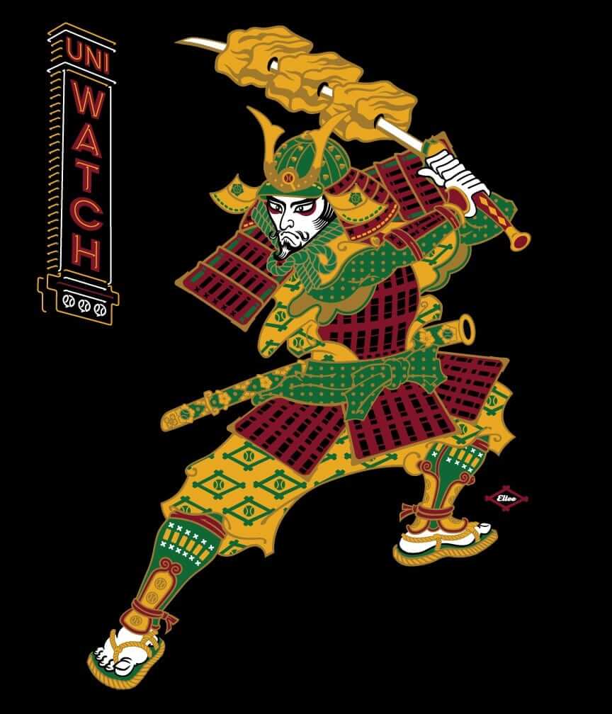
T-Shirt reminder: In case you missed it earlier this week, our latest limited-edition T-shirt in the Uni Watch Artist’s Series is by the great Larry Torrez (aka Eltee of DC). In the spirit of his Meatscots caricature series, he’s imagined a fictitious Japanese baseball team called the Kyoto Yakitori, whose mascot is a baseball-playing samurai with a sword that serves as a baseball bat and as a yakitori chicken kebab skewer (click to enlarge):
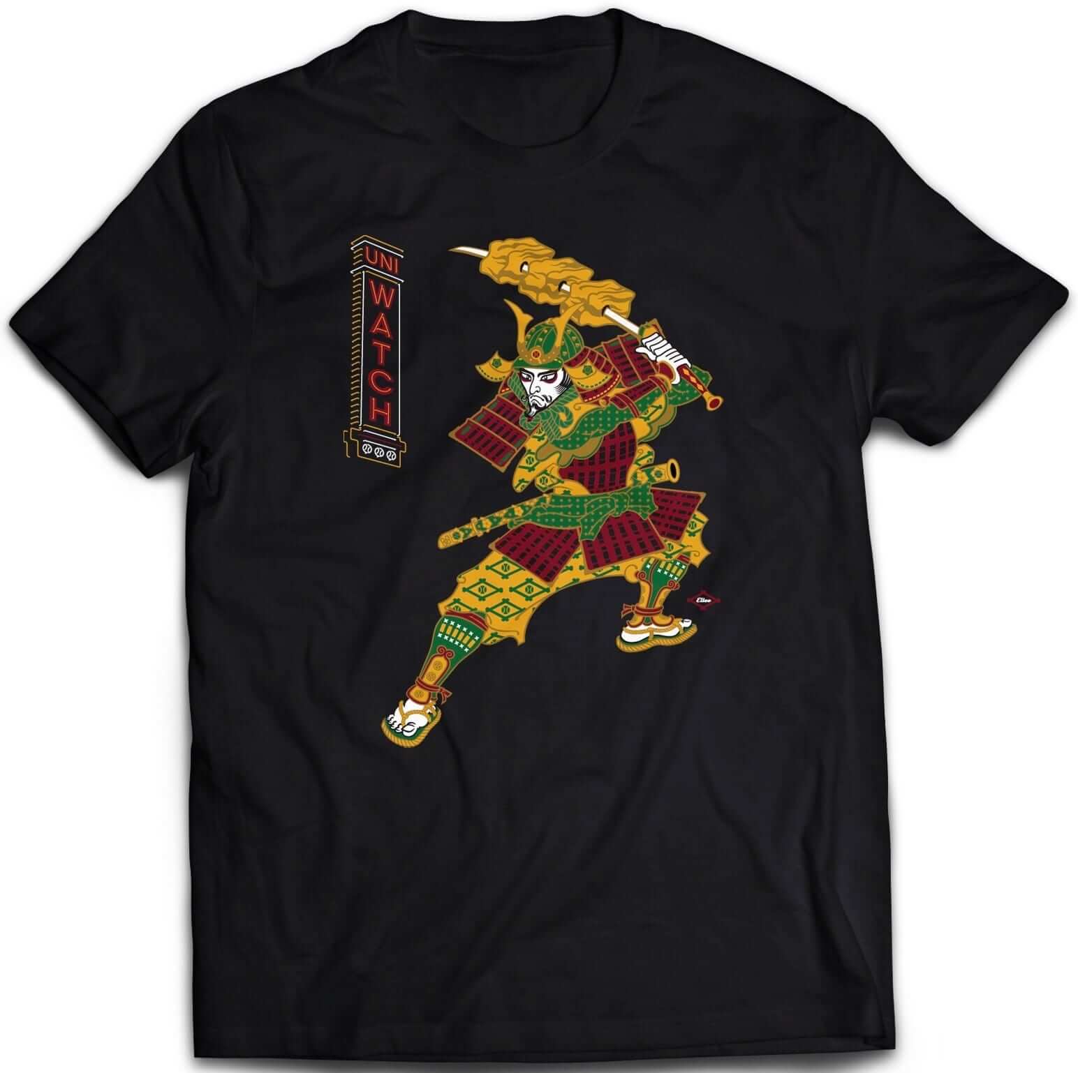
It’s available in three different black short-sleeve options (two of which come in sizes up to 5XL) and one long-sleeve option (up to 5XL). Plus I’ve also made the design available as a sticker. Haven’t done that before with any of our T-shirt designs — let’s see how that goes.
Some of you have also asked why I’m okay with this design if I have issues with Native American-based sports designs. That’s a perfectly valid question, and I’ve created a separate page to address it. Look here.
The shirt is available here through next Thursday, April 6. My thanks, as always, for your consideration.
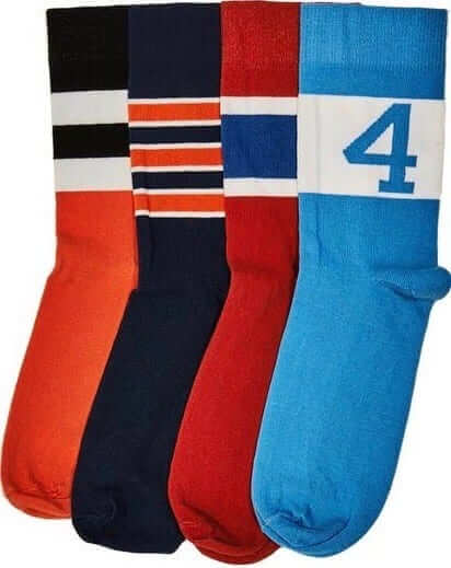
StripeRite sale: In honor of North Carolina making it to the Final Four, nicely symbolized by our Carolina blue sock with the “4” on it, we’re running a sale on our StripeRite socks. From now through April 7, use the discount code FINALFOUR to get 10% off. This applies to any order from our first or second batch of StripeRites. Thanks for your consideration.
Contest reminder: We’re running a new ESPN design challenge to redesign the Raiders for their move to Las Vegas. Full details here.
Signal Flare: If you’re a sneakerhead and a Size 9, drop me a line. Thanks.
The Ticker
By Mike Chamernik

Baseball News: Teams announced their promotional schedules yesterday. Among the many highlights is the Giants’ reversible Warriors knit hat giveaway in late April. … The White Sox had to use smaller NOB lettering on a jersey for Bastian Schweinsteiger, who plays for MLS’s Chicago Fire. … The Washington Post made a cool “coloring book” animated graphic featuring the key player for each MLB team this year. … New two-tone hat for Villanova (from Michael Geddes, via Phil). … The baseball team at Wharton (Texas) High School uses an upside-down Expos logo, which looks like a “W” (from Mike Knapp). … The Buffalo Bisons will wear 1987 throwbacks on Opening Day (from Pat Quinn). … The Round Rock Express has six specialty jerseys for this season, including one fauxback inspired by the Rangers, their parent club. All the jerseys can be seen here. … Tonight, a Jacksonville news station will air a segment on how the minor league Jumbo Shrimp got their name and visual identity (from WB Young).

NFL & College Football News: The Lions may have leaked their new uniforms in an email to season ticket holders. More info here. It’s tough to see, but it looks like there will be “Lions” lettering on the right sleeve, which probably won’t look great (from Phil and many readers). … The Pontiac Silverdome will finally be demolished. The Lions last played there in 2001, and has since become a popular site for urban exploration. … New helmet for Elon (from @synoptico).

Hockey News: The Oilers will wear their orange alternate jersey at home during the playoffs, and then that jersey will become their new home jersey next season. The Oilers are making the switch to welcome a new era.

Basketball News: The Knicks wore their throwbacks last night. … Nets guard Jeremy Lin has names of family members inscribed on his custom Adidas shoes. … Players in the McDonald’s All-American game last night wore a special edition of James Harden’s new shoe. … The Pelicans put all the jerseys for the 2016-17 Louisiana state basketball champs on display at their arena. … Blake Griffin wore a custom pair of Jordans last night that will be auctioned off to benefit a children’s cancer charity. The shoes were designed by Griffin and an 11-year old Children’s Hospital of Los Angeles patient. … The website for a news station in Madison, Wis., has two screw-ups: An outdated Bucks logo and a Michigan logo for an item about Michigan State (from Tyler Davis). … Today’s issue of USA Today includes some graphics that make it pretty clear what the editors think the NCAA tourney is really about (from Jorge Cruz).

Soccer News: FC Barcelona will wear a commemorative jersey in May to celebrate the 25th anniversary of their first European Cup win (from @the_boot_room). … FC Isloch Minsk teased a new advertiser for their new jerseys (from Ed Å»elaski). … A new bust of Cristiano Ronaldo looks both horrifying and nothing like him.

Grab Bag: This is tremendous: A few decades ago, gangs in Chicago would wear colorful varsity-type sweaters with their logos and symbols on them. Many more photos here (thanks, Thomas Juettner). … An artist in Iceland embroiders flora and fauna designs on sportswear logos (from Jason Torban). … Spider-Man’s new suit has an array of advanced features and gadgets (from Brinke). … New home jerseys for Jamaica’s Rugby (from Josh Gardner). … This neat chart shows all the colors used by transit lines in cities across U.S. and Canada (from William Yurasko).
I had the Sunoco stamp album, too. Though was never able to get the complete set. Looking forward to opening a stamp pack to see which players were included, who was new and who was already “collected”.
I’m crossing my fingers that the Lions sleeve wordmark is only on the silver color rash jersey. Can’t see wordmark on the blue one that ziggy is wearing.
Psst: Crossing your fingers for the Lions doesn’t work. I’ve tried it for years, and for a host issues…
Yeah, pretty sure it’s on all the jerseys but the throwback. And if it’s there it link a team put their name (albeit the “Bucs” is a nickname) on their sleeve.
Sad!
Proofreading:
“It appears to be genuine collector’s item.”
Fixed.
The laundry list of shit for sale is embarrassing.
Paul is effectively re-tweeting other people’s work, and trying to make a dime off their efforts. It’s just getting sad. Can’t even be bothered to proofread the article, I guess you get what you pay for.
For you readers, I kindly urge you to look at other sources. ESPN’s Zach Lowe, formally of Grantland, frequently writes about uniforms, court design, and aesthetics. And when I say “writes”, he writes words, like you know, a writer. I have yet to see him have a “guest contributor”, let alone every. dang. article.
I second the recommendation of Zach Lowe’s work — he’s really good!
Take your own advice, please.
I have to admit I wish I’d thought of “Un-watch”.
Proofreading:
Third paragraph: “playing footbal”
Fixed.
That link about the gang sweaters is utterly fascinating. Human beings are completely friggin’ insane.
I wonder what the origins of the sweater are. Is it just like, the campus in-crowd at public schools back in the 1940s-50s wore sweaters, so gangs adopted the style? Or is it more like how the popularity of “The Godfather” in the early 1970s led actual mobsters to adopt many of the customs and aesthetics Mario Puzo invented for his novel?
I’m too busy today to get sucked too far down the rabbit hole, but there a link within the linked story that seems to address a lot of those questions in great detail…origins of the neighborhood gangs back to the 50s and 60s and so forth. It just seems crazy!
What’s even crazier is that it extended to every variety of gang across every demographic and neighborhood. Gangs whose neighborhoods and ethnic backgrounds made them very different still adopted a similar aesthetic.
“…and Saints running back Don McCall…”
The Saints as nature intended.
Absolutely! You beat me to it.
“The White Sox had to use smaller NOB lettering on a jersey for Bastian Schweinsteiger, who plays for the MLS’s Chicago Fire.”
Shouldn’t be “the MLS’s Chicago Fire,” it should just be “MLS’s Chicago Fire.” It’s a big thing to put “the” in front of MLS when it’s improper — not much sense in saying “the Major League Soccer’s Chicago Fire.” European media just got corrected on this by a well-known commentator on Twitter since it is a regular occurrence there.
Excellent point! Will adjust wording.
But every time I listen to BBCSport on satellite radio, it’s always, “The Chicago Fire of the MLS signed Bastian. . . .”
In terms of the quotes in the Professionals on Pro Football book, the comment on punishing your opponent is still valid today, it’s the nature of this very physical sport. And while it’s sad some players from the 1960s are having serious problems, I haven’t seen any data which suggests the NFL knew anything about it during that era. Medical knowledge and player equipment were primitive in the 60s as compared with today.
Young players today are still eager to enter the NFL Draft, and they are well aware of the risks involved.
Actually, the NFL suppressed and manipulated the results of medical research for decades, precisely so players would NOT be “well aware of the risks involved.”
If they were too stupid to know that something that physically hurts is bad them, that’s on them.
The ability of some fans to treat athletes essentially like livestock never ceases to amaze.
I think it’s highly inappropriate to suggest anyone is treating athletes like livestock. For that to be true, someone would have to say they think athletes are kept in confined space in a barn with the sole purpose of eating to produce for people and being bred to keep the confined barn full. And the first time they see daylight is when they turn up lame and are dragged out of the barn, have a bullet put in their head, and left to await a mink farmer to come collect the remains.
Athletes know the risks of the game they play and to suggest otherwise is to insult the intelligence of athletes. You want them to weight those risks more seriously? Stop paying them ridiculous amounts of money. That is a risk/reward that I dare say over 90% of the rest of us would take given the choice.
Wow.
I suppose that’s one way to look at it.
But wow.
Lee
Funny I thought the same thing when I read what Paul wrote. Punishing your opponent is and always will be an essential component of the game of tackle football. A player who embodies good sportsmanship would NEVER want to injure an opponent. However there is a difference with hitting someone hard, a tough legal hit that takes his will to keep coming back away and blowing out someone’s knee or shoulder. Football is a naturally violent sport. I think a fan who never played at any level could never really understand how violent the game is.
In the past I’ve seen NFL Films footage and live coverage of a mic-ed up Arena League huddle saying basically the same thing: “OK, their quarterback has a bad ___” (shoulder or knee) “…so we really have to go after him.” In one of those instances they even said they needed to take him out of the game. That’s intent to injure.
Stuff like that was my final straw. I grew up thinking the Raiders were dirty and the other teams played “the right way.” Now I know there are no distinctions. They’re all the Raiders.
No surprise about the Oilers. It seems that any time an NHL team is planning on promoting their third jersey to full-time status, they’ll wear it in the playoffs first – assuming they qualify for the playoffs before making the switch.
The Penguins (1997, 2016) and Flyers (2001, 2009) have done it twice. Other teams that have done so include the Stars (1999), Wild (2007), Sabres (2010), Kings (2011), and Ducks (2014).
There have been a few aversions. The Blues’ 1997-98 third jersey was tweaked and adopted as their home jersey in 1998-99, and they even had the revised logo at center ice in the 1998 playoffs, but they wore their red-trimmed jerseys in their series against Detroit. The Sabres never promoted their red jersey, but it did make a playoff appearance against the Flyers in 2001 before Buffalo reverted to the black jersey. Finally, we have the Sharks, who wore black for several playoff appearances but never demoted the teal.
The one team I’m not sure about is Ottawa, as I can’t seem to find any images from the Senators’ playoff series against Buffalo in 1999, so I can’t confirm if they wore their red alternates (which replaced the black jerseys in the 1999-2000 season) in that series. There are plenty of pictures from their 2006 series, which does me no good here.
Flames promoted their black horsehead third in 2000.
It was a shitty jersey, but they did away with the awful mid-1990s set with the goofy stripe at the same time, so its a wash.
But they weren’t in the 2000 Stanley Cup Playoffs. That particular transition falls with the likes of the 2002 Penguins and the 2010 Islanders.
Gotcha. I missed the “in the playoffs” qualifier and thought we were talking about thirds only.
Canucks promoted their vintage 3rd royal blue and green uniform to full time status during the 2007 playoffs. Though they did not wear that exact jersey the next season, it was a hint that they were switching back to blue and green full time, which did occur in 2007-08.
link
I’m not sure of the exact seasons, but I know the Leafs wore their 2011-12 third jerseys in at least two different playoff years before scrapping that entire uniform set for the 2016-17 season.
The Leafs have only made the playoffs once between the 2004-05 lockout and this season, in 2013.
Awesome to see the Express give a shout out to the dance halls in the area. I used to go to Maverick’s every Friday night when I lived there for a short time
The Oilers opened their new arena this year.
ALSO from this Orioles Facebook post, sounds like they’ll be wearing the Maryland flag script jerseys that they’re giving away to all fans on 5/20. As a Maryland resident, I’m going and I’m excited:
“All fans in attendance will have an opportunity to showcase their Maryland pride when the Orioles give away Orioles Maryland script replica jerseys featuring the Maryland state flag. During the game, Orioles players and coaches will also wear Orioles Maryland flag script jerseys and caps, which will be autographed, authenticated, and auctioned for charity.”
The Washington Post coloring book thing reminded me of 7-11 baseball trading cup art from the 70’s.
The colorful floating head (though the cups had some sketched shoulders and collars).
link
My only complaint about the Oilers going orange is the TV numbers on the shoulder yoke. They look out of place there. The standard location between the yoke and arm stripes would be much, much better.
The collar trim is somewhat botched, too. Solid blue would look better than orange-blue-orange.
Also interesting is that the Oilers orange jersey is very close to their first wha loom in 1972-73 so there is some precedent
I know that’s the reason for the placement of the TV numbers but they should have realized that it isn’t the best place for them.
Pictures of the Pontiac Silverdome (urban exploration) were interesting. Too bad it didn’t originally have a retractable roof. The sunshine would have made the seats and field look good.
Being afraid of heights, it was unnerving to see the two people up on what appeared to be a the very top of a structure that has been left to rot for so many years.
Isn’t the plural of Bison, “Bison” rather than “Bisons”?
link posted this morning on ESPN:
Nearly seven months after he needed emergency brain surgery because a line drive struck him on the right side of the head, Matt Shoemaker said he’s “perfectly comfortable” on the mound and has settled on a protective insert in his cap as he returns to the Los Angeles Angels’ rotation.
Great article! Really good info.
Looks like the Lions will have 4 Uniforms – Retro Blue, Regular Blue, White and a Grey.
Of all the pictures I’ve seen of the Silverdome falling into disrepair over the years, I think this one is my favourite
link
the new cast was wrong about the Silverdome being “just a parking lot for new cars” those cars are all the VW diesel engines that had to be bought back due to VW lying about their emission scores
link
my link also includes a neat drone fly over video
It’d be funny if a MLB player with an exceedingly long name was traded and his former team sent extra lettered nameplates along with his gear!
I don’t know if it’s intentional and I don’t know if he’s been doing it throughout the tournament, but Tomas Berdych of the Czech Republic is wearing Dolphins colors at the Miami Open today.
link
When I graduated from the School Of Visual Arts in NYC and worked my first art director job is when I first came into contact with these type of books. The agency’s studio library would have hundreds of these printed brochures, books, and pamphlets. The paper manufacturers and printing companies would drop these off quarterly. (we never thought of killing trees back then).
We used them as reference, hence the reason for the production notes at the back of the book — it was so that designers and art directors had a spec guide for how things were printed. If you see any of those books from that era (mid-1960s to mid-1980s) the last few pages always explained how the printing was done, what the fonts were, the weight of the paper, and the colors used (4-color/6-color, embossed, spot colors), as well as theunique paper used and where it was printed and what type of printing press.
This just in in the Cleveland Plain Dealer:link
A Familiar Wahoo Hypocrite brings great shame upon himself! May be headed for stockade…
has anyone ever looked at the different tilts of basketballs in NBA primary & secondary logos? they’re almost all different….I guess they tilt the ball differently to work with other elements in the logo….interesting!
RE: Professionals Look at Pro Football
My dad was an art director and got a stack of the K-C NFL publications. All were at this level of quality. Because K-C was headquartered in WI, many of the pieces were about the Packers.
If Wharton high school wanted to something Expos related and use a ‘W’, they should have gone the Expos’s farm team: the Winnipeg Whips
link
link
Proofreading:
Today’s issue of USA Today includess some graphics
I’m pleasantly surprised that the Oilers have decided to go full-time orange. I think it’s a beautiful jersey (though I do agree with previous commenters that the shoulder numbers look silly). But I’m surprised because there was a fan poll about it linked on Uni-Watch a month or so ago, and the blue jersey seemed to be pretty solidly in the lead.