Click to enlarge
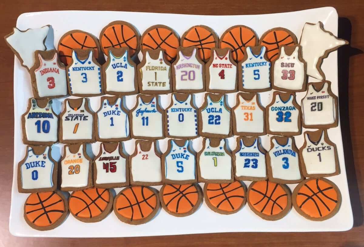
The Timberwolves have never had good uniforms, but they do have one of the best uni-related rituals in all of sports: Each year they mark the day of the NBA draft by preparing draft prospect jersey cookies. How cool is that? The maker’s marks are a bit depressing, but I guess you have to give them points for accuracy.
(Big thanks to Jared Hensch for this one.)

Odd couple: On the left is rapper/actor Ice Cube. On the right, uniform designer/historian Todd Radom (in a photo taken recently by his daughter, Hannah Radom). My latest ESPN column, which will post today, is about how these two gents teamed up to create the uniforms and logos for BIG3, the new 3-on-3 basketball league that’s debuting this Sunday. Check it out here, and then I’ll have a follow-up blog piece next week with a lot of additional background info from Todd.
And speaking of ESPN stuff, in case you missed it yesterday, here’s my piece on five takeaways from the NHL/Adidas unveiling.

Just give me all your money already: In case you missed it yesterday, there’s a lot of new Uni Watch-related merch currently available, as follows:
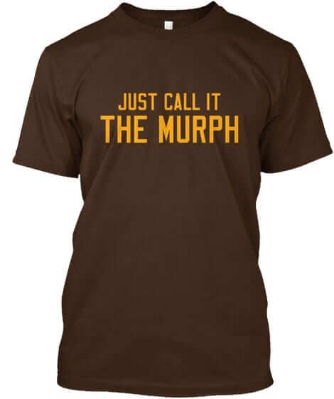
• Four new Naming Wrongs designs have just launched (including the Murph design shown at right; click to enlarge). You can see all of the new designs here, you can read more about them here, and you can order them in the Naming Wrongs shop. (They’re also cross-listed in the Uni Watch shop, where card-carrying Uni Watch members can get 15% off. If you don’t already have the discount code, get in touch and I’ll hook you up.)
• The third batch of StripeRite socks is now available. Most of the designs from the first and second batches are available as well.
• With Independence Day fast approaching, this would be a swell time to order the Uni Watch stars and stripes T-shirt. But in order to get the shirt in time for the holiday, you’ll have to choose rush shipping, which costs an extra $7. (For those of you who ordered this shirt yesterday, I think it will arrive in time for the holiday even with normal shipping. Fingers crossed.)
Okay, end of sales pitch. My thanks, as always, for your consideration.
The Ticker
By Paul


’Skins Watch: In light of this week’s Supreme Court decision overturning the ban on trademarks for offensive terms, which was widely viewed as a win for the ’Skins, the New York Times editorial board, which had previously opposed granting of trademark status to the ’Skins, now supports it (from Tommy Turner).
Baseball News: New bat knob decals for Twins INF Ehire Adrianza. … The Montgomery Biscuits have a new cap with a wraparound biscuit design. Not bad, but nothing can match the anthropomorphized biscuit. … Poutine-themed jerseys this Saturday for the New Hampshire Fisher Cats (from Tris Wykes). … The White Sox will retire Mark Buehrle’s No. 56 on Saturday. Fans will receive a commemorative pin with this logo. … This is pretty cool: The old Hale America “Health” patch, which was worn on MLB jerseys in the early 1940s, is now being featured on a cap (from @civil_standard). … Great little video clip about the origins of the Cardinals’ birds on the bat insignia. … Our own Phil Hecken is featured in this excellent podcast by the Hall of Very Good crew — don’t miss.

Pro Football News: The Calgary Fire Department donated a custom-painted Calgary firefighters helmet to be awarded to the CFL’s Calgary Stampeders’ special teams player of the game following wins (from Wade Heidt). … The Ravens hung a motivational sign from the goalpost of their practice facility (from Andrew Cosentino). … Cris Routh spotted the Dolphins using mismatched “2” numerals for two games in 1988: against the Bucs on Oct. 30 and against the Browns on Dec. 12. In that second shot, the 7s are mismatched as well. … For reasons that aren’t clear, Steelers WR Antonio Brown was spotted working out in a Panthers helmet. … The CFL’s Montreal Alouettes have two interesting anniversary decals on their helmets: Canada 150th and Montreal 375th. Halftime performers last night wore jerseys with No. 375 for the Montreal anniversary. … NFL officiating note: The head linesman will now be called the down judge. The designation on the back of the jersey will be “DJ” (from Mike Wilson).

Hockey News: Here’s something I hadn’t remembered: At one point the Florida Panthers’ gloves were supposed to have claws (from Moe Khan). … Gotta love a hockey uniform that references Naragansett beer and Jaws simultaneously (from Joel Mathwig). … The Stars will retire Jere Lehtinen’s No. 26 on Nov. 24 (thanks, Mike).

NBA News: The Bucks’ D-League G-League affiliate, the Wisconsin Herd, officially unveiled their logo set, although there wasn’t much drama because the primary mark had already leaked a few days earlier.

Soccer News: A uni-related gaffe on Arsenal’s website may have hinted at Alexis Sanchez’s departure from the team (from Ted Arnold). … New road kit for Barca. … The LA Galaxy will celebrate LGBTQ Pride Night on Saturday, with rainbow-patterned warm-up tops and corner flag. … Experts have identified the worst jersey in the history of English soccer (from Matthew Solly).

Grab Bag: American Airlines is searching for a new uniform manufacturer following repeated staff complaints about their unis causing various health problems (from Dan Tarrant). … Longtime reader/contributor R. Scott Rogers put his 2017 Purp Walk sticker on his curling broom handle. … The city of Columbia, S.C., is getting ready to choose a new flag design (from @jhlichty).
arent state flags enough? we need city flags? are there county flags? who other than govt offices actually fly or buy these things?
Talk to Chicagoans. They’ve got a great city flag and it’s all over the place.
Indy’s City flag is sharp too… and all over it seems
It’s great. I’m surprised the Chicago teams don’t incorporate it into their unis. A sleeve patch at the very least.
The Chicago Fire have incorporated the flag and/or six-pointed Chicago stars on several kits. The Chicago Red Stars (women’s soccer team) is NAMED for the stars on the flag.
Ironically, these teams don’t play in Chicago, but in scenic Bridgeview, IL.
Also, amateur teams, clubs, and businesses throughout the area incorporate the flag or stars into their jerseys quite often.
I stand corrected. Thanks, Tom.
link is still one of my favorite Chicago Fire kits.
The Chicago Blitz used to have the city flag on its helmets
link
Who other than government offices flies state flags? Heck, in pretty much any country in the world other than the United States, even the national flag is only flown by government offices. Identifying government buildings and institutions is one of the main points of any flag, even a national flag.
Within a couple blocks of me, we have a Post Office and a fire station. The buildings are actually kind of similar looking. What makes them easy to tell apart, and thus remember which is which, is that the Post Office flies the U.S. flag out front, while the fire station also flies the city flag. It’s useful and valuable for the city to have a recognizable flag precisely because it makes it easier to identify city government offices.
And if a city has a good flag, people do tend to use the flag to show their local pride, which builds civic solidarity when people do it. People and businesses with any connection to Chicago or D.C. regularly display their city flags or incorporate them into artwork, logos, even tattoos. In Wisconsin, I’m seeing the same thing starting to happen with the People’s Flag of Milwaukee, even though it hasn’t been adopted officially by the city government yet.
Our state flag is flown in various places in Michigan. This past week I noticed it at a water park and a car dealership. They are usually flown with the U.S. Flag and rarely alone.
Who other than government offices flies state flags?
Agreed for the most part, but having lived in Texas for four years, I can tell you the state flag of Texas is everywhere. Not just on government buildings, but just about everywhere that an American flag is flown – offices, businesses, homes. (True that many homes have college flags as well.) I don’t think I’ve ever been anywhere where I’ve seen the state flag flown as much as in Texas. Of course, Texans are apt to think of their state as its own country, anyway.
It also helps that Texas has a really nicely-designed flag.
I often compare Minnesota with Texas, in that if you ask most Americans where they live, they’ll usually answer with a preposition: “I’m from Ohio” or “I live in Colorado.” Whereas folks from Texas and Minnesota often answer with a demonym: “I’m a Texan” or “I’m a Minnesotan.” And because Texas has such a well-designed flag, you see it all over the place in Texas and wherever Texans are around. Yet Minnesota has a crummy flag, so you don’t see Minnesotans displaying their state flag as a point of pride. Years ago, I had a 3×5 Minnesota state flag on my office wall, and other Minnesotans regularly asked me what flag it was.
New Yorkers and Alaskans tend to go by the demonym quite often too. Hoosiers are a special case in that and a variety of other ways.
If Connecticut had a demonym that wasn’t awkward and terrible, I would definitely use it.
Jon – what’s so bad about “nutmegger”? (Except some likely autocorrect issues)
Nutmegger is good, but so few people understand the meaning that I always have to explain that I’m from Connecticut. I’d like to see “Yankee” adopted, but Red Sox fan Yankees would never go for it. ;)
Folks in South Carolina use the palmetto tree and crescent moon imagery from the state flag all the time. I flew the flag at my house alternating time with the Stars and Stripes.
The prevalence of a city flag is directly proportional to how well designed it is, from my experience. That’s why you see a lot of the Chicago, D.C., Indianapolis, and Portland flags (among others) used or adapted locally.
Agreed. A really good civic flag link and becomes precisely the rallying symbol flags are intended to be.
I moved from Columbia, SC last fall ago after living there for seven years. Aside from a wild guess, I could not have successfully picked out the city flag from among a lineup. I had no idea.
Since moving to St. Louis, I do notice the city flag here and there though.
It helps that our flag is pretty awesome.
link
Certainly better than the vexillological turd belonging to the suburb in which I live:
link
There’s a guy in Denver devising link. I don’t much care for the one he set up for where I now live, so I sent him a design for the neighborhood where I lived as a little kid. We’ll see if he uses it.
There’s an extra h at the beginning of the link to the Wisconsin Herd logos (hhttps:….)
Thanks. Fixed.
The Timberwolves sure do like drafting players with low numbers! More than half (14 of 26) of their draftees wear numbers between 0 and 5.
And baseball fans, look at
Mmmm, poutine.
Just learned a new word.
Too bad New Hampshire and Montgomery aren’t in the same league. Poutine jerseys and biscuit caps would be a delicious matchup.
Ted Nugent rocks!
“The Timberwolves have never had good uniforms…”
Not recently, but their originals were a thing of beauty.
-The Canada 150th decal are on all the CFL team helmets this year. I do like the Alouettes change this year to the white helmets and white pants as the primary look. Though they could benefit from a redesign, this is a nice small change. This reminds me of the good looking 1980s Montreal Concordes/Alouettes uniforms:
link
We are going to be seeing lots of white/red/white at home and white/white/blue on the road as was worn back then.
I also liked their royal blue and green set. It wasn’t the most distinctive uniform, but it’s enough to build on for sure.
Not recently, but their originals were a thing of beauty
YES.
Yeah, have to disagree w Paul here; these were fantastic: link
Never cared for that look myself. But I’m aware that some people do like it.
Blue, Green and White is a tough color combination to make work, judging by the number of teams that have abandoned it
1. Dallas Mavericks
2. Minnesota Timberwolves
3. When Hartford Whalers became the Carolina Hurricanes – and even before that they became more dark blue and silver
4. I’m not any MLB team has tried it
5. In football the Seahawks, although they always had silver, and have now adopted the extreme book ends lime green and dark blue, which speaks to the problem in the first place, the colors are too similar
Which leaves I think just the Vancouver Canucks, who took an extended hiatus from the color scheme.
Regarding teams in North American Big Four leagues that have abandoned the kelly green and royal blue colour scheme, don’t forget the Oakland Seals. Dropped the blue trim in favour of yellow trim when they became the California Golden Seals:
link
Thanks Wade, I had overlooked. I can’t think of too many university programs that use it, maybe one can say Tulane, there are probably others, but they don’t exactly pop into mind.
Tampa Bay’s second iteration of their Devil Rays’ identity was green, with blue and black trim. And let us not forget the Pete Maravich-era Atlanta Hawks. But a common thread of all “once was blue+green” teams is a sizable chunk of the fan base pulling for their restoration. It’s easy on the eyes, despite breaking the design rule of using two colors with similar value.
Royal blue and kelly green can still be found in the highest level of hockey for junior-aged players. Major junior hockey’s Swift Current Broncos of the WHL:
link
Blue, Green and White is a tough color combination to make work, judging by the number of teams that have abandoned it
I don’t know that’s a good metric. Athletic gold and royal blue is a fantastic color scheme, but it’s been abandoned by pretty much every club that ever wore it (although some have since returned home).
link link link.
Florida Gulf Coast University
The Jets had link link back then as well.
(Both images from 12/10/1988 vs. Colts.)
Just wondering if there’s going to be a “I’m Still Calling It the D-League” t-shirt
Today’s ESPN column is up:
link
Two teams with Purple? Ohh Noo!
I’m totally on board with Ice Cube’s picking the uniforms for each game. If it were up to me, the Stanley Cup finals would all have been gold-on-black.
The Fisher Cats jersey looks more like “Internal Organs Night at the ballpark.
If only Ice Cube was the commissioner of the NHL….sigh
Then maybe my Sens wouldn’t have such ugly uniforms & horrible logo.
Once the Rangers and Canadiens agreed to a dark on dark game, about ten years ago, but someone had to consent to wear white helmets, spoiling the effect. For want of a set of red helmets, we were deprived a very appealing sporting contest.
The Montgomery Biscuits have a new cap with a wraparound biscuit design. Not bad, but nothing can match the anthropomorphized biscuit.
What if they combined the two?
link
Antonio Brown’s Panthers helmet was a gift from Greg Olsen, and he was doing it out of honor for the TE
link
How about “Corporate Stadium Names Suck”? That way, you can still make a statement if there isn’t an applicable team/venue-specific statement – namely, if your team has never had the good graces to call home a venue that has been spared this blight, or perhaps in the rare case where your team has never been so unfortunate as to never have resided in a venue that has been cursed by this blight.
*never been so unfortunate as to have resided in a venue that has been cursed by this blight*
Making changes to how I worded that last line, I forgot to strike that last “never” before submitting.
Not a bad idea. Will consider it!
Agree with the sentiment, but the slogan could do with some finessing.
“Would you sell your own name?”
I admit, it’s not quite as succinct as the inspiration for it, “Corporate Rock Still Sucks”.
Going back to the NHL’s new Adizero jerseys… the one thing that’s really frustrating me right now is the lack of a proper design template based on the new construction. I just don’t want to force my future concepts onto the now-outdated Edge template.
It’d be nice if we could get images of one of the new jerseys laid flat, and I mean completely flat with no bunching, so we can get a proper and accurate look at how it’s constructed, how the new hemlines look, etc.
The Wild sort of have the template for each of their new Adizero jerseys in the timeline graphic here link
The link will look familiar to Seahawks and Sounders fans. I don’t put it in the “worst away jerseys in EPL”.
The people who thought that and the brown Coventry City kit belong on a worst-of list should donate their eyes to someone else. Don’t wait til you’re gone…go ahead and do it now because you’re not using them properly. Those two look mighty fine.
Granted, the ad on the Swansea jersey sullies the look considerably.
Lightning get rid of “TAMPA BAY” over the logo on the road uniform! link
NHL draft uni: The new adidas collar looks as bad as the reebox and the nikelace. Grade F