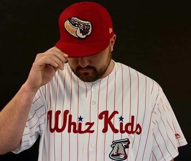
One of the most interesting uni-related developments of recent years is the trend of minor league baseball clubs taking on a new team identity, often based on a local food, for a game or two. The phenomenon began in 2015, when the Fresno Grizzlies became the Fresno Tacos for a day. The move was a hit with fans and the media (and not just in Fresno), so many teams have followed up with similar moves.
Minor league promotions, of course, are full of trends and bandwagons. But as trends go, this is a pretty good one, because each one-day makeover has involved some genuine creativity and imagination — so much better than the boilerplate uniform promotions we’ve seen so many times (Star Wars Night, Ninja Turtle Night, Hawaiian Shirt Night, yawn), most of which look like the teams are all ordering out of the same catalog.
Granted, some of the executions have been better than others. It’s worth noting that the first Fresno Tacos promotion in 2015 was timed to coincide with the city’s annual Taco Truck Throwdown event, so it resonated particularly well with the local culture. Some of the other promotions seem uninspired by comparison. Still, anything’s better than another R2D2-inspired jersey.
The latest entry in this category comes from the Lehigh Valley IronPigs — the Phillies’ Triple-A affiliate — who announced yesterday that they’ll rename themselves as the Whiz Kids for their June 29 game against the Pawtucket Red Sox.
“Whiz Kids” is a particularly ingenious name because it (a) pays homage to the Phillies’ 1950 pennant-winning squad, which was nicknamed the Whiz Kids because of the team’s youth, and (b) references Cheez Whiz, a key element of Philly cheesesteaks. The resulting uniform, with a Phils-themed jersey script and a cheesesteak-emblazoned cap, is brilliant. Here are some additional shots (click to enlarge):
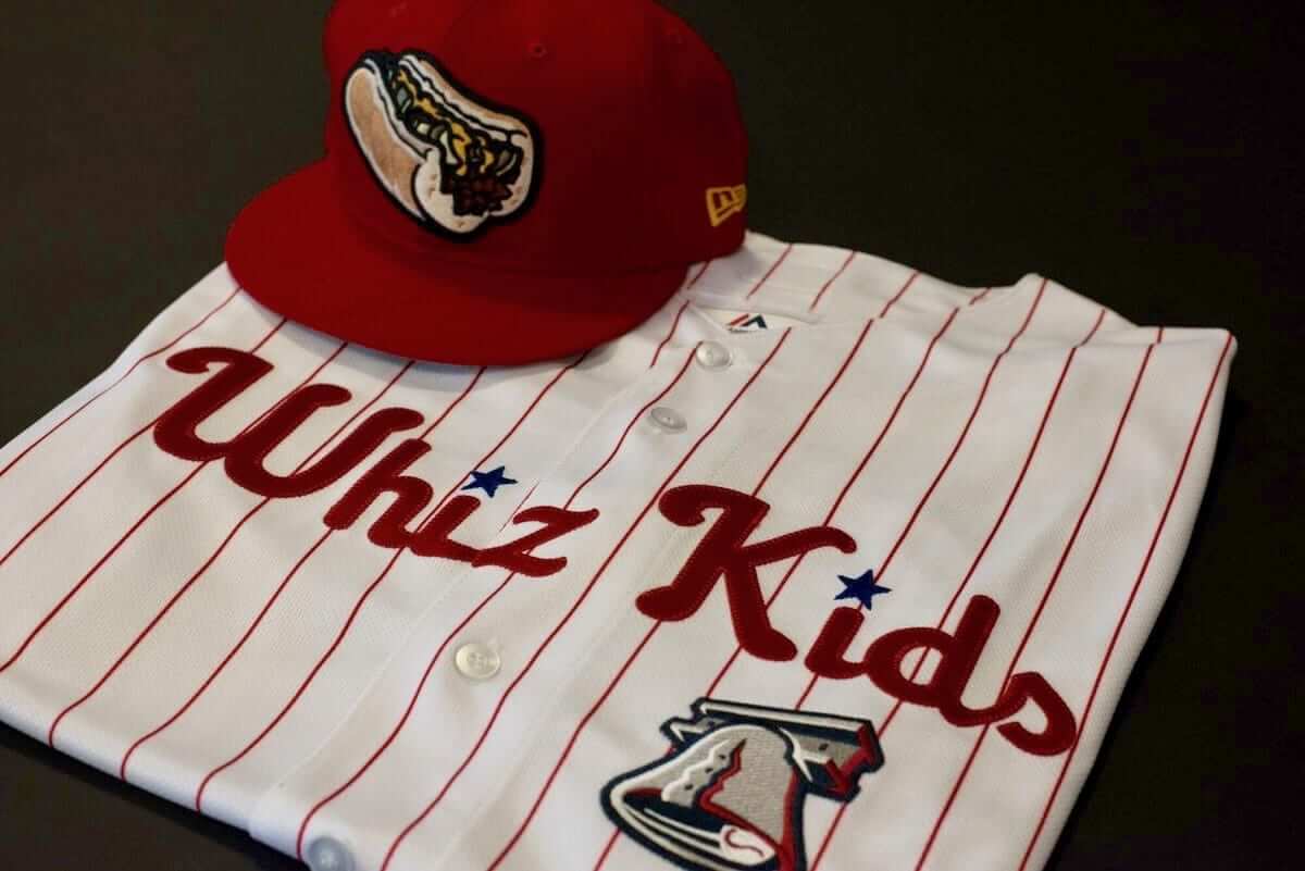
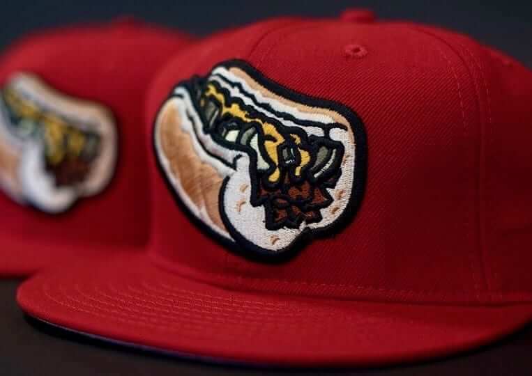
Full disclosure: When it comes to cheesesteaks, I’ve always been a provolone guy, not Whiz. But this promotion might just be enough to convert me. Nice job all around — kudos to all involved.
How would you all feel if top-level pro teams did this, instead of just minor league teams? What if the Phillies became the Whiz Kids for a day? What if NFL, NBA, and NHL teams got on board?
Personally, I’d be all in favor of that — at least in theory. In practice, I worry that they’d overdo it and mess it up somehow. What do you think?
Meanwhile, here’s the the song that the IronPigs should play at the ballpark on the night they become the Whiz Kids. Not holding my breath, but a guy can hope:
NBA wrap-up: Congrats to the Warriors and their fans on last night’s championship and on a near-perfect postseason run. Last night’s game was uni-notable in several respects:
• It was the final NBA game without uniform advertising, which will begin next season.
• It was the final NBA game without a maker’s mark on the uniforms, which will be added next season.
• It was probably the final NBA game for the foreseeable future with sleeved jerseys, although we still don’t know that for sure.
Lots of people have been asking me when Nike will unveil the new uniforms. I had generally assumed that it would be done either prior to or in conjunction with the NBA draft (the draftees will be posing for photos while holding up jerseys, and you don’t want them holding the old Adidas product, right?). But the draft is next week and nothing’s been announced, so it’s pretty obvious that that’s not when the uniforms will be revealed.
Moreover, although the regular season is now over, I’ve heard through the grapevine that the Adidas contract actually runs through the end of the NBA Summer League, which doesn’t wrap until July 17. So we’re probably still more than a month away from seeing the new uniforms.
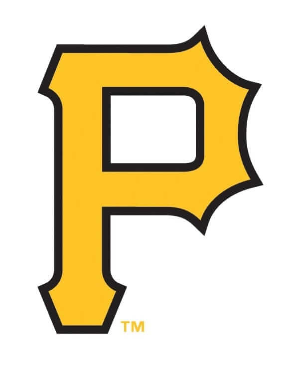
Letter imperfect: The Pirates’ primary logo has never felt right to me. There are those pointy spikes (or are they spiky points?) around the bowl of the “P,” but then the top-left corner is squared off. The whole thing feels out of balance, at least to me.
Is it possible that someone at MLB agrees with me? Possibly. Take a look at the Buccos’ cap for next month’s MLB All-Star Game (click to enlarge):
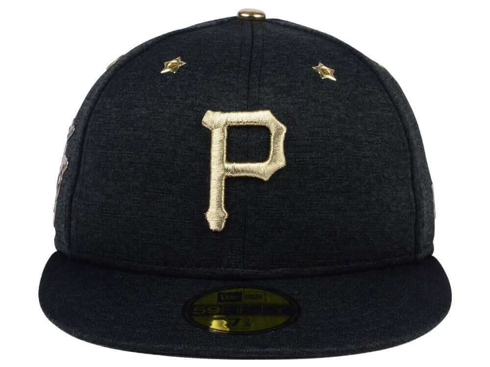
Interesting, right? Here’s a side-by-side comparison of the logos on a regular Pirates cap (left) and the All-Star cap:
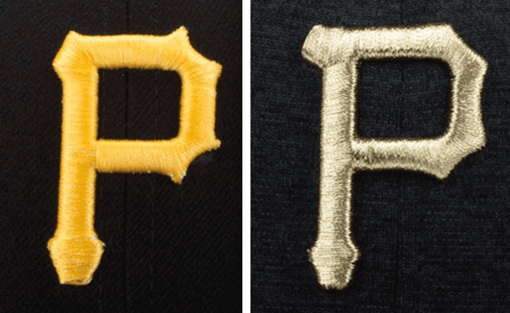
Actually, the version on the regular cap doesn’t look so bad when viewed in this embroidered form, because the embroidery softens the extremes of the corner spikes. Still, I think the All-Star version looks better.
Could this be a soft launch for a logo revision? Hmmmm.
(My thanks to @AtomK13 for alerting me to the altered logo on the All-Star cap.)
Collector’s Corner
ӬBy Brinke Guthrie
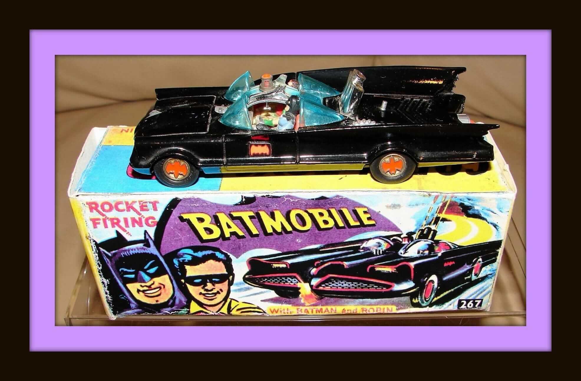
Starting off this week’s Collector’s Corner with a tribute to Adam West. The actor, who died Friday night at the age of 88, was a big part of my growing up. Corgi released this Batmobile back in 1966, and it came with a “Batmobile Owner’s Badge” to wear and missiles that would fire out of the “Triple Rocket Tubes.” The front end featured a “Chain Slasher Blade,” and the rear end included a “Turbine Jet Exhaust.” The retail cost for this back in the day couldn’t have been more than $5.99 or so; this one’s close to $300. Holy Inflation, Batman! I had this one, though I was more of a 007 Aston Martin DB5 guy. RIP, Mr. West.
Now for the rest of this week’s picks:
• With the Golden State Warriors winning their second NBA title in three years last night, they’ll be getting another flashy ring. In the 1970s, the team received these Bulova Accutron watches, too.
• Now this is terrific: a 1966 Packers/Chiefs Super Bowl wall hanging. Check out all the teams! There’s one helmet just marked “A.” Could that mean “AFL”?
• This glossy 1960s K.C. Chiefs bobble is in perfect condition.
• Ever seen a set of 1970s Steelers Russian nesting dolls?
• Here’s a 1969 mini-poster from the inside label of a can of Hi-C, featuring Bengals quarterback Greg Cook.
• How about the artwork on this 1960s California Angels pennant. Nice drawing of Angels Stadium and the Big A scoreboard.
• Way back, Sunbeam bread came with NFL stickers. Which means, naturally, you needed a sticker album to keep them in.
• The eBay seller calls this a “magnet” and “sticker,” but in fact this is one of those nice 1970s enameled NFL team medallions, this time for the New York Football Giants.
• We’ve seen plenty of electric football games, but this game, Pro Draft, uses football cards so you can be the GM and build your own team.
• Check out this Philadelphia Eagles Technigraph plaque — perfect shape.
• Our unintentional weekly series of 1970s MLB switch plates continues, this time around with the Houston Astros.
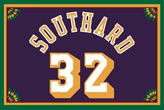
Membership update: Six new designs have been added to the membership card gallery (including Loren Southard’s vintage Lakers treatment, shown at right). With one exception, we’ve finally finished all of the Purple Amnesty Day orders, and that one remaining card — Scott Wedemeyer, it’s yours, and you know why it’s more of a challenge — should be completed today or tomorrow. I expect the printed/laminated versions of these cards to ship out by the end of the week.
Remember, a Uni Watch membership card now entitles you to 15% off of any of the merchandise in our Teespring shop (if you’re an existing member and would like to have the discount code, email me). As always, you can sign up for your own custom-designed card here, you can see all the cards we’ve designed so far here, and you can see how we produce the cards here.
The Ticker
By Mike Chamernik

Baseball News: The Cubs’ Ben Zobrist usually wears long pants with team-colored shoes and accessories, but he went with a more traditional look on Sunday: black batting gloves and shoes, and stirrups. “He stroked a dinger with the look so I hope he sticks with it,” says Steven Luft. … The Chiba Lotte Marines have a new mascot, a bulbous anglerfish (from Ted Arnold). … As we know, the Rays wore their 1970s-themed fauxbacks on Saturday. People who served as “Fan Hosts” at the game were given these T-shirts, which are based on Robert Crumb’s “Keep on Truckin'” comic (from Jerry Kulig). … Dalton Wheat of the Single-A Greensboro Grasshoppers is hitting .350 while wearing leather work gloves, instead of regular batting gloves, at the plate. He wears the gloves, which are usually meant for welders, farmers, and the like, because they’re thicker than standard batting gloves (from Jason Gray). … While the Mariners wore button-free pullovers on the road in the late 1970s and early 1980s, Willie Horton had a two-button Henley style collar (from Johnny Garfield). … Orioles OF Hyun Soo Kim has a little illustration of himself on his shin guard.
College & High School Football News: National champions Clemson visited the White House yesterday and gave President Trump a jersey. … New field design for Iowa (from Josh Claywell). … New visor for UNC coach Larry Fedora (from James Gilbert). … Speaking of UNC, the school is starting to convert a couple of sections of Kenan Stadium from aluminum benches to plastic seats, painted Carolina blue, of course. It’s not clear yet if the school will replace all the seating, since that would reduce the stadium’s capacity (from Dan Tarrant). … Jarod Grieco says his friend painted the midfield logo for the Oxford (N.Y.) Blackhawks, a high school team. “He calls it a perspective drawing, as he was commissioned to make it look correct from the stands.” … In the mid-1960s, before switching to their familiar UA logo, Auburn had players’ uni numbers on their helmets. But, it looks like the school created a prototype with a tiger logo on the sides at the time (from Clint Richardson).

Hockey News: Most NHL teams teased their new Adidas jerseys, including the new Vegas Golden Knights. All 31 teams will unveil their new jerseys on June 20 in Las Vegas. … Predators fans were famous for tossing catfish on the ice during the team’s postseason run. In the wake of the Penguins winning the Cup, some Pens fans are twisting the knife by eating raw catfish (from Alex). … The Kansas City Mavericks of the ECHL are holding a design contest for a new logo (from Alex Manners).

NBA News: The Wizards’ John Wall sponsors a few AAU programs in his hometown of Raleigh. The teams, both boys and girls, wear Wizards-esque unis (from Robert Anderson). … Speaking of AAU, a team in Cincinnati is named Shining Star. They have unis based off of the carpet pattern from The Shining, the legendary 1980 thriller film. In the movie, though, the carpet was red, orange, and brown (from Glenn Riley). … Here are the uniforms that the 60 teams will wear in this year’s The Basketball Tournament.

College Hoops News: Instead of rings, Indiana players were awarded a clock for winning the Big 10 in 1983 (from Darrell Frazier). … In 1974, La Salle brought the wrong uniforms to the Palestra for a game against Villanova. So, the team wore Penn’s white unis instead. Penn plays at the arena full-time (from Ryan Kelly).

Soccer News: New home jerseys for Sunderland AFC (from Darren Paul). … New kit fonts for Juventus, who will also wear Scudetto and Coppa Italia patches next year (from Chris Cruz). … Also from Chris: New away kit for Celtic.

Grab Bag: New logo for Amazon Prime (from Brinke). … The Summit League is holding a fan vote to determine the best uniform in the conference.
On the “wall hanging”, the only helmets depicted are NFL, none are AFL. I’d say the “A” is for Atlanta which probably hadn’t yet come up with their original fantastic logo.
Given the rather rough qualities of the drawings, I’d concur on that. The A helmet was probably just a placeholder. And note that the uniforms on the players depicted don’t actually match any team uniforms of that time – they’re pretty generic designs with shoulder loops. Another case of a seller with an inaccurate label (probably due to their own ignorance).
On the other hand, BROWNS PHANTOM CB HELMET SIGHTING!
I think “ignorance” is a pretty harsh term here. The NFL wasn’t nearly as ubiquitous as it is now. Remember, Super Bowl the First wasn’t even sold out.
It’s true that the word “ignorance” these days is often used as an insult, but it really just means that a person doesn’t or didn’t know something.
If you think about it, every fact that you currently know, you were ignorant of at some point.
I freely admit that there are many things in this world that I am ignorant about. For example, until today I was ignorant about the history of the cheesesteak, or even that Cheez Whiz was actually considered a valid choice for a cheesesteak by the outlet that purportedly created it.
In any case, the level of ubiquity of the NFL in 1966 is not germane to an eBay seller’s listing in 2017. It seems like there’s at least one inaccurate description every week, and I generally chalk them up to the seller not fully understanding what it is they’re selling, possibly because they themselves may have gotten it secondhand are are just trying to unload it, and they’re not familiar with the intricacies or just haven’t done the research – hence, ignorance.
Better to assume that, as well, than the alternative – deliberate misrepresentation.
Also that item features one of the strangest renderings of the New York Football Giants’ logo that I’ve seen, an outsized 49ers logo and not-quite-right Cowboys and Steelers logos.
I found it interesting that of the 15 NFL team helmets depicted on that mid-60’s wall hanging, all but two of the team (Atlanta and Washington) still use helmets that are either exactly the same or close variations today.
Amazing, really, given the amount of logo/uniform changes sports has seen over recent decades.
Editing:
ONLY INCLUDE IF WARRIORS WIN MONDAY NIGHT:
was left in the collectors corner
Goddammit, I knew I’d forget to deal with that. Now fixed.
May I suggest putting notes like this in HTML comments and intentionally misspelling something in them so they’re flagged in your editor before uploading? Depending on the CMS you’re using there’s a TODO tagging capability that keeps you from taking content live that needs attention.
You scared me Paul….when I saw Whiz Kids in today’s post, I thought we were getting a post about this:
link
I work for a clinic of specialty doctors. Our urological surgeons sponsor the restrooms at our local summer baseball ballpark. One of the most popular pieces we’ve created is a men’s room poster that says “Whiz. Kids. Two things we can help you produce.” One of the highlights of my writing career.
Et tu, Jeff? They don’t sponsor. They advertise!!
True. Got detached from reality and caught up in our in-house language.
Well, does the revenue from their advertising go directly to the upkeep of the facility? If so, then you could make a fair argument for the S-word. Otherwise, yeah, they’re advertisers.
;)
Local summer baseball park. I would assume it is some sort of rec league facility, in which case the money from the urologists are going directly to offset upkeep costs which would have to be paid either by the municipality, fundraising, or entry fees by the teams/players. I’d say this is a case of sponsorship since a local summer baseball park is likely a not for profit organization.
Oh, please.
Did the bathroom exist before the ads?
Could the bathroom exist without the ads?
It is not essential support; it is a trade of revenue for exposure. That’s advertising. Jeff Ash, who posted the original comment and works for the
sponsoradvertiser, agrees. The end. Let’s please move on. Thanks.Just takin’ the piss, Paul. ;)
It’s a new *cough… revenue stream for advertisers.
Despite what the eBay listing says, that likely isn’t a Packers-Chiefs Super Bowl wall hanging in Collector’s Corner. It was shared Sunday on the UniWatch Facebook page and pretty much shot down there. It’s likely a 1966 NFL item produced before the new Atlanta team had released its helmet logo. That the second player is in Chiefs colors is just a coincidence. Not at all a Super Bowl item.
Here’s the Uni Watch Facebook thread from Sunday.
link
Assuming Nike does indeed scrap the sleeves, what’s more likely in Year 1…sleeveless versions of the many sleeved alts out there, a variety of brand new alts, or a mostly simple uniform with far fewer alts than recent years.
“UNC…..plastic seats, painted Carolina blue,…”
MOLDED in Carolina Blue I would suspect; not painted.
As the contributor of that item, I will add that you’re correct. I can’t remember if that was Paul’s wording or mine when I emailed it to him, but the seats are constructed of Carolina Blue plastic with black armrests, to be totally specific.
Also, a few years back when UNC enclosed the east end zone, the new section built there featured blue stadium seats instead of the metal benches found throughout the rest of the stadium.
It might be cool if they were actual wooden seats that WERE painted though.
Plastic is probably more cost effective these days.
Right. I imagine plastic holds up better for outdoor use.
The original (I’m still calling it the) Charlotte Coliseum had wooden seats panted orange. Replaced recently with plastic ones.
Proof proofreading:
“here’s the the IronPigs should play”
“was was a big part of my growing up”
“for the for the Oxford (N.Y.) Blackhawks”
Answering the question:
Adding local food specialties to the already-overcrowded schedule of major league alternate jerseys seems like a bad idea.
Fixed.
“Proof proofreading”? Is that an intentional typo?
All of the typos involved repetition. (As did yesterday’s Pearls Before Swine.)
“Cheez Whiz, a key element of Philly cheesesteaks”
My heart breaks a little bit to read this. It’s the moral/culinary equivalent of reading that well-done is the ideal way to serve a steak, or that cooking to an internal temperature of 175 is a key element of preparing tuna. Cheez Whiz came onto the market two generations after the cheesesteak was popularized as a ubiquitous Philly dish. Whiz is the signature of the crappy downtown tourist traps that value speed of preparation and marketing gimmickry over authentic tradition or culinary quality. As recently as the 1980s when I lived there, folks in Philly generally understood this and regarded Pat’s and Geno’s with indifference or contempt, preferring authentic choices of either white American cheese (white due to Pennsylvania’s innovative food-safety regulations) or, if one was adding peppers, provolone. When we moved to town, neighbors and my dad’s new colleagues warned us away from Pat’s and Geno’s and explained the inauthenticity of Whiz on cheesesteaks. It was one of the first things multiple different people said when greeting us, from the delivery truck driver to the head of Bryn Mawr’s philosophy department. Clearly, Philadelphans once thought it was important local knowledge to impart to newcomers that white American was the proper and authentic topping for a cheesesteak. (Tellingly, my dad’s favorite steak joint, the Mainline Diner in Wayne, doesn’t even have cheesesteaks on the menu anymore. Why bother with the real thing when the customers are just going to demand that you drown the tasty bun and steak you’ve taken care to prepare in glops of cloying Cheez Whiz?)
To see Whiz accepted as a legitimate cheesesteak topping, indeed the presumed correct topping, is like seeing the McRib sandwich held out as the ideal serving of barbecued ribs.
Couldn’t agree more. Grew up in South Philly, still live in the area, and never put Whiz on a cheesesteak. No one in my family used it, or ordered it, either. Provolone or American thank you very much. As for the Iron Pigs and their cross-pollination of subject matter, no harm no foul. And a great, if somewhat misguided, idea.
To be clear: I’ve never put Whiz on a cheesesteak either (or on anything else, for that matter). As stated in today’s text, I’m a provolone guy. But Whiz has become an entrenched part of cheesesteak culture.
I was not aware of the full history, however. Thanks for that, Scott.
Count me in as a member of team provolone. But Provolone Kids just doesn’t work, so whiz it is. Also, put me on record as saying that DiNic’s roast pork, broccoli rabe, and provolone sandwich blows a cheesesteak out of the water when it comes to Philly sammies.
Think they’ll wear the bacon pants with these?
Also true about DiNic’s. Now I’m hungry and I am stuck in the South Jersey ‘burbs at work.
I’ll second this also. Lifelong native, 3rd generation. And Pat’s and Geno’s are where the tourists go or where the drunken frat bros congregate at 3am after the bars close. White American cheese and fried onions OR provolone and marinara. Don’t believe the masses. Just don’t go John Kerry on us. ;)
Mmm, provolone and marinara sounds good.
Well, I decided to look up more on cheesesteaks, and managed to learn something new.
Hypothetical meeting:
“Hi, I’m Wendy Thomas. My dad named his fast food chain after me!”
“Hi, I’m Geno Vento. My dad named me after his restaurant.”
Amen, arr.
People are always surprised when they ask me, “Where can I get the best cheesesteak?” and I answer “The local corner pizzeria to wherever you’re staying.”
I always say that Pat’s and Geno’s are tourist traps. Still, when I get that craving when I visit my parents, I go to the local pizzeria.
Pat’s King of Steaks or Geno’s.
You must choose one or the other.
No. You don’t. I could throw a rock from almost anywhere in the city and find a better cheesesteak. Don’t be a lemming.
Cheesesteaks are like bourbon. There are no bad ones, but some are better than others.
You must choose one or the other.
Too many people have too many rules when it comes to food. Forget both of them…I’m not going to stand in a long line only to get scolded in a Philly accent for not ordering properly. I’ll find a nice neighborhood place where I can get one with mushrooms and provolone. And if the mood strikes me I’ll put some ketchup on it.
I’ve never understood that either or mentality either. It’s like the Pepe’s or Sally’s in New Haven. I know people who will only eat at one or the other. But as far as I’m concerned, they’re both excellent. And if waiting in line isn’t your bag, there’s plenty of good pizza around. Just like cheesesteaks in Philly.
Mmm… McRib.
In my 52+ years of life I have never eaten a cheesesteak with Cheese Whiz…and I never will…
I honestly can’t remember eating anything with Cheez Whiz (or any other spray “cheese”). I’m pretty sure I did at some point in my life, but if so, it’s been long blacked out or repressed.
I too prefer American With for my cheesesteaks, but my wife who’s family is from South Philly always gets a Whiz With Insideout and it is also pretty solid.
Do I even want to know what the “Insideout” part means? Or is this a time where it might be a good idea for me to remain willfully ignorant?
ArrScott!!
Thanks for the cheesy knowledge Arr… you are a Cheese Wizzzard!
Provolone please on my sammich.
That Warriors watch up for auction on eBay is not from the 70s. It has their Run TMC era word mark which did not debut until 1988.
Blame the seller for the inaccurate description.
On the other hand, just because it wasn’t on the uniform until the late 1980s doesn’t mean that the Warriors didn’t have that particular wordmark in their portfolio years earlier.
Unfortunately, I don’t have any evidence one way or the other.
I think the pro teams would try to bring in a corporate advertiser if they would become another team for a day. The Yanks becoming the Bronx Bombers or Murders Row brought to you by “insert corp name here”. I dont think it would be any different then a giveaway day which is sponsored.
Why do you assume that? The minor league teams don’t do that for their one-day makeovers, and it would be a lot easier for them to get away with it if they wanted to.
Regarding the NHL teasers, not much that’s surprising going on there. Minnesota adding a chest stripe is interesting enough.
Really disappointed that the Flames are sticking with the black C. I’ve never been a fan of that version of the logo; to me, black isn’t fire, it’s what’s left over after fire – the charred-to-a-crisp remains of whatever was burned, and the smoke that came from it. You can’t really generate a black flame, either. I’d be fine if they went back to the 90s version of the logo, with a black outline around a white C. After all, a white hot flame makes a hell of a lot more sense.
Then there are the four teams that didn’t have teaser images yesterday. Pittsburgh and Toronto just changed designs this past season, so it’s extremely unlikely they’d be changing anything around again so soon. Yeah, Florida just changed their unis as well, and are rumored to be making some kind of change, but based on their teaser it’s probably relatively minor.
That leaves us with Montreal and Chicago. The Blackhawks have had consistent uniforms for over sixty years now, only making minor tweaks here and there. The Canadiens, meanwhile, haven’t done much more than tweak their red jersey over the past century, and their white jersey has been consistent for the last seventy years. And both teams are consistently ranked atop “best/favorite uniform” lists. In short, any significant change from either of these teams would come as a complete shock.
What’s with the Sabres? I thought they were going back to a lighter blue? Oh well.
Another hope apparently dashed. Though I’m still holding out for the elimination of the gray piping and pit stains.
We’ll find out in a week!
Looks like the Flyers orange may be a deeper, richer shade than the current, day-glo-like, color they currently use.
I disagree with you on the Flames.
The 1970s look is a fun throwback now and then, but the red and black (not the current version with the weird striping but the prior version) is their iconic and best look.
I would take link over link every single day of the week, and twice on Sundays.
I thought it was interesting that the Clemson football team gave President Trump a jersey bearing number one. Usually teams give the President a jersey with their Presidential number. I can recall Presidents Clinton, Bush and Obama getting many jerseys and it seems like it always had their Presidential number. I’m sure there are a few occasions where teams went away from tradition and gave the Presidents various other numbers for whatever reason. Seems like an interesting project for someone to tackle. Maybe someone already did?
If only there were a simple mechanism, maybe on the internet, that would allow us to quickly and easily see if other presidents have received No. 1 jerseys….
link
link
link
interesting that I know many people that use 45 when discussing the Prez and not his name.
The custom of referring to Presidents by their ordinals is a fairly recent phenomenon. It began with George W. Bush, who was often referred to as “Bush 43,” or simply “43,” as a shorthand to distinguish him from his father, George H.W. Bush, who retroactively began being referred to as “Bush 41,” or simply “41,” even though he had never been called either of those during his presidency.
Interesting that the P on the normal cap has the top let serif curling upward to balance the spikes on the bowl. Even that improves the mark a ton, but I still prefer the subtler details on the All-Star mark.
The Pirates need to do the same thing to the “7” on their jerseys that they’re doing with the P. As it is, the 7 looks like a 2 with the base cut off.
I’ve no problem with the pointy spikes, but feel on the embroidered regular cap there is also a bit of a spike on the left corner. are the All Star caps gold or what?
Y’know, looking at the Pirates’ P logo, I think it kind of looks like some sort of spiky battleaxe.
And, of course, because I thought it, link
And for bonus points, it’s being held in the left hand!
Why would Auburn University have a “UA” logo on helmets? Should be “AU”
Calling it a “UA” logo is wrong, though. link, so it should be read top-down – “AU”.
MLB already dresses up players in soldier and flag costumes. Putting them in sandwich outfits can’t be too far down the road.
Or putting them on sandwich boards, for that matter. I mean, putting sandwich boards on them.
What if the Phillies became the Whiz Kids for a day? What if NFL, NBA, and NHL teams got on board?
NO. You want to give away replica specialty jerseys to the fans, fine. Keep it off the players, though.
In practice, I worry that they’d overdo it and mess it up somehow. What do you think?
And that’s why. You *know* that’s exactly what they’d do.
As a native Philadelphian, Cheez Whiz grosses me out and I never order a cheesesteak with that garbage on it.
We need more stupid looking “special” uniforms with stupid concepts. In fact, teams should just wear a different jersey every night to make things more “special.”
Eventually we’ll get to the point where you’ll see this on a team’s promotional schedule:
6/13: Regular Uniform Day – Throw back to the old days with no uniform gimmicks, no ads, just two teams playing ball and wearing what they used to wear every game.
One minor tweak “Regular Uniform Day presented by Old Granddad Bourbon – Throw down a shot or six while we throw back to old Granddad’s days . . . .”
Those All Star Game caps look better than I thought they would. I dig the polished metal squatchee. Still, I have the same problem with them that I had last year; there’s no difference between AL and NL. It would have been cool if they’d rendered the home team in gold and the road team in silver.
Anyone care to help me out with one of these Cheesesteak caps?
link
The store doesn’t ship to the UK
Lots of social media posts about a Ravens photo shoot link.
Looks like they’re using the old jersey template for the shoot.
The weirdest thing is link post where it looks like Terrance West has black fabric on his shoulder. At first I thought it was a shadow, but when you compare it with link, it looks like the color change is right at a seam.
Opps, that’s Kenneth Dixon, not Terrance West.
“How would you all feel if top-level pro teams did this (re-ding their names/uniforms for 1 day), instead of just minor league teams?”
My god, NO.
Dressing teams up as food items is… well, MINOR LEAGUE.
WTF is wrong with teams wearing, you know, their uniforms? I mean the way it is already is that there are so many special uniforms and special events, that literally nothing is really “special” anymore.
And my god, based on a rich track history already established, how could anyone think they wouldn’t overdo it and mess it up somehow? I think we’re all aware that the general philosophy of the marketing arm of professional sports seems to be “why just DO something when you can OVER DO it!”.
Ugh, worst idea ever, and no way it would turn out well.
Lee
“It was the final NBA game without uniform advertising, which will begin next season.”
Do we know this for sure? I thought it was still undetermined whether all teams would have advertising have next season, potentially leading to some unencumbered games.
Fair point. Let’s say it’s the final NBA game in the pre-uni-advertising era.
“The phenomenon began in 2015, when the Fresno Grizzlies became the Fresno Tacos for a day.”
phe·nom·e·non
fəˈnäməˌnän,fəˈnäməˌnən/Submit
noun
1.
a fact or situation that is observed to exist or happen, especially one whose cause or explanation is in question.
How about:
“The MONEYGRAB WHICH QUICKLY BECAME SOOOOO TIRESOME IT JOINED THE RANKS OF PINK AND CAMO GEAR began in 2015, when the Fresno Grizzlies became the Fresno Tacos for a day.”
It’s interesting how consistent it is across the internet that comments beginning with a copy/paste from a dictionary site are almost never of any value.
Gratuitous copy/paste notwithstanding: I strongly disagree with your comparison. MLB pink/camo is lazy, unimaginative, and often promotes bad civics and other bad values. Minor league one-day renamings are usually creative, playful, and have more imaginative energy behind them than anything MLB has done in years. Apples and oranges.
With the adidas teasers for NHL jerseys, why do the link and link teasers use different French expressions?
Different dialects?
Plugging them into Google Translate, the Ottawa one comes out “Training the future”, while the Montreal one comes out as “Create the Future”, which would be closer to the intent of “form”.
I’m going to go a different direction on Whiz Kids. How about a uniform with the Mannekin Pis as the logo, rather than a sandwich.
:-P
re: With the Golden State Warriors winning their second NBA title in three years last night, they’ll be getting another flashy ring. In the 1970s, the team received these Bulova Accutron watches, too.
I dont think the watch posted was part of any award to a team in the 1970s. In fact, here is another link to a watch with same face but different band for the “90s”
link
#CaveatEmptor
That Warriors watch has the wordmark used from 1988 through 1997. Definitely not from the 70s.
You say the phenomenon began in 2015 with Fresno, but in 2012 the Reno Aces became the Reno Ghostriders for a weekend, as part of a “what might have been” weekend-long celebration.
“What If” renamings go back at least to 2009. But the food-themed renamings started in Fresno in 2015.
totally agree about pirates; the hat logos have always seemed vaguely asymmetric to me
If those sneak previews are correct, Vegas’ home uniform will be steel grey as opposed to black, which will make that much sought after color (……No) their’s