During and prior to the NFL draft last month, we talked about how most teams are transitioning to Nike’s new tailoring template.
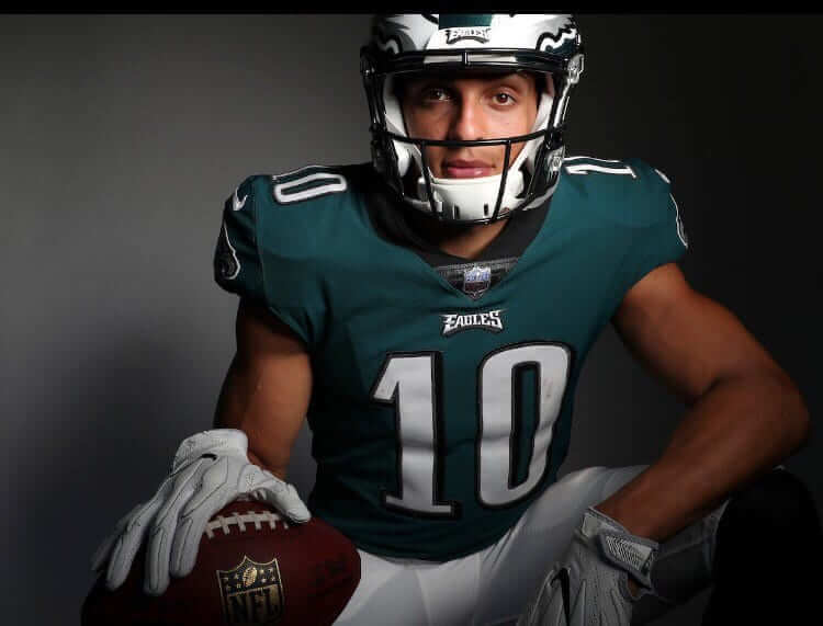
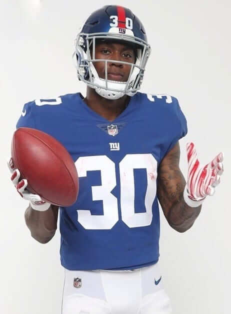
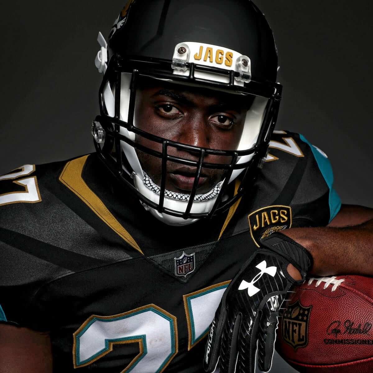
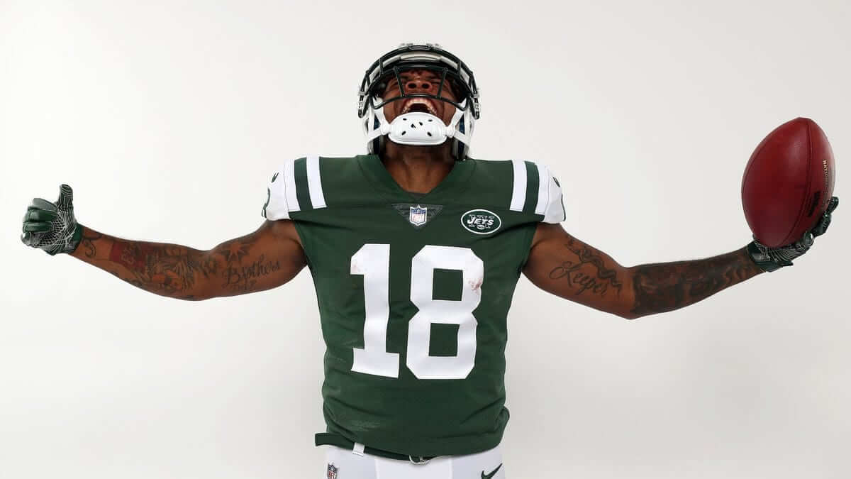
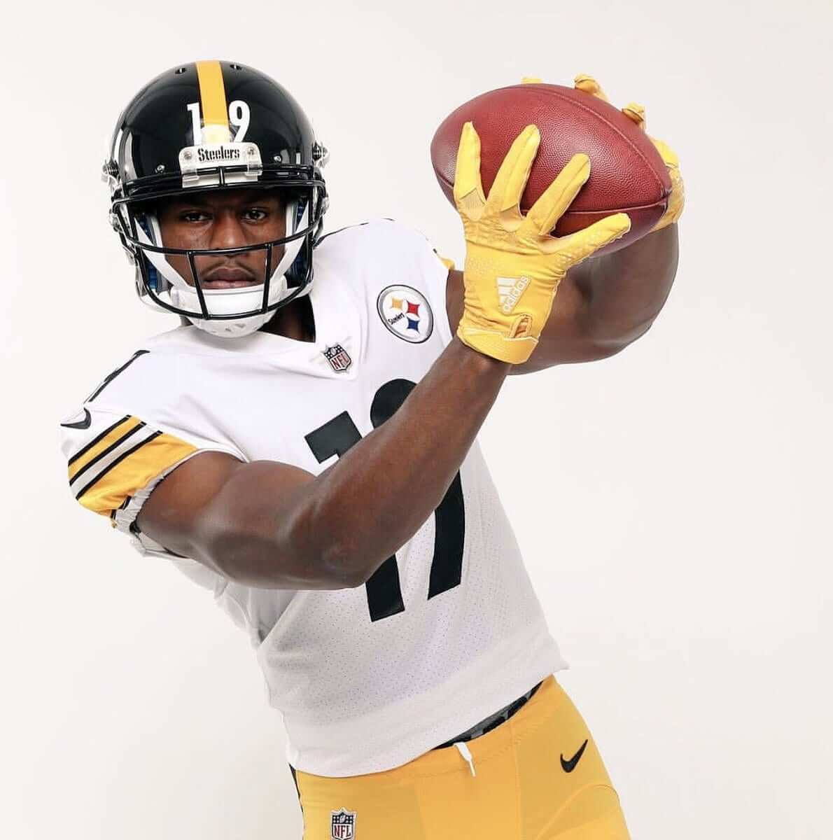
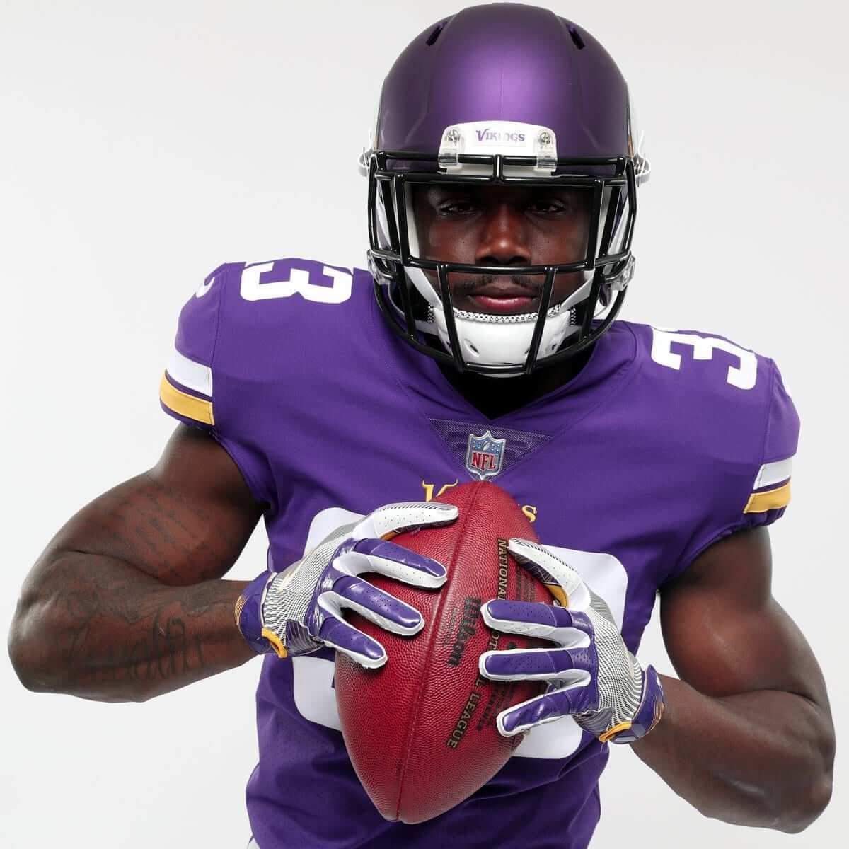
Now that NFL teams are conducting rookie photo shoots, we’re getting our first looks at how that template looks on a fully suited-up player. Here’s a team-by-team breakdown of what’s been circulating so far (for all photos, click to enlarge):
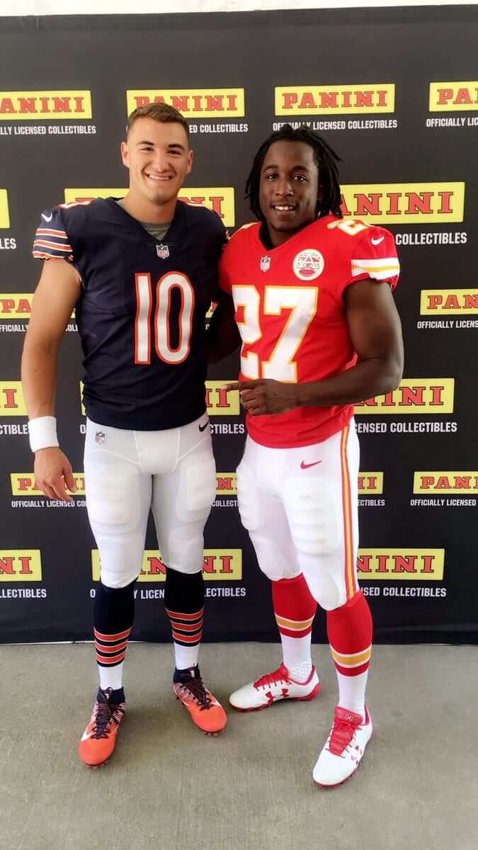
Bears and Chiefs
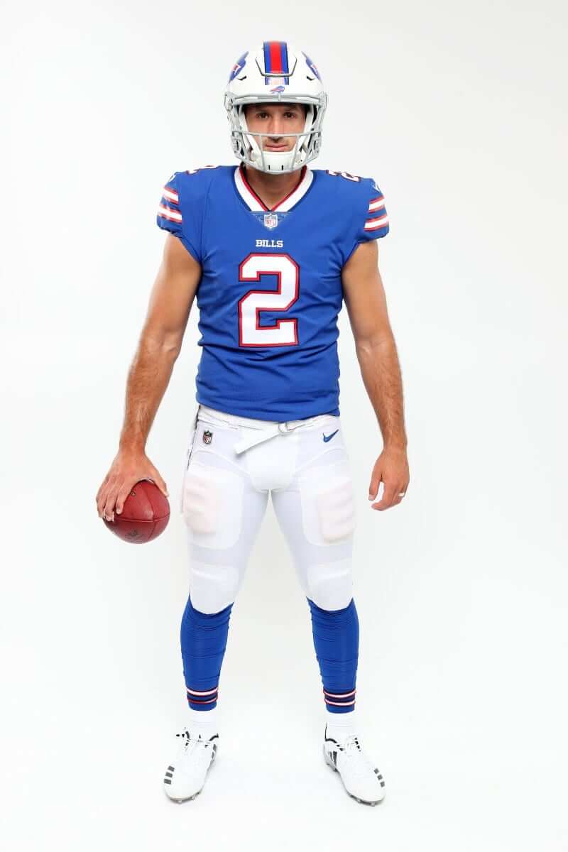
Bills
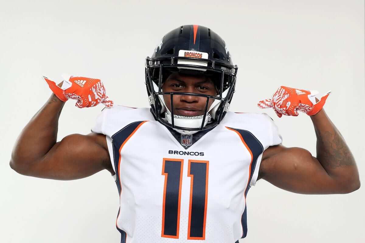
Broncos
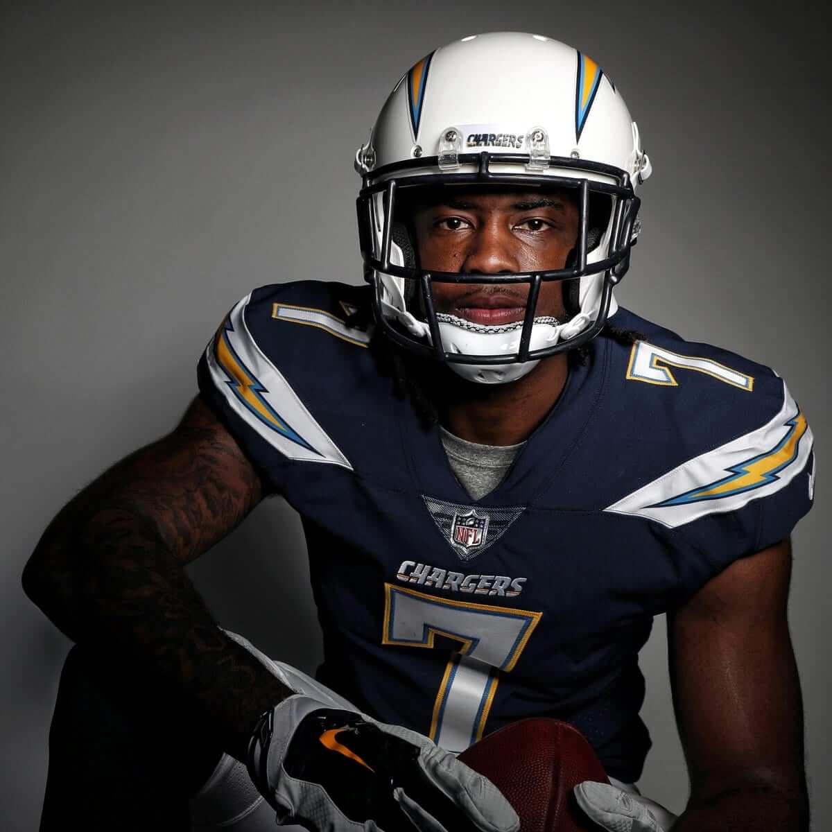
Chargers
Eagles
Giants
Jags
Jets
Steelers
Vikings
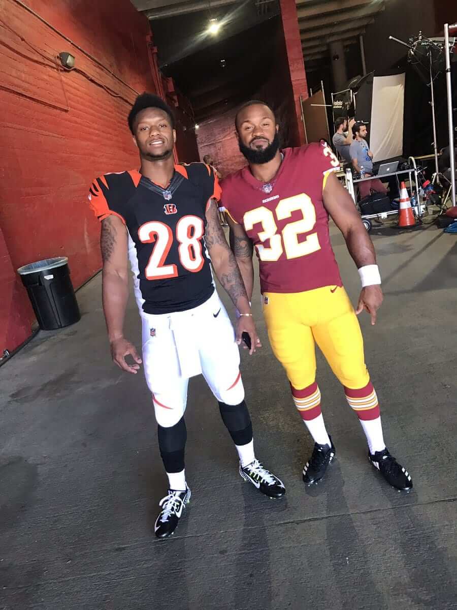
Washington
Some quick notes:
• The collars are sooooo much better without the Nikelace.
• But as we discussed a few weeks ago, it’s too bad about the truncated striping on the Bills’ collar. The same thing will be happening with the Pats, although I haven’t yet seen a photo of a player wearing the new jersey style.
• Aside from the collars, the lack of seams is another big improvement.
• As you can see in the final photo in the series, some teams are still using the old jersey template in their photo shoots. Does that mean those teams are definitely sticking with the old template for the upcoming season? Possibly, but I wouldn’t bet too heavily on that based on a photo shoot in May. Sometimes the new jersey stock isn’t available yet. If a team is wearing the new template in these photos, you can bet that that’s what we’ll be seeing on the field. But if you see the old template, I’d recommend a wait-and-see approach (except for the Browns, who as we’ve already discussed are stuck with the old template because of their ridiculous contrast-colored top-stitching).
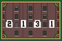
Membership update: Eight new designs have been added to the membership card gallery. That includes the very interesting request we got from Keith Adelsberger (shown at right; click to enlarge), who wanted the “2131” sign that was posted at Camden Yards on the night Cal Ripken Jr. broke the consecutive-games streak. I wasn’t sure Scott Turner would be able to execute that one. But as you can see, he really nailed it. Great job, Scott!
The printed/laminated versions of these cards will ship out in a few days. Next up: all of the orders we received on Purple Amnesty Day.
Remember, a Uni Watch membership card now entitles you to 15% off of any of the merchandise in our Teespring shop (if you already have a card, you can email me to get the discount code). As always, you can sign up for your own custom-designed card here, you can see all the cards we’ve designed so far here, and you can see how we produce the cards here.
The Ticker
By Paul

Baseball News: My ESPN colleague Buster Olney’s excellent piece on the idiocy of beanball retaliation includes the following passage: “[Orioles pitcher Jim] Palmer disliked how [White Sox catcher Carlton] Fisk wore his uniform and, fixated on that, he hit Fisk on purpose.” It’s not clear what Palmer didn’t like, but Fisk went higher-cuffed, and with higher-cut stirrups, than most other players of that era, so maybe that had something to do with it (from Jason Brame). … The Reno Aces are holding a design contest for a new jersey to celebrate Reno’s sesquicentennial. … Whoa, check out the great uniforms for this American Legion team in Wyoming (from @wyomingfootball). … The Bowie Baysox wore a puppy-themed jersey yesterday, to raise funds for animal charities (from Al Hood). … Whoa, so much going on in this uniform! A purple tequila sunrise with white-on-white numbers, verically arched TNOB — with periods! — and Northwestern-striped stirrups. That’s Massillon Jackson High School in Ohio (nice find by Tom Pachuta). … The Gwinnett Braves are having a contest to select a new name for 2018, apparently because fans sometimes confuse them with the big league team.

Soccer News: New sponsor advertiser for Juventus. … New kit for Newcastle United. “The numbers have the updated lion on the base of the numerals,” says Josh Hinton. “Last year, the Premier League was using the outdated PL lion on the base of the numerals.”

Grab Bag: The captain of the Syracuse lacrosse team wears a “C” (from Brian Wulff). … New logo for the Western Lacrosse Association, a men’s Senior A box lacrosse league in British Columbia (from Wade Heidt). … Pro golfer Jason Day is wearing shoes with Tiger Woods’s logo. … Rugby news from Craig Costello, who writes: “For every Leicester Tigers game, each player has a unique letter placed on the chest of his jersey. This dates back to the club’s tradition of using letters instead of numbers to identify players, which they began back in the 1920s. Whereas most rugby teams are numbered 1-15 (with the number of the shirt generally describing the player’s position and role), Leicester spent 70 years with their players wearing A-O. The tradition was brought to an end in 1998 when the rulemakers of the top division of English rugby decreed that everybody should wear numbers to avoid confusion. In recent years, Leicester have included the letters on the front of the shirt as a neat nod to their history. They also still wear the letters on the back in non-competitive matches.”
I don’t care for the triangle the shield sits in. Though I don’t hate the Broncos version too much (colored to NOT match the jersey).
I also don’t like (OK, I HATE) the team name under the shield. The Giants and ‘Skins are prime examples. It’s just too much.
I agree, I am not a fan of the team name or logo on the front of the jersey like that. It’s too much and unnecessary.
I’m sure it’s just a coincidence that more and more teams started adding team names to the chest right around the time that jersey retailing became more of a thing….
Tail wags dog. Again.
Looking at the Gridiron Database website it looks like most teams added them in the mid-90’s, which is right around when I got my first replica jersey as a kid, so I can’t dispute you there.
Here’s a question, because I only took a small sample, but with teams like the Eagles and Giants, it looks like this is the only spot on their entire uniform where the mascot name is spelled out. Is that the common way this wordmark logo was used?
I’m sorry, Todd, but I don’t understand your question. Can you clarify what it is that you’re asking?
I guess you answered my own question in your other reply. The entire uniform (for most teams) doesn’t have the team’s name anywhere on the helmet or jersey so they put it on there to say “hey, this is a 49ers jersey” instead of just a red jersey with white lettering.
I hate those wordmarks! Is it so the opposition knows who they’re playing?
It’s 100% so purchasers of overpriced polyester shirts can feel like “I’m wearing a 49ers jersey,” as opposed to “I’m wearing a red jersey with white lettering.”
Are the black matte stripes cutting across the black areas of the Jags’ jersey shoulders a design element, rather than the cut of the jersey itself? I didn’t see it on any of the other teams, but it could be the lighting.
It’s either a black screen print or black film applied to the black fabric as a design element. A similar technique is used on the collar triangle. The different sheen/texture is what makes it stand out from the jersey fabric.
The design element is to represent “jaguar claw marks across the shoulders”. Similar design found on the teal alternate and white jerseys.
Too bad the Jags didn’t change their entire design. Worst uniform in sports, IMHO.
Proofreading:
“Buster Oleny’s” Olney
Fixed.
I am 100% against throwing at a guy’s head that could harm serious injury.
However, no problem with a guy wearing one in the middle of the back for being stupid.
The other night, Blue Jays break Freddy Freeman’s hand, albeit on purpose. Kevin Pillar shouts a gay slur after being struck out, then down 5 Jose Bautista hits a home run and stares down the pitcher and flips the bat.
I am sure I’ll get blasted for this but oh well.
Not particularly interested in debating the ins and outs of macho-man retaliation, or the virtues of throwing at someone’s back vs someone’s head (as we know, MLB pitchers have pinpoint control and never miss their target — you can tell because there are never any bases on balls). The only reason that item is in the Ticker is because of the reference to Fisk’s uniform. Let’s please stick to that. Thanks.
I would have thrown at Fisk for wearing number 72
I would have thrown at him for having the first name Carlton.
NEVER. throw at anything above the waist. My dad would throw at the rib cage, but if you *have* to retaliate just put one on the rump.
I have a newfound respect for Earl Weaver…didn’t realize he wasn’t big on retaliation.
And I don’t approve of throwing at bat flippers. Bat flips Make Baseball Fun Again
link
New kits for Zambia.
Bowie Baysox puppy-themed uniforms feature characters from the “Paw Patrol” cartoon series. It’s too bad no one’s thought of using “OMFGDOGS” for a similar-themed uniform:
link
Hey, looks like the “sweat blocks” on the stomach and back will be gone thanks to the new jerseys… that’s a huge plus IMO.
As a father of young children, I feel I must point out that the Bowie Baysox were wearing uniforms with characters from the tv show “Paw Patrol” and not simply “puppy-themed” uniforms as the article stated.
It needed to be pointed out. My 5-year-old said so.
It should be pointed out that just because the retail version of a team’s jersey is the new template doesn’t mean the on-field jersey will be the same. The retail jerseys of the Packers have been the same template as every other team even though they’ve been using the Reebok template in the field.
I don’t know why that posted as a reply to the Paw Patrol comment.
I am neutral on the Nikelace, but in my opinion the bigger improvement for 2017 is shrinking the size of the contrasting collar for the Texans, Broncos and Eagles. The 2016 versions were cartoonishly large.
link
The new templates look way better. Good culmination of Nike technology and classic NFL without being too Nike-ish or too out of date like the teams still using the Reebok template look. The Bengals are selling retail jerseys in the new template so hopefully they switch because that toilet bowl collar looks awful.
This updated template is probably the biggest change for the Jets, perhaps they’ll finally have one shade of green for their uniforms this season!
I still hate those shoulder stripe panels. They should reverse the colors, so that we don’t have that stupid right-angle cutoff at the sleeves. Green-white-green on the green jerseys, and white-green-white on the white jerseys. I strongly believe it would vastly improve their look without having to significantly alter the template.
Hmmm actually I wouldn’t be so sure that the Bengals are switching to the new template. In that picture both their jersey and pants have the newer chrome NFL shields (on the old template with flywire collar) that up until now were reserved for the vapor templates only. If the Bengals were indeed waiting on the new template why go to all the trouble to put the chrome shield on the old one unless that’s what they will be wearing this year?
The Bengals are not switching to the new template. Paul’s already covered that in a previous issue regarding their new “patch” they’re wearing this year. The Bengals player was merely in a photo with a member of the Redskins, one of the teams who is switching their jerseys.
New NFL jerseys feature a mesh grill for ventilation. Because on a v-neck that’s right where you’d need air flow? But let’s drop breathable mesh from everywhere else on the design? Eliminating seams and sweatbox, positive. Adding that awkward tri-seam under the numbers in the back, big negative.
How did the guy modeling the Giants jersey get the number dirty already? Is that blood?
-Jet
Maybe it’s from his gloves.
…or the wax from a fresh from the box football.
Reliever Al Alburquerque was recently link. I hope the Rockies sign him and send him to their AAA team in Albuquerque.
Awesome! He could join the short list of players such as Dave Philley on the Phillies, Johnny Podres on the Padres, and a few more I can’t recall right now…
-Jet
Still can’t believe Lou L. never signed Miroslav Satan to the NJ Devils. Talk about a once-in-forever missed opportunity.
Bryon Baltimore was with 4 teams in the WHA but never the short-lived Baltimore Blades.
Too bad Jim Gott never played for the Angels. Bill James was always hoping for Jim Gott v. Tim Teufel duel.
Jeff Feagles punted for the Eagles.
Some internet search while on a very boring conference call….
John Denvir, Guard, Denver Broncos 1962
Francisco Melendez; San Francisco Giants 1987-88
Francisco Oliveras; San Francisco Giants 1990-92
Francisco Peguero; San Francisco Giants 2012-13
Francisco Santos; San Francisco Giants 2003
Curtis Pride played for the Nashville Pride.
Jerry West and David West both played for the NBA’s West All-Star team.
“New
sponsoradvertiser for Juventus.”Not really new per se, just a subbrand of the already overarching advertiser Jeep
I believe that is an entirely new font on the Newcastle shirt, and not just a revised logo.
Also, if anyone out there is a fan of soccer jerseys, crests, logos and the stories they tell, I have started an Instagram feed that features the crests of shirts from my collection. It’s called link. Part design, part history, and a pinch of conspicuous consumption.
Correct. That is a new Premier League font. Brighton has used the same font in its reveals, and it’s been reported on by Footyheadlines.
link
That Camden yards membership card=genius!! And Scott did a great job. I wish I’d have been able to think that far outside the box to request something like that.
Further to the new league logo post, there is another item of aesthetic interest surrounding Western Lacrosse Association (WLA).
The 7 box lacrosse teams in the summer league play on 3 different surfaces. 4 teams play on a concrete floor, 2 on a wooden floor, and 1 team plays on an artificial turf floor.
Differs from the winter National Lacrosse League where every team plays on an artificial turf floor.
WLA is absolutely fantastic to watch, thanks for reminding me to go to a game soon.
The Gwinnett Braves are going to have a new name and Brandiose will do the designing. Oh goody.
so is it worth being rid of another Native American mascot if it means the new team imagery will be designed by Brandiose?